
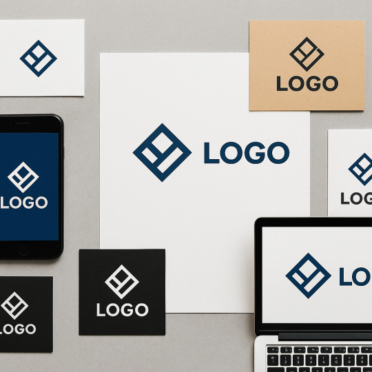
branding & logo designer helping bold brands stand out with clean, timeless visual identities.
Don't wanna be here? Send us removal request.
Statistics
We looked inside some of the posts by hansamabranding and here's what we found interesting.
Average Info
Notes Per Post
0
Likes Per Post
0
Reblog Per Post
0
Reply Per Post
0
Time Between Posts
2 days
Number of Posts By Type
Text
17
Last Seen Tumblr Blogs


Fun Fact
Tumblr has a low social media market share in South America.
Text
Branding Logotypes – The Power of Typography-Driven Identity

Logos often steal the show with iconic symbols: Nike’s swoosh, Apple’s… well, apple, and Twitter’s bird (RIP, little buddy). But sometimes, the most powerful branding tool doesn’t need an icon — it just needs letters. Welcome to the world of logotypes, where the typeface is the logo.
A logotype — or wordmark — is a text-only logo that uses unique font treatments, custom typography, and often subtle modifications to turn a brand name into a visual identity. It's not just about writing the name of your business — it's about making that name unforgettable at first glance.
What Exactly is a Logotype?
In simplest terms, a logotype is a logo made from words, not symbols. It’s the name of the brand, styled in a distinctive way. No icons. No mascots. Just pure typographic magic.
Some classic examples:
Google — multi-colored, clean, friendly
Coca-Cola — flowing script with nostalgic charm
Visa — bold, simple, and trustworthy
Canon — a customized serif typeface with instant recognition
These brands don’t need a separate icon. Their name is the icon.
Why Choose a Logotype?
There’s something beautifully direct about a logotype. It says: “Here’s who we are. No guessing. No abstraction. Just us.”
Benefits of logotypes:
Clarity & Recognition People see your name front and center every time. You don't rely on a symbol they have to mentally connect with your name later.
Versatility Logotypes scale beautifully — perfect for business cards, email headers, signage, and digital platforms.
Typographic Expression The font, weight, spacing, and letterforms express the brand’s tone. Sleek and techy? Go geometric sans-serif. Fancy and high-end? Try an elegant serif with ligature flair.
Cost-Effective for Startups Skip the symbol development phase. Start strong with a clean, distinct logotype.
The Anatomy of a Great Logotype
Creating a great logotype isn't just typing your business name in Helvetica and calling it a day. (Unless you're really into Helvetica.)
Let’s break down the core components that make or break a logotype:
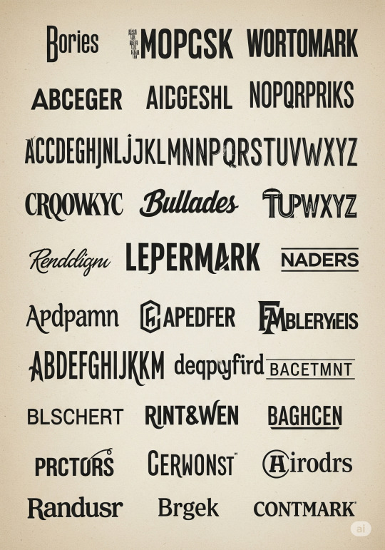
1. Typeface Selection
This is your personality. Think of it as your brand’s voice, but visual. Serif? Sans-serif? Monospaced? Script? Each carries meaning.
Serif fonts – Tradition, reliability (e.g., TIME, Vogue)
Sans-serif fonts – Modern, clean (e.g., Google, Facebook)
Script fonts – Elegance, personality (e.g., Coca-Cola)
Monospaced – Tech-savvy, methodical (e.g., IBM)
2. Customization
To avoid your logo looking like clip art, most strong logotypes involve customization — letter tweaks, unique ligatures, or spacing alterations that make it unmistakably yours.
Even small changes (like elongating the tail of a “y” or tilting the “e”) can create signature style.
3. Kerning & Spacing
Poor kerning can ruin everything. (Ever seen "CLINIC" with the L and I too close? Yikes.)
Every space between letters is a design choice. Adjusting tracking and kerning ensures visual harmony and professional polish.
4. Color Treatment
While many logotypes start in black and white (for clarity), adding brand colors can enhance recognition. Google’s primary colors, for instance, are integral to its identity.
Real-World Examples
Let’s flex those observation muscles. Here’s how different brands used logotypes to carve iconic niches:
FedEx: Uses a bold sans-serif with a hidden arrow between the “E” and “x” — subliminally reinforcing speed and delivery.
Pinterest: Combines script and a subtle "pin" shape in the “P.”
Disney: A custom, playful script that instantly evokes nostalgia and magic.
None of these use symbols — but the typography is the symbol.
Best Practices for Logotype Design
Here’s your go-to checklist when designing or evaluating a logotype:
✅ Is it legible at all sizes? ✅ Does it reflect the brand’s tone and industry? ✅ Is the spacing even and intentional? ✅ Has it been tested in black & white first? ✅ Can it stand alone without supporting graphics? ✅ Does it avoid font clichés? (Papyrus, Comic Sans — we’re looking at you.)
Bonus tip: Avoid over-relying on free fonts. While Google Fonts is a gift to mankind, your brand deserves something more custom. Hire a type designer or modify a base font if possible.
Unique Fact of the Day
📏 The Coca-Cola logotype hasn’t changed significantly since 1887. That makes it one of the oldest continuously used logos in the world — proof that strong logotype design can be incredibly durable across centuries and cultures.
When Should You Use a Logotype?
Here are some ideal scenarios:
You're just starting and want to prioritize clarity.
Your name is unique or catchy enough to be memorable on its own.
You want to lean into elegance, minimalism, or directness.
Your brand will operate primarily in digital spaces where icons can get crowded.
But remember: logotypes work best when your name is not too long or overly complex. “The Consortium for Reusable Bamboo Solutions Inc.” might want to rethink things.
Final Thoughts
In a world full of symbols, sometimes the boldest thing you can do is just spell it out — with style. A well-designed logotype doesn’t need bells, whistles, or mascots. It whispers your name and gets remembered anyway.
https://letterhanna.com/branding-logotypes-the-power-of-typography-driven-identity/
0 notes
Text
Designing for Versatility Across Platforms
Welcome back to the daily logo design deep-dive! So far, we’ve journeyed through the basics of logos, learned about different types, tackled design principles, and explored how logos communicate brand identity. But here’s a harsh truth: even the most beautifully designed logo can completely fail if it doesn’t work where it needs to.
On today’s ride—Day 11—we’re diving into versatility. Or, to be dramatic: how to stop your logo from becoming an embarrassing blob on a billboard, a pixelated mess on a mobile app, or a barely visible stamp on a pen.
Why Versatility is Crucial in Logo Design
Think of your logo as your brand’s chameleon. It should be able to thrive whether it’s printed on a tiny business card or projected on a stadium screen. It has to look great in full color, black and white, or even carved into wood (hey, artisanal coffee shops still do this).
A logo needs to be:
Scalable
Adaptable
Readable
Timeless
Cross-format friendly
Fail at any of these and your logo might just become a branding liability.
Principle #1: Scalability (aka, the Anti-Microscope Rule)
If someone needs a magnifying glass to identify your logo at small sizes, it’s time to go back to the drawing board.
✔ Do this:
Test your logo at various sizes: favicon (16x16 px), app icon (512x512 px), billboard mockup.
Stick to clean lines and bold shapes. Intricate illustrations may look pretty but tend to break down at smaller scales.
✘ Don’t do this:
Avoid hyper-detailed designs. Logos are not paintings.
Don’t rely on fine lines that can disappear or blur out at smaller sizes.
Principle #2: Simplicity is Your Friend
Think Apple, Nike, or McDonald’s. All successful logos with ultra-simple designs. They’re iconic precisely because they are unmistakable at any size.
Pro tip: The more clutter you remove, the more power you inject. Simplify without stripping away meaning.
Principle #3: One Logo, Many Versions
A truly versatile logo has flexible variations, ready to suit different situations:
Primary Logo – Your hero. Usually horizontal with icon + logotype.
Stacked Logo – Great for square spaces (think social media profile pics).
Icon-Only Mark – Just the symbol or lettermark. Think Twitter’s bird or Instagram’s camera.
Monochrome Version – Works in single color (black or white).
Inverted Version – For darker backgrounds.
Responsive Logo – A modern take: the logo adjusts as screen size changes, shedding details for mobile views.
Your logo isn’t just one file. It’s an entire system.
Principle #4: Context Is Everything
Your logo will be seen:
On screens and billboards
In print and packaging
On social media, uniforms, pens, T-shirts, and car wraps
So you need to test across mediums:
Does it work in RGB and CMYK?
How about embroidery (trust me, gradients hate fabric)?
Can it be embossed, debossed, foil-stamped?
Design it once. Think of it a hundred ways.
Principle #5: Color That Travels Well
Colors look different on different screens and printers. That warm orange you picked? Might look like radioactive pumpkin on some displays.
Best practice:
Build your palette with Pantone, CMYK, RGB, and HEX equivalents.
Test contrast to ensure accessibility (especially for color-blind users).
Have a black-and-white version that still feels iconic.
Common Mistakes When Designing for Versatility
🚫 Too much detail. Tiny swirls, flourishes, and textures don’t scale.
🚫 Relying on gradients. They’re beautiful—until printed in grayscale.
🚫 No clear spacing rules. Your logo should always have breathing room.
🚫 Ignoring different file formats. Always export your logo in multiple formats (SVG, PNG, PDF, EPS, JPEG), each for specific use cases.
Quick Exercise
Want to stress-test your logo?
Shrink it to 32x32 pixels. Can you still recognize it?
Print it in black and white.
Place it on both dark and light backgrounds.
Stick it into a social media profile picture circle.
If it fails any of those… well, at least you know what to fix.
Unique Fact of the Day
Did you know? The first ever “responsive logo system” was created for MIT Media Lab in 2014. The logo dynamically changes shapes based on user interaction and context—pioneering the modern trend where logos morph based on screen or content!
In Summary
Designing a logo isn’t just about what looks good on screen. It’s about making sure your brand mark survives in the wild. A great logo doesn’t just survive—it thrives, whether it’s on a keychain, an Instagram reel, or a Times Square billboard.
So tomorrow, when we dive deeper into creating a brand style guide, you’ll see how versatility lays the foundation for consistency—the secret weapon of every strong brand.
Until then, keep your lines sharp, your colors smart, and your logos adaptable.
https://letterhanna.com/designing-for-versatility-across-platforms/
0 notes
Text
Dynamic Logos – The Shape-Shifting Chameleons of Branding
Forget the “one-logo-fits-all” mindset. In a world where your brand appears on everything from smartwatches to skyscrapers, your logo needs to do more than just exist. It needs to adapt.
🎭 What is a Dynamic Logo?
A dynamic logo is a flexible, ever-changing version of a logo that retains core visual elements but can adapt in:
Color
Layout
Shape
Imagery
Pattern
Context
The trick is in maintaining brand recognition while allowing creative variation.
🔁 Static vs Dynamic: The Showdown
Static LogoDynamic LogoOne fixed formMultiple evolving formsGreat for print & tight controlGreat for digital & engagementPredictable consistencyCreative adaptabilityExample: Nike SwooshExample: Google Doodle
Dynamic logos are like jazz—structured, but full of improvisation.
🧠 Why Use a Dynamic Logo?
1. Multi-Platform Branding
Your logo appears on TikTok, billboards, merchandise, apps—each needs a unique treatment.
2. Cultural Relevance
Dynamic logos can reflect seasons, causes, or trends without needing a rebrand.
3. Audience Engagement
Changing logos spark curiosity. Think of Google Doodles—people actually check the homepage to see what’s new!
4. Creative Freedom
Designers aren’t boxed into one rigid format. The logo becomes a living part of your brand story.
🔍 Examples of Iconic Dynamic Logos
Google Doodles – The perfect storm of playfulness and branding.
MTV – Their original logo from the ‘80s was designed to morph constantly (graffiti, glitch, pattern).
City of Melbourne – A geometric “M” that shifts colors and patterns depending on the context.
Nickelodeon (early 2000s) – Same font, splashed onto a ton of quirky shapes.
🛠️ How to Design a Dynamic Logo
1. Establish a Core Anchor
Even in chaos, there’s order. You need a consistent element (like a base shape, typeface, or symbol).
Example: Google’s letterforms stay the same—even when the visuals are wildly different.
2. Build a System, Not a Single Mark
Think modular. How can your logo be rearranged, recolored, or textured without losing identity?
3. Design for Motion
Dynamic logos often work beautifully in animations. Plan for transitions, loops, or interactive states.
4. Style Guides Still Matter
Yes, it’s flexible—but it’s not a free-for-all. Create a dynamic design system, not logo anarchy.
⚠️ Pitfalls to Avoid
🚫 Too Much Variation If people can’t tell it’s the same brand, the concept fails.
🚫 No Visual Anchor Without a repeating element, your logo becomes a shapeshifter with identity issues.
🚫 Inconsistent Tone Your playful Valentine’s Day variation shouldn’t look like a horror movie teaser (unless you're Netflix).
💡 Pro Tips for Dynamic Logo Success
Use motion graphics to make dynamic logos pop in video and app UX.
Connect variations to events, campaigns, or locations.
Let user-generated content influence variations (very Gen Z-friendly).
Pair dynamic logos with static counterparts for legal or packaging uses.
📚 Unique Fact of the Day
In 2008, the City of Melbourne launched one of the world’s first truly dynamic logos—a bold, angular “M” that could morph into hundreds of variations. It was one of the first city governments to fully embrace visual fluidity as part of their civic identity. Progressive and pixel-perfect.
🧾 Key Takeaway
Dynamic logos aren't just a trend—they're a response to an evolving world. When designed well, they become an ever-changing heartbeat of your brand, perfectly suited for the hyper-visual, scroll-happy generation.
https://letterhanna.com/dynamic-logos-the-shape-shifting-chameleons-of-branding/
0 notes
Text
Lettermarks – When Initials Say It All
Sometimes, less really is more.
When your brand name is long (looking at you, International Bureau of Long-Windedness), a full wordmark just isn’t practical. Enter: the Lettermark—a clean, compact, and confident way to showcase identity using just initials.
🔠 What is a Lettermark?
A lettermark is a logo built solely from the initials of a brand name. No icons. No illustrations. Just a few carefully crafted letters acting as the entire visual identity.
Think:
IBM (International Business Machines)
CNN (Cable News Network)
NASA (National Aeronautics and Space Administration)
HBO (Home Box Office)
These brands took long, formal names and distilled them into something punchy, iconic, and easy to remember.
🧩 When to Use a Lettermark
Lettermarks are ideal for brands that:
Have long or complex names
Want a modern, minimalist look
Need a logo that scales easily and remains readable
Rely heavily on typographic identity (think law firms, agencies, fashion houses)
You’re using visual simplicity to create verbal clarity.
✍️ Designing a Killer Lettermark
It might look simple, but crafting a good lettermark takes nuance. Here’s your cheat sheet:
1. Choose the Right Typeface
Serif = authority, class (great for law firms, finance)
Sans-serif = clean, modern (great for tech, startups)
Script = elegant, high-end (great for luxury, fashion)
2. Pay Attention to Spacing
The fewer the letters, the more every curve and corner matters. Kerning is king.
3. Play with Customization
Lettermarks often involve modified characters, ligatures, or unique connections between letters.
4. Keep It Bold (Sometimes Literally)
Thin, light fonts can disappear in small sizes. Test it at both favicon scale and billboard size.
🧠 Smart Branding with Initials
A lettermark doesn’t have to be cold. Done right, it can still:
Suggest movement
Convey elegance
Build personality
Take LV (Louis Vuitton). Those two little letters exude heritage and prestige—all without a full name in sight.
🧠 BONUS: Hybrid Approach
Some brands start with full wordmarks and later transition into lettermarks once they gain recognition. This is a smart branding evolution strategy.
Example:
Pinterest uses its full name as a wordmark.
Later on? Just the “P” on the app icon.
⚠️ Common Mistakes
🚫 Generic Fonts – A plain Arial “HK” is not a logo. It’s a homework header.
🚫 Poor Scalability – Lettermarks must shine at all sizes, especially tiny.
🚫 No Brand Voice – A lettermark should still feel like your brand, even without extra elements.
🧠 Unique Fact of the Day
IBM’s lettermark logo was designed by legendary designer Paul Rand in 1972. The horizontal stripes weren’t just stylish—they suggested speed and dynamism, modernizing a tech giant without losing its serious tone.
(Aka: it said “we’re fast and futuristic—but still wearing suits.”)
🧾 Key Takeaway
Lettermarks are the sharp dressers of the logo world—clean, confident, and quietly powerful. When your name is long but your style is sleek, go for initials that speak volumes.
https://letterhanna.com/lettermarks-when-initials-say-it-all/
0 notes
Text
Emblem Logos – Tradition with a Modern Twist

Emblem logos are the wise elders of the logo world. Classic. Bold. Intricate. They hold power and prestige and often carry a sense of heritage. If logos were houses, emblem logos would be the vintage mansions with stained glass windows.
🛡️ What Is an Emblem Logo?
An emblem logo is a design where text, symbols, and shapes are all integrated into a unified frame or seal. The design is often contained within a circle, shield, crest, or badge.
It’s not “symbol + wordmark.” It’s all-in-one, baby.
Famous Examples:
Starbucks (That circular seal wraps it all up.)
Harley-Davidson (The winged shield? Iconic.)
BMW (Classic, clean emblem style.)
Harvard University (If it has Latin, it’s probably an emblem.)
🧭 Why Use an Emblem Logo?
Emblems scream credibility and legacy. Whether you’re a craft brewery, a sports team, or a school, emblems say “We’ve been around. We’re not messing around.”
Perfect for:
Schools & universities
Sports teams & clubs
Automotive brands
Coffee shops & craft products
Law firms & financial institutions
📚 Emblem Logo Advantages
✅ Strong Visual Identity Everything lives in one tight unit—great for patches, stamps, stickers, and merch.
✅ Instant Heritage Feel They suggest tradition, authority, and story. Even if you started last week.
✅ High Recognition They’re dense, but when done well, they’re memorable from a mile away.
⚠️ Emblem Pitfalls to Avoid
❌ Over-Detailing If it looks like a medieval coat of arms on a smartphone, scale it back.
❌ Bad Scalability Because emblems are intricate, they can suffer at small sizes. Always test your logo in both large and tiny formats.
❌ Typography Chaos Cramming too much text into a badge shape leads to a clutter-fest.
🛠️ How to Design a Modern Emblem Logo
Here's how to make your emblem logo roar like a lion, not squeak like a hamster:
1. Start With a Shape
Shield, circle, badge—choose a frame that suits your vibe.
2. Combine Type and Symbol Creatively
Think of your name, year founded, iconography. Blend them with intention.
3. Keep It Balanced
Symmetry is your friend. Emblems rely on harmony.
4. Modernize the Classic
Use clean lines, flat colors, and smart spacing to avoid looking dated.
🔁 Emblem + Minimalism?
Yes, you CAN modernize emblems! Many designers now create minimal emblems—flat, geometric versions that keep the traditional feel without the Renaissance flair.
Think Warner Bros. updated shield, or Stella Artois’ cleaner badge variations.
💡 Pro Tip:
Try mocking your emblem onto a coffee cup, notebook, or t-shirt. Emblems love merch. That’s their natural habitat.
🔍 Unique Fact of the Day
The Starbucks emblem evolved from a 16th-century Norse woodcut of a twin-tailed siren. Over the years, it’s been simplified from a detailed mythical creature to the modern, clean green goddess we sip today.
Yes, your overpriced latte has logo lore.
🧠 Key Takeaway
Emblem logos are perfect for brands that want to build legacy, authority, or just look like they’ve been around since the dawn of time (even if they launched last week on Shopify).
They may be traditional, but they’re not stuck in the past—especially when given a modern twist.
https://letterhanna.com/emblem-logos-tradition-with-a-modern-twist/
0 notes
Text
Abstract Logos – The Art of Visual Metaphor

Welcome to the realm of abstract logos—where shapes, lines, and color tell stories that words can’t. If logo design were music, abstract logos would be jazz. 🎷
They're expressive, interpretive, and loaded with meaning—without being literal. So if you’re tired of being on-the-nose, this one’s for you.
🎨 What Is an Abstract Logo?
An abstract logo uses non-representational shapes or symbols to convey a brand's identity. Unlike icons (which show actual things like houses or scissors), abstract logos rely on form, balance, and color to suggest meaning.
Think:
Nike (that swoosh? It’s movement in logo form.)
Pepsi (spherical form with color symmetry = energy + balance)
Adidas (the three stripes = mountain, challenge, progress)
It’s not about what the logo shows; it’s about what it evokes.
💡 Why Go Abstract?
Abstract logos are powerful when you want a brand image that:
Transcends language or culture
Is highly unique and hard to imitate
Leaves room for interpretation and emotional connection
Perfect for:
Global companies
Startups aiming for a modern feel
Brands in tech, fashion, fitness, or art spaces
Anyone with a bold, visionary vibe
🧬 The Psychology of Abstract Forms
Believe it or not, shapes speak:ShapeEmotion/MessageCircleUnity, community, infinityTriangleDirection, power, growthSquareStability, reliabilityDiagonal linesMotion, energy, actionOrganic shapesCreativity, softness, flexibility
Your challenge is to use form to communicate your brand DNA without spelling it out.
🛠️ How to Design an Abstract Logo
Designing an abstract mark isn’t just throwing shapes at a canvas. There’s a method to the abstract madness.
1. Start With Meaning
Even if your logo doesn’t literally depict something, it should represent an idea. Ask: What does your brand stand for?
2. Sketch Symbols First
Start with literal images. Then stylize, reduce, rotate, and abstract until the essence remains.
3. Use Color With Purpose
In abstract logos, color does a LOT of the storytelling—make sure your palette matches your brand tone.
4. Test Interpretations
Ask others what they feel when they see it. Abstract logos are like Rorschach tests—you want alignment, not confusion.
⚠️ Watch Outs
Being too vague: If your abstract shape means nothing to anyone, it fails.
Poor execution: Bad geometry = amateurish feel.
Inconsistency: The rest of your brand identity should support the abstract form.
🔁 Abstract + Wordmark = Power Combo
Many companies use an abstract symbol alongside a strong typographic logo. That way, the abstract mark can stand alone (like an app icon or favicon), while the name builds brand awareness.
Famous example: Spotify
Symbol: Sound waves in a circle.
Wordmark: Clean and modern.
The symbol becomes iconic once brand recognition kicks in.
📱 Real-World Use Cases
App icons: Abstract shapes scale well and are memorable.
Fashion logos: Let’s be honest—fashion brands love mysterious logos.
Tech startups: Abstract forms suggest innovation and breaking norms.
Fitness brands: Diagonal lines and dynamic forms scream “let’s move!”
🤯 Unique Fact of the Day
The Nike swoosh, arguably the world’s most famous abstract logo, was designed in 1971 by a student named Carolyn Davidson—and she was originally paid only $35 for it.
Don’t worry—Nike later gave her stock that's now worth millions. So... fair-ish.
🧠 Key Takeaway
An abstract logo invites your audience to feel instead of just see. It’s less “this is a tree” and more “this feels like growth.” It's poetic branding.
And when done right? It becomes unforgettable.
https://letterhanna.com/abstract-logos-the-art-of-visual-metaphor/
0 notes
Text
Wordmarks and Lettermarks: Typography at Work
Welcome back, design traveler! You’ve mastered the art of symbols, explored shapes, and learned about responsive logos. Now, it’s time to dig into the world where type does all the talking: wordmarks and lettermarks. If logos were a band, these guys would be the lead singers—loud, clear, and hard to ignore.
🅰️ What Are Wordmarks and Lettermarks?
Both of these logo types rely entirely on typography—no icons, no illustrations, just pure letterform magic. But they do have different vibes and uses:
Wordmarks (aka logotypes): These are logos made up entirely of a company’s name in a styled font.
Think: Google, Coca-Cola, Disney, FedEx
Lettermarks (aka monogram logos): These are logos based on initials.
Think: IBM, CNN, NASA, HP
Both forms live and breathe typography, and when done right, they are iconic—even unforgettable.
✏️ When Should You Use Each?
Wordmarks are fantastic when:
Your brand name is distinctive and not too long
You want to increase name recognition
You don’t need a symbol to communicate your brand
Lettermarks are the go-to when:
Your company name is long, complicated, or hard to pronounce
You want a simple, scalable identity
You already have strong brand recognition
🎨 Typography: The Real Hero Here
The typeface you choose isn’t just about being pretty. It carries emotion, tone, and intent. Some considerations:
Serif vs Sans Serif
Serif: Traditional, authoritative, trustworthy (e.g., law firms, luxury brands)
Sans Serif: Modern, minimal, clean (e.g., tech startups, lifestyle brands)
Custom vs Stock Fonts
Custom typography (like Coca-Cola’s script) can make a logo iconic and ownable.
Modified stock fonts can still look unique if tweaked properly.
Spacing & Kerning
Letter spacing (kerning) can make or break a wordmark. Improper spacing makes it feel unpolished or amateurish.
Weight & Case
Uppercase tends to feel stronger and more formal.
Lowercase can feel more friendly and casual.
Mixing them? Bold move—but it can work (e.g., eBay or iTunes).
💡 Famous Case Studies
Google: Clean sans-serif wordmark with a playful color palette = instantly recognizable.
CNN: Bold, red lettermark—3 letters and it’s global.
Visa: Wordmark so simple, yet it evokes trust.
NASA: Lettermark that feels futuristic and strong—fitting for space explorers.
Each of these brands tells a story just through their type.
🛠️ How to Design Your Own
If you're working on a wordmark or lettermark, here’s your mini-process:
Start with the brand voice: Is the brand friendly? Premium? Playful? The typeface should echo that.
Explore typography options: Use font pairing tools or draw your own characters.
Experiment with custom tweaks: Ligatures, icon-style letters, or creative negative space (think FedEx’s arrow).
Test it in different contexts: Does it look good tiny? Printed? On a billboard?
Pro tip: Start with black and white. Color can distract you from seeing what really works.
📦 Bonus Thought: Pairing Wordmarks with Symbols
Some brands pair wordmarks with icons (like Spotify or Dropbox), allowing them to switch between full and compact logo modes. This hybrid model gives you the flexibility to grow your logo's ecosystem.
But if you're going for a pure wordmark or lettermark, your type must carry the full brand load. No pressure. 😉
🎯 Final Takeaway
Typography isn’t just design—it’s branding language. With wordmarks and lettermarks, you have the power to create logos that are bold, sophisticated, or fun, using nothing but letters. When done right, these logos become timeless.
🤯 Unique Fact of the Day
The FedEx logo is one of the most famous examples of hidden symbolism in typography. Look closely between the E and the x—see the arrow? It represents speed, direction, and precision. And it’s all just clever use of negative space.
https://letterhanna.com/wordmarks-and-lettermarks-typography-at-work/
0 notes
Text
Adaptive Logos – Designing for a Responsive World

Let’s face it: gone are the days when a logo lived only on a signboard, business card, and a fax cover sheet (RIP fax machines 🪦). Now, a logo has to show up on a smartwatch, website header, social media icon, app splash screen, car wrap, coffee cup… you get the idea.
Enter: adaptive logos—a modern, modular approach to logo design where your visual identity changes shape, but not its soul.
🧬 What Is an Adaptive Logo?
An adaptive logo is a visual identity system that includes multiple versions of the logo, each optimized for different contexts, while retaining consistent core elements.
It's like a costume change, not a personality shift.
Key Versions You’ll Often See:
Primary logo – Full version with all components
Secondary logo – Slightly simplified (stacked, condensed, or horizontal)
Icon or logo mark – Just the symbol or monogram
Favicon – Super tiny version (e.g. 16x16 px)
Wordmark – Just the brand name, stylized
Responsive logo – Changes dynamically depending on screen size
🖼 Why Adaptive Logos Matter
📱 1. Multi-Device Compatibility
Your full logo might look great on a billboard—but shrink it to a phone screen? Suddenly, that elegant serif font turns into digital soup.
Adaptive logos make sure you always look crisp, clear, and confident—whether it’s 40ft wide or 40 pixels tall.
🔄 2. Flexibility for Marketing
From podcast thumbnails to product packaging to TikTok banners, brands now live in hundreds of contexts. A single static logo just can’t keep up.
🧠 3. Stronger Brand Recognition
When executed well, adaptive logos reinforce brand memory by showing consistency across varied contexts, not rigid sameness.
🌍 Famous Examples of Adaptive Logos
1. Google
Their famous multi-colored “G” icon is instantly recognizable—used as a favicon, app icon, and profile picture. It adapts beautifully across environments, yet still screams “Google.”
2. Spotify
Spotify uses its full logo when it needs gravitas (e.g., printed reports), but often switches to its three-wave icon on apps and ads. It’s fluid, responsive, and unmistakably Spotify.
3. Coca-Cola
They’ve created various lockups of their classic script wordmark—sometimes integrating it into the shape of a bottle, other times simplifying it to a swoosh-like curve.
🛠 How to Design an Adaptive Logo System
✍️ Step 1: Start with the Primary Logo
Make sure your full version includes all necessary elements—icon, logotype, tagline if needed. This is your foundation.
✂️ Step 2: Build Modular Versions
From the full logo, begin subtracting or rearranging elements while keeping the core DNA intact.
Create:
Horizontal version
Vertical/stacked version
Standalone icon
Tiny size-friendly version (for 16x16 px use)
🎨 Step 3: Ensure Consistency
Use the same colors, spacing rules, and style across all versions. It's okay to adapt layout—just don’t lose the brand’s voice.
📏 Step 4: Test at Different Sizes
Zoom it out. Shrink it to a favicon. Slap it on a mockup of an app icon. Your adaptive logo should perform like a champ under pressure.
💡 Adaptive ≠ Random
Let’s be clear: an adaptive logo doesn’t mean throwing different versions at the wall and seeing what sticks. It’s about creating intentional, cohesive variants that serve different needs.
Think of it like a jazz band. Each instrument plays its part, but they all follow the same rhythm.
🧠 Unique Fact of the Day:
The Whitney Museum’s “W” logo, designed by Experimental Jetset, is adaptive by design. The zigzag "W" literally stretches and shifts in form depending on the artwork it's displayed with. It was one of the first major museum identities built on responsiveness as a concept, not just a tech need.
✍️ Design Mission: Create Your Own Adaptive Logo Set
Take a logo you've already created and build:
A primary version
A simplified icon
A wordmark-only version
A tiny-size favicon version
Put them into a slide deck or mockup. See how they play together. This is your logo orchestra. Conduct it with style.
https://letterhanna.com/adaptive-logos-designing-for-a-responsive-world/
0 notes
Text
Logo Legalities – Copyright, Trademark, and How to Protect Your Work

You've created a logo that turns heads, wins hearts, and maybe even got a standing ovation from your client’s dog. But now it's time for the unglamorous—yet vital—stuff: protecting that shiny design so nobody rips it off.
Legal protection isn't just for billion-dollar brands. Whether you're freelancing, building your own company, or designing for a friend’s Etsy empire, understanding copyright and trademark law is essential.
🧾 What's the Difference Between Copyright and Trademark?
Let’s break it down in plain English (and just a sprinkle of legal-ese):
📚 Copyright
What it protects: The creative expression of an idea (your design work)
When it applies: Automatically upon creation—no registration needed
What it doesn’t do: It doesn’t protect the logo as a brand identifier
Copyright says, “You made this artwork.” But it doesn't say, “This represents a business.”
® Trademark
What it protects: Logos, names, symbols, and designs used to identify a brand
When it applies: When used in commerce and optionally registered with the appropriate authority (USPTO in the U.S.)
What it does: Stops others from using a similar mark in the same industry
In short:
Copyright = I made it. Trademark = It represents me in the marketplace.
🧠 Real-World Scenario:
Imagine you design a logo of a red squirrel eating a donut. 🍩 It’s super cute. Copyright protects your drawing. But unless your client registers it as a trademark, another donut shop can use a similar squirrel without breaking the law—especially in a different region or country.
🛡 How to Protect Your Logo
✅ 1. Document Your Work
Keep timestamps of sketches, versions, and final files.
Email drafts to yourself or use cloud tools that record creation dates (Google Drive, Dropbox, Figma).
This won’t give you bulletproof protection, but it’s a start.
✅ 2. Use Copyright Notices
Even if it's automatic, a notice helps. Example:
© 2025 Jane Smith. All rights reserved.
Place it in presentations or on your website portfolio. It tells the world: “This design is not for the taking.”
✅ 3. Register a Trademark (Optional but Smart)
For serious brand-building, a trademark is worth the cost. In the U.S., this means:
Searching the USPTO database
Filing an application
Paying the fee (usually $250–$350)
Waiting several months
Pro tip: Consult a lawyer or use a service like LegalZoom if the paperwork scares you more than Comic Sans.
👩🎨 Freelancers: Protecting Yourself in Client Work
🔄 Who owns the logo?
Depends on your contract. If you don’t specify, copyright stays with the designer by default in many jurisdictions.
To transfer full rights:
Include a clause like: “Upon final payment, all rights to the logo design will be transferred to the client.”
Or use a more formal IP transfer document
Don’t give up rights until you’re paid. No exceptions. Not even for your cousin’s garage band.
🧠 Unique Fact of the Day:
Nike’s iconic Swoosh was designed in 1971 by a college student, Carolyn Davidson, for just $35. Nike later trademarked it, of course—but Davidson didn’t get royalties. Decades later, Nike gave her stock (now worth millions). Moral: design may be temporary, legal foresight is forever.
✍️ Design Mission: Audit Your Legal IQ
Find your latest logo project.
Ask yourself:
Do I have proof I created it?
Did I define ownership clearly with my client?
Would this logo be worth trademarking?
Consider adding a copyright notice to your portfolio.
Even if you don’t trademark every logo, you should always know where you stand.
https://letterhanna.com/logo-legalities-copyright-trademark-and-how-to-protect-your-work/
0 notes
Text
Logo Presentation – How to Make Your Logo Shine

You’ve poured hours into designing the perfect logo. But if you hand it off in a plain JPEG with no context, you’re not just underselling your work—you’re letting your brilliance whisper instead of roar.
Presenting a logo is about storytelling, strategy, and showmanship. Let’s dive into how to package your design so that clients, stakeholders, or Dribbble followers fall in love at first sight.
🧠 Think Like a Marketer, Not Just a Designer
Design isn’t just visuals—it’s strategy wrapped in pixels. Your presentation should guide viewers through:
The problem the logo solves
The thinking behind the design
The application in real-life contexts
By doing this, you shift the conversation from “I like it” vs. “I don’t” to “It works” vs. “It doesn’t.” That’s a big upgrade.
📑 What to Include in a Logo Presentation
Here’s your essential checklist for a knockout logo deck:
1. Introduction & Brand Goals
A quick summary of the brand’s mission and audience
What the old logo lacked (if redesign)
What the new logo aims to accomplish
2. Logo Concept Breakdown
Meaning of each shape, symbol, or element
Why you chose the typography
What the color palette communicates
Moodboard or inspiration references (optional but powerful)
3. Logo Variations
Full color
Black and white
Inverse / knockout
Icon-only or monogram
4. Spacing & Scalability
Clear space rules
Minimum sizing
Legibility tests (e.g., on mobile vs. billboard)
5. Real-World Mockups
This is where magic happens. Show your logo in action:
Business cards
Signage
T-shirts
Website headers
App icons
Product packaging
Tip: Don’t overdo it. 3–5 mockups are enough. Quality > quantity.
🖼 Recommended Tools for Logo Mockups
You don’t need to be a 3D wizard. Here are easy tools to showcase your logo like a boss:
MockupWorld: Free and premium PSD mockups
Smartmockups: Super user-friendly, web-based
Artboard Studio: For creating mockups and full brand visuals
Adobe Dimension: Great for photorealistic renders (steep learning curve, though)
🔄 Get Feedback Before the Big Reveal
Before you hit “Send” or “Present,” do a dry run. Ask:
Does the logic flow?
Is the story clear?
Do the mockups match the brand vibe?
Would someone unfamiliar with the brand “get it”?
Test on a friend, colleague, or your reflection—whatever works.
🧠 Unique Fact of the Day:
The London 2012 Olympic logo, one of the most controversial designs in recent history, was reportedly presented with a dynamic video, theme music, and usage in motion graphics. Despite criticism of the static design, its bold presentation made it hard to ignore—and hard to forget.
✍️ Design Mission: Create Your Presentation Deck
Pick your favorite logo you’ve designed and create a 5–10 slide presentation. Include:
Brand summary
Logo explanation
Color and typography reasoning
At least 2 mockups
A final reveal slide
Present it to someone—even if it’s your goldfish. Practice articulating your ideas out loud. It’ll train your creative brain for client work, job interviews, or portfolio reviews.
https://letterhanna.com/logo-presentation-how-to-make-your-logo-shine/
0 notes
Text
Exporting Your Logo – Mastering Files, Formats & Brand Kits
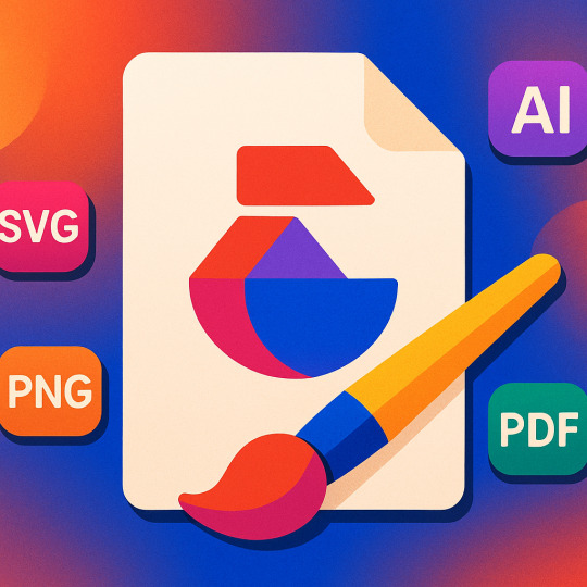
So, you’ve got a shiny new logo—awesome. But what now? If you deliver a JPEG and call it a day, prepare for disappointed clients, blurry print jobs, and a branding nightmare.
Let’s talk about how to package, export, and future-proof your logo design like a true professional.
🗂 Essential Logo File Types
Every format serves a specific purpose. Here’s the breakdown of the MVPs:
1. SVG (Scalable Vector Graphics)
Best for: Web use, digital interfaces, UI/UX design
Pros: Infinitely scalable, editable in vector software, lightweight
Cons: Not ideal for print if not properly converted
2. PDF (Portable Document Format)
Best for: Print and sharing final vector files
Pros: Preserves vector data, universally readable, print-ready
Cons: Slightly heavier than SVGs
3. AI (Adobe Illustrator)
Best for: Your original working file
Pros: Fully editable, perfect for archiving and client revisions
Cons: Not universally accessible without Illustrator
4. EPS (Encapsulated PostScript)
Best for: Print production, logos in commercial use
Pros: Supported by most printers and design software
Cons: Can flatten layers, not ideal for web
5. PNG
Best for: Web use (especially on transparent backgrounds)
Pros: Clean transparency, high-resolution
Cons: Raster format—can’t be scaled without losing quality
6. JPEG
Best for: Fast previews or social media (in non-transparent cases)
Pros: Small file size
Cons: No transparency, lossy compression
🪄 Organizing Your Logo Deliverables
Want to feel like a pro and make your client love you forever? Deliver a complete logo package.
Here’s what to include:
🧩 1. Full Logo Kit
Full color
Black & white
Inverse (white on black)
Transparent versions
CMYK, RGB, and Pantone (if needed)
🖼 2. Different Lockups
Horizontal version
Stacked version
Icon-only version (if applicable)
🔤 3. Typography Guide
What font(s) were used
Where to download/buy them
Alternatives (if commercial license isn’t included)
🎨 4. Color Codes
HEX (for web)
RGB (for screen)
CMYK (for print)
Pantone (if brand needs strict color matching)
📁 5. Folder Structure
markdownCopy
Edit
/YourLogo
/AI
/SVG
/PDF
/PNG
- Color
- Black
- White
/BrandGuide.pdf
🎨 What Is a Brand Guide?
A brand guide is a mini-manual that outlines how your logo should (and shouldn’t) be used. It's crucial for brand consistency—especially when handing things off to marketers or third-party designers.
Include:
Logo placement rules
Minimum size
Clear space around the logo
Don’ts (stretching, recoloring, awkward cropping)
You don’t need a 100-page corporate bible—just enough to keep things consistent.
📦 Unique Fact of the Day:
NASA’s “worm” logo, originally retired in 1992, made a comeback in 2020 for its clean and modern appeal. Why? Because its original vector files were meticulously preserved. Moral of the story? Archive like a nerd.
✍️ Design Mission: Build Your Logo Kit
Whether you’re working on a client project or your personal brand, go through this checklist:
✅ Export in AI, SVG, PDF, PNG, and JPEG
✅ Create color, black, and white variations
✅ Create vertical/horizontal/icon versions
✅ Write a 1-page brand guide
✅ Organize the files into folders
This is where you go from “just a designer” to a design professional. Good design deserves good delivery.
https://letterhanna.com/exporting-your-logo-mastering-files-formats-brand-kits/
0 notes
Text
Logo Redesign – When to Evolve vs. When to Rebuild

Redesigning a logo isn’t just giving it a fresh coat of paint. It’s a strategic decision that can make your brand feel more relevant—or completely alienate your audience if you’re not careful. Yep, it’s a delicate dance between innovation and identity.
Let’s break down the why, the when, and the how of logo redesigns that don’t cause PR disasters.
🧭 Why Brands Redesign Their Logos
There are several legitimate reasons to rethink your visual identity. Here are the biggies:
1. Outdated Design
Your logo looks like it came out of a 90s clipart collection. Enough said.
2. Brand Evolution
The business has grown or shifted focus, and the original logo no longer reflects its mission.
3. New Audience
Maybe you’re targeting a younger crowd, going global, or entering a new market. Your logo needs to speak their language.
4. Digital Optimization
Logos made for print don’t always work on digital platforms, mobile apps, or tiny favicons.
5. Reputation Reset
If a brand has had some rocky PR history, a redesign can signal a new beginning (but it better be backed up by real change).
🔁 Evolution vs. Revolution
Here’s the million-dollar question:
Do you tweak the current logo (evolution) or scrap it entirely and start over (revolution)?
🧬 Evolution (Subtle Changes)
Pros:
Maintains brand recognition
Feels familiar and safe
Ideal for long-established brands
Cons:
May feel underwhelming if too subtle
🔧 Examples:
Google’s transition from serif to sans-serif
Pepsi’s many gentle curves through the years
⚡️ Revolution (Complete Overhaul)
Pros:
Makes a bold statement
Perfect for repositioning or relaunching
Cons:
Risks alienating loyal users
Takes more time and money to roll out
🔧 Examples:
Airbnb’s transformation from “dull blue tech” to its modern abstract “Bélo”
Instagram’s leap from skeuomorphic camera to gradient minimalism
🚨 Redesign Disasters to Avoid
❌ Ignoring Brand Equity
If your old logo is beloved, don’t toss it like last season’s trend. Build on its legacy.
❌ Losing Distinctiveness
Generic “modern” logos often look the same—don’t let your brand get lost in a sea of sanitized sans-serifs.
❌ Going Trend-Only
Trendy fades. Functional lasts. Don’t sacrifice usability for what’s hot this month.
❌ Not Testing
A/B test new versions with different audiences. What you think is clever may just confuse the public.
🛠 The Redesign Process (Without the Headaches)
Start with Brand Strategy Why are you redesigning? What’s changed about your mission, tone, or market?
Audit Your Current Logo What works? What doesn’t? What elements have equity?
Sketch Multiple Directions Explore evolutionary and revolutionary routes side-by-side.
Test with Real People Employees, customers, and a few design-minded friends (not just your cat).
Refine, Iterate, Simplify Good logos are rarely made in one go. Polish it.
Roll Out Strategically Update all your touchpoints: website, packaging, socials, signage. Consistency is key.
💡 Unique Fact of the Day:
The Gap logo redesign of 2010 lasted… wait for it… six days. That’s right. The new logo was so universally hated that public backlash forced them to revert to the original almost immediately. The lesson? Never underestimate the emotional bond people have with a brand's logo.
✍️ Design Mission: Redesign Exercise
Pick a well-known logo (Starbucks, Uber, Twitter, etc.), and try:
A subtle evolution – Keep its soul, modernize the lines, maybe tweak colors or font.
A radical redesign – Reimagine it entirely from scratch as if it were a brand-new company.
Then compare:
Which design communicates the brand values best?
Which feels fresh but familiar?
Which could spark a Twitter war? 😅
https://letterhanna.com/logo-redesign-when-to-evolve-vs-when-to-rebuild/
0 notes
Text
Trends vs. Timelessness – Designing Logos That Last (or At Least Don't Age Poorly)

👓 Trendy vs. Timeless: What’s the Difference?
Trendy
Designs that follow current popular aesthetics. They’re often eye-catching, modern, and perfect for riding the “now” wave.
🎯 Good for: Startups, social media brands, fashion, entertainment ⏳ Lifespan: 1–3 years if you’re lucky 📉 Risk: Looks outdated quickly
Timeless
Designs that ignore fleeting fads and rely on solid design principles. They stay relevant and respected even decades later.
🎯 Good for: Legacy brands, institutions, anyone playing the long game 🕰 Lifespan: Potentially forever 💡 Bonus: They age like fine wine.
🔮 Logo Trends That Come and Go
Design trends are like mullets and neon windbreakers—cool one day, tragic the next. Here are some logo trends that burned bright (and burned out fast):
🌀 Gradient Overload
Think of Instagram’s logo glow-up. Super trendy… but try printing that on a receipt.
🧼 Over-Simplification
Many brands recently flattened or stripped their logos (hello, Google, Airbnb, Volkswagen). While this can boost readability, it can also remove personality.
📦 Geometric Minimalism
Perfect circles, triangles, and squares—great for digital apps, but sometimes indistinguishable from each other.
🧠 Neo-Brutalism and Anti-Design
Purposefully ugly, weird layouts—cool for designers, confusing for normal humans.
🏛 What Makes a Logo Timeless?
1. Simplicity
Less is truly more. Think Apple, Nike, McDonald’s. These logos can be recognized instantly, even without text.
2. Memorability
A unique form or visual hook (like the Nike swoosh or Twitter bird) sticks in people’s minds.
3. Scalability
Works perfectly from a favicon to a billboard.
4. Versatility
Looks great in black and white, full color, embroidery, animation, or as a cookie cutter (yep, that’s a real thing).
5. Emotional Neutrality
Timeless logos don’t rely too heavily on pop culture references or current events—they let their brand personality shine over time.
🖼 Timeless Logo Case Studies
Nike
Created in 1971 for $35. It’s still in use today, untouched. Why? It's simple, fluid, and loaded with motion.
Coca-Cola
Its script logo hasn’t changed much since 1887. It owns its red, owns its swirl, and screams "nostalgia" in the best way.
IBM
Paul Rand’s striped logo has been in use since the ‘70s. A modernist design that’s elegant and techy, without looking dated.
🎯 Should You Follow Trends?
Short answer: Sometimes.
If your brand is part of a rapidly changing space (tech, fashion, gaming), trendy logos can feel fresh and relevant. Just be ready to rebrand often, or at least keep a design evolution strategy in your back pocket.
If you want a brand to stand the test of time, invest in timeless principles from the start—even if it means bucking the current aesthetic wave.
🧩 Unique Fact of the Day:
The London Underground “roundel” logo (the red circle with the blue bar across it) has been in use since 1908—proving that a simple shape with strong composition can survive over a century of cultural and design shifts.
https://letterhanna.com/trends-vs-timelessness-designing-logos-that-last-or-at-least-dont-age-poorly/
0 notes
Text
Composition and Balance in Logo Design – Creating Visual Zen

🎯 What Is Composition in Logo Design?
Composition is how the elements of your logo are arranged. It’s not just about placing stuff randomly and hoping it looks good (that’s how you get logos that look like ransom notes). It’s the intentional act of balancing visual weight, alignment, spacing, and flow to guide the viewer's eye effortlessly.
Think of your logo as a well-choreographed dance—the shapes, letters, and icons all need to move together without stepping on each other's toes.
⚖️ Types of Balance in Logo Design
1. Symmetrical Balance
This is when both sides of your logo are mirror images or evenly weighted. It feels stable, formal, and trustworthy.
🧠 Used by: McDonald’s, Mastercard, Toyota 🧩 Good for: Corporate, finance, heritage brands
🧘 It says: “We’ve got our stuff together.”
2. Asymmetrical Balance
Here, the elements are different, but still balanced by visual weight. It’s more dynamic and modern, creating tension and movement.
🧠 Used by: Nike, Adidas, Airbnb 🧩 Good for: Startups, lifestyle brands, tech
🧘 It says: “We’re flexible, innovative, and interesting.”
3. Radial Balance
Elements radiate outward from a central point. It’s less common but very powerful in the right context.
🧠 Used by: BP, Olympics 🧩 Good for: Institutions, global brands, events
🧘 It says: “We’re connected, inclusive, and centralized.”
🧮 Key Composition Concepts
🔳 Visual Hierarchy
This is how you prioritize information. The most important parts (like your icon or brand name) should draw attention first.
👁️ Tip: Use size, contrast, and placement to guide the eye.
↔️ Spacing and White Space
Negative space isn’t “empty”—it’s breathing room. Too little space makes a logo feel cramped. Too much, and it drifts apart like a long-distance relationship.
🧘 Tip: Make sure there’s enough space around and inside elements (like between letters).
🧲 Alignment
Elements should feel intentionally placed, not like you sneezed and everything landed somewhere.
Center-aligned = Balanced, formal
Left/right aligned = More editorial or directional
Off-center = Modern, creative, but tricky to get right
🧘 Tip: Use grids or guides during sketching and digital work.
🔄 Repetition and Rhythm
Repetition of shapes, colors, or angles can create cohesion. Rhythm in visual elements creates flow, guiding the viewer naturally.
🧘 Tip: Use repeating angles or curves to make everything feel like part of the same universe.
🧪 Examples in the Wild
Apple
Simple, centered, and balanced through negative space. Asymmetrical shape, but with weight balanced by the bite and stem.
Adidas
Three diagonal stripes? Asymmetrical balance + motion = bold and athletic.
WWF
Soft curves, central alignment, and loads of negative space around the panda = harmony + friendliness.
🧩 Unique Fact of the Day:
The Twitter logo is composed of 15 overlapping circles. That’s right—the bird isn’t just a bird. It’s a masterpiece of circular geometry and proportional balance, designed using the golden ratio. No wonder it feels so graceful in flight.
https://letterhanna.com/composition-and-balance-in-logo-design-creating-visual-zen/
0 notes
Text
Shapes in Logo Design – The Geometry of Emotion
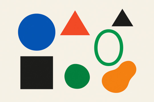
🔺 Why Shapes Matter More Than You Think
Ever wonder why some logos feel powerful while others feel soft or stable? It's not a coincidence—it's shape psychology in action.
Shapes in logo design aren't just about aesthetics. They influence how we perceive a brand, even before reading the name. The human brain associates geometry with emotion—so your logo’s form can instantly communicate ideas like trust, innovation, or fun.
Let’s decode the shapes hiding in plain sight.
🔵 Circles, Ovals & Ellipses
Circles are friendly, inclusive, and unifying. They represent wholeness, community, and continuity.
🧠 Associations: Unity, protection, infinity, harmony 🧪 Used by: Pepsi, BMW, Spotify, Olympic Rings
✨ Why it works: Circles have no beginning or end—making them feel stable and complete. Ovals often give off a futuristic or techy vibe.
🟦 Squares & Rectangles
These shapes are solid, stable, and grounded. Think of them like the reliable best friend of design.
🧠 Associations: Trust, strength, logic, security 🧪 Used by: Microsoft, American Express, BBC
✨ Why it works: They represent reliability and professionalism. Rounded rectangles (like the Netflix app icon) soften this effect while staying dependable.
🔺 Triangles
Now we’re getting edgy—literally. Triangles are directional, dynamic, and full of tension. They often symbolize progress, movement, or even danger depending on how they're oriented.
🧠 Associations: Direction, energy, conflict, hierarchy 🧪 Used by: Adidas (pointing up), Google Drive, Delta Airlines
✨ Why it works: A triangle can represent growth, strength, or movement upward. But flip it upside down, and it can feel unstable or rebellious.
💫 Organic & Abstract Shapes
Not every logo sticks to perfect geometry. Abstract or freeform shapes can evoke creativity, emotion, and uniqueness. Think of the blob-like Airbnb symbol or the dynamic Nike swoosh.
🧠 Associations: Innovation, creativity, personality 🧪 Used by: Nike, Airbnb, BP
✨ Why it works: These shapes break the mold, literally. They give brands the freedom to express something more artistic or abstract.
🖼 Negative Space
Let’s not forget the invisible shapes—the ones that appear between or around elements. Designers love sneaking surprises into negative space:
FedEx: Hidden arrow
Toblerone: A bear in the mountain
WWF: The panda’s eye patches create the illusion of depth
✨ Clever use of negative space can make your logo feel sophisticated and memorable.
🤹♀️ Combining Shapes for Deeper Meaning
Logos often blend multiple shapes to create emotional complexity:
Circle + Triangle: Unity + Motion (Spotify’s play button)
Rectangle + Abstract: Stability + Creativity (Google’s evolving logo)
Symmetry + Asymmetry: Balance vs. energy
Shape combinations can build stories within your logo, even if people only feel them subconsciously.
🧩 Unique Fact of the Day:
Adidas’ triangle-shaped “mountain” logo symbolizes the challenges athletes overcome. It’s not just a sharp shape—it’s a metaphor for persistence and personal growth. So yeah, it’s basically your motivational poster in geometric form.
✍️ Design Mission: Shape Exploration
Time to play some creative Tetris:
Choose three shapes: one circle-based, one triangle-based, one square-based.
Sketch your logo idea using only one shape family at a time.
Add small variations (like curves or corners) to see how it affects the feeling.
Ask yourself: which version feels most like your brand’s personality?
https://letterhanna.com/shapes-in-logo-design-the-geometry-of-emotion/
0 notes
Text
Typography in Logo Design – When Letters Speak Louder Than Words

🅰️ Why Typography Matters
Typography isn’t just about picking a font that looks nice. It’s about choosing a tone of voice for your logo—one that shouts, whispers, charms, or commands. A font can make your brand feel professional, quirky, edgy, playful, elegant, or even revolutionary.
Imagine if Disney used Times New Roman in its logo. Suddenly, your childhood loses a little magic, right?
Typography isn't decoration—it's communication.
📚 The Two Main Font Families (and Their Vibes)
Typography is a vast universe, but let's start with the two major species of type:
1. Serif Fonts
Serifs are the tiny “feet” or lines attached to the ends of letters.
🧠 Personality: Traditional, elegant, trustworthy, academic 🧩 Examples: Times New Roman, Georgia, Garamond 🧪 Used by: Vogue, Tiffany & Co., The New York Times
⚡ Great for: Law firms, luxury brands, publishers
2. Sans-Serif Fonts
Sans-serif means “without serif.” These fonts are cleaner and more modern.
🧠 Personality: Minimal, straightforward, friendly, modern 🧩 Examples: Helvetica, Futura, Proxima Nova 🧪 Used by: Google, Spotify, Airbnb
⚡ Great for: Tech companies, startups, lifestyle brands
🔤 Other Font Categories to Know
🖋️ Script Fonts
These mimic handwriting or calligraphy. Often used for elegance or whimsy.
🧠 Personality: Feminine, artistic, personal 🧪 Used by: Coca-Cola, Instagram ⚠️ Use sparingly. Hard-to-read scripts can feel messy.
💡 Display Fonts
Unique, decorative fonts designed to stand out. Think weird, bold, fun.
🧠 Personality: Creative, bold, rebellious 🧪 Used by: Toys"R"Us, Fanta ⚠️ Not ideal for body text—best kept to logos and big headers.
✨ Anatomy of a Letterform (Nerd Alert!)
Let’s geek out briefly. Here are some parts of a letter you probably didn’t know had names:
X-height – The height of lowercase letters like "x"
Ascender – The part that goes above the x-height (like the top of “h”)
Descender – The part that drops below the baseline (like “g” or “y”)
Kerning – The space between individual letters
Tracking – Overall spacing between characters
Why does this matter? Because small tweaks in spacing and alignment can make your logo feel just right or awkward as a bad first date.
💼 Case Studies: When Fonts Make the Brand
FedEx
Simple sans-serif? Sure. But the magic? A hidden arrow in the negative space between the “E” and the “x.” Clean, clever, confident.
Vogue
Classic serif type. Instantly says “high fashion, darling.” The thick and thin strokes add sophistication.
Lego
A bold, chunky sans-serif with rounded edges that screams: "Play with me!" (But not in a creepy way.)
🎯 How to Pick the Right Font for Your Logo
Define your brand personality. Are you refined or rebellious? Playful or prestigious?
Pick one primary font. Keep it simple. Most logos use one, maybe two fonts.
Test in context. How does it look on a website header? On a business card? On a billboard?
Avoid the cliché pile. Fonts like Comic Sans and Papyrus have been… overloved. Choose something original—or customize!
🧩 Unique Fact of the Day:
Helvetica is the most used font in the world—so much so that it has a documentary made about it. The city of New York uses Helvetica for all its subway signs. So, if you’ve ever gotten lost on the F train, blame Swiss design.
https://letterhanna.com/typography-in-logo-design-when-letters-speak-louder-than-words/
0 notes
Text
Color Psychology in Logo Design – The Secret Language of Hue

🎨 Why Color Is a Big Freakin’ Deal
Imagine if McDonald’s used grey instead of red and yellow. Would kids still beg to go there? Would you even see it from the highway? Probably not.
Color isn’t just visual—it's emotional. It’s a ninja sneaking into your subconscious, whispering things like “trust me,” “buy this,” or “this brand is eco-friendly, promise.”
In logo design, color choices aren’t random. They’re strategic decisions that support a brand’s personality, audience, and message.
Let’s decode the meaning behind common colors and see how brands wield them like psychological lightsabers.
🌈 The Color Breakdown
🔴 Red – Bold, Passionate, Urgent
Red is an attention magnet. It stirs up strong emotions—think love, danger, excitement, and appetite (yep, that’s why it’s everywhere in food branding).
🧠 Used by: Coca-Cola, Netflix, YouTube, KFC ⚡ Use if: You want to spark energy, passion, or hunger. Avoid if your brand is about calm and serenity.
🔵 Blue – Trustworthy, Calm, Professional
Blue is the corporate crowd’s favorite child. It inspires trust, stability, and calmness. It’s like the dad of colors—dependable and always wears a polo shirt.
🧠 Used by: Facebook, Intel, PayPal, Ford ⚡ Use if: You want to communicate trust, technology, or healthcare values. But too much blue can feel cold or impersonal.
🟡 Yellow – Cheerful, Optimistic, Friendly
Yellow = sunshine in logo form. It grabs attention and feels warm, fun, and playful. It’s also highly visible from far away (hello, McDonald's).
🧠 Used by: McDonald’s, Snapchat, Ikea ⚡ Use if: Your brand is youthful, friendly, and energetic. Just go easy—too much yellow can tire the eyes.
🟢 Green – Natural, Balanced, Fresh
Green whispers “I’m sustainable and maybe vegan.” It’s associated with nature, growth, health, and money.
🧠 Used by: Whole Foods, Spotify, Android ⚡ Use if: Your brand involves wellness, finance, or environmental focus. Green soothes and restores.
⚫ Black – Powerful, Sophisticated, Luxurious
Black is sleek, elegant, and serious. It’s often used in fashion and high-end brands. Think “I wear sunglasses at night” energy.
🧠 Used by: Chanel, Nike (paired with white), Apple (classic era) ⚡ Use if: You want to project authority, luxury, or minimalism.
🟣 Purple – Creative, Royal, Mysterious
Purple combines the calm of blue and the fire of red. It suggests imagination, luxury, and the mystical. Ancient rulers literally hoarded purple dye—it was that rare.
🧠 Used by: Yahoo, Hallmark, Twitch, Cadbury ⚡ Use if: Your brand is whimsical, imaginative, or premium.
🧡 Orange – Energetic, Fun, Adventurous
Orange is the party animal of the palette. It’s bold but not aggressive, and it brings creativity and youthfulness.
🧠 Used by: Fanta, Nickelodeon, SoundCloud ⚡ Use if: You want a playful, bold look that’s less aggressive than red.
🎯 Strategic Color Combos
Many successful logos don’t stop at one color—they play with combinations that reflect layered meanings:
Red + Yellow: Speed and appetite (McDonald's, Shell)
Blue + White: Clean trust (Oral-B, Ford)
Black + Gold: Premium luxury (Lamborghini)
Green + Blue: Nature and tech balance (Land Rover)
Color is like a recipe—get the proportions and pairings right, and it tastes (or looks) chef’s kiss.
⚖️ The “Don’ts” of Color in Logos
Don’t rely on color alone – Your logo should still work in black and white. Color enhances, but form is forever.
Don’t use too many colors – Keep it simple. Most top logos use 2 or fewer.
Don’t ignore cultural context – Red means luck in China, but danger elsewhere. Know your audience!
🧩 Unique Fact of the Day:
Cadbury purple is a trademarked color. That’s right—Pantone 2685C is legally off-limits unless you’re working with the chocolate royalty themselves. The company even fought Nestlé over it… and won. Talk about protecting your brand identity.
🖍️ Design Mission: Color Experimentation
Choose three brand adjectives (like elegant, bold, eco-friendly).
Use a color psychology guide (like this one!) to pick one main color and one accent.
Create a few logo variations using just shape and color—no text yet.
Convert your design to grayscale. Does it still feel “right”? If not, back to the drawing board!
Tools like Coolors.co or Adobe Color can help you experiment with palettes.
https://letterhanna.com/color-psychology-in-logo-design-the-secret-language-of-hue/
0 notes