Level 4 (Complete) - Level 5 (Currently) Visual Communication Student | BCU | Graphic Design |
Don't wanna be here? Send us removal request.
Statistics
We looked inside some of the posts by hasviscom and here's what we found interesting.
Average Info
Notes Per Post
8
Likes Per Post
7
Reblog Per Post
1
Reply Per Post
0
Time Between Posts
16 days
Number of Posts By Type
Text
17
Last Seen Tumblr Blogs


Fun Fact
In 2020, 27% of US Tumblr users had an annual household income of over $100,000.
Text
CPD - Continued Professional Development
As I’ve been working freelance before starting university I have worked with several clients and I tend to showcase my work on social media specifically Instagram. This is because Instagram is one of the fastest growing social media platforms and that is used for business purpose as well as personal. My freelance company name is Emperors Graphix
Below is some of my work which I have previously done:


Previous designs


2 notes
·
View notes
Text
Learning Outcome 3 Competition Brief With RVJ (Continued Further devlopment)
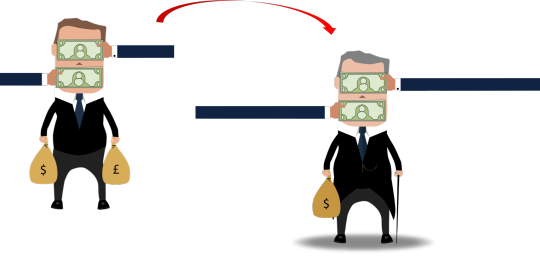
After the final design, I had some good feedback from my tutor and I made further changes to the design. After feedback amongst the group and my tutor. Therefore, I decided to make further changes and develop the design even more. As the book is about politicians who are corrupt I feel my previous illustration was not as effective therefore I came up with the idea of researching and finding a copyright free image of a prime minister “look-alike” portrait. This way I can manipulate it using photoshop and add pieces of my own to it to show a more effective message through the design.
I found an image of a man in a suit who resembled as a politician. However, after getting the image I decided to make changes to the image as you will see in the following slides. As you can see below.
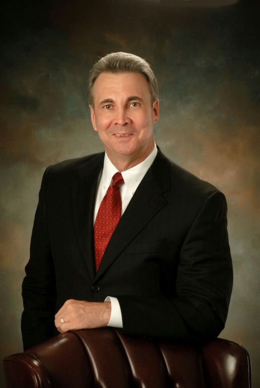
Reference:
Solis, J. (2019). [image] Available at: https://www.pinterest.co.uk/pin/380272762275970533/ [Accessed 15 Jan. 2019].
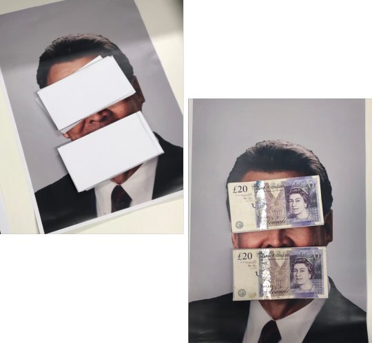
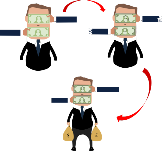
After I found the image I manipulated and edited the image on photoshop to highlight and accentuate certain areas, and then printed it on A3 paper and placed real money stacks on the eyes and mouth in order to cover this. I Photographed the money on top of the A3 paper and edited it again using Adobe Photoshop and added the final touches. As you can see below.
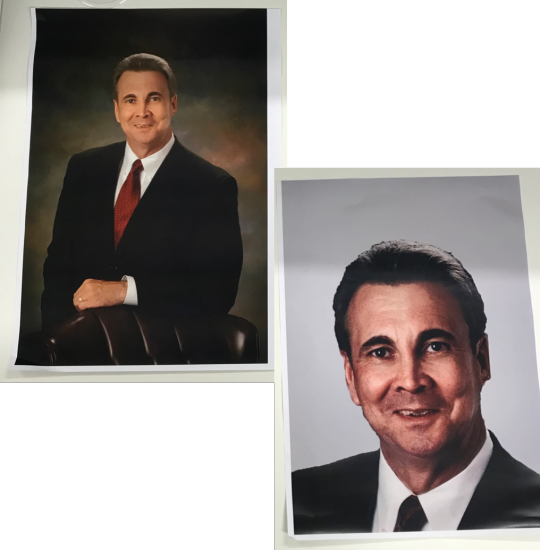
Once I printed it in A3 I then placed the money stacks on the individual's eyes and mouth to depict that he is corrupted by money and power. As you can see this is how it turned out when I took images with the money stacks on top of his face. Once this was done I then uploaded the picture onto photoshop and edited it further to see what the final results would be.
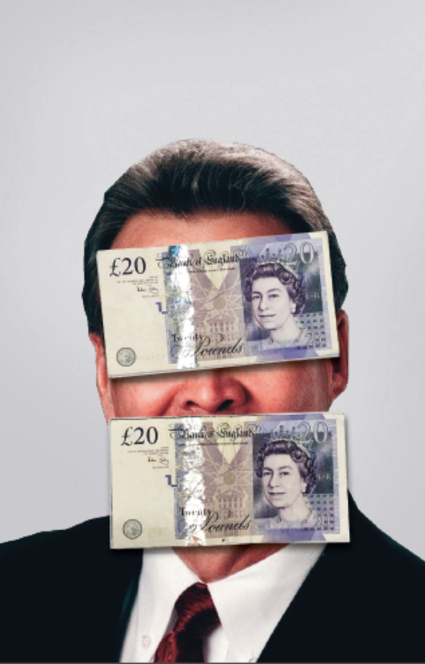
As you can see when I edited the image in Photoshop I adjusted the contrast, brightness and made the picture more bolds to give a dark/political feel to the image as I wanted to portray the man to look powerful in the sense of colours and tone. I also edited the money stacks to make them bolder and I edited these separate so that I can layer these later during the process. This is because the size will remain the same but the effect will be more prominent. As you can see this is the final outcome. I had to add the drop shadow for the money stacks Also for the final design, I used colours Red because that shows power, evil, and greed, and black because it means professional, high class, wealth and power.
Once the design was completed I looked into various fonts as you can see below and I wanted to go for something which is a newspaper style. As you can see these are the different fonts I looked at.

I chose this font because it looks similar to the newspapers font and I wanted to give that media style font.

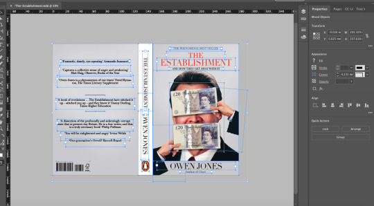
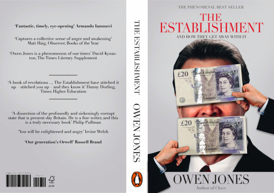
This is the final design of the book cover and I chose to use the Didot font because it just stood out more and looked more professional. I also added actual hands and overlapping the authors name banner to give a 3D effect. As you can see the process of the book cover design which was designing in Adobe Indesign.
Design Process:
Final Book Cover Design:
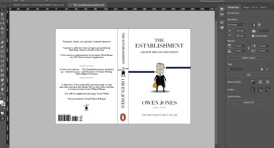
Below is an example of a published book.

0 notes
Text
Learning Outcome 3 Competition Brief With RVJ
I chose the Adult Non-Fiction Cover Award – “The Establishment” by Owen Jones. This is because I found the brief itself very interesting and the concept behind it was something unique and was a great challenge for me as I've never designed a book cover before. The concept of the brief is based in the non-fiction book called “The Establishment” and the author Owen Jones wants to portray that people at the top are doing nothing but just filling up their own pockets and not bothering with anything else.
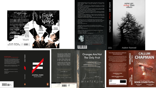
After reading the brief I took a lot of different types of non-fiction books online in order to get some inspiration. Also, to see the designs of different book covers. As this was something new to me. Once I researched I sketched out some ideas into my sketchbook, I did this because it helps me gather various ideas.
As the book is about corruption and politicians getting away with what they do I felt like I need to sketch out different styles of illustrations which symbolize this issue.
Below is the research which I did to gather ideas for the book cover.
Research
After the research, I did further research looking at some of my favorite practitioners and this is the artwork which relates to the brief that I have chosen.
Barbara Kruger:


Frank Shepherd Fairey:


Chip Kidd:
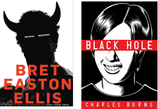
Cipe Pineles:

After the research was done I started to samp my ideas into my RVJ (Sketchbook) As you can see below. I wanted to base the sketches around a politician who is greedy and corrupted with money.
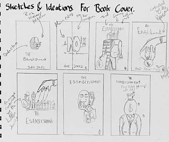

After the sketches, I started to design the character for the book cover and below process. I wanted to make the design using Adobe Illustrator. as you can see below the process and the development as i was not happy and kept making subtle changes.
I wanted to achieve a very simple yet effective design which can grab the reader’s attention. I went with colours which hold power such as blue, black, white and gold. I had to do further development as you can see.
As you can see on the right side the man is the final character design I took moved this on to Adobe Illustrator and started the book cover design process.
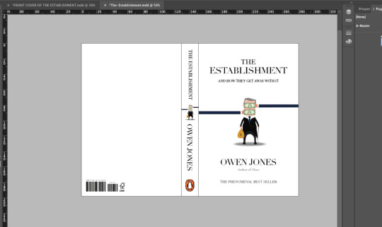
I followed the information that i got from the brief and i added the text for the back cover and the spine.
Below is the final design of the book cover.

The front cover:

0 notes
Text
Graduate+ Week
I attended the graduate+ week and the workshop with Zoe Bennett aka “The motivational Queen”. She is an international motivational speaker, author, humanitarian and a personal development trainer. She has worked with many companies such as NHS and Lloyds Bank. The workshop was very helpful because she gave so many ideas on how to network with people and how to be confident when you communicate to companies and how you should pitch your ideas to them. She highlighted the main networking points and how people should grow as a business. Especially if you are a business it is important to network with the correct people.


0 notes
Text
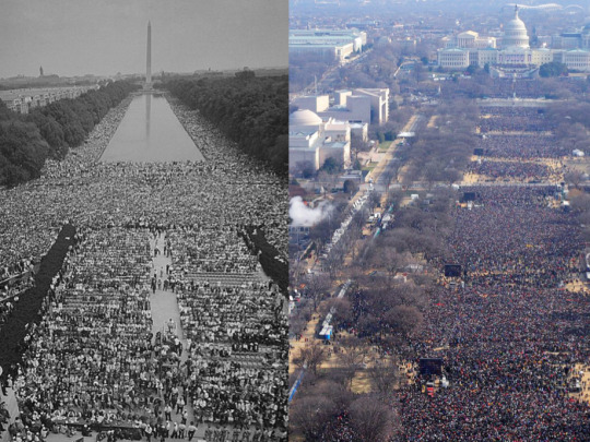
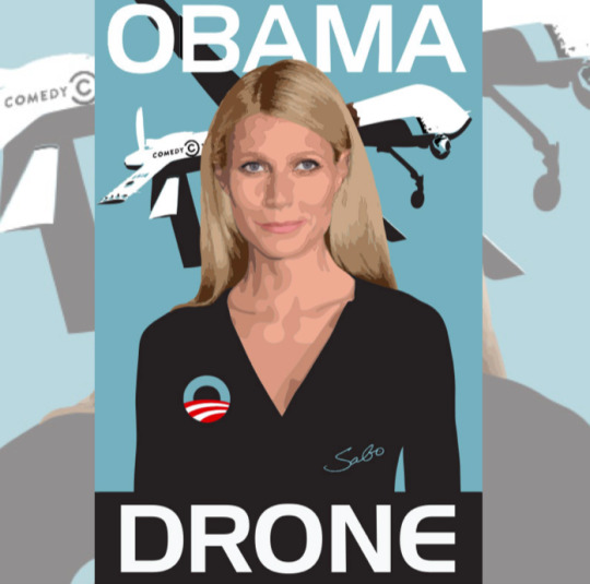
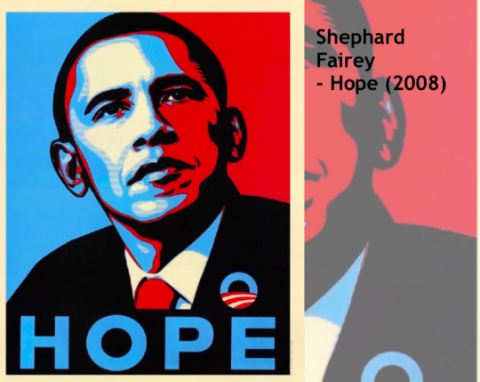
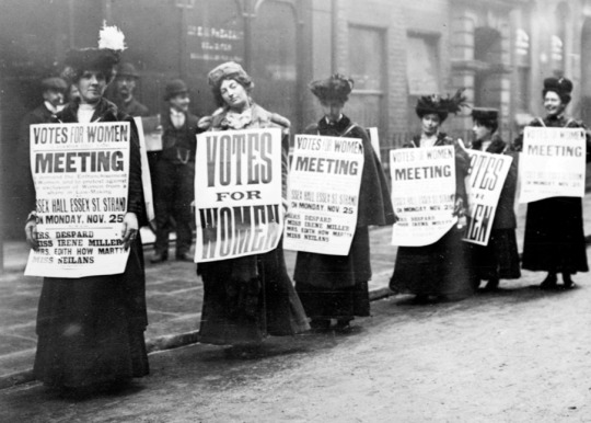
Contextual Studies Lecture 1 - Politics of the image
In the lecture we discussed politics and we were introduced to how corrupt politics and politicians can be and this is why people tend to turn away and not follow the political discussion as its full of negativity. However, it is important for people to follow and to be aware of politics and the steps they take.
We saw the differences between the past years and how things have changed over time such as Martin Luther King’s speech and Obamas speech.
0 notes
Text
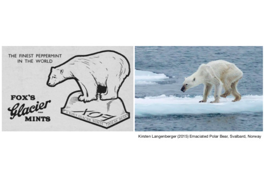
Contextual Studies Lecture 1 - Designing for the Anthropocene
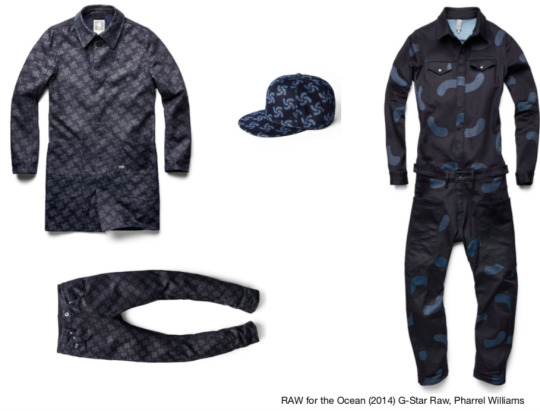
Fred Hubble was the lecturer and he spoke about climate change and we discussed how it affects our planet and how we are polluting the wildlife and nature. The actions we take we don’t see how it will affect and this can make a huge change in nature and how we live. Climate change has a massive effect on carbon dioxide levels. However, there are campaigns and brands who have worked together to save the ocean from waste plastic. There are brands such as Gstar, Adidas and in order to get their collections popular, they worked with famous artists such as Pharrell Williams. This was part of the clean-up operation.
0 notes
Text
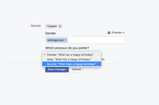
Contextual Studies Lecture 1 - Gender Discussion
This lecture was about equality and how that is still an issue in this day from the human development point of view. It mentioned how men and women are differently equal but still, there are a few times where things are done differently. Especially in other countries. Saudi Arabia is a good example because now they are allowed to watch football in a stadium. Saudi Arabia is slightly stricter on women and what they are allowed to do.
Karl Marx wrote about how each humans role is shaped by capitalist society. The work environment would shape you as a person. E.g. a factory workers attitude will be different compared to a factory owner.
0 notes
Text
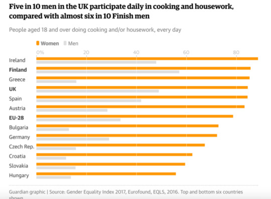
Contextual Studies Lecture 1 - Consumerism
In this lecture, the topic was about capitalism and communism in order to get a better understanding of consumerism.
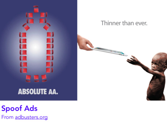
Below you can see the example which shows the positives and negative aspects of capitalism. We also discussed the differences and the things we value. Humans tend to value different things in a different type of way, whether its materialistic things, relationships, love and much more.
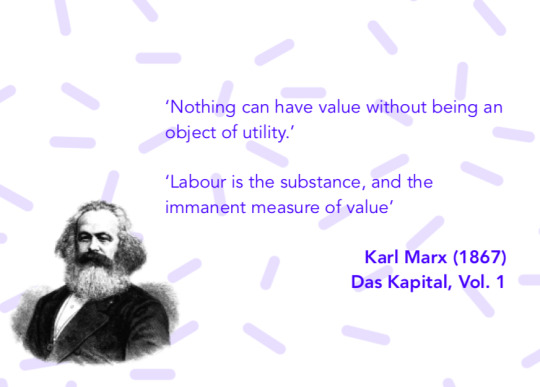
Also in the lecture, Karl Marx Karl Marx who is a philosopher and a socialist suggested that nothing can hold more value unless it is an object of utility and that value is labor. There are many theories one of them is the subjective theory of value which is the value each person will have for each specific thing.
We discussed if children have a sense of value in terms of something exciting such as playing games is more important to them than money or gold.
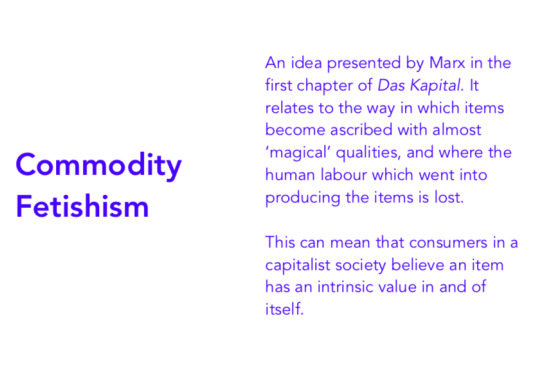
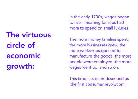
Karl Marx also talked about commodity fetishism and the way luxury is not a necessity and it’s just something that can fulfill your aspiration of a comfortable life. This is the reason why the value of labor is lost and it’s become a capitalist society. Therefore wages started to rise in the 1700s and families had more money to spend on small luxuries and more business and this helped the economy to improve, this is called the first consumer revolution.
As you can see below these are the examples which I got from the lecture.
0 notes
Text
Contextual studies lecture notes - (Context of graphic communication)
Lara Furniss explains that the future of the design industry is dependent on the ability to think and work beyond discipline. The lectures help us to understand the contextual framework in more depth as it underpins the overall design practice.
It also allows me to learn various ways of seeing the world and areas of critical theory. This will encourage me to research and to work further into the practice.
I will need to conclude the lectures with 1,500 words critical evaluation that will “Articulate the contextual relationship between research, communication, and design”, using the information from the lectures and including other academic information. I will need to evaluate my work critically. I will also need to reference correctly in the method the university approves.
0 notes
Text
Fashion Lookbook brief
This assignment is part of the learning outcome 1 and tests your professional ability to produce work to an advanced level. The fashion lookbook brief was launched in week 5.
The brief was to produce an engaging and experimental fashion lookbook to showcase the up and coming fashion designers of BCU. The lookbook aim was at the London fashion week 2019. The photographs of the two fashion collections which we need to use for the lookbook were provided to via Moodle.
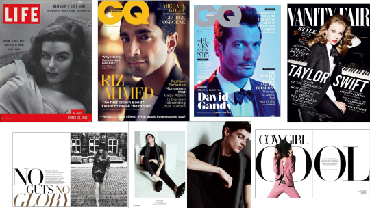
Before designing the fashion lookbook I researched more about the concept and how a lookbook is formed. I looked at various magazines such as GQ, Vogue, Vanity Fair, Instyle and many more. The research really helped me as I understood the concept of designing the layout, which needs to be easy on the eye and interesting for the audience to read. I had a look at some examples on Pinterest to get some inspiration as well as idealize the different layouts of a fashion lookbook. Many magazines and lookbooks involve a lot of typography and good page furniture to have everything aligned correctly.
Research:
Below is the Fashion lookbook research I gathered from Pinterest and online.
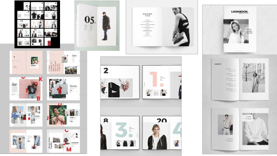
I also did some Magazine research for some inspiration and to gather ideas for the layout.
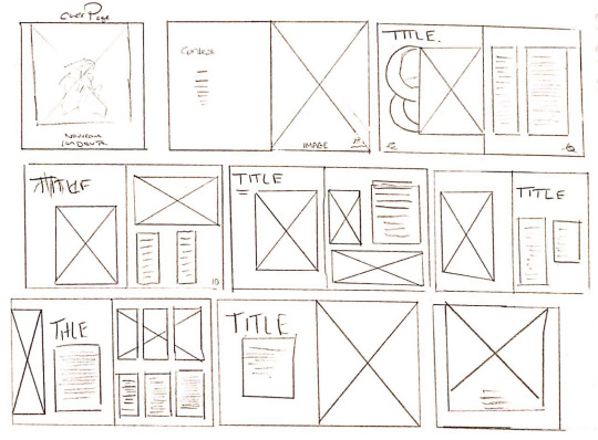
Sketches and development
After the research, I started to draw scamps for the fashion lookbook this was for me to understand and to plan the page layouts.
Once I sketched the scamps i then started to design the logo for the fashion lookbook because I feel every lookbook has its own name and the brand. The name for my fashion look book is “Nouveau Couture”. I used a font which gave a vogue style look to the brand. "Nouveau” means Modern or up to date in French.

_________________________________________________
Fashion Look book main design:


4 notes
·
View notes
Text
Client Brief’s/ Chosen Client Brief and Work Process
In the first week, the module was launched. We had 6 clients coming from different graphics companies and they presented their briefs for us to choose and sign up for.
The briefs were:
- RBH Client Brief - (A name and branding for the Christmas bitter and small advertising campaign)
- SHED Client Brief - (Logo and Packaging concept)
- Sixth Story Client Brief - (Rebrand Brit Food)
- ALIVE Client Brief - (Social Media campaign for NIKE)
- Mccann Client Brief - (Bacardi brand campaign)
- BDF Client Brief - (Designing an APP for the Birmingham design festival)
Chosen Brief - BDF (Birmingham design festival) Client Brief
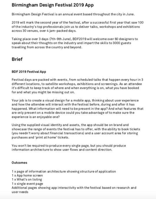
I chose to go with BDF client brief and that's what I signed up for this is because I was interested in the concept of design and app for the client. Once I signed up I had to do research about Birmingham design festival (BDF) this was for me to understand the brand and the purpose of the festival. BDF is a design festival which takes place every summer in central Birmingham. The purpose of the festival is to bring all the creative individuals together to take part and engage with the showcases, live shows, speech which are held by design professionals.
We also had to write 500 words on why we chose the specific client brief and how it will help us in the future and what skills are going to be required to complete the task. After the research, I had to simplify the client brief and bullet point the main tasks which need to be carried out in order to design a successful app for the festival.
Client Brief Broken simplified:
I had to consider all the aspects before designing, for example, the user experience, design, theme, color palette ( the brand colors cannot be changed), focus on the accessibility, ticket purchasing, and pages order.
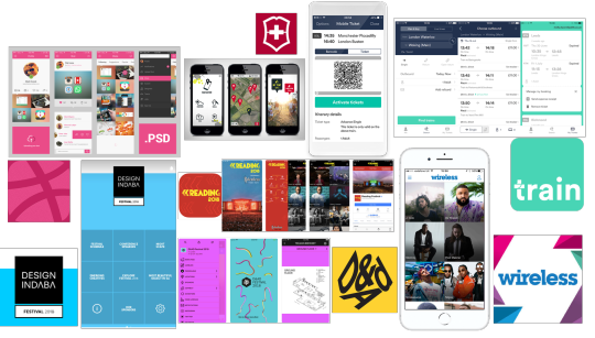
Once the brief was simplified I looked at different app design examples and researched different UX/UI’s. This helped me to understand the design aspect for the mobile apps in order for me to design a successful app for BDF. I researched the competitor apps as well as you can see below.
Research
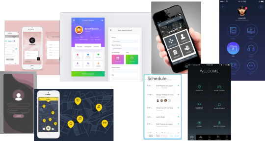
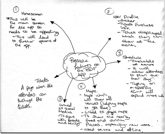
Below are a few ideas which I wanted to integrate into the app design such as the communal page for the app users to use
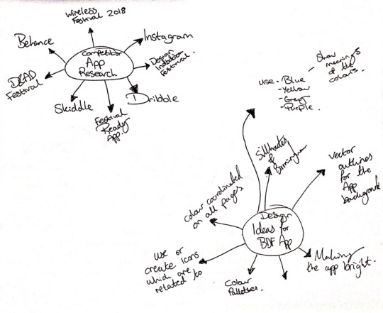
After the research, I then brainstormed different ideas into my sketchbook and the ideas for the app that I want. As its a design festival app, I wanted the app to be simple for but eye-catching by using various colors which represent Birmingham.
Sketches and design process:
Below are the sketches and ideas which I gathered in my sketchbook.
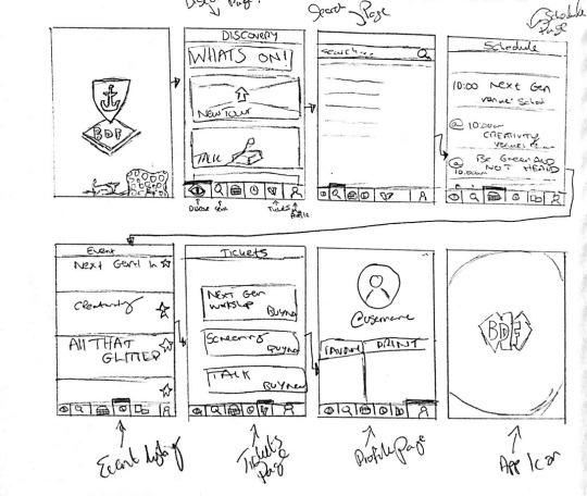
I also sketched wireframes for the app as this will help me understand and be aware of each page and the concept behind each page. As you can see below.
After the wireframes, I gathered the four main colors which I wanted to integrate into the app as these colors represent Birmingham. As you can see below.
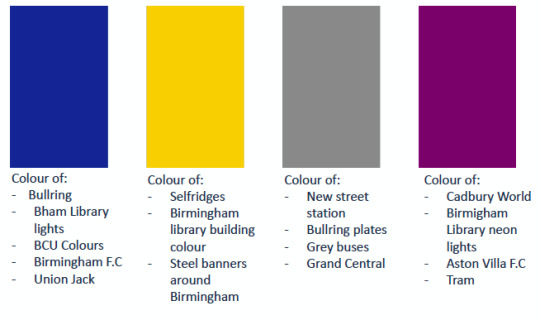
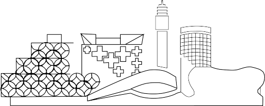
I also design the Birmingham skyline which I wanted to add to the app like a little design touch to show that the Birmingham design festival app proudly presents Birmingham and we are proud of the city.
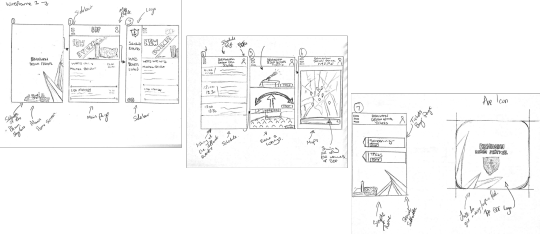
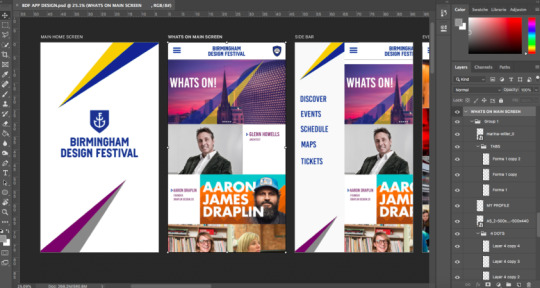
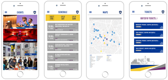
I designed the app using Adobe Photoshop I design each frame using the colors and fonts which match the actual branding, I chose to go with a simple white and color splash theme. This is because its easy on the eyes and has a good clean look. Also, each page was considered and designed according to the client brief as well as making it beneficial for the users.
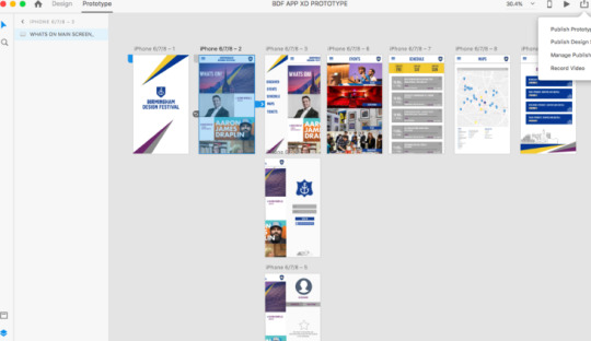
After designing the app in Photoshop I tried to create a prototype using Adobe XD this was a good experience for me as I've never used the software before. However, I made the prototype by inserting all the frames and using the wireframes. As you will see the animation below.
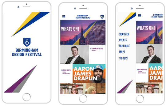
Main BDF App Design
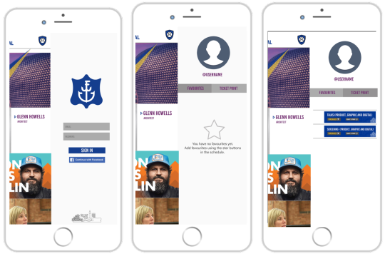
App Prototype Below:
https://vimeo.com/304671120
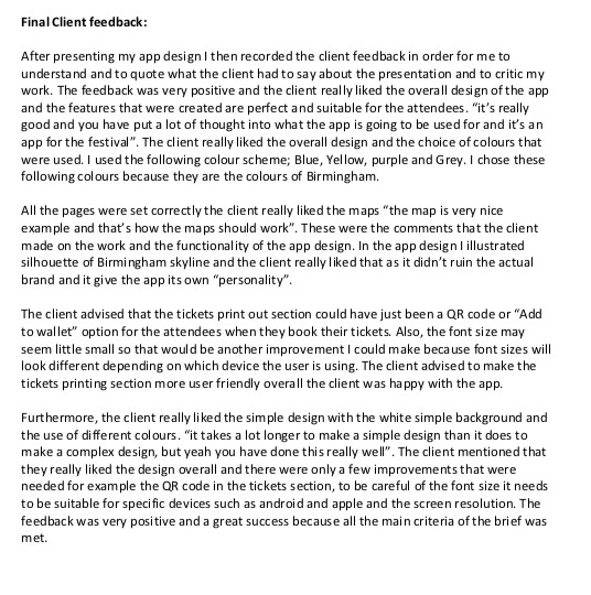
After presenting to the client we had to mention the feedback into our 1500 words evaluation which you can see below.
0 notes
Text
ADM Live Project
This module is an opportunity for us to engage in a professional manner with an aspect of our subject area, which contributes to the development of employability skills. The module is designed to prepare us on how to work with clients and to collaborate with design associates.
0 notes
Text
Personal Module Evaluation – Enterprise of graphic communication. (1000 Words)
At the beginning of the module, we learned about different festivals that have taken place in the past also the meaning behind the festivals. This was something different for me because I usually don’t go to festivals so this gave me the opportunity to research about festivals and to understand why it’s so popular in order for me to prepare myself for the module brief.
After reading the module brief I had multiple ideas in mind and I visualized of what sort of festival I want to work toward but I was not 100% sure because I didn’t know how it would turn out in the end. Therefore, I wanted to make sure the festival needs to be unique in terms of branding and design. I researched further into different festivals and I came across music festivals, Eid festivals (Eid Mela), Holi festival, film festival and many more.
The brief was about creating a full brand experience for your own fantasy festival. The key points were to focus on the main visuals, the tone of voice and the design language to define the audience its aimed for. Whilst I was researching I came across drive-in theatres which were invented in the 1940’s, after reading more into it I had an idea of designing a film festival but using the original roots of a drive-in theatre as it was a massive entertainment platform back in that time period. I wanted to make that relive again but even bigger and better for the audience to enjoy.
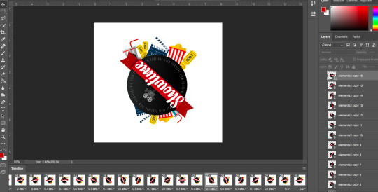
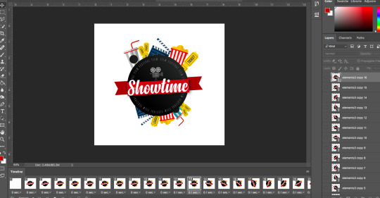
After deciding the festival idea, I moved forward to festival names so I came up with various names which would relate to a drive-in theatre. I finally chose “Showtime Film Festival” the reason why I chose this name because it fits well with the concept of a drive-in theatre experience and a modern festival. Once the name was finalized I began to sketch logo ideas into my sketchbook. I sketched 15 logo’s and the logo design was more compact designs with elements of cinema essentials such as popcorn, film, drinks, camera.
Once I gathered the ideas I designed the logo design using adobe illustrator I wanted to make the logo in a very modern compact style but at the same time, it gives a vintage type of feeling so for the main name I chose a calligraphy style font. I surrounded the circle with the main cinema experience elements e.g. popcorn, tickets, drinks, and movie cut board. The colour palette was a wide range of colours (happy colours) yellow, red, white, black, grey and blue. The colours I used for the logo fit really well for the festival theme because the festival is in summer and bright colours fit perfectly with the season.
I was inspired by various graphic designers when it came to designing the logo my inspiration came from Michael Beirut, Chip Kidd, and Herb Lubalin. Their work is based on calligraphy and illustration. I really loved their technique especially Michael Beirut's as he used the bold fonts and lines to create a unique logo design. These inspirational practitioners helped me create strong visual posters as well as logos.
The festival would be popular through social media because everyone uses different social media platform e.g. Facebook, Instagram, Instagram, and Twitter. Therefore, I designed 2 posters and social media post which will have information about the festival, the address, tickets details and the dates of the festival. The second poster shows three featured films for each date starting from 12th July up to 15th July 2018. These poster designs will be up in city centre, train stations and other public areas such as parks and around London. As this is a drive-in theatre I had to research about different open area locations. After researching I wanted to go ahead with Hyde Park in London. The reason why I chose Hyde Park because this is one of the most popular parks in Central London. As I wanted the customers to be aware of the festival location instantly hence why I chose Hyde Park London.
After designing the Poster designs I wanted to take branding process a step further and I went ahead and designed an animated GIF of the logo. I created the GIF using Adobe Photoshop. The transition of the GIF is the logo appearing and then it would have a full motion spin this will be on a loop to grab the audience attention. I thought this would be a great way of grabbing the audience’s attention as it’s a strong visual which can be shared through social media and be displayed around the city centre.
I wanted to make wearable for the festival such as branded polo shirts for the staff to wear, branded goody bag and goody box which will have branded popcorn alongside drinks and chocolates for the customers to enjoy. I also designed a branded lanyard which will be given to the customer at the gates when they show their ticket. The lanyard and ID card will show the film times and ticket number. I designed the lanyard because this will make it easier for the staff to know who has purchased the tickets. These wearables are really good for the festival as there is something to give back to the customers and for them to have a great experience. I wanted to create “Showtime film festival” a full brand which will stand out and be bigger than the previous drive-in theatres that have taken place.
After designing this whole brand experience and concentrating on the visual language as well as making this an exciting festival. I learned throughout this module and I got the opportunity to try something I never looked into. At the beginning of the module, I was slightly confused about what my festival could be about but the research helps me and allowed me to create a festival and a brand which was inspired by drive-in theatres which were more popular back in the day. I really enjoyed this module as it was more creative than my previous module. However, I feel I could have worked on few more areas, I could have designed the festival website mock-up and an app for the customers to use this would have made the brand even more visually strong. Also, I could have created an advert using more visuals and a video which music or parts of different movies in order to create an amazing advertisement for the festival. However, in the future, I will look more into video editing and create videos which can help me in the future when It comes to branding. I will closely look into motion graphics because this will make the visuals even better and I can bring my ideas to life by actually creating a good animation. I strongly intend to focus on refining these skills in future.
0 notes
Text
Secret 7 (Competition submission)
I created the Music cover I cannot mention or show the design as it needs to remain as a secret, however, I have submitted the design to the secret 7 website
0 notes
Text
Wearables
I wanted to go a step further and create items for the festival, for example, the branded polo shirts for the staff to wear at the festival. Also, I designed a goody bag/box which will be handed to the customer when they enter the festival. In the goody bag, there will be popcorn, drinks, and chocolates. I designed a lanyard with the ticket print attached. This is when the customers enter the gates they will be given these lanyards to show that they are part of the festival and they have paid for entry.
Below you can see the designs I made of the wearable. I created the box/bag designs using illustrator.

0 notes
Text
Animated Sting Promoting “Showtime film festival”
After creating the poster I created a GIF using Adobe Photoshop. I made this animation because this can be put up on the social media website and the festival website. I used Photoshop to create the GIF by using multiple layers.
This was the process of creating the GIF. I made the GIF which runs in a circular motion. This is to grab audience attention and to make the Logo design pop out.

1 note
·
View note
Text
Festival Guide Listings (Movie Line Up and Main Festival Poster design)
I designed an A2 poster which will have all the information about the festival (how to get there, how to purchase tickets etc) These posters will be displayed around City Centre, train stations, social media and other public places.
Below is the poster design

As you can see I went for the pop colors as this is a summer festival so I wanted this to stand out and to grab the public attention.
Below is the Film Festival Movie Listings.

As you can see above there will be three showings each day. The festival is for four days Thursday, Friday, Saturday and Sunday. There will be a mixed genre of movies such as Action, Comedy, Drama etc. I created this design in this style because it will be eye-catching and it will stand out to the audience. I have also created a social media post which will allow the social users to share the post amongst their friends.

1 note
·
View note