
Don't wanna be here? Send us removal request.
Statistics
We looked inside some of the posts by helenaspatial3 and here's what we found interesting.
Average Info
Notes Per Post
1
Likes Per Post
1
Reblog Per Post
0
Reply Per Post
0
Time Between Posts
1 day
Number of Posts By Type
Link
2
Photo
14
Text
1
Last Seen Tumblr Blogs


Fun Fact
Tumblr was attacked by a cross-site scripting worm deployed by the Internet troll group GNAA on Dec 3, 2012.
Link
1 note
·
View note
Link
0 notes
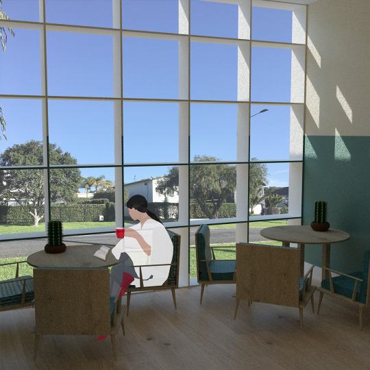
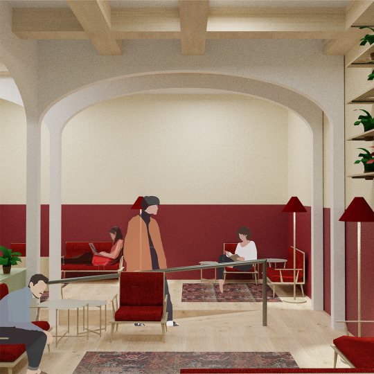
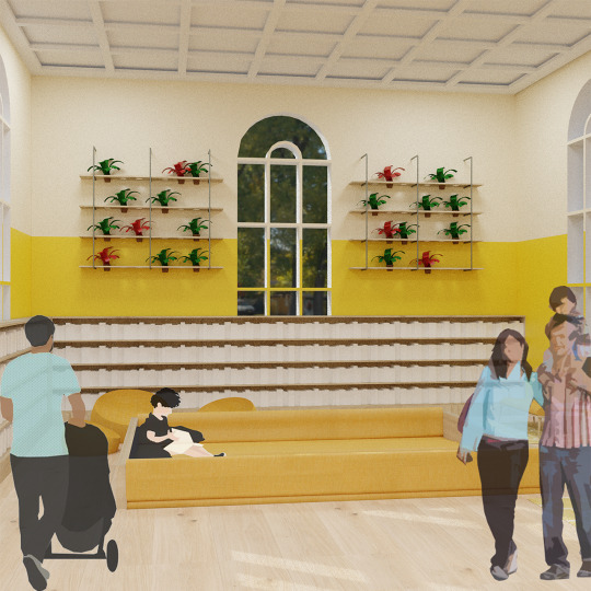
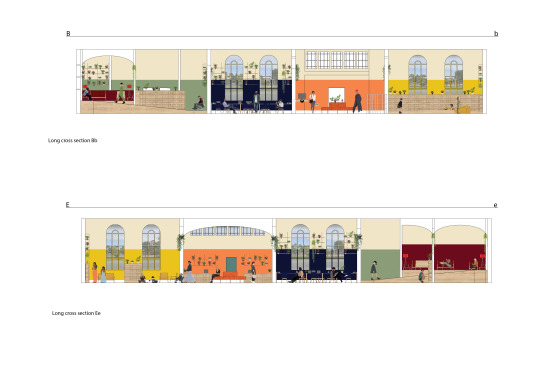
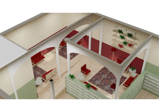
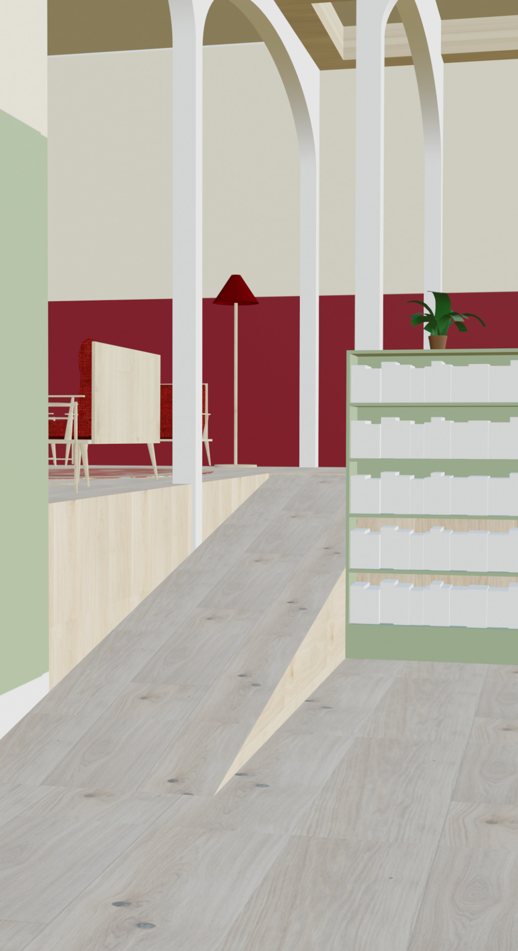
Photo
Perspective view of the book space. The first image is looking over the book space from the reading nook, and the second is within the book space.
0 notes
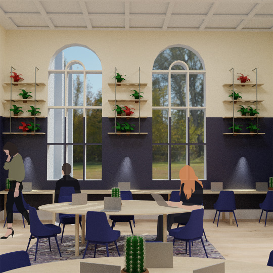
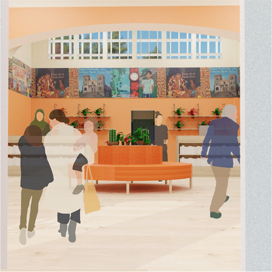
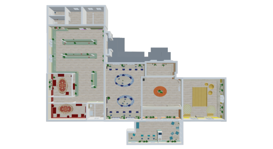
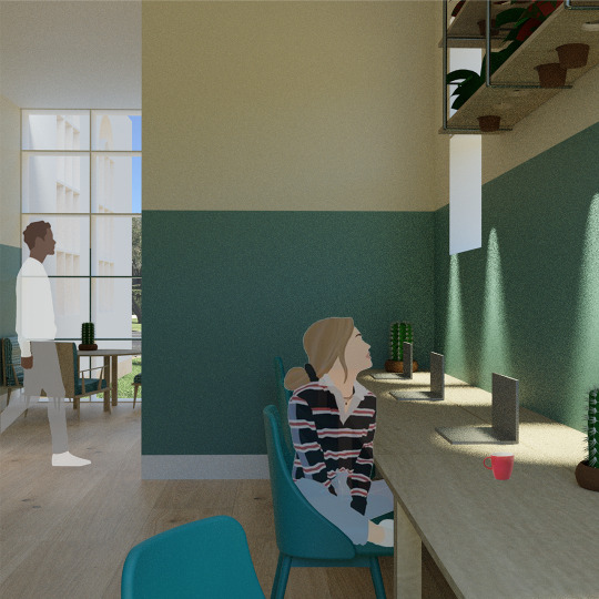
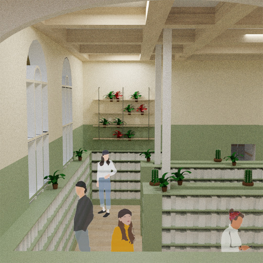
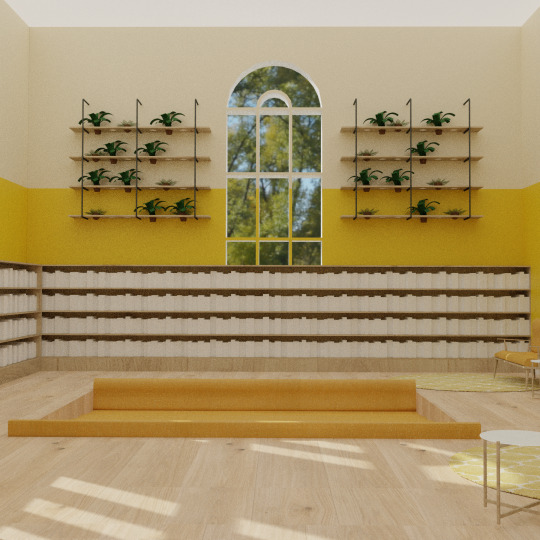
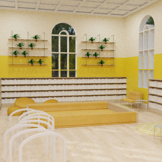
Photo
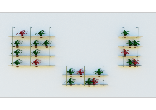
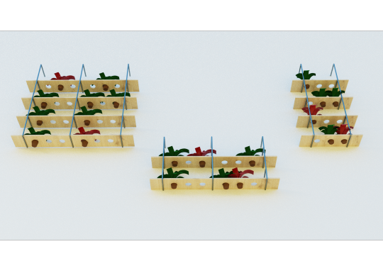
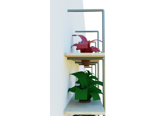
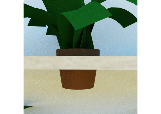
Design features of my Library proposal.
1. The hanging plant shelves, the plant pots have a wide rim at the top which holds them in place in the holed wood. The plants are at a height where the average Nz’er can reach up to water them with or without the help of an extendable hose head. I’ve chosen a diverse range of plants, both natives and non-natives. (Made of old industrial pipes and wooden slats with circular cut outs.)
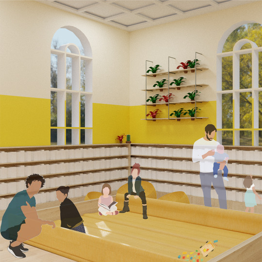
2. The playpit, which is for kids to play/read in while parents can sit a few metres away in the couches or nearby on the rugs. This means the parents can relax whilst knowing their kids are contained and in a single area. Also a good way for parents and kids to socialise. (Made of couch cushions and plywood)
3. A stage extension to create a reading nook that sits above the rest of the library floor. Creates a cosy nook for people to quietly read or use their phone/computer.
0 notes
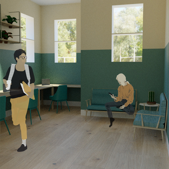
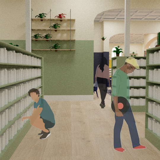
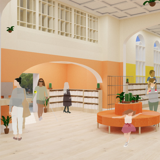
Photo
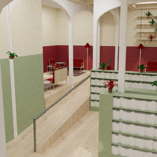
Accessibility for entering the reading space.
The top left image is of the old ramp. The top right is the new ramp. The lower images are of the new ramp and handrail system.
A big change I had to make to my design was the ramp leading up to the reading space, I had gotten my measurements wrong and it did not fit building regulations. My first ramp was 6.5 metres and not the 10 metres it needs to be for a 1 metre height change, so I had to angle my ramp to fit the space.
The new ramp is 10.5 metres long, not including the flat resting corner, and fits the 1 metre:10 metre ramp ratio.
I have also added a handrail for those who are not in wheelchairs but need the rail for stability/help.
0 notes
Photo

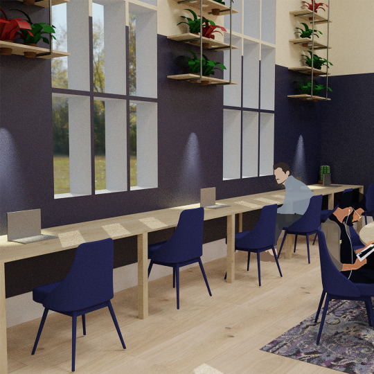
Wallpaper colours I have chosen for the Grey Lynn Library based on the mood and feeling I want to create in each space.
Navy Blue for the computer/study space -
Blue is a calming colour that makes people feel centred, relaxed and less anxious. Important traits for a space where people spend time studying, doing research or needing computer assistance.
Teal for the staff space -
I chose teal as it is a mix of blue and green, both promoting calm and restful feelings. They are both soft and natural colours which make people feel more comfortable. I want the staff space to feel welcoming and calming, as the library can be a hectic place sometimes with loud kids or people needing assistance, the space is needed for staff to relax on their break or in the office to complete work.
Green for the book space -
Green gives a space a natural feel and makes people feel more comfortable/relaxed. Green is also restful, restorative and helps with composure due to its soft natural look. Which is good for a space where people will be quietly perusing books.
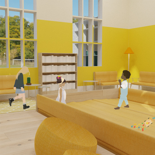
Yellow for the kids space -
Yellow is a joyous, lively colour that brightens moods and increases energy. It is a welcoming colour for kids and young families as it brightens the room and radiates happiness and optimism.
Orange for the foyer -
Orange is a welcoming colour due to its brightness and warm tones. The colour is energetic and enthusiastic, exactly how you want people to feel entering a public library.
Red for the reading nook -
Red is a cosy colour, due to its depth and warmth, and paired with the room being in a corner and risen above the rest of the library, makes the reading space feel womblike and safe.
0 notes
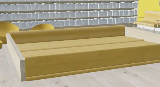
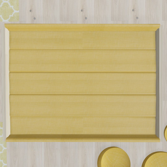
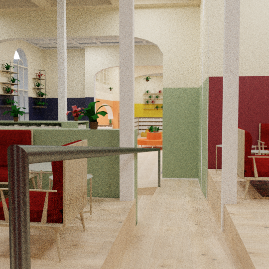
Photo
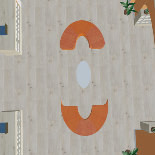
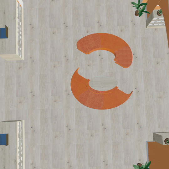
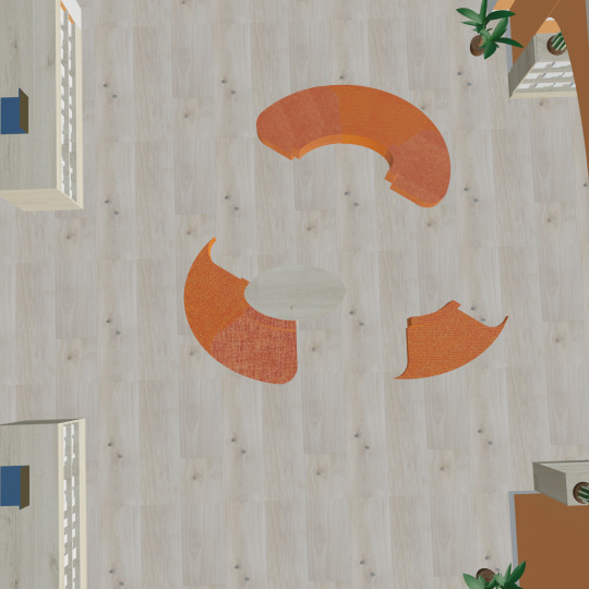
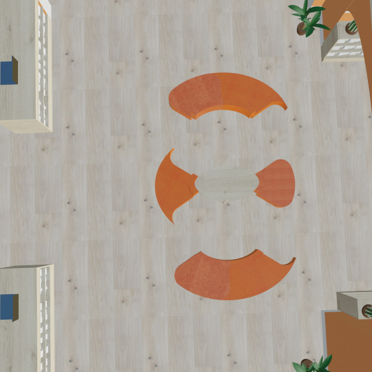
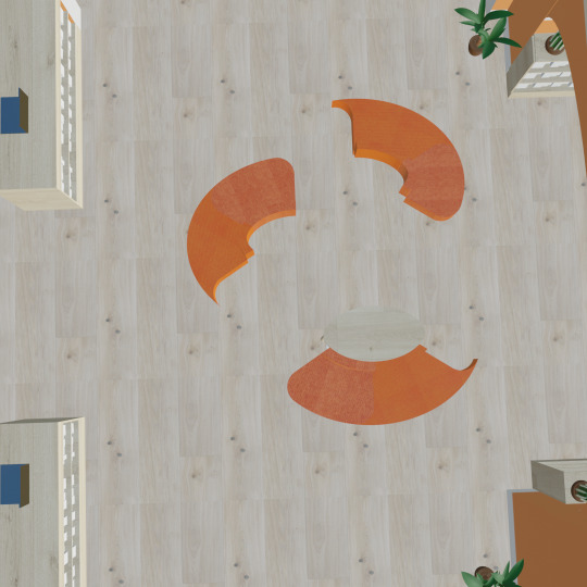
Five different arrangements of the modular couch in the foyer space.
0 notes
Text
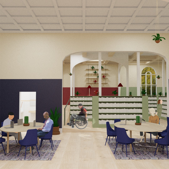
Fixing the accessibility and permanency of the Grey Lynn Library.
I got some helpful feedback on my draft proposal about the accessibility and permanency of my design. Mainly on the use of rugs, the new oak flooring and the playpen being sunken into the ground.
Because of this I have enclosed and raised the play pit so it is on the ground level. It doesn't have the same clean look but it makes the change not as permanent and easier and cheaper to install as you could use a basic plywood to build and would not have to excavate the floor.
The first image is the sunken play pit and the second is the new raised play pit.
The next issue I have solved is with the new Oak flooring. Because I have chosen to rip out the old carpets and replace the flooring it would be expensive, as I would potentially have to take out the flooring underneath, whether its cheap plywood or original wooden flooring.
Because of this I have chosen to go with laminate flooring. The chosen laminate is cheap, easy to install, and you do not have to remove the flooring underneath as it is laid on top and won’t damage the underneath. The laminate also looks like the original oak flooring I had chosen, and not cheap and fake.
The chosen laminate is scratch resistant, water resistant, so won’t buckle, and is very strong. I think this is an easy and safe fix for the problem and stops the permanent changes.
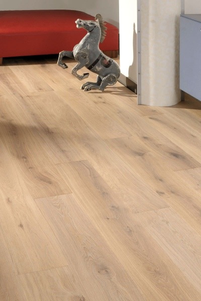
The first image is the chosen Oak flooring. (https://www.forteflooring.co.nz/product/catalogue/wood-flooring-planks/moda-portofino)
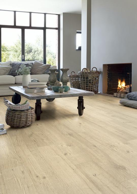
The second image is the oak laminate. (https://www.flooringxtra.co.nz/flooring/laminate/light-wood/quick-step-impressive?pid=FLIM-1853)
The last issue is with the rugs.
The chosen rugs were not given much thought other than they should not block the walkways for wheelchair/pram/cane users.
To me rugs are super important for framing a room and creating and warm and cosy space, which to me, a library should be. I found a blog site (http://www.whatdoyoudodear.com/accessible-home-our-flor-area-rug/) of a Mum with a toddler in a wheelchair who had problems with movement on rugs. She shared that she had bought a new rug system from FLOR (https://www.flor.com) that made rugs that worked in a tile system and were made to be denser and thinner than a regular rug. Also as they were in a tile system they are easier to clean and replace if needed. Because the tile is denser and thinner a wheelchair is able to easily roll onto the rug without extra force and does not sink into it so can easily roll across.
Below is a video of the Mums child rolling across two regular rugs and then the new FLOR rug.
youtube
0 notes


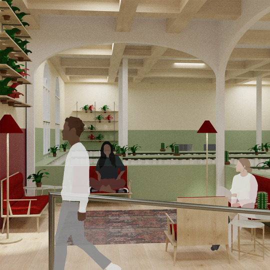
Photo

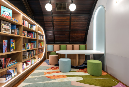

Children’s Library at Concourse House / Michael K. Chen Architecture.
Bronx, USA. 2018.
A children's library that sits within Concourse House, a shelter for Women and their young children who are transitioning out of homelessness and into permanent stable housing.
They designed the space focused on reading, story time and book events. The importance of reading for cognitive development and emotional health is the reason they built this space here, as many of these children would not usually have constant access to books, learning and recreation.
They have placed a light, colourful education space In a traditional/old style building that is made of very dark wood.
The new space is made of colourful carpets, paints and neutral wood tones. with furniture that can be stored away in cupboards or folded up into the wall.
The space uses a lot of soft curves and angles, a safe, womblike space for young children.
https://www.archdaily.com/908678/childrens-library-at-concourse-house-michael-k-chen-architecture?ad_source=search&ad_medium=search_result_projects
0 notes