
Statistics
We looked inside some of the posts by hiennguyendesign and here's what we found interesting.
Average Info
Notes Per Post
27
Likes Per Post
22
Reblog Per Post
3
Reply Per Post
2
Time Between Posts
2 months
Number of Posts By Type
Photo
12
Text
3
Video
2
Last Seen Tumblr Blogs


Fun Fact
Tumblr has 4 main sources of revenue.
Photo
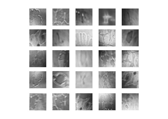

Week 5 Water Prototypetype::::: Final submission
Ok so I completely changed my concept from what I was showing in class, which was the cords
I wasn’t feeling super inspired and everything felt too predictable, I wanted a sense of chance, randomness, and spontaneity.
I was playing around with water- sometimes when I can’t sleep I shake up my water and watch it project across the ceiling- kind of looks like mould or bacteria under a microscope
Since I started developing this idea quite late in the timeline of the assignment- feels quite undercooked- I could definitely work this further- especially in terms of presentation...
Rules for Water Prototypetype:
1. Fill a transperant, smooth, container/water bottle with desired amount of water.
2. Shake the water bottle vigorously to agitate the water.
3. Place water bottle onto a phone torch in a dark room so that the water projects onto the walls of the room.
4. As the water drips, bubbles, pools, and eventually settles, search and photograph letterforms.
5. Repeat steps 2-4 as many times as desired.
Note: If you are thirsty during this process, simply drink some of the water and then continue. Differing amounts of water in the bottle can create interesting results.
0 notes
Photo


Week 4 prototypetype progress
Rules: for cord type
-use one singular cord
-all of cord to be included in the glyph from beginning to end
-refold cord between each glyph
-place/toss on a flat surface and let cord unfurl in its own shape
-look for a letter form- cord can be viewed from any possible angle as long as all of the cord is visible.
-repeat fold and toss steps if no character can be found
a, d, e, g, k, n, p, w, *, ? (these r the glyphs that actually follow my rules, shown in image 2) you can actually see a pretty clear diff between the ones that follow rules and the ones that don't
0 notes
Photo


Week 3 progress on prototype type
Working with cords.... experimenting with angles, shapes, photo editing, shadows, lighting.
i quite like the look of the letters.
thoughts: is this an experiment with the material or is it a modular typeface.. is it one or is it both? thinking..
2 notes
·
View notes
Text


Week 2, yoko ono
Creating a system for prototypetype
rules.... steps..... restrictions..... bounds.....
hmmmm more to come
0 notes
Photo


Reflective Statement
In starting Communication Design Studies, my personal objective was to develop a stronger understanding of design, design movements and important designers. I also wanted to develop practical skills in the process. Looking back now, I’ve definitely achieved both these objectives (yay!) the first through attending lectures, and the second from attending workshops and completing the assignments. Some of the movements that stand out to me are early-print, Bauhaus, Memphis Group and post-modernism as a whole. The workshops provided me with practical skills where I learnt many different methods of type making and typographic principles, collage, and of course zine making and publication design. I was particularly inspired by the colourful, bold, geometric style of the Memphis Group, as it is so playful and bright- it really reminds you that design can be fun and playful. I was also inspired by the creative I interviewed for my zine, stick and poke tattoo artist, Poko Ono, and the way she self-built her career. Lastly, I really appreciated the focus on group work during the workshops, as gave me an introduction into design communities and how you can work off of each other to create great design.
1 note
·
View note
Photo

Bauhaus and Women’s Rights
During Week 8′s lecture about Bauhaus, the discrimination of women in the school was briefly mentioned so I decided to look further into it.
While Bauhaus welcomed women to their school, providing them with access to art education that was not available to them prior, only 6 out of 45 of the teaching staff were women. On top of this, women were restricted to what was seen as the more feminine crafts such as fine art, ceramics and weaving.
As much as we glorify and respect our past designers and movements, its always important and interesting to also know the negative sides- the prevalent inequality between men and women where women were discriminated against and restricted in their work. To this day Bauhaus is seen as very progressive and forward thinking, but maybe it’s just not as progressive as we all thought.
(information from http://www.bbc.com/culture/story/20180919-anni-albers-and-the-forgotten-women-of-the-bauhaus)
4 notes
·
View notes
Photo


In week 9′s lecture we looked at post-modern movements, in particular the Memphis Group. Although I had never heard the name ‘Memphis Group’ before, I definitely recognised their geometric, bold, and colourful style.
The Memphis design movements began with a group of designers in 1891. Despite their name (which came from a Bob Dylan song), this post-modern movement was from Milan, Italy. Their wacky furniture design was a rejection of modernism and minimalism, which was a lot of structured and efficient design. The Memphis furniture reminds me of children’s furniture, or even like a cartoon come to life.
(images from instagram.com/memphis_milano)
(information from https://mymodernmet.com/what-is-memphis-design)
0 notes
Photo


Week 12! (Zine progress)
Just thought I’d go over some of the main decisions I’ve made for my zine:
Colour: As Poko Ono is a tattoo artist, she works with a limited colour palette. Her work is mostly black ink with the occasional coloured ink which is usually red, hence I decided to keep a really simple colour palette of only black and red. I’ve edited the photos to either grayscale or duotone (red/white) to suit the colour palette.
Digital vs Non-digital collage: I experimented with collage as I wanted to layer the images and the text throughout the zine. Although collage creates a more tangible feeling (not sure if thats the right word haha) that would create a pretty interesting appearance, I decided on doing it digitally as this allows me to overlay photos with line drawings or text.
Binding: As soon as I started considering binding for the Poko Ono zine, I thought it was pretty obvious that I should hand stitch it using a needle and thread (because she is a stick and poke tattoo artist). I did a few practice ones and I ended up liking the results of a simple running stitch with red thread the most.
Lastly, I’m about to start experimenting with printing the line art onto transparent sheets. I was thinking of using the transparent sheet as an insert for the zine, which would add 2 additional pages, and would overlay the text. I think it would be pretty cool to have because if you put your hand under the transparent sheet it would look like the tattoo design is on your own skin.
1 note
·
View note
Text
Ask Me Anything starting points: Research 5 Creatives

1. Poko Ono (instagram.com/poko_ono) : A stick and poke tattoo artist from Adelaide. She has quite a unique and distinct fine line tattoo style. Some of her common themes are floral, animal, and renaissance inspired tattoos. I really admire her work and would LOVE to get a tattoo from her eventually.

2. Girl Gpace (instagram.com/girlspaceadl) : Not too sure if this counts as a creative, but Girl Space is “an arts space for womxn, femmes, gnc, trans and agender artists based in adelaide”. They host workshops and events showcasing local art, and recently launched their very own zine!

3. Joey Yu (www.instagram.com/itsjoeyyu) : Joey Yu is an illustrator (among other things) based in London. She works mostly with coloured pencils and giving her work a sense of vibrancy and movement. Her use of a kind of warped perspective makes her work a really interesting and also gives it a strong sense of movement which is cool.

4. Manjit Thapp (www.instagram.com/manjitthapp): Manjit Thapp is another illustrator from the UK. She generally uses a mix of digital and non-digital methods in her work which is interesting. She does mostly portraiture and has done illustrations for books and magazines.

5. Nevari/Isabelle Raven (www.instagram.com/nevariart): Izzy (a close friend of mine) is an artist who does hand drawn and digital art. A lot of her work is inspired by Mandala drawings, and she also does a lot of continuous line portraits.
0 notes
Photo


week 11!
To get some inspiration for my zine, I headed over to sticky institute to browse their selection. I picked up one called ‘Swimsuit’ by Rachel Ang and another called ‘Small Pleasures’ by Dangerlam- both pretty cool zines. ‘Swimsuit’ uses perfect binding, where the pages are glued together at the spine. This looks really professional and neat- however is probably quite expensive and/or time consuming. ‘Small Pleasures’ is saddle stitched with two staples down the middle of the zine. On the outside the staples are covered by a strip of black duct tape which creates a nice finished appearance.
0 notes
Video
tumblr
Week 10!!!!!
In this workshop we used InDesign templates to create our very own 8 page A5 zines. I called mine Sparkle Zine due to the sparkly cat paw image on the front page. The template documents were pretty confusing at first, as they had master pages which I was unfamiliar with- but I think I get it now. It was also pretty confusing because the pages were in a random looking order and in all different directions, but you just have to have faith in the template because it all works out in the end. It was so rewarding to finally print out the zine, bind it, and cut it, and be able to flip through the pages of my very own zine. Very fun workshop 10/10
1 note
·
View note
Text


week 9 !
week 9’s class was all about collage and of course more letterforms! We were set with magazines, scissors, and glue to find existing letterforms within the images. The cutting and pasting was a really refreshing change from using illustrator and photoshop.
1 note
·
View note
Photo


Week 8 !
This week we went around RMIT to look for letters and numbers. These will be put together with all the other letters and numbers that every one else found to be made into an RMIT type face.
2 notes
·
View notes
Photo


Week 6!!
Week 6 we developed our typeface: “Stronk Bold”. We started with the orange quarter-circles, then added the blue triangles. The first row of letters of stronk bold look really consistent, with the shapes and the size, but from there onwards it starts getting a little wonky (e.g. the ‘x’ is really small and the ‘s’ is pretty big)
2 notes
·
View notes
Photo


Finally submitted my question for brief 1: “Can design be a chore?”
For my final submission I photographed the question in the laundry of my college. I considered a studio set up with a clean white background, but I decided it would be more effective and add further meaning to the question if I photographed it in context i.e. in the laundry.
I came up with this question as I was doing my laundry. I think of design as innovative, exciting, and creative, but as I was hanging my clothes up to dry, it made me think: as a designer, can the process of designing become tedious and boring, almost like it’s a chore?
6 notes
·
View notes
Photo


Week 4′s lectures mentioned the illegible logos for blackmetal bands. These logos represent much more than just the name of a band. They’re used as codes for the band’s fans- only they can decipher and understand the logos. Are there designs, logos, typefaces, etc. that I see in my everyday life that are designed only for my demographic- illegible and undecipherable to others?
2 notes
·
View notes
Video
tumblr
here’s a pretty cool timelapse of our group using water to paint our pangram onto the pavement
5 notes
·
View notes