
Last Seen Blogs

sorrowgrove
Welcome to the Grove

phoenixeuqdynamite
Untitled
aquarismo-atipico
Aquarium Paradise
iammrorange-blog
Candles, Champagne and Chandeliers.
Text
When coming up towards the end of term, it became quite stressful to finish all of our work for each subject including ceramics, photography, visual communications, life drawing, print etc. However, i have managed to get a massive amount of work done this week and feel like i have been able to relax a bit more.
In photography we have been doing patterns in nature, this is enable to link to our overall theme of nature and the canal and river trust. We were able to take some photos at abbey park of diffrent things and parts of nature which we found interesting. This has been a really interesting experience for me as I have never used a camera before and it was really interesting to see diffrent camera settings, effects and filters which I could use. Also another thing which I have really enjoyed is the fact that because we have been going on several shoots, I have been able to see the change in seasons throughout the photos which I have took. We have also been focusing on things to do with the topic of photo montages. I have been able to look at several artists such as Eleanor Shakespeare, Melinda Gibson, Rosanna Jones and Abigail Reynolds. I really enjoyed looking at artists connected with photomontage. This lead onto us being able to work with photoshop and able to make our own photomontage. I found photoshop really tricky to work with and didnt really like it. However, I was happy that i was able to gain a new skill and experience. My favourite artist to look at was Eleanor Shakespeare as her work had alot of depth and meaning put into it. I loved the way she has put problems and news which is going on in modern day and incorporated that into her work.
In Visual communications we have both Jules and Helen teaching us. We have been doing diffrent topics in each of our lessons which has been really nice because we aren’t doing the same thing all the time. We have also paired up with the other group A now, which has been really nice as I have been able to make more friends and speak to diffrent people. In Helen’s lesson we have been doing a still life topic where I have been looking at artists such as Giorgio Morandi, Roy Litchenstein, George Braque and Paul Cézanne. I loved looking at Roy Litchienstien’s work the most as it has a pop art vibe within it which I really like the colours. We made information boards for each of the artists and created a piece of still life in the style of Giorgio Morandi. We also created a massive a2 piece of work which was of any objects we had taken pieces of still life however, we were able to use our own materials and pictures. I was really happy with my final outcome.
0 notes
Text
Work by Ford Maddox Brown
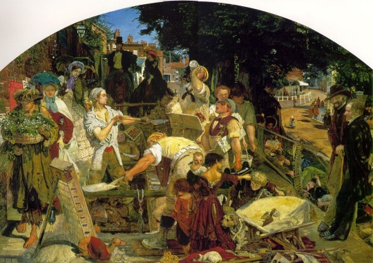
This image is painted by Ford Maddox Brown and is called Work. It took eleven whole years to paint, he started painting it in 1852 all the way to 1863. It is held in Manchester City Art Museum. The main theme throughout this piece of work is Victorian social and political concerns, this is because he wanted to include one of his favorite books, Thomas Carlyle’s Past and Present so this is where the theme came from. There are many individual parts in this image which have a very detailed back story. Firstly, the man right in the left of the corner who is wearing the long ragged piece of clothing which could be mistaken as a dress. He is carrying a basket of flowers and wearing an almost opaque hat, allowing you to see his face which is making a strange expression. He also does not have any footwear on. In this picture you can clearly see a lot of people doing hard-work, jobs that need doing and include a lot of meaning. However, the strange man I described in the photo actually has the mental age of a nine year old boy, he was also described as a thief. Therefore, this boy wasn’t able to have a proper job so he went round and sold flowers to the public. To go into major detail, if you look close enough on the life side of a image, there are posters on the wall. One of the posters has text about a thief which is referring to this man, just foreshadowing throughout the picture the backgrounds of some of the people. Moving on to the small girl dressed in the burgundy medium-sized dress with the small baby placed in her arms. It is quite clear that these children can be identified as orphans, this is because of the black ribbon tied around the baby which signified in those days orphans. This clearly just shows how awful these times can be as there is a young girl who guessed to be about twelve years old who is looking after two young children and a new born baby, not only is she looking after them but she is working at the same time. She is doing hard, messy work that isn’t sutiable for a child, she is clearly doing this to earn money to look after these children who are now her responsibility. Moving onto the man who is sat with a burgundy hat and waist coat on, he actually got ran over when running out of a house where he was really badly injured therefore he is unable to do any practical work. There are clearly the two man standing out who are doing a lot of practical work, they are building sewers. In this day of age when the image was set they didn’t have sewer systems, so clearly as you could tell it was very disgusting, dirty and unhygienic when people where going to the toilet. They had to dispose of feces and waste which could of been building up in houses for a long period of time, sometimes all of the waste which built up would actually soak into the walls making it a really awful and unsanitary place for people to live. This really was the epitome of what the people at the bottom of the class scale had to deal with. The woman at the left on the picture holding a blue umbrella, is identified as someone of middle class. She is clearly using the umbrella to keep the dust out of her eyes from all the work that is taking place. This just shows her being prestigious. The two men standing at the right of the photo are identified as Thomas Carlyle and Denis Sedrick. The two men are just standing observing the people work. I believe that there is a constant between Thomas Carlyle and Denis Sedrick and the two men who are building the sewers. This creates a sharp contrast between classes, as Carlyle and Sedrick have never been taught to work where as the others have to in order to survive. The main thing I spotted in this piece is the layout of the people. Right at the top of the image are two high class people on horses looking down at the lower class. It carries on in order of class where right at the bottom there are dogs which are at the bottom of the chain. There is a jack russell which is catching rats and hunting and then there is another dog which almost looks like a homeless mutt and has no owner.
The overriding message in this image is that the real heroes of Victorian London are actually these people that aren’t identified. They do so much work in order to survive and do not get any credit. It is believed to say that the higher class are intimidated by these lower class people as they would never be able to complete the amount of hard, back-breaking, life-threatening work that these people complete. This whole image has one main focus which is the social pyramid. There are hidden words within the image marking ‘robber’ and ‘great violence’ as they try to talk these people down to there lowest which strongly shows the intimidation.
I really love this piece of work, I think the way that it seperates the people into diffrent social classes which you can see the higher and lower is almost reversed. I feel in enables people to look at the lower class people and feel like they deserve better and they are truly the real heroes. I think the way that Ford Maddox Brown has involved real people is great it makes the piece more realistic and let’s you see more of what Manchester was really like. The colours in the image are heavenly, I feel like the stick the same mostly in the image at the bottom with quite neutral and plain colours. I think another thing in this piece which I would like to highlight is the way that the lower class have light shining on them and it’s very bright and beautiful. Then compared to, the higher class is dark almost like they are lurking in the shadows not wanting to be seen and get involved. I think this obviously highlights them as lazy and useless even though they think they are the opposite. I think this piece of work can definetly be considered a piece of work it allows you to feel emotion within the piece. I think you feel a lot of sympathy for the people that work all day long just to be able to live and I think you feel a lot of anger to the people that lurk in the shadows and don’t contribute to society. Overall, I think this is a eccentric piece; it has a lot of meanings and implied points all throughout the image.
1 note
·
View note
Text
Mark Quinn Blood Head-
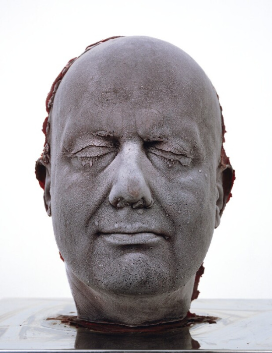
This is a piece of work by the artist Marc Quinn called Self. Self is a self-portrait of the artist, he has literally used his own body for material for a cast of his own head which is immersed in frozen silicone. The cast includes ten whole pints of his own blood which he went to the doctors every six weeks to get taken. There is actually more blood in the head cast then there is in the whole human body. A little bit of background about the piece is that when Marc Quinn created this piece he was actually an alcoholic and he needed something to be connected to in order to survive. I think that this way it definitely makes the piece more personal because the piece has a backstory. The work needs a freezer to be in at all times which is set at -12C. Marc Quinn creates the same piece of work every five years to capture an aging cycle. This piece of art definitely has very different and mixed opinions from viewers. In my personal opinion i quite like this piece as it has never been done. I think there are a lot of pieces which get repeated or parts are copied therefore it can be come boring looking at the same thing. If you was walking through an art gallery or a museum, I think this piece would stand out. I think that the overriding effect that when they are all finished you will be able to see the pattern of the sculptures getting older and older is really cool and it will definitely be interesting to see the finished effect. I think this piece can definitely be considered a piece of art, I can understand the aspect that people find it disgusting and quite uncomfortable but I consider art as something that makes you feel emotion and I feel this piece definitely does that. I also really like the effect of the frosted glaze, it looks really nice i think makes the red a little bit more subtle. I think that this piece is quite intriguing and fascinating.

This is an image of the museum which Marc Quinn’s Blood head is held. Beyeler Foundation, Riehen / Base.
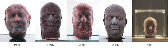
This is an image of the head slowly aging every five years. I think you can definitely see the difference in the images and the face slowly starts to drop down and the lines are slowly starting to become more sharp which is a sign of aging.
0 notes
Text
Photography
In photography this week I feel like we was able to get up to a lot more pratical use. We used the cameras for the first time this week by going to do a shoot at abbey park. We got to learn all the different camera settings, mainly auto and the macro setting for close ups. I’ve learnt all about the diffrent lenses and how to zoom in and out and view my photos after taking them. When we went to abbey park, we obviously had to take photos to do with our theme which is patterns in nature. So I took several diffrent photos of flowers, trees and anything I thought would fit in with the theme. Then for our homework the past week we have just had to review the shoot and right about the images we took. Also I researched artist who use composition photography and just researched a bit about that.
Ceramics
In ceramics we started to do more practical stuff also. We got little polyester mini tubes which were almost like clay and uses craft knives and tools to make a stamp out of them. We had to like this to our theme too but it was more patterns in the sea. I used turtles and starfish a lot in my pattern. We then got some clay and rolled them out with rolling pins to make it completely flat and then pressed the stamp into the clay to make some patterns. We have then left them in the classroom for next week. Also I did a bit of research on some artists for ceramics
Visual communications
In Helens lesson of visual communications, we carried on with drawing onions. We have drawn so many onions in so many different types of ways; we have drawn them blind, continuous line, other hand, diffrent backgrounds and now we are doing diffrent colours. At home this week I have been painting the onions in diffrent colours and also making grade colour bars. At the start we did grade bars with normal pencil but now we have started to do them with colour. I used watercolour pencils, watercolours and alinky paints, I think it looked really nice. We also had to use paints to do thin and thick lines with all diffrent colours. Lastly we had to do macro drawings, where we have drawn things really up close on A3.
Print
In print this week we have been using the drawings we did last week with fine liner and water and have been doing them on coloured paper instead with bleach. The bleach drawings came out really nice however it can get a bit messy when it starts to leak out. After the bleach had dried I outlined the drawings with fine liner and added some white pen. They looked really nice when they was finished and I am really happy with the final result.
Visual communications
In Jule’s lesson of visual communications, we have been learning about the design cycle. This week I have made a poster about the design cycle in my sketchbook and have wrote in throughly the clear steps of the design cycle. I then have made another information poster about the canal and river trust fund. The canal and river trust fund is what our final piece is based on making a magazine cover for there company. So I have been gathering up a lot of information about the company. Lastly I have created a mood board with some ideas of what I would like to do for my final piece, I took some photos at abbey park to but on this.

0 notes
Text
ART
What is ART?
The real definition of art is- the expression or application of human creative skill and imagination, typically in a visual form such as painting or sculpture, producing works to be appreciated primarily for their beauty or emotional power. However ART is much more, there is several types of art. There is art in painting, drawing, sculpture, makeup, graffiti, interior design, architecture, dance, music, films and food. Everything around you is art.
There are main four definition of art are Mimesis, communication, significant form and institutional theory of art. These words are confusing for most humans. Mimesis means the creation of art. The word is Greek and means copying people and creating work that has already been done before. Many pieces of art get re-created every day. Communication is speaking to people, texting, ringing, face-time, letters, there are all different sorts of communication some are works of art. Even the way a message or a letter is formed, there could be a pretty stamp or an emoji; that is a form of art.
Art is anything that brings you emotion. Any sort of sadness, laughter, anger, happiness, literally any sort of emotion is a work of art. In my opinion art isn't just what somebody draws on a page. Films are massive work of art, from the running credits to the attention to detail in CGI. Actors jobs are to form a piece of art because that is something that brings massive emotion. Art is in food, from the way the packaging has been designed to the way it tastes; the way it tastes good make you happy. Dance is a work of art the music plays a massive part, imagine watching somebody dance without any music, even the way peoples bodies move is a work of art. Art is the way your house looks, from the tiling in your bathroom to the way your front door looks. Art is tattoos, drawing on a piece of paper is one thing but having the ability to draw on somebodies arm is a massive skill. Art isn't just one thing.
Art is short for Origins and History. Origins means when something begins, when art started so many things where created. There is thousands of years of history of art and people probably haven't realized because art is such a massive field of creation. I think that art brings life to the world. There are many people in the world that think that art isn’t important, they think that doing a sum or writing is more important than drawing a piece of paper. I understand that you need to learn how to read and write and occasionally do a sum of numbers. However, what they don’t realize is that Math’s is art; when you have been trying to work out for hours how to do a sum and you finally get it, that brings you joy. Joy is an emotion and emotion is art. When you are writing a essay on a book, analyzing characters, really looking deeply into why these characters act the way they do, you could say this is being far fetched but it is art. Reading a novel is art, it makes you feel emotion so it is art. So these people that think art isn’t important they are the furthest from being right. Art is the most important because everybody creates a piece of art each day, even if they cant see it.
There is a clear difference between art, design and craft. Art is clearly as I've said anything that shows emotion or a feeling. Design is the process of planning something and building up ideas. Craft is making things and being creative. All three of these things are linked together and are forms of art.
Image 1-
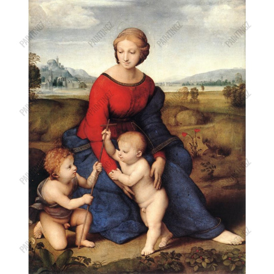
Image 1 is a picture of a woman who looks around 25 years old, sitting in a outdoor setting which almost looks like she is sitting in front of a backdrop. She is wearing a red dress which looks like it is made out of thicker material. She has a blue blanket covering her lap and left arm which could possibly imply that she is trying to cover her dress and even the outline of her legs. Her hair is dark, to reddish blonde and is braided in a middle parting. Her eyes look friendly but rather absent. The smile is quite subtle and could be described as looking calm. The woman in the photo is identified as Mary, the mother of Jesus. Mary is slightly raised from the floor. Between her two downward facing hands, there stand a two to three year old naked boy with short reddish hair and he is leaning against her. Next to the boy, is a somewhat older looking boy with red curls, he is kneeling on his right leg with his only clothing being a greyish cloth covering him. I went into further research to realise that he is holding a wooden Latin cross delicately in his hand. The crossbar at the top is rather short and the other child holds the top end in his hand. When I looked really closely into the image I realised three very fine golden rings, almost like a halo placed above there heads. Within this photo there has already been two aspects of religion one being the Latin crossbar and the other being the implied halo’s. The landscape in the background is mostly brown to light green in colour. There are various hills which are knee height and in the distance there is a small village. To the right of Mary, there are two red poppies one open and one closed. Also at the bottom of the photo there are some strawberry plants. I think that they have included some hints of red within the plant to match with Mary’s dress. In my personal opinion, I quite like this image because I feel like it has a lot of symbolism behind it. Knowing that the woman in the photo is identified as Mary, mother of Jesus. The two children are identified as Jesus and John the Baptist. I like the fact that this photo has history behind it instead of it just being a painting. I really love the scenery in this photo and how they have added little hints of red which connects to the main focal point in my opinion Mary’s dress. The photos don’t make me feel anything as I feel like it is really hard to have an emotional connection to the image knowing it was painted so long ago. However saying that the history behind it is almost warming as people have such a connection to religioI think that this image can be considered art as it has the basic elements. It has a backdrop which most drawings or pieces like these do, it is drawn with so much detail and the painter has used oil paints to my knowledge. These are all basic elements of art to make such a beautiful piece.
Image 2-
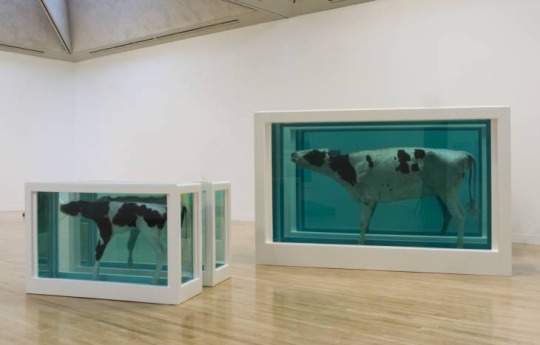
This image is a piece of work by Damien Hirst called Mother and Child divided. There are four tanks filled with formaldehyde solution which obviously keep the calf and the adult cow preserved. The tanks are installed in pairs, the two halves of the calf at the front and the two halves of the mother behind. The sufficient space between the animals could lead to the viewers in the museum to be able to see the animals insides. There are thick white frames around the boxes which take the focus away from the bright turquoise solution. The sculpture was built in 1993 for Venice Biennale and was the focal point of the 1995 Turner award. This piece of work is very different to anything I have ever seen before and obviously there are going to be many opinions which are different about it. Damien Hirst has done similar work to this with a tiger shark. I think that the tanks that the cows are held in have a very industrial metal vibe. I don’t really like this photo at all, I think in a lot of ways it’s very cruel and I think that this is quite a popular opinion on this piece of work. The way that both a mother and child a separated not only from tanks but cut in half is very far fetched. I think that the way that the animals are cut in half symbolises that heart wrenching pain to lose a mother or child. I think that the photos make me feel a lot of sadness and sympathy for the animals. However saying that I completely understand that millions of cows are killed everyday for the food we eat but I don’t think there is any reason to be using it for a piece of art. I don’t really see what about it can be considered as art as it is all very morbid.
Similarities between the two pieces-
There are sharp similarities between the two images. Obviously the biggest of similarities is the topic which is both of the images show a mother and child relationship. However they are mother and child relationships in very different ways. In image number 1 you see Mary the mother of Jesus holding Jesus in her arms below. Mary looks rather content in the image as she is happy to be with her child and Jesus looks happy to be with his mother. However in image 2 it is obviously a image of a cow and calf separated from each other and not only separated but there bodies are cut in half. As I’ve said I think this symbolises the gut wrenching pain of losing somebody especially a mother and child relationship. So even though they both have the similarities of the mother and child topic, they really aren’t that similar at all.
Image number 3-
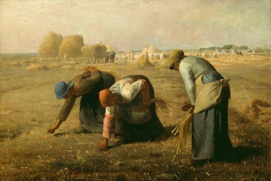
This next image is a piece of work called the Gleaners. The gleaners is an oil painting by Jean Francois Millet completed in 1857. It depicts three peasant women gleaning a field of stray stalks of wheat after the harvest. A little bit of background about the painting is the most important school of rural french painting in the nineteenth century was the Barbizon school, which was a group of informal artists this was included Millet. This piece of work is now shown as pioneering work and is a perfect example of Millets profound respect for the timeless dignity of human labour. So a little bit more about the picture, the picture is obviously titled the Gleaners. The word Gleaners is usually more commonly used as ‘Gleaning’ which means the activity of collecting left over corn and other crops from farmers fields after the harvest. In the picture we can clearly see that the women are doing this. Another thing that I think is really highlighted in the image is that the task was clearly really hard, you can see by the women’s backs really struggling. However this was a really important contribution to the diet of rural workers and was one of the main takes undertaken by french peasants at the time. Millet himself spent almost a decade researching the process. I think that it is so good that he took his time to throughly research the piece as it gives him a better understanding. I particularly like this piece a lot more than the others. This is because in the nineteenth century it wasn’t very popular for women to be outdoors it would be more cooking in the kitchen and being a housewife. So I like that in this image the women are having the independence to be out in the fresh air doing something more practical. This image can definitely be considered as art as it has all the different elements, the painting is beautiful, there are a range of colours and so much more.
Image 4-
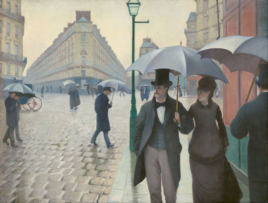
This is image above is called a Paris street, Rainy day by Gustave Caillebotte. When I looked through some research I learned that this piece is influenced by the traditions of academic art. His art is very much style of Manet and Degas. Manet and Degas are two artists in the nineteenth century. In this image, Caillebotte has obviously painted a picture of a normal day on the streets of Paris. The effect in this photo is both real, casual but choreographed at the same time. There is an absolute massive scale of architectural development which makes the humans surrounding it look tiny. I feel like many of the figures in the picture look isolated and absorbed in their own thoughts, their expressions downcast and they seem to be hurrying rather than strolling in my opinion. Judging by the weather in this scene, it looks like it’s a winter afternoon as they all have there umbrellas and winter coats on. I feel like the main focal point in this image is definitely the couple right at the front of the picture, dressed in what looks like the latest fashion in that day. She wears a fur-lined coat, with a hat and a veil; while he wears a top hat, frock coat with an upturned collar, bow-tie and a waist coat. In the background there are a mixture of upper class and working class pedestrians. In addition to the architecture of the buildings, the other main feature of the picture are the umbrellas which are carried by many people on the street. According to a website I looked at by an art critic, people seem to think that the umbrellas are symbolic of a shield to the owners not just from the rain but also from people passing by. I think that it really interesting as it definitely shows the constrast between the upper and lower class. Another thing that is highly interesting about this image is that the artist Caillebotte was really interested in photography, I think it shows a lot in this image as it is almost a snapshot of everyday life and it looks very realistic as if someone has taken a picture. You can see how the artist has really taken his time to position the lampposts, buildings and figures in the picture. The lamppost is placed perfectly to separate the buildings and make more of a focus on the couple as it’s placed behind them. I really like this piece of art as it’s quite realistic and I love the posh Paris vibe. It is very elegant and I love how big the buildings are and the way they are layed out. It’s quite obvious that this is a piece of art, the painting is so lovely in this image and the attention to detail is amazing. It is really nicely structured and layed out and has a great balance throughout the image. The image because of the weather is supposed to be dull but there still manages to be a several different colours and gives you a warm and cosy vibe.
Similarities and differences between the two images-
I think that in these two pieces of art there are several similarities and differences. Firstly, there is a massive difference within the photos, they are living completely different lifestyles to one another. There are diffrent reflections of the same period in France. So starting with the Paris Street, Rainy Day it is clearly an image that has more upper class pedestrians as the Gleaners are lower class. In 1853 Paris was completely rebuilt and there are now very wide open streets and boulevards but before this is was very tiny town with not a lot in it. Baron Houseman was the man to design the rebuild of Paris, so they demolished all of it and all of the poor people that where living in Paris at the time where all moved to the country side. So after this Paris was completely rebuilt as a well-know and weathly town. In the photos now it’s clear that there was obviously rich people moved into this new amazing town that is completely rebuilt and then in the other piece there is the poor people that have been moved out into the country side. Moving on to the similarities which are quite a lot shorter than the differences. The first couple of similarities which stand out is the fact that both images were painted in the nineteenth century. The gleaners was painted in 1857 and Paris street, Rainy day was painted in 1877; both images are set in France.
0 notes
Text
My first week at college was really enjoyable, I throughly enjoyed getting to know my teachers and what things I will be doing in there lessons.
First thing I did this week was make a photography sketchbook which was based on drawing with light artists. One of the main artists I focused on was Eric Staller. I really enjoyed looking at his work especially knowing I have never heard about drawing with light before. I learnt about his career and his most popular pieces of art work. Another thing we focused on doing in lesson is actually creating our own drawing with light images. We was all given torches and led coloured film and we made shapes in the air with the lights off. We put the camera on a long exposure so it fitted in perfectly. I really enjoyed doing this and can’t wait to carry on.
Another thing I did this week in Jules visual communications lesson was learn about the design cycle. For our final exam we are doing a magazine cover based for a company which is canal and river trust. We researched into canal and river trust and looked into what the company do. They work for several charities, protect animals, open bridges,locks and aqueducts etc. We also made Pinterest boards based on the information we gathered. I also made a poster on the design cycle, on Procreate.
I had print for the first time. I throughly enjoyed it and it was completely the opposite of what I was expecting. I used fine liners to basically draw what was in front of me. I had a setup of dried fruit, plants and anything associated with nature. I think the pictures came out really nicely and I was really impressed with my self. When the ink had dried on the watercolour paper I got some water and a paint brush and slowly inked the pen out to give a watercolour effect. I then let it dry and added some white pen to add just a little extra detail. This has probably been my favourite lesson in the week.
I also had ceramics with Lisa, which I also didn’t really expect myself to like but I throughly enjoyed it. We draw seashells up close so we could get really detailed patterns. We also got thick string and made patterns on card I made some circles and swirls using PVA glue. In our next lesson we are going to be moulding clad into pattern card which I am really excited about. We are also using the patterned card to make pretty patterns out of it with chalk or pastels. When we have all our different patterns and drawings we are going to be making a mood board.
In helens lesson, we had visual communications. We started the lesson off with doing grade columns. We did basic shading light to dark and then changed to doing some mark making, which I had never doing before. Then we moved on to drawing some onions, we drew some normal onions, some onions with different patterns and mark making. I carried on to do them at home doing blind drawings, continuous line, drawing with our other hand and drawing on different materials etc. I really enjoyed drawing on things like newspaper and pages out of books.
I really enjoyed myself having my first week at college and only wish I could spend more time there. I really enjoyed writing this blog too and feel like it keeps me in check of everything I have to do and makes sure I have completed everything.

0 notes
Text
For my first blog, i would like to speak about my interests and things that i enjoy doing. My favorite kinds of art are animation and watercolor pencils drawings which are linked with cartoons. I love TV and film art which are surrounded with my favorite TV shows such as The vampire diaries, The 100, American Horror Story, Outer Banks and Friends etc. I also love Disney films since I was really young, my favorite Disney films are Princess and the frog and Tangled. I am a massive huge fan of Harry potter and know all the films back to back. For my age, I love old school films and music. I love Grease, Breakfast club, Clueless, Pretty Woman, Notting Hill and many more. This applies to my music taste to, I love Queen, Madonna, Whitney Huston, Fleet wood Mac and so many more.
Another thing that I am really interested in is Interior Design, I love keeping my room tidy and finding different ways of designing my room to express my interests. One of my walls in my bedroom is covered in movie posters, album covers, my favorite quotes, TV programs and films. I love my room and feel so comfy and cosy. This links to my love for interior design, i love designing things and helping other people find there style for there room.
Another thing that i am absolutely obsessed with is Christmas. I absolutely love being cosy and cold at Christmas time. The festive feels with winter and being with your family, is my favorite time of year. I love decorating the whole house ready for Christmas. I also have a little job at Billy Bates Fun Fair, which runs throughout Christmas, which is really fun. I love Christmas music and films, my favorite Christmas film is Nativity 1.
Also, I have got into reading a little bit more and i really enjoy it. At the minute I am reading the After Series by Anna Todd, I have watched the first film and I thoroughly enjoyed it. I would like to widen my imagination a little bit more though and carry on reading different books. I love films, books and tv shows I feel like it is my comfort zone to explore different stories.
I love going on pintrest and making different boards and pins, of my favorite films, collage walls for my bedroom, TV shows which i have got invested in, different actors and genres of music. I feel like this is a massive way of trying to express your self and I also find it really fun to do and a relaxation method. It also makes me feel more motivated when I have a clean area to do work with when I’m at home.
Image 1-

In our lesson today, we needed to look at images in depth. The first image, is of a man in a painting with a pair of glasses in front only showing one lens. The man in the image seems to be identified as Vicent Van Gogh- a famous artist, giving us the idea that this photo has been taken in an art gallery. Deeper into this, knowing that the sentence at the bottom of the photo is in french could imply that this is taken in the famous Louvre museum in a France. The sentence translates into ‘see more clearly for less’ showing that this could be for a advertisement for glasses, where the sellers are trying to show the good prices of the glasses. The colours in this picture, are very light and have the same colours of blues and greens throughout the photo with hints of brown. I think that this photo would have a very different effect if the colours where changed, the colour scheme is very happy and has very little darkness. I think that the focal point in this photo is definitely the mans face, only because of the lense focusing on it and making it more realistic then the rest of the photo. The part of the photo which is focused by the glasses looks like a real life photo of a man, unlike the other half which looks like a painting . This implies how good these glasses really are; which is the message that the advertisers are trying to get across, to sell to customers.
Image 2-
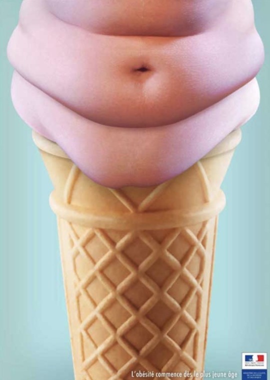
This next image shows an ice cream, which has a normal cone but the ice cream has been replaced by an oversized stomach. The colours in this photo are quite plain, however the main three parts of the image have completely different colours. I think that there is a massive reasoning for the colours as, they have used quite nice happy colours when the subject it is based on is quite serious. This could be because they do not want to offend anyone. The focal point in this image is straight away the ‘ice cream’ which is actually an oversized stomach. It’s the first thing that you see when you look at the image and it makes you think what it actually is. This advertisement also is french which is implied by the symbol at the bottom with the colours of the French flag and the sentence in french which is translated into ‘obesity starts at a young age’. This implies that this advert it directed to children, which also can be implied by the ice cream as it is a very child-like food.
Image 3-

This image shows a man with a car painted on his face, getting punched by another man with a car painted on his hand to create the image of two cars colliding and crashing into one another. It is stated clearly underneath ‘Stop the violence, don’t drink and drive’ implying that this is an advertisement about awareness of drinking whilst driving. The colours on this image are a lot darker than the other, showing that this is a serious problem happening all around the world. The only colours which stand out from the dark background is the two cars which are red and green. I think a reason why the cars are a different colour are to show that this can happen to anyone because these are quite popular car colours. The focal point in my opinion is the mans face, you can tell that he is in pain which shows how bad it could be. Another thing I picked up on in this photo is the text. The words in this image are different sizes and colours, the words ‘Stop the violence’ are in white and ‘don’t drink and drive’ I found this unusual as it would be the other way around because red is a colour I associate with the world violence.
Image 4-
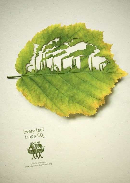
The next image seems to be based on an advertisement to do we saving trees, the advert is clearly raising awareness. The colour scheme for this advert is quite bright, the colour green is definitely the main focus. Green is a colour that I would normally associate with nature, therefore this links really well with the purpose of the advert. I definitely think that if the colour was different then it wouldn’t link as well. The focal point of this image appear to be the leaf with the city shaped in the middle. It shows huge amounts of smoke coming out of these factories showing the huge effect on the trees. To conclude, I think that this advert is all about saving the trees.
Image 5-

The next image, is my favourite out of the 7. The image shows two political leaders Donald trump and Kim Jong Un screaming into a boys ears, however he cant hear any of it due to have headphones in. The headphones are labelled ‘noise canceling’ showing that they block all the sound out. I did some further information into this advert to learn that it was for a campaign called ‘block out the chaos’. In my opinion this obviously means blocking out all the bad things gong in the world. The two things in this image that signify this the most is the rocket and the red button. I feel like the both show ideas of war and heavy violence. This is also shown by the colour red being used throughout the image, as the colour red could signify the feeling of anger. In this image I don’t really feel that the colours would change much because it is spreads it point across really well, however the colour red does tie in really well with the subject. I don’t think that there is a focal point ethier in this image as there is so much going on, however there definitely is a running theme of violence. Another thing i have noticed is the only white space is the headphones blocking out the sound, the colour white represents purity and peace.
Image 6-
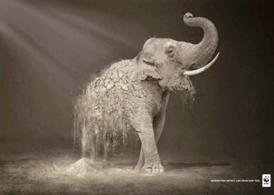
This image clearly shows a elephant which is crumbling as if it is made out of stone. The colours in the image are very dark and there isn’t any bright colours, this therefore implies that this is a serious advert. In the corner is the logo for WWF (World Wide Fund For Nature) showing us that it is an advert about awareness for animals. The main focal point in the image is clearly the elephant, as it is clear and the message of the elephant becoming hurt of extinct is clear. In the corner there is a quote saying ‘desertfircation destroys 5,000 species every year’. Desertfircation meaning the process by which fertile land becomes desert, typically as a result of drought, deforestation, or in appropriate agriculture. This implies that where these elephants are living isn’t safe and they are struggling to survive.
Image 7-

Image 7 shows a cup with a car printed on the lid where the straw is coming out of the gas pipe on the back of the car. It displays a clear piece of text stating ‘Pollution is closer than you think, friends on the earth’. I think that this text implies how brainwashed the world is. I think that the world every day uses more cars, buses, taxis, trains, planes and this obviously causes more pollution but people aren’t aware of this. There for this advert raises a lot of awareness. The colour scheme is quite plain and bland, however I think this suits the advert well as sometimes colours can be distracting from the real message making more people focus on the text.
2 notes
·
View notes