
Don't wanna be here? Send us removal request.
Statistics
We looked inside some of the posts by hopewalker116c-blog and here's what we found interesting.
Average Info
Notes Per Post
2
Likes Per Post
1
Reblog Per Post
1
Reply Per Post
0
Time Between Posts
4 days
Number of Posts By Type
Photo
17
Last Seen Tumblr Blogs


Fun Fact
Tumblr was acquired by Yahoo for $1.1B in 2013.
Photo

this robot was made on sketchup and I think it is really cool. The detail is amazing and I hope some day I will be able to make something as perfect as this!
blog 26
0 notes
Photo

this sculpture was made by Claes Oldenburg and is called Cologne which I think in English means “dropped cone” I think this sculpture is cool because it looks like the cone is melting and has formed to the shape of the building. It also made me crave ice cream!
blog 25
2 notes
·
View notes
Photo

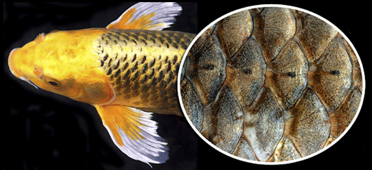
scalloped patterns like this are seen in clothes, tiles, artwork, and many other things. patterns like these are inspired by fish scales and how they layer on top of one another.
blog 24
0 notes
Photo

this is one of my favorite dresses because the pattern has so many different colors
23
0 notes
Photo

rather than just saying what goes in each bin, this artist visually shows you!
blog 22
0 notes
Photo

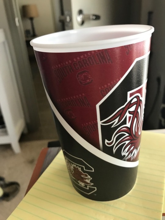
this cup appears shallow when you look from the inside but deep when you see the outside
blog 21
0 notes
Photo

A window in transparent. If you look at the window you see scratches, dust, or rain drops, but if you look through the window you see the world beyond
blog 20
0 notes
Photo

The use of color in this logo gives off a great illusion of space! It appears that the pencil is 3D, even though it is not, due to the slight color variation. It also contains gestalt where the tip is not connected to the the pencil but the psychic lines imply that it is touching due to proximity.
blog 19
0 notes
Photo


I thought this artwork at the museum was very interesting. It is not something I would ever want in my house but I liked all the different components that were happening. I thought it was really cool that the canvas was made up of different fast food containers. It was also a very interesting choice to include a chair in the piece. But either way I thought it was pretty cool!
blog 18
0 notes
Photo

I like this poster by Paula Scher because it is very bold and very abstract but you still know what it is trying to say. I really liked learning about how Paula changed the way everyone looked at Broadway playbills because I love going to plays and whenever a new one or new movie or anything comes out I definitely judge it by the artwork on the advertisement.
blog 17
0 notes
Photo


the paper shows actual lines because there are literal drawn lines on the page
the hand shows implied lines because the lines on your hand are not finished or connecting but create the illusion of a line where there is not one
blog 16
0 notes
Photo

When this photo became popular at the beginning of the year I remember seeing it and loving such a powerful a message could be conveyed in an image. When I heard the presentation about this photo’s designer, Shepard Fairey, it became my favorite of the day. I think it is very interesting that a street graffiti artist would be hired to work on such impressive activist movements such as the women marches this fall. I think it is amazing that he is using his talent to teach important lessons.
3/1
0 notes
Photo

I do not look at a lot of album cover art or know a lot of artists. Many of the artists I like to listen to just have a photo of themselves on the cover. One of my favorite album covers is Taylor Swift’s 1989 cover. I like that the photo looks vintage and is a polaroid. I also like that the title is written in her handwriting. I also like that her whole face is not showing, I think it adds to the moodiness and emotion in the photo.
2/22
0 notes
Photo

This was my favorite logo. It uses repetition of form very well. A lot of the logos used repetition of form and gastalt which worked very well. All of my favorite logos used expressive type such as this one looking like a fence and saying fence. Expressive type is very effective in logo design.
2/17
0 notes
Photo

I think that this poster is designed well. It is very simple but is still very aesthetically pleasing. I really like the bright colors and the layout of the letters. The letters are laid out in an interesting loose grid with really draws in the eye
2/10
0 notes
Photo
Illustrator demo using outlines and blending tools
2/13
0 notes
Photo

My designer, Erik Spiekermann, is a type designer and has made many posters about typographic rules
2/8
0 notes