
Don't wanna be here? Send us removal request.
Statistics
We looked inside some of the posts by ht-fmp-2025 and here's what we found interesting.
Average Info
Notes Per Post
0
Likes Per Post
0
Reblog Per Post
0
Reply Per Post
0
Time Between Posts
8 hours
Number of Posts By Type
Text
17
Last Seen Tumblr Blogs


Fun Fact
130K people were victims of a chain letter scam that affected Tumblr in May 2011.
Text
Gameplay Video
I made a short simple gameplay video since its an easy way to present my game:
youtube
0 notes
Text
Creating An Objective In my Game
After playtesting players' said my game was quite confusing with what they had to do therefore i want to add something for them to do. So, I want to add rings to fix this issue as it will create a challenge for the player to do and give them more to do.

Firstly, I created a new actor and did some simple coding by adding to a score variable when overlapped then destroying the actor.

Next, I created a simple win state inside the plyer so that it will check the player's score every tick and when it reaches a certain point it sends the player to the win level.

Then, I made a simple ring model in Maya then imported it into my game.

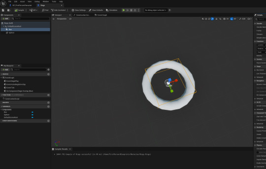
Lastly, I added them throughout my map.
0 notes
Text
Why I'm using Grey-boxing
My game is published with grey-boxing and doesn't have a finalized map. This is because I found I didn't have enough time to produce a map as I focused a lot on the mechanics inside my game instead of the map / visuals of my game. Next time, I will try to balance my work load better so that I can get good visuals as well as good mechanics.
0 notes
Text
Playtest Feedback
After letting a few people playtest my game I looked at the results and this is what I found.
Firstly, most people seemed to have found my game easy as well as found it easy to understand.

Next, most people liked my controls and no bugs were apparent yet which is good.

Lastly, most people moderately enjoyed my game but I had quite mixed reasons with the main ones being to create a goal of sorts as well as improve my map as it didn't have any texturing.

My main takeaway is to try and improve the visuals of my game as well as making more to do in the game as players seemed to be a bit lost with what they should do or where to go.
0 notes
Text
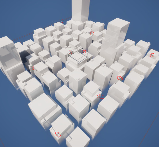
Optimizations To My Map
The primary changes between the prototype and the current is I adjusted the position of the buildings to be more organized and aligned so that it would match a regular city with the spacing between the buildings. I also replaced a few of the buildings and shifted round their general order so that its more random and less of the same building types next to each other. Finally, I redid some of the obstacle layouts as a lot of them were basically the same so I tried to randomize them slightly using rotations or slight shifting.

0 notes
Text
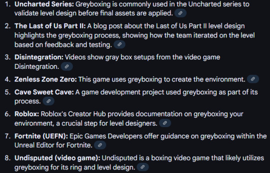
Grey-boxing
Grey-boxing or block-out is a design aspect games use in order to make a rough layout to their map. Grey-boxing is used by lots of different games in order to make a base for what they want their map to look like. Grey-boxing is primarily used for 3 reasons:
To check playability of the game without wasting to much time
make a base for the layout so that its easier to design later on
to ensure all mechanics in the game are functional
lots of games have used grey-boxing in their design process which include titles like Uncharted, Zenless Zone Zero and Cave Sweet Cave.
0 notes
Text
Adding Audio
Firstly, I found an audio file online of New York City so I picked it as I thought it would match my game best. Then, I simply imported it into my game and made a sound cue of it.

Next, I did some small coding so that on the game start it plays the audio.


0 notes
Text
Minor Game Changes
Throughout my development I've made a few small changes such as tweaking values or adding different features. In terms of changes I tweaked a few values of most things such as the slide speed, Vault and mantle height as well as the general player move speed.

(2.5 to 2.0)

(Increased Mantle Height (100 to 140) )
In terms of featured stuff being a fog on the bottom of my map to hide the void and I added a few extras structures in my game to make it look a bit nicer.


0 notes
Text
Creating A Bounce Pad
I made a bounce pad mainly because their was a few spots in which the player would be stuck so I decided to make it so their isnt any softlocks in my game. So, I started with a simple model in maya of a trampoline as i thought this resembled a bounce pad best.

Next. I imported it into Unreal Engine and made a new actor for it so that i could make it functional.
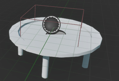
Lastly. I added some simple code so that when the player walks over it, it launches them up in the air.

0 notes
Text
Creating UI
To start off I created a new gamemode in which removes the player from the scene so that you cant see it falling into the void forever

Next I simply made A few widget blueprints for all the screens I needed which are the controls menu, death screen and start screen.


Next, I made some levels for the different UI elements as I would make the player move to different levels to show the different UIs

Lastly, I did some small coding for the buttons on the menus so that they would send you to the different levels with the specific UI such as the controls menu.

youtube
0 notes
Text
Win Screen Research
Valorant
Valorant has a relatively complex win screen with it showing the accolades of each player that match as well as a score. I do like all of the different statistics but i think it will likely be too much for my game as well as too difficulty to make therefore i will stick to a simpler background.

Clash Royale
Clash Royale's win screen is pretty good with it showing the amount of towers the player destroyed represented as crowns as well as highlighting who won. I like the general simplicity of the win screen so i may try to keep a similar level of simplicity to my game.

Cuphead
Cuphead's win screen is pretty good with it showing how much of the objectives you had done as well as having a grading system. I like the whole aesthetic of the win screen as it uses bright colours to represent the player winning as well as having simple fonts and layout.

0 notes
Text
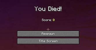
Death Screen Research
Minecraft
Minecraft's death screen is very simple with it showing the players score with a red tint and the ability to either go to the menu or respawn. I like the simplicity of the death screen but I do think the layout could be altered slightly primarily with the alignment s things like the score is in quite a off spot therefore I will try to layout my death screen to the best of my ability.
Dark Souls
Dark Souls has one of the most iconic death screens but I do think there isn't a whole lot to it. I like the simplicity of the screen as its straight to the point but I think it could have a bit more to it such as a menu button or respawn etc, since I think this would make the death screen a bit easier to understand.

Metal Gear Solid
Metal Gear Solid (MGS) has a very simple but effective death screen with it being a futuristic font and a simple layout. I like the font for the game over as I think it reflects the games setting well but I'm not big fan of the kerning on the exit button as I think it looks a bit too stretched. Therefore, I will try to use a good layout and font type for my game's death screen.

0 notes
Text
Start Screen Research
Hotline Miami
Hotline Miami's start screen is quite simple with a neon sign stylized font with a simple background with some palm trees. I like this background as it reflects the game quite well and its art-style in general. I also like the simple layout of the start screen as it has good emphasis on elements using levels of hierarchy in which I could use inside my own game.

Kingdom Hearts
Kingdom Hearts has quite a distinct menu with it primarily being white nd modern with the exception of the logo and outsides. I like the sizing of the logo and its general design but I think it stands out a lot and doesn't mix in too well with it being quite different in style. I also like the illustration on the right as it represents the main character of the game decently but again its quite a different style to the main game.

Skyrim
Skyrim has quite a stylized design with their start screen with it showing the main logo of the game with a sleek font used. I like Skyrim's general style as I think it flows quite well with its simplistic design with a modern layout but I think the design is a bit empty with it being completely black in the background with minimal difference besides the mist/smoke at the bottom.

0 notes