
Last Seen Blogs

hazisonline
HAZ IS ONLINE

dressrec
REC●Fan

jenmcconnel-blog
Jen McConnel

phuonglinhne
Phương Linh nè!

luael
🌻Luaël🌻
Note
hi!! your work is beautiful! do you recall the shade name of the blue-green bookcloth you used for eugenesis by any chance? thank you :)
I'm pretty sure it's called "dragonfly", though some sites have it listed under different names.
0 notes
Text
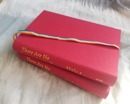
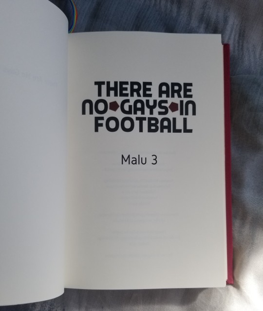
There Are No Gays in Football by Malu 3 (@penaltykeks)
with art by alby mangroves (@artgroves) and @mizufae
Bound for Zephyr for the Renegade Bindery book exchange
Words: 212,919 | 662 pages
Binding this book made me nostalgic. When I was in high school and just getting into fandom and reading fanfic, Merlin was one of the bigger fandoms on Livejournal. I actually have never watched the show, but know a bit about it through fandom osmosis.
I went with more of a classic look; I wanted it to look like something traditionally published. The design isn't super eye-catching, but I'm proud how it turned out because I think the overall construction and layout is well done. I wish I had some slightly better photos, because in person I think it looks really nice, but I finished 1 day before the deadline so I didn't really have enough time. 😅
I'd also like to thank @desmothene for advising me on the typesetting for both of my exchange books.
Fonts: Alegreya, Gidole, and Piximisa
Bookcloth: Dark Red Brillianta
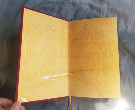
(Unfortunately I'm not sure exactly what type of paper the endpapers are. I bought them from a local paper store and I can't find them on another website.)
In regards to the construction, the only snag I hit was with the cases. I somehow managed to get glue spots all over the bookcloth. Once you get glue on the Brillianta it simply won't come out. But, pro tip, if you have some acrylic ink of the same color you can paint over the spots and it becomes much less noticeable.
I also had some difficulties with the titles. Lining up the iron-on was annoying, I couldn't tell if it was even and in a straight line. Then I realized I could hold the bookcloth up to the light and see it on the paper side. (I added this picture because the whole process was so fiddly, I want some documentation it turned out okay.)

I have to give a shout out to this sulphite paper I bought from Blick's. I originally bought it to use on my printer, which didn't work well, at least on my laser printer. But it works super well for made endpapers, with very minimal wrinkling.
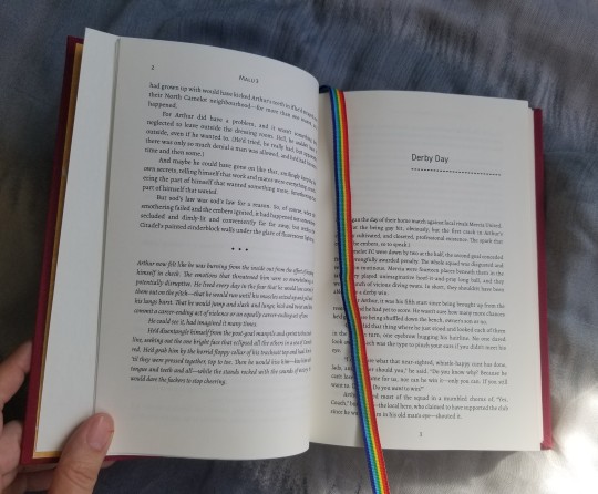
I really like these ribbons, I think it gave a nice pop of color, as well as fitting the theme of the story.
Surprisingly, my favorite part of the typesetting was...the appendix! That's because I found some very interesting notes by mizufae about the background of the fic, as well as the art created for it. Reading it, it made me happy to think about how fanfiction can be so collaborative and creative, and bring people together out of a simple shared enthusiasm.

I was really struck by this sentence in particular: "I like to imagine that one day I will go mad and print TANGIF out and have it bound as an actual book. Do you realize it's over 200k? That translates to a ~700 page novel." Well, it only turned out to be a little less than that. 😄


161 notes
·
View notes
Text


Dark Prelude: To Pierce the Wound
by CavalierConvoy & @skidblast
9,646 words | 82 pages
This is a cute little volume, 4 x 4 inches, sewn board binding. I followed this DAS Bookbinding tutorial.
I completed the typesetting in February for the Binderary challenge, and finished making it in May. I've never done a book this small, and it was an interesting challenge designing it. I've found smaller books are more difficult to typeset due to the size limitations.
For the title I used the font Mad Hacker, the body font is Alegreya and Alegreya Sans, and the subtitle font is Heldustry. If you are a Transfomers fan, I'm pretty sure Heldustry is one of the same fonts used on the G1 packaging.
I used the sunshine Duo bookcloth, but I'm not sure of the paper. I used Dorland's wax medium to coat the paper for the first time and it's really easy to use, you can simply apply with your fingers.
65 notes
·
View notes
Note
Hey! I wanted to ask where you got the gold, shimmery bookcloth you used for "All That Is Gold"? It looks beautiful!!
They were selling it at a paper store near where I live, but they don't have an online store. However, I believe it's this Asahi gold bookcloth.
1 note
·
View note
Text
Eugenesis by James Roberts
598 pages | Fandom: Transformers


This is definitely the most ambitious project I've done so far; and I think also by far the most professional looking typesetting.
Due to the springback style binding, there unfortunately isn't much visual interest on the cover besides the titling. For this copy I used blue-green Duo Bookcloth and Jacquard Lumiere 552 Bright Gold. The endpapers are this marbled jute paper.
The benefit of the springback style for longer books like this is that it can lay open very flat. Also due to the construction it can spring open automatically to some extent, which is really fun. I've gone into more detail about the technical details in this post, if you're curious.
There are some more photos of the typesetting after the cut.
I put a lot of thought into the design: I wanted something that looked modern and understated, and I think I was successful. The title fonts are Gentium Book Basic and Montserrat. The body font is Crimson Text, with small portions in IBM Plex Mono.
I'm very curious on the typesetting of the original book. Mine ended just under 600 pages at 11pt font and relatively narrow margins; I'm wondering how mine would compare.
This following page I ended up changing slightly, adding the italics and bold, but I don't think it's too egregious of a difference.


I wanted to show off these two pages in particular; it was such a struggle trying to figure out this programming language. I used that IBM Mono in a few small sections in the body text as well, as you can see in the other picture.


246 notes
·
View notes
Text
Guess who made three springback copies of Eugenesis?


Prowl for scale.
Please do not ask how long this took, it was frankly a ridiculous amount of time; the springback binding intimidated me so much.
I'm going to give some notes on this particular style; hopefully it will be helpful if you're interested in trying it. The actual finished product is in my other post.
I followed DAS Bookbinding's tutorial:
Springback Binding Endpapers
Reinforced Springback Sewing
Full Cloth Springback Notebook Part 1, Part 2, Part 3
Regarding the endpapers, it was rather difficult for me to get the papers to glue together without wrinkling. I never did get it exactly right. It definitely won't work with PVA, you have to use a PVA/paste mix. In the video, DAS puts some kind of blotting and parchment paper between the sheets before putting them in the press to flatten. For me at least, the parchment/wax paper was useless. I'd advise only using blotting paper to help draw out the moisture. I used this printmaking paper; no doubt there are other good papers you could use, but I haven't tested any others. I made endpapers from cotton rag, jute, and chiyogami paper. I got the best results with the chiyogami, but I'm not exactly sure why.
Also be aware, you can slightly see the bookcloth glued on the back side of the endpapers on the inside of the book. I just used some scraps I had, so it was only luck it didn't clash.
The reinforced sewing is kind of annoying, I was never 100% sure I was doing it correctly. This is the same 2 copies of Eugenesis (600 pages), so you can see the before and after. There was a 2 cm difference between the unglued copy and the glued/rounded copy. Since I used two colors of thread on the reinforced sewing, it's a bit easier to see what it looks like than in the video.


DAS' tutorial is very comprehensive. The only thing I would change is cutting the spring and the boards to size before you glue them to the textblock, not after. I don't really see the benefit of cutting after you glued it on.
DAS trims the textblock, but I wouldn't recommend it. I did it on the first book using the chisel method, but it was really difficult to do since the textblock is so thick. And I cut before I rounded, so I didn't even have to consider the margins. As for a guillotine--personally I'm not confident enough in my skills or my guillotine to try it, especially after all the work you have to do to even get to that point. For a blank book it might work out okay, but since you have to round the spine, I think it'd be really difficult to get a consistent margin in a printed book.
When making the spring, DAS glues some paper on the inside and goes partially over the other side to reinforce it. The paper I used was pretty thick, so it ended up being visible along the spine. Unfortunately I hadn't considered this and on the first copy I made it wasn't a straight line. The next copy I kind of sanded down and added thin layers of paper to make the difference less noticeable. Probably it'd just be better to use thinner paper in the first place.
In addition, you can see the reinforcing paper when the book is fully open; in this first book I made you can see the old art on this scrap paper I used.


Also take care on putting the grooves in the joint with the bonefolder. I ended up slightly ripping the blue middle copy. After I had finished gluing on the bookcloth, I was going over the groove a second time, and I accidentally tore a hole with my bonefolder. And at that point, there's really no way to get the bookcloth off easily/neatly.
In the video, he pulls it taut around the book and then adds the groove; I'd advise laying on the bookcloth, using the bonefolder to get it in the groove, and then flattening the cloth over the boards. I don't know if it's really an error with his video, it could be just a result of the Duo bookcloth I used with this project having thinner backing paper.


Overall, I think this style is really cool, especially how the spring allows the book to open automatically (if opened in the middle). However, it's going to be overkill unless it's a really long book.
113 notes
·
View notes
Text
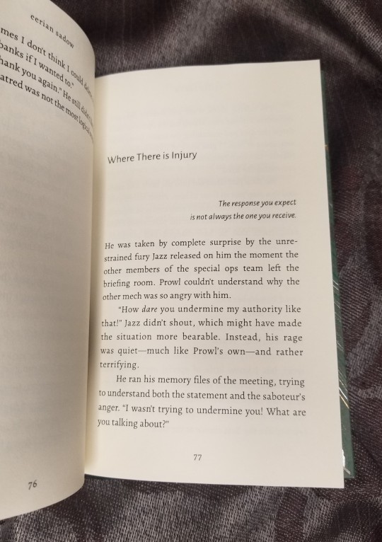
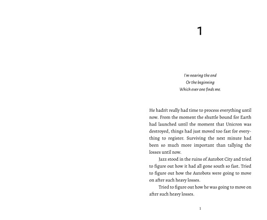
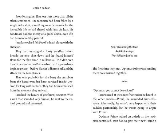
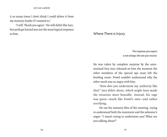
Nights in Your Arms by eerian sadow | 131 pgs
Days in Avalon
Homecoming
There Will Be Love
Some Say Love
This is another one of the books I did for the Binderary challenge in February. I'm kind of annoyed I didn't take very good pictures of this book, as I think it was a cute little volume. I had a lot of fun with the layout--it was the first time I've ever formatted a song fic (that made me feel pretty nostalgic NGL). It was a bit of a challenge because there were a bunch of small chapters and subsections, so at first I wasn't sure of the best way to organize things.
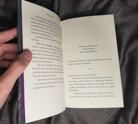
I put some screenshots of the layout under the cut, which is probably not too interesting unless you're planning on typesetting your own books.


45 notes
·
View notes
Text
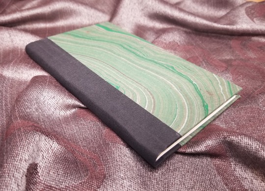
All That is Gold by Rizobact
26,148 words | 105 pgs


This was for a bookbinding challenge I did in February, and I think it turned out very beautiful, mostly due to the materials.
Actually not much to say about this project, the typesetting and design was really basic. It is the first time I've used that particular bookcloth and added a two-page spread.

The bookcloth has a beautiful texture and you can see how it shimmers in the video.


I was so stupid trying to figure out this spread because I used a different paper than the rest of the textblock, and couldn't figure out how to sew it in. Should I make a one page signature, tip it into the book, or what? Then I had the obvious realization to just work with the layout to make sure the spread is in the middle of the signature.
114 notes
·
View notes
Text
With Absolute Splendor by Lise (@veliseraptor)
43,533 words | 170 pages
Bound for @ehyde for the Renegade Bindery book exchange


I am so happy about the colors of this book turned out. Originally I was planning to use some red paper for the cover, but then realized how much it didn't match the endpapers. The orange and black turned out so much better than my original idea.
Fonts: Sabon and Spectral
Bookcloth: Yellow-Orange Duo
Cover: Marbled cotton rag
Endpapers: Marbled mulberry
There really isn't anything new or interesting I did in the construction. I did made endpapers because the paper is too thin to work otherwise. I really like how this particular paper looks but it's also translucent enough that if you don't put some other paper down first, you can see the book board underneath.
The cover paper in contrast is really sturdy, and I really recommend it, very easy to work with. The yellow-orange Duo bookcloth is also good quality, the only thing to remember is that unlike most other bookcloths it has a definite grain direction.


81 notes
·
View notes
Text
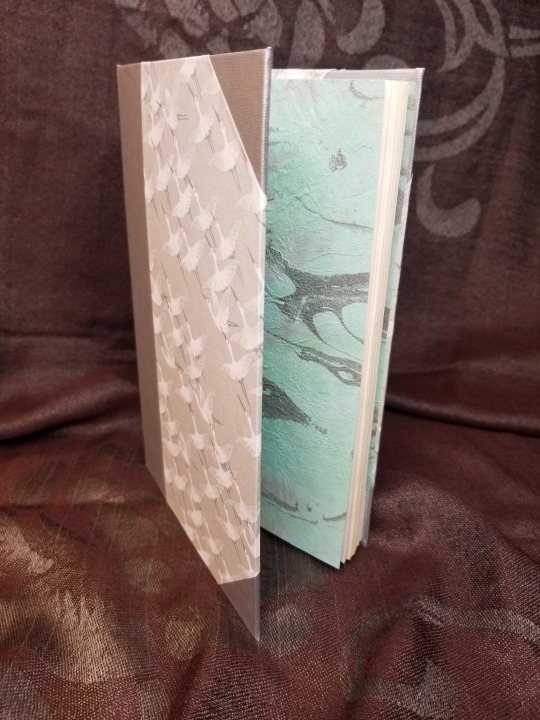
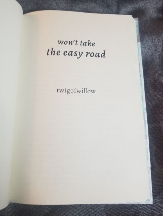
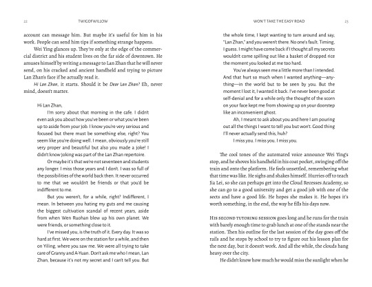
won't take the easy road by twigofwillow
47,173 words | 158 pages
Bound for @ehyde for the Renegade Bindery book exchange

I've actually read a ton of MDZS/The Untamed fic, but I hadn't bound any for myself yet, so it was interesting deciding on the design of this book. I think it came together in the end, though I have to admit, I just went with vibes rather than anything more complex. IDK, I guess to me the fic just had such a gentle mood, I wanted to match that it some way.
Font: Alegreya and Alegreya Sans
Bookcloth: Luminescent Sterling
Cover paper: Yuzen with crane pattern
Endpapers: Marbled momi
This book has made endpapers, the momi is too thin; it feels like tissue paper. Unfortunately, I don't really see being able to use it on covers.
Normally taking video is just self-indulgent, but the yuzen paper has a beautiful pearlescent quality that I found very difficult to photograph, so hopefully it's easier to tell how it looks on video.


There were several text messages and such in this fic, I think that the Alegreya serif and sans serif works really well for that type of thing. I've never used Alegreya before, but I really ended up liking it.
64 notes
·
View notes
Text


My first time doing a springback binding; I mainly followed DAS Bookbinding's guide, except for some places I cut corners. I don't know how obvious it is, but the benefit is that with longer books, it will lay flatter than a regular casebound binding. The spring action is pretty cool; if you open it in the middle like I did in the video, after it gets past a certain point the spring will open the book automatically.
It's a copy of Eugenesis, but I'm planning to make another (better) version, as I had some problems with the toner smudging.
61 notes
·
View notes
Text

So it's not too interesting, but last week I finished up another 3 copies of Crystal Ghosts for some people in the J/P discord server I'm in. Which makes 7 copies of the book I've made so far. 😅 I think I'm taking a break with this one for a while.
I added some vinyl along the side this time, which was surprisingly annoying, probably because I'm an idiot and ironed on after the case was complete. I also changed the title page a bit on one of the copies, which I think looks a bit better.
Blue and white: paper was this marbled lokta and the bookcloth is this starched linen
Orange and pink: marbled mulberry paper (which was very thin, so I put some other paper undeneath) and Arrestox black bookcloth
Blue and gold: lokta paper and the same Arrestox black


If you're interested in bookbinding minutiae check under the cut to check out my flawless endpapers and headbands lol
A lot of people have trouble with their endpapers wrinkling but I've been lucky enough to never have a problem with it. Anyway, I'm proud how neat they turned out. It's all scrapbooking cardstock from Michael's.


Someday I'll learn how to take better photos.
The headbands is same old, same old, but I finally thought of using leather cord for the core instead of nylon, and it's so much easier. No need to mess around with gluing the end of the cord.


29 notes
·
View notes
Text
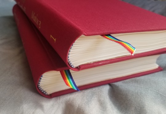
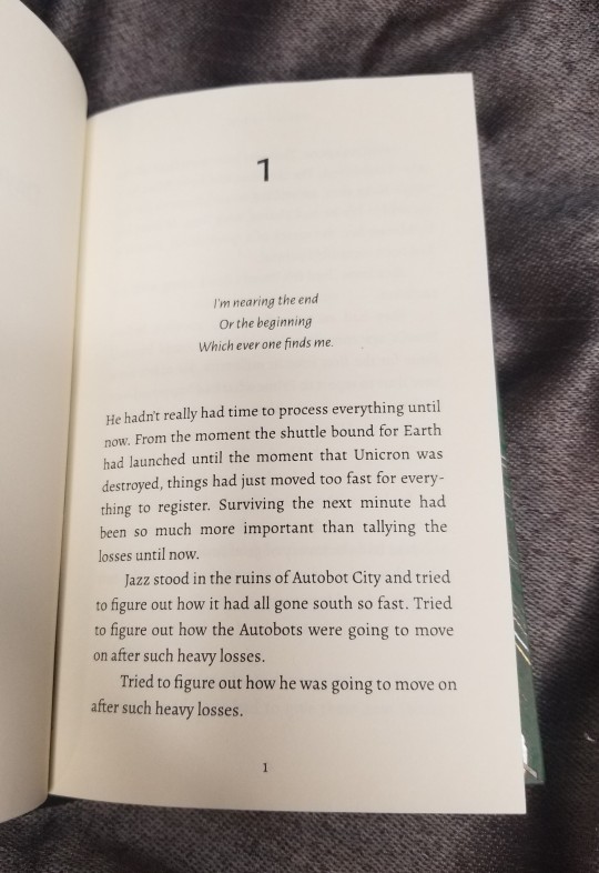
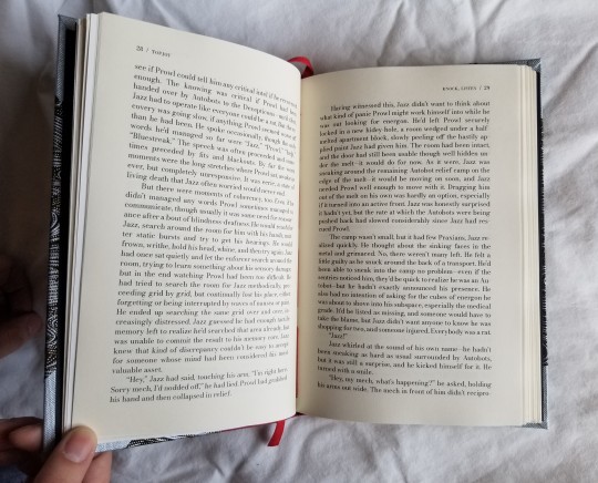
Crystal Ghosts by Rizobact:
Enduring as Crystal / Eternal as Love
85,688 words
264 pages (5.5 x 8.5 in) / 373 pages (4.25 x 7 in)


Fandom: Transformers
Pairing: Jazz/Prowl
This is such a fun and imaginative fic! I really enjoy the world-building in this story; it takes the TF canon and reworks it in such an interesting way. Plus ghosts! What more can you want? I'm looking forward to rereading this, now that I've bound it.

Fonts:
Body: Bodoni
Titles: Pretty Real and Marquisette
Materials:
Bookcloth: Dubletta gray
Title: Cricut Everyday Iron-On, black
Text block: Hammermill copy paper 20lbs; Londonderry linen thread 30/3, ivory
Headbands: Soie Perlee Silk Thread, Tapestry Purple #348; shimmer lavender embroidery floss
Bookmark: 3/8 in. lavender shimmer grossgrain ribbon
For several tedious reasons, this project took me quite a while to complete (including that I made 4 copies 😱). So, I don't quite remember my thought process or inspiration from choosing the layout. I think that mainly wanted to emphasize the fantasy/fairy tale vibe I get from the fic, as well as the whole "crystal" element. At first I looked over several "mystical" vector files for pictures of crystals, but I couldn't find anything that looked good; I ended up simplifying the idea and using simple shapes.
I normally don't go for pastels, but the lavender cover paper with the metallic flecks matched the mood I was going for. (I can't find the specific paper online; I got it from a local store, but they don't have a website to order from unfortunately.) The addition of the shimmer in the ribbon and embroidery floss, also went with the theme, as well as satisfying the part of my brain attracted to shiny objects. I had difficulty taking good pictures, but you can see the metallic flecks and texture of the paper better here:

On this project I learned was that wheat paste can really save you from mistakes. Previously, I used PVA glue to put on the cover paper. This time I mixed PVA and wheat paste together. And as is my habit, I placed the paper on crooked. 🙃 I've done the same with PVA before, and had to cut a whole new paper out. But this time I was able to just peel off and try again! So definitely recommend. (A lot of recipes say to use a stove, but I've had perfectly good results using a microwave instead).
For the image in the smaller book, I printed on some inkjet matte paper I've used before, but for the larger book I wanted paper that wasn't quite as thick and would lay better. I got it printed at FedEx Office, which I would recommend checking out if you have one in the area. I've printed images at Staples before, but (for at least the one near me) they don't have good options for matte paper. FedEx definitely had a better choice of paper (mine also have an up-and-down paper guillotine, instead of a swing one--check it out if you need some paper or bookboard cut).
However, I realized that laser printer makes the image come out darker as compared to the inkjet (as you can see below). So that's something to take into account the next time.

Some interiors of the smaller book as well:

Not much to say about the headbands, except that they are so fiddly to do, I always want to include a picture of them to commemorate my efforts lmao. That, and that sewing through grossgrain ribbon is easier than satin.

93 notes
·
View notes
Text
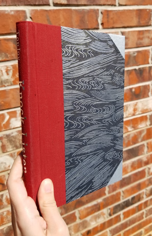
Knock, Listen by TopJoy
59,205 words | 213 pages
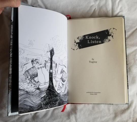


Fandom: Transformers
Illustration by amne-chan
When I first started this hobby, this is one of the first fics that I knew I wanted to bind. I find it very viscerally engaging; every time I read this story there comes a point where I have to stop and take a moment to collect myself, it pulls on my emotions so strongly.
Ah, I can't describe quite why I like this fic so much. I find the more I'm emotionally affected by something, the less I can pin down the reason. But one of the things I really love is Prowl's interpretation of the world following his brain injury; the imagery and sensory details used are so interesting to me. Then seeing what he is experiencing from the outside as the story switches between different characters--I really love that kind of interplay between contrasting POVs.
More pics and details after the cut:
Fonts:
Body: Bodoni
Titles: Triptych
Materials:
Bookcloth: Lustre metallic silver (?)
Cover: Chiyogami, silver swirls & gold dots on black
Headbands: DMC Diamant D321 Red; DMC Pearl Cotton Size 5, 310 Black
Title: Cricut Foil Iron-On
Text block: Hammermill Cream 20lbs
Author Copy:
Bookcloth: Brillianta brick (?)
Bookmark: 1/4 in. red Italian cotton ribbon
Text block: Epson premium presentation paper matte; Londonderry linen thread 30/3, Wild Rose
My Copy:
Bookcloth: Asahi crimson
Bookmark: 3/8 in. burgundy satin ribbon
Text block: Lineco linen binder’s thread

I actually ended up making two slightly different copies of this book. That's because I always make my copy first, so I can make all the mistakes on it, instead of the author's copy. Mainly, the bookcloth and paper used to print the illustration are different.
For a long time I was very ??? on the layout of this book; I really couldn't decide what I was going for. Then I realized...I had a fanart I had commissioned earlier that already matched the imagery of the story. So then it was fairly easy to figure out. The other images for the title page and the chapter titles were some free vector graphics.
I wanted a borderless illustration, so (for the author's copy) I used 8.5x11 matte photo paper. Even though the color is different, I don't mind it, and I think the image quality is much better. However, you do end up with a sheet of paper in the middle of the signature that is the wrong color... In retrospect, I should have cut down the sheet on the right side, so it was close to the margins.
I ordered a mixed bundle of bookcloth from this supplier, so I'm not sure exactly what the brand or color is of the silver for the corners and the spine on the author's copy. For my copy, I used this crimson asahi bookcloth, which is not as nearly forgiving to mistakes. It's not coated, so if you get glue on the fabric side, you can't really get it off properly; I tried to blot it some off with water and it left a stain. 🙃
It also has this raised texture, which I'm not really a fan of; it makes me nervous I'm going to snag and rip it somehow. I think it would be more suited to something that doesn't get a lot of handling, or at least someone who is more careful than me.
The next two pictures are of my copy; you can see some of the headband details and texture of the bookcloth. The video is also of my copy, because I forgot to make one of the (better) author's copy. T_T
337 notes
·
View notes
Text
Audition by crabapplered
12,783 words | 55 pages


Fandom: Transformers
Pairing: Jazz/Prowl
Illustrations from Eine Neue Groteske
This is it, this is the story that got me into Jazz/Prowl. Such deft characterization and prose, such a beautiful exploration of Prowl in particular, words really cannot express how much I adore this fic.
I bound this twice: first in a slightly modified stiffened paper binding, second in coptic stitch.
More pics and details below the cut:
Fonts:
Body: Bodoni
Titles: Lydian
Materials:
Bookcloth: recycled from a photo album
Cover: Marbled Lokta, gold and black on blue; eyelets (coptic); Marbled Indian cotton rag, black and gold (stiffened paper)
Title: Cricut Foil Iron-On
Text block: 5x7 in. greeting cards; Londonderry linen thread 30/3, black; DMC Pearl Cotton Size 5, 3844 Dark Bright Turquoise (coptic); Hammermill copy paper 20lbs, Lineco linen binder’s thread (stiffened paper)
Comparison pictures between coptic (left) and stiffened paper binding (right):


For the first book, I followed DAS’ tutorial on German stiffened paper bindings. However, I did end up modifying it so that the bookcloth covers the top of the boards. So, it’s a bit of a mix between the stiffened paper and case bound book.
For the spine, I used black paper and red bookcloth I recycled from the cover of a photo album. I really like how the gold iron-on vinyl looks on the texture of the black paper.


On my second copy, I followed this tutorial on coptic binding. I had never done coptic before, and was finding it extremely difficult; I actually had to take out the sewing from my first attempt and try again. However, the second time I used a curved needle, and I cannot stress enough how much easier it makes things. My first try took me an hour, and my second 15 minutes.
The eyelets were easier to add than I thought they would be. I drilled a hole with a pin vise, then punched them in with eyelet pliers. If you try this, make sure you get the correct length; mine ended up slightly too short for the thickness of the boards and didn’t punch through all the way, so the inside doesn’t look as good in comparison.
I wanted to make the textblock thicker to show the coptic binding technique more, so I cut down some blank 5x7 greeting cards to the correct dimensions and decreased the signature size from 16 to 8 pages. It sort of works. The paper definitely has a nicer texture and color compared to the copy paper, but on some pages the toner didn’t print correctly and came off when touched. Possibly you would get better results on an inkjet.
I’m still not sure what I think about the coptic binding. It does look very elegant, and the way the pages open flat is definitely a benefit. However, I think you have to be much more careful in construction or it ends up looking sloppy. Which as a person who is always getting measurements incorrect, it was kind of annoying.
I'm enjoying making these tiny books a lot; it presents some unique challenges and there is more an opportunity to try new techniques. After all, if you make a mistake, you won't have to reprint 300 pages and try again.
134 notes
·
View notes
Text
Laid to Rest by acernor
67,946 words | 224 pages

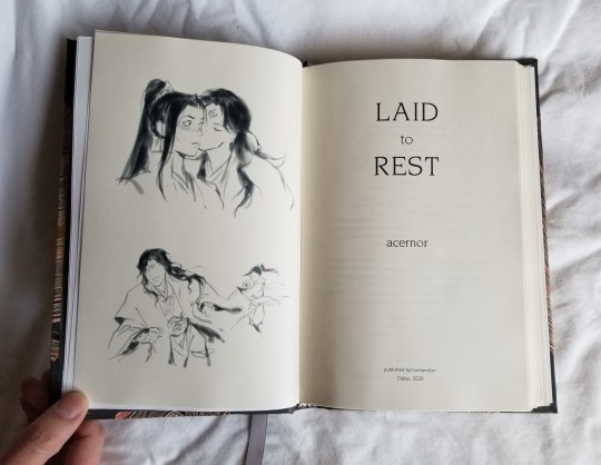


Fandom: The Scum Villain's Self-Saving System by Mòxiāng Tóngxiù
Pairing: Liu Qingge/Luo Binghe/Shen Qingqiu
Illustration: Xiao Tong @velsmells
Wow, this book ended up being much more of a project than I anticipated, as you can see from the "published in 2020" on the title page. It's three months later, and I've finally finished! 🥰
I absolutely adore this fic, such a great character study and coda to the novel, and of course some excellent porn with feelings. Such exquisite writing, one of my favorite SVSSS fics! I’m ashamed to admit, when I first read Scum Villain, Liu Qingge didn’t make much of an impression on me; I credit this story for showing me the light. So earnest, so awkward, really just my favorite kind of character.
Continue past the cut for my ~process~ (ノ◕ヮ◕)ノ*:・゚✧
Fonts
Body: Cheltenham
Titles, header and page numbers: Novarese and Gill Sans
Materials
Bookcloth: Arrestox pewter
Cover: Gray, pink, and gold marbled jute fiber paper, 96 gsm
Headbands/bookmark: DMC Diamant D140 Black Gold; DMC Pearl Cotton Size 5, 353 Peach; 3/8 in. grey satin ribbon
Title: Cricut Foil Iron-On
Text block: Hammermill Cream 20lbs, Lineco linen binder’s thread
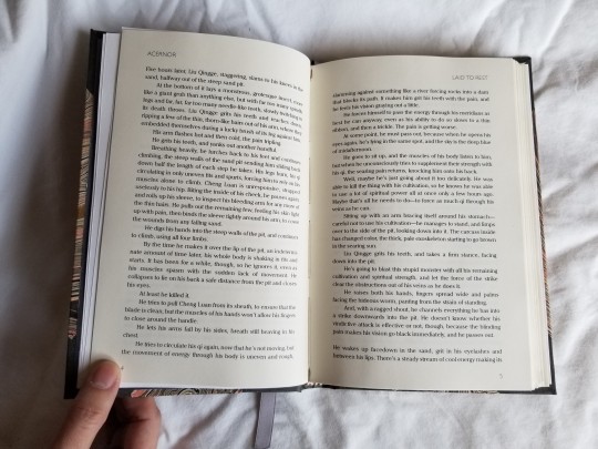
Unusually for me, I made my decision for the layout pretty quickly. I knew I wanted something that looked like a contemporary fantasy book. In particular, the 1 inch indent on the opening chapter paragraph, parallel with the chapter title, I saw in Gideon the Ninth. I think it really gives an elegant, modern feel. I did the same mixture of Cheltenham for the body text and Gill Sans for the header and page numbers in my previous project, astolat’s And I Alone Have Escaped to Tell You.


(Comparison with Gideon the Ninth, as well as some clearer pictures of the layout because I can't take focused photos to save my life)
I debated for a while about the cover paper: I thought maybe something blue, white, and/or gray would work as Liu Qingge’s colors, but I couldn’t find anything I liked. My next thought, was, Hey, this pink/grey paper I already have looks blood-ish … demon blood… 🤔 So, it’s not much of a thought, but the combination with the gray bookcloth turned out so well, I can’t really complain.
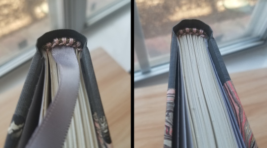
For this project, I did zig-zag endpapers using DAS bookbinding’s tutorial, which was frustratingly vague at parts. But I much prefer the end results compared to pasted on endpapers, and I’m going to continue to do it in the future. However, I was a bit dumb, so I pasted paper over the spine as reinforcement…but that also went over part of the hinge, so it doesn’t flex as much as it should. Well, you live and learn.
Once I found this tutorial, I was able to make the headbands very easily. The use of tissue paper makes starting much easier and the process much less fiddly. I think that the satin ribbon looks pretty, but in the future I want to use cotton, and for books of this size, a smaller width. Getting the needle through the weave and keeping the ribbon centered was difficult.
I used my sister’s Cricut machine to cut out the titles, and I was really surprised how it cut out the thin serif font. Unfortunately, I had already constructed the case so I couldn’t properly lay it flat on the ironing board--would not recommend.
For a long time I've been hesitant to make wheat paste, since PVA worked fine already (and I hate trying new things). But it was so easy, I’m annoyed I didn’t do it sooner. Water, flour, a microwave, that’s all you need. I got a much smoother application with a mixture of paste and PVA, as I wasn’t rushing to put down the endpapers before the PVA dried up.
I tried a few new things with this project: using zig-zag endpapers, adding headbands and a bookmark, titling the spine, and gluing the endpapers with a paste/PVA mixture instead of straight PVA. I really think it ended up creating a more professional-looking book.
Thank you, acernor, for writing such an excellent fic, that was such a pleasure to bind! As well as to velsmells for graciously giving permission to use their artwork, and everyone on the Renegade Bindery discord who took the time to give me advice and feedback. 💖
303 notes
·
View notes

