
Download free Vector icons in SVG and PNG formats. Modify and Edit SVGS, Made for designers by the designers.
Don't wanna be here? Send us removal request.
Statistics
We looked inside some of the posts by iamvector and here's what we found interesting.
Average Info
Notes Per Post
0
Likes Per Post
0
Reblog Per Post
0
Reply Per Post
0
Time Between Posts
8 days
Number of Posts By Type
Text
17
Last Seen Tumblr Blogs


Fun Fact
69% of Tumblr users are millennials.
Text
20 Graphic Design Tools to Revolutionize Your Projects [2024]
In the dynamic landscape of graphic design, staying ahead often requires the right set of tools to bring creativity to life. Whether you’re an experienced designer or starting out, the latest graphic design tools may help you alter your work. In 2024, the field of graphic design continues to expand, with a plethora of modern applications and resources at your disposal. From industry-leading software suites to specialized tools for specific design tasks, the alternatives are many and varied.
In this article, we will look at 20 graphic design tools that are influencing the future of design. They assist you in transforming your thoughts into appealing designs that create an impact. Join us as we explore the amazing world of graphic design tools. Here, innovation meets imagination, and opportunities abound.
Importance of Graphic Design:
Graphic design is vital for modern communication. It serves as a visual language that links ideas and people. In today’s digital world, compelling pictures are essential for attracting attention. They aid in conveying messages clearly and establishing connections. It allows companies and people to stand out online, from social media postings to website designs. Graphic design goes beyond looks; it shapes how we perceive things online, boosts engagement, and influences our online experiences.
Top 25 Graphic Design Tools:
If you enjoy graphic design software and applications, you understand the importance of having the correct tools. These technologies enable graphic designers to produce appealing projects. As technology advances, new programs and software emerge every year, altering the sector.
We’ve compiled a list of the best 20 current graphic design apps so you can play with the most powerful tools and elevate your work.
Let’s start by exploring the best graphic design tools essential for content creators.
Canva
Canva is a flexible graphic design tool noted for its simple UI and powerful functionality. It provides a variety of design components, templates, and customization choices. This level of accessibility is appropriate for both beginners and professionals. Canva allows customers to create great graphics, presentations, social media posts, and other content. Its simple drag-and-drop interface enables rapid and easy design development. Its huge library of templates and design components serves as both inspiration and help.
Canva’s collaborative features also allow teams to collaborate on projects. Canva simplifies graphic creation by offering a full platform. It allows users to express their creativity and create professional-quality designs without requiring large design knowledge or technical abilities.
Adobe Photoshop
Adobe Photoshop is an excellent choice for graphic design, having all the tools you want. It helps people to realize their creative concepts. Its powers span from simple picture editing to intricate digital artworks and photo manipulations. Photoshop provides designers with a broad set of tools and functions. It allows them to have exact control over every component of their ideas, resulting in pixel-perfect output.
Some key features include layers, filters, masking, and advanced editing tools like the Content-Aware Fill and Puppet Warp. The features make design workflows more flexible and efficient. They allow designers to explore and create high-quality visuals. Photoshop is an essential tool for graphic artists. This is due to its versatility, strength, and ability to create appealing designs for a variety of tasks.
Adobe Illustrator
Adobe Illustrator is a prominent vector graphics editor known for its versatility and accuracy. Illustrator provides a robust framework for producing scalable graphics. This is due to its focus on vector-based design. Its distinguishing characteristics include a variety of tools designed for graphic design, illustration, and typography. These instruments enable the fabrication of complicated patterns with unmatched precision.
Illustrator’s extensive toolbox allows users to modify shapes, lines, and colors. This encourages the creation of visually appealing artwork. Its connectivity with other Adobe Creative Cloud products makes workflow more efficient. This makes it a useful tool for both pros and amateurs. Adobe Illustrator allows designers to express their ideas. They can create amazing, scalable visuals that take their ideas to new levels of brilliance.
Read rest of the article here
0 notes
Text
The Power of SVG Icons in Elevating Your Brand Game
In today’s digital age, visual communication plays a pivotal role in shaping brand identity and perception. SVG icons use math equations instead of pixels to create shapes and lines, unlike traditional images. They are a type of digital graphic designed for scalability and clarity across various screen sizes. These icons can be scaled without losing quality, making them perfect for digital applications. This unique feature sets icons apart and ensures they remain crisp and clear at any size. Visual branding is about making a consistent look that shows what a brand is like. This includes things like logos, colors, and pictures that all fit together to show what the brand stands for.
SVG icons are crucial for visual branding, making designs more captivating and reinforcing brand identity. They enhance user experience by adding visual interest and clarity to digital content. SVG icons are scalable and flexible, unlike traditional raster icons. This versatility makes them ideal for use on different digital platforms and devices. SVG icons, versatile tools for website navigation and social media graphics, empower brands to communicate . They contribute to creating memorable brand experiences for consumers. In this guide, we’ll discover the Power of SVG Icons and how it can transform brand identity and perception. We’ll explore their power to make brands stand out and be noticed.

Understanding SVG Icons
SVG Icons
SVG icons are visual components that use mathematical equations rather than pixels. They provide scalability and versatility across a variety of screen sizes and resolutions. This means they can be larger without losing quality, making them suitable for a variety of digital applications. These icons vary from standard raster graphics, which use a set grid of pixels. They are resolution-independent, providing sharpness and clarity regardless of display size or resolution.
Advantages of SVG Icons over Traditional Image Formats
One of the primary advantages while using Power of SVG Icons is their scalability. Traditional image formats like JPEG or PNG use pixel-based graphics, which can look blurry when resized. They can retain their sharpness and clarity even when scaled up or down, unlike raster-based formats. This feature makes them ideal for responsive web design and high-resolution screens.
Another major role of SVG icons is their minimal file size. Because SVG files are based on XML code rather than pixel data, they are far lower in size than raster graphics. This not only speeds up page loading times, but also decreases bandwidth use. This makes SVG icons an effective option for web developers and designers.
Versatility and Scalability of SVG Icons
SVG icons provide exceptional flexibility. They allow designers to create elaborate forms and effects that exceed the restrictions of standard image formats. These icons provide designers many customization options, including simple shapes to intricate images. This freedom allows designers to express their ideas without constraints.
Also, they are scalable, which means they can be stretched to any size while maintaining detail and quality. These icons are adaptable and can be used for a variety of purposes, including website graphics, mobile app icons, and printed items. Hence, the power of SVG icons is justified. Their scalability offers bright, clear pictures across all sizes and resolutions. Whether on a small smartphone screen or a gigantic billboard, SVG icons keep their visual integrity and impact.
Read rest of the article here
0 notes
Text
Boost Your Site’s Appeal with The Trendy SVG Icons
When you visit a website, what’s the first thing that catches your eye? It’s often the visuals, right? Well, that’s the power of visual appeal in web design. Imagine a website without any images, colors, SVG icons or attractive layouts. It would be like a book with no cover—not very enticing. Visual appeal is crucial because it’s what draws people in and keeps them engaged. Think of it as the first impression your website makes on visitors. If it looks outdated or unattractive, they might leave before even giving your content a chance. So, creating an appealing website is key to grabbing attention and making a lasting impact.
Now, let’s talk about Free SVG icons and why they’re a big deal in web design. SVG stands for Scalable Vector Graphics. Unlike traditional image formats like JPEG or PNG, SVGs are based on mathematical equations rather than pixels. This means they can be scaled to any size without losing quality, making them perfect for responsive web design. Not only that, the icons are lightweight, which means faster loading times for your website. Plus, they can be customized using CSS, allowing for endless design possibilities.

What are SVG Icons?
Engaging SVG Icons are like magic pictures for websites. They’re not like regular images you see online. Instead, they’re made using a special code called XML. This code describes how the icon looks—its colors, shapes, and all the details.
One cool thing about SVG icons is that they can change sizes without getting blurry. Whether you’re looking at them on a tiny phone screen or a big computer watch, they stay clear and sharp. This makes them perfect for any device, from phones to tablets to computers. Another neat trick of SVG icons is how they adjust to different screens. No matter if you’re using a small phone or a big TV, these icons always look right. They’re like superheroes in web design, always ready to fit in wherever they’re needed.
So, why choose SVG icons over regular images? Well, they’re super flexible. You can change their colors, make them transparent, or even add special effects with a little bit of code. This means you can match them to your website’s style and make it look extra awesome. With these icons, your website can stand out and look great on any device, making everyone who visits smile.
Importance of Trendy Icons in Web Design
Trendy icons are like the cool stickers that make a plain notebook look awesome. They do a lot more than just look nice on a website. These little pictures actually help you find your way around. You know those tiny pictures you see on websites, like a little house for the homepage or a magnifying glass for search? Those are icons! They make it easy for you to understand what each button does without having to read a lot of words.
When websites use high-quality SVG icons, it’s like adding some fun decorations to a party. They make the website look stylish and exciting. Plus, they make it easier for you to find what you’re looking for. Imagine going to a website and seeing everything in plain text. It would be like reading a big book without any pictures – not very fun, right? Trendy icons make the website more interesting and make you want to explore it more.
Some websites are really good at using trendy icons to make things look awesome. Think of websites like your favorite fashion brands or cool tech companies. They use icons that match their vibe and make everything look super sleek. And when you’re browsing on your phone, these icons still look great and are easy to tap on, no matter how small your screen is. So, next time you’re surfing the web, keep an eye out for those trendy icons—they’re like little pieces of art that make your online experience more enjoyable!
Popular Trends in SVG Icons:
SVG icons are really popular on websites nowadays. People like them because they can change size without getting blurry. They’re also small files, so they don’t slow down websites. And guess what? You can easily change their colors and sizes with CSS. That makes them super flexible! Since websites need to work well on all devices, these icons are perfect because they look good on any screen. Plus, they’re great for people who need special tools to use websites. The icons are a hit because they’re easy to use and make websites look awesome!
Let’s have a look at some popular trends:
Exploration of current design trends in SVG icons: Designers are looking into what’s cool and new about making icons. They’re trying out different styles and tricks to make icons that catch people’s eyes and stay modern.
Minimalist designs: Some icons are getting simpler. They’re cutting out extra stuff and just showing what’s important. These simple icons are easy to understand and look good, making them great for apps and websites.
3D icons: Now, some icons aren’t just flat. They look more real, like they’re popping out of the screen. Designers are using special effects to make icons have more depth and look more interesting.
Animated icons: Some icons are moving now! They’re not just sitting there; they’re doing stuff. These moving icons catch people’s attention and make things more fun. They’re perfect for making websites and apps more exciting.
Illustrative icons: Some icons are like tiny drawings now. They’re really detailed and show a lot. Designers are making icons that look like little pictures, so they tell a story or make people feel something. These icons have a lot of personality and make things more interesting.
Read rest of the article here
0 notes
Text
Benefits of consistency for brands in terms of their logos and fonts
Consistency is essential for good branding, as each contact reinforces a brand’s identity and values. Logos and fonts are important components of visual branding since they serve as the foundation for brand identification. Consistency in logos and typography across several devices is critical. It aids in building brand awareness and consumer trust. This article discusses the several benefits of brand logo and typeface consistency. It investigates how this strategic approach promotes brand recognition, customer trust, and long-term loyalty.
Consistency in visual aspects, whether in the form of a timeless logo design or a certain font type, improves brand identification. It also creates the brand’s personality and ideals in the minds of consumers. Brands can offer memorable experiences for their audiences by establishing a consistent visual identity. This promotes engagement, loyalty, and corporate success. For creating more engaging logos with certain fonts, the use of SVG icons is the most effective method.

Let’s explore the value of consistency and how companies may use it to stand out in a competitive market.
Establishing Brand Identity
Definition of Brand Identity
Before getting into the benefits of consistency, it’s important to grasp the concept of brand identity. Brand identity refers to the visual and linguistic aspects that set a brand apart from its rivals. It also shapes customer perceptions. Logos and fonts play a crucial role in communicating a brand’s identity. They represent its values, personality, and offerings.
Role of Logos and Fonts
Logos and fonts serve as the foundation of brand identification. A logo is a visual emblem that captures a brand’s soul. Fonts influence the overall tone and personality of brand messages. Consistency in logos and typography guarantees that every engagement with the brand strengthens its identity. This instils trust and recognition among consumers.
Impact on Brand Recognition
Consistency in logos and fonts helps to increase brand identification. When customers see the same features of a brand on a regular basis, they form strong associations with it. This association makes it easier for customers to recognize and remember the brand. This applies even in crowded and competitive marketplaces.
Building Consumer Trust
Consistency in logos and fonts improves brand identification while also increasing customer trust. When consumers observe consistent branding, they believe the brand is trustworthy and dependable. This view leads to a gradual growth in trust and loyalty. Also, consistent branding instils confidence in customers. It reassures them of the brand’s credibility and competency.
Read rest of the article here
0 notes
Text
Base64 Encoding Assets – Everything You Need to Know
A person can convert an image to various formats such as PNG, SVG, JPEG, Webp, and even Base64 strings. If you’re reading this article, you might be familiar with all image formats except for Base64 strings. Hence, we’ll guide you through the what, when, where, and why of Base64 in this blog to help you use it more confidently in the future.

What is Base 64?
Base 64 is a general term for different encoding schemes that are similar to each other. Primarily, one can encode binary-to-text where the binary is represented by a printable ASCII format. Each of the digits of Base 64 represents 6 different bits of binary data collectively. Basically, by using Base64 Encoding Assets one can turn binary data into their text format to enable easy transmission of data through emails and HTML formats.
Base 64 is a simple coding algorithm whether used while encoding or decoding details and has a 65 character subset. A 6-bit binary string is what comes up from the Base 64 data wherein the 65th character serves as the pad that can be called the end. It is used for achieving a proper size with all the 64 data.
Feeling overwhelmed at this point? Wondering if there’s a straightforward solution to convert your files? This article aims to simplify Base64. To start, we’ll introduce a simple converter that allows you to convert all your free SVG icons files into their Base64 string.
You must have known by now what a Base64 Encoding Assets is all about, next we will head to the next big question and that is, when & how can one use the Base 64 image strings?
When to use Base 64 image strings and how
The inception of Base 64 stringed data took over after emails became a necessity. Initially, emails were just mere texts but then came the scope of attaching images and media files to it. In the first few years, image files sent over the internet used binary data. However, it was noticed that the chances of the raw binary data becoming corrupt were high. To handle this problem, Base 64 came into existence.
It was noticed that binary data consisted of several null characters which in some of the other computer languages represent the end limit of character strings. Ideally, if the original information can be transmitted in multiples of three, everything works well. However, if they’re not multiples of three, you’ll end up with empty bytes. The raw form of binary data containing null characters can stop a file from being intercepted completely when send and that is why it was primarily introduced.
In Base64 Encoding Assets, these empty bytes are tagged with 0 to form a 3-byte group thereby solving the problem.
Generally, for C and C++, 00 at the end of a raw binary data string will be read as a stop here sign.
Read rest of the article here
0 notes
Text
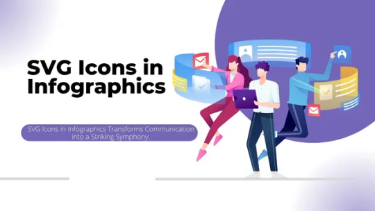
Role of SVG Icons in Infographics for Visual Communication
Ever wonder how those cool infographics get their groove? Enter SVG icons, the unsung heroes of visual communication! This deep dive into the crazy world of infographics reveals how these icons transform dull data into a visual feast. With their remarkable scalability and razor-sharp quality, SVG icons in infographics make work sparkle and sizzle.
So, why does this matter? When we try to offer ideas or information, we want to make it as simple as possible for everyone to grasp. Icons like Social Media Icons can help us achieve precisely that. They’re like little superheroes who make our image seem fantastic.
In this adventure of the role of SVG icons in infographics , we’ll look at how these unique icons interact with our informational images. It’s like a hidden code that makes our stories more interesting and simpler to follow. Let’s pull back the curtain and see how they transform infographics!
Understanding SVG Icons
SVG icons work similarly to digital stickers on web pages. They are unique in that you may adjust them without losing clarity. Consider them to be clever stickers that look excellent regardless of size. These icons, unlike conventional graphics, are created using arithmetic rather than small dots. It ensures that they remain sharp and clear on any platform.
This makes them useful because they can fit exactly on any screen, be it a little phone or a large PC. What is the best part? They’re willing to adjust! SVG icons for branding, are like superheroes, and may alter size and shape to suit wherever they are needed. This improves the appearance of websites while also making them more user-friendly. So, the next time you see a nice tiny image on a website, it may be an icon working its magic!
The Significance of Infographics
Infographics are like friendly guides that make information easy. They are significant because they convert difficult concepts into visuals and phrases. All these are simple to understand and remember. Our brains prefer visuals, and infographics use them to help us grasp information better.
Now, meet the SVG icons. They’re similar to infographic assistants. These icons can change size without becoming blurry. They work with infographics to ensure that the images remain clear and great whether you’re on a large computer or a little phone. Think of infographics as storytellers and icons as the magic that keeps the tale looking good. SVG icons in infographics work together to make learning and comprehending very enjoyable and simple!
SVG Icons vs. Traditional Image Formats
The icons are the agile and adaptive alternative, winning the game with reduced file sizes and superior quality on every platform. JPEG and PNG, while still dependable, may weigh down with bigger file sizes and exhibit some wear and tear when scaled. Let’s compare SVG icons to classic picture formats like JPEG and PNG.
File Size Considerations:
SVG Icons: The icons are file-size magicians. They are frequently smaller in size than JPEG and PNG files. Why? Because SVG is based on arithmetic rather than dots, it requires less space to hold information. This means that webpages load faster, and users don’t have to wait for icons to show.
JPEG and PNG: These conventional image formats are old-school heavyweights. They consume a lot of space to hold pixel information, resulting in bigger file sizes. This might cause webpages to load slowly, especially if there are a lot of photos.
Retaining Quality Across Devices:
SVG Icons: They are the adaptive superheroes. They maintain their sharpness and clarity regardless of the device or screen size. The icons look great on every device, whether it’s a phone or a computer screen.
JPEG and PNG: These formats seem more like fixed superheroes. While they’re good at what they do, the quality may differ when resized. Enlarging them might result in a loss of quality, making the photographs appear pixelated and less crisp.
Read rest of the article here
0 notes
Text
Exploring the Versatility of Free Social Media Icons
Working with social media and wondering how you can create better designs for it? Here come the social media icons into play. These icons not only enhance the design but also add an X-factor to your work. The use of well-designed icons can significantly enhance the overall aesthetic and functionality of a website or graphic. Social media has a big impact on how people connect and share information. The visual elements play a crucial role in the overall user experience and design look.
Grasping the depth of these icons unlocks doors to imaginative and enjoyable design possibilities. Come along on this journey as we uncover how the versatility of free social media icons can be a potent tool for crafting engaging and effective digital experiences.
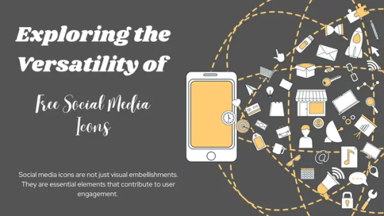
The Impact of Social Media Icons on User Engagement
Social media icons are not just visual embellishments. They are essential elements that contribute to user engagement. A well-placed and appealing set of icons can encourage users to connect with a brand across various platforms. Consider popular websites like Facebook, Twitter, and Instagram. Their icons are instantly recognizable, creating a seamless and intuitive user experience.
Icons serve as visual cues that guide users to share content, follow a page, or engage in social interactions. A well-designed set of SVG icons can evoke trust and credibility. It ultimately positively influences user behavior. As digital experiences become increasingly visual, the importance of icons in web and graphic design cannot be overstated.
Types of Free Social Media Icons Available
The internet contains a variety of free SVG icon resources that cater to a wide range of design preferences. Icons are available in a variety of styles, themes, and designs. All of them allow designers to select ones that complement the identity of a website or project.
Some icons have a simple appearance, but others are more complex or stylized. Icons can also be grouped according to topics. These vary from nature and technology to industry-specific aspects. The diversity ensures that designers may discover just the right group of icons to suit their creative ideas.
Where to Find Quality Free Social Media Icons
Finding high-quality, free social media icons entails browsing many internet marketplaces. Some websites specialize in selecting and distributing high-quality icons for designers. It is critical to evaluate the icon’s quality, clarity, and compatibility with your brand’s aesthetics.
Several websites provide high-quality, free icons for projects. Iamvector is there, which offers free SVG icons not only in social media but in other categories as well. Flaticon allows for modification before downloading. Then there is Iconfinder, which has a wide selection (some free, some with credit). There is also Icons8 that is open for customization, Freepik has a variety of styles, and Pixabay gives vector images. Always verify the licensing conditions for compliance, including any attribution obligations.
Before moving ahead, just have a look at the checklist of know-how for using SVG icons:
Be cautious and verify licensing agreements: Before utilizing any SVG icons from websites, exercise caution and review the license terms associated with each resource.
Free to use, but check usage rights: These icons are offered for free. Still, it is essential to understand the usage rights indicated in the license conditions. Examine whether there are any limitations on how the icons may be utilized.
Proper attribution is key: Proper attribution is critical for remaining in compliance with licensing restrictions. Check each website’s attribution rules and be sure you follow their criteria when utilizing the icons.
Understand licensing terms: Take the time to read and understand the license conditions supplied by the websites. This will help you prevent unintended breaches and guarantee that you use the symbols in line with the terms and conditions.
Compliance is essential: Adherence to the license terms is critical for remaining in compliance with the agreements. Failure to comply with the rules might result in legal consequences, so use these SVG icons wisely. The terms could lead to legal issues, so it’s important to use the SVG icons responsibly.
0 notes
Text
The Importance of High-Quality SVG Icons in UI Design
High-quality SVG icons in UI design emerge as silent storytellers on the wide canvas of digital design. Every pixel is a brushstroke, and every interaction tells a tale. Have you ever wondered why these insignificant graphical elements carry such power in the UI landscape?
Free SVG icons pass on a lot in a small space. Beyond aesthetics, the scalability of SVG icons assures clarity and sharpness across a wide range of devices and screen sizes. Whether on a desktop monitor or a pocket-sized smartphone, these icons retain their visual integrity. Ultimately, you’ll get a consistent user experience.
Is it all about the importance of high-quality SVG icons in UI design? Not really, It was just a glimpse of what was coming afterwards. So, let’s get started with the journey and see what it holds for you.

1. SVG Definition
Scalable Vector Graphics is a widely used XML-based file format. It describes two-dimensional vector graphics. SVG is an open standard developed by the World Wide Web Consortium (W3C). The World Wide Web Consortium, commonly known as W3C, is an international community where member organizations, full-time staff, and the public work together to develop web standards. W3C was founded in 1994 by Sir Tim Berners-Lee, the inventor of the World Wide Web.
Text editors are responsible for creating and editing SVG icons, as they are essentially XML files. Web graphics is something where SVG is commonly used. It allows for the creation of interactive and dynamic graphics. You can manipulate them through CSS (Cascading Style Sheets) and JavaScript. Most modern web browsers use it. Hence, it is a versatile and widely used format for web development. Not only this, these SVG icons are best for branding purposes.
2. Why SVG is Fabulous
SVG icons have become a cornerstone of modern web development for their sheer fabulousness. Unlike traditional image formats, SVG is resolution-independent, ensuring that your graphics always look crisp and clear regardless of the display size. Its versatility is unparalleled, seamlessly adapting to various screen dimensions without compromising quality.
SVG is not just a static image; it’s a dynamic and interactive visual language that empowers designers and developers to create visually stunning content. With its XML-based format, SVG is not only fabulous for its visual appeal but also for its adaptability and potential for creative expression in web design.
Read rest of the article here
0 notes
Text
SVG icons for branding | Build a Strong Brand Identity with SVG Icons
Building a strong brand identity is more important than ever in today’s digital landscape. And one powerful tool that can help you achieve this is SVG icons. As an entrepreneur or an experienced marketer, icons offer endless possibilities for creating an appealing brand experience.
In branding and design, every pixel counts. But what if I told you that free SVG icons can do much more than just occupy space on a screen? They have the power to transcend pixels and weave emotions and narratives into your brand’s identity. Imagine capturing the essence of your brand in a single image, conveying not only its visual appeal but also its story and values. In this blog article, we will explore how you can use icons for branding to give your business new heights. It is solely done by creating a dance of pixels and emotions that leave a lasting impression on your audience.

Breaking down SVG Magic:
One of the most enchanting qualities is the SVG icon’s resolution and independence. Unlike raster graphics, which lose quality when scaled up or down, free SVG icons maintain their crispness at any size. This opens up a world of possibilities for creating visuals that adapt flawlessly across various devices and screen sizes. But wait! There’s more magic to be discovered. Animation in SVG adds an extra layer of dynamism and interactivity to your designs.
With SVG’s interactivity, they become powerful tools for engaging users on a deeper level. These dynamic icons can respond to user actions, providing instant feedback and enhancing user experiences like never before. Imagine a website where hovering over an icon triggers a delightful animation, or clicking on it reveals hidden content. This seamless blend of functionality and aesthetics creates immersive experiences that leave lasting impressions on visitors.
The Psychology Behind SVG Branding
SVG icons are not just visual elements, but they also have the power to tell stories and evoke emotions for your brand. The psychology of symbols plays a crucial role in creating a strong brand identity through SVG icons.
1. Iconic Storytelling:
Symbols have been used throughout history to convey messages and stories, and free SVG icons have continued this tradition in the digital age. By utilizing universally recognized symbols, icons can instantly communicate a brand’s values, essence, and personality.
For example, the Nike “swoosh” represents speed, movement, and athletic excellence. When this SVG icon is seen, it immediately creates a connection with the Nike brand and its associated values.
2. Visual Semiotics
SVG icons have a hidden language that communicates with viewers on a subconscious level. Visual semiotics is the study of signs and symbols and their meanings within a specific cultural context. By understanding the semiotics behind icons, brands can create a deeper connection with their audience.
Take the Apple logo, for instance. The bitten apple in the icon is a powerful symbol that represents knowledge, innovation, and creativity. It conveys a message that Apple products are desirable and enable users to think differently.
Read rest of the article here
0 notes
Text
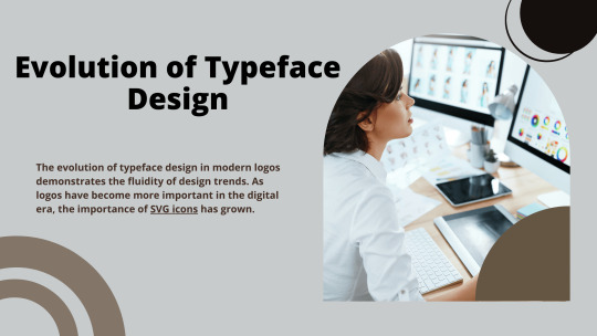
Exploring the Evolution of Typeface Design in Modern Logos
Typeface design is essential in the production of logos. It is a form of visual language that communicates a brand’s identity to its audience. The evolution of typeface design in modern logos demonstrates the fluidity of design trends. As logos have become more important in the digital era, the importance of SVG icons has grown. These icons provide a versatile solution. They ensure that logos remain intact across several devices and screen sizes.
The availability and use of free SVG icons have revolutionized modern logo design. Designers now have access to a wide collection of high-quality icons. They give them a versatile toolbox to boost their creative expressions. This democratization of design tools not only empowers designers. It also adds to the visual diversity of logos in today’s digital age.
Historical Perspective on Typeface Evolution:
The historical evolution of typeface design in modern logos is a fascinating tour. Simple and decorative fonts dominated early logo design. It reflects the quality of the time. Serifs and ornamental embellishments were popular, creating a feeling of timeless grandeur. The mid-twentieth century transitioned toward more minimalist and sans-serif fonts. This reflects the more significant trend toward simplicity and modernism in design.
The advancement of technology had a significant influence on font development. Digital resources allowed designers to experiment with new forms and structures. Hence, a multitude of unique fonts. Customization became more available. This allows firms to personalize their typography to communicate their own identities. The shift from print to digital media increased the demand for adaptable and scalable typefaces. Ultimately, this led to the creation of fonts designed for screen readability.
Modern Typeface Design in Logos:
Logo typography trends strike a careful balance between simplicity and distinctiveness. Sans-serif typefaces remain popular, emphasizing clarity and simplicity. However, the use of bespoke and hand-lettered fonts has seen a noticeable increase. They provide authenticity and originality to company identities. Variable typefaces have gained popularity with their versatility in weight and width. It enables dynamic and adaptable logo designs. Designers are also experimenting with a mix of conventional and digital components. It results in unique and distinctive types of treatments. The use of negative space and unique letterforms demonstrates a desire for logos.
Click here to read more
0 notes
Text
Enhance Design with Complementary Typefaces and Font pairings
In the ever-changing world of design, every detail matters, and typefaces & font pairings are no exception. The intentional use of complimentary fonts and font pairings may boost your designs from decent to great. It results in a visual language that connects with your target audience. Typography is more than selecting typefaces that look beautiful together. It is also about understanding the psychology of each typeface and the message it communicates.
Choosing the appropriate typefaces is the key to creating the perfect design. This delicate font-matching technique combines many types to improve visual harmony and balance in a project. Using suitable font consistency for brand recognition ensures consistency across designs. Practical ideas, real-world examples, and insights into design principles will help you make educated decisions that correspond with your project’s objectives.

Understanding Complementary Typefaces:
In the world of design, mixing typefaces & font pairings is an art. A serif font may bring a touch of elegance to a page, while sans serifs offer clean lines perfect for digital spaces. Designers know that serifs guide readers in print and sans serifs stand out on screens. To pair fonts well, one must grasp their traits deeply. Classifying typefaces into groups like serif or script helps predict how they’ll work together. Scripts are great for drawing attention; use them sparingly as accents only.
Weights matter too—balance is key here to font consistency for brand recognition! Fonts vary from thin to black. Matching them requires care, not just with weight but also with style. It’s often simpler to mix types across categories than within one group due to built-in contrast differences among classes. Yet even same-class pairs can shine when designers consider weights carefully, striking the right balance between similarity and variety without tilting towards either extreme overload or monotony. Indeed, skillful pairing depends much on practice mixed with intuition—a dance of knowledge plus feel—that makes typography sing both online and offline.
Read more here
0 notes
Text
9 web design trends to follow in 2024
This year, huge, strong fonts, dark mode, 3D components, bright colour schemes and simple design have been increasingly fashionable. Many new web design abilities and strategies exist to assist designers and creatives develop more spectacular products. But what 2023 trends do you believe will stay popular, and which ones will skyrocket in popularity in 2024?
We’ll reveal nine web design trends that we believe will define 2024 including the Metaverse, data visualization, fun user experience, and some online site design and collaboration tools.

layouts based on a grid
Divide your interface into pieces using grid-like layouts that employ lines, frames, borders, and grids to let users easily identify one area from the next. Even better, grid-like arrangements make it easier for visitors to scan and discover the most important stuff on a page even when there is a lot of content on display, so they never feel crowded.
In light of this, it is understandable why grid layouts of SVG icons download , have swiftly gained popularity as an alternative to the more traditional design patterns. Do not forget about 2024 when it comes to this style trend.
The skill of combining several design methods
Designers have a daunting task when it comes to creating eye-catching visuals. But the trend of combining multiple design components and styles is precisely what is needed to fix this issue. In 2024, you may experiment with the following to make your initiatives stand out:
Blending two-dimensional and three-dimensional elements
The viewers won’t be surprised by the 2D graphics and flat text. 3D visuals, on the other hand, are far less prevalent yet may rapidly capture the interest of the visitor. Mixing 2D and 3D components create a dramatic visual contrast that draws the attention of the viewer. It’s a good idea to use this to make your website seem more current and unique.
Making use of several media to convey information
It’s essential to keep in mind that when images and texts are used together, language provides context and images support it. It’s a win-win situation when the two of them work together.
Excessive information
Before reading the information, people who use the internet scan pages rather than reading the whole page. Make the most essential material stand out by employing bigger fonts, photos and videos to grab the attention of your visitors. You may also increase the visual impact by using an eye-catching hue.
A 3D design that is both diverse and inclusive
Another critical web design trends for 2024 will be 3D design. It doesn’t matter whether 3D structures have been around for a long time; in the future, 3D components and graphics in website projects will be more diversified and inclusive.
Characters in 3D
They’re becoming more popular as mascots or characters for businesses, designers, and websites. Feelings may be given a current and high-tech appearance thanks to 3D technology but can have a more human touch to integrate website messaging and brand tales. Research shows that most buyers make purchases due to this.
Images, 3D animations, and more
Minor aspects of a website have been enhanced with 3D effects in recent years. When creating a landing page, 3D pictures, such as those seen in banner ads, are very effective in grabbing the attention of site visitors.
In the past, All free SVG icons were a distraction for visitors who had to wait for a lengthy period for a lot of material to load. Still, as our gadgets grow quicker and better, we can expect to see a resurgence of 3D loader animations and the broader usage of 3D in all aspects of websites.
Read rest of the article here
0 notes
Text
The Importance of Consistency in Font Usage for Brand Recognition
Branding is very important for businesses trying to get into the competition. It creates customer impressions. You can also cultivate a distinct corporate identity. A brand is a symbolic representation of a company’s beliefs, products, and ethos. It is an important component in developing a distinct market presence. In the complicated tapestry of brand development, typeface consistency contributes to brand awareness. Fonts used for a brand’s visual aspects include distinct tones, emotions, and messages that appeal to the target audience.
Font consistency for brand recognition usage across platforms and communication channels improves brand memorability and identification. Visual identity is essential for building brand trust and loyalty. It includes features such as logo design, SVG icons, and color schemes. A consistent visual identity gives a professional, polished image. It also creates trust. This helps build long-term connections with customers. They identify the visual aspects with the brand’s essential values. Rigorous typeface consistency and visual identity curation are critical in the competitive arena of brand creation. They build customer awareness, trust, and loyalty.

The Psychology of Fonts in Branding
Font psychology is vital to font consistency for brand recognition. It creates customer impressions and builds brand awareness. Fonts can express emotions and messages. It acts as a silent ambassador to communicate a brand’s identity. Choosing a consistent font type for brand assets and platforms is critical. It helps develop a unified and memorable brand identity.
Consumers relate distinct emotions to specific font designs. Consistency helps to strengthen those associations over time. Font choice has a significant influence on customer perception. It impacts a brand’s trustworthiness, professionalism, and personality. Successful businesses share a common thread. Their dedication to keeping a distinct and consistent font style. This style has become linked to their visual identity. It contributes considerably to their long-term success in the competitive market landscape.
Consistency Across Platforms
Font consistency for brand recognition is essential for identification across several platforms. A coherent visual identity is built using the same typefaces in print and digital media. This consistency guarantees that consumers see a consistent brand image. It adopts a sense of familiarity and confidence. Brands need help with their set typeface specifications. It causes confusion and dilution of brand identity.
Reduced memorability and brand recall may be among the consequences. Several case studies highlight the benefits of cross-platform typeface uniformity. Brands that follow a consistent typeface strategy see greater identification and consumer loyalty. It proves the benefits of consistent visual language across several mediums. Font consistency is essential for sustaining a brand’s identity and leaving a lasting impact on its audience.
Read rest of the article here
0 notes
Text
SVG Code Generator and Advantages of Using SVG Icons
Here is a free online tool for generating SVGs from code. You can create custom icons using this free online SVG code generator and download them instantly. To edit your existing SVGs, simply upload the file. It will be displayed on the right side of the editor, with its code shown on the left side.”
SVG Code Generator

Advantages of Using SVG Icons
1. Scalability and Resolution Independence
One of the main advantages of using SVG icons is their scalability and resolution independence. Unlike pixel-based images or icons, which can become blurry or lose quality when resized, SVG icons maintain their sharpness and clarity regardless of the screen size or resolution.
2. Perfect Display on Any Screen Size
SVG icons are based on vector graphics, which means they are made up of mathematical equations rather than a fixed grid of pixels. This allows them to be scaled up or down to any size without sacrificing quality. Whether you’re viewing a website on a small mobile device or a large desktop monitor, SVG icons will always be displayed perfectly.
3. Beneficial for Retina Displays
With the rise of high-resolution displays like Retina screens, the need for crisp and sharp icons has become even more crucial. SVG icons are the perfect solution for this, as they are not limited by pixel grids and can adapt seamlessly to Retina displays. This ensures that your icons will look stunning and professional on any device.
4. Enhanced Accessibility for Visually Impaired Users
Another important advantage of SVG icons is their enhanced accessibility for visually impaired users. Since SVG icons are rendered by the browser, they can be easily resized or modified by assistive technologies according to the user’s preferences. This allows visually impaired individuals to have a better user experience by customizing the size or contrast of the icons to suit their needs.
0 notes
Text
What is the difference between fonts, typefaces, and logos?
Have you ever considered how minor features like fonts, typefaces, or logos can make or break a website? These are the most crucial aspects of website design. Do you know how fonts, typefaces, and logos contribute to today’s world of visual communication and branding?
The typeface market emphasizes accessibility. The font business, with 50 million websites using Google Fonts, is valued at over $4 billion. Font selections have a big influence on brand awareness. In Fortune 500 logos, sans-serif fonts are preferred 70% of the time. The Font and Typeface Market Report estimates that by 2028, the market will be worth USD 1316.92 million. Two noteworthy logo statistics include the popularity of blue among Fortune 500 firms and Apple’s iconic design. Only 25% of small firms are ready to pay more than $100 for a logo, indicating clear financial limits.
From the statistics, it is clear that the significance of fonts, typefaces, and logos cannot be overstated. These elements play a pivotal role in shaping a brand’s identity and communicating its message effectively to the audience. So, as you delve into the world of fonts, typefaces, and logos, don’t forget the impact that well-designed icons can have on your overall design aesthetic and user experience. These seemingly little details, including free SVG icons, collectively contribute to creating a memorable and visually appealing online presence.

Let’s move on to the difference between fonts, typefaces, and logos for a better understanding. But before check out the relationship between the three of them.
Relationship between Logo, Fonts, and Typefaces:
Besides all the difference between fonts, typefaces, and logos, there are some similarities between them as well. The connection between logos, fonts, and typefaces is important to developing a unified and visually attractive brand identity. Logos are the symbolic depiction of a brand. They encapsulate its values, mission, and personality. The choice of fonts and typefaces is critical. They strengthen and complement the brand’s message. Fonts are distinct styles and forms of lettering. Typefaces contain a larger range of characters with consistent visual components.
Consistency in font and typeface choices throughout many brand aspects, such as logos and other communication pieces, promotes a feeling of brand homogeneity and identification. The font chosen influences both the legibility of the text and the overall aesthetics of the brand. As a result, it is important to consider integrating logos, fonts, and typefaces. This will help create a powerful and memorable brand identity that connects with the target audience.
Difference Between Fonts vs. Typefaces vs. Logos:
Font:
A font refers to the specific style, size, and weight of a typeface. It includes variations such as bold, italic, and regular within a typeface family. Fonts are particular implementations of typefaces that can be digitally or physically applied to text.
Example: Helvetica Typeface
Typeface: Helvetica
Fonts: Helvetica Regular, Helvetica Bold, and Helvetica Italic
Logo Usage: A brand might use the Helvetica typeface in its logo to convey a clean and modern image.
Typeface:
A typeface is a family of related fonts that share a consistent design. It encompasses various styles and weights, such as regular, bold, italic, and others, all maintaining a coherent visual identity. Helvetica, Times New Roman, and Arial are examples of typefaces.
Example: Coca-Cola Logo
Typeface: The Coca-Cola logo uses a unique script typeface.
Font: The specific implementation of that script typeface in the Coca-Cola logo is distinct and may not be available as a separate font.
Logo:
A logo is a visual symbol or mark that represents a brand, company, or product. It often includes a combination of text and graphic elements to create a distinctive and recognizable identity for the entity it represents.
Example: Times New Roman Typeface
Typeface: Times New Roman
Fonts: Times New Roman Regular, Times New Roman Bold, Times New Roman Italic
Logo Usage: Times New Roman might be used in a logo to communicate a sense of tradition and formality.
Read rest of the article here
0 notes
Text
Difference between WebP PNG and SVG formats – Explained
Using the appropriate image formats on a website is necessary for web designers and developers during the process. Indeed, the use of high-quality images can increase the credibility of what you are showing online.
However, if you use large-size assets on your website, you might compromise with the loading speed of your website. So, it becomes paramount for all web designers & developers to use images or other assets like GIFs & animations using a suitable format. For that, you need to consider an image format that delivers high quality even with a small size.
In general, we see that the popular choices of image formats are JPEG, PNG, SVG, GIF, etc. With these formats, it is generally seen that if you want to compress the size of the image you are using, there are chances that the quality of the image will also decrease.
To solve this issue, Google came up with the webp image file format as a replacement to the other types. With this file format, web enthusiasts were able to use smaller files with the same quality or higher quality for the same size on their websites. Let’s dig deeper and find the difference between WebP SVG and PNG formats.

What is WebP? And why is it unique?
WebP is a leading web image format that supports both lossy & lossless compressions along with animations & alpha transparency. Today, a terrific technology war is going on among various file formats to become better than others. In this war, WebP has attracted significant interest from the stakeholders and is becoming a leader in the competition leaving behind some most popular file formats like JPEG.
The one thing that makes WebP unique from all other file formats is its compression properties. Compression, in simple terms, is encoding a file’s data into lesser bits than the original. There are two types of compression processes; lossless and lossy.
In lossless compression, the quality of an image remains the same when you decrease the data size. Whereas in lossy compression, there is a slight decrease in the quality of an image with a significant data size reduction.
Benefits of using WebP files
Faster loading time:
Web pages with WebP images load faster due to their smaller size. And we all know how important website speed is for a good user experience. According to a report, a delay of a second in loading a page reduces visitor satisfaction by 16%. And one in every four visitors will abandon your site if it doesn’t load in 4 seconds.
Less media storage:
It compressions result in less storage space. But it may not be so impactful for smaller websites. However, websites with more images can save a lot of space and money on web hosting services by using smaller images of WebP format.
Transparency & animations:
WebP files are capable of supporting transparent backgrounds of PNG files. They also possess the animation capabilities of GIF files.
With these valuable benefits, WebP does have some shortcomings also. The main problem with these file format is that all web browsers do not support it. Although many browsers are compatible with WebP, the browsers like Internet Explorer still lack loading WebP files quickly. Besides, the picture quality reduces marginally. However, this difference is too small to visualize.
It has become a leading picture file format. While other formats like SVG and PNG are also relevant in many situations, you need to understand where WebP can be a better choice and where not. For that, let’s discuss how WebP distinguishes itself from SVG and PNG files.
Read rest of the article here
0 notes
Text
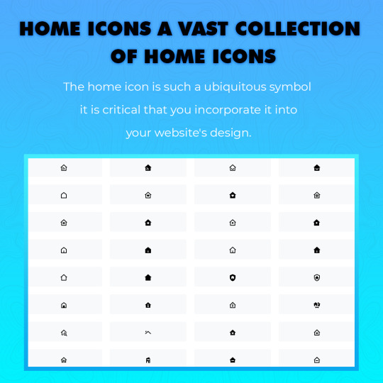
Home Icons: A Vast Collection of Home Icons
Understanding what the icon represents is one of the most important aspects of an icon. When people see the icon, will they immediately understand what it means? Even the most beautifully designed home icon is of little use if the user cannot determine what it does at a single glance.
However, even though the meaning of many icons is unclear, there are a few universal icons, such as the ones for home, printing, and searching. To provide a clear way back to the home page, the home icon is used. This symbol is something the user may click on from any place to start anew from page one.
Because the home icon is such a ubiquitous symbol, it is critical that you incorporate it into your website’s design. If you want your website navigation to be straightforward to understand, you must determine whether or not you should include a Free SVG icons on your website.
The icon in the shape of a House
For many years, the outline of a house has served as a symbol for the concept of “Home.” Many various colors and outlining styles are available for Home Icons . Someone who does not understand what this symbol represents is quite unusual thus when using this sort of home icon, it is essential that it blends in with the general style of your website.
You may do this by altering the color, size object or outline style of the object; a website devoted to children’s items may employ an outline that seems to have been made with a crayon to represent the product. A premium spa, on the other hand, would use a much more streamlined shape with straight lines to express itself.
Hamburger Icon
The hamburger emblem may serve as a navigational tool. When this button is pressed, a more extensive menu appears. Typically, the hamburger symbol will be situated in the upper right-hand corner of the page, and the home link will be the first link in the navigation bar inside that menu.
The surge in the number of Internet users accessing websites via their mobile devices has led to the creation of an instantly identifiable symbol. This symbol doesn’t take up a lot of space but effectively communicates that users can access navigation.
Anyone who has used a mobile device is likely to be familiar with the hamburger menu. They understand that by clicking on it, they may navigate back to their previous page or another page on the site. Because one in every ten individuals in the United States who browses the Internet does it only via a mobile device, this symbol is expected to become more popular in the future.
A Text-Only Icon
Sometimes the most effective symbol is none at all. Text inside the menu that just mentions “Home icons” might be effective in conveying the information. There is another benefit of using text to show where the home link can be found: the website will load much more quickly than if the user has to wait for graphics to load.
CJ Pony Parts, for example, is an example of how style can be applied to a product design. Take note of how the “home icons” text is located in the top left-hand corner of the page. Furthermore, it is highlighted in red, making it immediately distinguishable. This is a simple, yet very effective design.
0 notes