
Statistics
We looked inside some of the posts by if77blog-blog and here's what we found interesting.
Average Info
Notes Per Post
1
Likes Per Post
1
Reblog Per Post
0
Reply Per Post
0
Time Between Posts
2 days
Number of Posts By Type
Text
16
Last Seen Tumblr Blogs


Fun Fact
US Tumblr user growth rate is estimated to slow down to 4.1%.
Text
Week 12
At the beginning of this week I finally decided the 8 photos that I am going to use for my final piece:


0 notes
Text
Week 11
During this week I discussed my new idea with my peers and asked them what I could improve on. They mentioned that they really enjoy my idea due to the fact there are so many different interpretations of my images and many things I could discuss about them and that I could put into my 500 word critical analysis. For example, I could speak about the relationship between parents and their children and how important it is to cherish quality time between them. Also regarding the images of the children being carried and the father teaching his son how to ride a bicycle, I could mention how important the role of a parental figure is and the caring instinct that the majority of parents are naturally given.
Im very happy with my change of idea, as I said before, I was particularly struggling with the previous one where as I much prefer researching and finding our information about photography regarding families and parents and their children.
0 notes
Text
Week 10
After the presentation, the whole class was given a theme each and was asked to go around campus with a camera and capture images relating to their theme given. I was given the theme bicycles which was lucky as there are hundreds of bikes around Sussex University. At first, I took around 5 images which I thought looked okay when I went onto the gallery of the camera and looked at these images I noticed they were really dark and underexposed. I, therefore, had to increase the ISO, which I did to around 1200, and my images came out much brighter and of better quality. I noticed that I was able to do this much easier than when I first started at the beginning of the term, I knew exactly what I needed to do to make my images look a lot better whereas at the beginning of term I would not have known to do that. Here are some of the good quality pictures I took:


The image above is my favourite image I took. I love how the first bike seat is completely in focus whereas the other bikes in the distance are completely out of focus. This image could imply various connotations and is possibly one of my favourite images I have taken so far this term.

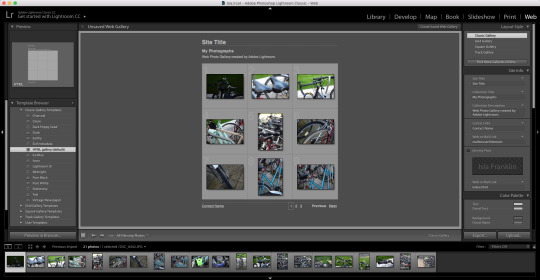
After we took around 20 pictures of our theme, we returned to class and were asked to put these in a web gallery, which we were also taught how to do. Firstly we had to open up Adobe Lightroom and ‘Create a New Catalog’, saving it as our name and in our media files folder.

Once we pressed create and clicked on the folder we had saved out themed images in we could select the ones we wanted to be viewed in our web gallery.

As well as this we were able to add titles to our web gallery and also add captions under each picture if we needed too.
During week 10 I took time to research family photographers around the world to gain some inspiration for my images and gain some more knowledge about photography.
The first person I looked at was Kate T. Parker, a commercial and fine art photographer who basis her work primarily in the United States. She specialises in taking black and white photographs of parents and the children looking intimate and close which therefore highlights the bond between them. Her photography captures special moments that children live whether these pictures include their families or friends. Here is one of her images:

Through looking at Parker’s black and white photography it has inspired me and influenced me to experiment with potentially putting one or two of my images in a black and white effect. I think this would be beneficial to my images and would make them feel much more emotional and intimate. I decided to test out some of my images in black and white:


As well as making the image black and white I also increased the sharpness making the image seem a much better quality. This image, in particular, I like in black and white as when It is in colour it seems like a lot is going on, whereas in black and white you can focus much more on the father and son.
Kansas Pitts is the next photographer I looked at, she is a creative photographer who specialises in capturing family photographs. Through her photos, It is clear that she is passionate about photography and her images make use of the surrounding beauty of nature to create stunning and beautiful photographs. Here is one of her images:

One of the photographs I captured is highly similar to Pitts’ photography, especially the photo above. It is clear that the child is placed in the middle of the photograph, as it is the main object linking the two parents and connecting them together. This is obvious within the image below as the young girl is placed directly in the middle of the two parents, indicating the bond between the three. Just like the image above and Pitts’ idea of capturing the nature and landscape, the image below clearly captures the landscape of the Brighton Pier and the sea.


The image above also shows the bond between mother and daughter as they are obviously holding hands as well as showing the beautiful scenery.

I adjusted the image, as seen above by increasing the contrast by a little and increasing the sharpness like how I did in the last image. It is clearly a massive improvement from the original image and making it look a much higher quality.

I also tested this image out in black and white, however, I much prefer it with colour due to the beginning of a sunset introducing a nice lighting and effect to the photograph.
Another photographer that I thought was pretty inspirational was Anne Kerr, an award-winning photographer who specializes in photographs of families, children, and older people. Her photographs are predominately captured using natural lighting and on-location photography. The natural lighting she uses helps her creates stunning natural photographs and makes them much more impressive than those captured within a studio.

Similar to one of my images which focuses primarily on the setting on the image with the father and son in the top left-hand corner of the image. This makes the location stand out a lot more and highlights the pair in the corner playing and having fun - emphasising their bond.

Again, with this photo, I have reduced the exposure due to the slight white wall at the top of the photo being slightly overexposed and also have increased the sharpness making the setting stand out further.

I also tested this image out in black and white which I really liked, however, the child slightly blends into the stones and also the sea doesn't look as exciting as the image with colour.
0 notes
Text
Week 9 - Idea Change
Early in week 9 after capturing some photos for my previous idea, I took a trip to Brighton to capture some images. I became aware of how many families gathered in the town as well as on the pier and decided to change my topic. My idea will now be focusing on families and the relationship between parents and their children. Whilst in Brighton I captured many photos of parents interacting with their young ones and decided this would be a really good topic to focus my photography on. Here are some of the images I captured and that I’d like to include in my final piece:

The image above is one of my favourite images, it clearly depicts a loving and caring bond between a father and his daughter. The fact he is carrying her further exaggerates his love for his daughter and the significant bond between them, seen by her arms wrapped around him.


The image above represents a special bond between mother and daughter, their close body language and the fact they are both looking at the same thing portrays them as close and exemplifies their relationship.


The young daughter being placed in-between the mother and father represents her like the piece holding the parent's relationship together and also representing unity. This photo clearly portrays a bond between the family as they are clearly spending quality time together on Brighton Pier.


The two above are both of fathers holding their sons, this reflects a caring nature on the fathers as their sons are in need of being held.

The image above is another one of my favourites as it is clear the dad is trying to help his son ride a bike. This is a typical father and son activity representing the nature of parenthood.
Here are some more images that I had photographed which could also potentially be used within my final piece:


When taking these pictures on the pier I came across quite a few issues, due to the sun setting as I was taking them, the lighting was a bit off in a few of the photos so I, therefore, had to adjust the ISO number to 100 so that the photos weren't so overexposed. Another issue was the due to it being a form of street photography, the individuals I was taking pictures of did move a lot, for example they were walking or playing. I then had to change the mode on my camera to sports mode for a few of my photographs to make sure there wasn't as much, or no motion blur in any of my pictures.
This idea change was also due to the fact I was particularly struggling with my last theme, I was unable to capture many good pictures that related to my topic so therefore when a new idea came to mind I decided to change my topic for the best.
0 notes
Text
Week 9
During week 9 I captured some more photographs that could potentially be used in my final piece as well as some practice shots that I could possibly develop. The majority of these photos were taken of my subjects looking at one's self in a broken/smashed mirror. This has many significant connotations such as the idea of body dysmorphia, as well as the idea that what you see online, such as on social media or in magazines, isn't necessarily true or real.


I really like this image I captured as the females face is slightly distorted due to the cracks in the broken mirror, this could be highly significant within my topic and subject of body dysmorphia.

I also like this image I captured due to the fact the subject is directly staring at the camera, this is very intimate and personal which could potentially address the viewers much more directly.

This final image is possibly my favourite image I took in this week, it is of better quality than the others and the subject takes up most of the shot, unlike the others. The colours of her jumper make the image stand out a lot more, potentially drawing a lot more attention to the image. This is why I am therefore going to consider this last image as one for my final piece.
As well in week 9 my class mate, James, and I had to create a presentation on web 3.0 and unambiguous photography and present it to the class. The presentation had to be roughly 10 minutes and include lots of detailed information.


0 notes
Text
Week 8 - Task 3
For this final task, I found a large image of a landscape on Google, I then saved this to my desktop as a ‘jpeg’ image.

I put this image into photoshop and attempted on changing the image size much much smaller.

The original image size, as seen below, was 118.53 by 74.37

I started off by changing this image down to a width of 80cm

Once I had done this, I then pressed ‘fit on screen’, making the image look almost the same as it did before.

This was the image once I had changed it to 80cm. I then continued on lowering the width to 50cm, then to 30cm, then to 10cm and then to 5cm.

This was the image when the width was at 5cm, it’s clear the image has been clearly manipulated as it‘s of a very low quality in comparison to the original image.

After we had reached a width of 5cm, we were then instructed to bring the image up again in size to its original size. I went back up to 10cm, then 30cm, then 50cm, then to 80cm and then to 118cm, its original size. This is was the image turned out like:

0 notes
Text
Week 8 - Task 2
For this task, I took the same image of the Queen, which I had used previously in the last task. I saved this image to my desktop, making sure it was in a ‘jpeg’ format.

After I had done this, I was instructed to open the image in TextEdit by right-clicking and pressing ‘open with...’ and then clicking on the TextEdit application.

This then opened up my image of the Queen in a text format which made up the whole image. This text was extremely long.

We then had to delete a section of the text on TextEdit, which made up the image. We did this by highlighting a section and pressing backspace. This was allowed to be any part of the text and any length of the text.

Once we had done this, we then had to close the TextEdit application and re-open the image in Photoshop by right-clicking and pressing ‘open with...’ and then Photoshop. This is what my manipulated image of the Queen turned out like, just by deleting some of the text.

0 notes
Text
Week 8 - Task 1
The first task we were taught how to do was to change a ‘jpeg’ image into a ‘tif’ image and then put this into audacity, modify it and change it back into an image.
To do this we needed to find an image on Google Images, making sure it is a large image. I chose to pick a picture of the Queen.

After this we had to save the image to our desktop, making sure it's in a ‘jpeg’ format.


We then opened the image up in photoshop, pressed ‘save as...’ and changed it into a ‘tif’ file to our desktop. This has officially changed our original ‘jpeg’ image of the Queen into a ‘tif’ image.

We then had to open up the application Audacity and import the ‘tif’ file by clicking ‘import’ and then ‘raw data...’.

A box would then come up after you pressed ‘raw data...’ where we had to change the ‘encoding’ to ‘U-Law’, the ‘byte order’ to ‘little-endian’ and the ‘channel’ to ‘1 channel (mono)’ This then imported the file into Audacity as a sound once ‘import’ was pressed.

When the sound was in Audacity we were able to modify the sound by changing the bass and treble, this made sections of the sound much smaller, which can be seen in the image below. This is manipulating the image.

Exporting the sound back into an image was done by adding ‘.tiff’ to the end of the name of the image and changing the ‘header’ to ‘RAW (header-less) and changing the ‘encoding’ to ‘U-Law’.

Once this was saved and reopened, this is was the image looked like.

I tried another one swell with a different image and this is what it turned out like.

0 notes
Text
Week 8
In week 8 we began looking at circulation and authorship of photographs and images by looking at a few artists. The first person we looked at was a German artist and photographer, Michael Wolf, who predominately photographed daily life in big cities such as Hong Kong and Germany. He has many famous pieces such as ‘Bastard Chairs’, this was where he photographed lots of recycled chairs by individuals in Asia to show China’s culture of thrift. Although this project was highly famous and influential, it did raise a lot of authorship concerns due to the fact he did not own these chairs, or make them.

Another famous project Wolf did was ‘The Real Toy Story’ where he collected many plastic toys in China that were made by factory workers. He then captured images of these workers making the toys and surrounded the image by the toys that he had obsessively collected.

Finally, the last piece we looked at by Michael Wolf was where he captured 100 photos of 100 rooms which were 100x100 square feet. These photographs were all taken from the same point of view and were very informative and influential. Again, the idea of authorship was questioned due to the fact these were not his rooms.

Personally, I enjoyed looking at Wolf’s photography, I thought it was very intriguing and informative. It gives you an insiders perspective to what life is like in rural areas, especially when looking at the ‘100x100′ photographs. These photographs make you re-evaluate how you look at the world and have definitely Italy influenced a lot of people. Although the problem with authorship is quite prominent with his work, though when we looked at composition, it's clear he composed the photos very well, making these photographs very powerful.
We also looked at other photographers such as Julian Stallabras and Richard Hamilton.
During week 8, I tried to capture the images that could potentially be used for my final piece. I captured these images outside due to the natural lighting being more realistic, I also looked at how the lighting made the images look gloomy and grey reiterating the point of these photos and my topic. Here are some of the images I captured:

Although I really like the concept of these images, the background and my subject, the quality of the image isn't as good as I would’ve hoped it would have been. this was maybe due to my ISO being a bit too high so when I re-shoot I need to take the ISO into consideration.

This image I looked due to the depth of field being very prominent, however, I think I would have preferred to make her reflection in the mirror more in focus but the image does convey my point about narcissism.

This image is also not at the quality I would have liked it and again this could have been due to the ISO and as you can see, the sky in the mirror is a little overexposed.

I really like the colouring of this image as it is almost a grey colour, this could add to the theme of my photos. However, the subject isn't looking at themselves in the mirror which doesn't fit the topic of my photography.

This image I particularly liked, the camera is looking down on the subject making them look specifically inferior to the outside world. Along with the subject looking at one's self in the mirror could also convey them believing they are not good enough which is what a lot of people struggle within the real world. Of the images I had taken, this was my favourite as I believed it was of a better quality than the others, the subject is also looking at himself which relates to my theme and also the angling of the camera can be seen as very significant. Therefore, I would like the consider this last image as a potential for my final piece.
0 notes
Text
Week 7
This week we looked at photo and flashgun, we researched a few photographers and the flash-gun which can be attached to cameras, potentially bettering our photographs. Here are some of the influential photographers we were encouraged to study:
The first individual I looked at was Garry Winogrand, the most influential photographer of the 20th century. He took bizarre and visually compelling photographs of American life during the 1960s. He specialised in street photography, where he took poorly composed images and called it ‘snapshot aesthetic’. It was this technique, his skewed and off-centered images, that helped emphasise his subject matter. He challenged original pre-conceptions of American society and post WW1 optimism and this influenced a generation of photographers. Here’s one of his photographs:

The next artist I looked at was Sophie Calle, a French writer, photographer, and an installation and conceptual artist. Her work was distinguished by her use of arbitrary sets of constraints which helped her evoke the French literary movement in the 1960s. She depicted human vulnerability within her photographs by examining identity and intimacy of individuals. She did this by following strangers and investigating their private lives, she sometimes included panels of her own writing In her photographs as well.

Cindy Sherman, another American photographer, was another influential artist I chose to research. She completed a set of “untitled film stills” which consisted of 69 black and white images subverting typical stereotypes of women.

Next, I looked again at Nan Goldin, who I had also looked at in Week 4, in much further detail. She was an American photographer who focused on capturing LGBT bodies, moments of intimacy, the HIV crisis, and the opioid epidemic. She called her work the ‘ballad of sexual dependency’.

Finally, the last artist I looked at was Martin Parr, a British documentary photographer, photojournalist and photobook collector. His photography took an intimate, satirical and anthropological look on modern daily life. He predominately documented social classes and wealth.

Looking at the influential photographers helped me look further into my project idea and how it could actually help bring awareness to the subject and possibly make a change to how we, as people, view ourselves.
Capturing images of individuals looking at themselves through distorted, blurred or broken mirrors could bring potential awareness to the issue of body dysphoria where people see themselves, for example, larger in a mirror than they actually are in person.
I then learned about ambient lighting, which I didn't know the meaning of before. Ambient light means the light that is already present in a scene before any additional lighting is added. It usually refers to natural light, either outdoors or coming through windows etc. It can also mean artificial lights such as normal room lights. Therefore using ambient lighting within my photographs would mean I wouldn't add additional lighting, to potentially better my photos. Using ambient lighting within my photography would be good due to the fact it makes it more natural and realistic.
After this, I learned how to calculate correct exposure by learning about flash-to-subject distance. The reason flash exposure is determined by the flash-to-subject distance is that of the power of light emitted by the flash. The amount of light the flash gives of is known as the guide number (GN); the higher the number, the brighter the light. However, the brighter the light means the further it has to travel from the flash and as the light travel from the flash to the subject its power and intensity falls. Light falls at a fast rate which is known as the inverse square law.

The inverse square law states that for every unit of distance an object is away from your flashgun, the intensity of light it receives is 1 / distance 2.
The maximum power of the flashgun is indicated by the GN. It’s usually stated for shooting at a sensitivity of ISO 100 and a focal (zooming) length of 24-105mm. I learned that most flashguns have motorised zoom heads that automatically adjust as you alter the zoom setting of your lens or fit prime lenses of varying focal lenses.
I also looked more at the aperture which is the same as the F-number, this enabled me to understand this setting more.

I began here experimenting with my photography theme. I managed to get one good photo which I am going to develop for my final piece:

0 notes
Text
Week 6
This week I decided what my final idea would be for my project. I am going to take photographs of individuals looking at their reflections in a few different types of mirrors: broken, distorted and normal. I chose this idea because of the common concept of narcissism, the excessive admiration of oneself and one’s physical appearance, in today's society and the idea of materialism. My photography is going to focus and bring awareness to how the recent obsession with ‘selfies’ and social media raise issues of extreme problems such as body dysphoria and anorexia, due to the social pressures of today's society. It’s obvious that today's generation is very consumed by what themselves and what others look like, in contrast to other previous generations, which is why taking photographs of individuals studying themselves in mirrors will conform to this idea and bring awareness to this. As well as using mirrors, I may look into using objects such as windows or water to view the reflection of the individual as well. Altogether my photography project will highlight the idea of how frequently people look at themselves from a narcissistic point of view and base extremes judgments upon themselves because of this, causing extremely dangerous problems.
To begin my photography project I started by buying a collection of mirrors:

Using these types of mirrors I am able to take them and place them anywhere, making my photography much more portable and less constrained.
This week we also did our elevator pitches to the class. We created a 5-10 minute presentation on our topic where we had to include a collage of ideas, artists that have inspired our topic and 50 words on its relevance to the brief. This was my presentation:


0 notes
Text
Week 5
This week was reading week; I used this time to brainstorm some ideas and research some photographers for my final photography piece. To do this I used Google to try and gain some ideas as well as taking a few trips into Brighton town, and also my hometown, to try and gain some inspiration. As seen in the mind map to the left, I gathered my favourite ideas and wrote them down, did some research on each one to try and find some examples of the types of photography and some photographers linked to those themes.

Alleyways: One idea I had was the idea of alleyways, I got this idea due to the fact I managed to capture a really interesting and great picture of an alleyway (right) during the 'street photography' task in week 4. This picture mainly darkened the buildings and surroundings and focused mainly on the sunset in the background. I think it is a stunning picture and I also love how I captured the flying seagull at the top. Thus could portray many connotations.

Reflections: I thought the idea of capturing images of reflections would be really intriguing and engaging as the idea of viewing things in different perspectives interests me. Due to finding this theme extremely fascinating, I went on to research different types of reflections in photography.
Natural reflections generally occur within nature, such as waterscapes.
Architectural reflections occur on architectural surfaces such as an old building reflecting on the glass of another building.
Surreal reflections are harder to notice, these are objects/things reflected in puddles on the ground for example.
Abstract reflections are colours or lines reflected without revealing the actual object being reflected.
I looked at a few photographers who commonly captured images on reflections, however, the artist that stood out to me most was Daniel Kukla. Kukla placed a mirror on an easel in key locations around Southern California, he made sure that what he captured in the mirror's reflection contrasted the landscape directly behind the easel, creating amazing photographs. Here are a few of his images:


Mirrors: Whilst studying reflection photography and researching photographers; I came across the idea of using mirrors within my photos. Almost like what Kukla did with his photos however, I liked the idea of using people in my photos instead of scenery as I felt this was more personal and effective.

Developing on one of my ideas, I decided to capture some images of seagulls when venturing into Brighton one day to see how they turned out and if I could use this idea for my final piece. Here are some of the ones I captured:


0 notes
Text
Week 4
In this weeks session, we looked at famous photographers that predominately challenge original stereotypes. The first one we looked at was Lee Miller, a photographer in the contemporary period - a period of juxtaposition. She mainly photographed binary opposites, which was highly controversial, such as men dressed as women. As well as this Lee Miller was a film photographer and she also was a photojournalist throughout World War 2, photographing the Blitz. Secondly, we studied Lillian Harvey, who like Miller, broke certain stereotypical and controversial boundaries. She focused on gender gaze and the overexposure of women as "Lee was used to people looking at her as a thing rather than a person". Harvey also photographed during the war and portrayed it as 'A Woman's War' due to the fact it wasn't common during this time for people, especially women, to take photos of the war - this went against gender boundaries. Diane Arbus was another individual we looked at, she's an American photographer who predominantly took black and white handheld photographs. Arbus was particularly famous for taking photos of marginalised people whom she called 'circus freaks', these consisted of people who were dwarfs or transgender etc. These people weren't accepted back during the 1900s so Arbus took these photographs to help make a change and normalise these people. Arbus received a lot of criticism for her work, saying she was exploiting these individuals for her own personal benefit. As well as this she regularly took pictures of celebrities, families and also nudists. In week 4 we were given a task to go around Brighton and take exactly 150 pictures of people. I found this task particularly difficult and awkward due to the fact we had to take pictures of actual individuals which is extremely personal and quite hard to do. However, I ended up with a few good shots.


0 notes
Text
Week 3
We spent this week looking at the 'Ways of Seeing' and composition in photography.

Famous critic, Berger, said “seeing becomes words. The child looks and recognizes before it can speak” as well as “an image is a sight which has been recreated or reproduced. It’s an appearance or set of appearances, which has been detached from the place and time in which it first made its appearance and preserved – for a few moments or centuries. Every image embodies a way of seeing”. Through looking at this critical analysis it is obvious that the composition within a piece of art, such as a painting or photograph, it powerful to the image, potentially making it a masterpiece.
The word ‘composition’ describes the placement of relative objects and elements in a work of art. Therefore, before taking a photograph you would have to arrange the elements within the frame to make it suit the core idea or goal of your work. There are many guidelines of composition which we discussed and studied within this weeks session. These include the rule of thirds, horizon line, leaning into the frame, leading lines and patterns/textures. these guidelines and the use of good composition helps guide the viewer's eye towards the most important elements of the work, therefore making it very important.
We learned about depth of field in this weeks session also, a basic definition of depth of field is: the zone of acceptable sharpness within a photo that will appear in focus. In every picture, there is a certain area of your image in front of, and behind the subject that will appear in focus.
Aperture = the access given to light from the lens to the camera sensors. The size of your aperture controls the amount of light entering your lens. Adjusting the aperture, or the f-number, the simplest way to control your depth of field as you set up your shot.
Large aperture = Small f-number = Shallow (small) depth of field
Small aperture = Larger f-number = Deeper (larger) depth of field

Rule of thirds-
The “Rule of Thirds” can help you create well balanced and interesting shots. The basic principle behind the rule of thirds is to imagine breaking an image down into thirds (both horizontally and vertically) so that you have 9 parts.

As you’re taking an image you would have done this in your mind through your viewfinder. With this grid in mind the ‘rule of thirds’ now identifies four important parts of the image that you should consider placing points of interest in as you frame your image.

The theory is that if you place points of interest in the intersections or along the lines that your photo becomes more balanced and will enable a viewer of the image to interact with it more naturally. Studies have shown that when viewing images that people’s eyes usually go to one of the intersection points most naturally rather than the center of the shot – using the rule of thirds works with this natural way of viewing an image rather than working against it.

0 notes
Text
Week 2
In this weeks session, I was put into a group of three, we were taught about motion blur and shutter speed. I learned that the bigger the aperture (F-number) on the camera settings means a smaller depth of field, this was really useful to me as it helped me understand more about the photos I was taking and how to make them better. We were given a task to take pictures of the members of our group jumping and try to capture a picture of them mid-air. These were some of the good photographs I was able to capture:


After capturing images of the members of my group jumping mid-air, we were instructed to go to the motorway to try capture clear photographs of moving cars by using a slow shutter speed to capture a good image. Within this jumpology task, we were advised to take out photos using a very high ISO of around 1600 and a fast shutter speed to help capture the individual jumping. I enjoyed doing this task as not only did I capture some really good and interesting photographs, the task was also highly engaging and fun to do.

Although I captured a few good photos, I also came across a few issues with exposure and motion blur, to begin with, due to having my camera settings placed incorrectly. Here are a few of the bad ones that I captured:


The majority of these images are not good due to the motion blur, this may have been due to the shutter speed on my camera being wrong. The middle image on the first row is highly underexposed which could be due to the ISO setting being wrong. As well as this it could be due to the fact I focused on the bright background. The blurred photos would have been due to my shutter speed being too slow, therefore making my photos highly burred and not professional.
0 notes
Text
Week 1
Throughout this week’s session, we began with an introduction to the module and what we will be studying. We were taught a bit about the histories of photography and I found out a lot of useful information, such as the camera was invented in the early 1800s. As well as this I was also made aware that in 1827, Nicéphore Niépce took the first photographic image. After briefly learning about the histories of photography we were instructed to go around campus to experiment with the Nikon D7000 by taking photos using different settings and compositions. During this task, I took around 60 photos with only around 4 of them being good, the others were either blurry, overexposed or underexposed. This is something I hope to increase my knowledge on throughout the semester to capture better photos. We had to showcase our best and worst photos to our classmates, these were my two:

This was my best photograph as it could contain lots of symbolism within the frame. The fence could indicate entrapment within a society whereas the bright, yellow 'Sussex University' flag could represent freedom and new possibilities. The fencing perfectly lines up with the composition in the shot, making it look highly professional and intentional.


These were my worst photos as it is clear that both shots are very overexposed, making them very bad photos. I hope that I will learn about the correct exposure and settings on the camera to help me avoid this problem in the future in seminars to come.
1 note
·
View note