ikeaobservations-blog
IKEA marketing observations!ツ
This tumblr functions as an analysis of Ikea for my Digital Marketing course
8 posts
Don't wanna be here? Send us removal request.
Last Seen Blogs

teamchitoge
Chitoge for Life

gifbun
Anime gif OKIBA

blabacz
Bez tytułu
missycl
MissyCL

a-christmas-fruitcake
Uncle Lizard's Emporium
Text
Top five recommendations to top management of the firm?
1.) Ikea has a beautiful Instagram, but I would suggest a few things could improve it. One would be to make the environmental work and attentiveness MUCH MORE apparent. This is very important for a company to be working on, especially in this current political climate. I was not aware of how much work Ikea puts into sustainable and environmentally friendly products and processes. I think this is the case for most people, and as people become more aware- this will become increasingly important when shopping for anything.
2.) Another Instagram suggestion, (I am focusing on Instagram because it is a leading social media now and I foresee it continuing to be) would be to really nail the color theory on the feed. The pictures are always good quality, with a lot of negative space, but they do break that a little too much. There is not enough consistency with their posts. They’re close, but still missing the mark.
3.) A really big thing Ikea needs to update is their website. It’s honestly the navigation bar (and above) that is the worst part. It is in the style of some random template that one chooses that doesn’t know anything about design and just chooses the easiest option. Ikea is beautiful and has beautiful designs and it really throws off the ENTIRE website!
4.) Also, relating to the Ikea website, it is much too chaotic. I understand that Ikea has a lot of products, services, and just a lot to say. On the other hand, they have smushed way too much into each tab and it comes off as much too chaotic. It makes it difficult to shop.
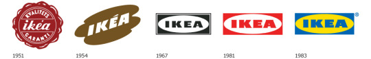
5.) Lastly, the logo. I have seen the Ikea logo evolution and it’s so strange that they have ended up on the blue and yellow one. None of them have been fantastic, but I certainly think the predecessors are better than the one we have today. It does not communicate the fabulous design that Ikea is all about. It does not show a good concept of color theory or design in general and I have no idea why it remains. Again, Ikea is so beautiful, this logo does not belong here.
0 notes
Text
Evaluate the brand’s social media usage.
Ikea has an Instagram profile for every country it has locations in. This is a very smart idea because it allows for the marketing to be divided up and more specialized to each country. The US Instagram takes the approach of being an interior design blog. It features interior design ideas while advertising its own products.
Ikea also has a Pinterest where it does the exact same thing, except more in depth. There are categories for every space one could ever design, and within these categories are different arrangements of Ikea Products. Again they take the design approach, cementing their brand’s aesthetic, rather than giving out coupons or anything of that nature. On all social media, there were no sale promotions to be found, only them trying to further the association’s people have with the brand Ikea. Ikea definitely has a lifestyle brand approach to their social media.
Ikea’s Twitter has many calls to action. However, They surprisingly have a VERY low engagement rate on Twitter. This is shown in their 370K follower, yet the average “like” or “retweet” is 10-25! This seems to. be because the primary usage for Ikea’s Twitter is to give product updates. Their feed focuses on blatantly selling more than drawing people into an aesthetic. It seems that’s how their Twitter differs from their Pinterest and Instagram.
IKEA USA (@ikeausa) • Instagram photos and videos. (n.d.). Retrieved from https://www.instagram.com/ikeausa/?hl=en
IKEA USA (IKEAUSA)'s ideas on Pinterest. (n.d.). Retrieved from https://www.pinterest.com/IKEAUSA/
IKEA USA (@IKEAUSA) | Twitter. (n.d.). Retrieved from https://twitter.com/IKEAUSA?ref_src=twsrc%5Egoogle%7Ctwcamp%5Eserp%7Ctwgr%5Eauthor
0 notes
Text
Evaluate the use of landing pages on the site. What types of landing pages can you identify?
The Landing Page one is presented with after clicking on the first Ikea link when doing a quick Google Search is considered a multi-product landing page. This, being pretty self-explanatory, is because there are multiple products and services being advertised on one page. An “Ikea blue” navigation bar hangs above a slew of ad’s that change in a slide show fashion.
When clicking on an ad for bathroom decor, it is clear they are optimizing for conversions. This is shown in a few ways. One, is by showing price discounts. They do this by showing the current price compared to last years more expensive price side by side for every product on this page. They also give a solid explanation about what makes this possible- not leaving the customer wondering. Another factor that I noticed on this page was their good product imagery. Each photo of their product is crisp, clear and has great composition.
IKEA New Lower Prices - IKEA. (n.d.). Retrieved from http://www.ikea.com/ms/en_US/newlowerprice/?icid=us|iba|20170424|01
Home furnishings, kitchens, appliances, sofas, beds, mattresses - IKEA. (n.d.). Retrieved from http://www.ikea.com/us/en/
0 notes
Text
If you had a $1000 budget for digital advertising for the product, how would you approach spending it?
I would completely focus on social media marketing. I have clearly seen the power that it holds and I believe in the effectiveness of it. I would build brand equity by zeroing in on my target audience. I would create positive mental associations by perfecting the aesthetic and voice of the brand. I would also use social media to collect feedback from the customers. I would develop a hashtag and also directly ask customers to fill out surveys for a small incentive. I believe this would be a beneficial investment. I would also use my platform to offer deals/discounts, as well as contests. This would create interaction with the companies posts and generate more customers in the long run.
(n.d.). Retrieved April 25, 2017, from https://www.forbes.com/forbes/welcome/?toURL=https%3A%2F%2Fwww.forbes.com%2Fsites%2Fsujanpatel%2F2015%2F08%2F26%2Fhow-to-start-investing-in-social-media-marketing-the-right-way%2F&refURL=https%3A%2F%2Fwww.google.com%2F&referrer=https%3A%2F%2Fwww.google.com%2F
Is Social Media Marketing Worth the Investment? | SocialSEO Blog. (n.d.). Retrieved from https://www.socialseo.com/blog/is-social-media-marketing-really-worth-the-investment.html
0 notes
Text
IKEA “persona”
Boswell Borklind
Background:
-White/Filipino
-Single
-Possess niche intelligence; somewhat educated
-Nuclear family
Demographics:
-Metrosexual Male
-18-25
-45,000 annual income
Identifiers:
-Minimalistic
-Urban
-strives to be handy
-Family oriented
Goals/Challenges:
-affordable decor/ practical items
-aesthetically pleasing decor/practical items
How we help:
-offering an immersive labyrinth themed layout that adds a sense of adventure to the normal, mundane shopping experience
-creating trend setting styles that break boundaries of normal interior design
-offering food at all of our locations, to encourage “family” trips to the Ikea store
Objections:
-over-stimulation
-potentially not wanting to assemble items themselves
TEXT AD:
IKEA Home Furnishings- Affordable, Aesthetically Pleasing Products!
www.ikea.com/us/en/
Bring your family to our family!
Ikea Fullerton, CA - Yelp - IKEA | Catalog- Search/ apply for jobs at IKEA
0 notes
Text
SEO evaluation
On seositecheckup.com, Ikea’s site received a 75/100. Ikea scored well on its meta-title as well as it’s meta-description, which allows it to have a better ranking. They also do well with keyword usage, which are “Ikea,” “product,” “store,” and “family.” These all appear in the title tag and description, which is on point! They pass the “favicon” test, which is good for branding, allowing an icon to appear when bookmarking one of their pages. The website is connected to various social media platforms, which is good for the pages “social sharing” which increasing the page's popularity metrics. Overall Ikea’s website uses NO “black hat” practices and therefore increases their page rank and creates a nice online environment.
On the negative side, there are a few things Ikea’s website failed at. One thing it doesn’t have are “H1 Headings,” these headings help indicate the important topics of your page to search engines. The biggest fault is how there are MANY pages that don’t pass the “SEO friendly URL test,” this makes those URL’s less likely for people to share or even click on.
Overall I would primarily update the pages that don’t pass the SEO Friendly URL test, that feels like a really important aspect to fix. I know from personal experience that I am more likely to share a “cleaner” URL than a messy one!
Company Information - IKEA. (n.d.). Retrieved March 03, 2017, from http://www.ikea.com/ms/en_JP/about-the-ikea-group/company-information/
Search Engine Optimization Made Easy. (n.d.). Retrieved March 03, 2017, from http://seositecheckup.com/
0 notes
Text
Design, Content, Colors
The Website interface is on the lower end of the user-friendly spectrum. There is an off-putting essence to the Ikea website that occurs because of too many small bouts of text, excessive (internal) advertising, and inconsistent color choices. An understanding of color theory is present in the overall Ikea brand, as concluded by noticing their choice of yellow and blue as their logo colors, but the execution of putting those colors on their site is a mess! There is no organization, no consistency.
Ikea seems to not care about having limited ad space. Even though their ads are Natural Internal Links- it is suffocating. They do use a lot of Natural Outbound Links, which they do a good job with eloquently inserting within the text.
Something I really enjoy about the Ikea website is their appeal to pathos on every topic page of their website. They make a practical, human connection that corresponds with “living rooms” or “kitchens,” etc. Their alt-text is super on point, fully describing every photo with a simple list of the Ikea items present. Their photos that sample different styles of interior design are beautiful and honestly capture the viewer. I assume their high photo quality discourages webpage “bounce” and makes people want to scroll through.
Overall, every link has really short load times, high-quality photographs, original content, so I'm sure the site generates high traffic. Their downfall really does lie in their overcrowding of text, their “keyword” stuffing, and lack of proper coloring.
Company Information - IKEA. (n.d.). Retrieved March 03, 2017, from http://www.ikea.com/ms/en_JP/about-the-ikea-group/company-information/
0 notes
Text
Post 1!
I chose to do my term project on Ikea because I am a frequent shopper and lover of Ikea. Not only am I completely overtaken with beauty when I walk around Ikea’s warehouse-style store, but I am fascinated with Swedish design, production, marketing, and selling.
Ikea is a B to C business and a leader in its market! As reported in 2015- their market share grew by .5% and continues to. Its annual revenue is 32.7 B (in euros.)
Ikea’s headquarters are located in the Netherlands, Luxembourg, and Lichtenstein. They have a complex, hierarchical management system. The business management structure starts with a division between “shops and factories” and “franchise and trademark.” Then both categories branch off into 2-3 more specific categories. Amidst all this grouping there are over 137,000 employees!
Company Information - IKEA. (n.d.). Retrieved February 08, 2017, fromhttp://www.ikea.com/ms/en_JP/about-the-ikea-group/company-information/
Milestones in our history. (n.d.). Retrieved February 08, 2017, fromhttp://inter.ikea.com/en/about-us/milestones/
0 notes