
Master Degree Animation Student at University of Hertfordshire
Don't wanna be here? Send us removal request.
Statistics
We looked inside some of the posts by iliyandanev and here's what we found interesting.
Average Info
Notes Per Post
1
Likes Per Post
1
Reblog Per Post
0
Reply Per Post
0
Time Between Posts
3 days
Number of Posts By Type
Text
17
Last Seen Tumblr Blogs


Fun Fact
Tumblr is available in 18 languages.
Text
Text Harvard Reference Source's
Barthes, R., 1980. Mythologies. Translated by A. Lavers. London: Paladin.
2. In semiotic theory, signs are into three categories: symbolic, iconic, and indexical. A symbolic sign is based on convention or learned association (such as language), while an iconic sign resembles what it represents (like a photograph), and an indexical sign has a direct or causal connection to its referent, such as smoke indicating fire (Peirce, 1931–1958).
3. Reading patterns can be understood as functioning like a language, structured through signs and meanings (Saussure, 1916).
4. Transmedia storytelling involves a single fictional story that expands and adapts across multiple versions and platforms, with different stories contributing to a larger narrative universe (Jenkins, 2006).
5. Advertising images work by attempting to achieve identifications, encouraging viewers to relate to the lifestyle portrayed (Stuart Hall, representation and the media)
6. Sex is described as “an ideal construct which is forcibly materialized through time” and “not a simple fact or static condition of a body, but a process whereby regulatory norms materialize ‘sex’” (Butler, 1999, p. 236).
7. According to Eagleton (1990), aesthetics is primarily concerned with sensation and the affective perceptions of beauty.
8 According to Chan (2014, p. 1), the term virtual reality refers to computer-generated environments that involve interactivity and immersion.
0 notes
Text
10. Pushing limit making sense of VR, AR and MR

sawada, yukio (2021) Best VR motion controllers to buy [BLACK FRIDAY 2019], Pinterest. Available at: https://www.pinterest.com/pin/46021227435628433/ (Accessed: 19 June 2025).
------------------------------------------------------------------------------
The last topic I selected is about pushing the limits of making sense in VR, AR and MR. First, VR stands for virtual reality, which is a fully immersive digital environment that replaces the real world. It is commonly found in games where players explore virtual spaces.
AR, or Augmented Reality, adds digital elements such as images, sounds, or information to the real world around you. A good example is Pokémon Go, where characters appear on your mobile screen while the background shows the real environment.
Mix, or Mixed Reality, blends the real and virtual worlds more deeply. It allows digital objects to interact with the physical environment in real time. For example, in some Pokémon or Harry Potter games, virtual objects can be placed around your room and interacted with as if they were real.
But does this push the limits of making sense in those virtual worlds? As we know now what the different virtual worlds mean, the MR objects may behave like real ones, making it harder to tell what is real and what is not. This challenges our understanding of physical space and logic.
These technologies also extend or manipulate sensory experiences like sight, sound, and movement which can shift how we perceive time, space, and even our own bodies. Lastly, creators can use these tools to design surreal, symbolic, or exaggerated worlds that go beyond what is possible in real life, like a dream or abstract artwork.
0 notes
Text
9. Effects and Aesthetics

Pin on UM POUCO DE TUDO :) (2021) Pinterest. Available at: https://www.pinterest.com/pin/730427633295962396/ (Accessed: 19 June 2025).
------------------------------------------------------------------------------
The next topic is about effects and aesthetics, based on Alexander Baumgarten’s ideas from 1750. In media like animation, aesthetics refers to something created as a work of art that has both meaningful content and sensational effectiveness. It appeals to our senses and emotions.
In animation, aesthetics often shows up through exaggerated body language to express how a character feels. For example, when a character is cold, you might see little cold pendants appearing from their nose. Or when a character is hot and exhausted, their face turns red and heavy sweat drops appear. These visual cues communicate the character’s feelings clearly to the viewer without needing words.
0 notes
Text
8. Diversity
In a recent lecture of Politics, Diversity Inclusion, and Theories of Race and Gender, a quote by Judith Butler “If the immutable character of sex is contested, perhaps this construct called sex is as culturally constructed as gender; indeed, perhaps it was always already gender, with the consequence that the distinction between sex and gender turns out to be no distinction at all.”
What does it mean by this quote from the analyze I've done is if sex also constructed through culture, then the traditional distinction between sex (biological) and gender (social) starts to fall apart. In other words, sex might actually be a kind of gender all along.
0 notes
Text
7. Representation identity of clothes

This content is blocked! (2025) Pinterest.com. Available at: https://www.pinterest.com/pin/AWK4Tt6bb0eX3jBCxAIeV_9xP_O4VuxxBL3cuIR8ymafoCTRmLmFeCE-57kiVHBIoqeJLIm9LRym4QdOPq5UbsI/ (Accessed: 19 June 2025).
------------------------------------------------------------------------------
I chose to analyze clothing and identity from the topic visual culture and identity and how clothing acts as a code that can represent aspects of a person such as appearing smart, messy, or provocative. However, there is also a debate around how clothing can lead to stereotypical representations. For example, people who wear punk style clothing are often unfairly judged as having bad manners, being a bad influence, or not knowing how to dress properly.
But in reality, this style is a form of self-expression and identity. It reflects the person's interests such as their taste in music, love for converts, and desire for freedom from social norms. Punk fashion challenges the idea that people must dress in a certain way to be accepted or seen as “respectable” by society. Instead, it embraces a different kind of aesthetic one that values individual freedom over traditional expectations of how men and women should dress.
0 notes
Text
6. Transmedia

Bonilla, M. (2013) Transmedia storytelling, marketing y otras historias, Pinterest. Available at: https://www.pinterest.com/pin/344877283979306687/ (Accessed: 19 June 2025).
------------------------------------------------------------------------------
I selected the next topic from a previous lecture on “Transmedia” subject to analyze how one story can be transformed into multiple versions across different formats such as animation, books, films and games. This approach is commonly seen in well known franchises like Star Wars and Marvel’s Spider Man, where the story expands beyond the original format and continues in various forms of media.
However, not all stories are transmedia. For example, Harry Potter is generally not transmedia because it is an adaptation from books to films, and the storytelling remains mostly the same without expansion into new, original narratives.
Transmedia storytelling is about expanding the original universe by adding new plots, characters, and timelines across different platforms. It becomes fiction with an interconnected narrative.
0 notes
Text
5. Typology of sign

Charles Sanders Peirce (1839 –1914) was an American philosopher, logician, mathematician, and scientist, sometimes … | Charles sanders peirce, Philosophers, Charles (no date) Pinterest. Available at: https://www.pinterest.com/pin/28780885094712707/
------------------------------------------------------------------------------
Typology of signs is another concept in semiotics that helps us understand how meaning is created through signs. According to American philosopher Charles Peirce, there are three modes of signs they are icon, index and symbol. Through my secondary research, I explored how these three types can be analyzed and applied to images, objects, and other forms of communication.
Charles Peirce’s typology is useful for analyzing and interpreting various visual elements such as paintings, photographs, and symbols. Each mode of sign communicates meaning in a different way.
Example
An icon is based on similarity. It looks like what it represents. For example, a painting of a penguin, a sketch of a dog, or a kangaroo crossing sign are all icons because they visually resemble the animals they represent.
An index is based on a physical or causal connection. For instance, a fingerprint on paper or a footprint in the sand is an index because it directly points to the presence or action of a person or animal.
A symbol is based on cultural agreement, its meaning is learned rather than naturally understood. A peace sign made with two fingers is a traditional symbol, while in digital communication, symbols like punctuation marks commas, brackets, colons can be combined to form emojis that express emotions, such as 😊 and :(
Understanding these three types of signs icon, index and symbol helps us interpret meaning more deeply in both traditional and modern forms of visual communication.
0 notes
Text
4. Reading Patterns

Wijaya, P. (2024) Shapes And Character Design, Pinterest. Available at: https://www.pinterest.com/pin/70437489309738/ (Accessed: 19 June 2025).
------------------------------------------------------------------------------
This is another topic I selected from my lectures on the subject of semiotics, focusing on how reading patterns help us understand images, text, and design. As an animator, I often work with different shapes to build and define characters. Understanding the basic structure behind these shapes is essential in character design.
The main shapes we commonly use before sketching a character and assigning them a role are circles, triangles, and squares. Each shape has its own meaning.
Example
The circle often represents joyful, friendly, and trustworthy characters. These shapes feel soft, approachable, and safe.
The triangle, in contrast, is sharper and more unstable. It’s typically used for villains or threatening characters, symbolizing danger, evil, or unpredictability.
The square conveys strength, bravery, and reliability. Characters with square-based designs are often seen as strong, stable, and protective.
This visual language shows a kind of reading pattern audience recognize and interpret these shapes, allowing them to immediately understand a character's role or personality based on design alone.
1 note
·
View note
Text
3. Quote

Dutton, M. (2018) Dressing The Professor: What To Wear For Working In Academia, Pinterest. Available at: https://www.pinterest.com/pin/78813062219770996/ (Accessed: 19 June 2025).
------------------------------------------------------------------------------
I selected this quote from my lectures in the semiotics subject. It was part of a presentation about Ronald Barthes and his theory of myth “Myth has the task of giving a historical intention a natural justification, and making contingency appear eternal.” Barthes, R. (2009) Mythologies. London: Vintage.
What Barthes means by this quote is that myth takes something historical, cultural, or political, something created by people in a specific time and place and presents it as if it were natural, fixed and timeless. In other words, myths hide the fact that these ideas or beliefs are constructed and instead make them seem like they have always existed.
Through secondary research, we understand that what seems “natural” in a myth is often based on cultural or political ideologies, human made choices that are shaped by history. For example, gender roles and national identity standards are all social constructs, but myth makes them feel like universal truths.
Example
The historical intention refers to the original cultural or political meaning behind an idea.
The natural justification is when that idea is presented as a fact of life, not shaped by society or history.
And making contingency appear eternal means disguising a changeable or situational idea as something permanent and unchangeable.
0 notes
Text
2. Picture
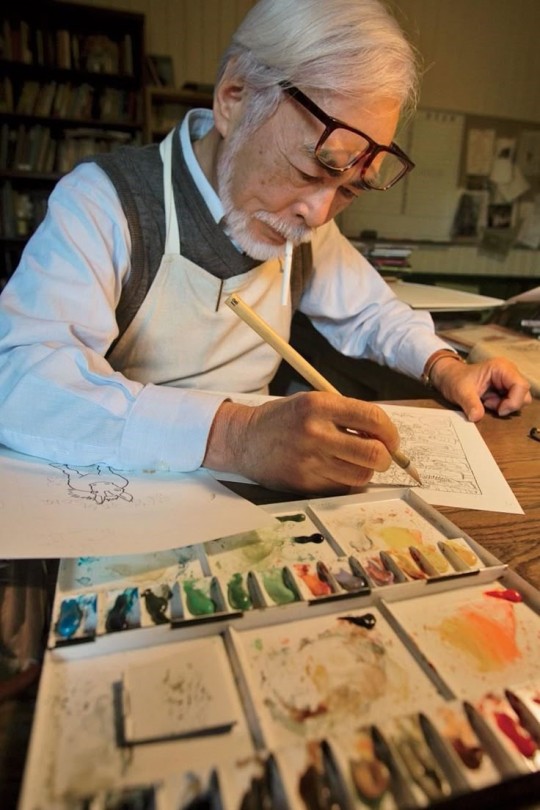
Mei, L. (2014) Director Hayao Miyazaki on The Wind Rises, Pinterest. Available at: https://www.pinterest.com/pin/2111131065571921/ (Accessed: 19 June 2025).
------------------------------------------------------------------------------
This is another analysis, focusing on a photograph of the well known artist and animator Hayao Miyazaki. What I mean is that semiotic analysis can be applied not only to artworks or films but also to images of people. A single image, like this one, can communicate deeper meanings through visual signs.
The hidden ideology within the photo can be understood using three key semiotic elements they are signifier, the signified and the sign. This approach was developed by Ronald Bathes, a philosopher and semiotician who explored how meaning is constructed through images and texts.
Barthes also breaks down the sign into three layers of meaning they are denotation, connotation and myth. These help us to decode what the images say about the person being represented.
Example
The denotation of the photo is straightforward: it shows an elderly Japanese man dressed in formal clothing.
The connotation suggests more: he appears to be a Japanese artist, focused and sketching thoughtfully, which implies creativity and discipline.
The myth, in this case, goes even deeper—it represents the cultural idea of "the artist" or "the genius animator." It reflects the origin story or identity often associated with Hayao Miyazaki, portraying him as a master of his craft and a symbol of imaginative storytelling.
0 notes
Text
1. Painting

Pace, J. (2024) Le vieux guitariste aveugle.1904, Pinterest. Available at: https://www.pinterest.com/pin/10344274146184429/ (Accessed: 19 June 2025).
------------------------------------------------------------------------------
I selected this painting by Picasso because it offers a rich opportunity for analysis due to the hidden signs and symbols it contains. Semiotics, the study of signs can be applied to image, symbols and visual elements to uncover deeper meanings and understanding who the artwork is intended for.
This particular painting was created by Picasso in 1904. It features a strong use of texture and is dominated by various shades of blue, ranging from light to dark. While many viewers associate the colour blue with the night, in this context, it likely symbolizes something more emotional, perhaps grief, sadness, or loss. The use of blue suggests a somber tone, and the overall environment of the painting appears gloomy and reflective.
It is possible that Picasso is expressing the loss of someone close to him, such as his wife, friend or family member. The way he portrays himself and the setting indicates a deep sense of sorrow and reflection. This is where semiotic analysis becomes valuable by examining the colours, the figure, and the surrounding environment. We can interpret the underlying message and emotional significance Picasso conveys through his art.
0 notes
Text
Reader my 10 sources
Cowen, E. (2020). Animation behind the Iron Curtain. New Barnet, United Kingdom: John Libbey Publishing Ltd. https://muse.jhu.edu/pub/3/monograph/book/100058
From the book “Animation Behind the Iron Curtains” there is one chapter that is significant to be analysed with two topics. The chapter is sixteen, page 171 about Bulgaria during World War II and the control of BCP “Bulgarian Communist Party” by Todor Zhivkov. The country was isolated by the USSR and the industry was involved with the first Bulgarian Animation studio called “Boyana Film Studio.” The next topic from the same chapter, page 172 a Bulgarian Animator with a heavy influence on his short, animated films this is Donyo Donev. The topics can be connected by analyzing the country that has been to war and part of the USSR and how that affected the Bulgarian Animators during that time and the animator Donyo Donev.
2. Cowen, E. (2020). Animation behind the Iron Curtain. New Barnet, United Kingdom: John Libbey Publishing Ltd. https://muse.jhu.edu/pub/3/monograph/book/100058
In chapter sixteen there is information couple of Bulgarian Animators that are not the only ones that Bulgaria is aware of on page 172. Todor Dinov is a part of the Bulgarian Animators that is well known for his short Animation and a founder of the first Bulgarian Animation studio in the country. Todor Dinov had experience in Animation that counts him as the first Bulgarian Animator instead of Donyo Donev where the Bulgarian audience is not aware who is the first one. The book “Animation Behind the Iron Curtains” has information on why Todor Dinov is the first and what makes him the founder of the first Bulgarian Animation Studio, along with his Animation done in different studios. The other one is Ivan Ivanov-Vano in Moscow, where Todor Dinov studied Animation and worked as a director of his own animated film “Junak Markos” (Mark the Hero) in 1955.
3. Greenberg, Raz. (2018). Hayao Miyazaki: Exploring the Early Work of Japan's Greatest Animator. https://library.oapen.org/handle/20.500.12657/58817
The article looks to be from a scholarly book academic book focused on Japanese animation, particularly the works of Hayao Miyazaki. It explores the cultural, cinematic, and literary influence shaped Miyazaki’s films, analyzing themes such as textual influence and European motifs in anime. This article is a high-quality source because it is backed by academic research, contributions from respected scholars, and has been published by a respected academic press, Bloomsbury Academic. The author’s involvement in both academic and popular publications add further credibility. This source is useful and interesting to me because it provides deep insight into the artistic and cultural demonstrations of Japanese animation, which can also apply to understanding other creators like Akira Toriyama. It highlights how cross-cultural influence shape storytelling in anime, helping to appreciate the aesthetic and narrative complexity behind seemingly simple animated works. This improves any study of anime as a global cultural phenomenon.
4. Holliday, C. (2024). Early British animation and cartoonal ‘co-conspiracy’: the case of Jerry the Troublesome Tyke (1925–1927). Early Popular Visual Culture, 22(1), 26–41. https://doi.org/10.1080/17460654.2024.2305484
Sid Griffith is an Animator and creator of Jerry the Troublesome Tyke (1925–1927) based in Cardiff. His black and white animation series was done traditionally but, the article, argues that the Animator Sid Griffith offers a work more extreme and consistent however in America cartoons like Felix the Cat and Out of the Inkwell are less hardworking and stressful. Sid Griffith achieved a new style from narrative and formal that collaborated with different media including in his animation drawing, movement, and the artist's hand. It is an artistic way of mixing those methods in the production of establishing within the early British animation. The mixed media of how Sid Griffith in his animation shows not only his character but also him by showing his hand in the animation. This can be understandable how Sid Griffith tried to add new methods to his Animation and how that brought interest into it.
5. Jaramillo Chávez, I. D. (2024). Beyond the panel: cinematism and affective responses in Itō Junji’s Tomie. Journal of Graphic Novels and Comics, 1–13. https://doi.org/10.1080/21504857.2024.2402522
The manga Tomie was done by Junji Ito analyzing the body horror in the manga that leaves the readers mystified. Combining the main character Tomie with a body horror uses violence and Tomei's regenerative nature in the stories. It argues that these elements work together to create powerful horror experiences. It is of high quality because it explores the storytelling of Tomie and the aspects which is the body horror in the manga. It is high quality because of how these elements work in a concerted way of having a character that becomes a monster by having body changes and being regenerated as a normal human being and the horror continues. Another thing is the cinematic techniques that bring the multiple faces of Tomie into the storytelling. It is a useful analysis that provides awareness of Tomie and horror manga in general.
6. McCullough, H. (2024). One Piece: created by Matt Owens and Stephen Maeda, Netflix (2023). American Journalism, 1–3. https://doi.org/10.1080/08821127.2024.2410649
Eiichiro Oda, the creator of One Piece, debuted in Weekly Shonen Jump in 1997, and it became one of the most successful manga series. Over 1,100 chapters were published across 61 countries and the manga it associated with the animation studio Toei. From this company episodes of One Piece started to be on air globally. Also the best-selling manga series with over 516 million copies One Piece won industry awards including three Tezuka Osamu Cultural Prizes and Japan Cartoonist Association Awards Grand Prize. This is high quality because of the statistics of best-selling manga that provide evidence of One-Piece and how successful it is. Another thing is the media that adapts the series in an animation way and into live action how does it impact the budget. The article provides analytic information about Eiichiro being a mangaka along with being recognized by his audience around the world.
7. Suvilay, B. (2018) ‘Dragon Ball: Body control and epic excess in manga and anime’, Loisir et Société / Society and Leisure, 41(2), pp. 250–267. doi: 10.1080/07053436.2018.1482670.
The article shows Dragon Ball by Akira Toriyama as a cultural and artistic work that blends elements of sport manga, kung fu and 1980s-1990s action films. It interprets the series as a Bildungsroman; a coming-of-age story highlights physical self-control, epic storytelling, and dynamic visual design. The article also analyzes how the anime adaptation boosts dramatic moments and how international audiences have interpreted the series differently, sometimes critically. Some viewers view the focus on physical suffering and endurance negatively, while others saw the Japanese hero as a model for alternative masculinity. This is a high-quality source because it offers a well-researched, critical perspective rooted and cultural and media theory. It draws from transnational reception studies and narrative analysis, making it academically rigorous and insightful. The article is useful and interesting because it deepens the understanding of Dragon Ball not just as entertainment, but as a complex, cross-cultural text with lasting social and aesthetic impact.
8. Sessa, C. et al. (2016) ‘A Study of Picasso’s Painting Materials and Techniques in Six of His Early Portraits’, Journal of the American Institute for Conservation, 55(4), pp. 198–216. doi: 10.1080/01971360.2016.1235438.
This article is about the study of Picassos painting of the choices he made by experimenting with colours to create a different shade of tone. Because in his own way of doing a portrait, Picasso sets different colours such as Prussian blue, cobalt blue, ivory black, lead white, natural earth, vermilion, chromium-based pigments, and different fillers were identified in the paintings. It is also the way Picasso uses the brushes while painting a portrait, is the way to understand the younger Picasso and how his painting became a huge success. It is significant to the study of Picasso because many of his drawings can mean something along with the colours for example dark blue and black which could mean someone is gone from his life or in short describing death. But this is in some paintings that appear during his lifetime telling what happens in his life by doing portraits with many colours.
9. Tosina Fernández, L. J. (2021). Visual representation of proverbs in comic books and their translation: Asterix as a paradigmatic case. Journal of Graphic Novels and Comics, 13(4), 592–605. https://doi.org/10.1080/21504857.2021.1966063
The studies of the comics that contain proverbs and other ways to communicate in the stories. By the French authors Albert Uderzo and Rene Goscinny, from the story Asterix the Gaul. It has an analysis of the author's linguistic ingenuity and the series of how these expressions are creatively portrayed through both language and visuals. The high quality from the comic Asterix the Gaul is the bubble text that is language along with a drawing of the character and story that is the imagery. I chose it because of the structure and the combination of the language and imagery creates an expression for the characters. It is useful to understand the challenges of combining those elements into stories that create comedic, mythological, and understandable stories and the approach of structuring the text that creates creative language in the story of Asterix the Gaul.
10. Triantafyllos, S. (2022). The dying city and the sick messiah: apocalypse and utopia in Neo Tokyo. European Journal of English Studies, 26(3), 462–479. https://doi.org/10.1080/13825577.2022.2148405
Katsuhiro Otomo is the creator of the Animation film Akira (1988) genre of cyberpunk and futuristic post-human that presents a utopia world with propaganda. Focusing on the settings themes of the city called Neo Tokyo how the landscapes are being shown in the film as a dystopian feature along with a significant world of how the society looks like with a better construction. There is an antagonist who tries to end the corrupt society and start a new society for the city. It is of high quality because the meaning dystopia can mean a post-apocalypse society is suffering. What has been shown in the film is a futuristic dystopia where the antagonist is suffering from a world where peace is not an option. Using the experiment Akira as a new world. Describes the theme of the world 2 separate worlds where the character wants to live in a progressed new world.
Evaluation
These are the 10 articles that are interesting for me during my secondary research. To develop my research from the online and visual articles, I want to expand the information that captures my interest and knowledge what I know more about it, and what more elements could be found in the actual articles and books.
0 notes
Text
Critical Analysis
In this analysis, I investigate two pages from the book "Animation Behind the Iron Curtains" by Eleanor Cowen, focusing on her discussion of Bulgarian Animation during the communist era. This section stood out in my research for it is exploration of the struggles animators faced under Soviet influence, particularly the story of Donyo Donev. Cowen's analysis provides not just historical context but a critical focusing on how art survived and occasionally thrived under ideological pressure.
Cowen begins the selected many ex-Soviet countries where situating Bulgaria animation within the boarder past war transformation of Easter Europe. After Bulgaria joined the Soviet bloc in 1946, it is economy shifted rapidly from agriculture to industry, with Stalinized collectivization beginning in 1948. Cowen describes this process as marked by "brutality and forced agreement," creating a landscape in which creative professions, like animation, were pushed back. This socio-economic context is essential to understanding the struggles of Bulgarian animators, who as Cowen notes, "received little to no institutional support and were often left to their own devices."
This phrase "left to their own devices" is crucial. It underscores the central argument of this section: those Bulgarian animators operated in isolation, without sufficient resources or systemic support. Cowen's language here is deliberately spare but impactful, conveying both the neglect and the quiet determination of artist who worked outside the spotlight of state sponsored media.
Cowen's profile of Donyo Donev provides a key case study. Donev, who studied at Sofia's Academy of Fine Arts and later gained recognition for his short film series "The Three Fools" in 1970 till 1990, is shown as both a product and critical of the system. Cowen notes his stylistic choices: simplified character designs, minimalist music using string instruments and percussion, and vocalisations instead of dialogue. These choices, Cowen argues, were both practical (given the lack of resources) and subversive, offering "a comic lens on the absurdities of life under communism."
What makes analysis effective is Cowen's attention to the interplay between form and messages. The exaggerated, goofily proportioned figures in "The Three Fools" are not just visually distinctive they reflect deeper social critique. Their absurd behaviour mirrors the contradictions and public administration of the communist regime, and Cowen's interpretation links this visual language to the political reality in a subtle but effective way.
The author also makes effective use of contrast. While describing the difficulties animators faced such as lack of proper studios, equipment, and funding Cowen contrasts this with the inventiveness of artist like Donev, who used limited means to create nationally and internationally acclaimed work. This contrast strengthens her overall argument about the resilience of Eastern Bloc artist, particularly in peripheral nations like Bulgaria that were often overlooked in broader Soviet media narratives.
In conclusion, Cowen's two-page analysis provides a focused, insightful look at the challenges and innovations of Bulgarian animation during communism. Her detailed examination of Donyo Donev's work, set against the harsh economic and political European animation. Through concise language, historical farming, and thoughtful critique, Cowen effectively demonstrates how animation served not only as entertainment but also as a subtle form of resistance.
The more I analyse Eleanor Cowen's "Animation Behind the Iron Curtain," the more I discover how deeply interconnected the early history of Bulgarian animation truly is. In continuing my research, I came across another key detail that adds depth to the discussion: before Donyo Donev become known for his iconic short animation series "The Three Fools," another major figure had already laid the foundation for Bulgarian animation Todor Dinov. This supports the conclusion that Dinov was not only Bulgaria's first animator but also a mentor and collaboration who played a key role in shaping the careers of emerging artist like Donyo Donev.
Cowen briefly reference Dinov's pioneering role in the development of Eastern Bloc animation, but further research reveals just how essential he was to Bulgaria's animation identity. As mentioned earlier, Dinov's first animation, "Junak Markov" (Mark the Hero), was completed in 1955 in Russia, and his first domestic animation, Margarita (The Daisy), was produced in 1965 at Boyana Film Studio. However, what adds further significance to his legacy is the fact Dinov also mentored Donyo Donev, and the two worked together on early animation projects. One notable collaboration was the short film "Duet" in 1961, directed by Dinov with Donev as co-writer and artist a project that not only illustrated their creative teamwork but also demonstrated how Bulgarian animation was evolving into a more stylized and expressive medium.
This mentorship is crucial to understanding the development of Donev's later independent work. In Cowen's analysis, Donev is recognized for his highly individualistic style simple, exaggerated figures, minimal dialogue, and rich symbolic humour. Howeverm his creative foundation was built alongside Dinov, whose influence helped guid Bulgaria's animation industry from it is infancy into a more structured and artistically ambitious field. Cowe's book, while primarily focused on the institutional challenges animators faced under Soviet rule, also implicitly emphasizes the importance of such between generations collaboration in keeping the animation culture alive despite political and material obstacles.
Therefore, returning to the central question who was the first Bulgarian animator? The evidence is clear: Todor Dinov holds that title both chronologically and institutionally. Yet his significance goes far beyond that of a "first." He was a connector between Soviet and Bulgarian animation practices, between state-controlled studios and studios and individual artistic voices, and between generations of animators. His mentorship of Donyo Donev, which began in the early 1960s, demonstrates how a national animation tradition was consciously cultivated in Bulgaria not as a mere imitation of Soviet aesthetics, but as a locally grounded, culturally specific art form.
Eleanor Cowen's book "Animation Behind the Iron Curtain" serves not just as a record of challenges, but as a documentation of strength and artistic continuty. By examining the professional relationship between Dinov and Donev along a back history of Bulgaria being part of the Soviet Eastern bloc country. Picture of how Bulgarian animation emerged from within through mutual support, mentorship, and a shared commitment to storytelling under constraint.
0 notes
Text
Concept sentence
In a cartoonish clash of wits, mischievous Ron constantly schemes to outsmart the bumbling but determined Don, leading to a nonstop chase and laugh-out-loud disasters.
0 notes
Text
Script

------------------------------------------------------------------------------
Evaluation
The script will go with no dialogue for the character, and the reason for that I want the action to speak more instead of the lip synching. Because I think the no talking will make it more interesting watching the two characters as they handle their situation without fully explaining what they gonna do and they gonna do more. What could be replaced with talking are sounds that can still be a way to act, but doing a sound in a scene, where a small sound, for example, of a shock or a fear, can still explain how the character feels.
This is my choice for the animation; the action speaks more.
0 notes
Text
Audiance

------------------------------------------------------------------------------


------------------------------------------------------------------------------
Evaluation
The reason why it is good for my target audience to be for BBCF a U because it is suitable for everyone without having a range of age that will not have unsuitable terms on it.
The film will be shown at festivals, for example, on a website called "filmfreeway.com." Where all soft films can be uploaded to those festivals that give people around the world to experience new artist films for free. That will give the chance people from around the world a chance to share their opinions on my Animation. Does it bring them back in time, to bring the nostalgia again when the Animations were in the right comedy?
These is my audiance to have the chance everyone to expirance my Animation without setting limit to it.
Links
BBCF U- https://en.m.wikipedia.org/wiki/File:BBFC_U_2019.svg
Website of Film Festivals- https://filmfreeway.com/festivals
0 notes
Text
Final Character Designs

------------------------------------------------------------------------------

------------------------------------------------------------------------------
Evaluation
The final designs of the characters will be presented in the animation like this very simple and interesting to watch. I had done with FireAplaca and Adobe illustration to sketch it high quality and cleaner to be as a final sketch. The colouring will not be hard, it will base in one given colour to the characters. Overall, about the designs I am very comfortable with drawing especially when it is during to animate it. This is the final design of Ron and Don.
0 notes