
Don't wanna be here? Send us removal request.
Statistics
We looked inside some of the posts by illustrationcoursework3 and here's what we found interesting.
Average Info
Notes Per Post
0
Likes Per Post
0
Reblog Per Post
0
Reply Per Post
0
Time Between Posts
3 days
Number of Posts By Type
Text
17
Last Seen Tumblr Blogs


Fun Fact
Mobile Tumblr US users spend an average of 4.04 minutes per session on the app.
Text
Evaluation
Looking back at my work within this project, it’s clear to see that I was fairly disorientated throughout, not really knowing where to go as a project concept. This is an issue I have faced throughout the course as I find it difficult to work on one singular project for an extended period, preferring singular short-term projects of varying topics within my own work style. This wasn’t helped by this project coinciding with the visual culture project, which made it harder to focus on one topic at a time, stunting progression within both my projects. I could’ve handled this situation better by properly designating time to work on each project and spending proper time to evaluate ideas before pursuing them.
As well as this, I believe I chose the wrong topic to develop within this project, as my execution narrowly matches the brief of being ‘non-fiction’. I say this as although the topic I chose, language and communication, is non-fictional and holds historical and cultural significance, it is incredibly vague and broad, allowing for way too much room for discussion without a defined message. Adding to this, my execution of this topic I believe was a bit misguided, as I illustrated this non-fictional subject through fictional means, portraying the theme through individually made character designs. Although I am proud of this outcome of the project, as I believe they were effective in execution and I personally enjoyed designing them, I don’t believe this was the right approach for the brief, as it draws attention away from the actual non-fictional topic.
If I were to be set this brief again with the research I have already conducted, I would instead pursue my ‘Net Art’ concept further, as it holds a lot of potential visually, has a clear set message and is a topic I am vehemently passionate about, having done copious amounts of research towards within this project alone.
However, this isn’t to say that I am not proud of what I have achieved within this project. Although I am disappointed I couldn’t fully realise my vision how I had wanted or bring it to completion, I thoroughly enjoyed working on the mini briefs and character designs as both allowed me to experiment within my style and challenged me with subjects I hadn’t illustrated before. I also found a lot of interesting topics and areas for inspiration within my research which will benefit my work in the future.
Overall, I am upset I hasn’t able to fully materialize my project to its full potential or properly utilise my research within my outcome. I hope that for the future, through this course, I can gradually learn to appropriately structure my workflow and conclude projects to a standard I can be proud of.
0 notes
Text
Final outcome
Unfortunately, I wasn't able to fully complete my planned concept within the designated time, having only completed the character designs for one zine and the covers for the rest. However, I would like to fully complete this project at some point, as I believe I have thought carefully about the design, message and execution.
0 notes
Text
Further character design feedback and planned improvements
After finalising all the character designs for the zine on the NATO Phonetic Alphabet, I asked for feedback again from my friend asking what that thought each character represented within the alphabet, here are the responses I received.


From this feedback, it allowed me to gauge how readable each character was, showing what I had discovered previously, being that the more vague words were harder to depict an thus harder to distinguish, this is evident with the name related words (Mike, Oscar, Charlie) and other words which have many interpretations (Uniform, Yankee, November, etc).
I hope to combat this miscommunication by accompanying each of these characters with their representative word as well as contextual props and backgrounds alongside them on their individual zine pages, so they can better represent their words within context.
0 notes
Text
Illustrative plans
I hadn’t designated enough time to properly illustrate and design the interior pages to these zines, however I planned the layout and composition, with each two page spread having one page as a full page illustration of a character design alongside their names of the phonetic alphabetic, and the other as historical and contextual information around the phonetic alphabet and it’s counterparts. The order of these pages would alternate, having the illustrations on the left then the right and vise versa.
With the full page illustrations, I’m hoping to portray the codewords not only from the character designs, but environments and actions depicted. I believe this’ll assist the recognisability of some of the designs, as some are harder to distinguish from my peer reviews. An example of this is the design for ‘Bravo’, which was often mistaken for other keywords, to better portray the prompt word, I will have the character ‘Bravo’ performing in front of a crowd to huge applause, hopefully illustrating a more clear depiction of the term ‘bravo’.
Within the neighbouring information page beside the illustration, I planned to have miniature illustrations of the character designs interact with the text and possibly depict the contents of the text.
0 notes
Text
Zine style guide and compositional ideas

Sketches planning cover composition/design ideas, as well as the logo sketch design
PHONETIC ALPHABET DESIGN

Scrapped cover design


Final cover design
With this zine, I went through a few different design options. With the cover, I wanted it to illustrate the phonetic alphabet without looking too juvenile, in fear it'd resemble a children's English book. If I had given myself more time to work on this, I feel I definitely could've made the cover more interesting, however I am still fairly happy with how the final cover design came out, as I feel the colour scheme and shape theory compliment the character designs I had made for the zine.
EMOTICON DESIGN


With this zine cover, I wanted to simply portray the most culturally significant styles of emoticons, as to illustrate the historical documentation of the topic within the zine. For this, I drew a simple frowny face, as to resemble the frowny face Unicode character, traced the 'laughing crying' apple emoji and just simply typed the bracket smiley. I believe that, although this final design is minimalistic, it is fairly effective at advertising its contents in an eye-catching way.
UNTRANSLATABLE DESIGN


For this cover design, I wanted to emphasise the language barrier between two people, having a large question mark come through the listeners ear and through their head, showing a lack of understanding. I believe I could've done this design better if i had given it more thought, as I believe it isn't clear that the figure on the left is communicating with the figure on the right, this could be rectified by an inclusion of symbols dictating speech, such as action lines or a speech bubble.
DIGITAL MOCK-UPS
Digital 3D mock-ups made on Pacdora
As I hadn't left enough time to make physical mock-ups of my cover designs, I instead settled for digital mock-ups, which were still effective in letting me gage if the designs work within their dimensions and if any assets need to be altered for legibility's sake.
0 notes
Text
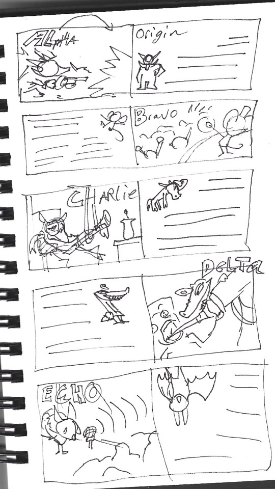
Final NATO phonetic alphabet character designs pt 1


With these designs, I wanted each to have a distinct silhouette, reflecting character’s unique personality and word origin.
To give all the designs a distinctive colour scheme, I changed the background colour when designing each individual character, allowing myself to create a unifying colour scheme to align with this background colour. As well as this, I made sure to change the designs to greyscale frequently, as to observe whether the colours contrast in a way that’s pleasing to the eye and exaggerates the most important aspects of the design, being the aspects which help illustrate what word the character represents of the alphabet.
One of my intentions for these designs was for them to be simplistic but sharp and bold, compromised of large defining shapes. I achieved this by utilising the lasso tool when designing, this allowed me to mark large shapes on the canvas, quickly defining the general shape I wanted to convey allowing more time for detailing the rest of the design.
Overall, I am very proud of how these designs as I believe they execute my planned ideas effectively and clearly to how I had imagined.
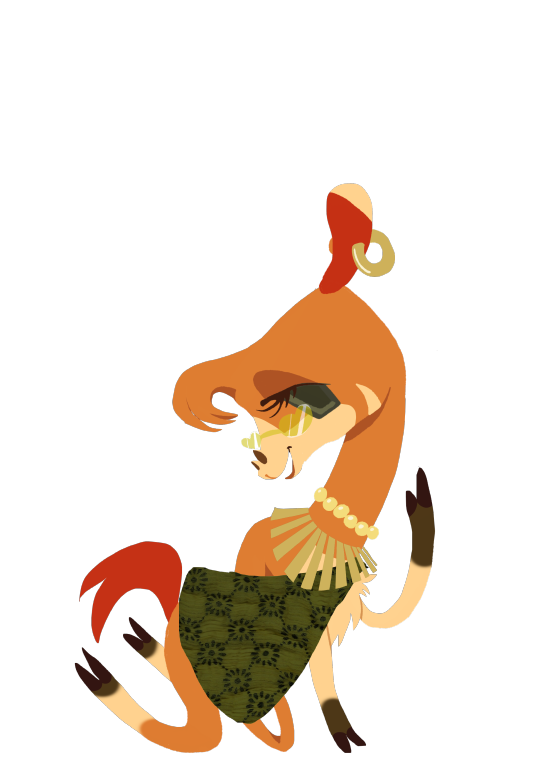
However, I believe that due to the vague nature of some of the words within the NATO Phonetic Alphabet, not all the character designs will be instantly recognisable as representing said word, examples being my representation of ‘November’, this is a word which doesn’t have many instantly recognisable symbolic or cultural representations, however I represented it through a blue-tinted scorpion, as to represent Novembers association with the star sign ‘Scorpio’ and an association to the months birthstone, being topaz. I didn’t want the designs to be blatantly obvious or stereotypical, but this may be an issue in making the designs readable for a wider audience
0 notes
Text
Designs concepts 3 (+ sketches)


Notes for designs unmentioned:
Uniform - Shell/tank design partially inspired by the ‘Tortoise’ style of tanks
Victor - Character to be posed in rampart heraldic lion style, as to evoke the imagery of victory and domination
Whiskey - design will have prominent chest hair, as an allude to the phrase 'that'll put hairs on your chest', referring to strong alcoholic beverages
Zulu - Wing pattern will be inspired by traditional Zulu fabric patterns and the naval flag design for the letter ‘Z’
Design sketches


For sketching and planning designs beforehand, I didn't do much of, as I wanted to work consistently the same digital canvas, however some designs proved difficult in execution so I decided to plan their shape and colours before concluding.
When deciding on how to design each of these characters, I wanted to make them to have a unifying style whilst still allowing each design to be unique.
I went about this by deciding on a geometric and line-less style, this was inspired by the 50’s UPA and 60’s soviet illustration and animation I had researched for inspiration, as a lot of the charm for these visual styles come from their shape language, flat whilst incredibly expressive. As well as this, I believe it evokes a collage-like style, unifying it with the design style for the rest of the zine project.
Character design feedback
For feedback on both my concept and character designs, I created an initial survey, before finalising all of my character designs, to gauge interest in the topic I’d chosen and whether or not I should develop it further.
Here are the responses


The responses are quite varied, which is to be expected when asking for peoples opinion on any topic, however the variety in responses to how people interpreted the characters allowed me to recognise the issues within a lot of their designs as well as how I had phrased the question.
I believe a lot of issues that came from deducing these characters representations came from the misinterpretation that they were representing the letters of the Alphabet and not the words within the NATO Phonetic Alphabet. I believe what would decrease this issue, as well as make the designs more readable as their words, would be to alter certain character's shape language to better resemble their related letter.
This survey also allowed me to see what topics related to my chosen subject people would be interested in learning about, such as etymology and the importance of code within the world wars. I will definitely keep these topics in mind when furthering my project concept.
0 notes
Text
Designs concepts 2


Notes for designs unmentioned:
November - The colour scheme for this design will be blue/yellow/brown, as to match the birthstones of the month November, topaz and citrine, as well as the birth flower, chrysanthemum
Oscar - if design was reworked, Oscar Wilde inspiration to be changed to film director aesthetic, as to allude to the ‘Oscar’ Awards
Quebec - Design to include the Fleur de Lis, an emblem seen on the flag of Quebec and heavily associated with the province’s identity
Tango - Design to include two heads, being a bicephalic snake, as to reference the phrase ‘It takes two to tango’
0 notes
Text
Designs concepts 1
For the zine covering the NATO Phonetic Alphabet, I thought it’d be fun to educate the reader on each word by representing them as unique character designs, alongside historical contexts and additional information on how the phonetic alphabet came to be on each page.
This concept has wholly inspired by the designs I has made for the ‘Deliberately Lost’ mini brief, as I had found the concept interesting and fun to do.
My thoughts with this project would be to make the designs based on animals, as animals within our collective culture are known for being used within symbolism, idioms and tropes, allowing for a lot of opportunities for portrayals for certain words within the NATO phonetic alphabet.
First thing I did when beginning this part of my project was to create mood boards to inspire design concepts, I researched into the meanings/associations for each word and tried to find reasonable and recognisable interpretations for each.


Notes for designs unmentioned
Foxtrot - If redesigned, colour scheme should change from resembling an arctic fox to resembling a common red fox, as to avoid confusion as being a wolf
0 notes
Text
Final idea
The final concept I came up with is an educational zine series focusing on teaching etymology, code deciphering and different unique histories around human communication.
For an actual outcome, I am planning on producing and designing 3 zines within this series, focusing on the subjects of the Nato Phonetic Alphabet, its history and purpose, emoticons and communication on the internet, origins and forms, and lastly untranslatable words and how they display the vastness of the human experience.
Research
Phonetic and spelling alphabets
How will this topic be portrayed:
Timelined history of the phonetic alphabet and what influenced the change, alongside character designs all representing the codewords, helping the audience learn the phonetic alphabet.
http://www.nato.int/cps/en/natohq/declassified_136216.htm

youtube
youtube
Significant info for topic
Reasons for development, that being to bridge the gap between communication issues within early telephone networks and later for two-way radio, utilised by militaries.
Began informally in the late 19th century, first recorded in 1898 within British Army signallers, only using acrophony on commonly misinterpreted letters, being A (Ack), B (Beer), M (Emma), P (Pip), S (Esses), T (Toc) and V (Vic). As time progressed to the world wars where distant communication was vital yet commonly interfered, these code systems would develop to be more consise and understandable.
How certain words are pronounced irregularly in order for clarity, such as uniform as 'oo-nee-form' and numbers such as three, four, five and nine pronounced as 'tree, fow-er, fife and nine-r' respectively.
The tests conducted to find the most suitable and memorable code words, finding confusing within 'five' confused with 'fire' and thus changed to 'fife'.
During the Nazi regime in 1936, Germany's previous military spelling alphabet was significantly altered, due to their spelling alphabet being composed of first names as code words, all names used with Jewish origins were replaced with alternate code words. As of 2022, the spelling alphabet has been completely altered as to have place names as code words instead of first names, with the previous code system restored to it's original state pre 1936 and retitled as an informal 'postal spelling alphabet'
Connections to Flaghoist communication and common use within number stations.
Emoticons and digital communication
How will this topic be portrayed:
A timelined history of the beginnings of typographical illustration and development of emoticons, kaomoji and emojis. Alongside this, it will cover the cultural significance of emoticons, their association to international communication and the phenomenon of Pareidolia.
youtube
youtube
youtube
youtube
youtube
youtube
youtube
Significant info for topic
In 1648, poet Robert Herrick wrote, "Tumble me down, and I will sit Upon my ruins, (smiling yet:).", considered to be the first documented use of ':)' representing a smile.
First use of a standard text-based emotion is often accredited to Scott Fahlman in 1982, where he proposed the use of ':-)' within bulletin boards in order to indicate humour, due to it being difficult to discern over online messaging.
After emoticons would spread to ARPANET and Usenet, developing further emoticons such as some which never caught on, example being '&' representing someone crouched convulsing with laughter.
Regional specific emojis (eg Kaomoji and umlaut based emoticons)
The development of the iOS emojis commonplace today
implementation of emoticons into Unicode, such as in wingding type
'tête à Toto', A children's drawing game/doodling style where one makes a face out of three 0's, two as the eyes one for the head, a + as a nose and an = for lips, drawn while singing an instructive song
Henohenomoheji, similar to the formerly mentioned, this is a Japanese children's drawing style involving kanji making up a face
Mondgesicht, another similar children's drawing game from Germany
Visual development of emojis and the design choices involved
The impact on modern online and general communication they've had
The Untranslatable
How will this topic be portrayed:
Through Two page spreads, with full page illustrations depicting the chosen untranslatable words accompanied by the joint page explaining the word, it's meaning and origins. The conclusion and introduction of the zine discuss the beauty of language and the unique perspectives throughout culture displayed through them, encouraging embracing of cultural identity and open mindedness to new languages and customs.
Significant info for topic
The story of The Tower of Babel as a contextual analysis of the concept of cultural divide and untranslatability
Bizarre puns, idioms and sayings and their contexts and cultural significances.
Uses of these singings within art and culture.
Words chosen so far to depict:
Ya'aburnee / يقبرني (Arabic; A wanting to die before someone else you love, because of how difficult it would be to live without them, literally 'You bury me'),
Cynefin (Welsh; a feeling had when finding a place where you truly belong, the environment hauntingly beautiful and perfect), Tenyérbemászó
(Hungarian; A face begging to be punched, literally 'Palm crawler'),
Mbuki-mvuki (Swahili; to remove clothing in order to dance more freely),
Hatsuyume (Japanese: The first dream had in the new year, believed to be an omen for coming year) or Wasuremono (Japanese: Items left behind or forgotten),
Qarrtsiluni (Inupiaq; Sitting together in the darkness, waiting for an idea to strike),
Akihi (Hawaiian; the instant forgetfulness after just being given directions)
Innerer Schweinehund (German; The voice in your head trying to make you lazy and procrastinate, literally translates to 'Inner pig-dog'
Qiang jingtou (Chinese; The fight and determination of a camera man to get the best shot)
0 notes
Text
Visual Inspiration


youtube
youtube
youtube


0 notes
Text
Finalised Main project ideas
After ruminating on the ideas I had thought of, I had wittled it down to three main concepts to decide from, those being-
Call to change for Birmingham city centre
•Critique on its cultural stagnation and reliance on development and big brands whilst demolishing independent Shops and defunding arts
•Mention The Square and Electric Cinema
•Criticise empty ugly buildings and landscape
•Spotlight independent and important areas of culture still present in Birmingham city centre that deserve preserving
This is a topic which interests me due to it being a huge concern to me and many others who live in Birmingham and the West Midlands, as due to the lack of funding from the council, barely any support is put into the arts and community, as well as no effort given to advertising affordable and independent events.
Two articles covering separate cases of iconic and historical landmarks in Birmingham city centre being shut down in place of development.


Observational drawings made whilst back in my home town of Birmingham, the left page being of a street corner in Balsall Heath, drawn whilst on the bus, the right page being misc illustrations of various subjects within a Café Nero in Birmingham city centre
Net Art and the current corporate nature of the internet
The conglomerated state of social media and other websites all sharing the same functions, simplistic designs and algorithms, causing all individuality to be lost of both the UI design, content, communities and users
The predatory nature of modern social media, intent on keeping its user base addicted in order to farm engagement for profit, prioritising frequent short-form low quality content
The current trend of social media sites blatantly advertising and promoting far-right ideological posts (eg, Twitter and Elon Musk, Far-Right pipeline on YouTube, homophobic & transphobic legislation added to Meta TOS)
Moss of humanity through incentivising AI
The importance of personal expression and how compartmentalising the internet has normalised bullying and hate.
Promoting the indie web and encouraging making personal websites
I had already researched these points previously within a past project, as well as briefly covering them within the ‘WWWILFing’ mini brief. I am incredibly passionate about this topic as I believe that many people, including myself, feel drained, stressed and pressured by social media, unknowing why or how to surpass it. It I were to develop this concept, I would want to educate people on the scummy business practices held by most big social media companies, seeing its customer base not as people but profit, jumping through any hoops and surpassing any morals in order to grab the largest pay check.
A history of language and code
In order to spread appreciation to language and how it connects everyone
Educate on the history of many unique language structures, how they were created and why they’re important (eg. Braille, sign language, Nüshi, morse code, etc)
Encourage preservation and appreciation of culture and identity
Encourage others to learn a separate language and to engage in other cultures as well as encourage literacy and an appreciation for history
How cultures perceive things differently through language expressions (colour, idioms, senses, etc)
This was a topic that drew my interest after partaking in the ‘Deliberately Lost’ project, as I found it really interesting to see how everyone characterised each other through their common speech patterns. If I were to continue further with this concept, I would hope to further research the deeper aspects to language and more notable messages and historical events to recount.
Presentation


Within my presentation, I displayed what I had made so far and explained my project ideas. Once hearing back from the group and my friends, I deduced that within the time frame, the language concept would be the most plausible to complete.
0 notes
Text
WWILFing pt 2
With this second attempt, I used the site 'Gifcities', the prompt word I chose was 'Stick', which resulted in this gif as one of the results
GIF 1
This GIF drew my interest due to the striking visual style and charm, very distinctive of most amateur web animation of the early 2000's. (dating to 02-May-2003 on its index)

Once clicked, the gif took me to an index page, then leading to this homepage displayed above, dated as being created sometime in 2004 or before.
The design is very noticeably garish and non-professional, relying solely on simple text and links with highly saturated colour.
Despite this, I believe this webpage holds a lot of charm, the lack of professionalism just shows that the author, despite their lack of experience, still has a lot of passion and decided to make a mark on the internet anyway, not expecting many to see their website.
Wanting to purely express yourself on the internet without wanting viewership or an audience is practically unheard of within the modern internet, as most of the incentive advertised within social media is to make money or receive fame, not as an outlet to represent and express yourself whilst humbly communicating amongst others.
Due to the motive to conglomerate all social medias and platforms into one standard, spaces for this kind of expression are hard to find. In an internet where once designated forums and webpage communities would chat amongst each other independently, big companies now incentivise appealing to everyone and thus satisfying no one, grouping practically everyone online to just a few heavily corporatized sites.
A notable example of this being a negative influence is its impact on online art communities. Within the early days of the web, most artists had their very own websites on which they'd display their art, shared through webrings and art forums. This would later develop into art social media sites, which would further the engagement of an audience to an artists work. However, in the modern state of the internet, most designated art sites are abandoned with a waning userbase, with most online artists hosting their presence on the larger mainstream websites such as twitter or Instagram to hopefully farm more engagement. However, due to the oversaturation of users and a website not built for promoting art, incentivising short and consistent work instead of works which take long lengths of time to complete, many artists struggle to find a platform for their art unless they push themself to make content to an exhausting degree to please the algorithm.

Due to the uniqueness of the username had by the creator of the website, I was able to find a YouTube channel attached to it.
This is an interesting insight into his life, seeing his love for videogames and caring for animals, humanising the faceless person behind the screen.
GIF 2

This was the second gif that caught my eye, due to it containing the character 'Pucca', Pucca is a show I loved as a child so I was curious on what the page could be about.

Clicking the gif lead to a blank pink page with sprawling text introducing the webpage
The pink page then redirected to this home page, a personal website for a woman named Rachel, decorated fully with pink glittery gifs and banners.
The website however wasn't fully archived, probably due to low viewership. Because of this, only the main page remains, with all of the branching pages (Bios, interests, fan links, etc) are all unarchived and redirect to scam or inaccessible websites, leaving a majority of this website lost to time.
GIF 3

This gif caught my eye due to it's bizarre message and execution, seeming like its an urgent warning, alerting of people being paranoid for unreasonable grounds. Immediately, this struck me as either as belonging to conspiracy theorist site or a conservative site.

Immediately after clicking the gif, my predictions reigned true as I was redirected to this page, a garishly patriotic webpage sprawling with American flag iconography and advocating for the use of firearms.

The main page follows more of the same visual ques, using heavily clashing colours and heavily digitally altered images. Advertising itself as 'The Thinking Mans Page', it hosts many pages on conservative politics of its time, firearms, etc.

What really stuck with me about this page other than it's visual style, is it's low viewer count. When reading the visit counter at the bottom of each page of this website, all the pages are archived as having a viewership less than ten, in one case only being one, meaning the sole viewer of the page was the archival bot, not even a real person. The possibility that I was the only living person to view this page aside rom the author makes me wonder about the other websites and creations made out there in the world which are yet to be seen by anyone at all. This is why I appreciate the work of the Internet Archive, as it archives the internet freely, not depending on popularity, meaning that anything gets a chance of being remembered, no matter how banal or strange.
GIF 4

This gif caught my eye initially due to the cute dog graphic, but the message caught me of guard so I found humorous.

Once clicked, it redirected to this page, sweetly dedicated to the author's dog, page themed with a bone patterned background and links to pet webrings and communities.

The main page shares this visual motif, showing the creators clear love for their dogs.

What I love about this page, is the level of personal touch within it's design. The creator puts their entire heart and soul out for the world to see, listing all their interests, passions, hobbies and connections, showing the world who they are.
GIF 5

Lastly, this gif caught my eye due to the pure surrealist nature of it, a disembodied bobbing head of what looks like someone's school photo.

When clicked, it led to this odd but sweet page, telling a short poem about how the authour and their close friend will never part and will be friends for life. The simple kitschy charm of this webpage not only comes from its endearing sincerity, but also its bizarre design, animating inhuman movement to static images of their disembodied heads.
As well as this, the page downloaded a .mid file, which can be listened to here.
(note: this audio, when the website was still online, would've been regularly played through the browser, but due to the nature of the archival of the site it downloaded it instead)
This level of effort within programming this site shows the creator's dedication and passion for telling the world of their close friendship.

When navigating to the main home page of the website, I was unfortunately met which a mass of dead links, unable for whatever reason to be archived properly. This left a huge chunk of the website undiscernible, it's original appearance lost to time.
ANALYSIS

Cueva de las Manos, Santa Cruz, Argentina
The innate urge to prove to others that u were here is primitive and ingrained within the human experience. Art and creative drive is something that makes us human, and that allows us to make our own marks within society proving that we once lived to the ones that come after us.
This is an element I definitely realised whilst researching and exploring the 'WWWILFing' mini brief, as time and time again I saw how many wanted to immortalise themselves online, usually in an unrealistic manner, only choosing to document the best of themselves.
The term 'chronosonder' I believe summarises my experience well, the phrase meaning to gain awareness of the fact that those who came before you held full, fulfilling and eventful lives. Although the period of which most of these websites originated from wasn't that long ago in perspective, considering the evolution technology and the internet itself has had since, the infostructure and culture of this era seems alien in comparison. Seeing that in contrast with the heavily earnest biographies and welcome sites makes you realise the person behind the site made it purely out of passion, unintended for professionalism, a sense of down-to-earth sincerity and humanity which isn't promoted within most platforms on the internet today
As well as this, navigating these spaces, once hosted and maintained by their respected owners, now completely vanished in their original form, only miraculously archived left me feeling somewhat sad, thinking about how many peoples important memories, experiences or creations held online have either been forgotten by the world or have completely vanished from site closure and 'bit rot'.
'Bit rot' is a phenomenon I came across frequently within this mini brief, this refers to the gradual degradation of digital data, most notably in the form of data files, such as digitised photos, videos, music, etc. This gradual wearing often presents itself as files gradually losing quality, showing 'artifacting' or pixelation. This mark of age I find visually interesting, as many associate the internet as being immortalising, something that remembers and maintains everything to post online. However, this is far from the case, as data files, websites, etc all age, decay and die too, much as anything does within the physical world. I find image artifacting very unconventionally beautiful, an imperfection of a system thought to be infallible, as said by Brian Eno, 'Whatever you now find weird, ugly, uncomfortable and nasty about a new medium will surely become its signature.'
Its because of these aspects, I would hope to emphasise the flaws within digital mediums, such as artifacting and link rot, and see the beauty within them and the passage of time.
Originally, I had planned to conclude this other attempt at the 'WWWILFing' mini brief with another try at an observational digital collage, inspired by each individual webpage. However, due to time concerns, I had to shelf the idea, however I would be interested in returning to it.
0 notes
Text
WWILFing pt 1
With this mini brief, I didn't finalise an end product, or go as far as i wanted due to time, however I was able to do two separate deep dives.
The first being the use of a random Imgur image generator, I decided that for each generated page I received, I would create an illustrated composition page of the images that interested me the most, resulting in visual collages of internet culture.
MY SEARCHES
With each individual search, it generates a large sprawling page of many unique images, of varying subjects, sizes, quality, and places of origin, resulting in many interesting and strange areas for inspiration.
What I thoroughly enjoy about this website is that it shows a true cross-section of both internet culture and humanity itself, showing what humanity finds memorable or important enough to be memorialised upon the internet, mostly consisting of suggestive and humorous images as well as family/personal photos, art, and online gaming screenshots.
Within my illustrative collages for this brief, I wanted to evoke the feeling of being overwhelmed, as to mimic the oversaturation of content online as well as the aesthetic style of internet pop-ups.

Example of multiple pop-up ads
For this, I will be cluttering the entire page, layering illustrations on top of each other. I also plan to use a multifunction pen, a pen with multiple colour nibs, so to overload the page with many eye-catching elements, all screaming to grab your attention.
Another aspect I will be implementing into these pieces is time. I want to create each illustration fairly quickly, one after another at quick concession. This is not only to achieve a scratchy look but also to evoke the feeling of vague/forgotten memories, only briefly remembered through simplistic colours and shapes.
FIRST PAGE


Left: Original scan Right: Edited version to add contrast and artifacting
For the first page I drew, the first thing that caught my eye immediately was the incredibly long image reaching the top of the page listing all the places the creator wanted to visit within their lifetime. I found this very charming, so I attempted to write and draw the entire list coiling around the border of the page. This was very strenuous but I believe it created an interesting affect, framing the rest of the page.
The rest of the images were chosen whilst I scrolled down the page, drawn in the order I viewed them and illustrated in colours matching its place in the rainbow order.
Although I am fairly happy with this outcome, I believe the middle of the page is fairly baron, and looks out of place compared to the chaos found around the rest of the canvas.
Another design element that I not only added to this outcome but the rest is the over editing of the final illustrations. I wanted to create this digitally edited artficating aspect to the illustrations, making them appear old and bit-rotted as to evoke the state of digital decay within older web landscapes, file forms and programming codes.

Visual example of bit rot within an image
SECOND PAGE


Left: Original scan Right: Edited version to add contrast and artifacting
With this page, I took a different approach to the first, choosing the colours based on which elements I wanted to stand out most and not just chosen by rainbow order.
I believe this worked in the piece's favour, as it allowed each aspect to stand out solely on their own whilst having a uniting illustration in the background in a faint yellow, emphasising the more bold coloured illustrations around it.
Despite this, I believe some compositional and illustrative elements could've been improved. For example, I commonly struggle to draw faces from reference free-handed, which is noticeable with the portrait on the top left in dark blue. Due to it being in a bold colour, it only makes the mistakes more obvious which breaks the general competency of the rest of the piece.
The main image that drew my eye within this page was the image of the person reaching into their skirt. I thought this image was very compositionally interesting and also filled the goal of illustrating the prevalence of suggestive and explicit content overly abundant on the internet. Its because of this, I wanted it to be a subtle centrepiece, putting it in the centre of the page but with a light yellow o that it doesn't distract from the other illustrations surrounding it.
THIRD PAGE


Left: Original scan Right: Edited version to add contrast and artifacting
For this collage, I wanted the main element to be the polar bear seen in the first loaded image. However, when first attempting to draw this, I believe I got too focused in detail and not shape which ended up creating an illustration that didn't resemble the polar bear at all.
As this was an image I wanted to emphasise on the page, I decided to start again on a new page.


Left: Original scan Right: Edited version to add contrast and artifacting
With this second attempt, I drew the polar bear using the technique of not looking at the page whilst drawing, keeping eye contact on the image whilst drawing. Although the outcome still doesn't resemble the reference image that closely, I am still more happy with this outcome as the illustration has more confident lines and dynamic shape, making it more visually interesting.
As I drew the rest of the page, I found that I liked the look of type amongst the illustrations, because of this, I shifted the main focus of the collage to words and typography instead of the initial polar bear image. For the rest of the page's creation, I actively searched through the results for interesting words and type design to include on the page. I believe this works very well in both the designs favour and also in the motive for the collages to feel overwhelming with information.
FINAL THOUGHTS
Overall, I thoroughly enjoyed this mini brief, but I believe I could take it further, possibly making more detailed collages to better represent each image generated.
0 notes
Text
Deliberately lost (Final) pt3


Left: Group participant's names and coinciding secret words Right: Pressed flowers, picked on journey


Observational drawings done on the journey, first and second illustrations drawn in playground, third drawn at outdoor café.
Brief Overview
Overall, I thoroughly enjoyed this project, as I let me connect closer to my peers and better understand the landscape of Bristol. It also allowed me to gain better confidence within my observational drawing skills, drawing in public and drawing amongst others, as I often struggle to work with others around.
A outcome of this mini brief, is that the language aspect inspired me to branch off and create character designs based off the NATO Phonetic Alphabet, an experiment I've been wanting to task myself with. I was incredibly proud with this outcome and thus decided to develop it into a much larger piece for the final project.

0 notes


Text
Deliberately lost (Final) pt1


Originally, our group had planned to meet at Bristol Coach station for the conclusive journey, randomly picking a bus through random chance with dice, and randomly generating a stop to get off at. However, due to monetary concerns, we took this journey by foot instead, taking a similar method to the test run.
Whilst walking in random directs, we came across a pathway, which we later found was Bristol and Bath Railway Path, which we would walk down and document, still branching off when code words were uttered according to the plan.
The following pictures document that journey.
0 notes