
Don't wanna be here? Send us removal request.
Statistics
We looked inside some of the posts by impoverishedrat and here's what we found interesting.
Average Info
Notes Per Post
2
Likes Per Post
1
Reblog Per Post
0
Reply Per Post
1
Time Between Posts
6 days
Number of Posts By Type
Text
12
Last Seen Tumblr Blogs


Fun Fact
In 2020, 27% of US Tumblr users had an annual household income of over $100,000.
Text
Final Project
Before I begin, sorry Merlin, this post is longer than I expected. But I hope it’s an interesting read as I had a lot of fun attempting this project!
Also I think Tumblr desaturated some of my screenshots D:
-------
For our final project, I opted for personal branding since I was more familiar with myself than CNM, and also because it seemed like a nice opportunity for self-exploration, especially in the last few weeks of the semester where we tend to get pretty lost about who we are and what we are even doing with our lives.

I first created a moodboard for the vibe I was going for. I love the sky, especially sunsets! Most people find sunsets comforting, but I find them fun too. Every sunset is a reminder that the sky isn’t just the same boring blue. I know many people may not see the fun side of sunsets like I do, but I wanted my brand to feel just like how sunsets feel to me.
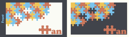
Logo
I wanted to include my name in it; not my actual name, since people tend to have difficulties remembering Chinese names. Perhaps my initials or a shortened version.

The squiggle
This looks like my handwriting, and it has my initials. I like its minimalism but it’s too elegant.
I continued exploring different ways of portraying my initials, and it suddenly hit me: what about jigsaws? I’m a huge fan of puzzles — jigsaws, rubik’s cube, sudoku, literally anything. I think that says a lot about me: I love problem-solving, and I have a great deal of patience. Those are personal traits that I would want to portray through my logo.

I went through a handful of drafts before arriving at my final logo. Initially, I envisioned using both my initials (MH), but I had issues with the letter M. I tried using both regular and irregular jigsaws, before deciding to focus on H which looks a lot more compatible with jigsaws. It took me long before I finally realised that there’s a jigsaw piece that looks like the capital H (Draft 4), but I had some qualms about using that on its own as my logo. I felt that people would only think of it as a jigsaw, and no one would associate it with the letter H, so I sent that to my friends and they confirmed my thoughts. Thus in my final logo, I included more of my name so that people will read my logo as a word, and associate the jigsaw with “H” as well (gestalt principle: proximity). I used Cooper Black since its curves complement the curves of the jigsaw, and edited the corners of the jigsaw to match the slightly sharp edges of the letters (gestalt principle: similarity).
I considered using the jigsaw on its own as a responsive logo, but decided against it as I really wanted people to interpret it as “H” as well. If I do end up using this brand in the future and it gains some traction, perhaps I’ll reconsider again.
My friend said draft 3 looked like a giraffe, inspiring me to make another giraffe icon that looks like “h”, since giraffes are chill and so am I.
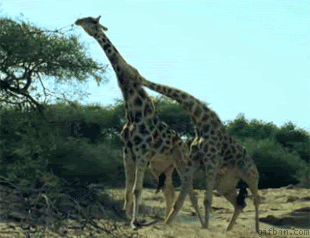
Chill, until they fight
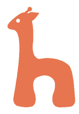
The giraffe
I still preferred my jigsaw logo, but we had to bring 3 logos to tutorial so I brought the squiggle and giraffe along too. My classmates really liked the jigsaw logo and I used that eventually.
Brand colours
I had to include burnt sienna. It’s not my favourite colour, but I have a bag that’s burnt sienna and every time a friend sees me with it for the first time, they always comment that the colour suits me a lot. I don’t get that often, so there must be something about burnt sienna. It’s a common sunset colour, and it’s also inviting, comforting, yet adventurous and fun. I like the connotations associated with it.
To complement it, I included yellow, an equally warm colour, and blue as a contrasting colour to balance them out. I also had neutrals – ivory and charade. Ivory is a warmer shade of white, and charade is less glaring than black, which fits in better with my other colours. As a whole, the brand colours looked fun, which was what I wanted.
I couldn’t decide which colour to use for my logo though. I like the burnt sienna variation but both felt warm and inviting. Eventually, I stuck to burnt sienna after my classmates pointed out during tutorial that yellow could be too in-your-face and less versatile.

Typography
Since I used Cooper Black in my logo, I wanted to use it in my brand too. I like its friendly look and it’s a good match with the style of jigsaws. However, it’s not the best typeface to read in for body text when there are many words, so I used Futura PT for that as it looks friendly too due to its round, sans-serif nature, but more readable.
Business card pt 1
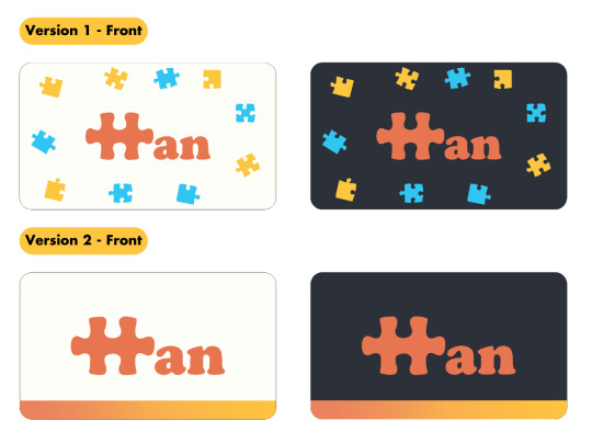
My initial designs. (the blue and yellow jigsaws aren’t by me, I took an online jigsaw template and converted them to vectors using Image Trace. I was going to make my own vectors after I confirm my design)
I ended up using version 1 as it’s more cohesive with my brand, as I saw myself repeating the jigsaw motif. I used my brand colours for the contact details on the back to make it less plain. But when I looked at the front again days later as I assembled my style guide on InDesign, I thought it looked ugly due to my exclusion zone. There was too much space between my logo and the scattered jigsaws.
Style guide
Short interruption to talk about selected pages in my style guide as they will be relevant in explaining my eventual business card design.
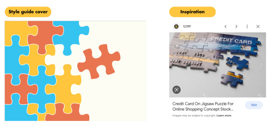
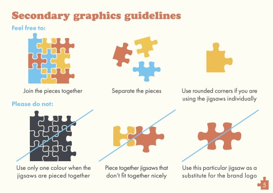
I found the Google image when I was searching for inspiration for my business card, but I found the design more appropriate for the cover page because it reminds me of presentation slide designs. Anyway, I thought the displaced jigsaw adds to the fun style and makes the design interesting. That jigsaw is actually the jigsaw H from my logo, but I’m using it as a secondary graphic instead.
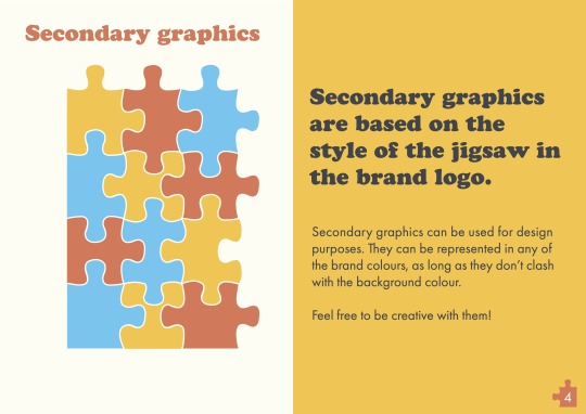
To create the other jigsaws, I first used the shape tool to form rectangles the same size as the jigsaw H. Then, I used pathfinder’s minus front mode to isolate the protruding parts and the blanks, and the unite mode to join them with the rectangles. I wonder if there’s an easier way though, as this was time-consuming.
Problem: I wasn’t exactly sure how to present this page. I think the visual layout can be improved for clarity.
I looked at some references and realised that they split up the different secondary graphics when presenting them, but I guess that’s because they can’t actually combine the graphics too. But jigsaws can be split up or pieced together, so I was in a bit of a dilemma at this point. I wasn’t sure which option would be better, so I kept the pieces together to see what my classmates would feedback during critique.
Business card pt 2
Back to my business card. I decided to tap on my secondary elements and have something similar to my cover page where the pieces are assembled together.
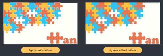
And I got this, inspired by a song I was listening to. The lyrics would translate to “I’m like a puzzle missing a piece, what a jarring void”. I wasn’t going for that emo mood but I realised I can get rid of some pieces to make the design interesting, instead of having everything pieced nicely together. I was concerned that one missing piece would be too jarring though so I got rid of all the jigsaw Hs, also because it feels weird if I got rid of one piece and kept the other. Still attention-seeking (I think), but not to the point of being jarring. Previously, my business card had rounded corners as I wanted a friendlier look. However, I think sharp corners suit the current design better, else the yellow jigsaw on the top left corner will be cut off by the rounded corner. Another reason was because I coloured the jigsaw outlines the same colour as the card to create a tiny distance between each piece. Without outlines, the design felt stifling to me.
As a result of adding outlines, the pieces on the edges exceeded the card boundary, like in the image above. Initially, I inserted my cards into InDesign as images since I can crop out the exceeded edges, but I realised that after 2 rounds of exporting (once as images, the 2nd time as the pdf style guide), the colours change slightly and they no longer match my exact brand colours, though they look alike. To remain faithful to my colours, I reverted to pasting from Illustrator into InDesign, and added rectangles near the edges of the card to cover the exceeded jigsaw edges. The sharp card corners are helpful in this aspect as I’ll need more than just rectangles to cover the exceeded edges if I had used rounded corners.
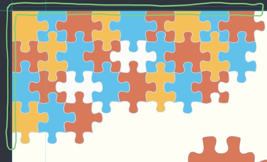
Rectangles
Resume
In my name card, I wrote that I’m a graphic designer and translator. However, since I don’t have any experience in graphic design outside of this module, I included everything that’s related to translation in my resume. I also included my CCAs as it felt obligatory as a student.
After I pasted all the information and trimmed the text, I realised it still has many words. Personally, I wouldn’t say it’s too wordy, but I think it can be subjective. I also coloured the headers and subheaders for all my sections in one brand colour each, besides ivory since that’s the background colour. I kept the body text in charade so that it’s easier to read.
However, something still felt off. My resume also seemed less appealing than the other aspects of my style guide. Anyway, after I submitted my style guide for critique, I realised that the body text for CCA was in black, not charade, oops. I still thought that section felt darker due to the charade headers and subheaders. But I think that played a role too, as it still looks dark (albeit better) after I rectified the colour.
Post-critique edits
1. Added typography use as I missed that out

2. Secondary Graphics
I split up the jigsaws as some of my classmates had issues interpreting what the page was about, affirming that the previous visual layout was indeed unclear. I considered including examples of potential designs by pasting screenshots of my cover page and business card but I had no idea how to format the images without destroying the aesthetics of the page, so I lengthened the text explanation to let the viewer know that they can refer to those examples. I also received feedback that the jigsaws looked like they were in the middle of nowhere, but I realised I happen to have 16 unique jigsaw pieces so I can put them in a 4x4 layout, so hopefully this layout is clearer!
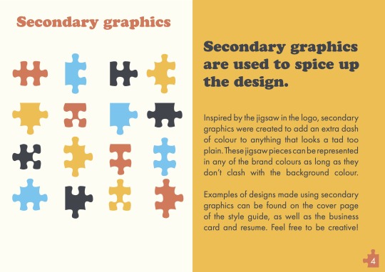
I also edited the guidelines, since the previous one was based on the premise of the jigsaws being joined together.
3. Business card
Some of my classmates said the missing jigsaw Hs looked jarring; some said it looks fine. The consensus was that leaving blanks adds dimension to design, and I had a really interesting comment saying that I shouldn’t change the design even if the blanks may appear jarring as it attracts attention when people wonder “why got blank”, and that's perfect for a business card. Hence, I kept the design and shifted my logo inwards for more breathing space, based on feedback.

4. Resume
Feedback:
Using charade for CCA makes the entire section look dull in comparison, and it also attracts more attention to it
Some think it’s wordy, some think it’s not wordy; ultimately, it depends on my target audience as different audiences have different resume preferences
The jigsaws on the top right corner look too colourful. The use of jigsaws under “Skills” is enough to convey my brand
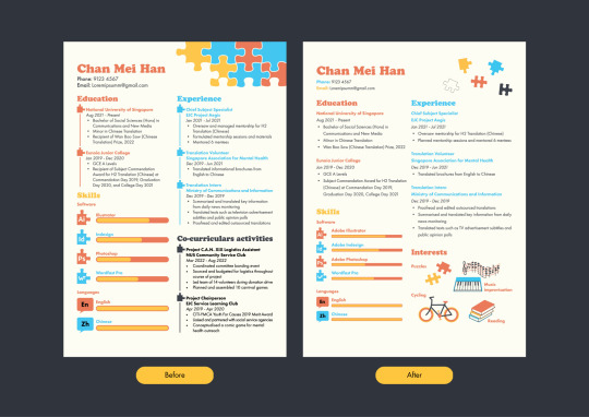
I made pretty big changes here. Firstly, I received a suggestion to colour the body texts of the respective sections in a darker shade of the header’s colour, but the texts were hard to read when I tried it. I think burnt sienna, blue, and yellow just aren’t that ideal to read in regardless of their shade. Besides, Futura PT Book uses thinner strokes, so that plus light colours = eye pain. Thus, I kept the body text in charade for readability, and stopped using charade for headers and subheaders to get rid of the problems of dullness and attracting more attention.
Secondly, I reduced words by replacing the CCA section with “Interests”. “Education” and “Experience” are both closely linked to translation, and I can’t cut the job descriptions as translation is broad, ranging from casual content like food recipes and audiovisual subtitles to formal business contracts. If I submit this resume for translation work, I need the job descriptions so my audience knows what texts I have experience in. If I submit this for graphic design, the previous version doesn’t reveal much about what I can do besides my proficiency in Adobe suite. Thus, I removed CCA since it doesn’t value-add to translation/graphic design, and I drew my interests using Illustrator’s pen and shape tools as a visual representation for what I am capable of designing.
Other minor edits:
Acted on feedback and replaced the jigsaws on the top right with small, scattered jigsaws
Removed the jigsaw ‘timeline’ in each section as my resume looked cluttered
Increased leading for body text to 18pt so my body text looks less like a wall of words
Created the proficiency scales with the line tool initially; replaced them with slightly-rounded rectangles as that suits the block-like aesthetics of jigsaws better
5. Changed my mockup to something less formal to suit my brand

And that concludes my final project! Although it was very time-consuming, it was also very fulfilling. Let me end this with a short story: before another module’s lecture, I showed my Illustrator workspace to my friends for 1 minute to get their opinion on my initial business card designs. I also showed them the first few pages of my style guide. I saw them for tutorial again the next day, and I was searching for jigsaw templates online as references. One of them glanced over at my laptop and she was like, “Oh you’re doing your style guide?” Woah, I was quite happy that she actually remembered my jigsaw motif although she only saw my work for a minute the previous day haha. And so I persevered, and now I’m finally done. Huge thanks to my classmates and Merlin for the feedback; I found the critique for this project to be especially useful!
0 notes
Text
In-Lecture Exercise G

To create a pattern that becomes darker in each subsequent stage, I used black lines with a weight of 25 in stage 1. For each of the subsequent stages, I duplicated what I had in the previous stage and increased the weight by 15. I was going to change the colours of the lines in each stage if the progression from light to dark isn't obvious, but good thing that it's quite visible, since the white gaps between the black lines become thinner as the line weights increase.
0 notes
Text
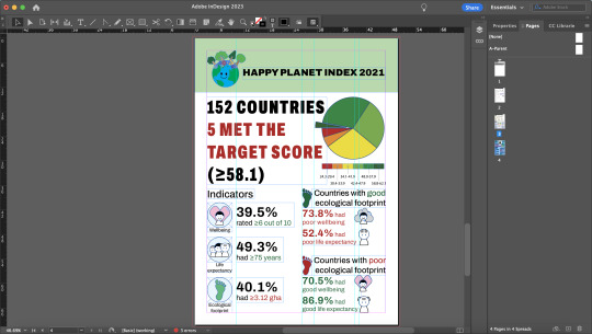
Assignment 3: Information Design
Topic
I chose to create an infographic for the Happy Planet Index (HPI), a measure of sustainability. There was a lot of numerical data about it online (including an excel dataset) and that was great, as I wanted to focus on charts/numbers so I won’t have to spend too long creating vector assets (that wasn’t my forte).
Extracting data

HPI’s excel
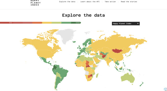
HPI website’s score distribution
The excel didn’t group the HPI scores into ranges from good to poor, so I got the ranges from the interactive website (you could see a country’s score if you click it on the map).

My notes
I thought the underlined parts were interesting, as it suggests that good wellbeing and life expectancy comes at the expense of the environment. I decided to further investigate.

My excel, with coloured HPI scores and abstracted columns for each indicator

Pivot tables
I was right! I thought I should include this relationship in the infographic to better illustrate that we’re not performing well as a world.
Data representation
Pie chart for HPI scores: shows proportion of countries in each colour range. Highlights that only a few countries (one small slice) met the target score
Bar graphs for indicators: show evident difference between good-average-poor
Numbers for relationship between indicators: percentages were more direct. This part requires more brainwork if presented as graphs

Experimenting
Ideas for assets

Happy Planet ideas
I went with my first idea as it was the most direct way to represent “happy”, and included nature elements to represent sustainability and the environment.

Final draft, but I removed that vine eventually

Indicators ideas
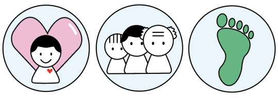
Wellbeing:
Lotus: peace, serenity
Smiling human + heart: contented
Heart: positive vibes, love
Heart behind human: very contented
Since there’s no universal symbol for wellbeing, I created assets for each idea and consulted my friends.

They preferred the one with the heart behind the human. These 2 replies stood out, offering an interesting perspective, so I went with that icon as it is all-encompassing.
Life expectancy:
I googled for inspiration.

These were good. I decided to remove the arrow as it doesn’t value-add. I’d use heights and hairstyles to represent the different life stages.
Ecological footprint:
Finally, something with a universal symbol! I stuck to green since it is associated with land, and with ecology.
Creating the assets (Illustrator)
Assembling the planet. I used the one with outlines to standardise with my indicator icons

Warm, brighter colours for the flower petals to convey a happy mood (Adobe’s Bright 2 swatch)
Yellow for the centre but lime green for flowers with orange-yellow petals for better visibility
Indicator icons
Standardised round icons for easier alignment later on
Lighter shades, as they aren’t the main focus of the infographic
Layout

I came up with several layouts and tried to critique them, eventually settling on layout 4 as its space allocation gave the right amount of emphasis for each element.
Typography
Heading and body text:
Helvetica Neue felt appropriate as its sans-serif nature makes it look ‘rounder’, which complements the aesthetics of the vector assets.
Headline considerations:
Attention-grabbing
Complements the assets’ aesthetics
Complements Helvetica Neue
Won’t look strange after I adjust the kerning and leading to align with the pie chart
I experimented with slab-serif and sans-serif typefaces that look block-like. However, I just couldn’t find the right font, so I ended up using Helvetica Neue tentatively. My friend said it looked ugly and I agreed, so I was still looking for another typeface.
Colours
Pie chart: retained HPI website’s 6-colour scale as I found it effective, but muted tones so it won’t compete with the headline for attention
Bar graphs: muted tones for the same reason. Kept the red-yellow-green system to signal good and poor. I used slightly different swatches from that of the pie chart, lest the viewer thinks I’m still referring to the HPI scores, due to the similar colours used
Red/green footprints: same swatch as the bar graphs, as they refer to the same thing
Background: 2 colours to split the infographic into 3 sections. I used white, and black at 80% tint so it looks closer to graphite grey. My charts were already very colourful, and I couldn’t repeat those colours to maximise visibility, so I opted for more neutral colours
Headline: teal and white, as they complement grey. I used white for “5 met the target score” as it is more striking than teal, and it is the main focus of my headline
Critique feedback

Merlin mentioned that we should consider where we are placing our infographics. As I intended for this to be a digital infographic, perhaps shown on HPI’s website or a social media site, I came up with additional considerations:
Some stuff can be relatively smaller since viewers can zoom in, but they shouldn’t be too small
Information should be very intuitive. Netizens won’t bother paying too much attention to something ie. they will likely look at it for a few seconds unless it’s a topic of interest
Edits
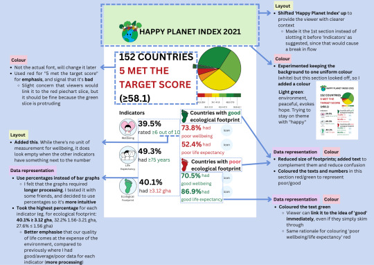
Changes to layout, colours, and data representation. Heavy reliance on red/green for the viewer to make links to bad/good even if they view the infographic for just a few seconds
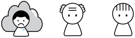
Added icons
Poor wellbeing: grey cloud and blue (heart). Commonly associated with sadness
Good life expectancy: old man from the ‘life expectancy icon’
Poor life expectancy: child from the ‘life expectancy icon’
Considered adding symbols of death, but the icons might look sardonic. Decided not to, since there’s text to aid the viewer
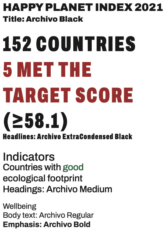
Final typography choice: Archivo
Headlines look arresting
Sans-serif, complements style of icons

Final infographic
Finally. This was a painful week and undoubtedly the toughest assignment, although I also had the most takeaways from this. However, I’ll be jumping ship to Canva for any ‘visual assignments’ outside of NM3217, for now. Special shoutout to everyone who offered me feedback, especially my friends for tolerating my stupid questions.

0 notes
Text
Assignment 2: Storytime!
Storyboard
When I learnt that we had to create a storyboard for this assignment, I thought of Peanuts, a comic strip from my childhood that I still read religiously.

The Complete Peanuts, Vol 1
This particular strip reminded me of the assignment requirements as the story relied on the positions, actions and expressions of the characters, without words. I also felt that storylines involving food contain lots of potential for development.

Main idea: A and B found a biscuit and were going to eat it together, but B finished it while A was gone, betraying A’s trust.
Idea One: A returns in time to catch B red-handed, and B faces the music.
Idea Two: B leaves after finishing the biscuit. A returns and realises, and she looks at the direction that B left in with complicated feelings.
I settled on Idea One as the ending is easier to understand and more interesting. After deciding on figurines as my characters, I refined my storyboard further by noting the positioning of the characters and the props used in each panel. I didn’t plan the camera angles as I wanted to take a few shots of each panel at different angles to compare their different effects.

Photo Taking Time!

For panel 1, I experimented with high-angle, eye-level, and low-angle shots. I didn’t like the high-angle shot as it seemed to communicate “Look at Purple. Look at Yellow. Look at the biscuit. They are all the same size”. It didn’t seem obvious that Purple’s hand was slightly outstretched too. I was quite torn between the other two as it felt like Yellow was ‘listening’ to Purple or giving her some of his attention in the eye-level shot due to the clearer view of his body angle, whereas Purple’s hand is obviously outstretched in the low-angle shot, and I liked the composition better. I decided to use the eye-level shot tentatively.

For panels 3-4, I thought that the camera angle should be standardised since they are supposed to convey together that Yellow is looking left and right, so it would be really abrupt if the camera angle changes in panel 4.
For panel 3, I took high-angle and eye-level shots, and played with the rule of thirds as well. I liked how eye-level shot 2 turned out as it allows the viewer to focus their attention on all the objects at once, compared to high-angle shot 1 where Yellow and the biscuit are very distinct entities. Both high-angle shot 2 and eye-level shot 2 made use of the rule of thirds but the eye-level shot feels closer to the viewer, and the space on the left seems to convey that Yellow is looking really far away to make sure that Purple is definitely not around. I tried to replicate this angle for panel 4.

Panels 5-7 were supposed to feature the characters’ back view, but the results were hilarious when I tested it out because Yellow’s head was so big that it blocked the biscuit. Yellow also looked less identifiable due to the circle on his head. It wasn’t shown in the previous panels so its sudden appearance was confusing, especially when there were no other signs to identify the subject in the photo as Yellow (besides his colour). It just looked like a yellow cube, not Yellow. I decided to photograph Yellow from the side instead to include his body in the frame and make him identifiable.

For panel 9, I didn’t make use of the dutch angle initially, and it looked like the characters were marching in both photos. I then played with the dutch angle and it looked slightly better but Yellow looked like he was tripping in the 1st photo, so I positioned my phone camera more towards the front of the characters instead. I liked how the 3rd shot turned out because Yellow occupied a significant amount of space on the left which makes him the primary focus of the photo, adding on to the comedic effect when the viewer realises that Purple is chasing after him, ready to give him a whack. I felt that the dutch angle made the characters stand out more too as they looked more animated.
Layout
I came up with 3 layouts while making sure that panels 3-4 are next to each other to make it clearer that Yellow is looking around.

Layout 1: Each row can be seen as a stage of plot progression which makes it easy to follow, but it felt strange having only one panel in the first row. I wasn’t sure if aligning the 1st panel to the right would confuse the viewer as they might mistake the 4th panel for the 2nd panel. Aligning it to the left would result in a break in the story flow as the reading order would be: panel 1 → title → panel 2.
Layout 2: It doesn’t follow the typical layout conventions, and it is slightly strange having 2 pictures in each row when there are so many pictures.
Layout 3: It doesn’t affect the flow or have a strange format. I submitted this for critique.
Post-critique edits
1. For panel 1, my classmates preferred the low-angle shot as it felt like Yellow and Purple discovered the biscuit, due to the composition. Someone also suggested that Purple could be facing Yellow more (instead of the biscuit) to show that they are communicating. I decided to reshoot panel 1 at a low-angle and adjust Purple’s position.
2. A classmate thought that Yellow was looking around for Purple so they could eat together, although he gave up waiting eventually. I felt that this slight misinterpretation doesn’t impede the viewer from understanding the main ideas of the plot, so I didn’t make changes based on this.

Final product! 3 Ritz crackers were harmed in the making.

0 notes
Text
In-Lecture Exercise F

This is a photo of Marks and Spencer’s Christmas musical gingerbread house, which functions both as a musical box and a biscuit tin. The 5 hues that I have selected are:
1. Brown
2. Greenish-black
3. Red
4. Green
5. Beige
I wasn’t too sure about the 2nd hue so I asked around, and some other responses that I received include: black, green, grey, blue, and a mix of navy and green. I feel that it could be any of those colours too, but I will just refer to it as greenish-black for this exercise.
I believe that brown was used as the main colour as that is the colour of gingerbread, but it feels calm and warm at the same time, just like beige. Meanwhile, greenish-black conveys a sense of mystery and elegance. Red and green are Christmas colours, symbolic of the festive mood when they are used together.
The five hues work together pretty well as that shade of red and green are reminiscent of Christmas, whereas the remaining hues mostly exude a sense of warmth. This colour scheme allows the viewer to feel at home, which is in line with Christmas, the season of happiness and warmth.
0 notes
Text
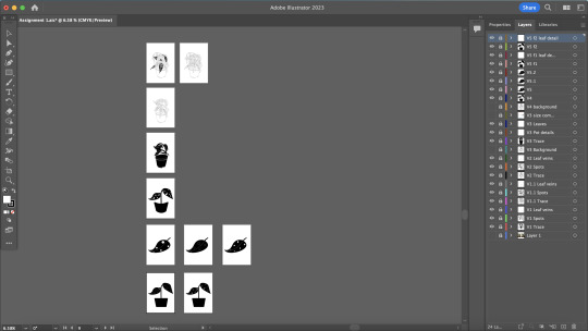
Assignment 1: Stripping Down!

I wanted to abstract an object that had a number of details so that I can just trace over the reference picture in Stage 1 and simplify it further, so I decided to make use of one of the plants I have at home. This plant stood out to me because of its spots, which felt pretty interesting because spotted leaves usually point towards some kind of plant disease. As such, I decided to use it for this assignment, with my main message being: Leaves with spots!
Stage 1
I imported my image into Adobe Illustrator and traced the plant using the pen tool. I used the ellipse tool for most of the spots and joined some of them using the unite shape mode.

I ended up with this, but I felt that the arrangement of the leaves looked quite messy, which could influence where the viewer places their attention. I decided to colour some of the leaves black and introduce contrast to make the plant look more striking as it directs the viewer to focus on the centre of the image first.

Stage 2
I reduced the number of leaves so that the plant wouldn’t look so cluttered. While the black leaves helped slightly, it didn’t feel ideal as there seemed to be some unnecessary emphasis on them, which wasn’t my intention. I thought that having fewer leaves could be another possible way to direct the viewer’s attention so I went ahead with that.

Stage 3
This was partially inspired by my picture in Stage 0. I saw the plant’s shadow and thought, right, shadows are a form of abstraction too. I tried joining the lines together and filling it black, but it didn’t fill nicely, so I ended up tracing the outline of what I had in Stage 2 instead and filling that in.

I wanted to keep it as a plant, so I thought I had to keep the pot as well to signal to the viewer that it is a plant that they are looking at through association, since some people may not recognise it immediately because the leaf shapes are not clearly defined, especially on the left hand side. However, those two leaves that were dangling out of the pot were interfering with the shape of the pot, so it might take the viewer a longer time to register that it is a potted plant. Thus, I added the pot details back, hoping that it would be more telling that it was a pot.

It looks strange because of the same two leaves. I experimented by adding outlines and leaf veins to check if it would look better.
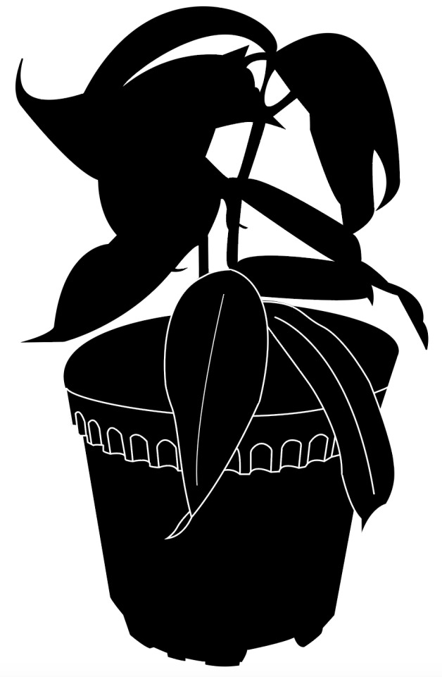
It still wasn’t what I had in mind. I decided to remove those leaves, and added leaf veins and spots for the remaining leaves that did not have a “normal” leaf shape. I thought that the leaf veins especially would aid the viewer in recognising that they were leaves.
While the pot’s shape was now clearly defined, I kept the pot details to balance out the amount of white lines in the upper and lower halves of the image, so that the lower half wouldn’t look too plain in contrast, especially since they were roughly around the same size.

Stage 4
I wanted something way simpler, so I used the pen tool to draw a pot and a plant from scratch instead of largely referencing the previous stage, like what I have been doing. I only included two leaves for simplicity, both facing opposite directions, to create a sense of balance. Just like stage 3, I only included a few leaf spots. I felt that I didn’t need so many spots to communicate my main message.

Stage 5
I was stuck here and wasn’t sure how to abstract further, so I reduced the plant to a single leaf as I thought it still conveys my main message. I decided to standardise the shape of the spots for a simpler design, and ended up with this:

The leaf spots looked really unnatural the more I stared at them. I looked through my previous stages again and realised that round spots felt alright previously because they were really small, but I enlarged the spots to fill up more space on the leaf so that I could reduce the number of spots. I decided to experiment with ellipses instead.

Looks slightly better, but something still feels strange. I couldn’t think of how to improve it further so I submitted it for critique.
Some of the feedback I got:
1. Instead of abstracting it to just 1 leaf, I should keep the pot so that it is still identifiable as the object in the previous stages, especially in stage 1.
I agreed with this, as I also thought that having just one leaf felt like I was going overboard. Someone else suggested using a pot like what I had in stage 4 but without the U curves, which sounds like a good idea.
2. The spots look like holes, especially because of the white background. I received two separate suggestions to reduce the opacity of the white spots, or opt for something similar to what I had in stage 3.
3. Keep the “united shapes” instead of using just circles/ellipses for the spots, as there are other plant species with holes in their leaves and my plant might be mistaken for those.
I agreed with both of the points above, and I finally realised why the leaf felt strange (because the spots looked like holes). I thought that the 3rd feedback was especially interesting as I have never considered that before.
After working on the feedback, I ended up with this:

I decided to go with the left image. For the left image, I lowered the opacity so that the white lines are less jarring as the amount of white in the upper and lower halves did not feel well-balanced at 100% opacity, since I no longer have pot details. It was similar to the concern that I had in Stage 3.
Here’s my final submission! Kudos to you for going through my abstraction process with me :)

0 notes
Text
In-Lecture Exercise E

This typographic representation consists of a title and body text, all in capital letters, in serif typeface. While the body text is not extremely difficult to read, the centre alignment presents an uncomfortable experience for the reader due to the lack of a consistent starting and ending point for each line of the text. This is compounded by the use of capital letters throughout, where each word is shaped like a block because of the lack of descenders and ascenders to balance out the overall shape of each word. At one glance, it feels like the body text is shouting at the reader, and while capital letters are usually used for emphasis, having the whole body text in block letters seems to suggest that there is no emphasis because every single word looks physically similar. The reader would probably be confused about why this typographic representation was done this way when there are so many other ways to represent it such that it is readable and the message is conveyed clearly with proper emphasis (if any).
How I would improve this typographic representation:
1. I would change the typeface used for the body text. I think it is alright using it for the title since it only has one word, but given that the body text contains so many words, I would use another typeface that has a mix of capital and small letters so that it would feel more natural reading it.
Since the title makes use of serif, sans-serif could be used for the body text instead to introduce contrast so that both typefaces complement each other.
2. I would change alignment of the body text, by either aligning left, or justify it and make edits to tracking so that there will not be unnatural gaps between each word. This ensures consistency and guides the reader to a fixed point at the start of each line, increasing the readability.
0 notes
Text
In-Lecture Exercise D
For this in-lecture exercise, I chose to photograph Mr Taekwondo. He’s from the Play To-Fu series by Japanese design team DevilRobots and I think his real name might be Xot To-Fu (based on the few very low-res pictures of the series that I managed to find online), but in case I got that wrong due to poor eyesight, let’s just refer to him as Mr Taekwondo.

Image 1
Mr Taekwondo is small. Like actually, smol. He stands at around 2.5 inches, so he’s not as threatening as his taekwondo uniform suggests. Not to us humans, at least. I took a long shot at a high angle to emphasise how tiny he really is. Nothing too special, the audience can definitely afford to mess with him.

Image 2
Next, I took an eye-level shot that is pretty neutral. It’s still a long shot, but Mr Taekwondo looks less vulnerable now that the audience’s height has been lowered. I wanted to present a different perspective of looking at Mr Taekwondo. The audience gets a good glimpse of his posture in this shot, and he looks somewhat dignified standing like that. Perhaps they were wrong, perhaps we were all wrong, perhaps we have to think twice now about whether we really want to mess with him.
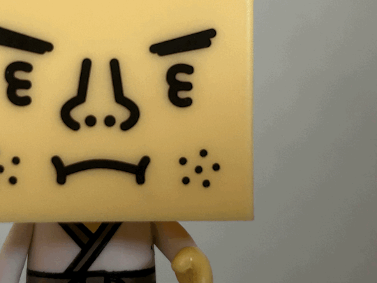
Image 3
This is an extreme close up of Mr Taekwondo’s facial features, and I made use of the Rule of Thirds so it would feel as though the audience is really facing Mr Taekwondo and engaging with him personally. This close up may lead the viewer to feel as though they are in closer proximity to Mr Taekwondo; they might be standing in the same training hall, awaiting a showdown.

Image 4
In this low angle shot, I made use of a dutch angle as well, so it feels like the audience is on the ground looking up at Mr Taekwondo. I wanted to make him look more threatening and present the audience with an entirely different perspective of him. Mr Taekwondo looks way more powerful here compared to the previous shots, and the dutch angle creates a sense of imbalance for the audience, filling them with a sense of uneasiness as they look at him. They definitely undermined him previously.
This was unplanned, but I really like the shadows at the top of the image. It feels like Mr Taekwondo’s opponent’s POV moments before they knock out.

Image 5
Another low angle shot, but without the dutch angle. It’s essentially just the first photo but at a low angle this time. The audience’s perception of Mr Taekwondo as a meek figure should have changed by now. They might see him as a formidable figure this time because the low angle creates a sense of power imbalance.
Once again, unintended, but the shadows on top seem to signify that doom is near. Mr Taekwondo has turned into the Joker and he’s about to seek revenge from those who have belittled him previously.
0 notes
Text
In-Lecture Exercise C
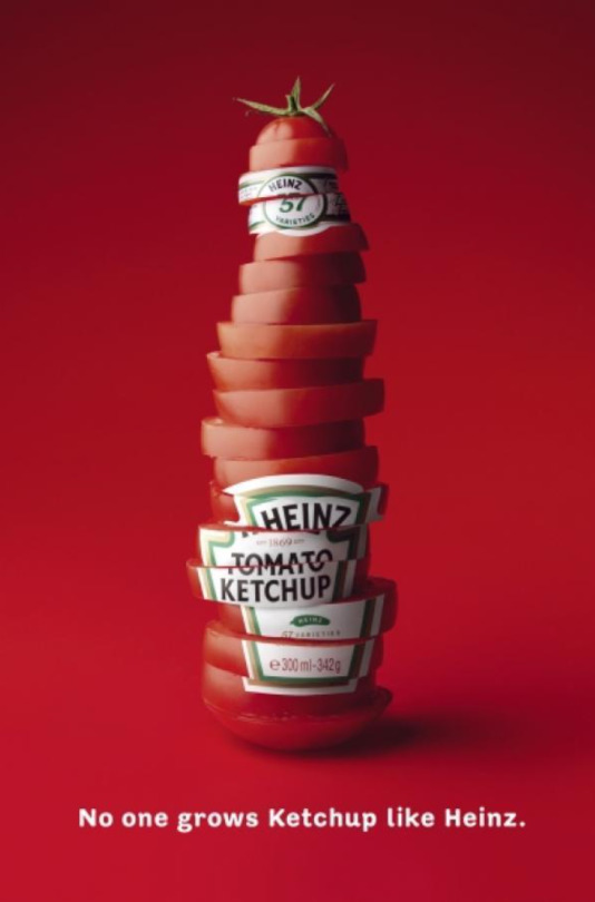
The ad features a Heinz Tomato Ketchup bottle that looks very much like a tomato. The bottle cap is replaced with the top part of a tomato, and the bottle consists of a disorderly stack of tomato slices, though the slices are arranged orderly enough so that the viewer is still able to make out the outline of a bottle. This signifier expresses the idea that Heinz uses freshly-sliced tomato to produce its ketchup, ensuring the freshness and quality of its products. Another possible signified is that Heinz’s ketchup is extremely organic, as demonstrated by how tomatoes seem to be the only ingredients used in this ad.
Another signifier is the tagline, which states that Heins “grows Ketchup”, suggesting that Heinz oversees the growth of the tomatoes used in its ketchup production. Instead of outsourcing the job or relying on suppliers, Heinz grows its own tomatoes, which further emphasises the freshness of its products.
In essence, the ad is trying to appeal to customers to buy Heinz’s Tomato Ketchup by communicating the idea that Heinz only uses tomatoes of the highest quality.
0 notes
Text
In-Lecture Exercise B

Description
For this in-lecture exercise, I have chosen an artwork by computer graphic artist Wuheqilin, a Chinese artist who is known for his satirical art targeted at Western entities. The artwork, titled 敬呼吸 (literal translation: In Honour of Breath), was first published online in late May 2020, a number of days after the passing of George Floyd.
In this artwork, an American policeman towers over several citizens who seem to be in a state of fear and helplessness. The policeman is in a crouching position and it looks like he is about to crush the citizens or the viewer anytime with his knees. It is notable that his physical appearance bears close resemblance to Chauvin, the policeman who knelt on Floyd’s neck, leading to his death. The artwork makes explicit reference to the incident, as evidenced by its caption, “Floyds, Can you breathe?”. Overall, the artwork evokes fear and feelings of oppression.
Analysis
The viewer’s attention is directed to the policeman due to his position. The policeman is in the centre of the artwork and occupies most of the space, which makes him the main subject. Additionally, the artist makes use of contrast. The city in the background is relatively lighter and blur, drawing attention to the policeman due to the darker lighting. Besides that, the policeman is positioned at a low angle, which is further reinforced by the use of shadows below his knee area, signalling to the viewer that the policeman is towering over them. In terms of size, the policeman is very much a giant compared to the other people in the artwork, perhaps 10 times their height or more, further highlighting that he is the focal point in the artwork. Generally, dull colours are used which produces a solemn mood.
Interpretation
The viewer is forced to adopt a POV where they are looking upwards from a vulnerable position, which allows them to better identify with the emotions of the citizens in the artwork. Furthermore, by referencing George Floyd’s incident, the artwork allows the viewer to imagine the sense of helplessness and fear that he experienced in that moment. The caption also appeals to the viewer to think about the many others who are existing or potential victims of such unjust oppression, seen through the use of the plural form, “Floyds”. Perhaps the artist is trying to increase awareness about the issue of racial and systemic injustice, and he is rallying for people who are in a more privileged position to do something to improve the situation.
Judgement
I really liked the use of the low angle in this artwork. When I viewed it on my computer in fullscreen, it really felt as though I was trapped in a situation like that and I hated that feeling, so I thought that the artist did a successful job in conveying fear as the primary message. I liked how real the policeman looked too, especially the folds on his pants. The same effect would not have been achieved if the policeman did not feel like an actual human being, say, if he was drawn as a cartoon character instead, with less attention to detail.
However, the object in the upper right corner felt slightly confusing. When I first looked at it, I thought it was a gun (perhaps because I associated it with the policeman). After searching up images of pistols, I concluded that it looks nothing like a gun, and so I thought it might be another weapon like a cannon or something. Or a tank. Something that shoots, basically, since it was black and had that cylindrical protruding part. It wasn’t until I scrutinised the other aspects of the artwork that I realised that it might actually be a traffic light (because of the one in the bottom left corner). I am still unsure if it actually is a traffic light because I have never seen one from such a low angle before, so I have issues associating it with one. That might be a flaw but not a major one since it doesn’t detract from the central idea of the artwork.
0 notes
Text
In-Lecture Exercise A
A machine/device that will enhance my creativity

Cat loaf
This is a cat, but unfortunately not one that breathes, meows and brushes up against you. I love looking at photos and videos of cats because I don’t own one myself and it helps a great deal when I’m feeling tired or stressed. There’s just something magical about cats. I feel a lot more creative when I am not stressed so I reckon it would work if I had a machine/device that looks like a cat.
Here’s how it works:

Heat radiators represented by red patches
Concealed beneath its thick fur coat are heat radiators for a more realistic sensory experience, else it will feel like I’m just petting any random soft toy that’s devoid of warmth. If I think hard enough, I might be able to convince myself that my dream of owning a cat has finally come true.

Speaker that plays music in 8D
Listening to music helps stimulate my brain too. I feel a lot more creative when I’m listening to music because it helps my thoughts flow really well. I tend to conjure various images in my head depending on the type of music I’m listening to and I think that’s a sign of creativity. I really like 8D music in particular, so there's a built-in speaker at the tip of the tail that plays music with reverb just like 8D audio. 8D audio usually requires headphones/earphones but this speaker will be able to provide just the same immersive experience. The tail will wave gently from side to side too for better sound projection.
I guess I just drew a cat speaker essentially. I’m pretty sure speakers and heat aren’t really supposed to go together but it would be kind of cool if this device actually works!
0 notes
Text
Testing
The quick brown fox jumps over the lazy dog
2 notes
·
View notes