
Don't wanna be here? Send us removal request.
Statistics
We looked inside some of the posts by indn211callagdecl2021 and here's what we found interesting.
Average Info
Notes Per Post
0
Likes Per Post
0
Reblog Per Post
0
Reply Per Post
0
Time Between Posts
3 days
Number of Posts By Type
Text
17
Last Seen Tumblr Blogs


Fun Fact
Tumblr posted its first advertisements in May 2012 and subsequently earned $13M in revenue.
Text
Project 2 - Closing Remarks
When I undertook this paper last year, I had to drop out after a shaky start due to illness and overwork. When I began to get sick four weeks ago, I was seriously concerned that I would once again have to drop out of a paper that I had put so much passion and effort into. Especially as I had already done good work, as evidenced by the grade for my first assignment. Fortunately, my tutors were able to provide me with sufficient leeway to both work remotely, and to my own abilities. And the result, however unpolished, showcases something which I am proud of, and would like to develop to its conclusion once I am able to.
0 notes
Text
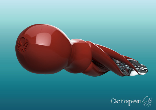
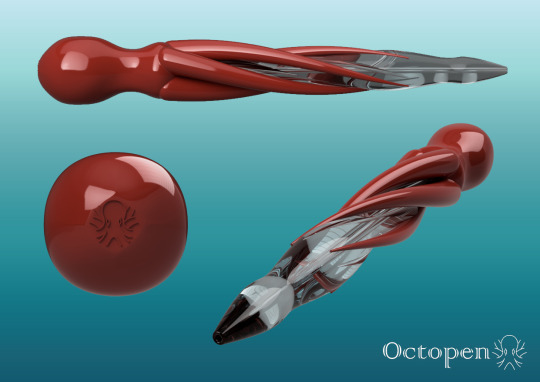
Project 2 - The Final Submission
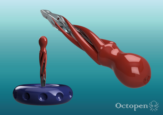
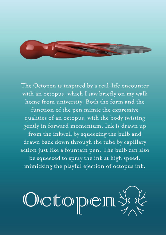
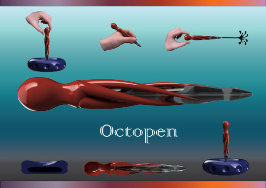
Preparing for the biggest proportional hand in of the trimester, I created my product renders in much the same way as I had made the images for the video. The shiny red of the pen and the blue-green of the background seemed like a pleasant and natural colour combination. I felt that these renders should feel more like advertising pictures than any kind of practical demonstration, so geared them towards visually interesting and revealing angles. Given the background and the form of the pen, these also have an implicit sense of motion. So that they would not feel too basic, I placed the Octopen logo discreetly in the corner.
For the product photographs, I used three images that I had prepared for my video. I felt these were appropriate, as they show the Octopen in it’s three stages, refilling, writing, and expelling ink. Finally, I stuck to my visual language for my document featuring the logo and written description. I also included a simple render of the octopen for some context as to the form of the pen.


youtube
0 notes
Text
Project 2 - Assembling the Video
For my final video assembly, I began by gradually substituting my storyboard with videos and graphic elements that I had created. I had some problems with importing video from my iPhone, these seemed to display unusually. However, all I had to do was import them into a new project, export that as a different format, and they played perfectly. I had to cut several small sections for reasons of musical timing, and the video itself overruns by a few seconds (not counting the end card).
At the end of the video, I used a film dissolve to more naturally transition from clip of ink splashing the paper, to ink splashing into the water. I also made use of the colour correction tools to restore the bluey green to the water, also making the ink a nice contrasting purple. I also created an end card, using the template from my INDN212 project last year. I could not find this specified in the brief, but it seemed essential for a piece of work at this level, especially to credit the music.
While some areas are a little choppy, given the stop-fade animation, the result feels deliberate, rich, and evocative of something far more ambitious. But it was enjoyable to make, and I believe communicates a strong sense of the product, as well as clearly showing it’s usage, and evoking it’s origin.


youtube
0 notes
Text
Project 2 - Generating Images
For sections of the video that I could not film practically, I found it necessary to use a combination of Fusion 360 renders, gradient backgrounds, photographic backgrounds, and other photographic elements. For the Fusion renders, I would cloud render them to the final stage with appropriate lighting and background colour, and then use a layer mask in Photoshop to remove the background, leaving any reflected or refracted colour somewhat matching the setting. I would then place the render contextually in the setting, such as placing it in the hand of a writing figure, and expanding the layer mask to cover parts I wish to be omitted. In the case of a moving object, I will often construct a single frame, and render several different stages, capturing each one as an image for use in Premiere Pro.


0 notes
Text
Project 2 - Live Filming
Having completed my video storyboard, I now had the task of selecting the elements that could be filmed live. I sometimes think I am just a frustrated filmmaker, given how much I enjoy this portion of the design process, and the ability to indulge creative and surreal methods of storytelling. For this I selected three moments that do not directly involve the pen and are easier to film than to simulate.
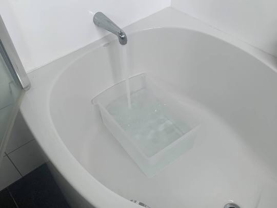
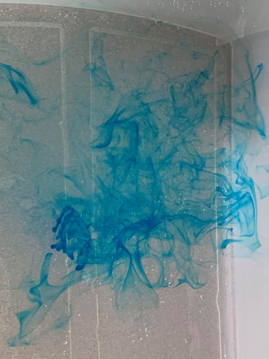
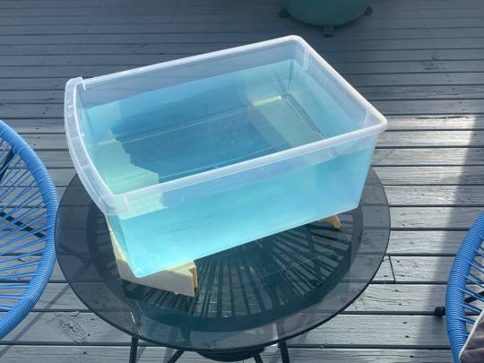
The first of these is when the hand reaches into the water to retrieve the Octopen. I began by emptying out a plastic drawer from the spare room, as I knew I would be filming from underneath. Filling this up with water, I put in a single drop of blue food colouring. It would be amazing to use the Stratasys printer to simulate the effect of ink or other substances dropped into water, and immortalise them in a moment. Mixing this in, I placed the drawer on top of several pieces of foam and activating the camera, slipped this underneath. I plunged my hand in several times at varying speeds, and found that I had a satisfactory take.
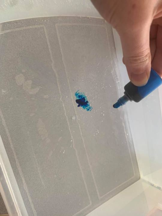
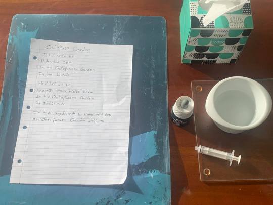
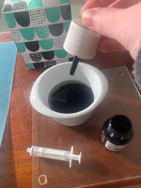
The second was the cheeky spray of ink all over the lyrics to Octopus’s Garden. Knowing there would be problems with splashing, I put down a blue plastic mat. It was clear I would only get attempt at this, so I had to make it count. I partially filled a container with water, and mixed in several drops of ink. I knew that if there was an accident, diluted ink should be easier to clean up. Drawing up a syringe full, I held the camera in one hand, making sure there was only a view of the paper. I had not expected the spray to be so powerful, as it actually pushed the paper, exposing the blue plastic underneath. Fortunately it looked good, and I should be able to remove to magnify the video in the editing suite, as to only feature the paper.
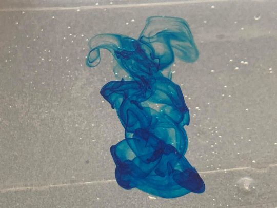
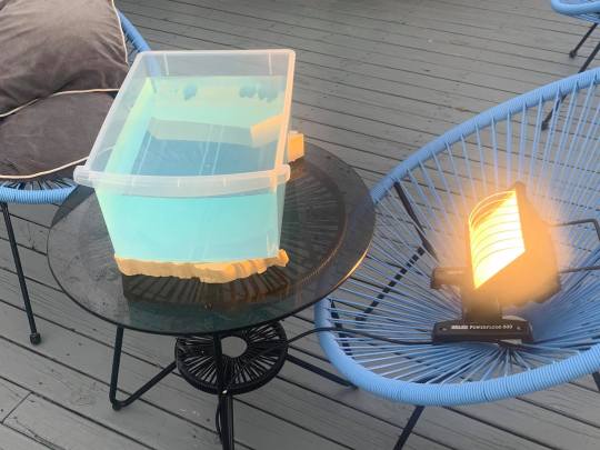
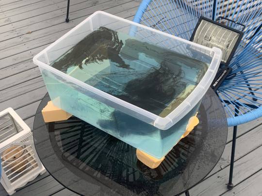
I had contemplated the necessity of the final shot, but after seeing the food colouring dissolve in the water, I knew that it would look stunning. I went back to my setup outside, but the day had already become overcast. So I rigged up a floodlight to better illuminate the water. Setting up the camera once again, I dropped in three drops of ink around the lens, and let them create their tendril patterns. Upon reviewing the footage, I found that as soon as I moved my hand away, the surface of the water turned grey, losing the beautiful rich blue I had hoped to preserve. However, the result is still quite stunning, and I may alter the colour in premiere pro.


0 notes
Text
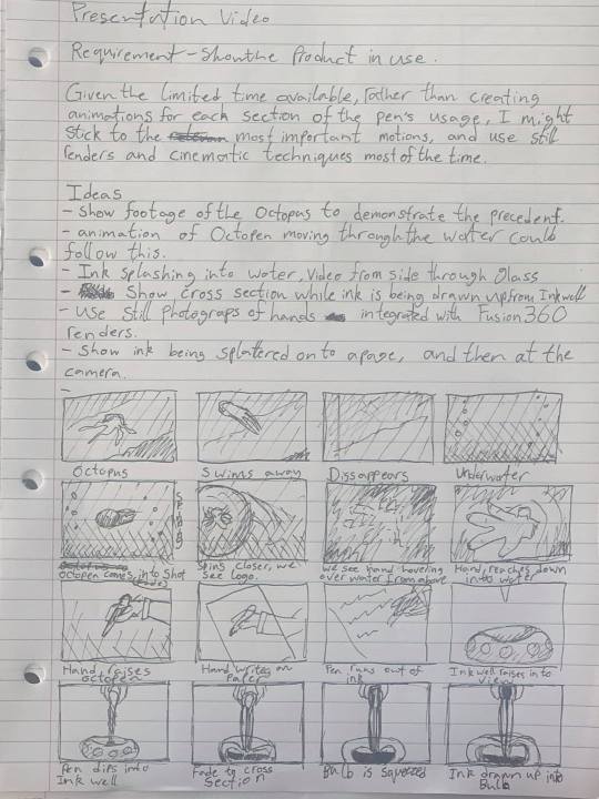
Project 2 - Making the Storyboard
Having made the components of my storyboard, I set to work putting them in sequence within Premiere Pro. This allowed me to select unnecessary elements and discard them, determining how to tell the best story in 30 seconds. An integral part of any story is the soundtrack, which gives it form and rhythm. I perused Bensound.com to find what I was looking for - a slow and gentle beginning, that leads to something more upbeat like the Beatles song “Octopus’s Garden”. After several hours of searching, I found the tracks Piano Moment and Beyond the Line. These share a similar structure, and match well tonally. The free license prohibits song mixing, but I reasoned that fading out one and beginning another would be perfectly reasonable. This then gave me a structure, and an emotionally resonant beginning to illustrate the film of my octopus. This takes nearly half the video, but established the product’s precedent in the minds of the viewers. It also reduces the amount I will have to simulate, given that I have no tangible, functional product to film.


youtube
0 notes
Text
Project 2 - Detailing FDM Preparation Process
Since I am unable to print my objects physically, I will explain my process for adapting my inkwell design into a printable form. First of all, I elected to divide my object into two halves, this will allow the inside to be cleaned and refined before the two halves are attached. To do this I created a series of 3 pegs, also to be printed. While I had initially considered attaching these as part of one single body, I decided against it as this would have raised up the print by half the height of the peg, requiring more infil. Also, printing both faces flat on the printing bed would give them a smooth finish, allowing them to sit flush with each other during the assembly. I used a pattern on path to distribute the pegs into a triangle, meaning that there is only ever one way to line up the details on the outside, before subtracting them from both halves of the body. Finally, I arranged them for printing, and exported them as an STL.
From here I would import the file into the UPBOX printing program, specify the infill settings, prepare the printer, and leave it to work for several hours. To achieve the best result for the curve, I would likely use the highest quality settings if there was enough time.
Following this, I would clean away the raft and infill, before glueing the pegs into place on the lower half with superglue. I would then paint a thinned layer of PVA glue on to the flat surface to act as an adhesive, and a barrier for the ink, before applying superglue to the tops of the pegs and fitting the upper body over the top until the two halves fit snugly.


0 notes
Text
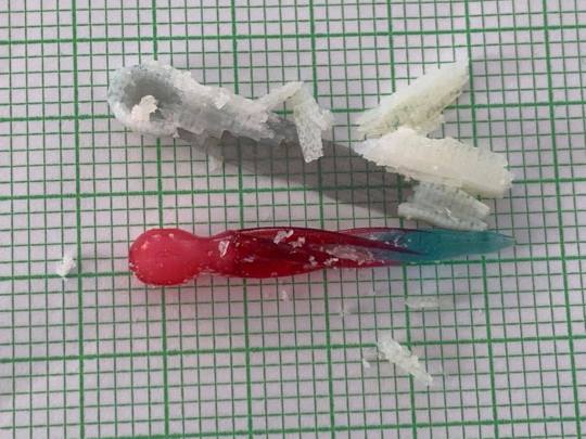
Project 2 - Cleaning the Model
Having received the model back from the printer, I realised that by only selecting the digital materials, I had a completely translucent model rather than one with translucent and opaque elements. I had intended to do a follow up print, but a mishap with another paper meant that I ran out of time. I also realised that because of the inkwell in the head of the pen, it would be full of infill material. This was expected but combined with the translucent bulb it visually differentiates from the rest of the pen. It does however serve to express the cavity within the pen to an observer.
I was able to remove the infill from the print with ease, employing an old toothbrush, a toothpick, and some warm water to do so. Unfortunately, I do not have the equipment required to clean it at home and cannot go to the store or the university workshop.
0 notes
Text
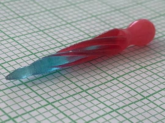
Project 2 - Refining the Model
For the final version of the pen, I wanted to give it a more commercial characteristic, to counterpoint my organic design, through use of the octopus logo. This had been developed for the Octoprint, and I had incorporated it into several logo choices for the octopen. When creating the storyboard for my video, I featured a shot of the otherwise bland bulb of the Octopen, and drew on the logo as a point of interest. This led me to refine it in Illustrator and import it into Fusion as an SVG file. Extruding the logo, I connected it with the bulb using the join command. I intended to chamfer the edges so as to provide a smoother finish, but due to the complex areas and different tolerances of the shape, I was unable to do so. However, this means that should the user press the bulb to an inking pad, they would be able to print this logo as a tiny character on the paper, a signifier that they had used the octopen.
I had intended to install a screw mechanism to the bulb so that it could be printed separately in the clear material and attached to the pen, but time has become too much of a restrictive factor for me to do so. While this is technically an important aspect of the pen’s production, the pen can function without it, and it is not something I can complete before the hand in.


0 notes
Text
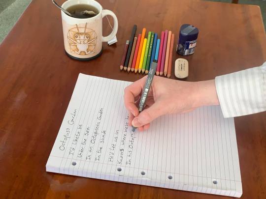
Project 2 - Planning the Video
Given my recent inability to use my voice, I have taken instead to writing notes on a refill pad. This allows me to quickly respond in a way that Text to Speech struggles to. Given the visual nature of storyboarding, I decided it would be best to do a series of quick drawings to get my ideas down quicky, as well as any visual tricks I could use to make the process more forgiving. I soon had a visual narrative that would probably be closer to one minute that thirty seconds. From here, I will refine it down to thirty seconds in Premiere Pro after picking a short piece of music.

0 notes
Text
Project 3 - Branding Ideation
While I am very happy with Colonna MT, the font I selected for the Octopen in Assignment 1, I thought it would be good to try several options and combinations in order to determine if I can do anything better. To this end, I decided that I ought to create at least five options. One of the qualities of Colonna MT that makes it inately suitable for this project, is the rounded shapes, playful serifs, and bisections in the text that remind me of the upper and lower surface of an octopus tentacle.
My first option is simply the word Octopen in Colonna MT font. I considered non capitalising the first letter, as this is often effective with minimalist titles, but felt that it lacked the gravity of the capital O, which also resembles the eye of the octopus somewhat.
My second option makes use of the Octopus logo which I designed for the Octoprint. This acts as a simple graphical element to communicate the pen’s influence, I thought it would be striking when imposed in the middle of the word, but in practice, breaks up the continuity of ideas in the title. Visually, it is placed so that the tentacles at each side line up with the top of the words, giving some sense of continuity between them.
My third option continues this idea, employing the same graphic but shrinking it somewhat to better balance with the text, and moving it to the other side. This counterbalances the weight of the O to some degree, the thinner lines allowing it to take up more space.
For my fourth option, I decided to explore a different font, something broader which maintains the rounded qualities. I tentatively chose Bauhaus 93, which maintains the simplicity, but adds an industrial element which detracts from the natural inspiration.
My fifth and final option features the Octoprint logo again at the end, much as with Option 3. This time the contrast between thick and thin lines gives this some interest.
Ultimately, while I am happy with the simplicity of my original logo, the third option adds a more literal element to the visual communication, as well as balancing the text. I may also find a way to incorporate this logo into the final resolved model of the octopen itself, as a way to tie the two together.


0 notes
Text
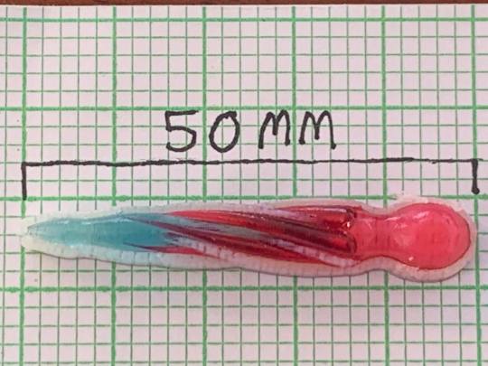
Project 2 - Model Print
After some discussion with my tutors, where I explained my situation and how I was not going to be able to print my model as intended, it was agreed that I could print a section of the model to show that I understood the process. I decided that while I could not print the whole thing in one piece in the correct materials, I could still print the main body of the pen, to illustrate how it would be held in the hand. To do this, I first removed the bulb at the top of the pen, to the point where I had a flat surface and no extraneous detail. I exported this as an STL with multiple bodies, and imported these into GrabCAD as an assembly. I optimised the tray, and used the digital materials option to select colours and translucencies similar to those I had used in my initial renders. Knowing that upwards face is the one that has the shiny finish, I was originally tempted to position the section of the pen vertically in order to expose the greatest number of symmetrical faces evenly. While this would potentially mean more polishing, it would avoid any irregularity, and potentially wearing down one side of the pen in order to achieve the same finish. However, I decided that this would likely be too costly to be implement with something this size.
Upon calculating the cost of the pen, even laying down, I realised would be prohibitively expensive for an incomplete section. Instead I reconsidered, and imported one of my unprinted experimental pieces. This is a 1/3 scale version of the pen, which I surmised would be sufficient. Given it’s smaller size, I thought it would be possible to print this upright. I thought wrong. in practice this was twice as expensive as the full sized component, and a full size version would be at least three times as much. So instead I rotated and optimized it, which produced a figure one fifth of the cost. Happy with this, I saved it as an objzf file and added it to the relevant printing folder on the R-drive in accordance with the instructions.


0 notes
Text
Project 2 - Test Printing
Following some correspondence with my tutor, I concluded that it will be impossible for the machine to print my design, as it contains both flexible, opaque pieces, and transparent, clear pieces which are best suited to the VeroClear material. This would suggest that my pen would then need to be printed in two separate materials. Given the timeframe specified by the printing schedule, my only option is to print my final flexible components this week, assuming that they will fit integrate with the Vero components that I will print the following week. I no longer have the time, nor the inclination to redesign the product.
I accept that the onus was on me to design in a way that fit the capabilities of the printer, and I have attempted to do so throughout my project. However, I am slightly disappointed with this limitation in what in all other respects seems to be a technical marvel.
0 notes
Text
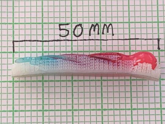
Project 2 - Material Experiments (Continued)
After re-reading the relevant part of the brief, I continued to consider how elements of my product would need to be tested. Given the requirement of at least five test pieces, I decided to include two identical cross sections of the full size pen which uses multiple materials. I placed these Vertically and Horizontally, to ascertain how the printer will treat the different elements in terms of surface finish and how this can be achieved. Finally I decided that a 1/3 Scale model of the pen would provide a nice contextual element to the set, providing a sense of the pen as a physical object rather than just a render. From here I attempted to export into GrabCAD Pro, but found that my attempt to divide my first object with another body had failed, and they would not align in the program. This left me with the problem that I cannot make complex divides to an object, and consequently cannot have any kind of shifting colour that I had hoped for. I compromised by using a pattern of curves to hopefully give one side of the surface a smooth, shifting finish.
From here I will be applying the relevant material qualities in GrabCAD and having my experiments printed.


0 notes
Text
Project 2 - Material Experiments
For this second part of the assignment, I will need to quantify the practical aspects of my chosen design, The Octopen, through experiments with the Stratasys J750. I will begin by considering the functional and material elements of the pen and how these will interact. From these I can design experiments to be printed and tested. For the sake of cost, they must be small and each achieve more than one thing.
Firstly, In order to attach the rubberised head to the body of the pen, and to have it be removable for cleaning, I need to have it attach with a screw. This will require a shift in material quality within a single piece, so the piece must be sufficiently thick in order not to break with wear, otherwise the pen will become useless. This can be printed as two separate elements, the tough, transparent section of pen body with the thread on the outside, and the softer section of bulb with the thread on the inside, and a change in material density.
Secondly, ought to ascertain the ability of the bulb to draw up, hold, and release ink. I can do this by creating a miniature or simplified version of my Octopen to print as a single piece. This will also allow me to test the translucency and shifting colours that I hope to achieve in my finished product, as well as determining the surface finish from the printer.
0 notes
Text
Project 1 - Midway Reflections
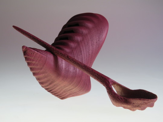
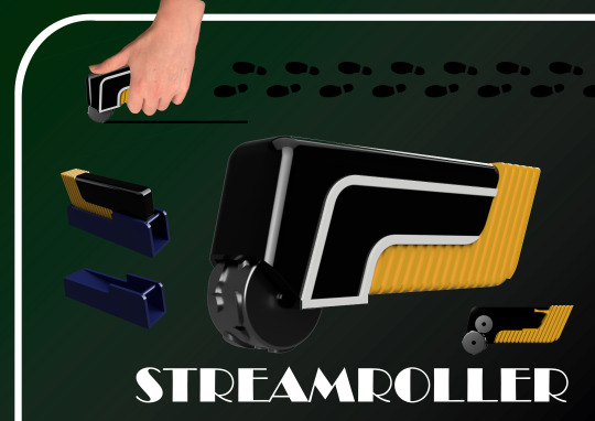
The Streamroller
Inspired by a single photograph of a Streamlined Art Deco Train and the Pizza Cutter from the kitchen drawer, the Streamroller is a tool for marking out pathways on a single piece of paper to link disparate sketches into an overall design narrative. The rubbery yellow handle with its grippable surface texture contrasts starkly against the streamlined dark green housing of the inkwell and wheels, making it easier to use. The holder is angled so as to allow the Streamroller to wheel down to the end, and rest parallel with the work surface for ease of retrieval. Whereas tyre tracks or rails would perhaps be a more appropriate stamp, they would be too impersonal. The feet remind the user that the journey of a thousand miles begins with a single step, as well as being an unexpected surprise.
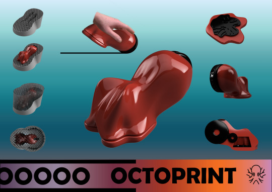
The Octoprint
Following similar lines to the Streamroller in terms of function, the Octoprint is inspired by my encounter with an Octopus, which has been documented elsewhere on this blog. The form is particularly inspired by the head of the octopus, with a lid sealing the inkwell also doubling as a stamp. This octopus head stamp serves as the central idea while brainstorming or problem solving, while the tentacle patterns act as the offshoots, related ideas, or solutions. While the illustrations are a flat glossy red, the finished product would be a rich shifting selection of colours, as indicated by the pink and orange stripe. Ink is particularly appropriate for the octopus, as they secrete it naturally. The case uses a net motif, which can imperil octopuses in the wild. Its grid structure and transparent material allow the octoprint to be on display, even while not in use. Despite their similarities, while the Streamroller connects ideas, the Octoprint generates them, displaying the contemplative intelligence I was lucky enough to observe in person.
The Octopen
The latest in coming of all my ideas but probably the most beautiful, the Octopen recalls the Octopus gracefully jetting away after noticing me. A relatively simple pen, but with a rubber-like bulb on the top. when the nib is placed in the inkwell, the bulb is squeezed, drawing ink up into the body of the pen, which can then be used to write with. The twisting form of the tentacles was trying to represents the motion of the creature in flight, abstracted in a way similar to Daniel Falconer’s elven architecture. The torus form of the inkwell represents an abstracted tentacle, with the suckers indented around the sides. This keeps the pen held upright for use, while its low centre of gravity prevents it from spilling the ink. like it’s natural counterpart, the Octopen also has a playful, intelligent aspect. Once the ink has been drawn up into the pen, by squeezing the bulb it can be squirted out at high speed on to a piece of paper (or a colleague!). This quality brings the design to life, abstracting both the graceful and humorous natures of the octopus into a concise and beautiful representation. On this basis, this is likely the design I will select to continue to the next stage of this project.
Comparing these to some of my better work from previous years, it is clear that my preferences for an abstraction of the natural combined with a love for strong visual signature is forming into a design language of my own.


0 notes
Text
Project 1 - Presentation Images
Given that I had opted to work through the night in order to keep my head clear for the presentations, I decided to make my presentation images look reasonably polished. Since Keyshot had failed me (I downloaded the free trial and was met with watermarks on anything I rendered), this involved cloud rendering of all the images I wanted to display, but in their test colours. To show some of the more diverse colour ranges that I had in mind, I created background gradients that better reflect the Octopus in its environment. I was careful to show all aspects of the design including the inner workings and interaction with the case, as well as carefully selecting an appropriate font. While these were done under pressure, I am pleased with the outcome -especially at this stage of the project.
Nice to know that I haven’t completely lost my touch!

0 notes