
Don't wanna be here? Send us removal request.
Statistics
We looked inside some of the posts by inrd701-sophia and here's what we found interesting.
Average Info
Notes Per Post
0
Likes Per Post
0
Reblog Per Post
0
Reply Per Post
0
Time Between Posts
9 days
Number of Posts By Type
Video
1
Text
8
Last Seen Tumblr Blogs


Fun Fact
Kazakhstan’s Minister of Communications and Informatics has blocked the Tumblr site because it contained 60 sites of terrorism, extremism, and pornography in 2015.
Video
tumblr
Week 12
HIFI Prototype User Flow (Iteration 1) Hi welcome to my prototype! Now on to the case study, and highlight reel AND A MILLION OTHER THINGS!! W
0 notes
Text
Week 12
HIFI Prototype (Iteration 1) & User Testings
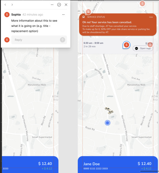
Insights:
Some insights gathered from user testing the wireframe and prototypes:
micro-animations ensure a seamless flow by incorporating micro interactions between touch points
elements' dimensions strive for legibility and aesthetic appeal in the design of elements
information and body copy craft notification messages that provide effective feedback mechanisms
hierarchy of information group elements in a way that presents a cohesive visual hierarchy
Class Check-in


Task: This was a fun things to do! I really enjoyed our project even though it was quite challenging for me. It’s always nice to reflect back :))
0 notes
Text
Week 11
LOFI Prototypes & User Testings

See Figma file here Challenges: • Micro-animations - making the flow seamless with micro interactions in between touch points • Elements’ dimensions - making sure that the elements are legible and aesthetically pleasing • Information & body copy - thinking about how to write the message on the notification that makes for a feedback mechanism • Hierarchy of information - grouping elements were quite difficult to do. To see which elements go well together.
Insights:
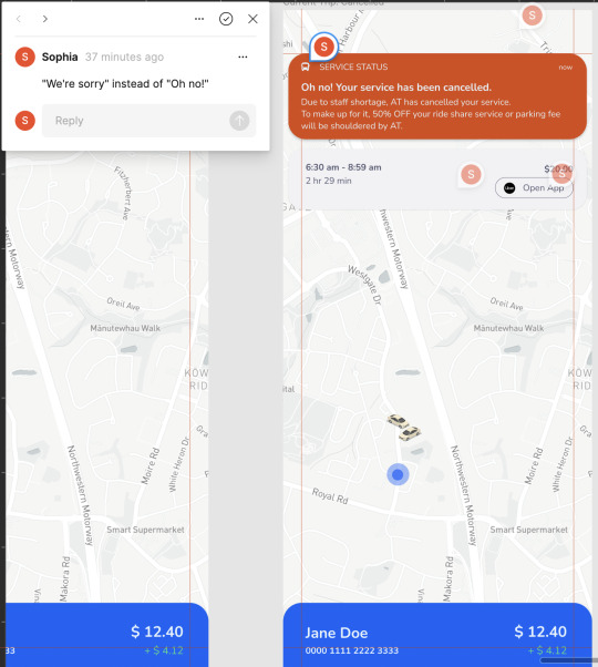
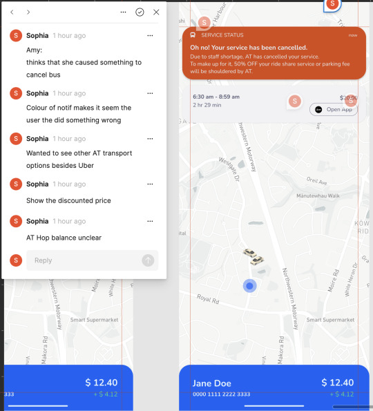
• Keeping in mind my HMW question at all times and how my added feature helps solve the proposed issue of easing the stress (with the use of app design) on AT users when their service is cancelled
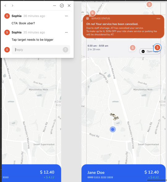
User Testing
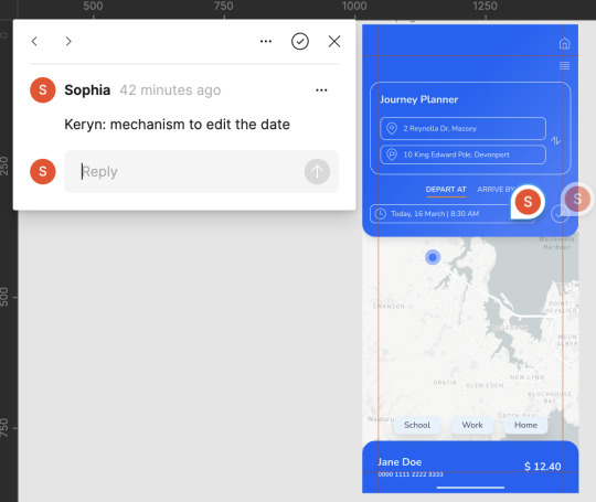
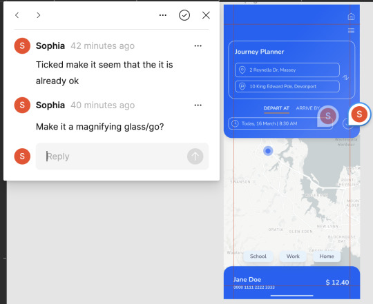
Keryn


HIFI Protoype

0 notes
Text
Week 10
Wireframe + Prototypes + User App Journey Map

Task: Boy what a task this is! Completely forgot everything I’ve learned on Figma. Anyway, we started off to a slow start with prototyping and kind of went back and forth from doing lo-fi prototypes to sketching wireframes as I can’t commit to just focusing on one.
During this time, I also retraced my steps back to doing a user’s journey on my proposed added feature on the AT app. Because I found that I would get lost sometimes on how the flow of the prototype should be.
0 notes
Text
Week 9
Wireframe User Testing


Insights:
Based on the initial user testing of the wireframe, several key insights were gathered:
improve grouping and navigation participants expressed the need for better grouping and arrangement of elements within the user interface to enhance navigation and ease of use
concerns about the 'reserve a seat' feature users raised concerns regarding the 'reserve a seat' feature, particularly in situations where the bus may already be full
integration with Uber participants suggested the integration of the Uber app within the Auckland Transport (AT) mobile app, allowing for seamless access to additional ride options
positive response to incentivised ride-share feature users expressed appreciation for the incentivised ride-share feature, indicating a positive reception towards this proposed addition. This feedback validates the potential value of the feature in improving the overall user experience.
These insights provide valuable guidance for refining the wireframe design and addressing user concerns, ultimately leading to a more user-friendly and impactful AT mobile app.
Challenges:
The limitations experienced during the user testing of the AT mobile app wireframe are:
limited functionality since wireframes typically lack interactive elements and functional components, it made it challenging to simulate real user interactions. Some users had difficulty understanding the intended functionality of some elements
lack of context without the complete visual design, branding elements, or real content, users struggled to grasp the overall context or purpose of certain elements within the wireframe which lead to misunderstandings or confusion during testing
cognitive bias users may have brought their own biases and expectations to the testing process, which can impact their perceptions and feedback
difficulty visualising the final product some users struggled to envision how the wireframe will translate into the final product which caused them to have difficulty understanding the intended user experience or providing accurate feedback
0 notes
Text
Week 8
How Might We...

Task: Formulating an effective "How Might We" (HMW) question posed a challenge during the ideation process. The initial iterations failed to accurately capture the primary problem experienced by Auckland Transport (AT) passengers. To address this, I undertook a thorough reassessment, gaining a deeper understanding of the problem and opportunity at hand, while considering the target audience and seeking practical, yet innovative design solutions. After careful refinement, we arrived at a final HMW question that better aligns with the insights gathered during the previous research phase.
Wireframe - Possible Solution 1:


Task:
Using the Miro platform, I developed a user-friendly digital wireframe that incorporates additional features for testing purposes. These features include the option to reserve a seat and an incentivised fare for ride-share services in the event of service cancellation. Our aim was to gauge how Auckland Transport (AT) users would respond to these potential solutions, addressing their frustrations stemming from unexpected cancellations and delays. These features directly align with our HMW question: "How can we effectively alleviate the stress experienced by AT commuters when their service is canceled at the last minute?"
Possible Solution 2: Redesign of a stops / stations

0 notes
Text
Week 7


Class Activity: Answering HMW Questions
Task:
In today’s class, we were tasked to do a group activity where we presented our HMW questions on a large piece of paper. Peers then offered their proposed solutions.
Insights:
Great to communicate in person our HMW questions as it raises additional questions that helped identify the flaws on our HMW questions
Gain ideas from others
See what others are working on and gain insight
Challenges:
Can get time consuming
Conversation may turn to something that is not relevant to the task
Allocated time for each person to present their HMW question varies
0 notes
Text
Week 6
Current App Design


Task:
For this particular task, we gathered the participants to conduct user testing of the current Auckland Transport (AT) mobile app and took the average of the scores they each provided. Our aim was to assess their experience using the app and gather valuable feedback based on Jacob Nielsen's 10 general principles for interaction design. Through this user testing session, we seek to understand how well the AT mobile app aligns with these established principles and identify areas for improvement. By collecting ratings and insights from participants, we can gain valuable insights into the app's usability, effectiveness, and overall user satisfaction.
Insights:
Users generally appreciate the app's effective display of system status and its ability to align with their understanding of the real-world context. They value the various feedback mechanisms that keep them informed about their actions within the app, finding the language and concepts familiar and easy to comprehend. However, the overall scores for the app indicate that there is room for improvement in certain areas. Users rated the app lower in terms of flexibility and efficiency of use, error prevention and recovery, and the availability of help and documentation. These insights provide clarity on the specific areas of the AT mobile app that should be prioritised for enhancement, in order to provide a better experience for AT passengers.
Challenges:
The challenges faced when conducting the current app rating task were:
limited candidate pool it was quite challenging finding an adequate number of candidates who are experienced with the AT mobile app
bias and subjectivity participants may have had individual biases, perceptions, or personal preferences that influenced their feedback, and affected the average of the ratings
emotional bias negative or frustrating experience can be emotionally charged. Therefore, emotions based on one aspect of the AT mobile app may overshadow or reflect through other aspects
News Articles

Task: The primary concern expressed by Auckland Transport (AT) passengers revolves around the significant frustration caused by last-minute cancellations and delays in service. In some instances, passengers receive no prior notice until their bus fails to arrive as scheduled. To delve deeper into the root causes of these disruptions, I conducted extensive research by analysing news articles, monitoring AT's social media channels, and engaging with their customer service. This approach aimed to gain a comprehensive understanding of the underlying factors contributing to these service interruptions and seek explanations for the inconvenience faced by passengers.
Insights:
From what I have gathered, the main reasons for AT disruptions, cancellations and delays are:
operational issues mechanical failures, driver unavailability, or vehicle breakdowns
traffic congestion Auckland's busy road network and unpredictable traffic conditions can lead to delays in AT services. Congestion, accidents, roadworks, or other unexpected events can impact the timely arrival and departure of public transport vehicles
infrastructure maintenance scheduled maintenance and repairs on infrastructure, including tracks, signals, and stations, can require temporary service disruptions or altered routes
unforeseen circumstances extreme weather conditions, natural disasters, or civil emergencies
staffing issues staff shortages, rostering challenges, or unexpected absences can impact the availability and regularity of AT services
Week 3 - 5
(some backlog due to family emergency)
User Interviews


Task:
The user interviews were conducted via questionnaires or face-to-face interactions, utilising Miro to record the participants’ responses. Considering the broad scope of Auckland Transport (AT), I initially had some uncertainty about the specific area to focus on. To address this, I carefully formulated and grouped my interview questions to gather valuable insights about passengers' experiences in three key areas of AT: the overall transport experience, the AT mobile app, and the AT Hop card system. This approach allowed me to gather comprehensive feedback and gain a deeper understanding of users' perspectives and pain points within each of these crucial aspects of the AT ecosystem.
Insights:
The following are the main insights gathered from conducting a user interview:
user needs and pain points last minute cancellations or delays that are not reflected in real-time on the mobile app
mobile app usability understanding where users encounter difficulties, confusion or frustrations helped pinpoint areas that require improvement to enhance the app’s usability
feature prioritisation enhancing or alleviating the stress from commuters when their service is cancelled or delayed without enough notice or alternatives presented
user behaviour and workflow gain insight on users’ behaviours, habits and workflows when using AT products and services
user expectations this task helped gain insight on users’ desired features, customisation options, and integration with other services and platforms (e.g. Google Maps)
emotional reactions and satisfactions helped gauge users’ emotional responses and overall satisfaction with AT products and services
Challenges:
The following are the challenges faced when conducting the user interview:
recruitment finding participants who are active users of AT products and services, and was willing to be interviewed was quite challenging due to limited time or conflicting schedules
recall bias some users had difficulty recalling their experience with AT transport services user expertise participants had varying levels of knowledge with the AT mobile app which had an effect on their ability to articulate their experiences effectively
bias and social desirability users may be influenced by their perception of what is socially desirable or inclination to provide positive or negative feedback to conform with social norms
interpretation of needs some users had trouble accurately articulating their needs or identify specific pain points
generisability the insights gained from the user interviews may not fully represent the entire user base, and findings may not capture the diversity of user needs and preferences
Week 2
App Rating & Reviews

Task:
Collecting feedback from AT app users allowed for the identification of trends and common concerns that passengers experience. As well as, a partial analysis on the users’ satisfaction levels, identify areas of improvement, and understand their preferences and expectations. This task helped inform user-centred design decisions which was conducted later on in the project.
Insights:
Most common statements from AT App users:
appreciates the ability to see how full the buses are
have to use Google Maps for navigation for more accuracy
frustration from inaccuracy of service that is reflected on the app
frustration from last minute service cancellations
would prefer if they are able to pay with personal device other than a physical AT Hop Card
Challenges:
The challenges faced when conducting an app rating and review analysis were:
biased and subjectivity caused some user reviews and ratings to be skewed in one direction, which made it challenging to come up with actionable insights
lack of context and further information why a rating or review is positive or negative
limited feedback scope where a comprehensive feedback on some areas of the product or service was not provided
ambiguity and vague feedback some reviews lacked clarity in details or language used
0 notes
Text
Week 1
Lighting Demo

Task:
For our lightning demo, Chiara, Hailey and I decided to analyse the UI of Google Maps as we found this to be a very effective app.
We evaluated this app according to Jacob Nielsen’s 10 Heuristic Principles for UI Design .
As a group, we talked about what we appreciate and like about the app’s features and UI design. I then decided to use Miro to organise these points into a mind map and sub-points and to show visual imagery of corresponding idea (ie screenshots of the app). Afterwards, I added sticky notes on areas that we found to show the said principles well.
Candidate Experience: Auckland Transport (AT)

Task: Above, is a mindmap with my personal experience with AT. As someone, who uses this service from the app, bus and ferry on the daily, I believe that I am capable of shining some light on the experience of a large demographic with AT. I have divided this experience with AT app, AT Hop Card, and the overall commute experience. Insights:
users’ pain points helped guide improvements, and addressed the most critical issues affecting user interaction
usability and accessibility issues helped guide improvements in AT’s mobile app user interface
service reliability and delays causes, patterns, and the impact on the journey of the users
communication effectiveness provided insight into the effectiveness of conveying important information (e.g., service updates, disruptions, cancellations or delays
opportunities for technology - integration that can enhance the user experience
Challenges:
bias and subjectivity relies on self-reported feedback and interpretations. As such, it may reflect the personal preference of just the user which could affect the objectivity of the finding
social desirability bias causes candidates to conform to socially desirable responses which may not necessarily reflect their own thoughts and experiences
0 notes