
interiordesigntorontonews
Toronto's Interior Design News
New products, upcoming sales, special events, etc....
1216 posts
Don't wanna be here? Send us removal request.
Last Seen Blogs

afactaday
A Fact A Day

dsasterprincess
dsaster.com

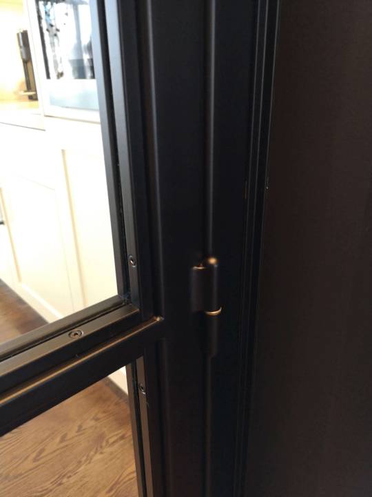
drywallandsteelstud
Untitled

neo-persephone
www.silver-jewellery-online.co.uk

donutofchesblog-blog
Организм который хочет умереть
Text
5 Reasons Why Saying NO to Home Staging is a Huge Mistake
Is Home Staging Worth the Cost?
Talk to any real estate agent and they will tell you that STAGING COSTS ARE NOT AN EXPENSE, THEY ARE AN INVESTMENT.
Talk to some “old-tyme” homeowners and they will tell you that HOME STAGING ISN’T WORTH THE COST.
In this article, Maria Saverino from Milagro Interiors schools us all about the Top 5 Mistakes you are making by not staging your home for sale.
There are no home sellers who have staged their properties with a certified stager and lost their money.
Staging is one of the best investments you can make, and the upshot is tangible, straightforward and immediate: Stage your home well and you will incite the best first impression, your property will sell faster and you will maximize your selling price, ensuring the best Return On Investment (ROI).
Think of home staging as loaning out some money and receiving it back with interest in a very short time!
According to the National Association of Realtors (NARS), for every $100 invested in staging, the potential return is $400.
A considerable number of sellers that I have encountered have shared certain assumptions about staging:
it is too expensive,
it’s just decorating or filling a house with “pretty” furniture,
it takes too much time and it is not worth paying for.
As a stager with years of experience and direct knowledge of the benefits of staging, I would like to explain why these assumptions are worth reconsidering. Staging is Marketing! Your property becomes a product like any other product.
When it comes to staging a property, you are trying to sell your home, and you want to do it quick!
Your home becomes a potential purchase for every buyer that walks through your door, and it is about showing the potential of your space to attract buyers to achieve the optimum sale. The stagers do all the work, and in many cases, it could take as little as a day, depending on the size and scope of the project; larger spaces require more time and effort, but in all cases, stagers work very efficiently and have the best insight to showcase the property in a way that appeals to buyers’ emotions.
Avoid falling into the trap of false assumptions and overall, avoid falling into what I call “the Top 5 mistakes” for not staging your property!
MISTAKE #1 – YOU’RE LEAVING $$$ ON THE TABLE!
If you do not stage, you risk maximizing your profit and putting big bucks into your pocket! Having a well-staged home will make your property look functional, aesthetically pleasing, inviting, and well cared for. It will turn your home into someone’s dream home, making the buying process quick; a well-staged home will peak the emotional experience for the buyer, helping them envision themselves living in your property, and arousing the desire to buy the property. It will justify your asking price and may also get you over asking.
The latest 2018 Home Staging Resource (HSR) study showed that 85% of staged homes sold between 6% to 25% more than their un-staged neighbours and a survey conducted recently by Home Gain, with more than 2000 realtors, found that investing in staging can generate up to 556% returns. So, rest assured that your house will be sold much quicker and for top dollar if you hire a certified home stager.
( Received top dollar for above picture)
MISTAKE #2 – MORE DAYS ON THE MARKET!
If sellers don’t stage their properties, they are putting their investment at risk of sitting on the market. This means fewer potential buyers willing to visit the property; few or none interested in buying the property and few interested in buying it for less than the asking price. To sell your home faster, it must stand out from the competition. A survey by Coldwell Banker Real Estate Corp. found that staged homes spend half the time on the market than non-staged homes. In addition, a recent study from the Real Estate Staging Association (RESA) stated that professionally-staged homes spend 72% less time on the market.
With every extra day that your property spends on the market, questions begin to arise. Buyers begin to wonder why the property has not been sold, such as:
Does the property have structural damage?
Is the house old or not well maintained?
Is the asking price too high?
Are the sellers hiding something? etc.
Don’t take the risk of putting these messages in your potential buyers’ minds. When it comes to selling, you never get a second chance to make the best first impression. So remember, when you’re out on the market you’re hot, and you don’t want to lose the momentum.
MISTAKE #3 - BIG PRICE REDUCTIONS!!!
Having a well-staged property will attract more potential buyers willing to pay the asking price or over asking. If you don’t stage, you are lost in the crowd and risk having to lower your price to get some activity. The National Association of Realtors survey found that the longer a property stays on the market, the further the price of the property drops. This means that homes that stayed on the market for 13-24 weeks sold approximately for 6.4% less than the originally listed price, while those that stayed on the market for 4-6 weeks sold for 5% less than the originally listed price. Although it’s clear that staging yields considerable returns, most sellers don’t understand or perceive the huge benefits that staging offers during the selling process.
MISTAKE #4 - NOT MAXIMIZING YOUR PROPERTY’S STRENGTHS and minimizing its weaknesses!
When you hire a Certified Stager you’re increasing your chance for a more profitable and faster sale. Only 10% of home buyers can envision the potential of an un-staged home. We bring out the home’s potential and increase the property’s value. The objective is to maximize a property’s strengths and minimize and disguise its flaws, giving it the best first impression to incite an emotional connection with potential buyers. According to NARS, almost a third of Buyers will overlook property faults when a home is professionally staged. Most buyers also have great difficulty in getting past the sellers personal decor and visualizing the potential of the property. The way we live in our home is not how we market our home. As stagers we understand the importance of furniture placement, creating good traffic flow, colour theory, de-cluttering and de-personalizing. We identify and highlight the focal points and we provide solutions!
( Above picture received offers on the second day!)
MISTAKE #5 - NOT OUTSHINING YOUR COMPETITION, (it’s a competitive market)
As a seller, you have a lot of competition and you can bet that potential buyers have already seen other properties and are willing to visit more. Stagers understand the psychology of buyers. If you want to stand out from your competition, you need to make your property look stunning or you need to lower your price. Let’s face the hard facts: No seller is willing or will want to lower the price of their property, which makes staging the ideal solution for securing a more attractive sale price! So if you are selling your property, staging is the best way to go to secure a better return! Real Estate is a time-restricted market, you don’t want your property to linger on the market, you want to be hot and you want to stand out!
These are just the top 5 pitfalls for not staging, there are definitely more. Understanding the benefits of staging will help you better understand the added value that staging brings to the sale of a property to maximize your ROI as a seller. Including a stager as part of your selling strategy, will yield quick results and much quicker benefits. Your home is your biggest asset, so why not do what you can to increase your investment? Your chances of having a greater number of potential buyers willing to accept the list price or bid over asking are greater, and the likelihood of closing the deal right away is much higher!
About the Author
Maria Saverino is the founder of Milagro Interiors.
She is a Certified Ultimate Stager, Professional Photographer, Graphic Designer, and a wife and proud mom of two beautiful boys.
Her big skill set is a huge asset for her clients; helping them to sell their properties efficiently while maximizing the equity OR providing home styling which allows them to live in a comfortable and functional way. Maria’s keen eye for design and passion and exceptional quality service exceeds her clients’ expectations which makes them return continuously. Clients become family!
Maria will efficiently walk through your home to fully assess and provide you with detailed advice on how to best prepare to make a successful staging process. She is a natural and true designer at heart! Maria understands that home is where love resides, memories are created, friends always belong, and laughter never ends.
Want to know more about Maria Saverino & Milagro Interiors? Visit her social channels and check out all the services offered by Milagro Interiors. Subscribe to her youtube channel where Maria offers weekly tips.
Website
Instagram
Pinterest
Facebook
Youtube
0 notes
Text
5 TIPS TO CHOOSING THE RIGHT ROOFING CONTRACTOR
Today’s guest post comes from blogger Evelyn Paulson. Evelyn blogs about home improvement, home renovation, and interior designs.
It always pays to hire a reliable roofing contractor when you’re in need of roof repairs or planning a complete overhaul of your house. Sure, you can try doing everything on your own. But when it comes to your safety and your home’s stability, it’s best to leave the work to professional roofers.
But how do you know if you're choosing the best contractor for your needs? Here are a few things you can do to make your search worth it.
Ask around town
If you want to lessen the risk of getting cheated out of your money, choose a contractor based in your area. Reputable roofers foster good relationships with clients, local suppliers, and other contractors in the city. They also already know the state's building code, so you don't have to worry about accidental violations.
Check for credentials
By now you probably have a list of roofing contractors that you want to approach. The rule of thumb in the construction world is to gather at least three contractors for you to get bids from.
You'll want to check if they have an updated state license. But don't settle for what they tell you. You can also do an online search. The Idaho Bureau of Occupational License has a database of registered professionals and businesses that's worth checking out. They also have a list of licensed roofing contractors with registration numbers, addresses, and contact numbers.
Make sure the roofer's team is insured too. It will save you from potential court cases and spending more money if an accident ever happens on site.
Look at their previous projects
A good roofer shouldn't just be skilled but experienced too. That should show in their work. If you aren't satisfied with just seeing a portfolio on their website, you can ask the previous clients themselves about the quality of the roofer's services. If the contractor's a big enough name, chances are they've got a handful of online reviews and testimonials that you can check out.
Here's a tip though: never completely trust a company that constantly has full five-star ratings. More often than not, they're too good to be true.
Compare the prices
Replacing or repairing is not a cheap endeavor, so it's important to make sure you're getting your money's worth. But remember, high-priced doesn't always mean high quality.
Before finalizing your decision, carefully compare and contrast the quotations that the contractors submit to you. Depending on the size of their house and the materials, the average Idaho homeowner can spend between $5000 and $7000 on new roofing. This still excludes taxes, permits, and other miscellaneous fees by the contractor. You should be cautious of estimates that seem too cheap or too expensive.
Prioritize Safety
Roofing, or construction work, for the most part, has plenty of health hazards. For instance, you're more exposed to the elements, you can slip and fall off, or the roof can completely give out under you.
A responsible roofer should be conscious of OSHA guidelines and show concern for their employees. They're well aware of the dangers of the job and should have a properly trained and equipped crew. They'll also be willing to postpone any work on the roof if it's raining or snowing since this increase the chances of slipping.
Choose Your Roofer Wisely!
Aside from picking a local roofer because they have a license, impressive portfolio, reasonable price, and complete equipment, you should also go for one that responds quickly. You won't want to deal with a contractor who takes their sweet time answering your inquiries or submitting estimates. And you definitely won't want someone who doesn't handle emergencies promptly.
So take a moment to do some research, and don't be afraid to ask your contractor questions. In the end, it'll be worth the reward of having a great new roof!
Author Bio:
Evelyn Paulson is an ardent blogger who loves to write about home improvement, remodeling, restoration, and repair. She is currently working with Weathertight Roofing, one of the best Idaho roofing companies, which offers exceptional roofing services for both residential and commercial properties.
Disclosure
Boise, Idaho roofing company Weathertight Roofing was Evelyn’s source of professional information for this article. A link to their website was included in the article. If you live in the Boise area and are in need of roofing services, feel free to click thru and conatact them. Interior Design Toronto does NOT receive any renumeration for this article or roofing services.
0 notes
Text
Interior Design Toronto - Spotlight on Home Société
Today's Interior Design Toronto store spotlight focuses on Home Société, one of Toronto's premier retailers of furniture and accessories for the home & garden.
Home Société features a broad and curated selection of furniture and accessories for the home and garden, all of which are carefully chosen for their beauty, quality and versatility, and tailored to reflect Toronto’s unique style. Whether you’re looking for contemporary, mid-century modern, industrial, art deco or scandinavian styles, the enormous showroom is designed to allow shoppers to mix and match their versatile design styles through the collective of brands and lines in-store, while ensuring the items are still linked in their style.
What brands does Home Société represent?
At the Home Société, you can find furniture & accessories from Maison Corbeil (with Velvet, Colette, Flou and .ca spaces), Jardin de Ville, Must, Ligne Roset and Kartell, as well as exclusive collections from LondonArt.
Store Locations
Home Société is located at 1270 Caledonia Rd in the Castlefield Design District.
Company History
With decades of expertise in contemporary design, Home Société’s new multi-brand retail concept space features more than 100 gorgeous lines of luxury to affordable home furnishings, brought to the city by a collective of Quebec-based design leaders and manufacturers: Maison Corbeil, Jardin de Ville and Must.
What makes Home Société unique?
Home Société is a brand new one-stop-shop for luxury to affordable home furnishings located in Toronto’s Castlefield Design District.
This multi-brand retailer features a spectacular collective of brands, fusing both local and international designs, all under one vast 80,000 square-foot roof. Home Société presents a broad but carefully curated selection of home and garden furniture and accessories that focus on quality and versatile appeal, and many
of which are made in Canada and are exclusive to the brand in Canada.
What's new in store?
Home Société constantly brings new products into their Caledonia Road showroom.
Contact Info
Instagram: @home_societe
Facebook: @homesociete
Web: https://homesociete.ca/
Email: [email protected]
Showroom Address: 1270 Caledonia Rd
0 notes
Text
How to Photograph Interiors - Part 3: Post-Processing
Now that we’ve covered How to Prepare for an Interior Shoot in Part 1 and The Photoshoot in Part 2, we can move onto the post-production process.
When packing your gear for a shoot, consider bringing a portable external hard drive and laptop with you so you can backup the RAW files immediately. This ensures that you’ll have a copy in case anything happens such as lost or corrupt memory cards, water damage, etc. and these things happen more often than you’d expect.
As a general guideline, you can follow the 3-2-1 Backup Strategy. Make 3 copies of the RAW files, 2 on separate hard drives and 1 offsite (eg. uploaded to the cloud or stored safely at another physical location like a trusted family or friend’s place).
Once you’ve made these backups, you can now start editing. We’ll keep this editing process minimal (ie. without using presets) so that you can understand the basics.
1. Organize your photos
Everyone has their own way of filing their photos. Once you’ve decided on what works best for you, stick to it. This is how I organize them so feel free to change it according to your needs.
After every shoot, I organize the photos by year and then by date. Here’s the hierarchy of folders on my external SSD Hard Drive:
> Photography - Work
> 2019
> yyyy-mm-dd Interior - Designer’s Name (Address of Location) - Raw photos
> Final - Final high-res JPG photos to be delivered
> Web - A few selected web-resolution JPG photos to be used on portfolio/social media
(This is optional but it’s useful so you have that new work ready to update your portfolio/social)
2a. Culling
If you shoot weddings or events where you have a few hundred photos, it’s best to cull the set first. This means that you take a first look through them and rate the photos to save you time when you’re actually editing. During this process, you’re also removing the photos that are unusable (ie. out of focus, accidental shots, people caught mid-blink, etc.). Photo Mechanic is a great tool for culling because it renders previews quicker than Lightroom and has a star and colour ratings.
Develop your own system of rating but here’s an example that you can use when culling in Photo Mechanic or Lightroom:
5 stars = Excellent photo that must be delivered to the client
4 stars = Great photo technically and creatively, but not a top-pick
3 stars = Good photo technically, but not very creative and doesn’t add to the story/collection
2 stars = Ok photo, but only if needed to fill in gaps in the collection
1 star = Unusable, delete.
Keyboard shortcut: You can also use the Pick/Reject system in Lightroom by pressing P on a photo to flag it as a pick and X to reject it.
2b. Import photos into Adobe Lightroom
Note: I have an Adobe Lightroom catalogue for all my work projects for the year. Some photographers choose to start a new catalogue for every shoot, which is helpful if each shoot has hundreds or thousands of photos. That helps your computer cut down on the time it takes to load the catalogue.
If you’re culling in Lightroom, drag all the RAW files from its folder into the Library module and start the process from there. If you’ve already culled your photos, select the RAW files you want to edit and drag them from the folder into the Library module.
Another way to do it is to go to File > Import Photos and Videos. Then navigate to the RAW files’ folder in the left panel:
As you’re importing, add keywords in the File Handling/Apply During Import panel on the right.
When the photos are imported, your Library will look like this (the photos have already been culled and flagged as Picked):
3. Develop Module
Once the photos are in the library, we can edit them. Here are a few things I’ll apply to each photo (either individually or as a batch):
Profile Correction
Check off “Enable Profile Correction” on the first image and sync this setting with all the photos. It’s located in the Lens Correction panel on the right (you may need to expand the panel). This ensures that every photo has the correct camera profile applied. Different cameras and lenses render photos differently so it’s best to turn on this correction.
Transform
With each photo, you may need to use the Auto or Vertical if the photo wasn’t level during the shoot. Sometimes, you’ll also need to manually adjust it using the sliders. Use the horizon lines in the photo and the grid in Lightroom to make sure walls are straight and floors are perpendicular.
Basic Panel
You can make most of your light edits here and deliver great photos. While you are being hired for your style and work, keep in mind the current client and the audience (who may very well include potential clients) to make sure the photos convey the right message.
Correct the white balance so that it represents the room the way you want the viewer to see it. In interior photography, I aim to keep the colours true to life and I check the before and after of the photo (using the \ key) often to do this. Depending on the interior designer, they may not mind stylized post-processing if it gives the room a specific look and feel that they want.
If the highlights in the photo are blown out, you may be able to recover some of the details by lowering the Highlights or Exposure sliders into the negatives.
To add pop to the photo, increase the Contrast bit by bit.
Tip! Watch out for negative impacts on the quality of the image when making adjustments. Be sure to compare the before and after throughout the editing process. Adjust the slider back and forth and dial it back if the effect becomes distracting (eg. too much contrast, loss of important details like highlights or shadows, colours are no longer represented accurately). Keyboard shortcut: Toggle the before/after by pressing the \ key.
After you’re happy with your edits to one photo, you can apply these same settings to other photos in the batch that have a similar lighting and colour situation. This will save you some time, but don’t forget to review each photo to make sure they’re consistent.
When the entire set is finished, filter the photos to make sure only your final selects are shown. Select them all and go to File > Export. Go through each section and make changes as necessary. Here are some examples:
Save the exported photos to a specific folder.
Custom rename the files according to the shoot and client.
Change the quality and resolution of the photos according to the client and use.
After you’ve exported and delivered the photos to your client, make backups of those JPGs. It’s useful to have them ready to show as portfolio work.
Thank you for following along in this How to Photograph Interiors series. I hope this has been helpful. Be sure to use the hashtag #idtjanetkwan if you apply these tips to your photos so we can see your work!
LINKS
Part 1: Preparation
Part 2: Photography
Part 3: Post-Processing
About the Author
Janet is a lifestyle photographer based in Toronto, Canada, specializing in business branding, interior and product photography. She works with small to large companies to create custom professional photos for their branding and marketing needs. Her work has been published in Apartment Therapy and The Jungalow. Some of her past clients include Airbnb, McDonald's Canada, Vichy, Haagen-Dazs, The Distillery Historic District and more. She loves The Office, sunsets and exploring the different neighbourhoods in Toronto.
Contact the Author
Website: https://www.janetkwan.com
Instagram: @janetkwan
0 notes
Text
Home Lighting Done Right - Advice from a Pro
In our ultra-modern life, we take home lighting for granted. Flip a switch and the light comes on. And when your home lighting is “right”, we don’t give it a second thought.
But when it’s wrong, it affects our mood, our productivity and our perception of a space.
Think about the super-bright cold fluorescent lights used in an underground parking garage. They brighten up a dark and lonely space with powerful light to drives away the shadows. Perfect source of light for that application.
Now think about sitting in your favorite chair with a cup of something warm and a good book. Would those same parking garage fluorescents make any sense? Or would you rather have a standing floor lamp casting a softer glow over your shoulder onto the book?
It’s surprising then, that people don’t give home lighting the same time & attention they give to other elements (paint, furniture, etc) in their homes. As a design professional, I’ve seen the right home lighting do wonders for a client’s space. The correct home lighting can liven up a space or soften the mood as needed.
But how do we choose the "correct" home lighting?
The quality of the light matters.
Perhaps more importantly, the form within which the light is delivered matters.
Making the correct choice can add a wonderful, functional layer to the design of a space. For good or bad, home lighting choices abound in the marketplace. For the homeowners, all this choice can be overwhelming and intimidating.
A few tips and tricks can go a long way to helping you get your home lighting right.
Tip One: Function First
It’s often said that home lighting is like jewelry for the home. While it’s true there are lots of fixtures that are beautiful to behold, home lighting is much more than a style statement. Lighting has to do a functional job as well.
There are three main types of light sources in designing a space:
task lighting,
ambient lighting
accent lighting
If you are going to light a room, you must first ask yourself:
what the room will be used for
and what kind of mood you hope to create.
For example, if you're lighting a kitchen, task lighting will be critical. Task lighting ensures safety while you are chopping vegetables for your favourite soup. Task lighting lets you check for water spots and schmutz on your wine glasses as you remove them from the dishwasher.
In your home office, task lighting will be critical at the desk where you pay your bills. In your bathroom, task lighting ensures you don’t step out of the house in the morning with toothpaste stains on your shirt.
In addition to task lighting, a good home lighting plan requires a focus on ambient lighting.
Ambient lighting washes the room in a general level of light. Ambient lighting ensures that you don’t trip on the edge of a rug, or bang your leg into a table, for example.
Examples of ambient lighting include:
a flushmount fixture in a room
or a large floor lamp, that combines uplighting and downlighting.
Accent lighting is a critical component of any residential lighting plan. Accent lighting fills out your space with points of interest. Accent lighting highlights textures, art or focal walls throughout your home.
A successful home lighting plan will use all of these light sources - task, ambient and accent lighting. Use of these light sources and depends on the space, in different ratios based on the need and use of the room.
Tip Two: The Style Files
Now that you understand the functions of home lighting, it's time to look at style. It's time to decide on the styles that are most appropriate for your space and the look you are trying to achieve.
When I develop a design plan for my clients, I carefully consider how the lighting can enhance the space with both style and function. For example, lighting comes in a vast array of metals and finishes, sizes and design styles.
It’s not always necessary to match metals. In fact, choosing finishes that are complementary, rather than 'matchy-matchy', creates a layered, collected feel that is much more interesting than if we had used a single finish on all light fixtures.
In addition to finish, you will want some sources of light to blend into their surroundings. This allows them to function without punctuating the room with any additional design accents. We often see potlights used this way.
Ubiquitous in most new homes and renos, potlights are often used in multiples. This would be overwhelming to many spaces if they were each a design feature. But having potlights in a room does not mean that your lighting job is done!
Some clients come to me for help after they have done a reno on their own and wonder why their new family room feels so cold and austere. They don’t realize that potlights alone cannot create the warmth and feeling they were hoping for.
When I bring in oversized table lamps with linen shades to diffuse the light and set them next to the sofa, for example, they start to see and feel the warmth they were craving.
We seem to know this when it comes to dining rooms. We rarely see a dining room without some sort of pendant or chandelier over the table. These fixtures connect or contrast with the style of the table and add a unique focal point to the space.
This same effect can be achieved in other rooms as well. A substantial pendant with a drum shade gives off a diffused and glowy light in a bedroom. This lighting effect can add a layer of warmth and architectural interest in a room where we hope for calm and quiet.
Over a kitchen island, where we want to encourage lively conversation and socializing, we can add unique pendants that speak to the style of the kitchen, while creating their own statement.
Bathrooms and powder rooms can almost always be helped with the addition of well chosen sconces placed beside the mirror to prevent the harsh shadows that tend to appear with overhead lighting.
And in a family room or study, a well placed floor or table lamp can add a cozy highlight to the space and make you want to curl up in a comfy armchair and enjoy a favourite book.
All these different layers of light together help to achieve the overall whole���that of a room that you want to spend time in.
Tip Three: A Bright Investment
If you have ever shopped for lighting you will know that prices can vary widely. And if you shop for home lighting online it may seem that what appears to be the same fixtures come with wildly different price tags.
But here’s where pounding the pavement and visiting a real bricks-and-mortar store can make a big difference in your shopping success.
While a brass fixture from two different companies and at two different prices may appear the same on your computer screen, when you see them in real life their finishes can actually be vastly different.
The lower priced fixture may be a sprayed or faux finish designed to approximate real brass, while the higher priced fixture may be hand rubbed real brass with a “living finish” meaning the piece will take on more character and become more beautiful over time. That’s a finish worth paying for, but you may not be able to appreciate it until you can see it in front of you, with your own eyes.
I always make sure I know the manufacturer’s quality and their finishes before specifying light fixtures for my client projects. I recommend you do too. If you aren’t working with a designer, make a trip to some of the wonderful lighting showrooms we have in Toronto and ask their well trained staff to help guide you through the process.
And make sure you save a reasonable chunk of your design budget for your home lighting—it’s an investment worth making for a beautiful home.
Tip Four: Turn on the Fun
In my design practice, I work with clients to create spaces that feel personal, curated and classic, with a modern touch. In my lighting choices, I search for the same kinds of pieces.
There are certain types of home lighting that will never really go out of style. An unlacquered brass sconce highlighting a built-in bookcase is a classic. So is a beautiful vintage chandelier.
If you do a little hunting, you can find some incredible vintage pieces that will bring a welcome history to a new space and add a unique layer you could never achieve shopping in big box stores alone.
Custom or small batch lighting makers are also a great source for unique, timeless pieces, and our city is home to many talented artisans.
Certainly lighting is functional, but it can also be fun. Hitting an outdoor market for a vintage gem or working with creative artists to create a custom piece can be an enjoyable part of the design process.
So next time you are getting ready to plan a renovation or a décor project:
Take some time to consider your lighting plan
Study the layers of light you will need in your space
Consider the style and form your lighting should take
Planning ahead, and using the tips I’ve given you will help you to see that a little lighting can go a long way to making your house a home.
About the Author
Jennifer Simon runs a boutique interior design studio in Toronto with a focus on natural materials and a mix of old and new to create curated, layered and thoughtfully designed spaces for her clients. She is a long-standing member of the Designers and Decorators Association of Canada and is also a certified “True Colour Expert”. She has been featured on Houzz.com, and has been quoted on design in both the Globe and Mail and Canadian House and Home magazine.
Contact Jennifer
Instagram: @jennifersimondesign
Pinterest: JSimonDesign
0 notes
Text
How to Choose a Paint Color for Your Home
If you have EVER tried to paint even a single room in your home, you know how difficult it can be to select:
the "right" color
with the "right" finish
with the "right" quality of paint
from the "right" manufacturer
Even when you do decide on your "right" color, how can you be sure that the color on the paint chip will be the same when you've applied it to your walls.
Heaven forbid you've got a perfectionist personality....the sheer variety & number of options will drive you crazy.
Even for professionals, color selection can be tricky. For example, if you were to ask the world's top interior designers....
does paint dry darker or lighter than the chip?
or how does sheen affect overall color appearance?
or how does anyone choose between all the different versions of white paint?
....you're going to get a whole bunch of different answers.
Luckily for you, I’ve heard all these questions and more during my career in the paint biz. Paint is tricky at times, but there are always ways we can help with the process. So, let’s dive in with the number one question in the paint industry:
Does the paint dry a tone lighter or darker than the chip?
The simple answer is neither. To understand the depth of this question, you need to learn about the color changing effects of sheen. In the paint industry, gloss and sheen are measured by reflecting light off a painted surface from specific angles.
Sheen is measured by deflecting a beam of light off a surface from a 85-degree angle into a receptor .
In the real world, this means that color of paint that we see on our walls will vary depending on:
the sheen of the product we choose
and the amount of, or absence of lighting in the room.
This play of optics, sheen and lighting has a major impact on how paint colors are perceived by the human eye. If this wasn't complicated enough, there is another factor at play here - the light reflectance value (LRV) of the color itself.
The science behind LRV is quite simple. In summer, a black t-shirt is going to absorb the sun's hot rays and make you hot. A white t-shirt is going to reflect some of the sun's rays keeping you cooler. That's LRV in a nutshell. Lighter colors reflect light and darker colors absorb light.
The LRV scale goes from 0 (absorbs all light) to 100 (reflects all light).
the higher the number – more relectance of light
the lower the numer - less reflectance of light - more absorbance of light
For reference, an absolute black would be a 0 and a pure white would be 100.
When we add sheen into the mix and we start to increase light reflectivity, we start making your paint color APPEAR to be lighter & brighter.
White paint + a high sheen = high light reflectivity
Dark paint + a low sheen = low light reflectivity
This brings us back to the question of Does the paint dry a tone lighter or darker than the chip?
The question of darker or lighter than the chip can be understood by utilizing a few predictors.
Check the back of any Sherwin-Williams colour chip for the Light Reflective Value (LRV) and select your sheen with care. A flat or matte finish has no, or very little light reflectance. This creates more depth in color as there will be no sheen to create a visual break in overall colour tonality. This means that your wall color will appear closer to the color chip.
Stepping up the sheen into a Eg-Shel or Satin finish will create a moderate color “change”. Your finished wall color will look slightly lighter than the paint chip. Going with a Semi-Gloss or Gloss finish will produce the biggest colour “change”. This will make your wall color appear noticeably lighter than the chip. One reason for the visual “change” in colour is that all paint chip color samples are printed ink, making it a different kind of flat finish!
For matters of sheen application, I have a bit more expert advice to share.
With technology advancements in product durability (Sherwin-Williams Emerald & Duration product lines), we can abandon the tired adage that a higher sheen equals more durable paint. Flat and matte finishes are now completely washable and even scrubbable. These product innovations allow you to ignore the paint durability question and focus exclusively on color and design.
It also allows you to create design concepts utilizing the play of sheen, colour and light reflectance. Utilizing these factors can create a very subtle or dramatic change in the space and can produce a very multi-dimensional visual appeal to your project.
This conversation about sheen, gloss and lighting also applies to the second most popular question, how to select the RIGHT white for your space.
The psychology of color is a topic of great research and study, as far as the symbolism, that too is well understood. In terms of color psychology and interior design, that is a topic of great divide. For some, utilizing white in a space can feel clinical, cold and abrasive. For others, it creates a feeling of vastness, openness and light to a previously dark and dingy space. When you speak about color and its perception that’s when the conversation gets tricky.
Diving deeper, the undertone and mass tone play a very large role in a color’s perception. To some, white means, straight out of the can, crisp and clean white. To others, white paint lives more in the realm of off-white or even the neutral section of the color scale.
The concept of white to off-white to neutral is simple. By adding varying levels of certain colorants will push the white into the desired state.
COOL WHITE - SW 6203 SPARE WHITE - WARM WHITE SW7005 PURE WHITE
sw7570 egret white, sw7551 greek villa, sw7005 pure white
There can be some understanding as to how a color will be perceived by acknowledging the undertone versus the mass tone. Whenever a color is created by mixing two or more colors together, that color will have both a mass tone and an undertone.
The mass tone is what you see first. It’s what tells you the color is red, blue, green and so forth.
The closer the undertone is to the mass tone, the truer the color will appear.
For example:
true red will have a mass tone and undertone that are very similar.
magenta will have a blue undertone
poppy will have an orange undertone.
To understand the undertones in any color, neutral or white you can look to the color theory design concepts - complementary, analogous or monochromatic.
Colour Theory - Analagous
Simply put, the other elements in the room will also change the perception of the color. For instance, if you designed a space with dark espresso floors, a taupe couch, beige, tan and bone colored decorative items then you select a white paint for the walls with a COOL blue undertone, you may be unknowingly creating a complementary color palette.
Complementary colors are located across from each other on the color wheel. These color combinations offer warm and cool colors and provide contrast. Other complementary color schemes include:
split-complementary, where a hue is combined with the two colors adjacent to its complement
analogous-complementary, where two adjacent colors and the complement of one of those two are combined
and double-complementary, which combines two hues and both complements
While many color wheels sport bright colors – colors, perhaps, less likely to be specified by a designer – don't dismiss them. They are valuable tools of the trade. The color wheel nicely illustrates several color characteristics to share with your clients.
Colors of similar visual temperatures lay adjacent to each other on the color wheel. Because of this arrangement, it is easy to contrast the differences. The warm colors (reds, oranges and yellows) appear opposite the cool colors (greens, blues and purples). The color wheels also make it easier to apply classic color theories to a design project.
Monochromatic, analogous, triadic and complementary color schemes are used most often.
Monochromatic schemes utilize one hue.
Analogous schemes use two hues that are adjacent to each other on the color wheel.
Triads use three hues that are equidistant from each other on the wheel.
Tetrads are four hues evenly spaced on the color wheel.
Color systems are particularly helpful in monochromatic and analogous schemes, where value and saturation variables provide variety and contrast, rather than multiple hues. Color wheels provide solutions to potential color difficulties, too.
For example, monochromatic color schemes may cause a problem with successive contrast, also called after-image phenomenon. Say you're in a room that has been designed in various shades of green. A very relaxing color, indeed, but when you leave the room, your eyes automatically start seeing red. This can make a light blue hallway look violet. This effect occurs because the receptors in the eye become fatigued when they are exposed to the same color for a period of time.
This specific “after-image” effect is also a play of optics just as the sheen and visual discrepancies of the color chip versus the wall paint. Also known as the eye’s state of adaption, there are many ways this scientific human trait can affect how we view color. The use of lighting or absence of lighting is a major component in a color’s visual acuity.
The additional layer of the chromacity of light in the space can also cause a change in color tone. It's a simple fact that light can change the appearance of any given color. Take the same can of paint and apply it to two rooms...
one that receives limited natural light
and another that's flooded with sunshine
...and you will see that it will look and act like two different colors.
For example:
a warm orange-red paint in a room with a north-facing window will make the room appear brighter and warmer and help offset the bluish cast to the light
that same red-orange paint in a room with a west-facing window will become intensely vivid in the late afternoon.
Now that we’ve reviewed the factors that affect color, let’s talk about how you CAN get it right the first time.
Sherwin-Williams has developed an online application that helps with color selection. Called ColorSnap, it’s a free download available on your Ipad or Tablet, Smartphone or even your web browser. It enables you to use your OWN photos of your space and digitally paint your walls.
This is my recommended first step to developing your design.
Using the “Day VS Night’ light toggle switch can be a fun way to facilitate conversation about expected color changes when using your sample photos.
You can also view Sherwin-Williams 1500 hues digitally displayed and speak to undertone and mass tone and how it will affect the space.
If you’re looking for design inspiration:
click and view your colors suggested accents by clicking Co-ordinating colors
view the colors scale by clicking Similar colors and color strip to find a monochromatic hue.
You can try it out here: https://www.sherwin-williams.com/visualizer
The next step is to test it.
Complete the design phase with a swipe of a tester pot by Sherwin-Williams. Each color 2 Go sample pot is designed to be large enough to spread the color throughout your space.
Remember my example of the North & West facing rooms?
We understand that there are no two spaces alike in your home – so we’ve made the sample big enough for you to spread around the color love! Sample pots are the finale to any design project. It’s the confirmation needed to provide the final approval for all of its design and expected elements. Bringing in your other design specifications will help too.
Create a large paint sample on the wall, and view the with tile, fabric and flooring etcetera that you’ve selected. You may notice that the tone changes with each item added into the vignette. This simple step is the best way to select the right color.
The fact is color never stands alone. Remember, any kind of light – daylight, artificial light, candlelight or reflectance from sheen – can dramatically change the way your paint color appears to your eye.
Acknowledging all the elements in your space before selecting paint colors will help ensure you select the right color, the first time!
For more great tips on Color & Design, head to www.sherwin-williams.com or to your local neighborhood store.
About the Author
EMILY GRUNDY - DESIGNER ACCOUNT EXECUTIVE, CANADA
Emily supports the residential interior designer market with color and paint specifications and provides continuing education for designers and industry partners. She works with the Canadian design account team.
Dedicated to the exploration of color and trends, Emily studied fine arts at OCAD University in Toronto. She is an allied member of the Interior Designers of Canada (IDC), Decorators and Designers Association of Canada (DDA), and the Association of Registered Interior Designers of Ontario (ARIDO), and a proud member of the arts community in Toronto.
Email: [email protected]
Instagram: @emily_grundy_
0 notes
Text
Interior Design Toronto - Spotlight on Around The Block
Today's Interior Design Toronto store spotlight focuses on Around the Block, one of Toronto's premier consignment retailers of artwork, lighting, seating, case goods, mirrors, rugs, large decorative items, small decorative items, tables, stemware, flatware, dinnerware, antiques, collectibles and other unique finds
What brands does Around The Block represent?
Around The Block carries a wide variety of manufacturers in their ever-changing collection. Currently, they don't have any exclusive designer partnerships.
Store Locations
The Around The Block showroom is located in the Bayview - Leaside design district at 150 Lesmill Road
Company History
After working at The Elegant Garage Sale, the owner of Around the Block, Warren Hales, decided to open a small consignment store on Avenue Road. Within three years of being open at the first location, Around the Block had outgrown its 1200-square foot space and moved to its current location.
Now in a 7000-square foot warehouse at Leslie and the 401, Around the Block has acquired 10,000+ consignors after being in its current location for 7 years. With new consignors entering partnerships with us every single day, we are helping Toronto downsize their homes, one set of china at a time.
What makes Around The Block unique?
Around The Block operates as a luxury home furnishing consignment store. What makes them unique is their inventory AND their staff. Around The Block handles such a wide range of items from so many time periods that their showroom is like a museum; only you can buy the items.
Their friendly and incredibly knowledgeable staff is always happy to answer customer questions, and point you in the direction of whatever you might be looking for on that particular day.
What's new in store?
Around The Block brings new items into their store every single day at 10am. Their website products tab is automatically sorted by what is newest in stock.
Around The Block - Plans for the Future
Around The Block is currently looking to expand their staffing, in both customer service and merchandising areas, as they have a surplus of inventory. In the next 3-5 years, Around The Block will most likely be looking to supplement our space with a second location, or will be looking to transfer everything to a new location.
Contact Info
Instagram: @aroundtheblockconsignment
Facebook: @AroundTheBlock1
Web: www.aroundtheblock.com
Email: [email protected]
Showroom Address: 150 Lesmill Road
0 notes
Text
Interior Design Toronto - Spotlight on WYRTH Home
Today's Interior Design Toronto store spotlight focuses on WYRTH Home, one of Toronto's premier retailers of kitchenware products, including dinnerware, flatware, glassware, cookware, and more. In addition, WYRTH sells home decor pieces including baskets, picture frames, vases, candles, and more!
What brands does WYRTH Home represent?
WYRTH Home carries a variety of premiere brands, including OXO, Joseph Joseph, Molly Hatch, Bia Cordon Bleu, SOMA, and more.
Store Locations
The WYRTH Home showroom is located in the Castlefield Design District at 98 Orfus Rd.
Company History
WYRTH Home was founded in June 2019 by Joey and Rachel Benitah, a brother and sister duo who were inspired to start the company after their own experiences decorating their apartments. They found it difficult to find stores that offered the modern products they were looking for at prices within their budget.
What makes WYRTH Home unique?
WYRTH Home is a home goods store that sells modern, on-trend, aesthetically pleasing products at accessible prices, with an interactive and memorable shopping experience. WYRTH has built a sweets bar that features cereal-infused soft serve ice cream, coffee and espresso. Joey & Rachel have built this concept to ensure that their customers to truly feel at home while shopping in their store. Additionally, they love working with interior designers, prop stylists and home stagers to help them find the perfect pieces for their client’s needs.
What's new in store?
WYRTH Home is increasingly adding new products in the home decor space, including throws, pillows, lamps, and more.
WYRTH Home - Plans for the Future
While nothing is concrete yet, WYRTH has plans to expand in the GTA, as well as throughout Ontario. Their long-term goal is to have stores across Canada. More immediately, they will be launching e-commerce very soon, which will ship all across Canada.
Contact Info
Instagram: @wyrthhome
Facebook: @wyrthhome
Web: www.wyrthhome.com
Email: [email protected]
0 notes
Text
Interior Design Toronto - Spotlight on Avenue Rug
Today's Interior Design Toronto store spotlight focuses on Avenue Rug, one of Toronto's premier retailers of Area Rugs and Carpets.
What brands does Avenue Rug represent?
Avenue Rug sells a broad selection of high quality custom rugs and carpets created by artisans from around the world.
Store Locations
The Avenue Rug showroom is located at 1120 Caledonia Road in Toronto’s Castlefield Design District.
Company History
With many years experience, Working with well-known designers in Canada. established at 2006
What makes Avenue Rug unique?
Avenue Rug offers a wide variety of transitional area and accent rugs of both oriental and contemporary style and design.
What's new in store?
always received new design and quality .
Contact Info
Instagram: @avenue_rug
Facebook: @AvenueRug
Web: www.avenuerug.com
Email: [email protected]
Showroom Address: 1120 Caledonia Road
0 notes
Text
Interior Design Toronto - Spotlight on Casson Hardware
Today's Interior Design Toronto store spotlight focuses on Casson Hardware, one of Toronto's premier retailers of hardware, exterior accessories, wall accessories, architectural specialties and bathware.
What brands does Casson Hardware represent?
Casson Hardware showcases designers and brands from across the globe such as Maison Vervloet, Formani, d line and of course Candian designers such as object interface, Shayne Fox, Bocci and so much more!
Store Locations
Casson Hardware is an Online Only store.
Company History
Founded by Canadian architects Megan Cassidy and Jane Son, CASSON brings beautiful hardware to modern built environments.
The duo met on their first day of Architecture school at the University of Toronto in 1996 and after many years of practice; formed CASSON in 2017. Student era roommates, mothers of messy little boys, and conspiratorial friends to the end, the two women believe that great design begins with attention to the smaller details.
What makes Casson Hardware unique?
Casson Hardware offers a beautifully curated online experience for both designers and retail customers. Bringing a new modern vision of hardware put together with a design professional's eye and knowledge. Megan & Jane edit through all the noise and bring to you pieces that exude good design, quality, and craftsmanship.
Their motto is multum in parvo: much in little. Casson Hardware exemplifies the belief that fine details make the biggest statement.
What's new in store?
Glyph Hooks in muted concrete tones from Californian designer Alice Tacheny, exotic hooks cast in Mumbai, terrazzo knobs from Greece, and an elegant new bathware collection from Cocoon in Belgium!
Casson Hardware - Plans for the Future
Casson has a mobile pop up showroom planned for mid fall 2019 showcasing their new lighting category and hardware products. We will update as info becomes available.
Contact Info
Instagram: @cassonhardware
Pinterest: @cassonhardware
Facebook: @cassonhardware
Web: www.cassonhardware.com
Email: [email protected]
0 notes
Text
Interior Design Toronto - Spotlight on RetroWorks
Today's Interior Design Toronto store spotlight focuses on RetroWorks, one of Toronto's premier retailers of handcrafted industrial style furniture, including bookcases, coffee tables, end tables, media consoles, bar carts as well as retail and hospitality shelving and displays.
What brands does RetroWorks represent?
RetroWorks designs and makes all of our furniture locally in Toronto. Jamie Filman is our Head Designer.
Store Locations
RetroWorks is an ONLINE only business located in Toronto. Check out their collection.
Company History
RetroWorks was founded in 2013 by Jamie and Liz, a husband and wife team, who first started to make industrial style furniture for themselves as they furnished their first home together. Then their hobby quickly grew into a full blown passion and they began to craft furniture professionally.
Jamie, an engineer who has been compelled to design and build things his entire life, and Liz, a financial services professional with a background in website development, leveraged their combined skills to start an online store for their industrial furniture business.
RetroWorks began by first designing their staple Industrial Bookcase, and took care to design and include stylized accents that adhered to a true industrial style aesthetic, including our including our steel plate corner brackets, the rivet bolts and our brass corporate boilerplate. These design elements have now become our signature look and are featured on all of our designs.
The business grew by first selling to homeowners across North America, but we did not accept custom orders for the first year. But shortly afterwards, we opened up to custom requests as well as commercial and hospitality customers and as a result, our product line has became much more sophisticated and diverse over the last few years. We enjoy working with our customers now on all custom projects and helping them bring their vision to life.
What makes RetroWorks unique?
RetroWorks specializes in expertly engineered, handcrafted furniture that is equal parts durability and elegance, and is as functional as it is stylish. Our furniture suits any design motif and the quality of our work will stand up to the test of time. That is why we love what we do. Our furniture is strong enough that it will outlast us on this earth and because it evokes a classic vintage aesthetic, it will also never go out of style.
What's new in store?
We've had a huge year in terms of product development this year. We've outfitted a spa in Northern Ontario with large display cases, a coffee counter and some mobile console tables.
We've also designed a tall industrial kitchen console for a local Toronto restaurant that features cabinet doors on the bottom of the shelf and open shelving on the top of the shelf. They use this for their point of sale station as well as for storage of their table and glassware.
None of these items have made it into our catalog yet, but they will be soon, once pictures are available.
However, most recently, we have just completed a custom glass display cabinet for a retailer of luxury merchandise in Calgary. We were really thrilled with the result and we've added it to our regular catalog now. It's a beautiful combination of the cool hardness of steel, the organic warmth of wood and the luxurious sheen of the glass. The glass cabinet can now be found here.
RetroWorks - Plans for the Future
We're currently working on a design for a large, custom wine cabinet for a customer in Toronto. This is going to be a very special piece that will crafted to store a wine fridge, a wine rack, wine glasses and it will feature a showstopper of a walnut countertop, made by another Toronto artisan, Jack from Son of a Woodcutter. We're very excited about this one.
Contact Info
Instagram: @RetroWorksCA
Pinterest: @RetroWorks
Facebook: @RetroWorksCA
Web: www.retroworks.ca
Email: [email protected]
0 notes
Photo


https://www.interiordesign.to/blog/powell-bonnell-introduces-their-new-atwood-desk
#design#home design#interior design#interiordesign#decor#home decor#homedecor#decor toronto#office#home#home & lifestyle#home improvement#home office#desk
0 notes
Text
Powell & Bonnell introduces their new Atwood Desk
Q: What’s new at Powell & Bonnell?
A: Powell & Bonnell’s Atwood Desk is brand-new and it’s a writing table with a stand-alone pedigree. Tapered wood legs featuring unique architectural truss-work holds aloft a waterfall wood top, with inset lacquered apron & pencil drawers.
The Atwood Desk shown below comes with an Americano oak top and Vanna lacquer drawer insets, matte black oak legs, with polished black chrome truss and drawer pulls.
This Atwood Desk measures 72”w x 30”d x 30”h. But if that doesn’t work for your space, custom sizes are available.
Powell & Bonnell offers up one of Toronto's finest collections of furniture, lighting and textiles. Their furniture offerings include seating, tables, mirrors and a really fantastic canopy bed. Their lighting range includes wall sconces, pendants, chandeliers, floor lamps and table lamps. Their textile selection focuses on a collection of great textures and colours that work beautifully in residential settings but were originally crafted for a more commercial market, so they wear like iron!
The Powell & Bonnell studio is found in Midtown Toronto at 236 Davenport Road. This is the place where the Powell & Bonnell product line is designed. Unlike most design studios, Powell & Bonnell uses their front window display that they use as a "laboratory" to showcase new ideas and solicit feedback on design prototypes.
For retail shoppers, Powell & Bonnell Home products can be found just a short walk down the strret from their studio in the brand-new South Hill Home showroom at 146 Dupont Street.
#design#decor#home design#home decor#homedecor#home furnishings#home improvement#interior design#interiordesign#home office#desk#deskporn
1 note
·
View note
Link


1 note
·
View note
Text
How to Photograph Interiors - Part 2: Photography
Welcome to the second installment of our in a three-part series on How to Photograph Interiors. In Part 1 of the series, our amazing author Janet Kwan of Janet Kwan Photography gave us a lesson on how to prepare your interior for an interior photo shoot. After working through her prep checklist, Janet has got us ready to start taking pictures.
So get your camera ready and let’s dive into Janet’s second lesson on how to photograph interiors….
Part 2: Photography
Welcome to the second instalment of How to Photograph Interiors. In part 1, I shared a checklist on how to prepare for a shoot. Once you’ve gone through that list, you’re now ready to shoot.
Photographed for The Kwendy Home
Equipment
It’s important to use the appropriate equipment for a professional photography assignment. But I want to emphasize that it’s crucial to learn the proper technique (eg. lighting and composition) first before investing in expensive gear. The best equipment can’t save a poorly-photographed, out-of-focus image.
Camera
With that said, a full-frame camera is recommended because it has a larger sensor than a crop sensor camera. Because of this, it will perform better in low-light situations. It’ll also give your camera the ability to use lenses to their full potential. In this article, we’ll be referring to a full-frame camera and FX lenses.
Lens
I use prime lenses (ie. fixed focal length) so they don’t zoom in or out. I prefer prime lenses over zoom lenses because of the range of work I shoot. The smaller size and weight of these lenses plus their wider apertures make them better suited for my style of photography. But you may find that zooms work better for you because you don’t have to switch lenses as often.
Here are some of the common lenses used in interior photography:
Wide Lens
Use a wide lens with a focal length of 24mm to capture the entire room. For example, a 24mm or 24-70mm lens (used at 24mm).
You could use an even wider lens such as the 16-35mm in some situations, but I’d avoid an ultra-wide lens like a 12-24mm. If you must use it, use it sparingly and be aware of distortion towards the corners of the photo. It’ll stretch the room and create an unwanted warping effect. In that case, you may need to adjust the perspective or crop the photo in post-processing to remove the stretched part of the image.
Medium Lens
A 35mm lens is one of my go-to lenses because it captures the scene with a similar focal length to the human eye. This gives the viewer an accurate idea of what they would see if they were in the room. The 35mm doesn’t create a lot of distortion either, which is a big advantage over ultra-wide lenses.
For mid-range details, the 50mm lens is great for the job. It’s not too wide and not too tight so you can focus on an area while still capturing the environment for context.
Long Lens
For detail shots, an 85mm or 24-70mm (used at 70mm) is useful to create vignettes within a room. They allow you to highlight specific objects or features of the room.
Tilt-Shift Lens
If you’re serious about interior and architectural photography, consider investing in a specialty tilt-shift lens with a focal length of 19mm or 24mm. A tilt-shift lens has the ability to both tilt and shift which allows the camera body to remain level while the lens changes the focusing plane. For example, if you’re photographing a tall building, the camera does not need to point up or down to capture the entire building because the lens will correct that angle.
Tripod
A sturdy tripod is highly recommended, especially in low-light situations where you may need to use a slower shutter (eg. 1/80s, 1/30s, etc.) to keep the camera in the same position when exposure bracketing. It will also save your back from having to crouch or bend down constantly to get a shot.
Tether Cable
Shooting tethered is beneficial for you and your client because the screen on the back of your camera is small. These small details can go unnoticed at first glance. With the camera tethered to a laptop, you’re able to zoom into different areas of the image to see if you need to make any changes before moving on.
Photographed for Oak and Isaac/Kelly Johnson
Camera Settings
File Format
Shoot in RAW format (instead of JPG or other formats) so that the files are uncompressed versions. Depending on the camera brand, they may have a different file extension like .NEF or .CR2). These RAW files give you the most flexibility and control when capturing a wide range of lighting and when editing in post-processing.
ISO
Generally, you want to maintain a low ISO to prevent grain (also known as digital noise) from appearing in the image. The ideal ISO is between 100-400. If there isn’t enough light, you’ll have to make adjustments to either your shutter speed, aperture or introduce artificial light.
Aperture
For shots of large spaces with a lot of depth, use a smaller aperture so that everything from the foreground to the background is in focus. An aperture in the range of f8-f11 is ideal but sometimes you may need to open up the aperture a bit to f5.6 to keep your ISO between 100-400.
When shooting details and vignettes, you can use a wider aperture (around f2.0-f3.5) to create bokeh in the image.
Shutter Speed
Out of the 3 main camera settings we talk about (ISO, aperture, shutter speed) your shutter speed is the most flexible if you have a tripod. If you’re in a low-light situation and your ISO is at 400 and your aperture is at f5.6 already, you can slow your shutter speed to allow more light into the camera. In those situations, it’s important to use a tripod and the camera’s timer or a remote trigger to prevent camera shake.
White Balance
Most of the time, the camera’s auto white balance does a good job of capturing the overall colour temperature. However, if the room has colourful walls, wallpaper or furniture, they might reflect those colours back into the room. This will affect the white balance. For example, if the wall is green, it could cause the room to have a slightly green hue in the photo. To correct this, first use a grey card to set the white balance in your camera or adjust the white balance temperature in Kelvin. The white balance can also be corrected in post-processing if you don’t have a grey card.
Photographed for The Kwendy Home
Lighting
Time of Day
Find out which direction each room faces and pick a time of day where the light will be even in that room. For north and south-facing rooms, choose a time when there is the most light. For east and west-facing rooms, avoid shooting when the sun is shining directly into the room, which can cause glare and hot spots on surfaces. I generally shoot between 10am-2pm if I want even lighting. In some cases, I may shoot when there is more light streaming in through the windows if I’m going for a specific look.
Exterior photos can be taken outside of those times, at sunrise or sunset, when the sun is lower on the horizon, creating a nice glow without harsh light.
Keep in mind that these times will change slightly depending on the season and location as the sun will rise and set differently. If possible, scout the location ahead of time or ask the homeowner to take a few photos on their phone at different times of the day so you know what you’re working with.
Natural Light v Artificial Light
There are different views on this, but ultimately it depends on the style and look that you and the client are going for.
Natural light is great for interior photography and is often used to feature a room during the day. Turn off lamps or overhead lights to avoid mixed lighting, which can cast colours and shadows. If a certain spot in the room is darker than you’d like, try using a large reflector to bounce light. On the other hand, if there is too much light coming in from one area off-camera, use a large diffuser to soften the light. These reflectors can be found on Amazon or used from other photographers. They’re a powerful and affordable way to shape light in many situations.
When you need to use artificial light, a flash unit with a shoot-through umbrella can help fill in the shadows. Make sure the flash doesn’t overpower the rest of the room. You don’t want the artificial light to be a distraction and take the attention away from the room.
It may make sense to turn on a lamp or overhead lights if it adds to the ambiance of the room. But be sure to keep the lighting consistent if you go that route.
Bracketing
The amount of light within a room will vary. The windows may be blown out while a corner will be dark. This is where bracketing can even out the light so that every part of the room is exposed properly. Bracketing is when you take a minimum of 3 photos at different exposures and merge them in post-processing.
First, take a photo that is exposed for somewhere in the middle. That means that the meter in the camera is in the centre. Then take a photo that is underexposed. Usually, this is where you properly expose for the windows to get the details back. For this shot, don't worry about the rest of the room being too dark. Then take an overexposed photo, where you properly expose for the darker areas of the room. In this shot, the bright areas of the room will likely be blown out.
We’ll talk about what to do with these photos in the post-processing part of this series.
Photographed for Jennifer McLean
Composition
Hero Shot
Start with the wide establishing shot by picking out one perspective that will be your hero shot. This is the shot that sets the scene and is the best representation of the room. If the space is huge, there might be two hero shots from different angles.
Make sure to take your time with this shot. Walk around to all corners of the room to select the best angle. Remember that what you see in person can look different in the camera so use your viewfinder or live view.
Watch out for items that are misaligned or appear to be overlapping another object. Refer to the checklist in Part 1 of this series.
Angle
The 2 most common wide shots are:
Shoot the entire room with your camera parallel to the far wall and
Shoot with the corner of the room in your frame.
Aside from detail and vignette shots, photos of a room should show at least some of the floor in the frame.
Shoot from an approximately mid-level height of the room or commonly referred to as waist level. This depends on the room though. For the living room, shoot from waist height will work well, but you may need to shoot a bit higher in the kitchen because of the countertop. The idea is that you want to capture the height of the room evenly without pointing the camera up or down into a room. The grid in your camera’s viewfinder or live view screen should be parallel to the walls and perpendicular to the ground and ceiling.
Use the level on the tripod or get a small hotshoe bubble level to ensure that the camera isn’t crooked. This will save you a lot of time in post-processing.
If you’re shooting a room with a table (eg. dining table, coffee table, kitchen countertop), make sure the camera is not shooting below the horizon of that surface, otherwise, the focus will be on what’s under the table.
Take a variety of landscape (horizontal) and portrait (vertical) shots so that you have options for websites, social media channels or print publications. Use objects, furniture and walls to guide the viewer’s eye to what you want them to see.
Use symmetry and negative space in your composition.
As mentioned in Part 1, interior photography showcases the room and its design as opposed to the scale of the space so you don’t always have to capture everything in the room at one time.
Photographed for Vintage and Teak
Details
Once the overview shots are done, move in to take some mid-range and detail photos, also known as vignettes. Focus on a smaller area of the room (eg. shelf, fireplace, stove, side table) and then followed by details (eg. hardware, decor). Create a different feel by taking the shot from a different angle.
Focus
Choose your subject in the room to focus the camera on, such as the couch, bed or dining table. Make sure it’s completely in focus before taking the photo. When the camera is set to autofocus, look for an autofocus indicator light in the viewfinder or screen (usually a small solid circle). This indicator will light up when properly focussed on the subject.
Reflections
As you’re shooting, look out for reflective surfaces so that you or your camera gear don’t appear in a mirror or a shiny object.
Review
After taking the standard photos of the room, go over your photos in-camera to make sure you’ve taken enough to fully capture the space before moving on. The next step in your photo shoot - Post-Processing - will be covered in part 3 of the How to Photograph Interiors series!
Stay tuned.
LINKS
Part 1: Preparation
Part 2: Photography
Part 3: Post-Processing
Glossary of Terms
Full frame vs cropped sensor – A full frame sensor is roughly the size as the “old” 35mm frame of film. Lenses are made to create a circle of light just large enough to cover that area (covering power). In a cropped sensor camera the physical size of the sensor is smaller so it only captures a portion of the entire image the lens is projecting, effectively cropping part of the image out. For more information on this see “Crop factor explained“. Common crop factors are 1.5 or 1.6x so if you put on a 50mm lens it is more like a 75mm with a 1.5x crop factor.
Popular full frame cameras
Budget friendly full frame cameras
DX and FX Format Lenses - In digital SLR cameras, the camera's format refers to the size of its image sensor. Nikon and other manufacturers make both DX-format sensors and FX-format sensors. The DX-format is the smaller sensor at 24x16mm; the larger FX-format sensor measures 36x24mm which is approximately the same size as 35mm film.
Prime Lenses - A prime lens is one that has just one focal length only (in contrast to a zoom lens that covers a wider range of lengths).
Prime lenses come in a wide range of focal lengths from wide angles through to the very longest of tele-photo lenses used by many sports photographers and paparazzi.
Tripods - The primary purpose of the tripod is to hold a camera completely steady—zero movement and vibration. However, the tripod is far from a one-size-fits-all-photographic accessory. Although they all look about the same—three legs and a part where the camera attaches, etc., there are many brands, styles, and variations. Some differences are centered on personal preference such as color; others are more purpose-driven. Manfrotto tripods are probably the most popular and highly recommended among professionals. More info on tripods.
Tether Tools is the most popular brand of tethering cable. Third party ones can be found for a fraction of the price, but the build quality and reliability of data transfer may not be as good.
ISO – stands for International Standards Organization and represents the sensitivity of your camera’s digital sensor to light. The lower the number (ISO 100), the less sensitive, the higher the number (ISO 3200) the more sensitive. A higher ISO allows you to shoot in low light conditions. Learn more about ISO and how to use it in your photography.
Aperture – the variable opening in the lens through which light passes to the film or digital sensor. Measured in f-stops. I like to compare it to your pupil which opens and closes to allow more or less light to enter your eye depending on the brightness level of the room. Learn more about Aperture and how to use it here.
Shutter speed – the amount of time the shutter is opened during an exposure. The shutter speed controls motion. Use a fast speed (like 1/2000th of a second) to freeze motion, or a slow one (1/4 of a second or longer) to blur moving objects. Learn more about shutter speed and how to control it in this article from www.digital-photography-school.com.
Kelvin – is the absolute measurement of colour temperature. On your camera under the White Balance settings you make see a “K” setting. This allows you to adjust the colour manually by degrees kelvin. The lower numbers represent warmer colours like orange (tungsten light) and the higher numbers are cooler (blues). Play with this scale to create different affects.
Hot shoe bubble level - A hot shoe bubble level mounts onto any standard hot shoe on a camera. It allows you to precisely align the camera on two planes, to ensure that the horizon line is absolutely straight.
Hot shoe - A hot shoe is a connector on a digital or analog camera. It is used to connect a variety of devices that communicate with the camera. If the hot shoe has a metal contact, the device can then ‘talk’ to the camera. You will usually find the hot shoe on the highest point of the camera when held upright. For most DSLRs, it is located above the pop-up flash, and directly in the center.
Vignette photography is defined as a reduction of an image's brightness or saturation toward the periphery compared to the image center. This technique is best know in portrait photographs that are clear at the center and fade off toward the edges.
About the Author
Janet is a lifestyle photographer based in Toronto, Canada, specializing in business branding, interior and product photography. She works with small to large companies to create custom professional photos for their branding and marketing needs. Her work has been published in Apartment Therapy and The Jungalow. Some of her past clients include Airbnb, McDonald's Canada, Vichy, Haagen-Dazs, The Distillery Historic District and more. She loves The Office, sunsets and exploring the different neighbourhoods in Toronto.
Contact the Author
Website: https://www.janetkwan.com
Instagram: @janetkwan
1 note
·
View note
Text
Interior Design Toronto - Spotlight on Modern Living
Today's Interior Design Toronto store spotlight focuses on Modern Living.
Modern Living is one of the GTA’s best sources for modern home furnishings. Modern Living is known for their variety of dining chair options, but they also carry office chairs, stools, lounge and ottomans, sofas, dining, coffee, and office tables, shelving, carpet, and lighting.
What brands does Modern Living represent?
Modern Living carries replica furniture from all of your favourite designers like Harry Bertoia, Ray and Charles Eames, Philippe Starck, and Eero Saarinen, in addition to original products designed by their factory. The Cabo Dining Chair, for example, is a beloved seating option among our customers.
Store Locations
Modern Living is strictly an online store based in Toronto, Ontario. However, customers have the option to take a look at furniture pieces by visiting their warehouse showroom. You can contact Modern Living directly at [email protected] if you are interested in viewing a particular product.
What makes Modern Living unique?
Modern Living prides itself on offering replica designer furniture at an affordable price. They are always offering monthly discounts on their products and they run numerous holiday-related sales throughout the year. In their own words….
We love being customers’ go-to store for luxury brands at a competitive price.
What's new in store?
Modern Living is always updating their website with new products. Be sure to check the website modernliving.ca, their Facebook page, and their Instagram feed for new product releases.
Modern Living - Plans for the Future
In their own words….
We hope to continue offering new and exciting affordable modern furniture options for our customers. You’ll also find us working on creating more content for our social media pages like adding a shop feature on our Instagram account. Stay tuned!
Contact Info
Instagram: @modernlivingca
Facebook: @modernlivingca
Web: www.modernliving.ca
Email: [email protected]
#Douglas Robb#Spotlight Article#Modern Living Canada#interiordesign design decor homedecor photography photograph photographer
0 notes
Photo


https://www.interiordesign.to/blog/2019/8/23/how-to-photograph-interiors-preparation-interior-design
How to Photograph Interiors - Part 1 - PreparationToday’s post is the first in a three-part series from Janet Kwan of Janet Kwan Photography.
In this series, Janet draws back the curtain and details the steps she takes to SUCCESSFULY photograph interiors.
A guide for interior designers and decorators, Part One of Janet’s “How to Photograph Interiors” series begins with a lesson on how to prepare your interior for the photographer.
0 notes