
Don't wanna be here? Send us removal request.
Statistics
We looked inside some of the posts by irismg and here's what we found interesting.
Average Info
Notes Per Post
0
Likes Per Post
0
Reblog Per Post
0
Reply Per Post
0
Time Between Posts
1 day
Number of Posts By Type
Text
17
Last Seen Tumblr Blogs


Fun Fact
The Tumblr office adopted Tommy, an 11-year-old Pomeranian.
Text
Indesign Day 2 - book
in this lesson we were learning how to start making a book in indesign in preparation for the homework we were given to make a short booklet of 5 nursery rhymes/songs which we will finish in the second half of fundamentals in semester 2.
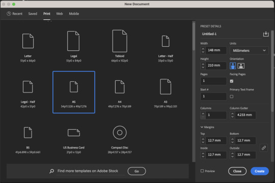
we want the booklet to be a4 so each page should be a5
once we had the pages set up (12) we worked on adding page numbers. We wrote page numbers 2 and two and copied that on to the other pages, then entered the a parent section and highlighted the 1 and selected current page number from the menu shown above. This makes all the left-side pages have the right number, we then repeated this with the right-side page number, making sure to always stay on the page numbers layer.

next we made page 9 black and then made new parent to make the page number text white so we can apply that to page 9 and have the text be visible.

we apply this by dragging the right side page from b-parent onto page 9.

then we added text blocks and made columns.
after setting up the book we moved over to illustrator to learn how to make end papers for the book.

in illustrator we made this shape and put it on a square of colour.

then we selected both shapes and dragged them into the swatches menu and applied the swatch to a shape to create a continuous pattern.

by double clicking on the swatch we can see the pattern options, where we can change the tile type of the pattern, which is automatically in grid.

I chose to use brick by row, with can be seen in the top right corner


next we made another repeating pattern, this time with a hexagon, we also made a smaller hexagon inside with just the outline and used the align tool to centre it.
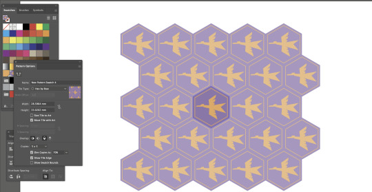
like we did previously we made a swatch, but this time chose hex by row as the tile type

then applied this to a shape like the other one

finally we made a large rectangle of the patter, imported it into indesign, and applied it to the first two and last two pages (not including the covers) as the end papers
0 notes
Text
Indesign Day 1 - notes

left - page layout - how to get placeholder tex - images and frames diagram - making image a circle
right - shortcuts
0 notes
Text
Indesign Day 1
In this class we started working in indesign on formatting some text. We used latin filler text to learn how to make paragraphs and headings.
to make the headings different to the rest of the text we used the character styles property to make it bold and also increased the spacing between the headings and paragraphs to make them stand out, making sure the heading is closer to the paragraph it is related to rather than the one above to keep them seperate.


we then made the text into two columns using the margins and columns settings which are accessed via layout.

next we added in some bullet points which we do by creating a new paragraph style

and within those settings going to bullets and numbering, to select the bullets list type

after that we went to indent and spacing to adjust the indent of the bullet points

we then learnt how to bold and italicise text, which was just creating a new character style like we did for the headings but applying it to the chosen words within a paragraph rater than a full line

next we needed to put this image into the text. In indesign when you import an image there is the image, and then a frame on top of that. You can move the image within the frame to change the cropping etc but if you want to move and/or scale both at the same time it is helpful to use the shortcut 'shift and command'.

to put the image in with the text we used text wrap and added spacing around the image to fit how we wanted.
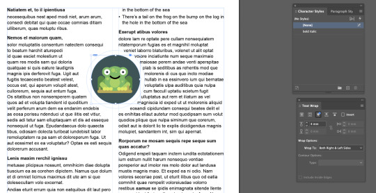
finally we did the same but with the frog in a circle shape, which we did by making a circle shaped frame and pasting the image into it. The text wrapping was the same but we just used the circle shape setting, because of the length of some words it didn't turn out as pretty as I would have preferred but I understand how to do it.

0 notes
Text
photoshop homework - image adjustment
our homework assignment for photoshop was to adjust 4 images (2 black and white, 2 colour)

I chose to start with black and white images and the first image I chose was this one of my cat maisey

I used curves to add more contrast to the image, I used an s curve to darken the darker values and lighten the lighter ones which really accentuated her stripes

next I chose this image of my fireplace, I really liked the flames
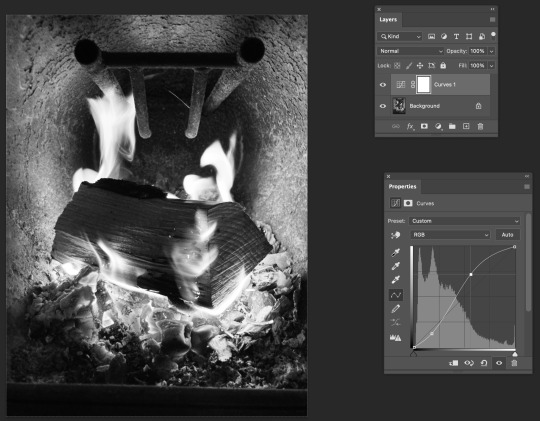
again I used curves to bring more contrast to the image again using an s curve, I really wanted to bring out the glowing of the flames and embers
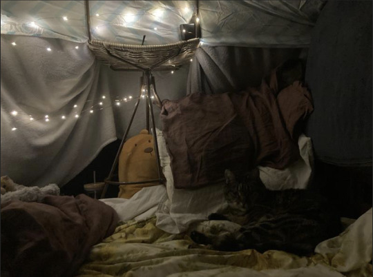
the first colour image I chose was of maisey in a blanket fort that I made, my aim was to make the image warmer to help match how cosy it felt.
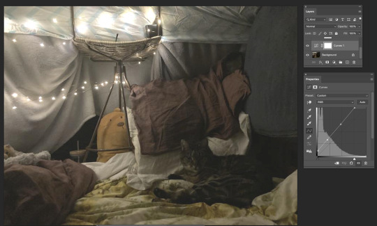
first I used curves to brighten the image to make maisey more visable and add to the glowing of the fairy lights, for this I mainly needed to lighten the lighter values as well as the shadows as the image was quite dark


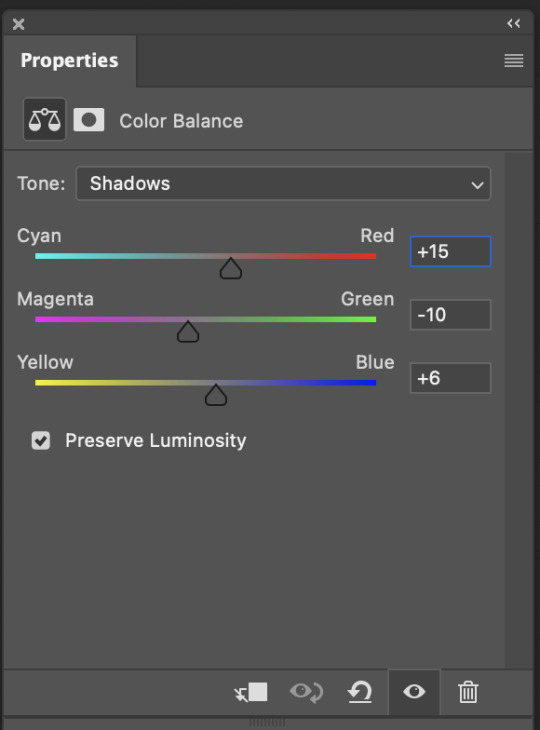
next I used colour balance to bring more warmth to the image, for this I added a yellow/orange tone to the highlights, yellow to the midtones, and a warm purple to the shadows, but I still wanted to keep it quite subtle (also it wasn't a very good quality image so I couldn't change too much without some issues)
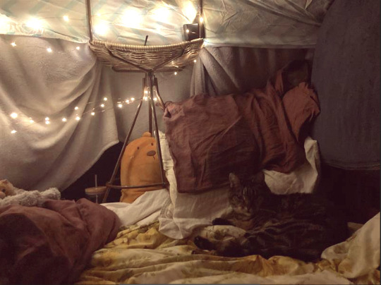
finally I added a warming filter of yellowy orange to make it more cosy.
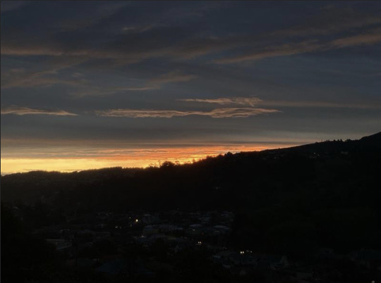
the final image I chose to use was this sunset photo I took from my house, I just wanted to play around and see how I could make it more interesting and like what it looked like in real life.

I started by using curves to brighten the whole image a bit, I was particularly focussing on brightening the sky to bring out more colour, and adding to the glow just above the hills

then I upped the saturation to again bring out more colour


finally I used colour balance to add more pinks and purples to make it warmer, which I think worked well with the yellow and orange already there.
0 notes
Text
Illustrator homework - hooty

for our illustrator homework we had to make an object using illustrator, I chose to make hooty from the show 'The Owl House' in his portable little house. I couldn't find a reference exactly how I wanted so I took inspiration from two and drew an idea for what I wanted to do in procreate I ended up changing this slightly to make it more interesting.
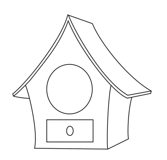
I started by doing the outlines of the house


then added the details and straps

next I started the colouring process and decided to add a gradient in the hole in the house to add some depth

more colouring progress ^


I finished the house colouring and then worked on hooty's face and body, using pathfinder to help with shadows and highlights.

finished image :)
I am really happy with how this turned out and I learned a lot making it, I struggled a bit with colouring after I'd drawn the house since I hadn't joined the lines to make shapes but I worked that out. I also spent quite a while working out where to put the shadows on hooty's body and ending up settling on the placement of highlights after some advice.

0 notes
Text
jumping guy - homework

with the homework I decided to start with the images and chose this explosion which I put behind jumping guy, I just used the auto select for this image which wasn't perfect but I think it's funny.

next I added this little frog which I took more care in selecting cleanly, using the auto select feature and then cleaning it up with the eraser tool.


I also adjusted the image to be more saturated and made the shadows more red to help it fit in with the explosion.

for my first illustrator image I made blinky from pacman, which I did using coloured squared to follow the pixelated shape.

then I added outlines using the outlines on the square shapes and deleting the lines I didn't want. I had issues with this because when I imported it into photoshop and enlarged the image there were gaps between each of the "pixels" I used to make it. So I had to go back and make new shapes to fit inside which turned out well.

for my second illustrator image I made a chunky wooden sword for jumping guy to wield which I kept relatively simple.

here is the final image :)
0 notes
Text
jumping guy - class

project we started in class and finished as homework. In class we were first focussing on selecting jumping guy and moving him to a sunny road backdrop. We did the selecting using a combination of the tools we learnt in the previous lesson mentioned before.

we had a layer of green and black underneath that we could switch between to differentiate parts of the image better when selecting and erasing.

fully selected jumping guy ^^^

then we imported the image to illustrator to make an object using primarily the pen tool.

we did this by making a snake shape with a thick line and then using the outline, and then added a gradient. To have the hand and foot going above the image we duplicated the snake and on the top copy erased space for the hand and foot.
we then moved this image to a background of a sunny road, and told to bring in two more images and two illustrator made objects as homework.
0 notes

Text
Day 5 - masking and selecting
We started by learning how to select objects using an ellipses select tool and then holding shift while using the same ellipse tool and polygonal select tool to add to the selection. After selecting the shapes we wanted, we then changed the colour using hue/saturation

next we practiced selecting with the pen tool using bezier curves, we first drew on a layer above the image to remind us which parts we were selecting.


after selecting the leaves we wanted we then changed the colouring with colour balance.
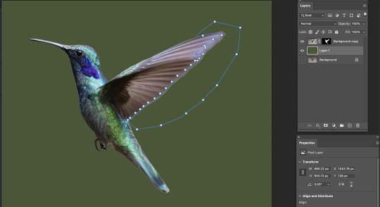
next we worked on taking an image of a humming bird and moving it from one background to another. We used the auto select tool to select the humming bird then removed it from the previous background to tidy it up. We used the pen tool and bezier curves with the wing to add more shape to the feathers as the blended in to the previous background.

we then used the blur tool to bring back a sense of movement to the wings.

then we added the humming bird into the new background and used the curves tool to help its lighting better fit its new environment.

the final image we edited was this one (i unfortunately forgot to get more screenshots), for this we duplicated the boat and put another one behind it, making this one smaller and at a lower opacity. We also erased some of the smoke from the second boat to help differentiate and make it look less like a copy, also used blur and eraser to blend in the wake and surrounding water
0 notes
Text
Day 4 - notes
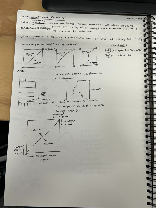
talking about colour correction vs colour grading
left - curves diagrams and explanation
right - shortcuts

left - hue/saturation and colour balance explanations
right - shortcuts
0 notes
Text
Day 4 - Image Adjusting
We first went over the difference between colour correction and colour grading. Colour correction being primarily to bring out parts of the image that wouldn't normally be seen/seen well. Colour grading is styling the images like through tinting, for an effect like enhancing the mood or sense of history. Then we started learning how to edit some images.

We started with this black and white image to learn how to use the curves tool to adjust brightness and contrast. In this image there is not enough contrast with the darkest values being too light, which we can see with the gradient on the left of the image.

To fix this we simply had to bring the left point over to the right which shortens the gradient and accentuates the shadows.
Next we worked on another version of the previous image which this time is too dark.

to fix this we brought the points in to brighten the highlights and create more contrast.

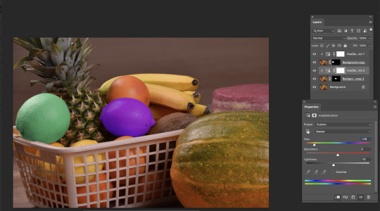
then we moved on to this image of a cat, which is too dark and very unsaturated
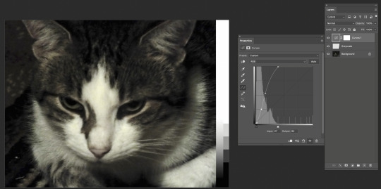
we started with curves to add contrast, bringing the right point over to the left to brighten the highlights, and making a slight s curve to add a little extra contrast. In doing this we can now see some colour in the image.

finally we used hue/saturation to increase the saturation and show some more colour in the image.

With hue/saturation you can also change the hue like here ^

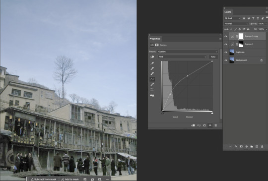
Next we looked at this image with buildings and stuff, which is again dark and under saturated.
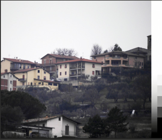
like with the cat we started with curves, brightening the light values and adding contrast, which made the colour in the image a bit more visible.

and then we used hue/saturation to increase the saturation.

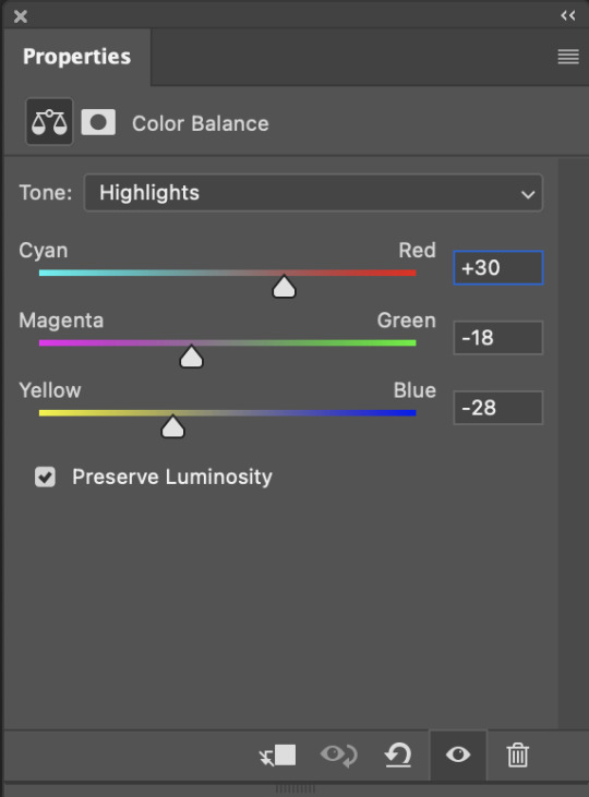
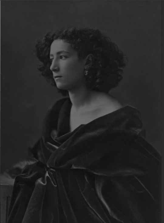
next we used this image of a man to learn about the colour balance tool in which we can accentuate certain colours within an image.


using this tool we gave the image a bit more contrast by adding a cooler bluey undertone to the shadows and warmer orangey undertone to the shadows
then did another version


with blue toned shadows and yellow toned highlights, making this quite intense.

and to finish lowered the opacity.


next we worked on this image with the goal of making it warmer with colour saturation, and added contrast with curves.


next we worked on this image, focussing on making the textiles more visible and darkening the image a bit


to do this we used colour balance, curves, and the photo filter tool which adds a colour layer on top on the image, in this instance we used it to keep the image warm and bring out more colour.

for our last image we looked at this, which is very dark
so we started with curves to lighten the image, but in doing this we lost a lot of detail in the sky, so next we want to bring that back

to do this we used a gradient in a mask on the curves layer, dragging the gradient down using the white line.

ta daaa!
0 notes

Text
Day 3 - Penguin
We started a project making a penguin to practice the techniques we've been learning.


throughout the process with both the body and the beak we started with a simple shape and then changed bits to fit what we wanted rather that drawing it all out with the pen tool.


For the eyes we used the gradient tool, with the radial setting and inverted it to have it going from dark to light from the middle. I chose to give my penguin heterochromia with blue and purple.

Next we started on the feet by making this shape,

and duplicating and flipping it to create the foot shape, we also squashed it to add perspective.

Then we duplicated this shape but removed the top lines to start the process of adding thickness to the foot.

We continued this by duplicating those lines and connecting them,

then colouring them, with the lower part being darker to add shading,

before combining them to complete the foot.


We also made a little leg to connect the foot and body.

We then duplicated the feet and attached them, making sure the body is in front, and angled one of the feet and the body to add movement. We also added a highlight on the top half of the beak to add dimension.
0 notes
Text
Day 3 - Broken Points
Learnt how to do broken points to do shapes like hearts

0 notes
Text
Day 2 - Notes

Left - Different ways to change scale, rotation, and position of objects in Illustrator - curves and points - step by step curve to straight and straight to curve
Right - Shortcuts
0 notes
Text
Day 2 - Curves
We next started learning how to use bezier curves, starting with single arc curves.


and then single and multi- arc curves, during this exercise I learnt that curves are much easier to rearrange when the handles are straight.

Finally we learnt how to go from curves to straight lines and vice versa. Going from straight to curved is more complicated than from curved to straight but I am finding it simple now that I have the hang of it.
0 notes
Text
Day 2 - Straight Line Shapes 2
We started the lesson do another exercise with straight line shapes.

I had the most fun with the dog, and ended up adding features like the nose, teeth, collar, and some detail to the eye and ears. The star took me the longest, I spent quite a while adjusting to get it as symmetrical as I could, its still not perfect but I'm happy with how it turned out.
0 notes