Statistics
We looked inside some of the posts by itsyoboit-blog and here's what we found interesting.
Average Info
Notes Per Post
24
Likes Per Post
24
Reblog Per Post
0
Reply Per Post
0
Time Between Posts
14 days
Number of Posts By Type
Text
1
Photo
16
Last Seen Tumblr Blogs


Fun Fact
Tumblr is available in 18 languages.
Text
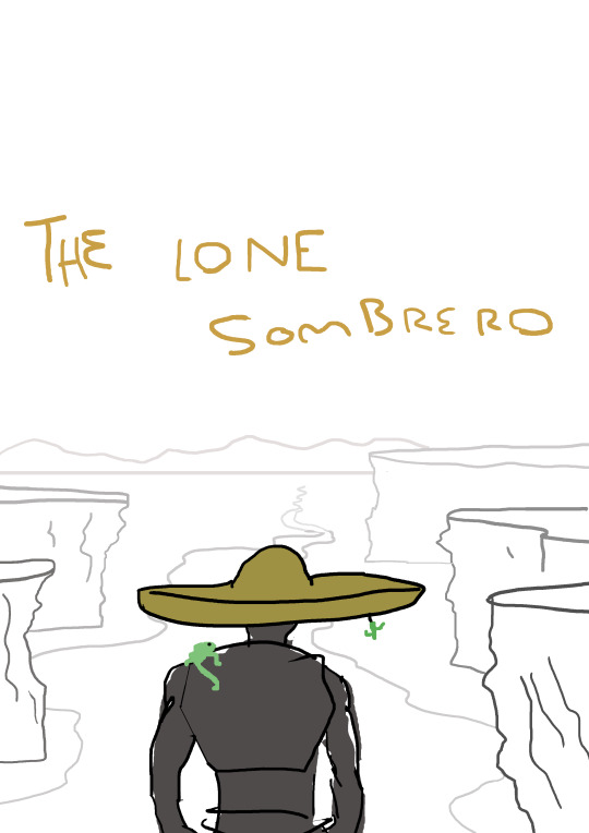
“Robopunk”

GAT110 Final portfolio submission
Robopunk is a half robot human battle bot whose been mechanically enhanced dramatically. He was saved from fatal injuries by an organisation who pre-programmed him to follow their orders, but his inner punk cannot be contained as he breaks free in defiance against his own controlled settings. Now he serves as a fierce punk gone rogue sworn to fight for the streets where the people whom he grew up with are oppressed by the very organisation that saved him.
Inspirations
My inspirations for creating Robopunk comes from many action films where humans are robotically engineered in which they adopt advanced combat skills. The idea of dystopian settings and dystopian films have also motivated me to my character a futuristic and robotic look. This setting Robopunk is shown in combat in a dry rocky environment where I picture many futuristic like battles take place, thick dust fills the air as a sign of fierce battle.
His head contains many features. Battle classes that enhance his vision, a loud Mohawk to show eye witnesses whose boss and a robotic ear piece that is connected to his brain and once took control over his actions. His right arm is synthetic yet enhanced and his torso is compiled of high-tech armour. His legs are fashioned with cargo pants which fits the idea of combat.
Strengths and weaknesses
Weaknesses I found was that shading my character according to the light emitting from the gun was somewhat difficult. I didn’t focus enough attention to pieces of his body that should be considered hidden from the gun light in which it should have been darkened quite dramatically which is one of my ideas of making this piece more improved. Also one of his back leg (angled and in the air) could have been shaded darker to further differentiate the back leg from the front leg (which appears larger and is angled at 90 degrees).
2 notes
·
View notes
Photo


Greetings I am a first year student at Media Design School, and this is my first game, hope you enjoy! "Keys 2 Success" is a simple maze game where you play over a good sum of levels that progress in difficulty. Made in GameMaker, the game draws a lot of inspiration from Music producer "Dj Khaled" and has quite the comedic theme in reference to Dj Khaled's iconic social status on social media. You must tactically avoid "They" (The people that don't want you to win) while collecting the keys to success. The keys to success are placed throughout each room/level and "they won't make it easy for you to get them". You will be challenged by the likes of these haters in order to "win, win, win" just like the Khaled himself. Dj Khaled is an inspiration worth acknowledging, and when playing this maze game, you will be accompanied by his wisdom.
Video link to game footage: https://youtu.be/EmYGoLoKoMo
Itch.io weblink:https
://itsyoboit.itch.io/keys-2-success
Gamejolt weblink:http:
//gamejolt.com/games/keys-2-success/208906
2 notes
·
View notes
Photo


Greyscale painting
For my greyscale painting I chose to paint an actual couch under natural lighting. Most the light source came from behind which is why there is a heavy shadow below the image. There was also strong contrast between the background(wall) and the ground, which helped me form the ideas of what exact shades I needed to use for the main figure. The couch itself consisted of extremely dark shades which almost merged with the ground in some way. I relied on the lighter shades of grey and white to bring my image to life 3 dimensionally. My first approach for comprising this image was to first paint the background and foreground, I then blocked out my couch in the middle and ultimately incorporated three layers of grey. For the bottom I used black, In the middle I used a light grey then above I used a blackish grey. I slowly bought my painting to life by studying the exact shades of each section to add depth to my image.
Still life painting
I decided to paint an orange for my still life because I loved the shades of orange that are incorporated in the fruit when studied with the use of lighting. To put focus on the fruit I used a dark shade of blue in the background, this also helped me create strong contrast in imagery. With this piece I intended on showing a slight sense of warmth due to the fact that this fruit consists of vibrant and warm colours. To begin with I blocked out an orange circular shape and the comprised 3 distinctive layers to incorporate shading. I feel like I achieved this by using shades from light brown to light orange.
2 notes
·
View notes