
ittaamilki
itta
I'm just trying to draw againdoodles request are always open :3
145 posts
Last active 4 hours ago
Don't wanna be here? Send us removal request.
Last Seen Blogs
a-passing-interest
not just a passing interest

pemerhatis-blog
Untitled
irondadfics
peter & tony fic finding

konstantinfresh-blog
KonstantinFresh

sad-indie-kid
quiet kid with loud opinions
Text

Sleepy but pls take these serirei fairy doodles me and my friends were talking abt disney fairies, decided that reigen is a tinker fairy and wawa is a water fairy, they love each other and sleep in flowers together

458 notes
·
View notes
Text
Guys. It's Friday. You know what it means.

Happy Reigen's Ass Friday again!
i just added a previous shot to that gif so yeah. it's so fucking fun to animate this man. god bless
previous post: https://www.tumblr.com/majesticcorn2000/760883840118046720/happy-reigens-ass-friday-everyone?source=share
311 notes
·
View notes
Text

Serizawa drawing cause I got inspired by the fact he could control technology a bit in the Reigen Manga.
67 notes
·
View notes

Text


Some sketches of varying quality from the past week or so …
I had to free vampire reigen early. I’m working on a digital piece of him for reigen week but I had to share asap because I’m going crazy
88 notes
·
View notes
Text

Happy Birthday Minori💜!!
can't believe it's already the second time I'm drawing bday art for her...🍰 my Mob Psycho obsession won't let me go anytime soon I think💞
69 notes
·
View notes
Text


WOWIE!! I’m so happy to be back from my hiatus with NEW stuff for you guys!
-
RENDERED COMMISSIONS ARE NOW DISCOUNTED TILL 1/1/2025
Busts - $12
Half Bodies - $15
Full Bodies - $25
This includes a colored background of your choice. Any extra additions are regular price. Terms and conditions from my original post STILL apply.
-
I ALSO NOW SELL ART PRINTS ON INPRINT!!!
Want to get a print of my art and support me? Check out my shop on INPRINT. All of my higher quality arts are shared there and it’s not just Mob Psycho 100! We have some Ninjago and Lego Monkie Kid pieces as well as one Deadpool drawing. Check it out!
27 notes
·
View notes
Text


My end of an art trade with the wonderful, @rebka18!! Reigen and Serizawa in ACNH style!
Enjoy these silly little guys. they were really fun to draw :3
Inspired by @baderpfulu's Reigen and Serizawa ANCH designs!
212 notes
·
View notes


Text
YOSHIOKA MAMORU

My piece for #yoshiokadiy2024!
I put a lot of time and effort into making this piece and i'm really happy with how it turned out! I had a lot of fun participating and it was really inspiring seeing everyone else's amazing submissions!
Thank you, @brandyy0moss for hosting this lovely DTIYS!
Dimple Friday #38
Bonus version under the cut:
Thought why not make a yoshiekurei version while I'm at it? heheh >:3
(Plus, i thought the added red contrasted nicely with the piece lol)

the culprit behind the kiss marks 💋

"Whoops, how did that get there~?"
57 notes
·
View notes
Note
as per Reigen’s request, may I request him and Serizawa making out? Is that a thing I can do?

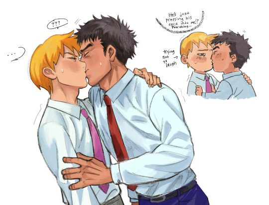
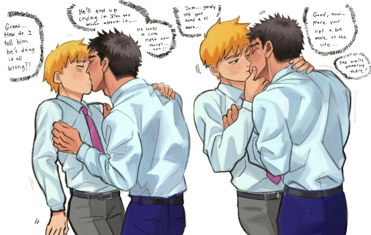
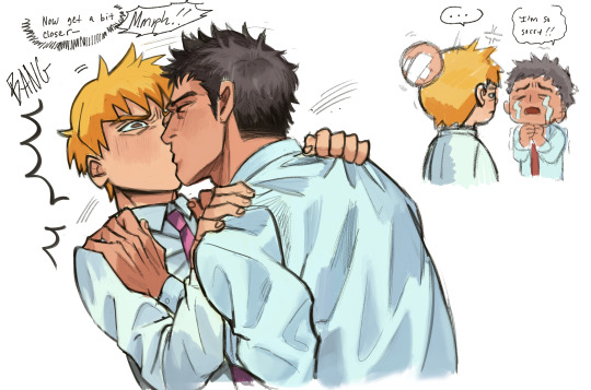
a poor attempt of making out with your very inexperienced boyfriend
854 notes
·
View notes


Text
Just a couple of friends who like each other a lot
349 notes
·
View notes

Text
sharing my opinion here about serizawas design inconsistencies over time (spoilers for mp100 ending)
i feel like in each new rendition of serizawa weve seen in official art ever since the start of S3 something feels off in a different way with every new merch release
lets start here ⬇ serizawa looks like,, himself. accurate to how hes drawn since his first anime appearance


⬇⬇⬇ and then slowly,,, things start to look off. his jawline is slowly getting slimmer, his eyes look wider (same with mobs too)

AND DONT EVEN GET ME STARTED ON THESE. especially the one on the right my god. who is that


every new promo art that comes out just feels very careless. I think you could say so for all the characters (mobs giant eyes, reigens waist getting skinnier/pointier features. the PROMO art of dimple that was literally FULLY TRACED OFF OF A TEMU PIRATE HALLOWEEN COSTUME. they all look bad here)

it just feels a little depressing how little they seem to care anymore, like theyre just trying to pump out merch without bothering to use a character reference.
i notice the changes the most with serizawa. every promo art looks like theyre playing a game of telephone. each version of him is based on the last, instead of his initial design (shown below)

at the end of S2, when reigen cuts serizawas hair, he still looks like himself. they did a great job of showing "how serizawa would look underneath his moustache and big hair". In S3 it feels like they've lost that mentality completely. like he's no longer based off of his original design, but an entirely new reference of his salary man look. some comparisons between S3 vs S2 and OVA down below


I find that the line weight in S3 is much heavier and unfocused. but what bothers me most of all is that... Serizawa looks different in nearly every scene... as if they're undecided on what he should look like. the shape of his nose and jaw, his hair all change depending on the episode entirely.


The art style change for S3 was meant to be "more accurate to the manga", but I find that it had the opposite effect. especially how serizawas and ritsus eye shapes changed. ritsus large pupils and serizawas more almond shaped eyes were more reflective of their manga designs
there are plenty of inconsistences in S1 and 2, but they're clearly done with purpose to reflect on ONEs art style (my beloved). I feel like the thinner lines allow more room for detail and extreme facial expressions that truly hold a candle to ONEs insane talent for capturing emotions.


these ^^^ compared to..
erm.. this.. ⬇


just felt very underwhelming... and serizawa certainly does mellow out once he starts working at S&S, but that doesn't mean that there's less opportunity for detailed expressions !!
the yokai fight scene was beautifully made i have no qualms.. but the amount of serizawa lore and dialogue in the manga that got cut from the anime just made him look like a cardboard cut out standing behind everyone. lots of funny and interesting moments cut to make room for the moefication of serizawa katsuya..
I feel like there's a lot of important moments that were cut, (reigen "i hope i can become a partner like that" arataka, serizawa "ive had a similar experience myself" katsuya )
or sad, intense scenes that were made lighthearted (the body improvement club trying to help mob, mob and ??? dialogue being cut, reigen removing his shoes in the final arc made to be meant for better grip rather than... his passively suicidal tendencies )
i think the people at bones are very talented dont get me wrong, i just felt like S3 could have been adapted better. this keeps me up at night its like 1am :) anywhosies thank you for listening to my ted talk i love you
336 notes
·
View notes