Don't wanna be here? Send us removal request.
Text
Reflections
I had already had some experience within photoshop before but it was great to learn how to do the things I knew before but a more efficient way! I had no clue what I was doing with InDeisgn before but now I feel like I can use it well and understand the tools it has and the function of it. I have gotten much better at using the pen tool and much quicker with making the work.
I feel like I have a deeper understanding of the software we have gone over. I found some parts harder to learn than others (such as getting my pen tool drawings to be even on each side) but now I can do such things with ease. I am proud of the work I have made.
Learning curves and the way that the shapes are effected was great for my understanding. and the way that handles are used and how to edit them after you have made the shape. when we made the penguin was when I started feeling like I had control over the pen tool.
Then we did some image adjustments with curves and adjustments layers. I was good to learn how the process of doing image adjustment, so then when we moved on to fixing some photos it was good for my understanding of also what to look out for when looking at images.
InDesign was a software I was always scared of because I saw it as something that had so many tools and so many little things to it that was so different than other software I had used before. But now I feel like I truly understand the tools and the software and am happy using it.
0 notes
Photo
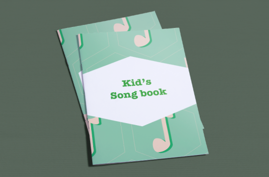
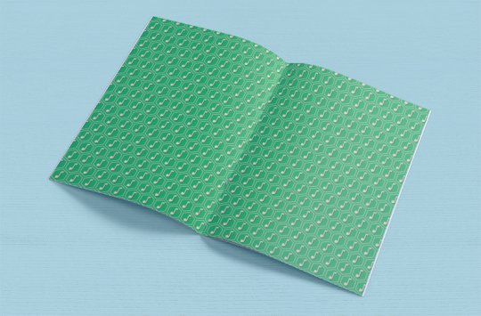
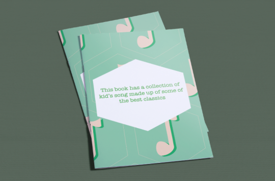
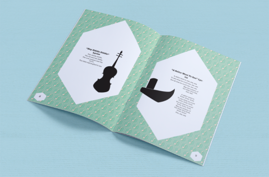
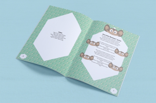
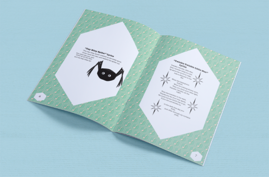
I am happy with how the book turned out, I made the assets for the book all myself. I found it fun putting the book together and seeing the final product was awesome! I wanted to go with a light clean design and I feel like I did this well
Created using a4-brochure-mockup-free-800x526pxfrom ZippyPixels.com
0 notes
Photo
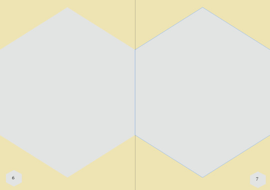
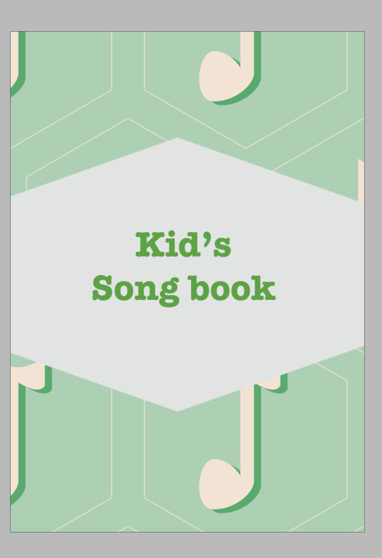
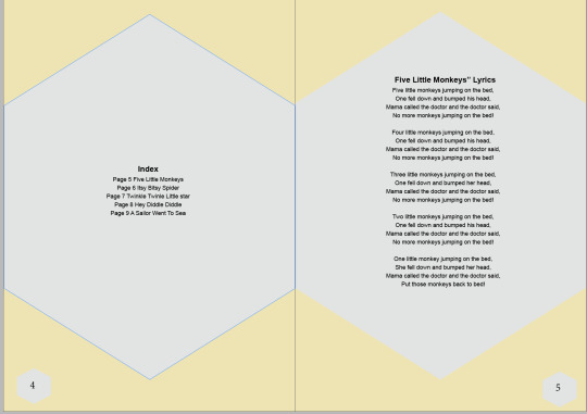
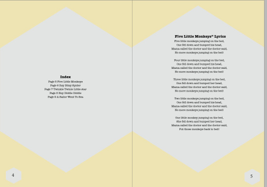
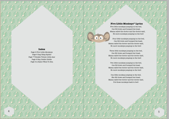
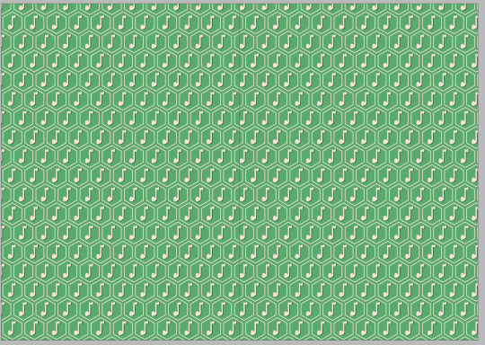
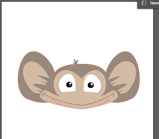
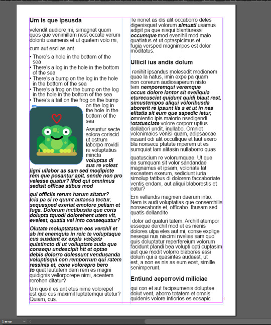
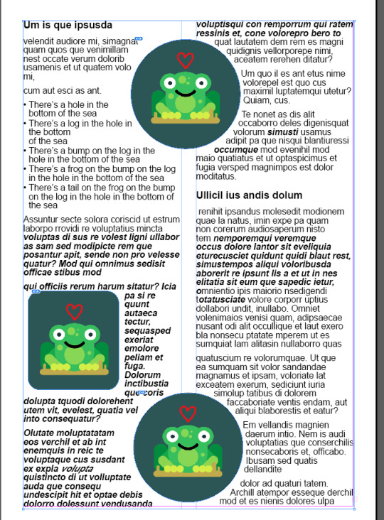
I started with the book being yellow and big shapes where the text is going to be but as I went on through the design I changed it to green and with a patten and started adding in my drawings of the song. I was super happy with how the pen tool drawings turned out, I used margins/columns to help design the pages of the book. and using paragraph styles for the text.
0 notes
Photo
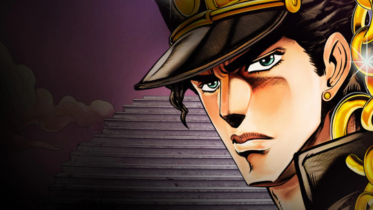
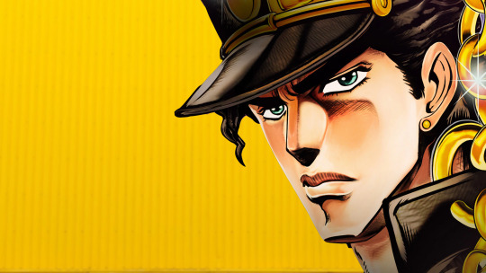
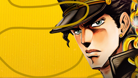
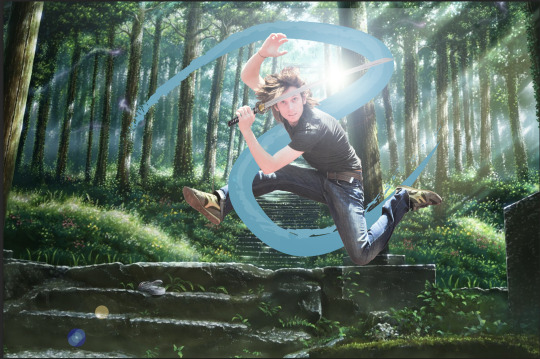
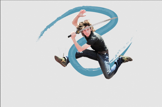
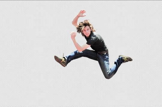


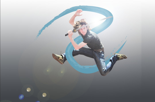
The image above I changed the background of for one of our tasks we had to change the background and also add something from illustrator going in front and behind the main focus.
The other image was the task we did in class and I had loads of fun with this. we used layer masks and selection tools to cut out the man jumping. I added extra effects to him like a lens flare and sword.
0 notes
Photo
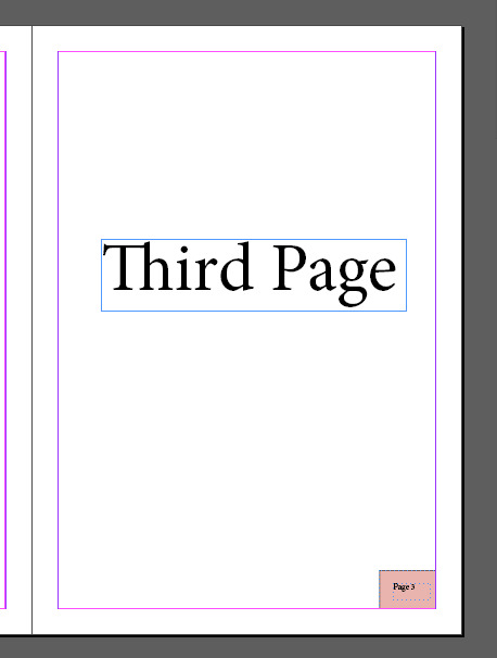
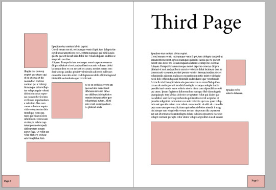
KeyBoard shortcuts:
Shift option command V = Paste in the same place
Type > insert special character > Markers > Current pager Number
What I would like to learn from this course:
How to design a book
Experiments:
Played around with layouts and columns
Notes from lecture:
Pages will be layout in the pages tab in indesign
Parent pages are similar to the paragraph styles but more visual
Tips:
Parents pages can help with logos/page numbers making it faster to do
Do disassociate a page to the others drag the “none” page to the page
Columns are useful and can be good to put lots of them so you can play around with lots of flexibility
Reflection/confident:
My confidence is growing the more we use/learn about this software now I feel like a 7/10 with the software
Enjoyable parts:
Playing with the layout of the pages
Things to cover:
Different design styles of layouts
0 notes
Photo
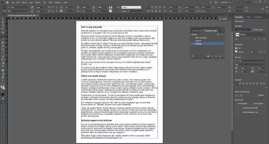
KeyBoard shortcuts:
Z= zoom
Space bar = move around
Hold down command = outside of the text editing
Command A = select all
W = preview mode/normal mode
Shift return = soft paragraph
Shift command = highlight text using the arrow key will highlight different text
Command while scaling objects will also scale the images inside
What I would like to learn from this course:
How to create an awesome looking document with amazing design
Rating of software:
9/10 very useful for documents and much better for design purposes rather than word documents
Notes from lecture:
Linked files are much better than normal because if we are doing a document that has lots of images then it is more streamlined
Scaling image and frame (indesign uses frames) when used right looks awesome
Pink line around the “edge” is the marge
Letting is the gap between lines
The style settings in the paragraph style options will capture the settings done earlier
Character styles is so we can change single words instead of a whole paragraph
Columns will split the page
Tips:
Make sure you are not in the text box when you want to move around
Go to window and tick in style paragraph styles
The paragraph style will save a lot of time compared to doing it for each page
Tick the preview so the document updates as you change it
Between 8-9 is good for text size
There is no need for selecting the heading you can just click it and put the style on it
Right click the character style and redefine style will push it into all of the text in that style
Reflection/confident:
I would say I had no confidents with this software before now I would like to say I’m 6/10 with it
Difficult areas:
Remembering to hold down command while moving/scaling an image
Enjoyable parts:
I love frogs so it was great to use the frog on a log image.
Things to cover:
Paragraph styles, character styles and resizing images within indesign and also how linking images work
0 notes
Photo
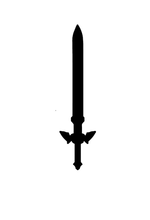
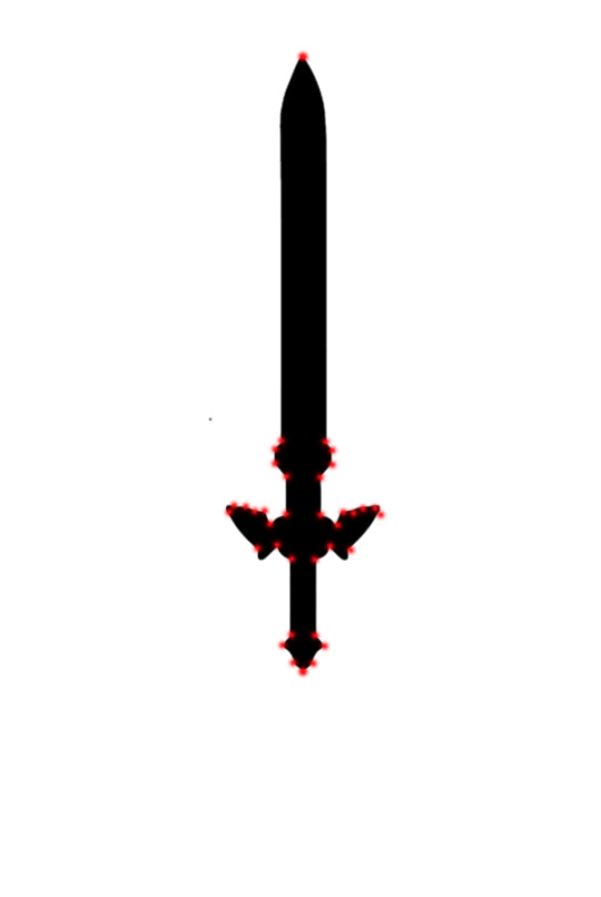
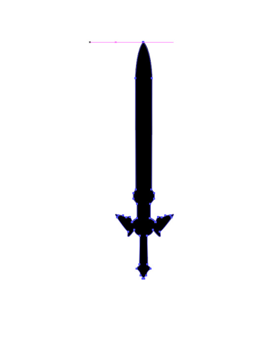
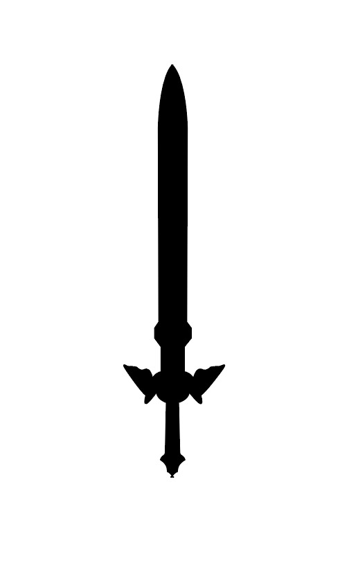
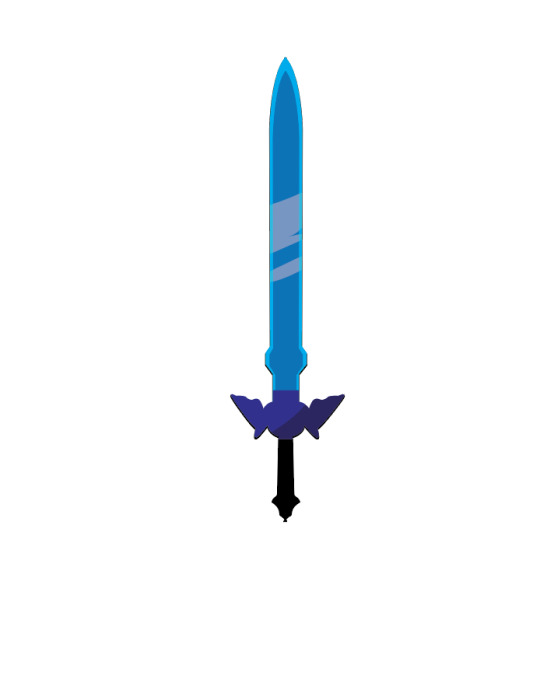
I was very happy with how this sword turned out, I used the technique we used in class where you do a half of the object and then join them together so that way both sides matched up. I used the path finder tool to do the shading/color
0 notes
Photo
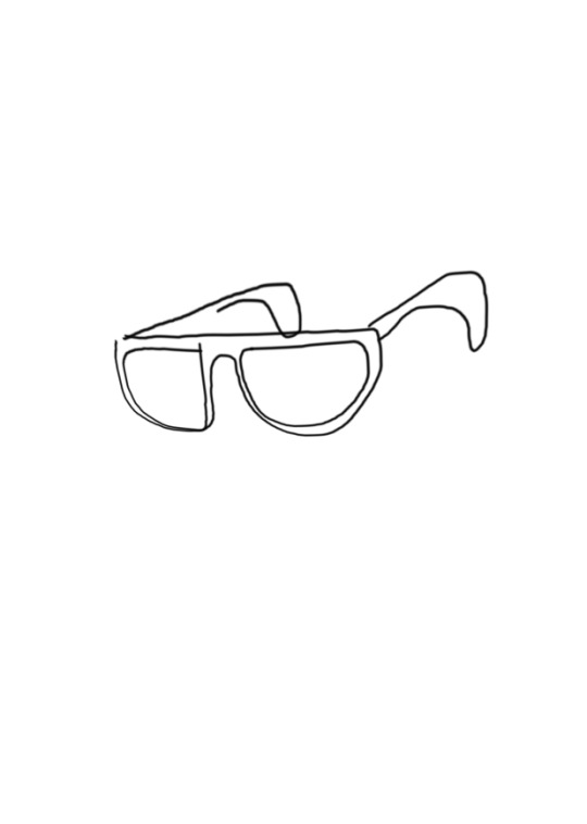
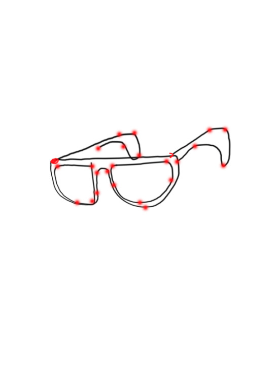
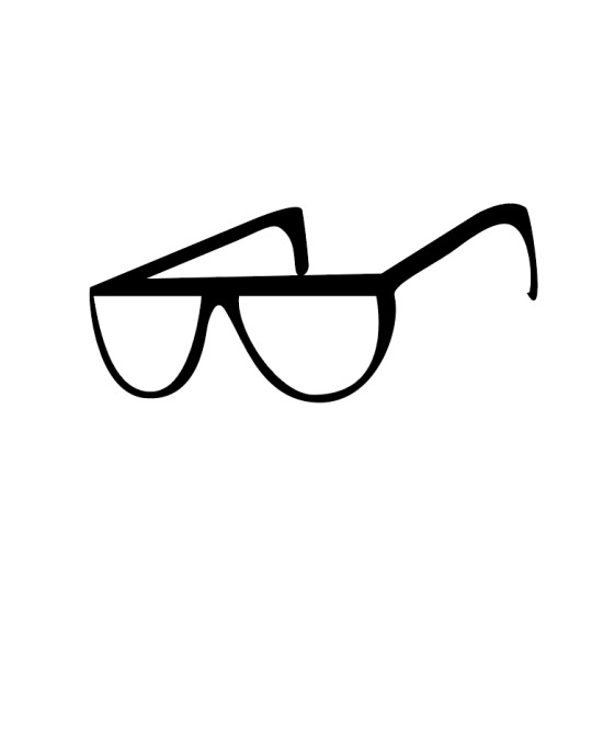
I found it challenging to get the shape prefect, with the back of the glasses. I am semi happy with how it turned out, in future I would’ve done less points on the drawing with the drawing of how many points to use
0 notes
Photo
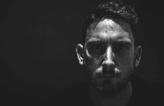
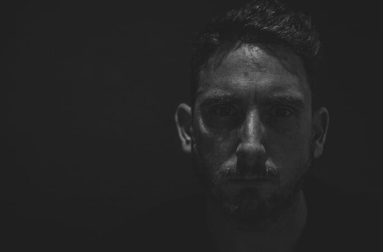
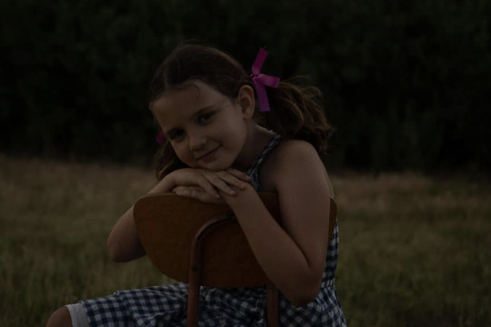
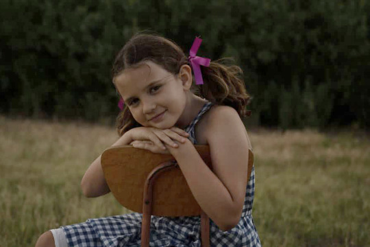


Adjustments made on photos that needed to be made the first image was too under exposed (the mans face in black and white) the next image was also under exposed (the girl on on the chair) the other black and white photo was also under exposed (train photo) and the last image was over exposed (the landscape)
0 notes
Photo
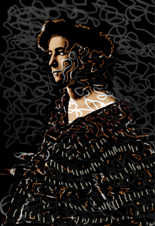
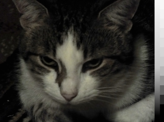
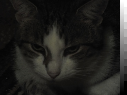
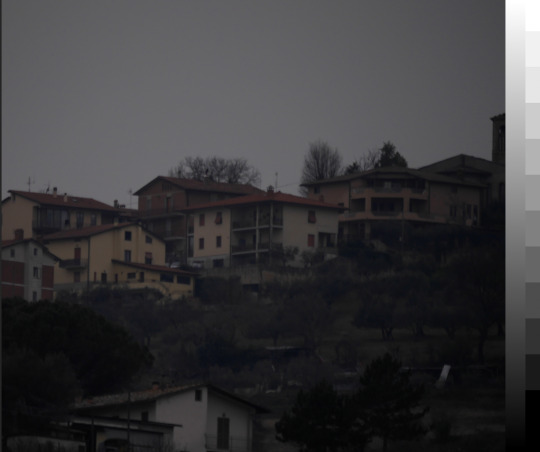
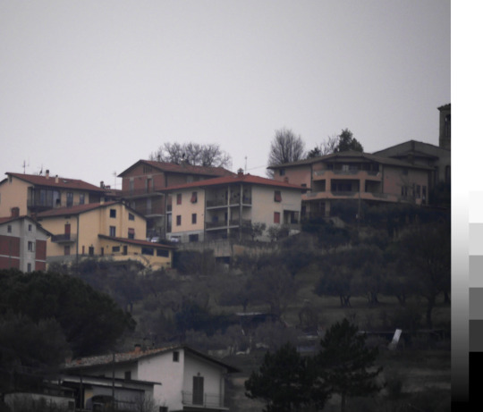
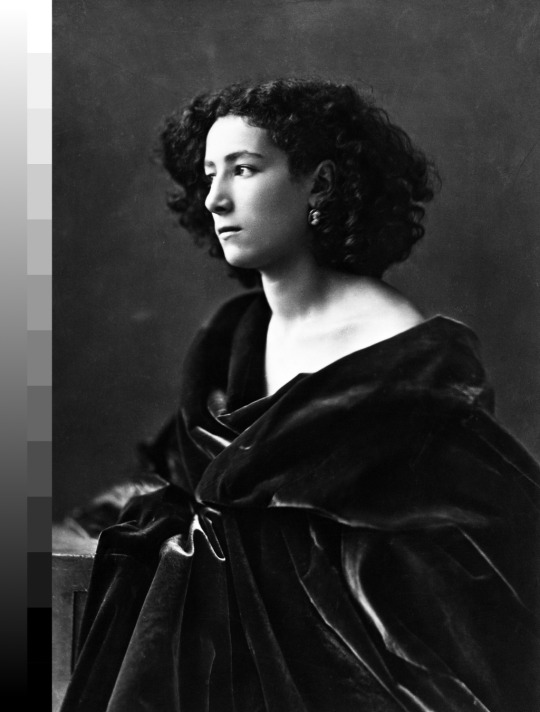
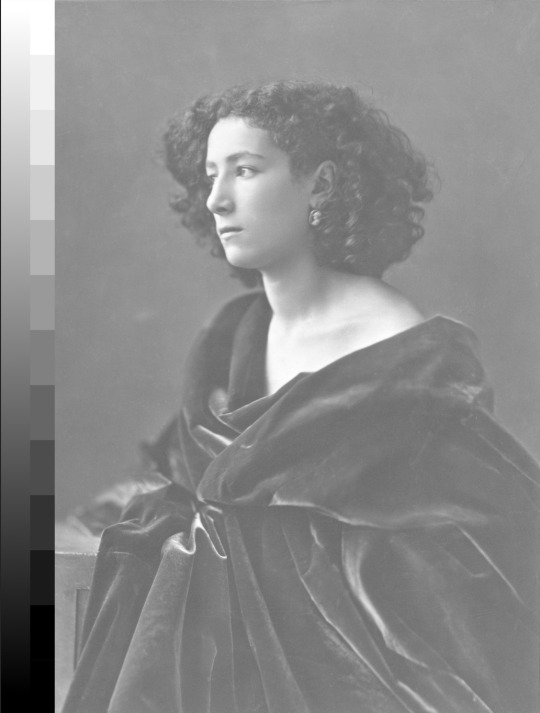
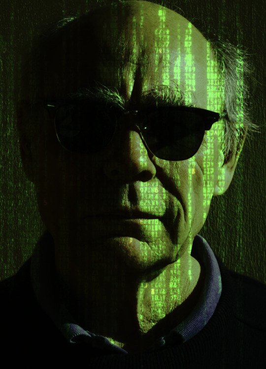
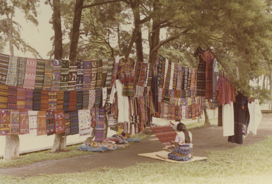
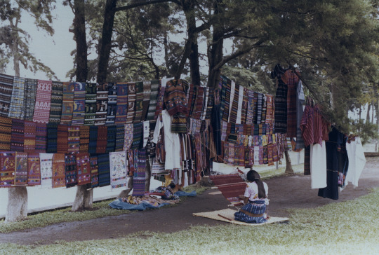
Image adjustment
Colour correction
matching two or more images to fit together, so the colours aren’t all different
Colour grading
Often applied when a creative step needs to be taken
Shooting in RAW is the best format for storing data
JPEG is one of the smallest file size
Image adjustment
one or more processes that are part of the colour correction / colour grading
Photoshop shortcuts
B = Brush
Z = Zoom
Space = pan
E = erase
[ ] = brush size
Alt/Option = colour dropper
Image tab
adjustment
(using it this way instead of making a layer adjustment will make the changes to the image instead of making a layer that you can change that will affect the image)
Curve tool
is like a graph, the x axis is the full tonal range, the Y axis is the output of the image, the line represents the unedited image
Shift + command + 4 = screen grab
Colour
hue/saturation, used for colour adjustments
0 notes
Photo
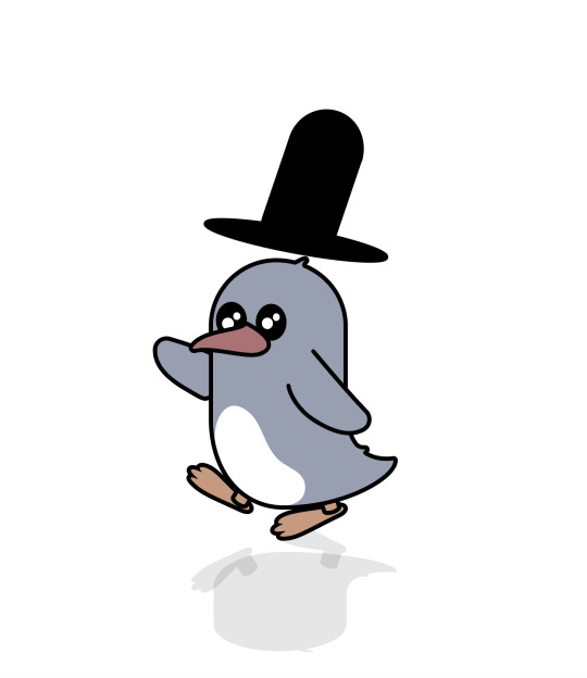
KeyBoard shortcuts:
Command Y = Wireframe
O=reflect
used like a archer point
while holding shift it will move it in right angles
- = removing a point from the object
+ = will add more points
Command U = Turn off guide lines
Command X = cuts
Command V = paste
Command J = joining to points
Shift command G = group
What I would like to learn from this course:
how to create a clean looking object that looks professional and simple
Rating of software:
8/10
Examples of work I like that relates to this:
clean UI in video games/websites
Experiments:
I played around a lot while making this penguin, like giving him a top hat and adding a shadow under him (still needs some work though)
Notes from lecture: Double clicking the layer you can dim your image/layer
Window, Art boards. This is like having extra paper to work on
Art board tool is on the left hand side towards the bottom, this can be used to move/change the “paper” you’re working on
Tips:
Use Layers
Can be found under the window tab
Object
arrange, bring front/back
Check the Link button while Placing the image under placing in the file tab
This will link it to the file so you can use the image without having the image saved on that computer
If you are moving stuff around hold option to copy it
Reflection/confident: I feel like I am getting a deeper knowledge for how the tools inside this software are used 8/10
Difficult areas: I still have problems with getting symmetrical objects
Enjoyable parts: It was enjoyable to make this funny little penguin
Things to cover: I would like to know how to make things a bit me even on each side while using the pen tool
0 notes
Photo
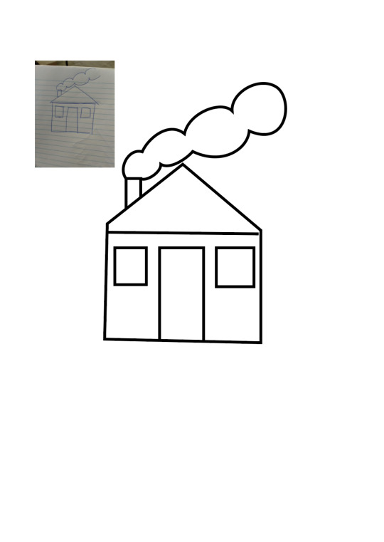
This was the second image I had to draw.
I found it to be easier than the other one, it didnt have many curves, looking now at it I can see some mistakes in it, but I will improve the design further. I used some of the curves we learn last week with the clouds, and I tried to use as less amount of points as I could
0 notes
Photo
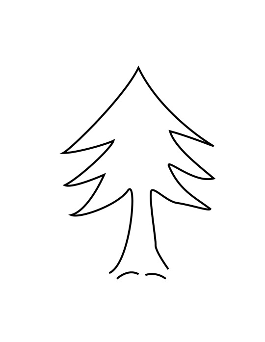
I touched up the design a little bit but I’m finding it hard to get it even on both sides, I tried to use as less points in the drawing. I will work further on this design and fixing up the mistakes still needed to be fixed
0 notes
Photo
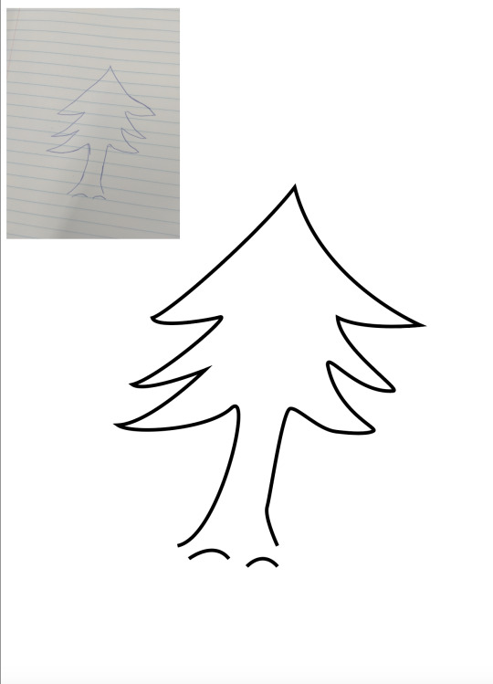
This week we have been practicing the pen tool, working on curves.
This is the practice work inside of illustrator. I will change the design around a bit more and make the design a bit more equal on each side. I found it to be quick and easy to use the pen tool, I got this outcome fast but will make future improvements to the design
0 notes
Photo
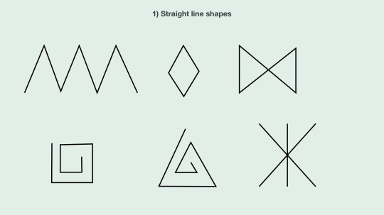
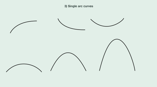
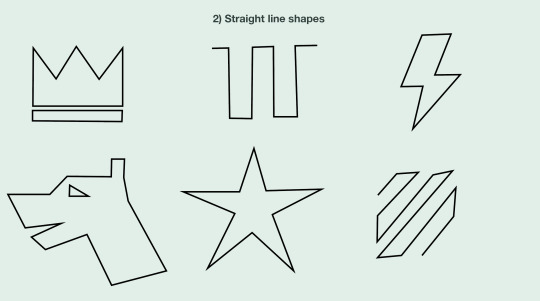
Friday 4th
Short Cuts
z = zoom
space = pan
v = mouse
p = Pen tool
a = Direct tool
cmd + Click = stop drawing
shift + cmd + S = save as
Bézier curves is said like “BEEH ZEE AYY”
I would like to learn how to get smooth symmetrical drawings with the pen tool
Rating of my software skills at the current time: 5/10
I would like to be able to make works like Starbucks logo, and other logos for example in this software
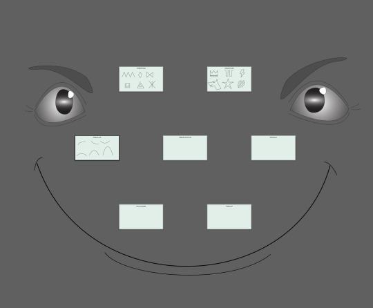
I played around with the software as seen in the post earlier (making eyes)
Tips: keeping the handles short will make a clearer image
I found that my paper drawings weren’t nearly as clean as the lines/shapes i did in the software
I am getting more confident inside of this software as we continue working with it
I found doing straight lines was difficult, but had a better time once the first few shapes had been done
I also found it fun to play around with and make interesting shapes
spent today learning about curves and the pen tool and how to approach doing them in Ai (illustrator) I found it hard at first to understand until we had it expanded on with the lines that make the curves and how they relate to the shape of the line/shape, it was fun to get an understanding of the lines and shortcuts. the shapes we made I had some problems with e.g : the star was hard because i was trying to rely on just my eye insteed of using a snapping gird. other shapes I had a better time with like the crown and lighten bolt
overall was very intrestening and learnt a lot there is alot more to learn but a great start into my adobe journey :)
0 notes
