
jacksnaddonart
Jack Snaddon
HNC Graphic Design and Illustration
27 posts
Don't wanna be here? Send us removal request.
Last Seen Blogs

gabzcollins
gabz
persephinae
Only In My Dreams

dieklar
DIE KLAR

curatedqueer
boys like me belonged in the rain

mapforham
MapForHam.com
Text
Smuggler’s Supply Gin
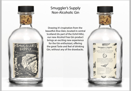
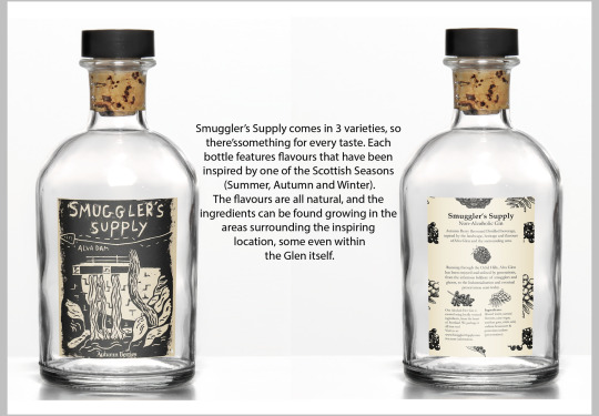
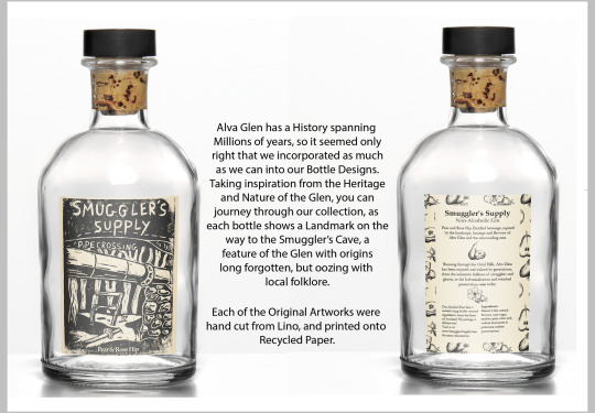
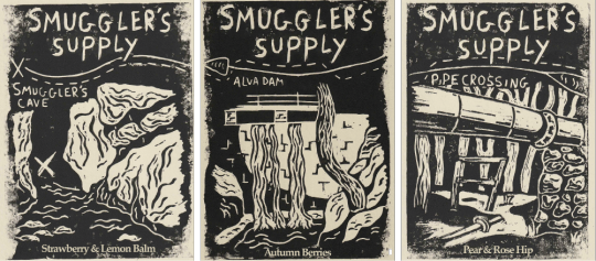
For this project, I was tasked with creating 3 labels for a distilled non-alcoholic beverage. At first, I was sceptical, as this included coming up with the actual product as well, so I felt a bit lost and overwhelmed to begin with. However, once I started the research, I started to get my bearing. Choosing my location was a big step towards this end, as that is where I based most of my development work on.
I wanted to use a location that incorporated the other two elements, Purity and Nature. I think the nature aspect was certainly more present throughout my project, with the purity falling more into the background (i.e. the purity of the water). From then, development was definitely easier, and I wound up incorporating aspects from all my concepts.
I kept my Target audience in mind, focusing my main design(s) on the sort of folklore of my location (inspired by Smuggler’s Cave), I done this as I stated in my early research that my target audience would be interested in the sort of quieter aspects of Scottish history, which I think this issue of smuggling falls into. Also, I tried to incorporate a sense of the journey and adventure that my that my audience would appreciate, which I feel is evident in the map aspect.
I think my design would definitely hold up against its competition, it may not be the most polished looking product, but this was all by design, and I’m sure it would certainly make my product stand out.
Naturally, there are areas I would like to improve on, such as experimenting more with colour, or perhaps coming up with some more samples before I dedicated myself to the Lino cutting technique, however, I am confident that my designs fit the requirements of the brief, and I completed this project to the best of my ability.
1 note
·
View note
Text
Student Design - Tequila
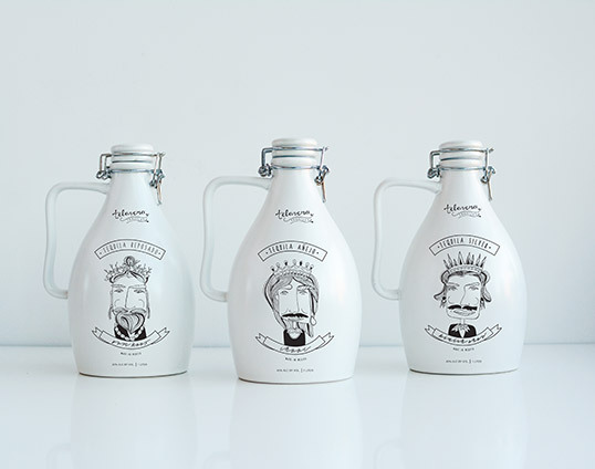
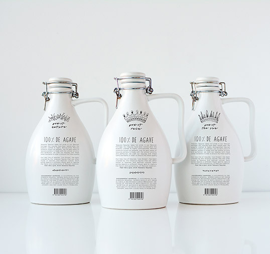
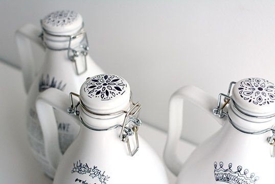
Designed by American design student Hannah Hart, this series of 3 tequila bottles were a response to a project brief much like mine. Propositioned to create alcohol packaging, she also based hers off a location, although she chose the whole country of Mexico. She took into consideration much of the arts and culture of the country, and based the shape of her bottles off a handmade pottery technique called Talavera. She also incorporated some imagery of Mayan Gods, some extraordinarily important figures of Mexican Culture and Religion. The lively illustrations were hand drawn and transferred onto each bottle using acetone. There are a great deal of things which inspire me about this work, from the hand generated illustrations, the vast amount of research that must have went into the project, and generally how this research has been applied to the finished project. I think this is a very clear example of how it is possible to link every aspect of a product design to the culture and history of whatever location has been chosen as inspiration, and given how my own location for this project has a rich heritage of its own, I think I would do well to remember this and absorb it moving forward.
http://lovelypackage.com/student-work-hannah-hart/#more-36718
0 notes
Text
Nongfu Water
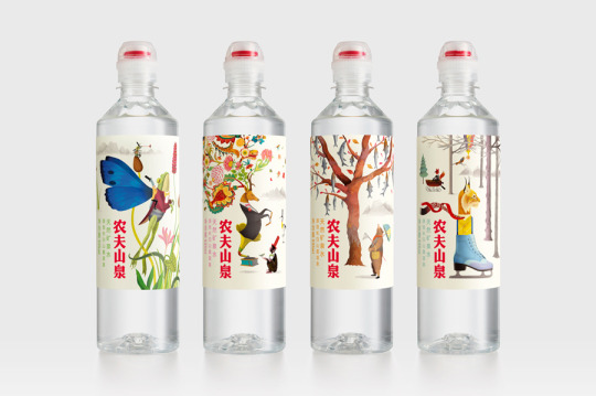
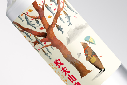
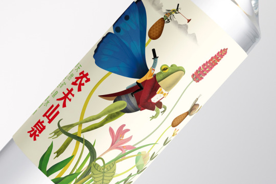
Despite not being specifically a distilled non-alcoholic Beverage, I was still very much inspired by the illustrative labels found on these bottles. Taking inspiration from the plants and animals found in and around Lushuihe National Forest Park in North Eastern China, the artist Brett Ryder (of Horse studio) has created a unique design for each of the 4 bottles. I think this certainly stands out from the other designs I’ve been looking at due to the style of illustration, however this may pose problematic as it could be conceived as too childlike. The main thing that actually inspired me about this product was that each of the 4 designs were not only based off the national park, but were based off a different season, and what the plants/animals look during that period. I thought this was an excellent way to look at the project, and would certainly help in creating different designs that are all linked. Overall, I think that with some more mature looking visuals/illustration, this would be a very good path to distinguish between the three different flavours, which could also take inspiration from the seasons, and would be a fresh take on the brief.
https://bpando.org/2015/06/02/packaging-nongfu/
0 notes
Text
Monoprinting - Berenice Sydney
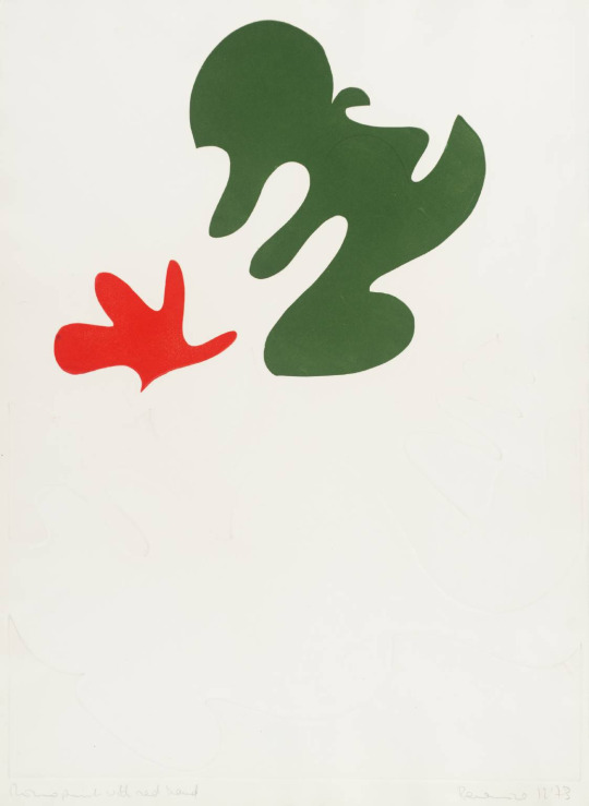
“Monoprint with Red Hand” Berenice Sydney, 1973
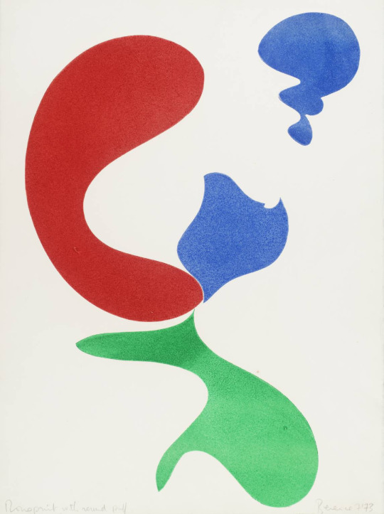
“Monoprint with Round Puff” Berenice Sydney, 1973
Monoprinting is a rather unique form of Printing, in that each design is unique. There are a few different ways to make a monoprint, but each one can only be made once, as opposed to the other techniques, which are designed to be recreated. Monoprinting usually combines mediums, for example painting and drawing withetching or woodcut. This allows them to be a lot more personal and usually more detailed than most alternate methods.
Berenice Sydney was a British artist who created art in many mediums, but spent a lot of time making monoprints during 1972. Her paintings were abstract, and this continued when she started printing. Her monoprints were often made by combining Oil paint and etching techniques on Steel, Cooper and Perpex. She makes use of strong solid colour segments, and her abstract objects are very defined. This has inspired me to think about how I may interpret Objects in my composition.
https://www.tate.org.uk/art/artworks/sydney-monoprint-with-round-puff-p01614
https://www.tate.org.uk/art/artworks/sydney-monoprint-with-round-puff-p01614
0 notes
Text
Serigraphy - Chuck Sperry
“Athena” Chuck Sperry, Screen Print on Canvas
“Artemis” Chuck Perry, Screen Print on Oak
The term Serigraphy refers to the printing technique more commonly known as Silkscreening (Screen Printing). This method requires a bit more preparation that Relief Printing, however, I feel like it would be easier to create high quality accurate designs. The method involves creating a mesh stencil, with your design cut out. You would then use a Squeegee to spread the ink over the mesh stencil, lower it down to your printing surface, and then spread the ink back towards you, so that the mesh and ink touches the surface.
Chuck Sperry is an American Screen Printer originally from Ohio. He currently works out of Hangar 18, his silkscreen studio in Oakland. He became well known for his screen prints for famous rock musicians, however in recent years his iconography has shifted to the nine Greek muses. I am inspired by his work as his style pays meticulous attention to detail, as well as remaining on brand throughout his works. He makes use of floral/organic patterns in his work, both as a background and to add texture/detail to his subject matter.
https://www.hashimotocontemporary.com/artists/99-chuck-sperry/works/3263-chuck-sperry-athena-2019/
https://chucksperry.net/tag/beyond-eden/
0 notes
Text
Relief Printing - John Banting
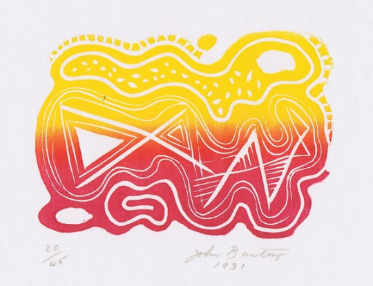
“Snake in the Grass” John Banting (Lino Cut)
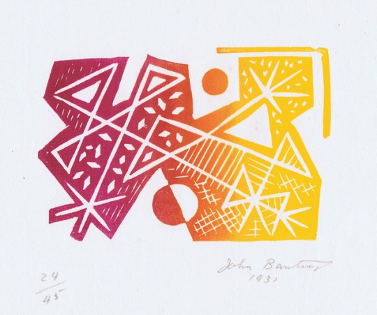
“Explosion” Jon Banting (Lino Cut)
Relief Printing is probably one of the more widespread methods of printmaking, it’s the only method I’ve ever had the chance to try out. It involves cutting into a surface (such as Wood, Metal, or Lino). The goal is to cut take out all of the “unused” or blank space in a design, so that the ink will only be left on the areas that were not cut. This is considered to be the most accessible of the printmaking techniques I will use, as you only really need your ink, a surface of which to cut out from and a cutter to do so. There is no need for any other specialist equipment, although a roller and a brayer (a device for smoothing out the ink after the paper has been applied) do help things along.
John Banting was an English Artist active in the first half of the 20th century. He was notably drawn to Surrealism and worked with a large variety of mediums across many different roles and projects. I have selected two Lino cuts of his, originally from 1931. I have selected these as they stood out to me amongst the other Relief Prints I was looking at, due to the gradient in the ink. This has inspired me to think outside the box when it comes to printing with Lino, as I had never considered using multiple colours of ink in this way, and with this technique.
References:
www.gerrishfineart.com. (n.d.). Banting, John (1902-1971), “Snake in the Grass, Alas”, Linocut, 1931/1971 from www.gerrishfineart.com. [online] Available at: https://www.gerrishfineart.com/banting-john-snake-in-the-grass-alas-linocut~2869 [Accessed 17 Feb. 2021].
www.gerrishfineart.com. (n.d.). Banting, John (1902-1971), “Expolosion”, Linocut, 1931/1971 from www.gerrishfineart.com. [online] Available at: https://www.gerrishfineart.com/banting-john-expolosion-linocut~2867 [Accessed 17 Feb. 2021].
1 note
·
View note
Text
Alex Trochut
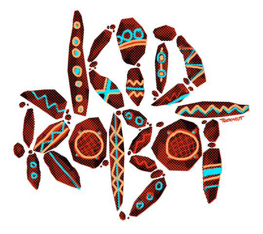
“Kid Robot” Clothing Design
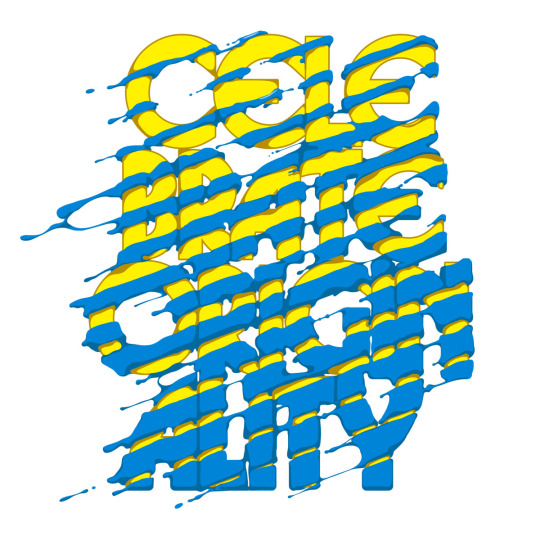
“Adidas Originals” Lettering
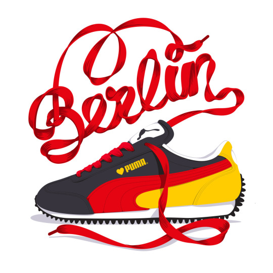
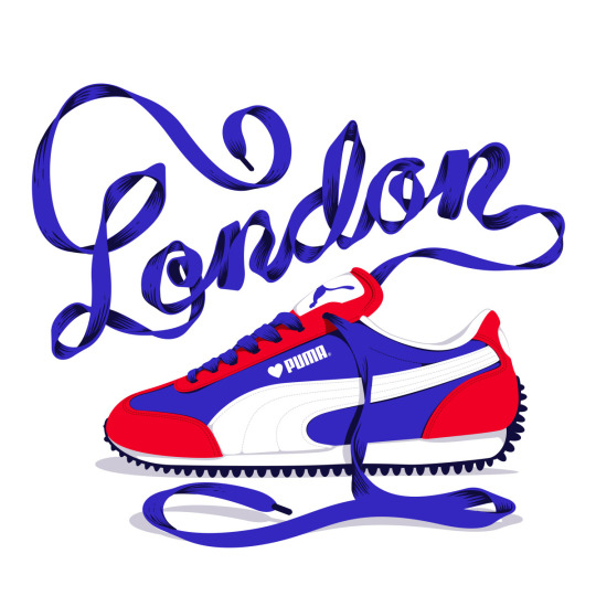
“Puma” Lettering Series
Alex Trochut is a Spanish Graphic Designer, Illustrator and Typographer, based in Brooklyn NY. He was born in Barcelona in 1981, he studied at the ELISAVA, a design school, as a division of Pompeu Fabra University, also in Barcelona. He cites his time at design school as his inspiring his passion for Typography. After this he worked for a few years in Spain, under his own Design Studio, as well as studios Toormix and Vasava. He has worked on projects with many high profile brands, such as Nike, Adidas, Puma, Coca-Cola and Pepsi, as well as collaborating with music artists on cover art, such as Katy Perry, The Rolling Stones and Vampire Weekend.
For the most part, Trochut’s design work takes a more Illustrative approach, and this will be what I focus on for my inspiration. Of course much of his work varies from project to project, however he does seem to specialise in making fresh, stylised/cartoon like visuals, in both his Illustration and his Illustrative text work. Trochut quotes that he learned much of his skills/knowledge in lettering from just looking at things he liked and interpreting them into his own style. He says this leads to a few mistakes, but this can result in some happy accidents. Trochut likes to change up his process, saying that if it’s a lettering project then he’ll often start off making sketches with a pencil on tracing paper, however geometric/modular based projects usually just go straight to to the computer. Trochut has also experimented in other fields, such as Photography and animation.
All Artwork from the Artists Portfolio:
https://alextrochut.com/
1 note
·
View note
Text
Jessica Hische
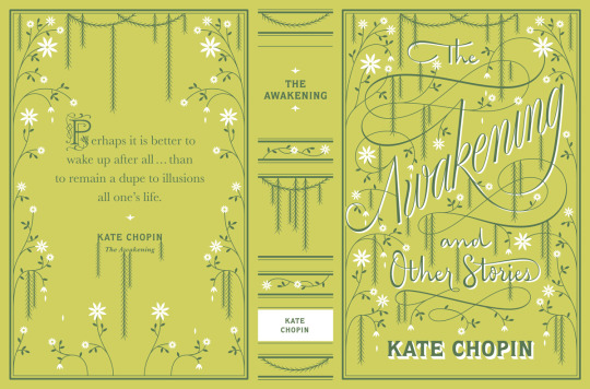
“The Awakaning” Book Cover
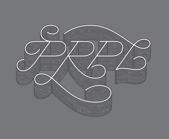
“PRPL” Shirt design
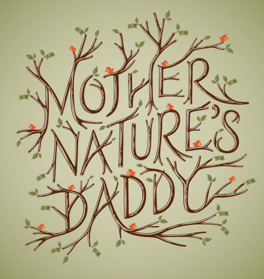
“Mother Nature’s Daddy” Article Illustration
Jessica Hische is an American Illustrator who was born in 1984. She has become well known for her skill as a hand lettering artist, and the few typefaces she has designed. She graduated from Tyler School of Art, Pennsylvania, after studying Graphic and Interactive Design in 2006. She spent the next 2 and a half years working as senior designer at Louise Fili Ltd. After this, she left to focus more on a freelance career, working as an Illustrator and Typographer. Since graduating, Hische has worked on many successful projects, such as book covers, Logos and graphics for all sorts of companies, and special stamps for the US Postal Service. She has also worked with a lot of well known brands, such as Apple, Facebook, Nike, Penguin Books and The New York Times. On top of this, she and her web designer Husband launched a side project aiming to help out budding web designers.
Hische’s work often takes a more natural, flowing style, with classic fonts emphasised by colour and small illustrations. She alternates between bright, bold colours, and using a more modern, discreet colour palette, obviously depending on the project. Like most other Designers I have researched for this project, she utilises a wide range of medium, both digital and analogue to convey her desired look. She cites that she uses her work to try and bring happiness, and when she’s not working, she does lectures etc. To try and inspire others to find the same joy in art as she does.
Artwork found on the Artisits website:
https://www.jessicahische.is/working
0 notes
Text
Morag Myerscough
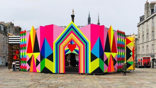
“Love at First Sight” Aberdeen
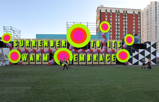
“Surrender to it’s Warm Embrace” Las Vegas
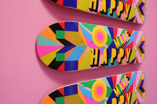
“Make Happy Skateboard” accompanying the Make Happy Installation in Hong Kong
Born in 1963 in North London to parents both in different creative industries, Morag Mysercough had an aptitude for art from a young age. She studied art at both St Martins College and The Royal College of Art. Post graduate, she worked with several large design agencies (such as spending a year in Milan as head designer for Michele De Lucchi’s studio). During these years she also spent many nights on freelance projects on the side. In 1991, she founded her own studio, Myerscough Chipchase, alongside Jane Chipchase. However soon after Chipchase left to work at Pentagram, so Myerscough set out with the studio under her own name, which is where she till works to this day.
Myerscough’s work specialises in large, immersive installations, which completely transform the designated space. She is commissioned through her studio for Urban areas, and she uses large, colourful shapes and bold text to brighten up otherwise “boring” settings. She often quotes her art as being a vessel for her to spread joy, and to share her mantra “Make happy those who are near and those who are far will come”. Her work is light and playful on the surface, but is carefully designed with each space in mind, often developed alongside local communities so as to grasp the history of the area. Not all of Myerscough’s installations make use of text, however when they do, it is always has the same strong effect on the viewer. Naturally I will focus on these pieces for inspiration, and I think It would be very fun to play around with something in this sort of style.
All artwork from the artists Commission Portfolio:
https://www.moragmyerscough.com/commissions
0 notes
Text
Marian Bantjes
NYC “Love Fest 2008” Banner
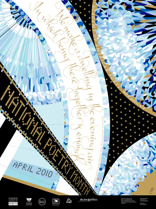
“National Poetry Month” Poster
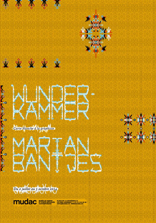
“Wunderkammer” Poster
Born in Canada during the 60s, Marian Bantjes studied only for a year, before dropping out and pursuing work in the visual communication industry in 1983. From the mid 80s-mid 90s, she worked as a book typesetter at Hartley & Marks. She then ran a design firm as a partner to Digitapolis, until 2004. She left the firm in 2004 to work on a style which she calls “Graphic Art”, which led to some of her most well known work.
I will be focusing on her latter/more recent work, as it is what will be inspiring me during my process. Bantjes has become well known for her ability to push the boundaries of her field, as she creates highly detailed, hand created and obsessively precise vector images. Her work is intricate, it often features wonderful flowing subjects and form, but is still complies with the level of structure you would expect from a world class Designer. Asides from her design work, Bantjes has also been exploring her style through a variety of mediums and formats, from foil printing and silkscreening, to more abstract ideas, such as one piece she created for an issue of “Varoom” where she used different coloured tape to create a pattern, and pencil crayons to draw eyes. Moving back to her Typography work, Bantjes is not afraid to play around with the form of her fonts, many of which appear abstract and difficult to read at first glance, although rest assured that this is fully intentional. I am inspired by her willingness to push the boundaries, and play around with what is considered conventional.
All images found via the artists portfolio:
https://bantjes.com/work/category/portfolio/
1 note
·
View note
Text
Kyle Reed
Kyle Reed is a Canadian illustrator, who makes extensive and effective use of Collage techniques. His work can be found in many children’s books and magazines. He uses both analogue and digital methods to create his work (most likely creating analogue textures and then editing and combining them digitally). His work inspires me as it has a very bold style, and he is able to create impressive details pieces of art, which still appeal to children.
“Kyle Reed Illustration”---. Kyle Reed Illustration, cutdrawglue.com/#/wild-animals/. Accessed 12 Jan. 2021.
“Kyle Reed Illustration.” Kyle Reed Illustration, cutdrawglue.com/#/teainvitation/. Accessed 12 Jan. 2021.
0 notes
Text
Helen Kellock
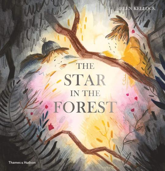
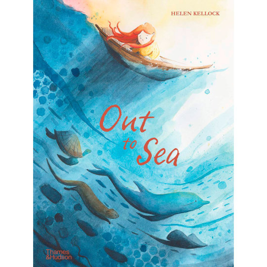
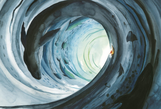
Helen kellock is a Scottish Illustrator and Author currently based in Glasgow. I have chosen to write about her as I was fortunate enough to get the opportunity to have a virtual sort of Q&A with her last November. She talked a lot about how she created the illustrations for her latest book, as well as one of her upcoming projects. I found this to be quite inspiring as it allowed me to gain some insight into the creative process of someone working in the industry which relates closest to this project. She uses a lot of analogue techniques for her work, and make excellent yet subtle use of textures, usually related to her work (finding things to use at the beach for a book about the ocean).
“Helen Kellock - BOOKS + COVERS.” Helen Kellock, www.helenkellock.com/booksandcovers. Accessed 13 Jan. 2021.
0 notes
Text
Axel scheffler
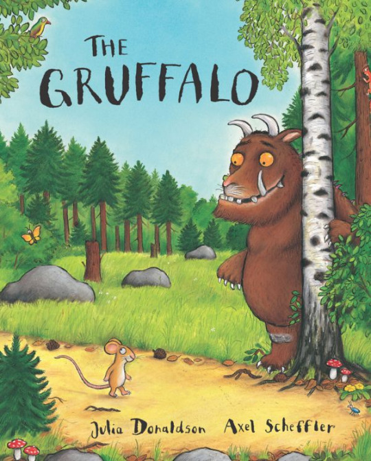
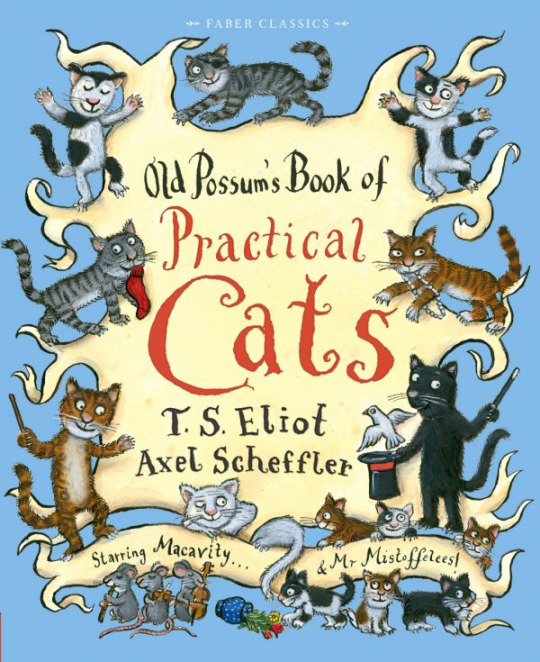

When I think of books from my childhood, the Illustrative work of Axel Scheffler is usually one of the first to mind. Known best for his work with Julia Donaldson on titles such as The Gruffalo, he has illustrated well over 100 books, in a career that has spanned decades. His artwork is usually very traditionally illustrative, in that he starts with a pencil sketch, then uses Ink (black and also coloured (applied with brushes)) on the final designs. He has quite a distinctive detailed cartoon style which I feel is quite recognisable, regardless of who he works with.
“Axel Scheffler’s Official Website | The Gruffalo.” Axelscheffler.com, axelscheffler.com/books-with-julia-donaldson/the-gruffalo.
“Axel Scheffler’s Official Website | Old Possum’s Book of Practical Cats.” Axelscheffler.com, axelscheffler.com/books-for-older-children/old-possum-s-book-of-practical-cats. Accessed 13 Jan. 2021.
“Axel Scheffler’s Official Website | The Ugly Five.” Axelscheffler.com, axelscheffler.com/books-with-julia-donaldson/the-ugly-five.
0 notes
Text
What 3 Words Mural - Brain/Sapping/Hope
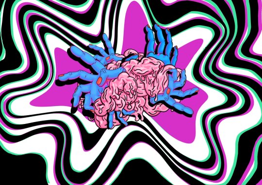
This is my final solution for our brief, where I had to create a mural design based on 3 random words (Brain/Sapping/Hope). I used a lot of techniques throughout the process, both in creating my final piece as well as all the sections that came before. Most of my techniques were digital in the later stages, although I explored different ways of how I could incorporate my analogue pieces into procreate. I think my final piece was quite effective in relation to the brief, as I successfully combined all three of my words into a piece that got some good peer feedback, such as clear interpretation of the words, and a strong style of artwork. I think one area I could improve on are perhaps the hands, as they could be seen as too stylised, and refining them a bit more would’ve had more of an impact, in terms of the word Hope.
0 notes
Text
JT Daniels
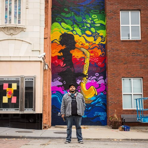
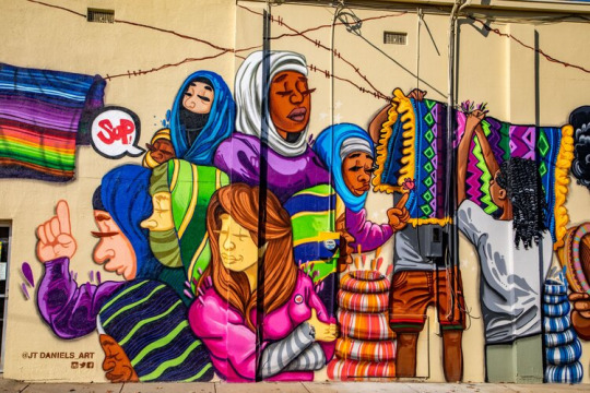
JT Daniels is a Kansas based artist, who stated pursuing art as a Teenager, making and selling custom skateboards and illustrations for his friends and acquaintances. He is now a full time artist who gives back to his community by teaches Art Class to people with disabilities, as well as working closely with a local Mural Arts Program.
His own Murals are very bright and bold, making use of a very vibrant colour palette. They are often stylised, sometimes abstract, and always very aesthetically pleasing. JT says he views each mural (or each blank wall for that matter) as an opportunity to communicate with his community. He has blended text and imagery together to create his personal style.
JT Daniels. (n.d.). JT Daniels. [online] Available at: https://www.jtdanielsart.com/ [Accessed 21 Nov. 2020].
0 notes
Text
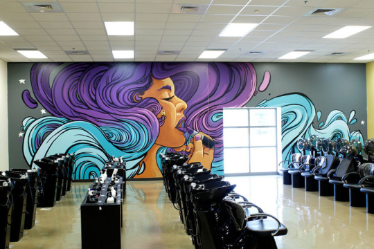
Sam Bates
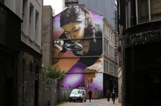
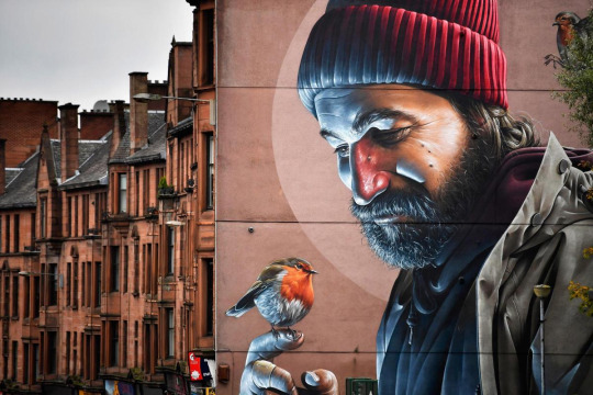
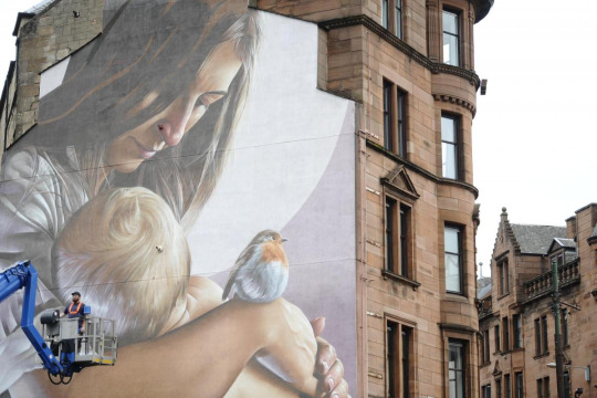
Sam Bates (aka “Smug”), is an Australian-Born artist who has been living and working in Glasgow for the past 16 years. His most notable work consists of giant Photorealistic portraits of various figures, including modern interpretations of St Mungo and St Enoch (cradling her son [St Mungo]), almost entirely by spraypainting.
Smug has stated that he first picked up a spray can when he was around 18-20, something he credits mostly to his peers and the skate scene he was a part of during his teens. He now paints murals for a living, and has travelled far and wide around the world for his commissions.
Swarbrick, S. (2019). Street artist Smug talks about creating some of Glasgow’s best-loved murals. [online] HeraldScotland. Available at: https://www.heraldscotland.com/life_style/17781363.murals-smug-aka-sam-bates-glasgows-street-art/.
0 notes
Text
“Origins of Symmetry”, Muse
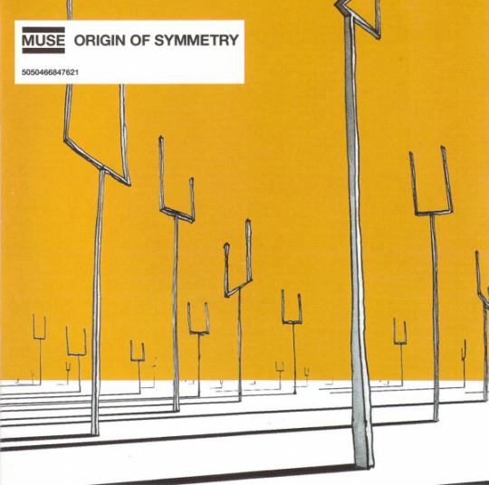
“Origins of Symmetry” was the 2nd studio album from English Rock band Muse. It reached number 3 in the UK albums charts, and contained popular singles such as “Plug in Baby” and their cover of “Feeling Good” (originally by Nina Simone). The Album (and the Album Artwork) was inspired by Michio Kaku’s book “Hyperspace” (Abbreviated), which explores theories of Higher Dimensions and Quantum Mechanics and suchlike. This is where Singer Matt Bellamy read the term “Origins of Symmetry”
The artwork itself appears very abstract, so much so that the subject matter is rather hard to define. Artist William Eager has provided little insight into this piece since its release in 2001, leaving fans to interpret it in their own ways, which I think is actually much more fitting for the album. Most people can agree that we are looking at some sort surreal landscape, with perhaps large tuning forks(?) pointing towards the sky. Another popular theory is that the image is of a kind of alien landscape, with its abstract and very symmetrical trees. The colour in this piece comes solely in the form of a yellow/orange wash, which makes up the “sky”. Overall I really do like this artwork. it gives an uncertain feeling of curiosity, which I think is exactly what the artist and band were hoping to create.
0 notes