
Don't wanna be here? Send us removal request.
Statistics
We looked inside some of the posts by jackwatters and here's what we found interesting.
Average Info
Notes Per Post
0
Likes Per Post
0
Reblog Per Post
0
Reply Per Post
0
Time Between Posts
20 days
Number of Posts By Type
Text
17
Last Seen Tumblr Blogs


Fun Fact
In 2020, 27% of US Tumblr users had an annual household income of over $100,000.
Text
Day One

Opening 3D Max 2025.

This is the screen I am met with for 3D Max, which is much simpler on first glance as opposed to the cantankerous calamity that was Maya UI.
0 notes
Text
isometiric


after this hit stop in the actions record section

result: Isometric road
0 notes
Text
Illustrator Maps


copy/paste edge of river to create pavement shape


tree

building

got this from google images


handmade grass texture


FINAL
0 notes
Text
Children's Songs Full Book

1) Title Page

2) End Page

3) End Page

4) Contents Page

5) Song One

6) Song Two

7) Song Three

8) Song Four

9) Song Five

10) End Page

11) End Page

12) Final Page
Reflection:
I really enjoyed making everything for this project. I didn't use anything anyone else made, all of it was me (aside from fonts and stuff obviously). It's a good sense of accomplishment, fulfillment and validation. This project has me using all the tools we've learned, design process, illustrator, photoshop, and InDesign. The only thing I'd do differently is fix the light hanging from the roof in the moles' room. Other than that, I'm proud of what I've done.
0 notes
Text
CHILDRENS BOOK DEV 2


^This is how the new page design translates into the image designs. It looks super good in my opinion. Everything looks more together an consistent, having those linking conventions. I've also decided all the text should be gold coloured. Annoyingly some of the illustrations have this white outline such as the cat on the underground part, I don’t know how to change that, I tried.

I've made this title text paragraph style to keep a consistent look.

Same goes for this body text style I've made too. Consistency.

Here's me using soft return to shorten paragraph size, it makes it easier to balance the images with the text.

This hexagonal pattern is just a random sort of Orange like pattern I made to fill the end pages. It'll contrast super well with the other colours in the book.

^Here's what the whole composition looks like at the moment. Pretty much almost done. It looks really nice in my opinion.


It's important to note I have adjusted the margins, raising the bottom up, centering things. But, my design doesn't really utilize columns so I haven't adjusted them, I feel like the one is fine.
0 notes
Text
CHILDREN'S SONG BOOK DEVELOPMENT.
Starting off this assignment I already have the sort of songs I want in mind. All of these songs will be more geared towards being "Child Friendly" rather than specifically targeting children, just for more flexibility in terms of options. It makes this assignment a lot more fun.
SETTING UP THE INDESIGN DOCUMENT: - A5 size 1754 x 2480 px - 12 Pages
CHOICES:
Are We Getting Any Closer - Songs Ohia Why? It's a pretty mellow song about getting close to somebody.
Place to Be - Nick Drake Why? This song is more poem like than the previous, it's more suited to these sorts of books. I would've just filled the book with nick drake songs, but I think having a wide array of different styles and approaches keeps the book fresh.
Potato Knishes - Ryan Dorin Why? This is an extremely surreal song that's just fun to think about, and it's about as non-sensical as some actual children's songs. The song itself is really weird and awesome, inspired by dadaism it takes advantage of a completely uncanny visual style to make an impact. I want to include the scene from the music video into my image.
Underground - Tom Waits Why? It's another absurd song, but it's much more grounded. It paints a clear image into your mind, which will be quite easy to put into an actual image for the book itself.
V. UNIVERSE - The Microphones Why? It's a song that helps you grasp the universe's immense expanse, and it reads like a really sweet kids rhyme. The song itself is something else (super atmospheric and scary), I wouldn't play that song to children, but I would read it's lyrics out to children.
Visualizing Each Song:
General Visual Style: For general visual style I want to think about what would appeal to a kid. OR firstly, I should probably think about what wouldn't.
No: - Visually Complex Images (because children are more likely to attach themselves to simple, approachable characters made from simple shapes). - Gore/Violent Images (obviously) - Sharp Shapes (rounded shapes are more appealing)
Yes: - Animal Characters (people aren't interesting to children, animals are much more appealing via their cute/coolness). -Simple, Vibrant Colours (Keeping things simple and visually eye-catching will appeal the most to children). - Fantasy Imagery/Abstract Imagery (Not everything has to be grounded, kids aren't picking apart all the aspects of these images, so making them visually interesting over keeping them grounded is probably the best option). A design style I want to specifically evoke is that of Scott Benson:

^I love his appealing and simple style and think it would work well in a children's book. TITLE PAGE DESIGN: I've made sure to paint all of these images in photoshop (illustrator for the vector images) with A5 sized canvases to match the InDesign file.

Here's a thumbnail I drew for the Title Page (Front Cover). I want the words to look like they're coming out of the trumpet the cat is playing. In terms of colours I'm Thinking about using orange/blue/pink, an unusual pallet, but I think it will work. I don't want to use any sorts of greens unless I absolutely have to cause it'll clash poorly.

Here's the final image. I think this palette works quite well, so I might just roll with it for the rest of the designs.

I've made sure to keep this document multilayered, adding as many layers as I could just so I can control all the aspects of the image.

^ Something to point out about this background I painted in photoshop is that I specifically designed it so it had depth and also vaguely looked like a city, just foggy. It lifts up the image quite a bit, looking more dynamic.

These abstractions exist just to fill space. The composition needed something, and I remembered that a lot of jazz album covers from the 50s utilize abstract art. So I just borrowed that idea for my own composition.

^This being one example POTATO KNISHES DESIGN


Here's the thumbnail I drew for Potato Knishes. It's heavily inspired by the video for the song.
^A screen shot from the music video (and yes, when I said surreal, I meant it). I felt like moving towards a more realistic interpretation of the character would go over better with kids. The character depicted in both the music video and my design is called Little King John, and he's lonely, so I tried to capture that here.

^This is my final design, I feel like it will pop against a good background. I'm quite proud of this, it really depicts the character of the lonely little king with only potato knishes to keep him company, all captured within this one image. Not having to explain much through the song. I think I want to make these images like that, with characters who are apart of the images that represent the songs. It's much more fun that way, and it's visually interesting for kids. When I was a kid, I remember that a lot of my favourite picture books would be the ones which depict a scene without text, one that implies something, it sparks the imagination. Obviously I have to include text here, but I want to lean into sparking the imagination of the reader. UNDERGROUND DESIGN
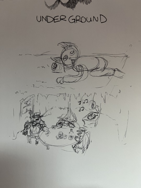
^This design for Tom Waits' underground depicts a group of moles living underground playing poker while a cat person above listens to what's going on underground by using a cup to amplify the sound. The inspiration for this is Tom Waits' curiosity for moles, so I thought it would be fitting to have the image depict them.

This final design is quite good. It properly visualizes an interesting scene that compliments the song.
UNIVERSE DESIGN
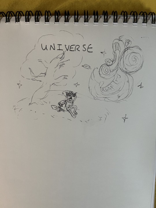
^UNIVERSE is a very unusual song. It hasn't much strong imagery within the lyrics themselves, but I based this design on the feeling I get when experiencing the totality of the lyrics. The magical wonder of the universe specifically is definitely inspiriting, and when listening to the song I imagine myself on a field looking up into the sky at night taking in it's sheer size.

^I've changed the design quite a lot from the thumbnail/concept sketch. I wanted to mix up the character a bit, taking a dog instead of a cat (too many cats already). I've also aimed to make a face in the sky with the moon as an eye, reflecting that lyric in the song itself "Oh, Universe, I see your face looks just like mine!". This design specifically evokes fantastical themes, which I like a lot. It's a consistent theme currently, so yeah.
PLACE TO BE: VECTOR DESIGN #1
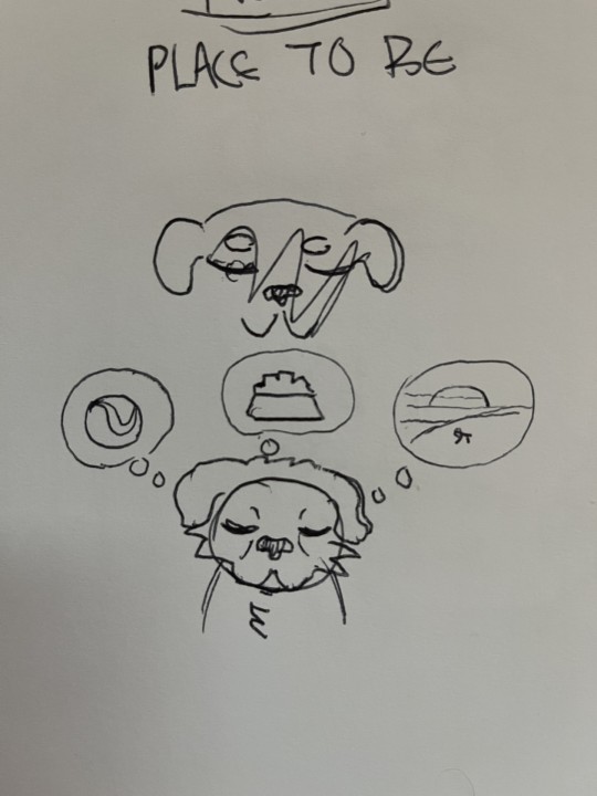
^ Vector Images are much more complex and difficult to pull off than the raster images I've been creating in Photoshop. For Place to Be I'm just going with a simplistic design.

Here I've utilized the Copy + Paste tool and the Reflect tool (O) to mirror the head shape for symmetry.

^This is my vector image. It's quite different, and it's hard to replicate the style I've been using in a vector image, so it's going to be a stylistic whiplash unfortunately, but it gets a idea across. A sad dog missing all the things he had, or a dog dreaming about the things he could have. Are We Getting Any Closer? VECTOR IMAGE #2
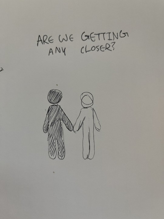
^Here I'm going for something Simplistic and easy to make. I'm running out of time. Since this is a song about getting closer to somebody, I am going to make that literal.

^This final design is simple, and gets an idea across.
MAKING THE INDESIGN BOOK
Numbered Pages:

^Just adding numbered pages to the document via the parent pages.


^All the songs are in including this contents page.

For the Title Page, I've researched this way of getting curved text. First, I make an invisible circle object, then I change the text tool to the "Type on a Path" tool which allows me to type on the curve on the circle.

^The raster image quality isn't great, I'll change that in the preferences.

^Changing the image quality.

^changing the colour of the pages. I might change them to a darker colour later.


^These are generally where I want the images to be in the compositions. I've also added some filler space where needed with the vector images with backdrop raster images.

^I've adjusted the parent pages with these pink borders I whipped up in photoshop. The frame really brings together a lot of the images and centers the eyes a bit more and fills a bit more space. I've also centered and lowered the size of the page numbers.
0 notes
Text
FINAL FUNDIMENTALS 1 REFLECTION
Over the course of these past four weeks I've learned many essential skills in terms of graphic design. Specifically, utilizing Photoshop, Illustrator, and InDesign. Each program having it's own obstacles to overcome, and it's been quite difficult to wrap my head around most of them. However, I do feel like I have a more comprehensive understanding of the basic tools for each program, and how to use them.
For illustrator, I found the Bezier curves quite difficult to use at first, however, through numerous moments where I had to use curves I've definitely gotten better at placing them. Thinking about where the apex points of a shape are, and then placing curve points at the apexes, that's probably what helped a lot in my improvement.
For photoshop, I caught onto a lot of the tools quite quickly, though I did initially have a little trouble with selection. The whole subtraction and addition to selections got a little difficult, especially with trying to hold so many keys at once. But, I eventually got better.
For InDesign, I found that trying to get text to flow around an image was pretty buggy. Sometimes it would work, sometimes it wouldn't, but eventually it did. I'm not sure if that was the computer, or just me making some simple mistakes I didn't initially see, and since we didn't spend much time on InDesign, it still lingers in my head a bit.
I'd say this course was very informative, and I definitely feel a lot more confident than I did when first starting off. Going from knowing nothing about how to use any of these programs, to having a solid foundation knowledge on how to use their essential tools, in only four weeks as well, it's all a little jarring, because it feels like an impossible amount of information to digest. Like if it all just popped into my head after a blur, because I feel as if I'd been shot out of a gun and have now just suddenly hit the wall. But, hey, it's all useful information that'll go to good use.
0 notes
Text
21/03/24 (2): End Pages

Now I'm going to create end page patterns. In illustrator we make this bird.

Now I make this black box, and send it to back.


Now we colour the bird white, and drag both the bird and the box into this swatches panel, where the blue verticle line is is where you want to drop it.


Now, I've made this Z sort of shape. Like a bubble font. Next shift x to fill it.

In the swatched panel, replace the black fill with our pattern, which it will fill the object with.

Double clicking the pattern in the swatched panel puts me in this window allowing me to edit the patterns.

Just changing the fill colours here.

I've created this hexagon shape, I'm going to put a copy of the bird in the hexagon.


Now using multiple short cuts such as holding option to clone the bird, dragging it into the hexagon. Then cloning both the bird and hexagon by pressing Com+C, then Com+shft+v to paste in place. Then selecting our foremost hexagon, and adding a white outline to it to create this nice emblem here.

Now, cloning my art board using the art board tool.


Now, we drag our hexagon emblem into our swatched menu just like before, then we edit via double click. We want our option to be hex by row, that'll fix these spaces between the patterns.

Making a new art board, then dragging a rectangle with our new pattern filled into it over the new art board.

To import this pattern into our InDesign project, we need to convert this pattern into unique objects. To do this, select our object with the pattern inside, then go Object -> Expand -> Click ok on the pop up window.

Now pressing com+y to go into wire frame mode, we now see our pattern has been convert to multiple objects. To import this into InDesign, we just copy our object, then paste it into InDesign.

Now, just copy/paste the pattern into InDesign, made sure I had layer1 selected.
Reflection: Using skills from both illustrator and InDesign was definitely a challenge, and at sometimes it felt like trying to fly the Starship Enterprise, alone, blindfolded, and with my hands tied behind my back. But, I eventually got there in the end. It's more the intricate nature of the process that's difficult, not really what you do, that's what I'm noticing.
0 notes
Text
21/03/24
Books/booklets: They can only be printed in multiples of four. It's hard to print these outside of multiples of four, this is because of how pages work.
You have a page and you fold it in half, you have 4 surfaces to write on, think of it like that. You can't really make that one page into side surfaces to write on without it being a pain.

Making sure to change my units to millimetres.

Opening the page tab via the window tab, I can add more pages using the plus at the bottom here. We want 12 pages for this doc.

Added the pages. There's this scroll area for where all the pages are.


I've made a front cover on page one, and a back cover on page twelve. I've used the text tool to make these, and then edited the text to make them bigger, and centre them using the control panel options.

Now, going to the top of the pages window, we double click the A-Parent pages to view them.


Now making these page notations on the parent pages. This will add these notations to all pages.
However, this won't notate each page to their correct number. Eg. you could be on page 7 and it still say "page 2" in the corner.


To make each page correspond with their page numbers, we highlight the page number in our A-Parent page, and then go type -> insert special character -> markers -> current page number, this will change the (in this case 1) number to an A, repeat for the other side with page 2 of the A-Parent pages. Make sure you've sized them right as well.

Now, for example, if I go to pages 4-5, I now see page 4 and page 5 notations at the bottom of the pages.


To remove the page 1 notation from my book cover, we just need to drag the None Page onto our cover page, this will make it so my cover page isn't influenced by the parent pages, removing that notation.

Now selecting both A-Parent pages, we're going to edit the margins of our book.

Opening up the margins and columns window, we now can edit the parent pages margin/column layout. These are the settings I've chosen.

Now aligning the our page numbers to the center, we just select align to page up in our control bar. Then we can center text box to the middle using this tool:

And then, we just align our text to the middle inside the text box.

Here I've made a black rectangle as a place holder photo, and then added some placeholder text. The bottom text box I've split into three columns using this tool:


We have some overflowing text in our three column text box as indicated by this small red gizmo:

Now, I've creating another text box on the other page so I can store some of that overflowing text. What we do is that we click on this red gizmo which lies along the transform gizmo of the text box we want to take from, our three column one.

Then, once you've clicked on the red gizmo, it'll give you text on your cursor, indicating you have the extra text. Then click on the new text box on our second page and that should move over our extra text.

Now, we move these Page numbers to another layer, just made this page number layer. Selecting both Page As and dragging them onto our new layer, just drag the blue dot from layer one to the empty dot on our page number layer.
I've also fixed a mistake where I was making those placeholder pages on my a-parent pages rather than page1/2, I just cut and pasted them onto page 1/2 from our parent pages.
Then, on multiple pages I've added these black boxes, which I'll use to show how to layer page numbers.

Now, I've made a new parent page by dragging the A-Parent column onto our plus button. This created this B-Parent, where we'll change our page numbers to white.

Now, since we've got white page notations on our B-Parent pages, we can now drag our B-Parent pages onto our black pages, this will add white page notations to our black pages. Therefore, we can now see what page we're on.
0 notes
Text
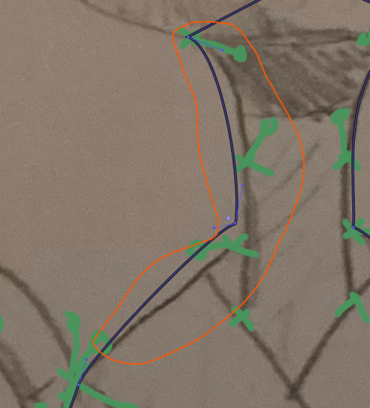
Graphic Images in Illustrator: Doing a little extra.
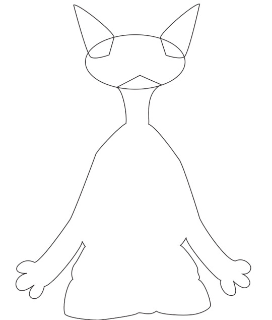
Graphic one: Making a silhouette
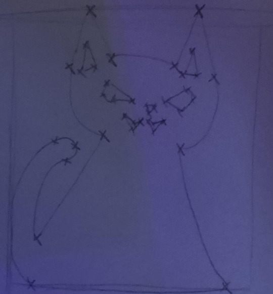
Here I've created the outline for a silhouette with each point I need to make marked by an X.

Opening a new illustrator project, and pasting the image in.

Purely following my markers here, making an outline based on them. Now, I probably should've added some handles as well when drawing this out, because it's definitely not all lining up. I also created two layers, one for the body, and one for the other bits so I can separate the two.

Fixing the tail here, just using the Pen tool, then pressing + to add a point at this apex. In retrospect, I should've put a marker here. I pulled the point out and adjusted it so it aligned up.

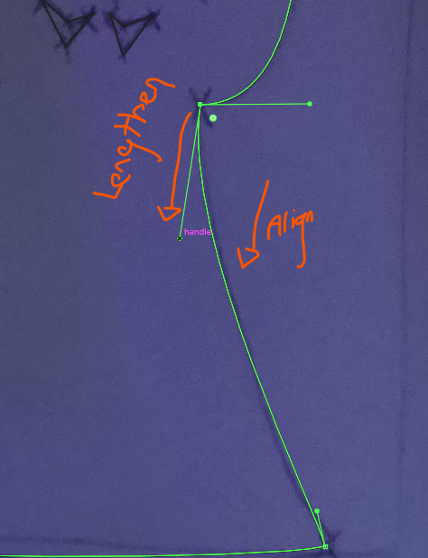
Here's me going in and adjusting some of the handlebars just to algin everything.
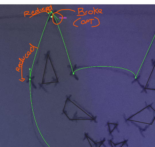
For this ear, it was looking a little less pointy than the other one. So I went in, and turns out I had forgot to make that tip of the ear point a broken one, so I just went and broke it up. Then, I reduced some of the handlebar length for the points that connect the left segment to straighten it up a little.

Here's the semi-complete linework.

All I did was fill the body with black, and the face with white so you get that feeling of the black silhouette with holes it in as if it were cut out.

Here I'm going in with the direct select tool and flattening the head a little by moving the handle bars for those two points down (as seen by the rotating red arrows). I also adjusted the right ear to fit the left ear a little more, importantly by using the round tool to round out the tip of the ear.

Now, I'm going in and moving these two points around the cat's neck up to match each other, this makes it so the cat's face doesn't look uneven. I've also moved the inner ear parts to line up with eachother.

Here's the result.

Here's the direction handles and wireframe. It's definitely a mess, and was rushed a bit.
Reflection: This definitely took a lot less time than I thought it would've, but in my haste to initially hammer down linework, I definitely overlooked some issues that I had to fix later on down the line.
Graphic 2: Full colour
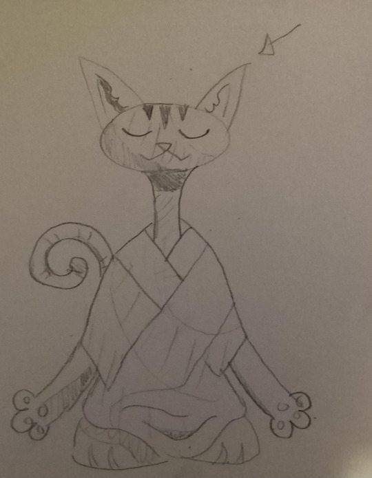
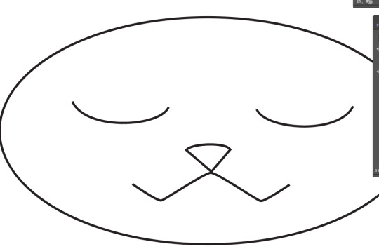
Here's the image, with bits of shade and all. I was feeling a little confident, so I went with a more complex image. I drew out this zen cat, and added some shading and light direction.
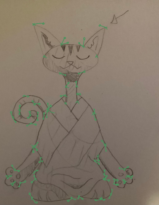
Not to make the same mistake twice, I decided to go into photoshop and mark out all the points and handlebars, and only now am I realizing how hard this is going to be.

Adding an elliptical in the shape of it's head, just trying to get a something to base the rest of the outline on.
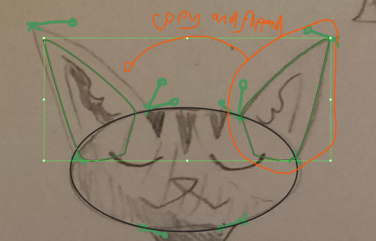
Here I made an ear shape corresponding to my handlebars and point locations/lengths. Afterwards I copy and pasted it, (ctrl+c then ctrl+v), and pressed O which allowed me to flip the copy to adjust it to the left side. This saves a lot of time.
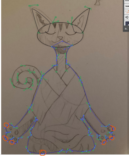
I've made the body now, following the guidelines, even so I had to make some new points just to balance everything out, those points are circled. The outline is definitely helping though, it makes the process a lot quicker.

Here are some things I'm gonna quickly fix.
Here's the fixed outline, now to add some of the missing details.

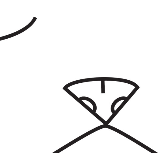
Doing the head first. The nose required me to do a hybrid point to get that curved top, and straight sides.
I've just cloned and flipped the right sides of the mouth and the right eye.
went in and added some extra details, this time using basic curves and lines.
Now I just need to go in and algin the body again, because I'm going to be adding the body details now.
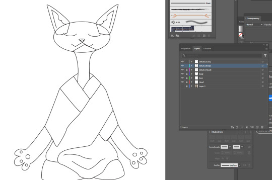
Here's all the details I made, including the body and ears, robe and all. Just using the pen tool, and some copy/flipping, pretty much what I've been doing the whole time.

Now, going in to fill the base colours of the zen cat. I made some new layers, then dragged the corresponding parts to these new layers while holding OPT to copy them rather than move them out of their original layers. I went with a nice, calm blue for the fur colour.

I had to go in and create a whole different shape over the lines I initially created for my details, because none of the lines connected up properly, not a mistake I want to make again cause that was frustrating (contrary to the peacefulness of the cat).
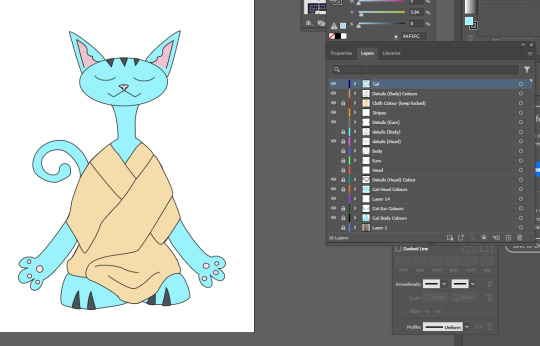
Added the tail and stripes. Next, it's time to add shading.
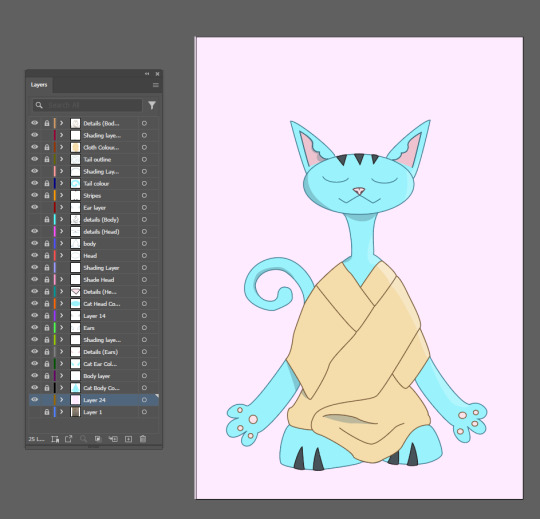
I've just powered through these shading layers, just constantly adding little shadows and highlights were I can using a mixture of the pen tool to create shading shapes, and the transparency tool to keep the highlights and shadows at 31% transparency. I also made all the lines coloured corresponding to what part of the body they are.
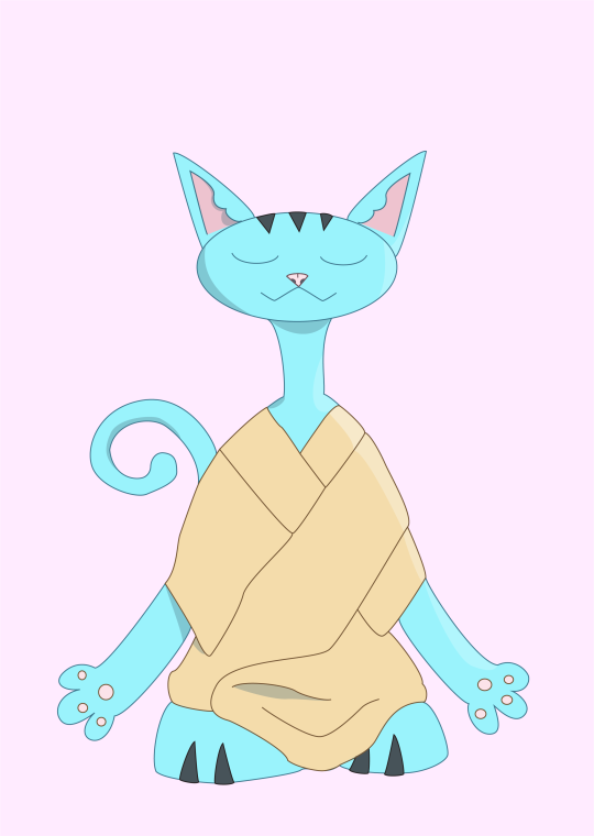
The final image here.
Reflection: This task was much like the Tentcruel I'd made before, but this time I used some different skills, along with better organization of my layers. I can feel the improvement.
0 notes
Text
14/03/24 (3): IMBEDDED IMAGES AND LINKED FILES explanation
A linked file isn't stored in the document, it's stored elsewhere. So, if you were to edit this file outside of the document, it would change inside the document. This also means when sending this file off, you must include both the document AND the linked file. If you just send the document, the linked file will disappear from the document.
An imbedded file is one that's stored inside the document, so it won't be subject to changes outside of the document. This means you can send it and the file will be maintained in the document.
0 notes
Text
14/03/24 (2), Images in InDesign.

Creating an IMG folder in my InDesign folder to store this example photo. It's a .tif (CMIK) file, we don't want JPEGS in a print document like InDesign, they don't look great for print.


Now we want to place our .tif file into our InDesign project, so we go to our file tab and click place. Find it and put it in.

Next we want to open our Links window as I'm going to edit the .tif file in photoshop, the Links window is what lets me update the image in our InDesign project with the changes I make to it in photoshop.


Generally we keep our .tif files flat and without layers as it bloats the file size, but this is for the example so I don't mind.

To update the file in InDesign, we just double click the hazard symbol in the Links window, the coloured one.
It updated, showing our updated image. Lets say the client doesn't like this, all we have to do is go back into photoshop, and delete the layer we just created, then save and update it.

To resize an image, you have to hold shift+command while transforming it, otherwise it will just cut it out.
If you don't, this will happen. And, this is because images in InDesign exist in frames, and you can't change that.

Next we want to insert the image into our page, I dragged it on but it's blocking text. So we go Window -> Text Wrap to open our text wrap window.


I want to use the frame to cut down the empty space around the frog, so I hold (while having the select tool active) shift + option to constrain the size of the scaling of the frame, then I move it inwards and get this clean cut of the frog.

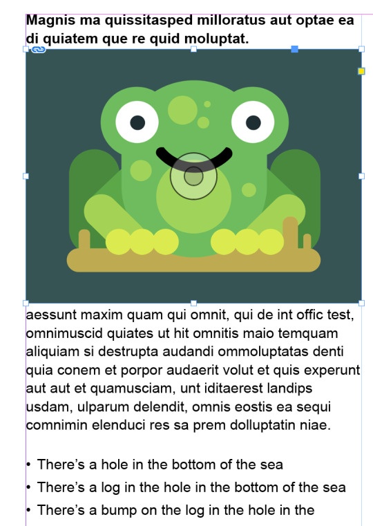
Next, I want to scale up this frog without having the frame scale up instead. So we hold (while having the select tool active) shift + command to constrain the size of the scale of the image, I then move it outwards to size up the frog over the text.

while having the frog selected, we go to the text wrap menu and then click the second wrap option (the lines with the empty rectangle symbol) which will move text that was behind our image now around it.
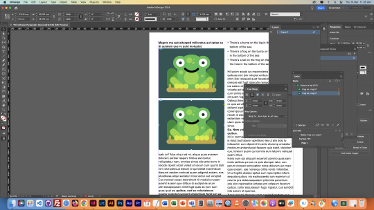

Next I clone the frog and size the clone down.

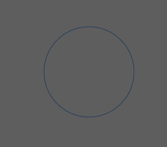
We overlay this eliptical with the frog, then we select the frog and do a cut with com+x.
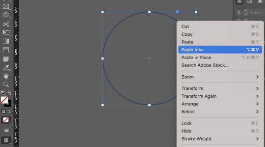

Next we right click on the elliptical and select paste into, that should past our frog into the elliptical frame.
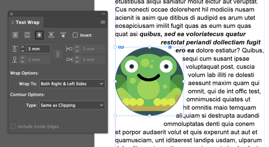
Dragging our new image to the page, I change it's text warp settings to the third option: warp around object shape. Then I increase the space between the object and text from 0 to 3mm.
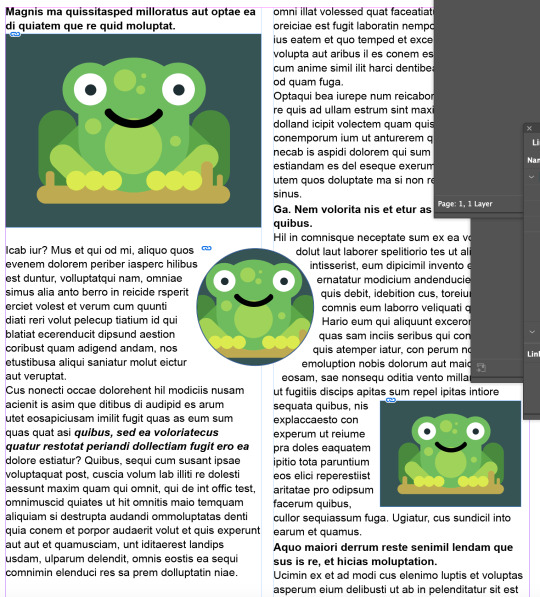
Here is what the page looks like now (just dragged the circle into the middle for this cool effect).

Reflection: InDesign is very cool, and kind of boring, but not really, but kind of really? I don't enjoy the process of creating these different paragraph styles, character styles, thinking about images and how they differentiate from images in photoshop/illustrator, nearly as much as making stuff in illustrator/photoshop.
But, I do really enjoy the resulting page layout. And I've already got some cool ideas on how to use this program for some personal projects (I own creative cloud on a personal account).
0 notes
Text
Starting up InDesign: 14/03/24
InDesign is great for Typographic and Image layout, especially in magazines.
The skill here is arranging text and images in a way that it's easy to interpret. Style and Utility, style is the look of the brand, and utility is the ease of reading. Striking a balance between these two is essential, as too much either way brings down the reader experience, no one wants to read a confusing maximalist mess, but no one wants to read boring blocks of text.
InDesign gives us designers the ability to edit documents, adding style, and arranging things. Styles could be bolding text, or character italic, etc.
Paragraphs are texts separated by spaces (pressing return). This includes the title of a text, or any body of text standing on its own. E.g, this would be the 5th paragraph of this post, first would be the title, then the 3 blocks of text between this paragraph and the title.
MAKING THE DOCUMENT:

Making sure to pick the A4 option here.

Once loaded, I'm presented with this.

First thing we want to do is go to our preferences, then change our units to millimetres for both vertical and horizontal. Make sure you also go Window -> Control to open the control pannel.

Make sure you have this window open, just go to Type -> open both Character and Paragraph styles.

Selecting the text tool, and then dragging it to make a text box.


To make 2 columns you must first activated the selection tool, then go to this box that has the 1 inside (as highlighted), then change it to 2. Different tools give different options on the command board.

Next, fill the box with placeholder text. Just because we're practicing, placeholder text is a great way to test our skills in preparation for client work.

Now, it's time to change the paragraph style so we get different text. We open this window by going to our paragraph style window, then double clicking basic paragraph.

Next, we jump to basic character options, and I'm changing the size to 11, leading to 14, and text to Arial.
W = Toggle Preview Mode

Next, disable hyphenation. This removes undesirable hyphens that split words.

Headings. Headings are the small little lines between paragraphs, a sentence or two. They count as a seperate paragraph, and usually people like them to have their own seperate style. So, we're just going to make a new paragraph style. First, we select one heading, and change it's typeface (fancy word for font we use instead of font, because font means something else technically) to bold Arial.

Next, go to the paragraph styles window and click the + box to make a new paragraph style. We're going to call this our heading style.

With our paragraph style, we can select headings (the sentence or two that separates paragraphs, they head the paragraph, and informs them) style for each, apply the style just be selecting the heading paragraph, and clicking the headings box in the paragraph style window.


Next we want to apply character spacing for our headings, adding 0.5 mm to the start and end under our indents and spacing settings. This is subtle, but makes it easier to differentiate a heading form the regular text.

^Example here


Grabbing some example text from moodle, then going to the mac only tool, text edit, then making it a simple format.

Next, I'm making this new paragraph style for bullet points after I've pasted the text into a new paragraph (make sure to use soft return (shift + return(enter)). Just selecting these options in the window where, have a good look. Making sure our bullet points look professional.

^Here's what it looks like.

Just changing the leading to 16 from 14 in the control panel.

Go to the character styles window, create new style. Then name it Bold Italic, and go to basic character styles and change the font style to bold italic. Character styles allow us to change the format of the Typeface of specific parts of a paragraph, rather than the whole paragraph itself.

^Here's what it looks like.
0 notes
Text
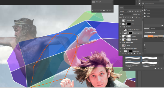
COMPOSITING HOMEWORK
FIRST IMAGE: GREEK GOD FROM JASON AND THE ARGONAUHTS

Firstly, placing the image down in the project, and giving it an overlay of itself so I can see what I'm adding/erasing.
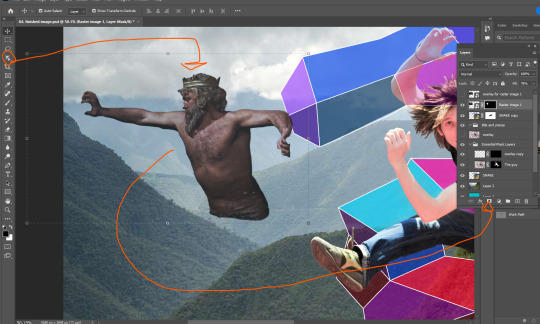
Here, using the easiest tool first. The Object Selection Tool to get a simple outline of the God, then turning it into a selection using the Work Path (alt + click on the box beside the Work Path text). After that, we just make a mask of the selection.

I want him back behind these hills. That'll involve erasing some of him so he isn't in front of the hill.

Here I've moved him behind the hill, and also behind the vector snake. But I've got some edges to smooth out.

I've cleaned up a lot of those lines using the soft brush brush tool, making the lines less defined makes it so he looks further back in the image. I also lowered the opacity of the God layer, just to make him look further back.
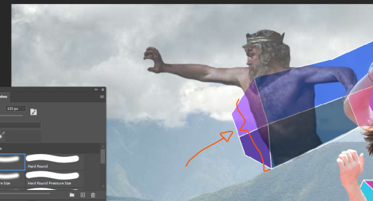
I felt the parts of the God's body behind the vector snake were too present, so I went in with the brush tool at about 3 transparency and made those parts more transparent.
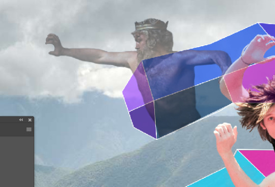
Decreasing the opacity of this layer again, just makes him look like he's right back.
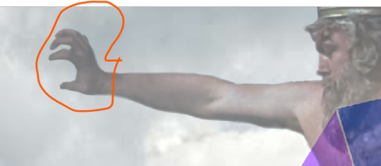
I went in with a small brush as to fix up the weird hand as a result of him holding onto a rock in the original image.
SECOND IMAGE: RINGO

Next I wanted to try and incorporate a small image into my work, so I decided that RINGO STARR would be a funny guy to place in. I went for this black/white photo to place, mainly because I wanted to try and incorporate that into the composition.

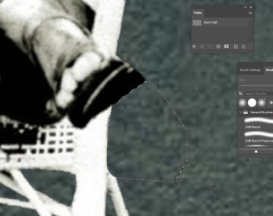
Pretty much applying the same formula I did with the Greek God, using the object selection tool to take Ringo and his chair out. The trouble is these small bits around here, so I just used the Pen tool to draw around this parts and then converted that into a selection, and filled that selection with black pixels on the mask layer.

The trouble now is how to hide that cut foot.

So I just placed him behind this bush, more specifically I removed his leg so it looks that way.

There he is, right in the back, looking on.
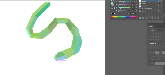
VECTOR IMAGE ONE: THUNDER
Unfortunately I forgot to document the creation of this file, but I made sure to open the whole photoshop image in illustrator (flattened), found where I want my thunderbolt, took an outline of it (the yellow squiggle), and then saved the file to this IMG folder. Making sure to keep it in that IMG folder.


Next, going into file and then place linked, just going to place that squiggle in place, then I can start editing it. Not skipping out on changing that setting circled in red to Media Box.
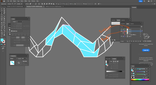
Here I'm taking a very similar approach to how I made the other vector image, but now I can explain it. First, I make two more layers, the top most layer being this white skeleton that outlines the bolt, and then a second layer for the colouring of the body. Also adding this gray background to make life easier in seeing the skeleton, but make sure to have that invisible when I save.

Then I go in and diversify the colours.
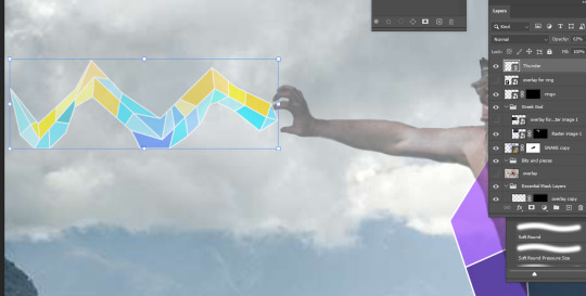
Here it is.

Making sure to place this bolt under the Greek God layer, I now go in and clean it up by creating a mask, and erasing all overlap with the hand (due to the transparency of the Greek God layer).

There it is.
VECTOR IMAGE TWO: Simple S
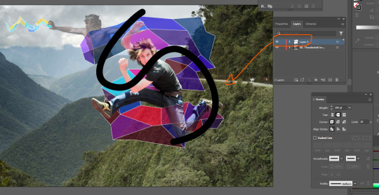
Pretty much following ever step as the previous vector object. I wanted to add another S behind the original, not sure why but I thought it'd look cool.
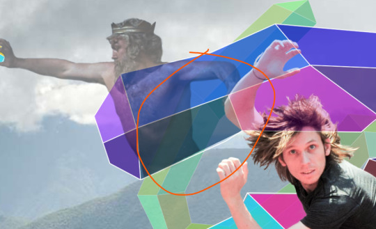
I need to add some more transparency to the Greek God as two layers are now overlapping him.
Just going in with the transparency turned to about 3 and a soft brush to lighten this pare up a little.
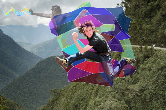
Finally complete, the full image.
Reflection:
I definitely stressed a lot while making this, and also cutting it close to the deadline doesn't help (just struggling to manage time at the moment). I completely forgot about the skeleton/body method when it came to making vector objects, so just went back and inspected the first one I made for this image. So, I wish I documented that process originally. This definitely helped build my skills, but it also stressed me the hell out, but that's life I suppose.
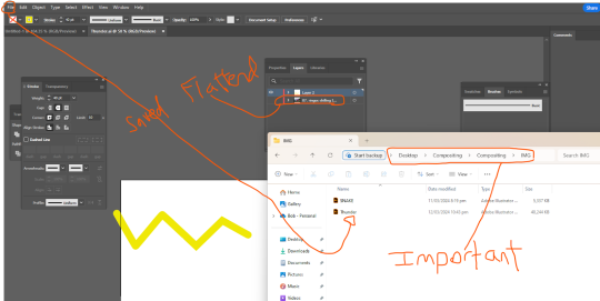
ALSO AN EXPLAINATION FOR WHY ALL THE IMAGES HAVE A GOOGLE LINK: I found Tumblr to be an annoying way to store screenshots, so I just chucked them into a google doc, turns out taking those images from the doc and placing them in links them as an image from google drive, I'll make sure not to do that again as it kinda annoys me.
here's the doc link: https://docs.google.com/document/d/1LazwekuUFVEyU9cOZBdAik50wVuxgqdyPpAmv9W9FjM/edit?usp=sharing
0 notes
Text
Fundimentals 1: 07/03/24 (2)

We open the image in illustrator. Select Flatten Images in the menu before it opens.

Adding a shape here, we're going to import this into photoshop.

Make sure we hide the previous layer.

Saving this image in a seperate folder called "IMG".

To import our object we use "Place Linked".

Selecting it here, we just click place.

Make sure we set tis mode to Media.

This will import the image in.

Now we clone this shape, and put it to the top of the order.

Now we make a mask of it. This is so we can remove some parts so that the man's body is in front of the image in places. We select our brush tool to black.

We now just paint out parts of the image.

Now we've made this.

Going back to illustrator, we're going to make a gray layer so we can see what we're doing.


I've created this image now, it's going to be the one I use for my image.

All we have to do is save that illustrator file.


I've just taken an image from google and put in in the bakcdrop.

Just fixed up the image so his arm, leg, and body are in front of the object again.

Final Image.
Reflection: This was much like the humming bird, but a little easier with experience. I really enjoyed this one, just cutting out a guy and sticking him in mid air, also the integration of illustrator illustrations is useful.
0 notes