
jacob-longcake
Jacob Longcake
Blog for Level 6 Fine Art
106 posts
Don't wanna be here? Send us removal request.
Last Seen Blogs

campaign-reflect
Untitled

cameatslemons
welcum 2 my tweested mind...............

mayor-lou
www.finestelectroniccigarette.co.uk

the-crows-fly-to-the-west
Suffer

urarashiraishi-bodyswitcher
Random blogger here
Text
Mixed-media Subway Sketch
This was the first piece I completed since returning to uni. I had some loose ideas floating about and wanted to get them out. I’d been reading a boom of Norse myths and begun to imagine the type of
0 notes
Text
Texture photos
Textures gathered during my walks around Salford.


0 notes
Text
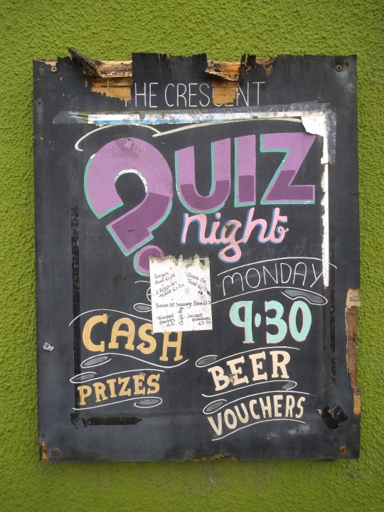
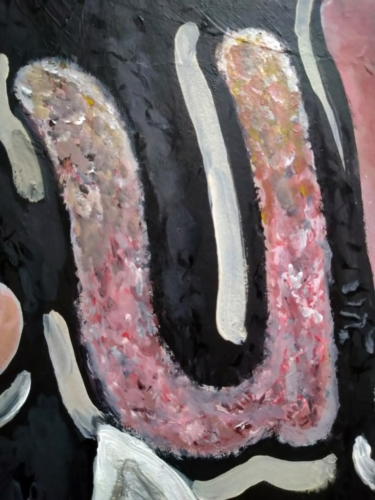
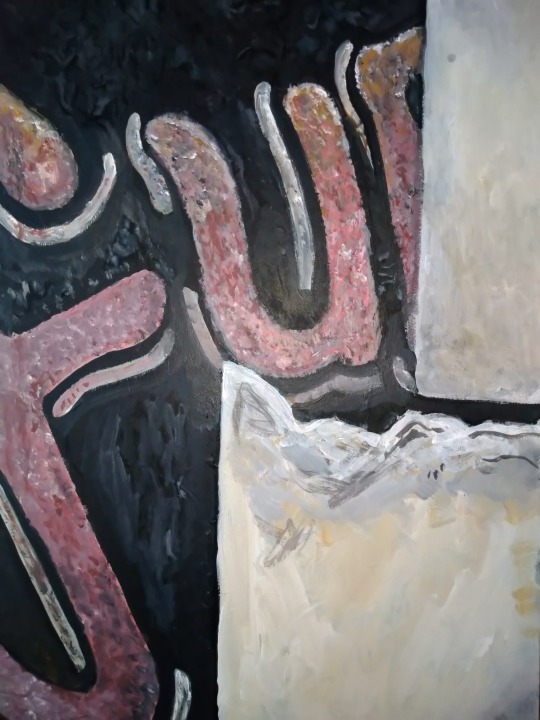
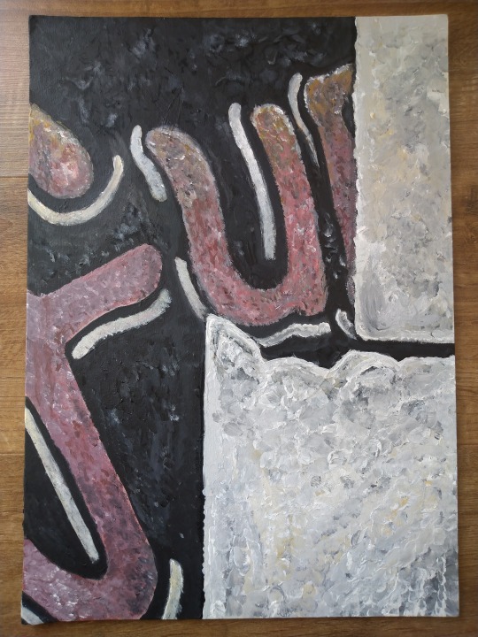
Texture/sign painting
I began this painting, wanting to try depicting the type of pub signage that I had in one of my earlier paintings. I’m fascinated by the textures of peeling paint underneath the really dated lettering. There’s something really poignant about it and you can imagine how the place used to be before it fell into disrepair. This painting is again based on photos I gathered from the derelict Crescent pub in Salford. I used acrylics on a 30 x 40 cm canvas. I don’t feel that this painting was successful, more just a dead end. I think my strength lies in more interpretative and stylised work, not this kind of reproduction, which doesn’t really interest me anyway. It took me working on this painting to realise that however. The object itself of the pub sign I find really interesting but my method of interpreting it so literally was off and at odds with the rest of my practice and interests as an artist.
0 notes
Text
Sketchbook
Below are a few pages out of my A3 sketchbook, based on photos I took on one of my trips around Salford. They are mainly exercises in mark making, trying out different pens, and as such are not as resolved as some of my other drawings. The photos were taken from my old halls of residence, chosen for its personal significance. I’ve been particularly interested in retreading old steps and returning to places that hold a lot of memories, something that I feel ties in with methods of psychogeography.
0 notes
Text
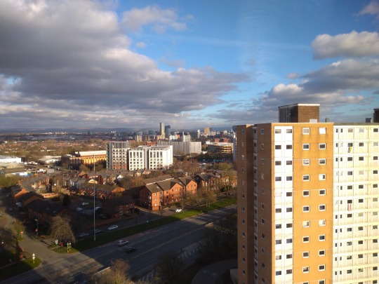
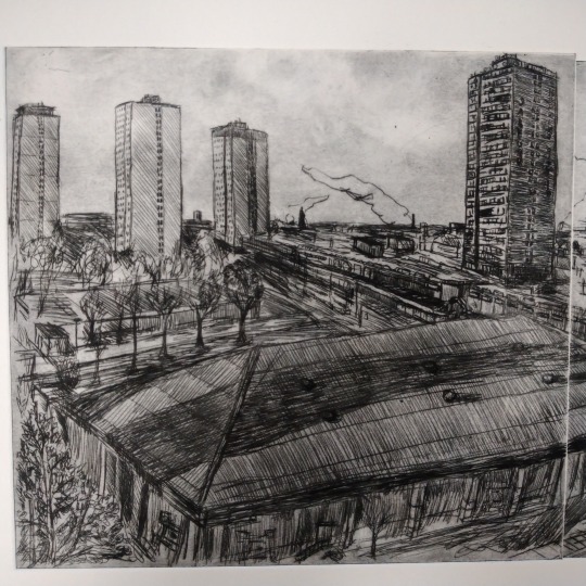
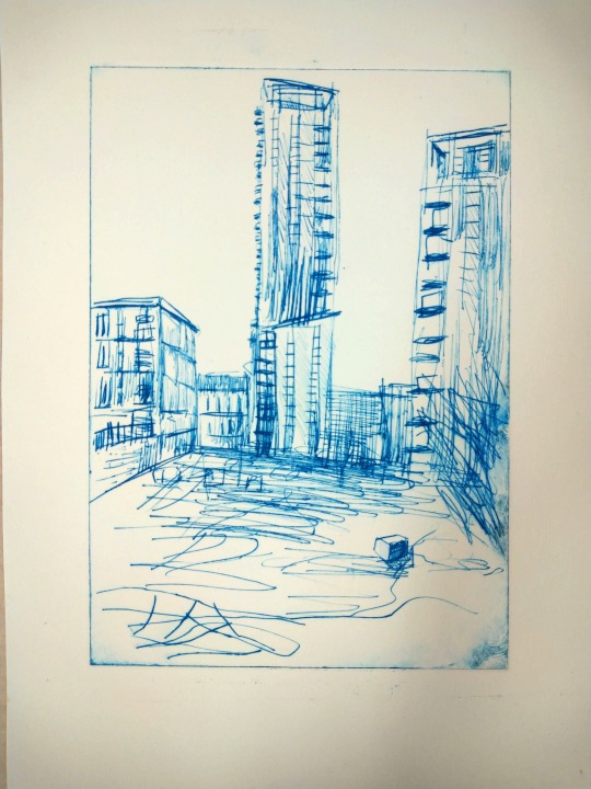
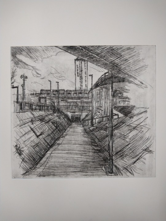
Two plate drypoint
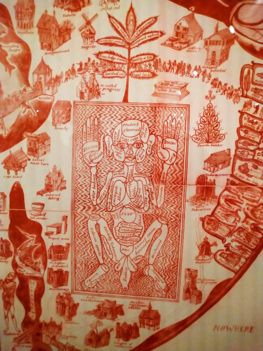
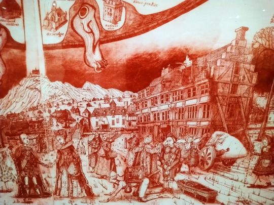
Since I saw Grayson Perry’s ‘Map of Nowhere’ at The Whitworth last year, I’ve been really interested in how he used multiple etching plates on a single sheet of paper. I really like the clean lines where the edges meet and how they break the design up. This can be seen in the photos that I took. It lends itself nicely to the antiquated style of the etching, bringing to mind relics in an old museum. The earthy choice of ink reflects this also, as well as the dark smudges that I assume are aquatint. As I have been using aluminium for my drypoints, it hasn’t been necessary for me to treat the surface to achieve this effect, as the natural texture of the metal catches plenty of ink if it is left un polished.
I took these ideas and applied that to my own printmaking, wanting to translate the style of one of my sketches and merge the disparate elements of my practice. I took a scene of Salford Precinct that I had sketched before from a slightly different angle, using a photo of the area as the basis for my design. As I have begun to do with all my drypoints, I flipped the photo in edit and then cropped it to fit the size of the plates. I had tried to sketch a design onto them directly, but aluminum is too soft and it scratched the surface. I have found marker doesn’t really work for this purpose as it smudges too easily since it can’t dry onto the metal.
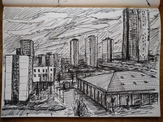
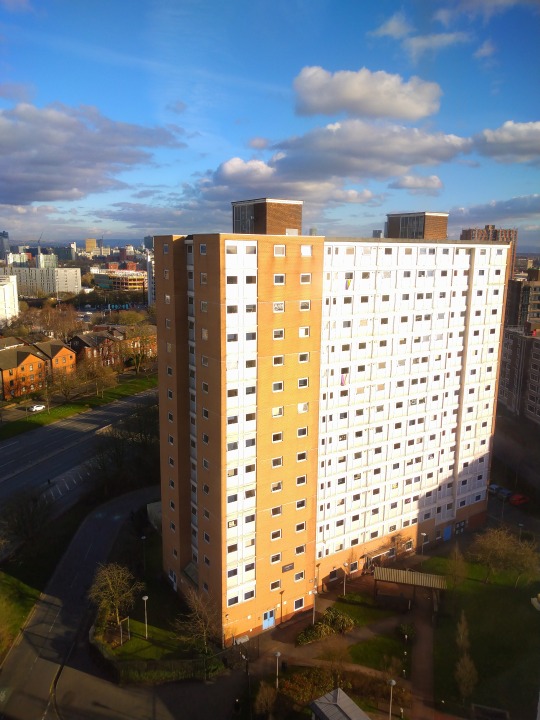
I chose this specific scene as I was lucky enough to be in my old uni halls and catch the view when I took it. I’d see something like it every morning when I woke up in my first year and I was always struck by how beautiful some of the sunrises and sunsets can be in Salford. I wanted the content of the print to be particularly meaningful in terms of the themes of psychogeography and place that I have been exploring with my practice. The shopping precinct is somewhere I spent a lot of time in first year, passing through to meet friends or going to get shopping, so it feels like a significant location that was my first real memory of the city. The architecture as well has always caught my imagination and there’s something really interesting about the prescribed layout, with all the tower blocks facing the same direction.
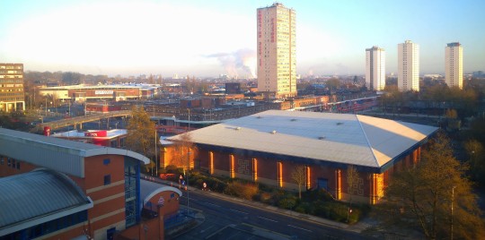
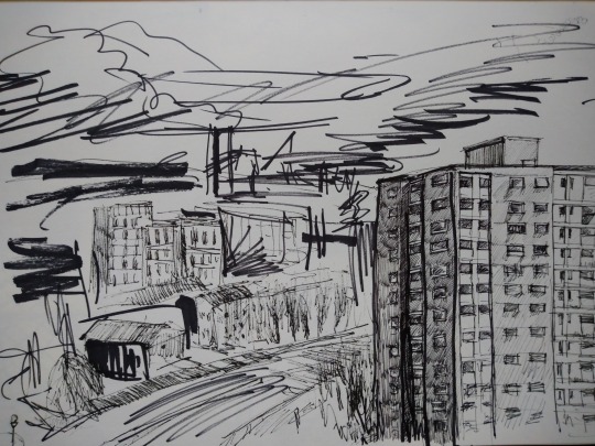
The main challenge came in trying to translate the complex image to the plates without the use of any kind of guidelines. It’s not something that I would normally choose to do as I end up feeling hampered by that kind of structure, but obviously mistakes are harder to correct with drypoint. I started from the tower in the centre and worked my way down and across, using it as an anchor by which I could gauge the distance between objects. It was quite difficult to discern some of the details as the buildings fade into the distance, so there had to be some interpretative elements to my design, an aspect I didn’t want to shy away from as I feel it ties in with themes of subjective experience of place and psychogeography/derive. I played around with different hatching effects/patterns to achieve a sense of colour and tonal shifts.
I hadn’t planned on it, but I ended up finishing both plates in one sitting, something that is noticeable in the quality of the lines on the left hand plate that become very loose. Although it wasn’t exactly intentional, I had set out to incorporate some unfinished/abstracted elements like I had in my earlier drypoints. There was also an interesting performative aspect that didn’t really occur to me until later, in terms of how I worked on the print until the cramp in my hand made it too difficult to make marks. One of the plates was slightly longer than the other, a detail that I took advantage of by using that plate for the tower blocks. I also just really like the misaligned, jigsaw effect that I find reminiscent of Grayson Perry’s etching. At one point I obsessed over getting my prints clean and crisp, but I’ve come to embrace the imperfections/unique elements that introduce an element of chance or individuality to a work.
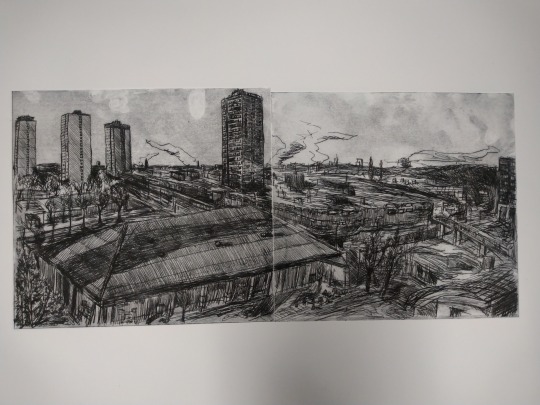
The image above is the very first print that I got from the plates, all of which were done on A2 cartridge paper. At the top left of the print are finger prints I left by handling the surface after I had already removed the ink with scrim, something I had forgotten from our technical demonstrations in first year. I like how the marks act as a record of the process that went into the print, an unintentional record of human activity and would like to expand on these chance aspects of my work in future. To this end, drypoint has been the perfect process to utilise, as the lines created have a smudged quality that is unique from the rough burrs the needle forms. This limits the control I have over the thickness and quality of the lines, that can even be effected by the process of inking and prepping the plate with scrim.
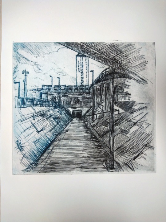
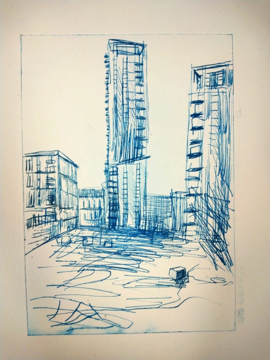
I had some blue ink leftover that I had mixed for another print, that I decided to use for this one. I didn’t clean the black ink from the plates other than what was removed in the printing process, which introduced another chance elements. This led to some areas of the print becoming darker than other, where the lines were heavier and held more of the black from the previous inking. In all of the prints I was really pleased with how the line where the plates meet had come out, not interrupting the continuity of the design too much but imposing a clear separation that again signals the process/materials behind the work.
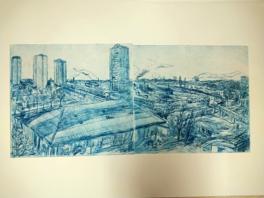
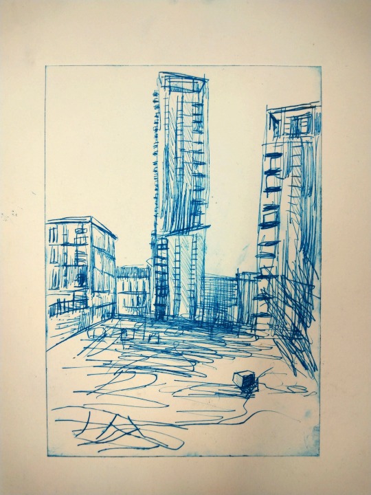
My final print really shows the huge difference that polishing the surface with the scrim can have. Small, circular motions have to be used to gently remove ink from the surface, but as much or as little as desired can be left. I must have removed to much on the towers to the left as they came out very faded. I think also that the paper had begun to dry too much after the soaking so this also would have had an effect on the quality of the lines. After successive prints, the ink began to stick to the surface in certain areas that can be noticed in the upper portion of the print, something I took advantage of to achieve a beautiful suggestion of clouds. When I next get the opportunity to return to drypoint, I want to expand on this and experiment with how the aluminiums natural surface texture holds ink. Out of all the pieces I have completed this year, this is the one I feel the most satisfaction with. I feel like it’s the first to successfully combine the separate elements that I have been working with like texture, line, subjective experience, architecture, place and psychogeography, even if that is in some modest way. Both plates together measure 50 x 24 cm at the highest and are printed on A2 cartridge paper.

0 notes
Text
Drypoint a la Poupee
Printing with multiple colours, or a la Poupee as it’s nicely called, is a printmaking process that I still hadn’t tried, so I wanted to take the opportunity to try it out. The name in French means ‘with the doll’ and refers to the small wads of cloth that would be used to apply the ink. I used a plate that I had taken prints from a few weeks before, choosing it for its fairly simple design that I thought would look good coloured. This was my first time mixing colours and using extender, which thins out the ink making it lighter in tone and transparent. I wanted to keep things fairly simple, so I opted to just use three colours. I wanted to lighten Ultramarine blue to a sky blue shade, which I tried to do with extender but that wasn’t the desired effect so I mixed in white ink instead. The tone was a lot richer than I had aimed for but I kept it as I liked the shade. I also made gray in a similar way using Charcoal black ink. The final colour I used was plain black. It was quite tricky to do this process on a relatively small plate like this. With any kind of intaglio process, the ink has to be removed from the surface of the plate using scrim, which was difficult to do without mixing the colours. Black ink is so strong that once it gets in it darkens anywhere it touches, so the final effect was not as bold as I had hoped.
I wanted to only shade in the sky blue, but because the lines were sparse, it didn’t come out very much, not helped by the fact that black ink made its way into that area. The main problem was that I hadn’t planned to use multiple colours on this plate when I made it and all the details were quite hard to ink up as I wanted. My second print was much more successful, after I took a much more relaxed approach to inking the plate. In the bottom left I used grey ink, but the tonal difference didn’t really come through and the blue really showed after a small amount of ink spread down there.
I’m very happy with how this print turned out though and with how the different shades add depth to the design. I think in future I will plan to use this method when making my plates, after seeing how much it enhances the design. I have also begun to experiment by leaving ink on the surface of the plate, making use of the aluminums natural texture that holds onto ink, that can be seen on the right of the print. This texture is referred to in printmaking as the key and metals used for etching such as zinc and copper lack this natural texture, requiring abrasion with tools or acid to achieve the tonal effect. Plate measures 25.5 x 23.5 cm and is printed on A3 cartridge paper.
0 notes
Text
Drypoint on plastic
I got given a mix of scrap materials for drypoint, including card, aluminium and thin Perspex. I hadn’t tried drypoint on plastic since college, when it was my preferred method of printmaking since I had first been introduced to it. I really enjoyed the similarity between using a needle on the plastics surface and traditional drawing. Returning to working on Perspex, I wanted to play with that transferability of skills between art mediums and the leniency of the material. I based the design off a photo that I had sketched from before. I chose to work from the original photo over the drawing as I didn’t want to limit the drypoint with what I had done before and also this gave me the opportunity to flip the image (edit pictured below), making it easier to make my reproduction accurate. Compared to working with aluminum, already a soft material for this process, the qualities of plastic allow for extremely fluid lines. I was effectively able to sketch out the design quickly, giving it a nice scribbled quality.
When it came to printing, I chose to use some leftover ink that I had mixed for another drypoint. It was the first time I had tried experimenting with mixes and extender, a substance used to thin the ink which in turn alters the colour. Initially, I had just used a small amount of extender and Ultramarine blue, but that didn’t seem to do mix in terms of lightening the pigment so I mixed in quite a bit of white. I was in a rush when put these through the press, so they aren’t the cleanest prints with some smudges of ink, but I like how the colour lends itself to sketchy style, almost like it’s been done in biro. It’s easy to really overwork a piece, particularly with drypoint, so it was nice to do something that transferred some of the fun and fluidity that I enjoy in drawing to another medium like print. Each print is on A4 cartridge paper. Perspex plate measures 15 x 21 cm.
0 notes
Text
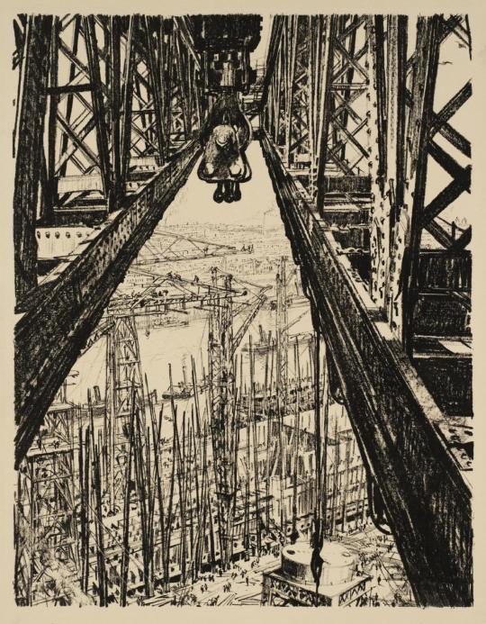
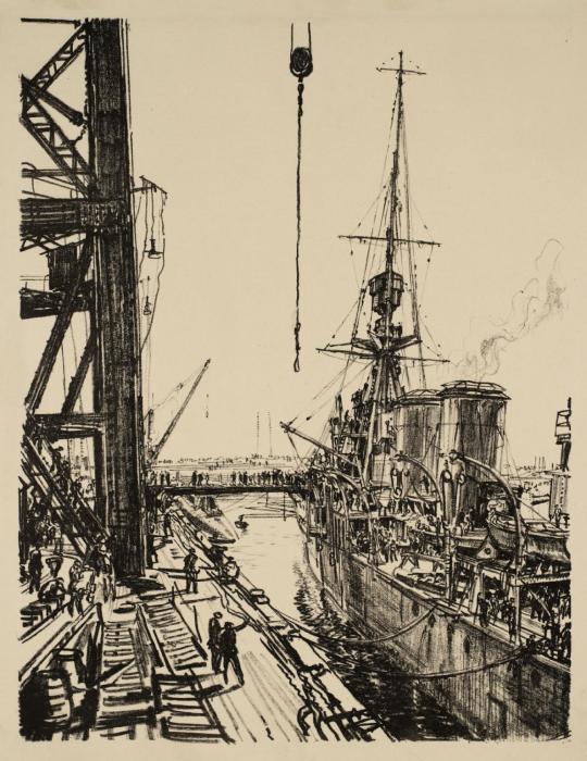
Muirhead Bone
Muirhead Bone was a Scottish artist, probably most famous for his depictions of First World War trenches. Working primarily in etching and watercolour, he also spent time producing landscapes and intricate industrial scenes. In terms of its relation to my own practice, I’m mainly attracted to his focus on architecture and his style of composition. I really like the sharp lines of perspective that bring the image off of the paper. The composition, often very symmetrical and angular, adds to this effect of immediacy. He lobbied for the creation of an official war artists scheme and in 1916 became Britain’s first appointed war artist. Bone was most famous as a printmaker and worked in a variety of disciplines, including lithography, a couple of examples of which are pictured below. I like the unusual view points he seeks out for his work, like the view if a shipyard from one of the cranes, which makes for a beautiful image in a purely formal sense. Bone’s eye for observation and perspective is really striking in works like these.
0 notes
Text
Psychogeography
Psychogeography refers to a mode of thinking that came out of a combination of movements within art and social theory, the definition of which Guy Debord would call ‘charmingly vague’. Debord, founder of the Situationists art movement in 1950s France, conceived of psychogeography as a reaction against the monotony of modern life. It drew upon various popular ideas in France at the time, including Marxist-theory and the historical figure of the Flaneur, a type of dandy or upper class gentleman that would walk and observe the busy streets if the city as an outside observer looking in. This could be traced back to the writing of Charles Baudelaire and his work ‘The Painter of Modern Life’. A central point of psychogeography for Debord was the concept of the ‘derive’ (drift), which he described as a method of following the path of least resistance and embracing subjective freedom through the relinquishing of any modern trappings that might dictate direction or how the world is experienced.
The writer Will Self, who teaches a psychogeography course at Brunel University, describes the process as the ‘free association of place and space’ as the individual is drawn through the environment, drawn only by inclination. The idea is deceptively simple, the ‘actualization of subjectivity’ as Self calls it. It is a deceptively simple idea, that by switching off our phones and wandering without clear intention we can achieve a sense of freedom that we are so often closed off from due to the pressures and constraints of contemporary life. These factors are compounded by the way modern civic planning works in subtle ways to discourage loitering, except in designated spots (benches, parks) and pedestrians are often punished for deviating from clear paths and pavements. Psychogeography also feeds into more mystical interpretations of the concept, like the idea of certain locations being laden with collective memory that can be ‘tapped into’ and the ancient idea of ley lines. Self, like Debord before him, describes these acts of resistance against the capitalist structuring of modern life as being a way to reclaim a better understanding of the places we inhabit, situating ourselves in the wider world.
I started reading about psychogeography numerous times while researching for my practice this year, but always found it difficult to engage with due to the broadness of the concept and how much it encompasses. I think in relation to my work, my observations and time building research is far more consciously directed than what Debord and Baudelaire talk about, but there are elements to it, such as the idea of soaking up the general feel of a place and how that changes in minute ways as you pass through that I feel really resonate with me. Personally I am heavily inspired by David Hepher and Mandy Payne in terms of their approach to their work as being like social documentation or some kind of anthropological study, except mine is taking the more subjective angle of focusing largely on places with personal significance for me. I’m really interested in this idea of collective/emotional memory that places hold, something that I have often thought about in terms of how some locations do seem to attract a certain kind of activity or evoke specific feelings in people. It’s interesting that I think I was already working with some of these ideas in mind, but having read more into psychogeography now, it has defined some of these concepts for me. I was talking to someone the other day about how much I enjoy just walking aimlessly around unfamiliar places, just to get myself situated and gain a better understanding of the landscape, that I find really good for my mental health and helps me visualize where I am. There are some parallels with mindfulness. On reflection, I’d say that maybe the reason I have developed two strands to my practice (figurative and the more textural paintings/rubbings) is because of this multi-dimensional experience of the world encouraged by psychogeography.
1 note
·
View note
Text
David Hepher - Pavement Horizons: Where the Walls Meet the Ground
In 2014 David Hepher produced this series of mixed media paintings, documenting the edges of pavements and, as the title suggests, the points at which the walls of buildings meet them. As is Hepher’s habit in his more recent work, concrete is incorporated into the works, applied over canvas as the surface onto which oil and acrylic paints are applied. He has described how he believes the fundamental job of an artists to be finding beauty in overlooked places. This attitude has led him through decades of work documenting the high rises and flats of the UK urban landscape, working with building materials and recording graffiti with the attitude of an anthropological study (Hepher has spoken of his interest in them as signs of habitation). This mission statement is quite similar to the way Theodore Major spoke about his work and it’s an aim I am motivated by as well, in the sense that I want to communicate the parts of the everyday that I find interesting or beautiful. I know his isn’t a novel focus for an art practice, exploring the aesthetics of the urban or post industrial landscape, but to me it is more about utilising this basis as a way to express my subjective experience of it.
Pavement Horizons takes this logic to an even more minutely observed level, focused on the cracks and textures of the street, tarmac of the road and weather stained concrete walls. These delicately portrayed surfaces are transformed into rolling hills and dark sky, laden with heavy clouds. Hepher is fully aware of the parallels he draws between the artificial and the natural world, evident in the titling that ranges from ‘Deluge’ and ‘Monsoon’, to ‘Northern Lights’ and ‘Cloudburst’. One work takes the title of a piece by the German Romantic painter, Caspar David Friedrich, called ‘The Monk by the Sea’. Hepher’s painting does share more than a passing resemblance to the 19th Century oil painting, but I’m unsure as to whether this is coincidental and the title came afterwards, or if Hepher intended to reference the older painting, as he does have a tendency to make allusions to landscape works of the past. He is an artist that very much contextualizes his work within a historical continuity of artists concerned with architecture and the world we inhabit. Along with Mandy Payne’s work, I find the focus on recording moments within the ever shifting architectural environment in Hepher’s art to be inspiring and very relevant to the current direction of my practice.
0 notes
Text
Drypoint
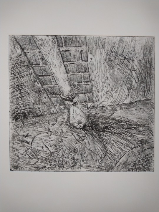
Due to the print room being shut through the start of the semester and my other responsibilities, I haven’t been able to use the aluminium plates I got for drypoint until now. I wanted to make the most of my time in the print room (I booked a 2.5 hour slot one afternoon) so I prepared two plates using an etching tool, based on photos I had taken during one of my walks around Salford. I was looking forward to returning to a more figurative style of working that matches well with the medium, although one of my aims was to see how I could depict different textures using only the lines from the etching tool. This was the focus of the first plate (25 x 24 cm) I produced, based on a photo of a drain pipe on the exterior of the Old Police Station where it met the ground. I had been looking at David Hepher and specifically his show ‘Where the Horizon Meets the Sky’, a series of paintings of the lower portions of buildings where they meet the ground, conjuring up landscapes and, as the name suggests, horizons from these mundane urban fixtures. I was really fascinated with how he had used texture to achieve this, so tried creating my own version informed by Hepher’s practice. I also wanted to take the opportunity to work with more natural forms and vegetation. A lot of the work I have been producing has been dominated by geometric forms and right angles, so the way this image is framed and it’s contents really offered me something refreshing to work with.
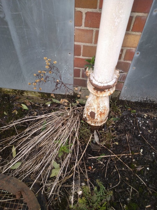
Some of the results of these experiments I was really pleased with, like the metal sheets that are riveted to the wall. They have an illustrative, almost comic book quality that I like. I tried to achieve a heavily textured surface on the plate by repeatedly going over the same parts with heavy hatching, the tool firmly pressed into the aluminium. There’s something really satisfying in how drypoint allows me to combine my traditional drawing technique with a more labour intensive and tactile material, something that I think comes through in the final piece quite well. It adds another layer of physicality to my depiction of something already grounded in surfaces and 3D objects, or at least I hope it does. Navigating my subjective experience of the work I produce and how that translates to the audience is something I am still getting to grips with. Often I have found that my more figurative work is received the best (pen and ink drawings were always my go to when it came to making art for fun, so this makes sense due to the experience gained). The feedback I get is sometimes regarding aspects of the work that I overlooked or never noticed, like the topographic quality of some of my texture paintings.
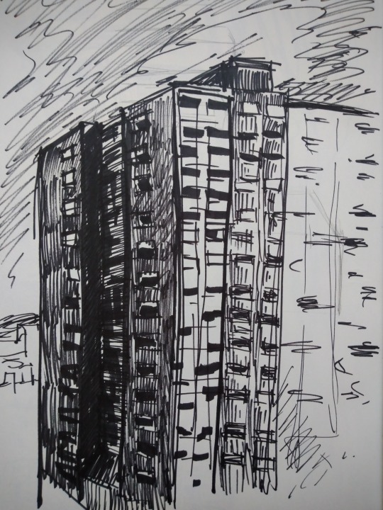
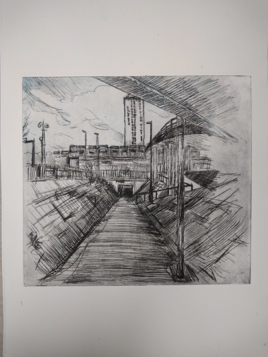
My second plate (25.5 x 23.5 cm) came again from a photograph I had taken, this time of Salford Precinct, a building that I think has captured a lot of artist’s imaginations (I was talking about Mandy Payne’s depictions of the same area with Craig in the print room; he showed me some of his own screenprints of the iconic building made in cement). My photo had just been a quick one captured as I walked to the shops one day, but I was struck by the assortment of angles that reminded me of Cubism. I like this idea of the elements of the urban landscape containing abstract qualities, coalescing to make different forms. I hadn’t intended on using the photo for anything special, but while I was doing a quick sketch based on it I realised it could make a nice print. I did another sketch in preparation, working monochromatically and considering the lines I would use in the final print. In the past I haven’t prepped as much but I found it really useful to quickly achieve what I had in mind, helping me to visualise and transfer it to the plate.
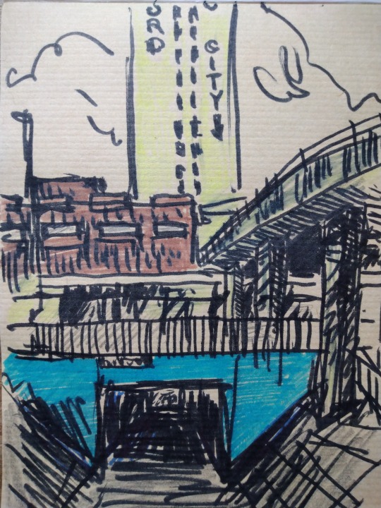
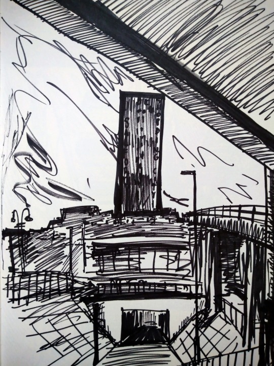
Another thing I did to assist this process was to flip the original photo on my laptop and work from the edited image. This is the first time that I can remember using this tool, but I found it to be a huge help. Usually I just work it out in my head when I flip the image for a print, but taking out that step only made the process even easier and far more accurate. It also made a difference to how detailed I could make my capture of the light, which I am especially pleased with in this print. I chose to leave part of the plate unfinished, a remnant from my initial plan to leave a similarly rough edge around the entire image, due to the shape of the photo not being the same as the shape of my plate. However, I ended up filling it out more than I anticipated as I worked, leaving me with the half done effect of the final print. It’s another example of certain constraints and conditions informing the direction a piece takes, leading to interesting results. In keeping with this rough style, I tried to keep the lines as loose as possible. I think that compared to the drypoint I made last semester, I have made a lot of progress with the materials, really opening up my style of working to be a bit more amenable to it and obstacles of translating an image that might arise.
The edges of the first drypoint were filed, but I actually prefer the raw edges of the plate in the second print. I know that filing is meant to make it easier to clean the edges but I actually found it to be the opposite and I quite like how the thin, un-filed lines frame the image. Another aspect of drypoint that I find useful is how tone of the print can be controlled just by how much ink is cleaned off of the plate. For the one pictured below, slight smudges of grey can be seen in some areas where I chose not to polish the surface too much, an effect that really calls to mind dirty, stained concrete for me. I think I would have made some of the indents into the aluminium deeper as some sections aren’t quite as dark as I wanted. I tried to be careful with the tool and this did allow me to achieve a really nice contrast between the dark shadows and sunlight reflecting off the path to the right, that then hits underneath the bridge. Both drypoints are printed on A3 cartridge paper. I aim to get back in the print room to make more of these prints, potentially layering them, as I have a lot of aluminium sheets to make use of.
0 notes
Text
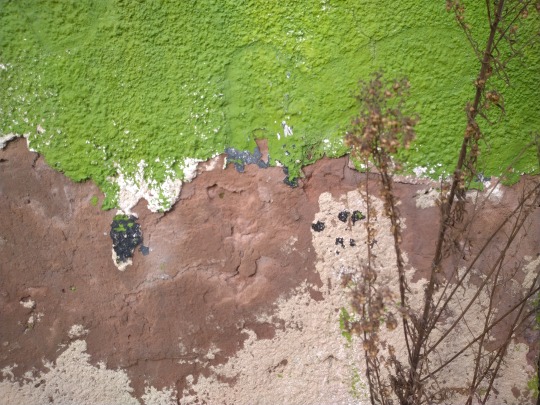
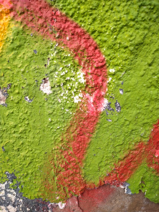
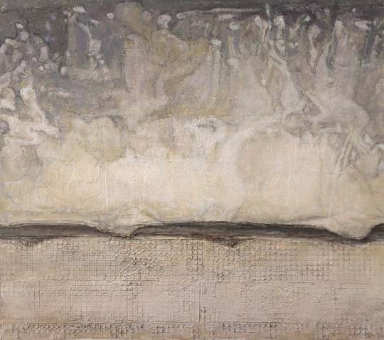
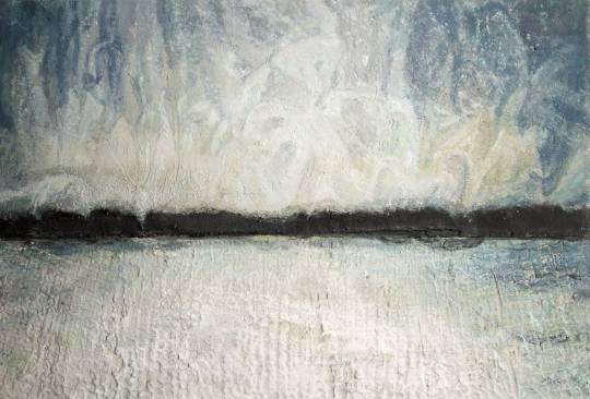
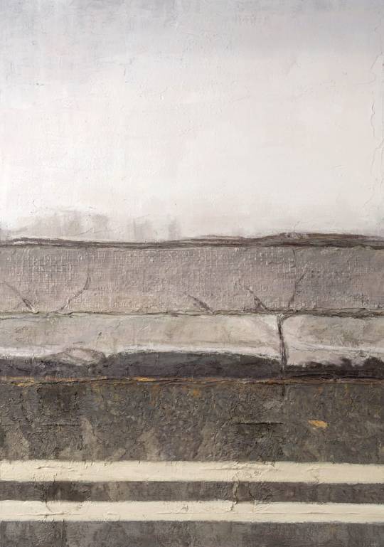
Texture Painting 3

I was really pleased with the outcome of my last texture painting and decided to work in that style again. I returned to the first of these paintings that I did, of the peeling green paint of The Crescent, for inspiration. I chose a photo I had taken of a different segment of that same wall, finding that it to be a great source for a diverse range of textures. Another aspect that attracted me to it was the layers of peeled paint and graffiti that brought splashes of unnatural colour. Part of my aim was to make a work based off of a real photo but that could appear to be an abstract piece without the added context. Angela had described my earlier painting of this wall as like looking at a topographic map or a satellite image, so I thought the different layers of crumbling plaster in this photo would really emphasize those elements, reminiscent of the layers of altitude in a mountain range. The patches of paint also call to mind these associations, like the patches of colour used in OS maps to describe different vegetation and terrain.

I worked with acrylics on a 30.5 x 40 cm canvas, working more intuitively than I have in the past. It was really enjoyable embracing abstracted forms and bright colours and I didn’t restrict myself in terms of what I used. I continually referred back to the source image as a point of reference, but never felt hampered by it. I think seeing Ian McKaye’s Collier Street Baths exhibition really informed my approach to this, a sort of abstracted method of recording a place that is based on sketches and original photos and yet highly interpretative. I found his way of working really fascinating in terms of the added dimension of his personal relationship to what the images depicted, communicated through his handling of the subject. Part of me would have liked to just leave the painting at this point, but in terms of what I was trying to achieve I knew it wasn’t finished. I wanted to build the depth of the colours and subdue them with a more realistic palette.

Overtime, the paintings relationship with the original photo that inspired it changed, as there was an ebb and flow in how heavily I chose to stick to realism or drift further into the abstract. I played with the fluid lines that would appear, building on accidental mark making and working that into the finished piece. One part that I would have done differently is the green streak of paint that runs vertically down the middle of the paintings. There was a nice transparency to the paint that I lost as I worked more on it, trying to build up a sense of the texture of the wall. It ended up with too much body and a sense of three dimensionality that I wasn’t aiming for.
As I worked my way up to the final layers, I introduced smaller brushstrokes in a kind of Pointillist style that I had used in my last texture painting of the pub sign. I like the finish it contributes to these texture focused paintings I am currently producing. I’m satisfied with how this piece turned out overall, although in terms of my practice I am not sure how far I will take this abstracted style.
0 notes
Text
Texture Painting 2

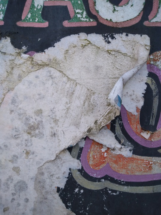
I made use of downtime between filming for the Start With Art video by getting quick photos of different textures in the different locations we used. I focused on close-ups of textures, particularly worn surfaces that had seen the effects of the elements, source material that I knew from my tests would make good paintings. I’m mainly interested in seeing the layers of paint, graffiti, fliers and plaster as a kind of record of the passage of time and the different forms that a building has taken, like the sedimentary layers of earth geologists study. There’s also an element of personification to this kind of intense study of the details within a larger structure that I keep thinking of like a portrait. There’s a quote I like, from someone I can’t remember, but it says something along the lines of older people making for better portraits, because the wrinkles and marks of their skin tell a story and add another dimension to the image.
One of these photos, of one of the peeling signs on the front of The Crescent, formed the basis for another one of these texture paintings. I used acrylic on a an A3 piece of card. I was conscious of framing and image composition when gathering source photos so the images were ready made for the paintings I wanted to make. Depicting a segment of text within the image takes it out of being quite as abstract as the previous tests I had done. I’m quite keen on the idea of making paintings that look like abstract works but are in fact based on detailed photos. This work is probably the most photorealistic painting I have done so far; I spent a lot of time layering and mixing the colours to keep them as accurate as possible. I wasn’t as exact when it came to the actual forms of the lettering and details being precise, as I wanted to maintain some fluidity of the brushstrokes and prefer to maintain an interpretative element in my work.
When I started I had Ian McKay’s highly abstracted work in mind, but I wanted to stay focused on appropriating a real image into what could be seen as an abstract work. For this painting I adopted a blotchy, pointillism-inspired style as a way of suggesting the flaky paint without having to painstakingly touch up every crack, which I feel would have ended up looking overworked. The paintings that I like the most are often loose, Post-Impressionist works with clearly evident brush marks. Another influence would be the work of Basquiat and graffiti, both of which feed into the thematic currents within my current practice. I’m not big into abstract art on the whole, but I appreciate the focus on automatic painting and the importance of each element of the mark making. Up to this point in the semester, this is the piece I think has been most successful, in terms of execution but also in how it combines some of the different avenues I have been exploring with my practice (texture, decay, architecture, urban spaces, time, memories).
0 notes
Text
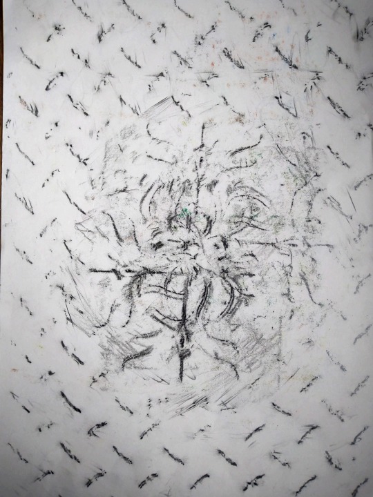
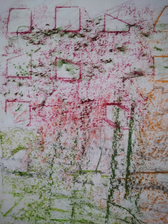
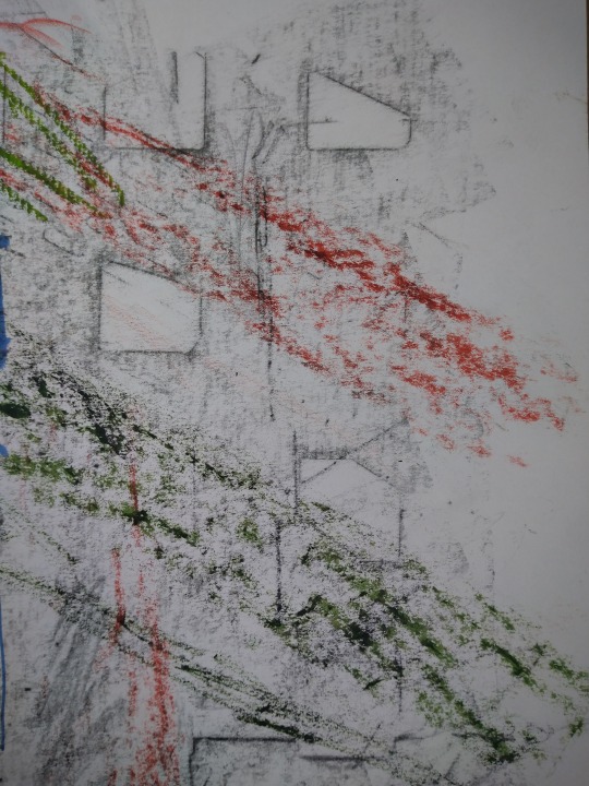
Rubbings
The Turnpike gallery commissioned me to make a short video for their Start With Art series on YouTube, serving as a simple introduction to my practice and a creative activity that could be done by young people at home. I chose to do rubbings/frottage as it tied in well with my practice and is an easy method of printmaking. During my initial day of filming I got rubbings from various locations around The Crescent and Chapel Street in Salford, as well as The Eagle Inn. I looked out for interesting patterns and chose locations that either held some personal significance or had a unique quality or some other historical element. I combined rubbings together on the same page like a collage, using different materials such as graphite and oil pastels to emphasize each individual texture. Rubbings offer a unique method for recording an environment, highlighting the forms that often go unnoticed within or everyday experience. Walls, grates, manholes and tiles all made for great source material in terms of the prints I was able to get.
For the video I wanted to give some suggestions of how these rubbings could then be worked back into, forming the basis for mixed media pieces. I filmed myself using pen and oil pastels to build abstracted cityscapes and forms out of the existing patterns. I also showed myself tearing up the rubbings and building collages out of the collected textures. I got some good feedback from The Turnpike on the quality of the activity.
I’m surprised that I hadn’t come to frottage sooner for my practice, as it fits in well with the areas I am currently exploring. I think it’s a creative method that I wouldn’t quickly associate with the type of work I do, despite it being a form of printmaking and extremely useful in terms of the research trips I have been making. I also find it interesting that in my painting I had naturally come to depicting close-up textures and details based on photos I had taken, with a focus that almost mirrors the effects of taking a rubbing. Fortunately I got this commission which led me to thinking about simple artistic methods that could be easily communicated in an accessible format, but this has fed nicely into my painting. All rubbings are on A3 paper.
0 notes
Text
Group Crit 04/03/21
Angela led this Teams meeting. It was really good seeing what people had been getting up to since we broke for Xmas. I went first and presented the work I done up to this point, which wasn’t as much as I would’ve liked but still explored a variety of styles. I received positive feedback for my line drawings and Angela liked the abstracted texture paintings I was beginning to do, commenting that she thought it made her think a bit of a topographical map. I got some interesting suggestions of artists and terms to research:
Simon Woolham
Hugo McCloud
Lui Wei
Gerhard Richter
Guy Debord
Flaneur
Psychogeography
Henri Lefebvre - rhythmanalysis
Ed Ruscha 26 Gasoline Stations
0 notes
Text
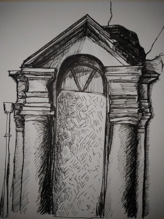
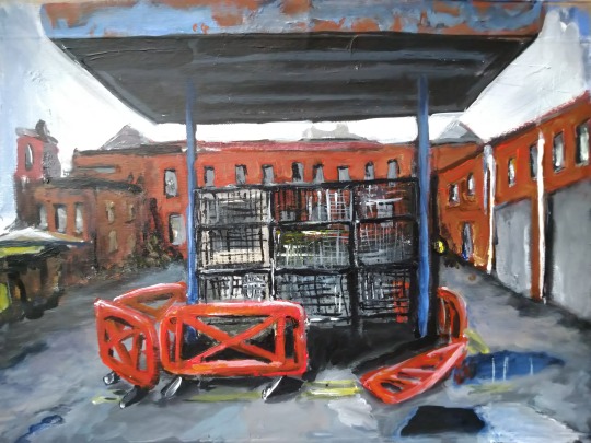
Sketches
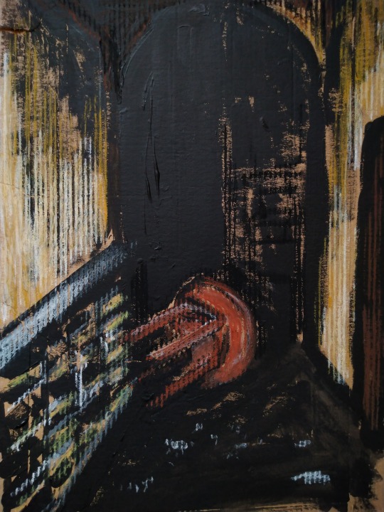
I completed a series of sketches, using different media, based on photos I took on my last trip around Pendleton and the Crescent. I was interested in developing the looser style that I have often used in printmaking and applying this to other mediums. I made a couple of fine liner sketches of the The Crescent pub and new builds in the surrounding area. The drawing of the doorway developed into a much more resolved work than I had intended and came out really nicely. I think it could make a good drypoint and am eager to get back into the print room and give it a go. I worked on A3 paper.
Around the front of the pub, I found a door where the window had been smashed in, which allowed me to get a good look at the interior and hallway. This became the basis for another sketch, this time in acrylic paint and oil pastels. I painted onto cardboard, which lent a wonderful effect to the walls and I incorporated the colour of its surface into the work, blending nicely with the pastels. The corrugated card gave a sense of the dilapidated walls, crumbling and stripped bare and the verticality of the lines flowed with the angle of the image.
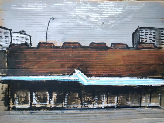
This is another example I made working on the same cardboard, again utilising the corrugated surface to suggest lines within the paintings. I also incorporated oil pastels into this one, to pick out these raised areas of the material. The image itself is based on a photo I took of a section of Salford Shopping Precinct, as I walked home for the bus. I liked the way the edges of the buildings aligned, a bit reminiscent of Mandy Payne’s work based on the same location (not planned but probably subconsciously emulated as I’ve been getting immersed in her work). I experimented a bit by using the paint like ink, drawing lines around the undefined blobs of brown and grey, thin washes developing the sense of a reflective surface for the windows. I used pastels for the canopy that encricles the structure, as I wanted the colours to really pop against the drab acrylics.
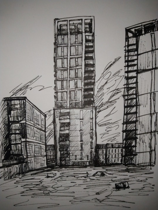
This is a more traditional sketch that explores the new builds that have popped up around the heart of Salford. A lot of them have a really boxy design, like stacked cubes. They sort of feel like a grid that’s been overlaid on parts of the skyline. It’s interesting how their architecture has been designed to reflect the traditional red brick terraces and former industrial buildings they sit right next to (these towers sit just across the road from Islington Mill). Fine liner on A3 paper
0 notes
Text
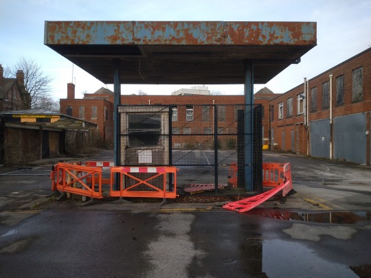
Police Station 2
Returned to the sketch of the Old Police Station. In total the painting probably took me a day, morning and afternoon. I am enjoying working on smaller pieces that take less tie and allow for looser experimentation. It suits my style well and allows me room to develop in a way that I wasn’t last semester while working on longer time pieces. For me, that often ends up feeling quite stagnant as I want to try out different ideas and get bored quite quickly, so a collection of smaller works on the go at the same time is a much more fulfilling way to work in terms of charting the development of my painting.
The photo I worked from was taken on quite an overcast day, so didn’t allow for much of a challenge in terms of light and shadow. At first I was quite constricted by the mesh in the middle of the booth and trying to make it look exact. But I found that a greater sense of realism could be developed through looser lines if the colour was right, giving a sense of the dully reflective quality of the metal. Working on my layering of colour and mixing was the main focus for this quick piece and I am confidant in the progress I’m making in that area. I like working with the lines and playing a bit mark making, finding a balance in terms of stylisation and a sense of realism.
0 notes