
Don't wanna be here? Send us removal request.
Statistics
We looked inside some of the posts by jacobhallyear2fmp and here's what we found interesting.
Average Info
Notes Per Post
1
Likes Per Post
1
Reblog Per Post
0
Reply Per Post
0
Time Between Posts
3 days
Number of Posts By Type
Text
16
Video
1
Last Seen Tumblr Blogs


Fun Fact
Premium Tumblr themes are available from anywhere between $9 to $49.
Text
My Final Evaluation
My focus for this project was 2D pixel art which was made in Photoshop and Aseprite to be used in a functioning demo that is made with the help of the Unreal Engine. I learnt a lot over the course of this project, especially in regards to my sprite work. I learnt a lot about animation in general, with the key revelation being that I finally became aware of the fact that I didn’t need to create a frame for every single slight movement and because of that I was able to both make and utilise my own in-between frames, which allowed me to properly animate my own characters performing multiple different actions fluidly. I was also able to find new, superior software to use for my sprite work, with that upgrade being Aseprite which was an immense help when creating animations. The key thing that helped me to learn all of this was my tutors who I would’ve been lost without, but when it came to the initial creations and designs I was able to use both my source material as well as some exterior research when it came to making sprites such as my status effect afflicted sprites.
I had a lot of design changes throughout this project, particularly when it came to the way I wanted to do things. I primarily started taking as much inspiration as possible from my source material, but after reaching a road block and consulting my tutors I decided to start being more original and make my character’s actions more unique. Towards the end of this project I had another change in design plans, focusing on other media outside of my source material and my own ideas for help due to being stuck and finding neither one of the previous methods to help. When it comes to hitting the end goal of my proposal I feel that I have hit the mark, but at the cost of the greater ambitions I had while working on my project. I initially felt that I could reimagine so much from that game from my childhood, but I quickly realised that just an inexperienced me with a few weeks could not match the work of a experienced full team with probably a couple of years. With that realisation in mind I pulled back a lot of my initial goals and ended up with what I have now.
I feel that my final product is a great demonstration of my abilities as an pixel artist, a sprite maker and an animator, but compared to what my initial ideas were, it's far from it. This doesn’t mean I am disappointed however, as I have come to realise that what I originally wanted was far too much for just me to handle. It easily reaches and excels past what I wanted for my FMP and just having a functioning demo displaying what my greater aspirations had imagined is honestly more than enough for me.
I feel that I have done a solid job throughout the entirety of my project, there are naturally going to be points of highs and lows, but I feel that I was more consistent on this project than I have been on some of my previous ones. I feel that if there was anywhere I would have improved it would’ve not been setting my sights so high straight off the bat, as it caused me a lot of stress and time trying to make everything a perfect equivalent to my source material when it didn’t need to be. It’s only now as I’m writing this that I feel the reason I had too large expectations is because of the high I was coming off from my previous project where I felt on top of my game. In the future I need to keep in mind that I need to set manageable and realistic goals to achieve, as aiming too high can lead to frustration and feeling like my work isn’t good enough when it absolutely is. I also most likely would’ve had a far easier time if I had known about Aseprite from the very beginning. When it comes to improving for next time I still need to learn more about coding as I am still largely clueless about it.
0 notes
Text
Pixel Artists
I wanted to use this post to have a closer look at some very talented pixel artists who I’ve either used for inspiration on this project or an previous one.
Paul Robertson-

Paul Robertson is a pixel art animator who has worked on the artwork of multiple pixel art games such as Fez, Shantae and the Pirate’s Curse and Scott Pilgrim Vs. the World: The Game (as well as the film of the game), as well as multiple one-off TV show episodes such as The Simpsons, Gravity Falls and Rick and Morty. Currently he creates both original and inspired pixel art pieces at his own whim. While I find his art both incredible and inspiring his style isn’t of particular use to me for this project as his characters are much larger than the sprites that I have been making.
Ivan Dixon-

Ivan Dixon is an, I quote, Earth based animation director, illustrator, designer. known for traditional and pixel art style. He’s known for creating pixel art intros for shows such as The Simpsons, Rick and Morty and Adventure time as, some 2D segments for games Fallout 4 and Wolfenstein 2, as well as a plethora of content for people and companies like Childish Gambino, Elton John, Cartoon Network and Adult Swim. Similarly to Paul Robertson, while I do find his art incredible and inspiring it’s simply not of much use to me on this particular project, with it being too big to suit my sprite work.
Pedro Medieros-

Pedro Medieros (a.k.a. Saint11) is a pixel artist and game developer who is known for making an insanely large myriad of pixel art tutorials as well as working on games such as Celeste, Towerfall and Out There Somewhere. Unlike the previous two Pedro Medieros has been an source of constant assistance, with his dozens of highly detailed, informative and easily accessible tutorials that detail probably every single aspect of pixel art. The only time his tutorials haven’t been of use to me is when I’ve forgotten to use them.
0 notes
Text
Designing Enemies 2
After spending so long on Unreal Engine and additional features for my main character’s I felt that it was about time I gave enemies another try after being stuck on them for so long and fortunately enough I have been able to come up with a few new designs, albeit with a lot of help from my source material.
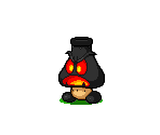
When I was first trying to design enemies I was struggling a lot, most likely due to trying to think of too much at once, and at the time I kept thinking back to M&L BIS and I was constantly wondering how they managed to have such a flawless roster of enemies. It’s only now that I’ve been able to figure that out and it’s for two reasons. The first reason is the legacy of the Mario franchise. A good 40-50% of the enemies in the game are effectively redone Mario enemies, with Goombas being found as Goombules, Elite Goombules, Chuboombas and Choombas.

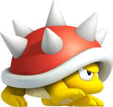
Spinies are Spike Blops.

Shy Guys are Fawful Guys and Dark Fawful Guys.


One of the running themes of the game is many of Bowser’s minions being turned on him by the main antagonist of the game Fawful, who brainwashes them into thinking that their his minions. The second reason is because of real world inspirations. Similarly to the minion scenario a lot of the enemies in the game are real world creatures or objects that have been corrupted or are just hostile.
The Beehoss is literally a bee and a plant.

The Fawflopper is a Fawfulised grasshopper.

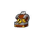
And the Trashure is a living treasure chest.
It was after having this closer look at the roster that I realised how they made everything and how I could do it myself, even if it wasn’t on an anywhere near as detailed level. This was something that just like all of my animations was something I just needed to realise I could use and now just ideas for enemies are a lot easier for me. The only thing holding me back now is just the desire for thematic enemy designs, but I don’t think that it matters all too much at this point.
Due to the point I’m at in this project these enemies are effectively stretch goals. I already have everything I need for a demonstration with just my first enemy, not even including it’s variant, because it alone allows for an turn based combat system to be shown in a demo, not even in a fully functioning format. This is why all of these new enemies are just the initial designs, because developing a full set of idle, attack and damaged sprites for them is a stretch goal that I couldn’t achieve by the time of this post. I do want to keep working on some of these enemies because I do feel that they have potential, but it’s unlikely I’ll be able to cleanly implement them into my current demo.
NMEs 2 and 3 - Roin and Ehcnalb:

These are a pair of pretty standard trope enemies, the clones. These enemies were actually as much an intended enemy design as they were an experiment. After doing all of the (intended to be) UI numbers in each character’s style, as well as having the plans to do the alphabet in their respective designs, I decided that I wanted to see how each character would look as the other’s style and I actually quite a fan. When it comes to the animations I would do for them I imagine that my go to would be just a colour palette swap of the original sprites, but I would like to do more with them and make them their own thing just like how I’ve done the same with the actual White and Black. A very good example is from Mario and Luigi: Bowser’s Inside Story, with the Bowser Memory M and L.

In the game these are (rather obviously) Bowser’s memory renditions of Mario and Luigi. Instead of just entirely replicating the brother’s move sets from the same game the memory brothers utilise some of the features from previous Mario games. Bowser Memory M creates and then jumps up and breaks a brick block which then either spawns a Super Star, causing it to dash into the brother’s at high speed dealing damage, or a Mushroom which causes it to grow to a ginormous size and chase the brothers. Bowser Memory L gets chased by a ghost and more accidentally runs into the brother’s while fleeing in fear. The reason this is so much harder and honestly nigh impossible for me to replicate is because I don’t have an entire franchises worth of history to pull from for ideas, but I do want to try and make something more unique for these characters.
NME 4 - Breakout:
A more original enemy, this design came to me after that aforementioned realisation and for some reason a brick was the first thing that came to mind. Initially I was just going to use one brick (the red one), but I felt that I would be more interesting if I used a couple more and make it look like they actually could’ve been a few bricks that broke out of a wall. When it comes to animations I don’t even feel that I need anything particularly out there, the idle could just be them rising and falling slightly, the attack is simply a charge and the damaged could just involve them becoming flattened, or I could make it more unique and have them crack slightly.
0 notes
Text
Status Effects and Emotions
In this post I wanted to document some status effects and my interpretations of how they would look on my characters as well as some demonstrations of how I can make my characters more emotive.
(NOTE: Throughout this post I frequently referred to Status Ailments as Debuffs, this is not the case. Debuffs passively affect the player via lowering their various stats such as armour, damage, magic, etc. Status Ailments directly affect the player by damaging them over time, preventing them to use specific abilities, putting them at the risk of death or completely stopping them from performing any kind of action whilst making them more vulnerable. At the time of posting this there are simply too many examples for me to comb back through the post and correct, and debuffs still do give a general image as to what I meant the entire time.)
Status Effects:

Status Effects are a tried and true aspect of gaming as a whole, appearing in a myriad of game genres from RPGs to Open-World FPS games and everything in between (albeit when those games also have RPG elements) as a way to either hinder or aid the player as they play.
The way status effects achieve this is by being typically seen in 2 forms, buffs and debuffs. Buffs are beneficial to the player and tend to increase various stats, such as the player’s strength, defence, magic, etc. Debuffs do the opposite, often reducing those aforementioned stats to make the player weaker leading to more difficult battles/exploration, but they can also be directly hazardous to the player as well, with some including poison, being put to sleep, being on fire, being stunned, being cursed, etc.
They are an incredibly useful tool for making particular areas or enemies an increased threat to the player as they can constantly drain the player of health, make them incredibly vulnerable at an inopportune moment or make them unable to do anything for a period of time.
However status effects don’t stop there, as many a game has given the player the opportunity to use these various debuffs on enemies as an more offensive utility and vice versa a lot of games have given enemies the ability to make use of buffs to make them a statistically stronger opponent for the player.
A very good game that demonstrates the adaptability and range of uses of status effects is Terraria.

To quickly get to the point a full playthrough of Terraria consists of 2 difficulties: Pre-Hardmode and Hardmode. After defeating a certain boss in Pre-Hardmode the game’s world permanently swaps over to Hardmode with pretty much every aspect of the game getting an increase in both difficulty and value. This includes status effects and one really good example is that in Pre-Hardmode the player can both be inflicted with and inflict enemies with the “On Fire!” debuff which causes the player to constantly take burn damage for as long as the debuff is active or until they jump into water. An evolved version that’s difficult to obtain yet useful to gain which can be gained in a few different ways in Pre-Hardmode and Hardmode is “Frostburn” which deals double the damage of the regular “On Fire!” debuff. In Hardmode this debuff has a new version called “Cursed Inferno”. “Cursed Inferno” ignites the player (or enemy) with green fire that does 3 times the damage of the “On Fire!” debuff, makes the inflicted take 10% increased knockback from attacks as well as the complete inability to be extinguished early by water. All of these ailments can be used both on and by the player if they decide to either seek the ingredients or the tools themselves to use them.
These are some examples of status effects in games:
Poison/Venom-


One of the core status elements, poison/venom has been around since the earliest days of gaming as a media and tends to be instantly recognisable due to it’s common appearance as either a sickly green or dark purple liquid that bubbles and lets off disgusting vapours. The reason why this is the common consensus for what poison looks like is likely due to how television has needed to make it apparent to the viewers that it’s what the liquid is, due to most poison in real life looking more akin to water and having it’s giveaway being the smell, which obviously can’t be easily demonstrated through a TV screen. The main use of poison/venom in video games is to slowly whittle the players health down over a duration which can lead to the player being at a health disadvantage during a fight or a ticking bomb as the risk of death becomes greater the longer the duration of the poison. The general way poison is removed is either by a healing ability, an antidote item or just waiting for it to wear off (which doesn’t always happen depending on the game). A similar debuff is Bleeding.
To also quickly use Terraria as an example again, in Pre-Hardmode the player can be inflicted/inflict “Poisoned” which causes slight damage over time, while in Hardmode the player has access to the “Acid Venom” debuff which does 15 times the damage per second of “Poisoned”.
Stun/Paralysis-


Stun/Paralysis is another core status effect that tends to instantly recognisable as well as punishing. Being stunned is often shown via stars circling the afflicted character’s head, most likely due to older cartoons such as Warner Bros utilising this visual detail frequently to emphasise moments such as characters getting hit on the head with large objects. Paralysis on the other hand is frequently demonstrated via electricity and this is most likely due to the common conception of it being able to short circuit people’s nervous system, causing the inability to move. In video games these status effects are primarily used to prevent characters from performing actions, with a demonstration in RPGs being the removal of turns for afflicted characters, while in games such as Open-World games it disables the ability to move at all. A similar debuff is Frozen.
Sleep-


Sleep is one of the rarer status effects found in games, but despite that it’s still one of the most defined and easily recognisable out there. The most frequent feature used to demonstrate sleeping is the floating “Z”s coming from the afflicted individual’s head, which has routinely been used by other medias thousands of times, particularly in comics and cartoons. Another frequent effect used to show someone’s asleep is cartoonish bubbles that either protrude from the sleeper’s nose and inflates and shrinks as they breathe or many smaller bubbles that rise alongside the “Z”s. This detail is very similar to the “Z”s used in the comics and cartoons of the West, being the general Eastern (particularly Japanese) version of them commonly seen in their manga and anime. In video games Sleep is effectively a much more potent stun/paralysis which completely removes the afflicted from the battle until they wake up. Sleep can be very punishing as it can cause a variety of unexpected follow ups depending on the game, but it can also be a blessing in disguise as in some games when character’s are asleep they can also heal.
My Versions:
Poison-
My Renditions:


These sprites are ones that took me an incredibly long time and that I am immensely proud of. I think that they look great and demonstrate what I need them to perfectly and I am glad I spent the time making them more detailed.
Starting with the character’s “afflicted” sprites by themselves, there wasn’t any point where it was majorly difficult nor particularly time consuming and I’m really happy with their end results. I can use these sprites for multiple debuffs to show the toll they’re taking on White and Black as well as the stance they change to when they’re low on health, which was a set of sprites I had decided to completely give up on. The one “issue” I encountered making these caused me to do something that I wasn’t expecting to have happen: I made an unique sprite for Black.
With White I found that their regular damaged sprite fit the “afflicted” sprite really well, but when I got around to making Black’s sprites I felt that the regular damaged sprite was too much of a transition from the “afflicted” sprites, so I decided to make a new, more reserved, variant. The issue this causes is that I don’t know how/if to do one for White because as I’ve already stated White’s original damaged sprite is already perfectly fine for this on it’s own. This is something I already know that I’m going to be coming back to.
Moving on from that the poison sprites themselves are ones I am really happy with. Originally I intended to have one (mostly) static effect floating around the character’s heads constantly to show they were afflicted with a debuff (examples below). However upon doing some research specifically for this post I found a way of demonstrating the poison in a way I hadn’t considered yet, the skull and crossbones seen in the very first image under Poison/Venom. After quickly producing my own rendition I felt entirely pleased with how it looked and was ready to use it as the effect, but after pondering on it for a bit I wondered if I could take it a step further and make it appear as if the skull was being formed by a gas that would expand from the centre and then vanish outwards and after a few attempts I ended up with the final version as seen above. I am incredibly happy with how this turned out and it it by far the piece I have been most proud of in a while. There is an continuation to this segment in the venom status effect below.
Finally after testing the skull and crossbones I felt that I was still missing a more continuous element to show that the character’s were constantly poisoned and I did go through a few ideas, such as having the characters constantly glow an ominous green, but I gave up on that idea as I would only be able to do it Unreal Engine without compromising my core design elements for White and Black and even then it wouldn’t work particularly for Black. After just kind of messing around with potential ideas for a while I ended up just making a green cloud and it was all I needed. I decided to imprint another skull onto it and I reused the “vapour wisps” and “bubbles” I had tried to use in my previous attempts and reminded myself that I didn’t need to go overboard with any animation, so instead of giving the various bubbles and wisps the impression of floating up and disappearing I decided to instead opt into the idea of artificial animating, with having the cloud move separately to the character’s bodies and I honestly feel that it looks much better than any kind of proper animation I could’ve tried to messily shoved into it. Similarly to the skull this segment has an extension in the venom status effect below.
Scrapped Sprite(s):
Sprites 1-
Original:

In Use:

I don’t think that this effect looks particularly bad, the issue comes from it simply being too busy to cleanly animate.
Sprites 2-
Original:

In Use:

I similarly don’t think that these sprites are particularly bad and initially I decided to scrap them just because I couldn’t get them quite right, but upon receiving some feedback from my tutor I also realised that particularly due to the resolution the “bubbles” looked very much like crosses which could easily be mistaken for the character being healed and not damaged.
Sprite 3-
Original:

In Use:

Once again I don’t feel any particular disdain against this version, I just think that the darker eyes fit this effect better.
Venom-
My Renditions:


These sprites are ones that came to me by complete chance and yet despite that I think that they still look great. Originally I didn’t intend to even have venom as a status effect, I felt that poison on it’s own was a good enough demonstration of a DOT (Damage Over Time) debuff, but upon experimenting with my poison sprites I found myself making an (near) entirely different array of sprites for this status effect variant.
Starting with the skull and crossbones I initially had them as the green ones seen in poison, but upon thinking about what the general conceptions of how poison looks I decided to also make a purple variant and from there I had a moment of genius. I already knew I wanted to use the purple skull and crossbones to some extent because I felt that they looked great on their own, but upon considering how poison can be both a liquid and a gas I felt that I could use the green for the gas based poison and the purple for the liquid based venom. I wanted to make a unique theming for both these colour variants and I was lucky enough to find one instantly. I decided to make the way the skull and crossbones appear completely different, with it sliding down to both appear and disappear in an distinctly different way. When it came to to cloud I decided to take it a step further than a recolouring with the impression being less that off a gas cloud and more of an acid rain cloud. I am really proud of how this turned out particularly because it was something that never crossed my mind until the moment of finally finding a good design for the poison.
Scrapped Sprite(s):
Original:

In Use:

This is actually the original anticipation effect for the venom, but after receiving some feedback from my tutor saying that the eyes could be the same colour as the main cloud I tested it out and found myself agreeing with the idea. I did the same thing with the poison cloud but with that sprite I felt that both the original looked better and that I would help me make both clouds look more unique.
Stun/Dizzy-
My Renditions:


These were some pretty difficult sprites to make, near entirely due to the floating effect, but I still feel that they are really well done. I am really happy with the character sprites, I think that they do a very good at cleanly and quickly demonstrating what position Black and White are in and are pretty unique on top of that.
When it comes to the dizzy effect itself, I am incredibly happy that it looks as well as it does. I went into this effect with the aim of involving the stereotypical stars that are associated with being dizzy as the main feature, with them wither “circling” the character’s heads or just floating up and down. The issue with this was that I’m using pixel art and stars are already a rough translation to this style to begin with when at a medium to large size, however I needed small stars which I couldn’t make look particularly distinct at the scale I needed them at (example below). So I decided to try and find some easily recognisable substitute effects in place of the stars and I was able to find the effect of spirals which I felt I could use as a suitable replacement.
The main thing that kept bugging me while doing this however was that I couldn’t find a good way to animate them without making them too big, so I went back to the internet and found the well known effect of circling lines, so I decided to give it a go. The issue for me this time is that these lines were heavily associated with the aforementioned stars, which I had already given up on. However it was on a whim of the moment I just decided to try and replicate a star with a yellow “+” symbol that I found myself looking at the previously scrapped idea in a new light. From there I ended up mindlessly doodling for a little while trying to get the lines to look as good as possible and I found myself growing on the concept more and more. I even found space to add the spirals I had also previously given up on and once I finally finished the first sprite I felt that I needed an extra sprite for some much needed animation and so I did, leading to this end result.
Once again while making these effects I was reminded that I didn’t need to go overboard with my animation, I didn’t need to document every slight movement a sprite made. This is still one of the things that I’m constantly getting reminded of and I’m glad that’s the case as the more it happens the more likely I’m going to think about it ahead of time.
Scrapped Sprite(s):
Original:

These sprites didn’t make it particularly far past this image, the most I used them for was comparing them to the heads of my characters and it was at that point I scrapped them.
Sleep-
My Renditions:
Sleep-


The last of my status effect sprites, but far from my least favourite, these sleep sprites are ones that I am immensely proud of. Not only do I think that they’re super expressive and apparent, but they’re also incredibly fluid and lively. These are by far my favourite sprites so far and I feel like I’ve reached a point where I fully understand the dynamics of my characters.
Speaking of the characters I think that they are the best factor of these animations because they are the main focus. I love how I was able to incorporate the character’s different styles into their “Z”’s and their sleep “bubbles” (Black’s more detailed than what the gif shows due to the outlines of their features being white on white), as well as giving them their own little quirks with White’s body rising and falling in contrast to the bubble to simulate breathing and Black’s hands acting almost like pumps that enable the bubbles to cleanly exist due to the nature of Black’s face being inaccessible regularly.
Sleep and Wakeup-


After reviewing my sleeping sprites I felt that I could experiment with a pair of “wakeup” animations to compliment them and after completing them I saw the perfect opportunity to mix in a couple of sprites I hadn’t been able to properly document to make the most natural, the most detailed and (in my opinion) the absolute best animation of not just my project, but my course as well. These animations are just an tiny shred of what I had imagined I would be able to make for this project when I first set myself upon this idea. And even then they have their imperfections and yet despite that I don’t think I have ever been happier with any work I’ve done in my entire life.
Scrapped Sprite(s):
Original:

Original/In Use:

These sprites are from an earlier stage of White’s initial sleep animation, with the character sprite initially being an in-between sprite to make the transition from falling to sleeping more smooth but was scrapped just due to not really being necessary and the Z’s being replaced with the current ones as I just felt they looked better.
Emotions:
One of the elements that I have enjoyed developing the most throughout this project is my character’s: White and Black. They started off as a pair of super simplified remakes of the original Mario and Luigi sprites from Bowser’s Inside Story, but I feel that I’ve been able to make them my own characters the further I’ve gone through this project. My main focus has been creating a full array of animations for them, from a battle dance/idle, to a couple of attacks with a variant that has them miss and even a small array of status effects, but upon some advice from one of my tutor’s as well as my own desire to practice some more character design, I wanted to test just how much I could do when it came to displaying emotions. I’ve found that while all the faces I’ve given my characters have been fine on their own, I’ve felt that it’s really the body language that defines what emotion they’re supposed to be feeling in a given moment, so I decided to draw up a relatively small list of how their face would look when feeling different emotions.
White:

From the beginning I found White to be the far easier character to display emotions with, likely due to their bigger eyes and head allowing for more detailed expression and more space to move said eyes around. I really enjoyed making all of these emotions and I feel that they are all very clear and defined, with some having multiple possibilities that would be decided by the rest of the body in proper sprites.
Black:

Black is a character that I’ve actually been having a bit of a hard time with making expressive. They definitely have a lot of potential just like White, but unlike White they rely a lot more on body language rather than their face due to having smaller eyes and a much smaller face. However this doesn’t mean that they can’t having expressive faces, as seen in the demonstrations above, but they definitely need to use their body to display emotion a lot more than White.
In general I am really happy with how all of these faces look as I’ve already mentioned and at some point I want to continue with this as I genuinely love working on these characters and making them feel more alive.
0 notes
Text
Unreal Engine
It’s been a long time since I last updated my progress on the Unreal Engine side of things, but that’s because I was adding A LOT of stuff and coding it all to work in a demo. A key thing to note is that while I had all of the ideas when it came to the coding, I was assisted by a tutor when it came to assembling it all as it’s something I struggle with.
To start with these are some notable features that I feel need highlighting as they are quintessential for the themes I was going for.
Charge Bar:
The system for attacking in this game uses a charge bar to calculate the damage of the attack. The mechanic rewards a players timing with more damage the closer to the end of the bar they wait and punishes them with less if they miss the bar.

This is where the attack starts, it sets the flipbook to the attack wind up animation and plays a timeline which acts as our charge bar progress as well as the value of the damage.

When the timeline is stopped, it checks to see where and based on that it will either be a hit or miss and use the correct animation as well as tell the enemy they have been damaged.
Enemies Attack Wind-Up:
This is the most notable example of animation that was primarily done in Unreal Engine and not Aseprite, mostly due to difficulties when it came to make a full attack animation in Aseprite alone. It also gives the player a clear heads up when the enemy is about to attack.

This where the enemies attack starts, it just sets the correct flipbook to a single sprite.

This is where it gets a bit more complicated, I wanted it to animate in three stages which is what the three timelines here do:
• Stage one has it spin up to a high speed in place.
• Stage two causes it to do a small hop to signal its attack is incoming to the player so they are ready to counter it and then it will crash into the player character and then offscreen behind them.
• Finally at stage three it will teleport to the offscreen side it started on and roll back into it’s starting place.
Damaging System:
This is a feature that wasn’t actually going to be present in the demo as there wasn’t a need for it, but as it developed it was able to be worked in again.

Due to the demo format of my work I didn’t want to create an actual damage system but rather a way that just simulates what I would want in the final product to have. So the damage is just give a random number between 1 and 25 and is just subtracted.

For visual feedback I wanted additional animation which was simply done by just having the flipbook shake and slide back using a timeline and a lerp.
Floating Text:
This is a staple feature of my source material that I had wanted to replicate from the start, with floating numbers that would fly off of the characters to show how much damage that had been either taken or done by an attack. I even made my own unique numbers for both characters, but I had to scrap them due to engine difficulties.

This is handled in a separate actor that is just a widget component. Which is just a single text box that does nothing. The actor has a custom event which will receive an input value to tell it how much damage was applied at sets that as the text of the textbox.

Here is where that custom event damage is sent.
Visual Demonstration:
This is a video of my demo that shows all of my imported animations functioning as they would in my final product alongside all of the aforementioned features above.
youtube
0 notes
Text
26/04/22 Evaluation
With this project approaching it’s end point I’ve been going back over some of my original intentions and plans and changing them so that I can still display my work in the best possible way despite not being able to use it to fulfill my original concept. I’ve had to just scrap the battle system that all of my sprites where originally made for and currently I intend to set them up in Unreal in a demo format where they can be interacted with to see how the animations would’ve originally played out. I am disappointed that I haven’t been able to create a fully functioning RPG combat system, but I am already plenty proud of my animations by themselves and I feel that at least propping them up on mannequins in place of where I intended them to be is a good enough middle ground. Due to the removal of the functioning battle system there have also been some other casualties when it comes to my initial concepts and goals, with the primary being that each character being controlled by their own respective buttons. I plan to have it so that they can just be simply clicked to have a few prompts pop up to trigger their various animations. In addition to that there’s also the casualties of an item/levelling system, a wide variety of enemies to fight (I do intend to make at least a couple more for concept) as well as an open world aspect. I do intend to fill this void of original plans with something new and I’m currently thinking of designing some more sprites to make White and Black more expressive, such as status effects and little effects to make them more personalised. I’m definitely going to be spending some more time in Aseprite in the coming weeks, but for now my priority is creating and cleaning up my Unreal demo.
0 notes
Text
6 Games With Different Pixel Art Styles
Terraria-

Terraria is a 32 bit 2D action-adventure sandbox game. The game utilises a colourful and varied art style, with shading, transparency, use of outlines, bold and clear palettes as well as reserved and mixed palettes. The game utilises a very modern colour palette with high levels of detail that can be easily missed at just a glance.
Shovel Knight-

Shovel Knight is a retro-throwback 32 bit 2D platformer that purposefully uses a older colour palette to pay homage to the SNES (Super Nintendo Entertainment System) games of old that inspired it. Even with a more restricted colour palette the game still features many details that simply wouldn’t have been possible on the older software that this game’s inspiration ran on, with shading being a notable example, as well as some other features that were an occasional feature of the time such as outlines.
Celeste-

Celeste is an 16 bit 2D platformer with a heavy emphasis on constant stretch and flow of the characters and level details to make the game world feel more alive and realistic. Despite the more modern use of animations and physics the game is still very reminiscent of older pixel art platformers similarly to Shovel Knight, with a more limited yet still highly detailed colour palette.
Super Mario Bros-

Super Mario Bros is an 8 bit 2D platformer and is a perfect example of the style of game that inspired more modern games such as Shovel Knight and Celeste. There’s a super limited colour palette but there’s still those small details such as shadows and outlines, but at a way simpler degree.
Octopath Traveler-

Octopath Traveler is a HD-2D open world turn based RPG that utilises pixel art in simultaneously one of the most inventive and one of the most breath-taking ways I’ve ever seen. The idea of HD-2D is 2D pixel art being imprinted onto 3D objects while also making use of other traditional 3D effects such as lighting, reflections, bloom and real shadows to make that pixel art stand out. This gives the game an intensely unique aesthetic that is immediately recognisable and detailed.
Minecraft Dungeons-

Minecraft Dungeons is an 3D top down, isometric dungeon crawler RPG that utilises 1 of 2 art styles: voxels or pixel art. It’s hard to tell which it uses even with close inspection due to the simplistic geometry of the game’s shapes allowing for either one to be easily used. The difference between the 2 styles is that with voxels every thing is modelled with voxels which are effectively 3D pixels, while traditional pixel art is what’s been seen with every other one of these example games being imprinted on the sides of the games shapes.
1 note
·
View note
Text
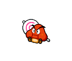
Developing Enemies 1
I’ve spent a lot of time creating new sprites for Spheroid Rage for their various states in combat as well as a variant of them that I have dubbed “Spheroid Sad” with their own list of unique sprites.
Spheroid Rage’s New Sprites:
Damaged-

Attack Prompts-

(Targeting White: left side, Targeting Black: right side)
I quite like these sprites as I feel that it’s made obvious what emotion/action each sprite is conveying while not being too complex. I especially like the expressiveness on the damaged sprite’s face and I also really like the theming of the outlines colours and shape, which is something that I initially did on a whim that’s now a detail that I want to make a key feature.
Spheroid Sad’s Idle and Sprites:
Idle-

Damaged-

Attack Prompts-

(Targeting White: left side, Targeting Black: right side)
I quite like the design of this variant as I feel that it’s actually very similar to the dynamic of Black and White, with it being a nearly polar opposite variant to it’s counterpart, which I want to try and make more of a core theme with the more enemies I create. The key thing I wanted to cement as more of an feature with this single enemy type is the theming of the outline’s colours and shape, with some enemies using it to fake the player out by using the wrong combination of colour and appearance, which I think I’ve been able to demonstrate really well here.
0 notes
Text
Different Scales of Pixel Art
While I found the best size for my character’s immediately I thought that it was a good idea to find out what they would’ve looked like in a few different sizes so that I could see if I had actually been working at the best scale for me and fortunately enough I feel that I nailed the sizing's off of the bat.


On the far left is the 8x8 version, next is the 16x16 rendition, then the original at 32x32 and finally at the far right is the 64x64 upscale. I actually think that all of these are fine on their own and I think that they’re all defined and recognisable regardless of the size. I still prefer the original versions, probably in part due to me working with them this entire time causing a bias, because I think that they’re the perfect mixture of properly defined and detailed. The 64x64 are a close second and I feel that the main issue I have with them is the hands and feet as well as the thought of how much extra would’ve been required for every sprite I’ve made. I feel that if I’d started with the 64x64 version to begin with then my bias most likely would’ve been more towards that take rather than my original 32x32. Finally I feel roughly the same about the 8x8 and 16x16 sprites, with a slight preference to the 8x8 versions because I like that they maintain that polar opposite design between the 2 characters better than the 16x16 ones. I do feel that I started with the ideal size from the very beginning, but in hindsight I feel that if I’d been working with the 64x64 measurements from the start I wouldn’t be in much of a different spot.
0 notes
Text
Project Proposal
https://docs.google.com/document/d/1ZaUjbWcrkjmT8G7Ve0i_lFrp_6PTJOy6Yt2UIbNy2FE/edit?usp=sharing
0 notes
Text
Battle Systems In RPGs
I wanted to use this post to take a look at some other RPG combat systems that have their own unique twists on the base of turn based combat and why I decided that the Mario and Luigi RPGs were the style that I wanted to replicate over so many other formats.
Persona 5:
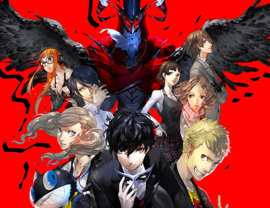
Persona 5′s combat system is at it’s core the usual system, there is the player’s team and the enemies and they take turns as they progress through the combat. What makes Persona 5′s combat unique however is the ability to completely remove an enemies turn from the rotation for one turn as well as then perform a follow up.

The way this works is very similar to the Pokémon series, every playable character and enemy have strengths and weaknesses to certain attributes. Some have resistances, completely block or even heal when being hit by some affinities, most to all have neutral affinity types that means they neither take massive damage or reduced damage when hit by them, while all have at least one affinity that does increased damage as well as knock them out for a turn, wherein they take more damage and the character that hit them gets another turn immediately to perform a follow up. Both the player and enemies can utilise this ability which makes for a very in depth combat system where the player needs to realise who has the ideal abilities for each combat encounter while also not putting team members in a bad spot where they can be more easily killed.
Aside from that unique spin on the base the game primarily focuses on the main playable character Joker who, with the ability of the wild card, is able to convince some enemies who are knocked down to join their side to then join his own roster of personas that he can freely switch when in battle, who all have their own move set as well as affinities. To counteract this freedom that he grants when it comes to what you’re able to pull off Joker has a crushing flaw wherein if he gets downed in battle the player instantly loses, even if there are other team members alive. This is what makes Joker the main character as he is also unable to be taken off of the team, which means that the player needs to make sure that he is always safe.
One final element that the game utilises is truly making the player’s team feel like a unified group of friends helping each other through the toughest times. During the sections of the game where the player is able to just walk around the real world they can choose to socalise with the various members of the Phantom Thieves and get to know them better. The more the player does this the more abilities those party members will gain to aid in battle, from being able to automatically recover teammates from status ailments such as being stunned or slept, to being able to take a hit that would’ve killed another party member that can sometimes save the battle. The game makes use of the non combat sections to strengthen the allies you gain along the way in believable ways.
When it comes to why I chose the M&L style of gameplay over this one is that this combat style just appeared way too daunting to try and replicate. I would need several affinities that each enemy and player character would use, on top of the various move sets and stats they would have seperate from that. I also just find M&L’s combat more engaging in general.
Cris Tales:

Cris Tales is in many ways a typical RPG, the player has a basic attack, a skill list, a party of characters to level up and the battles are turn based, but the key thing that the game uses to switch this up is the ability to control time.

In both the overworld and battle the player can invoke the power of two crystals, the Future Crystal and the Past Crystal. Using them can either age the enemy your fighting greatly or make them much younger, making them weaker and more fragile in the process. This by itself is already an interesting premise that shakes up the traditional RPG combat, but it’s when the game gets more experimental with this system that it becomes a real game changer. A good example is if the player is fighting a mechanical enemy such as a robot, or maybe someone in armour. If the player was to hit that enemy with a water attack and then used the Future Crystal, that enemy’s body/armour would rust and become much easier to defeat. Another example is that say an enemy spawns some extra enemies, if the player uses the Past Crystal then not only will those new enemies no longer be present, if the player defeats that enemy which spawned those extra enemies then goes back to the present, those new enemies will be permanently gone. It’s a super interesting system with a lot to play around with and is fully realised in so many ways.
Aside from the time element of the combat, the game also has some elements more similar to the M&L RPGs, with the ability to do more and take less damage with well pressed button inputs. This is a system that makes the combat more engaging for me as it means I need to be constantly paying attention in battle instead of just clicking one button every so often. This system sadly isn’t quite as realised as the original M&L games however and is actually closer to the style of the Paper Mario RPGs as there isn’t a way to completely dodge or even counter an attack in a clean, fluid motion, you just need to time a button press to a specific moment just before/as the character is hit.
That’s the main reason that I decided to go with M&L’s style of gameplay over this game, the game with it’s timing focus on combat was nearly there, but I felt that M&L’s combat is just more engrossing and enjoyable when it comes to timing attacks and dodges and with the elements of manipulating time I just couldn’t think of any new or unique methods of utilising it that hadn’t already been done by this game.
EarthBound:
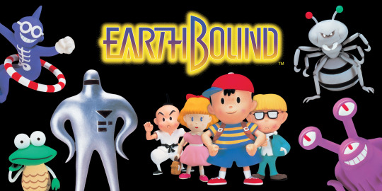
EarthBound is one of the most rudimentary RPGs, with the usual assortment of a player party, enemies in combat, a variety of abilities to use in combat and the classic turn based combat.

The main things that set this game apart and make it stand out are it’s greater focuses on a more free flowing world. Unlike many other games at the time enemies are not randomly encountered as the player walks around, instead they can be found all over the overworld and need to be walked into in order to fight. If the player walks into an enemy from behind they gain the benefit of a guaranteed first turn, but this also applies to enemies who can walk into the player from behind guarantying them the first strike. Another element of this combat engagement system is that as the player grows stronger weaker enemies that the player comes across actually get defeated on contact, completely skipping the battle phase.
Aside from that element of starting battles a cool feature of the actual combat is that when a player character gets hit they don’t instantly take the damage, instead the damage is gradually reduced from the HP bar in real time, with greater damage numbers or multiple attacks from enemies on a single character reducing that number quicker. This actually allows the player to save their characters from otherwise instant death if they are able to heal the injured party member before the HP ticks down to 0. It’s a really interesting element that I haven’t really seen anywhere else before.
The main reason for not using this combat style over M&L’s is that just like Persona 5 and Cris Tales before it I just don’t find this style of gameplay as investing, but I do find it’s element of HP reduction really cool and it is something I might try to implement if I have the time.
Slay the Spire:

Slay the Spire is a bit of a different style of RPG compared to the other games in this post, with it being a deck-building rougelike where the player must build up their roster of attacks, buffs and other various abilities.

Slay the Spire still has many of the traditional RPG elements that I’ve mentioned across this post and others, there’s a turn based battle system, a set of playable character’s with varying stats and attacks and a large roster of enemies the player needs to fight through. The main difference is the card system, with the cards the player collects in each level of the Spire dictating how the player fights, with multiple “builds” being able to be made with each new attempt at the Spire. The rougelike element means that no 2 attempts at the game are the same, with different enemies, cards and rooms being present in different combinations each time the player tries to climb the Spire.
This gameplay style is really interesting and I do find it very enticing, but when it came to deciding what style of combat I’d rather do this game wasn’t particularly high on the list due to just how many elements I would need to make. From all the various cards, the the playable character and the enemies, I just didn’t feel that it would be that investing and interesting to make.
0 notes
Text
1 and 2 Bit Games
In this post I wanted to focus on some smaller indie games that utilise the 1 or 2 Bit pixel art style and how they pulled it off.
Minit:


Minit is a small adventure game where every playthrough lasts for exactly 60 seconds. Once those 60 seconds up, the player character dies and they start all the way back home in their bed. Minit is a very good game when it comes to demonstrating the potential for 1 Bit style games as it takes its 2 colours and makes sure that every thing is always apparent despite the lack on deep detail. The art style does a phenomenal job at utilising the human brain’s ability to recognise patterns, which allows the game to get away with this art style in the first place. The use of “shading” on both the player character and objects in the world such as tables and chairs give the impression of those objects existing on those floors and just a few small lines on a black ground can give the impression of grass or waves. If humans didn’t have this skill to begin with then nothing that is shown in this game would be recognisable as it is. This game is a perfect demonstration of the 1 Bit art style done to a massive degree of success.
qomp:


qomp is a short game about the ball from Pong escaping. The game is controlled by a single button that when pressed changes the angle that the ball is moving in a similar fashion to Flappy Bird, but instead of needing to constantly press the button to keep the ball afloat the ball just changes it’s trajectory. The game is a pretty good demonstration of 2 Bit, with the many greys doing a perfect job at creating the various walls, hazards and other objects the player encounters along the way, while the red does a good job at emphasising moments such as the ball’s frustration and the hearts on the paddle. The game also utilises a kind of CRT screen that the objects at the sides of the screen which in turn allows for the sprites on display to look more unique and varied. It is an excellent demonstration of a 2 Bit art style.
Solid Aether:


Solid Aether is a 2D bullet hell where the player controls an empty black square blasting away full black squares that are shooting at you. It’s hard to tell if the game is 1 or 2 Bit due to it’s use of slight shading at moments, but that’s also because the game isn’t truly 2D as there seems to be a white background layer that the black shapes are in front of due to the shadows that exist on every single shape. This game is once more a very good demonstration of using an incredibly limited and simple colour palette and utilising it to massive success. It’s due to the game’s simplistic visuals that the style works so well and it’s really the stark opposite of Minit, with a white background with black shapes for detail against Minit’s black background and use of white for details. It’s a very good example for the 1/2 Bit style.
N++:


N++ is a fast-paced momentum-based platformer where the player must avoid hazards and enemies while collecting gold on their way to the end of each minimalistic level. This game is a bit of an outlier from the more traditional 2 Bit games, and is in reality closer to 3 Bit than 2 Bit, but this is because there are only ever at most 3 colours making up each level, with different shades of those colours being used for whatever fits best. Sometimes the levels are all a similar shade, but sometimes they are the complete opposite side of the spectrum. The hazards and gold are always the same colours and the players colour is also something that stands out against the level and it’s background. It’s an very interesting take on the standard 2 Bit art style, one that I find very fascinating, and I think that it’s an incredible example of how to twist such a basic art style in a very unique way.
0 notes
Text
RPG Mechanics
There are a lot of RPGs (Role Playing Games) in the world, with many of the most notable examples all featuring the same basis, that being every action is performed on a turn based format, with what is effectively an conveyer belt making each battle flow along. Another core element is the idea of levelling up, with the character’s the player controls gaining experience in battles or other means which allows them to become stronger in different ways. There’s also usually some kind of item/equipment system where there are many different kinds of healing/support items or pieces of gear such as armour or weapons that the player can purchase to aid them in battle. So many games have this base and I want to use this post to show the differences between different franchises to show what makes every series unique.
Final Fantasy:

Final Fantasy was in many ways the first of it’s kind. It laid the groundworks for so many subsequent RPGs across the gaming industry, with those core mechanics I mentioned debuting in this franchises very first game. It’s very much the core of the RPG genre and the way it’s own series has evolved also the decades has also reflected on the genre as a whole, with the progression from 2D pixel art to 3D models, to the greater emphasis on story and characters, even the addition of different types of RPG such as ARPGs (Action Role Playing Games) and voice acting have made Final Fantasy the real heart of the genre.
Octopath Traveler:

Octopath Traveler is one that has many of it’s roots dug straight into Final Fantasy, even being made by the same developers of Square Enix, but it made it’s mark by having the core story actually being split into 8 pieces, with the 8 playable characters all having their own reasons for venturing out into the world as they come together to form an unexpected group. They all have unique abilities and actually feature a kind of good v evil approach to them, with each approach to interacting with others can be done in a more clean manner but maybe slower or at the cost of something while on the other hand the could be a dirtier way to perform an action that’s quicker but could lead to the character being in trouble. An perfect example of this being the option to either cleanly trade with someone at the cost of some money or to illegally pickpocket them with the risk of getting caught and having to pay the price. It really does evolve those core mechanics found in Final Fantasy.
Pokémon:

Once again Pokémon is a franchise that features many of the core ideas found in other RPG games such as the turn based combat, the levelling of characters and the items to help in battle, but it’s unique turn on the system is by having the player go out and catch their team members for combat. The various Pokémon that can be found all over the world can all be caught, trained and used to battle which creates a new angle to RPGs that hadn’t existed before. It truly is one of the most unique takes on that core formula.
CrossCode:

CrossCode is the most different game I’ve mentioned so far as it is a very different game right down to it’s fundamental core. It’s theme is that of a single player MMORPG (Massive Multiplayer Online Role Playing Game) where the player character is stuck inside the game due to an incident in real life that forced them to be stuck in there. It’s already more self aware and toys with the idea of being self aware that it is a game than the previous examples that fully embrace the idea of those unique worlds being the only thing that exist to the characters, but aside from that it’s gameplay is more in the vain of an ARPG (Action Role Playing Game) with a combat system where the player is constantly able to move around and play how they want to. There are still those regular RPG systems however, with the levelling of characters and purchasable items and gear which are themselves referenced by the game as a core theme due to the world being set inside an in universe game. It takes all those well known mechanics and roots it in universe as elements of the game instead of the actual world, which is an massive spin of those base themes present in so many other RPGs.
Stardew Valley:

Stardew Valley is, similarly to CrossCode, less of a core RPG and is more of a sandbox game with RPG elements. The theme of the game is that you the player have grown tired of the mundane and oppressive city life and have taken ownership of your Grandfather’s farm that he left you in his will. The main game is just maintaining and evolving your farm over the years while getting to know the inhabitants of the town while enjoying life. That’s pretty much it when it comes to the core of the gameplay, but there are also many RPG elements thrown in there as well, with an entire cave area filled with various ores and enemies that can be defeated for money and loot, albeit in a form of gameplay more akin to CrossCode and less so to Final Fantasy, there’s a shop system where you can buy upgrades for yourself, your farm and the various seeds you need to actually create the farm with the money you make via the cave, the plants you grow and any other resources you come across, as well as a levelling system that will go up as you exercise the various skills you’ll need to use to maintain your farm which will allow you to become even better keeping your farm going. It really take those core aspects of those aforementioned RPGs and finely sprinkles them into a massively different genre of game to massive success.
Undertale:

Undertale is a of an oddity when it comes to the RPG genre, it has all of those core elements that I’ve been mentioning throughout this post with the battle system, the levelling of the player character and the various items and gear you can buy to help you in battle, but in reality the story is the main focus of Undertale. The RPG mechanics are in reality more of a tool that help strengthen the story and it’s many moving pieces rather than being the main reason you play the game. The levelling system in itself is a core element of the story which all of the characters are aware of and what it means. The main gameplay idea of Undertale is that every fight the player encounters can either be resolved peacefully with no one ever dying or can be resolved violently, with every enemy being killed. It is one of the most unique takes on the RPG genre that I have ever seen and is honestly one of the most unique games in existence.
0 notes
Text
1 and 2 Bit Pixel Art
The general style that I have been working with for my playable characters is called 1/2 bit pixel art. The idea behind these styles is very simple and kind of self explanatory, 1 bit is when you restrict yourself to using a single colour to create your pixel art, with an example being using white on a black background to make simple yet recognisable figures. This is generally used for sprites of animals and characters over backgrounds and levels, but it still can be used for those. 2 bit on the other hand is when you use 2, usually more defined colours, that you then use various shades of. This was a major style in the earlier years of game design when systems were a lot more simple and could only use a small colour palette. Here are some examples:
1 Bit:

Source: Saultoons - https://twitter.com/saultoons/status/1397202908215758859

Source: Brandon James Greer - https://www.youtube.com/watch?v=0BZwEoj50uw

Source: Kadabura - https://twitter.com/kadaburadraws/status/1110625520386035713?s=12

Source: Pedro Medieros/Saint11 - https://saint11.org/blog/pixel-art-tutorials/
2 Bit:

Source: zch - https://pixeljoint.com/pixelart/89352.htm

Source: angrysnail - https://www.instagram.com/p/B99WJJ4HCXb/?igshid=1di0swh74hjhw

Source: Crescent Moon Games - https://www.crescentmoongames.com/

Source: pixelgrm - https://www.deviantart.com/pixelgrm/art/Only-for-you-pixel-animation-gif-825327076
0 notes
Video
tumblr
Testing potential damage effects in Unreal
As I was creating my attacking sprites I started thinking about the damaged sprites. I have already made some damaged sprites for my player characters with the intention of adding effects to them such as blinking red and shaking for additional impact. I realised that I didn't know how any of that would look in engine so I decided to test out with some help what it could look like.
Above is a video of this working, it looks fine but maybe not as crisp as it would look if I did it in Aseprite but I can reuse this code for all my sprites and this would save me a lot of work. I’m still not sure if I will go ahead with it but I can always just see how it looks when I get to it and decided then.
Below is the code being used to create this effect. All it is doing is setting the sprite colours to red and back to default as well as making it shake by randomising its X and Y location by a small amount.

0 notes
Text
Designing Enemies 1
I’ve been spending a lot of time trying to figure out how to make my very first enemy and I have finally reached a point where I have an enemy design that I am content with.
Enemy 1 (a.k.a Spheroid Rage):

It’s taken me nearly 2 full weeks of brainstorming to come up with this one single character and I honestly have to say that I am still incredibly proud of this character despite how simple they are and I think it’s partly because I’ve also been able to create a full idle animation for them that looks really good:

Once again it’s really simple, but it’s clean and looks well animated. It has it’s issues but I feel that they are more inconsistencies than problems. I am really happy with this first enemy and I’m hoping it will allow me to continue on with having an easier time designing my future enemies.
One of the reasons that this first enemy in particular took me such a long time was because I had some predetermined rules I had set myself for what I wanted to include in my enemy designs. The first rule was that I was to use an actual colour palette for the enemies for two reasons: 1. I thought it would be a great contrast to White and Black in both theming and gameplay and 2. I wanted to branch out more with the detail I could apply to my characters as I’m simply not going to get better at it if I don’t practice. The second rule is that I wanted more unique core designs for the enemies. This is a rule that, unfortunately, I’ve had to mostly give up on as it was actually heavily restricting the larger scale of ideas I could’ve had for my enemy designs. I’m still trying to exercise this rule as similarly to the colour palette I believe that it’ll help the contrast between player characters and enemies, but I’m definitely going to be more lax with how hard I enforce this rule upon myself. Partly because of this rule I decided to actually go back to my source material and effectively copy my process for creating White and Black, by viewing some of the original enemies from that game that I could use for inspiration and the enemy that had stuck with me for most of this project as a key design I could use was the starting enemy for Mario and Luigi: The Goombule.

0 notes
Text
Making UI Elements 1
I’ve now made a list of stylised numbers for White and Black that will be used to display various pieces of information during combat, such as the character’s health and damage done, and possibly menus depending on what I add in the future.
White:

Black:

Just like with the core characters I wanted there to be a clear division between the styles of their numbers and while the colouring of the numbers was already a simple way to do that I wanted to go further with it which is why each characters numbers also look so different at their cores. White is a character that’s more notably curved and round, with parts of the body that are different sizes that don’t match up perfectly, so to me it made perfect sense for the numbers to be a variety of different dimensions and look like more traditional numbers. On the other hand Black is a very symmetrical character in many senses and has precise sizes for their body parts, not to mention that they’re way more cuboid with sharp corners and quadrilaterals making up every aspect of their body, so making the numbers a lot more clean and making sure they comply to the same dimensions was just the most logical choice. I really do think that this is a perfect start for the character’s unique UI elements and I’m really happy I was able to hit the ground running in the section of my project, especially after completely being entirely stuck on making any enemies.
0 notes