I'm a VIU graphic design student. I'll be posting updates on assignments and projects!
Don't wanna be here? Send us removal request.
Statistics
We looked inside some of the posts by jadaleedesign and here's what we found interesting.
Average Info
Notes Per Post
1
Likes Per Post
1
Reblog Per Post
0
Reply Per Post
0
Time Between Posts
9 days
Number of Posts By Type
Text
17
Last Seen Tumblr Blogs


Fun Fact
70% of Tumblr users say the Dashboard is their favorite place to spend time online.
Text
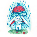
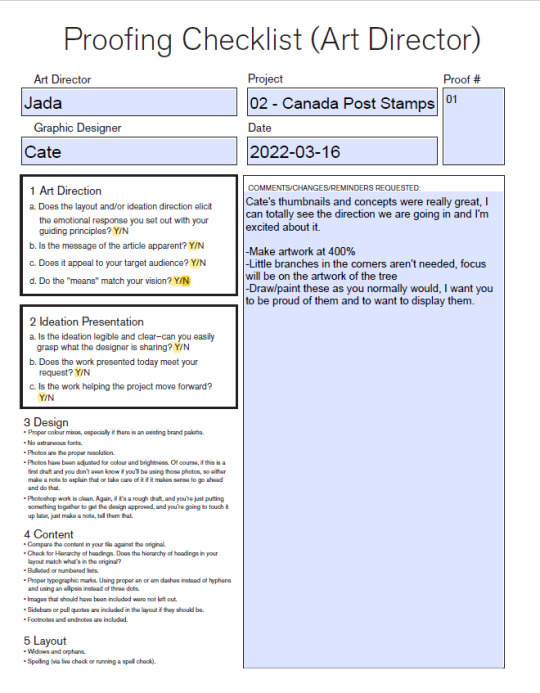
Post 11 - Proof 3
Almost there, I can't wait to see these finished.


I let Cate borrow my watercolour pencils this week so she can add variation and shading/highlights to her paintings. It's going to look really great. I'm going to suggest something different with the title, I'm still thinking about it but I think the title can be bigger, and take up 2 lines instead of one. I'll communicate this to Cate later today once I look at it some more.
0 notes
Text
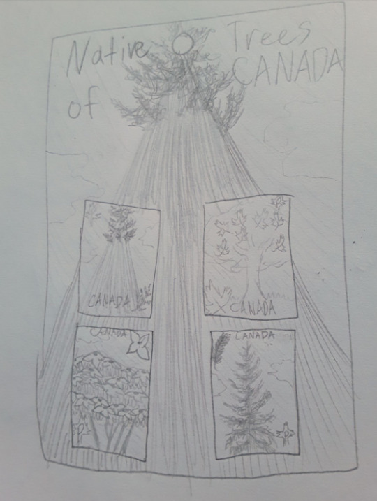
Blog Post 10 - Proof 2


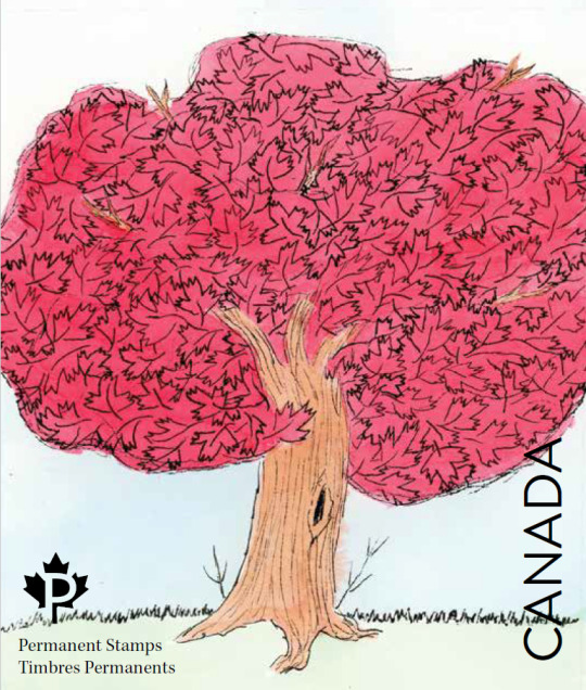

Here are 3 of Cate's Stamp designs as of this morning, we already went over removing the extra text on them. I love Cate's illustrations, there is a 4th one she showed me of a dogwood tree, the paint was just drying so she didn't get a scan of it yet! Cate is going to finish up her artwork by saturating some of the colours (the blue sky in some parts didn't show up when it meant to) and small photoshop tweaks. Cate also wants to make a new design for the cover of the booklet and I told her she can go for it if she has enough time! Don't want to overwhelm by popping in a new design but it does seem like a great idea!
0 notes
Text
Post - 9 - Proof 01
For next week I've got Cate testing out her scanner and helping her see what size she should work in with her traditional mediums. I'd like to see some more refined sketches for next week's proof 2
0 notes
Text
Post 8 - Brief for project 2
For project 2, I'm directing Cate. Cate loves nature and trees, so I thought it would be perfect to have her draw some beautiful Canadian native trees for our Canada Post stamp project. I'm having her illustrate using traditional mediums. I want them to look like we pulled the drawings out of her own sketchbook or art book.

0 notes
Text
Post 7 Proof 3
Jordyn finishes her pages for Offscreen magazine!


Credits:
AD - Jada (Me)
Designer - Jordyn
Illustration - Jordyn
Photos (Unsplash) - Amy Treasure, Scott Broome, Logan Fisher. (Photos edited by Jordyn)
0 notes
Text
Post4 - Proof 1
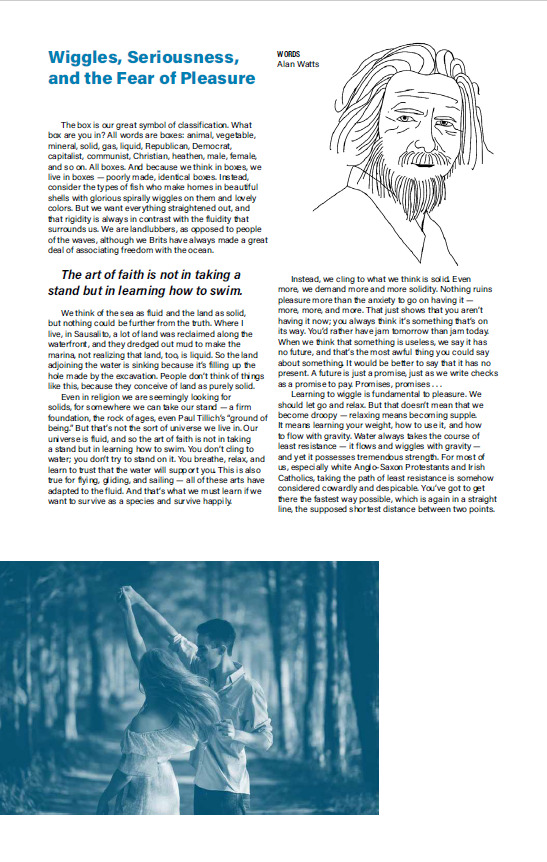
Jordyn did a really great job making this article fit into Offscreen magazine. I didn't have much to say for tweaking, I feel like she did a great job with the brief I provided, and the text looks really nice- no rivers or orphans. I love her image choice and line drawing, it all feels appropriate for the magazine and goes well with examples of previous issues of the magazine. For the all-blue page, we discussed making a linework illustration going down the side in white, as well as adding another pull quote (A sentence that pops out to her) to make the page feel purposeful instead of just blue. I think we lucked out this round as the Wiggles article feels like a perfect article to put in Offscreen.
Here's her work:


0 notes
Text
Post #4 - GD Assignment
My art director this time is Carson. My assignment is to create spreads for the OWL Magazine. My objective is to utilize illustration and make the article be enticing for kids 9-13 by using illustration and vibrant colours.
Here are some examples of OWL spreads for me to look at and get inspired by:


0 notes


Text
Post #2 : Folder Structure.
Here's a screenshot of the folders I decided to create:

I can always add or take away the folders as I need or don't need them. I also decided to make a folder for my screenshots for my blog posts.
0 notes
Text
What is an art director?
The definition of "Art director" seems to differ depending on the person. I would describe the role of an art director as someone who oversees the artistic process and overall look of a design/project. They will also provide guidance to the designers/the team about the look, feel, colors, and aesthetics of a design/project. They have to know exactly what they want the outcome to be and feel like and then guide the team towards that goal.


I couldn't figure out how to screen-grab a whole page on my PC, so here's multiple screenshots from top to bottom of the webpage. I was clicking through the Sephora website where the Benefit Browbar ad caught my eye, maybe because of it's pink-ness.
I'll say 3 guiding word principles for the art direction of this webage... would be: Bubbly, Feminine, and Simple. If I could add more I'd say cute and cheerful. While I'm not personally interested in these services at the moment, I still find this page appealing. It reminds me of Barbie.com when I was young but also in a grown-up way. The page is nice and easy to navigate and is short, sweet, and to the point. It makes it easy to know the prices of each service.
1 note
·
View note
Text
Post 14 - All done!
Hoorah!
Here's my final work for Baby Teeth:


These honestly came out better than I thought they would. I really like the look of them.
0 notes
Text
Post 13
I did a crap ton of revising and re-thinking about my package today. I felt like I was constraining myself too much by sticking to a basic box shape, and by trying to fit this baby head in there. My friends pointed out to me that the B’s in my logo resemble eyes, so I think the logo itself is enough to suggest it’s a face without having the baby drawing behind it. Trying to fit it in places was too annoying.
And then I decided to trace and measure out my toothpaste tube on paper and design a whole new box shape for this project. I think the cut-out idea was really fun but it was getting extremely tedious, and I think I can show a funky “out of the norm” package just from the shape alone.
Here’s my drafts, before and after I decided to change the shape:

And here’s my finished results (before photoshoot)


0 notes
Text
Post 12
Here is a proof of my “baby banana” flavour:


I think a critique tomorrow will be very helpful for me, as I am at a point where I feel like I need some insight.
This time I took a different toothpaste package (pro-namel) and used those dimensions since I liked the wider box. However I still need to adjust the measurements so that the tube can lie flat if I want this cut-out thing to work. Maybe it doesn’t even have to? We’ll see what people say. I also might turn the single banana illustration into a patterned background.
My three flavours will be: Baby Banana (0-2 years old), Shiny Strawberry (3-6), and Minty Morning (7 and up) so each box would get its own background pattern, and the baby will have different features. For Baby Banana the baby has a bow, for Strawberry they’ll have a different feature, and same for mint.
0 notes
Text
Post # 11 - More design exploration and first prototypes
Like our professor Nancy suggested to us, we should try to aim to design a package that stands out from the rest of its kind on shelf. For my children’s toothpaste brand I want to experiment with cut-outs on the box since I noticed that no others on the shelves seem to experiment with different-looking boxes.

Here are more thumbnails and sketches I made:


Here is a prototype I made:


I used my Sensodyne toothpaste box and tube as a reference since that’s all I had on hand. I think I want to make my next box a little bit wider so the tube can sit flat in it instead of on an angle.
I want the teeth of the cartoon baby to be cut-out to reveal the word “teeth” on the tube.
I decided last minute to make my design horizontal as opposed to vertical, because the illustration and logo don’t have to be squished if they are this way.
For next week I’ll make another prototype, and be well into the digital process
0 notes
Text
Post #10 - Starting Project 2
For project 2, I decided that I will make my own toothpaste brand, catered towards children and safe for babies. I've settled on the name "Baby Teeth"
Examples of a package design in my genre:


-What does the packaging tell you about the brand?
-I think these packages tell me that the brands care about the health of the little kids who will use this toothpaste. They aren't trying to look like a complex medicine/medicinal like most toothpastes, and they're not trying to be cheap looking like most children's toothpastes- like ones with Elsa or Hot Wheels plastered on them. It feels like they put a lot of care and attention for the parents choosing the right product for their kids. I like how it is very clear on each package what the flavour is, and what age the toothpaste is intended for. The adorable illustration I feel appeals as much to the adult parent as it does to the kids using it- maybe even more.
-Determine your additional objectives for your package
-My additional objectives, since I'm making my own brand, would be to create the branding myself, logo, colors, etc. I also want to try and find a way to make/decorate a toothpaste tube.
-What will you do? If you are designing something new, why are you tackling this product?
-At first I was in a whirlwind trying to decide what I wanted to do. I went back and forth between coffee mate creamer, crispy minis, snacks, and others. Then I realized that I wanted to do illustration for this product since that's what I like to do. So I thought of kids products, snack bars, gummies, etc. Then I thought about toothpaste and how ugly most kids' toothpaste is. That's what struck me and made me want to create my own brand of kids/baby toothpaste. I want to create something cute, or pretty, yet safe and informative for kids and their parents.
-Post some loose, quantity-driven thumbnails:
First: my Mood board:

Next, VERY sketchy thumbnails:


So far I think I’m going with the big logo on the 4th page, where the word “teeth” is moulded into the shape of teeth and the bubble letters on top. I’m going to continue to play with package concepts for the boxes.
0 notes
Text
Post 8 + 9 - Final packages!


Above are my photos of my final prototype before class on Tuesday.


And here we have my before and after photos that I took in class using the lightboxes our Prof Nancy set up. I used photoshop to edit out a couple scratches I accidentally put on my boxes, and to make the background all white to make it look like a real product photo!
I had so much fun with my project and I'm really looking forward to the next one!
Here is my updated rationale:
"My first idea for these was to make a tin or a reusable package for my markers, but I quickly realized that I wouldn’t really be able to DESIGN much for it besides a label. So I decided to give the Copic Ciao box a new shape, something a bit more compact and it can be made out of recycled paper or sustainable materials! My initial idea was to make a reusable package, and yes you should be able to if you are gentle with your boxes (this is what I do for my markers anyways), but then I realized that many people would put their markers in a pencil case or their own container. This is what made me realize that I should just try my best to make an appealing little box that looks pretty on the shelf and draws attention. I really enjoyed making the marker illustrations, and playing with the colors. I am overall really happy with the result!"
0 notes
Text
Post # 7
Here is my continuation of experimenting with my designs.
Since I was ill and not able to attend class last week, I didn't receive much input, except for one person who thought I should center/align the markers and pen tips on the side


I've made some improvements on the box's shape, especially with the folding tabs. I also added a hang-tab so the box may be hung up. I re-arranged some of the contents as well, and decided to keep the diamond shape on all of the packets for now. The colors used on the digital version are the official hex codes for the Copic marker colors.
0 notes