
jadeamann-art
Jades Art
Hi everyone! This is where I will be posting all my creative processes and work from College! I hope you enjoy everything! I’m studying - Art and Design lvl 3 ED and I’m in my second year!
39 posts
Don't wanna be here? Send us removal request.
Last Seen Blogs

jo-bsebastian
Jo-B Sebastian

deathrowline
DEATHROW!!

whobie
Untitled

derilaoreilleravis
Derila Oreiller Avis France 2022- Pharmacie Prix, Arnaque or Ach

kamandoshi
Fashion•Fitness•Lifestyle
Text
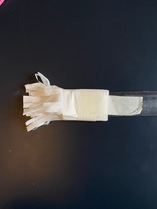
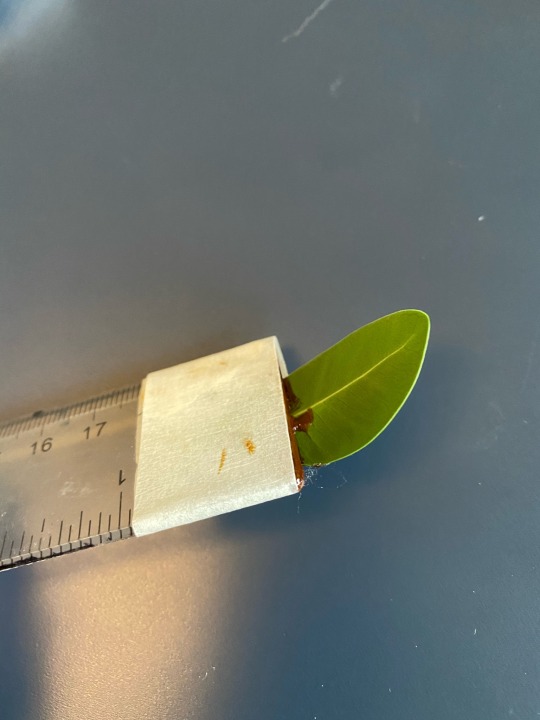
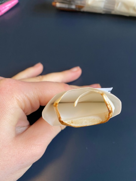
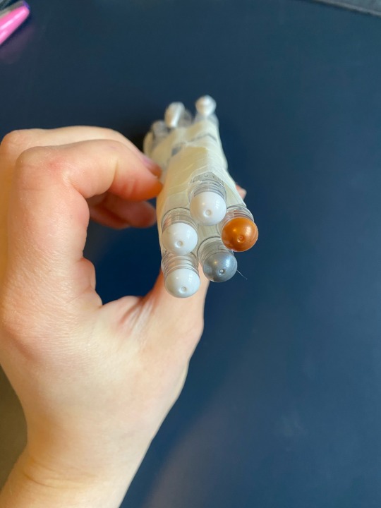
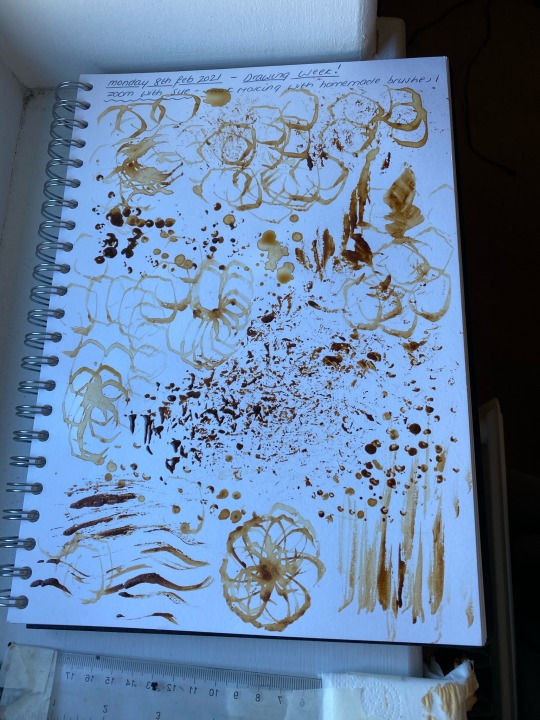
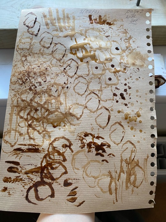
Really fun and creative drawing zoom with sue today for college!
I made my own brushes using a leaf, ruler, paper tissue, pens and masking tape to create different marks on my pages!
These are the 2 pages I made, a bit messy but super fun and I used coffee for my medium! I had 1 pot which was watered down and another which was a thick paste.
@strodetextiles
@strodefad
1 note
·
View note
Text
Art history 19/01/21
Guernica - Pablo Picasso, 1937
Guernica is a powerful oil painting created by Picasso in 1937 in response to the Nazis bombing the Spanish town, Guernica, during the Spanish civil war. This painting showcases the tragedies of war and the suffering it inflicts upon those on either side, especially innocent civilians. This painting is regarded as one of Picasso’s most monumental and famous paintings, regarded by many art critics as the most moving and powerful anti-war painting in history.
Picasso read about the bombing in a newspaper article which may be why he has included torn newsprint across the piece. However, the newsprint may also be representing the moment in which Picasso learnt about the attack and his initial response and emotions that he felt during that time. Also the attack was made publicly known due to a catholic man who was present during the attack, taking his story to a journalist where it was then published and printed for the world to see. The fact that the painting is also black and white may be visually symbolising the statement of putting something in ‘black and white’ In order to get straight to the point and bluntly stating the truth as well as aesthetically matching the newsprint which was black and white as well. As this is an anti-war statement Picasso wanted the message to be abundantly clear to all who viewed it therefore removing all colour from the piece also removes all distractions and creates a wholesome aesthetic. I personally think colour would have made this piece less impactful, the fact that it’s in black and white makes this artwork more powerful as it’s leaves everything to your own interpretation and imagination. Also black and white traditionally symbolise light and darkness, darkness may represent the violence and tragedies of war and white may represent the peace and harmony that is yet to come.
Picasso used oil paints that had the minimum amount of gloss in them, in order to create a matte finish which created an austere and simplistic tone to the piece. I think his use of black and white really makes this painting stand out from his other works as he normally uses bright and intense colours that create powerful and vivid images.
In the painting there is what appears to be a light at the top shining down over the chaos which may also be interpreted as an eye or the sun. Some people interpreted this as god watching over the chaos and destruction trying to shine light amongst the darkness bringing hope to those who were impacted by the war and attack. Others believed it to be representing the evolution of technology and how technological advancements are what led to the Spanish nationalists and Germans wanting to experiment with their new bombs and other technologies leading to the bombing on Guernica.
My interpretation is that the light symbolises how the truth of what happened in Guernica is now being shared through Picasso’s visual representation and in the media and it also symbolises hope to the victims in the painting that peace will come. There is also a man being trampled on by a horse while holding a broken sword at the bottom of the painting. I believe that the man represents the chaos and fear that the civilians felt during the attack and the broken sword symbolises their broken hope as they couldn’t fight or defend themselves. There is also a screaming dove in between the bull and the horse which may be symbolising the threatening of piece and loss of purity due to the Spanish nationalists giving the go ahead to attack Guernica, which was a Spanish town. The bull may also be symbolising the violence and rage that comes with war as they are associated to being aggressive and powerful animals whereas the horse may be representing the suffering of the people and the losses they had to endure.
Although this painting was created in response to the attack on Guernica, it is not a narrative painting of what happened, Its a symbolic painting which depicts not only the attack but also the loss and tragedies of war. It is a constant reminiscence between the battle of darkness and brutality against reason and peace and visually depicts the suffering induced by war. Therefore through my analysis of this painting, through its detailed composition and symbolisms I think that Picasso’s intention was to provoke a realisation of the tragedies of war and a feeling of shock and fear which would start a conversation about not only Guernica but all wars and the things that happen during war that we don’t see or hear about as well as the confrontation, losses and violence that happens to those who may not intend to be involved. I think this painting was intended to be shocking due to its brutal and realistic details. Picasso created it as an anti-war statement which I think was in hope of preventing people from condoning violence or future wars, hopefully provoking a sense of shock and realisation.
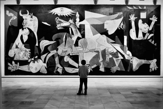
Photo from: https://www.google.co.uk/amp/s/blog.artsper.com/en/a-closer-look/artwork-analysis-guernica-by-picasso/amp/
I used information from my notes from my previous art history lessons as well as from these sites.
https://www.google.co.uk/amp/s/theculturetrip.com/europe/spain/articles/pablo-picassos-guernica-a-symbol-against-war/%3famp=1
https://www.google.co.uk/amp/s/smartartbox.com/apps/fireamp/blogs/smart-art-blog/understanding-picasso-a-look-into-guernica
1 note
·
View note
Text
Art history 12/01/21
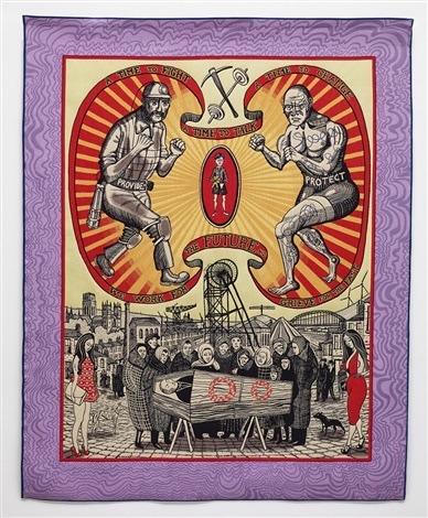
The death of a working hero - Grayson Perry, 2016
In this piece by Perry he has presented a response to the personal stories of a working class man. Made in the form of a tapestry but presented as a banner, this artwork is very large in scale as traditionally tapestry’s were made to be substantial in size as they were created to decorate large spaces such as mansions, castles or churches. Perry’s choice of producing a tapestry may be representing the importance of facing the problem on male stereotypes through its scale. Perry has a personal insight to understanding the pressures of male stereotypes, what people expect from men and what that pressure can create. His creation of Claire ( his alter ego ) was established at a young age partially due and in response to having an aggressive step father.
Before creating the tapestry Perry met with former mine workers and cage fighters of Durham who he describes as ‘ hard working men ‘. The banner portrays the different versions of masculinity that he encountered during the making process of this piece. There was a contrast between the need to be tough and the vulnerability that he witnessed while meeting these men who the work is based on. This goes to show how men are influenced and impacted by others and how they can sometimes act upon their own perceptions of what others may or may not be thinking. The persona of acting ‘tough‘ may or may not be genuine depending on the person. Peoples experiences, upbringing, culture, personality, friends and family are all factors that ‘build‘ a man or women however if it was genuine then why do men feel the need to act this way? and if it wasn’t then why fake it? Maybe because they worry of how people view them or what people will think or it’s because they worry how they might view themselves upon self reflection? I’m unsure.
The words on the banner read “A time to fight”, “a time to change” and “a time to talk”. These words are sorrowful and contemporary and represent the problems of male identity, igniting a conversation of what we all should fight for, a better future and equality for all.
In the middle of the tapestry, surrounded by the sadness, chaos and loss there is a little boy holding a teddy bear. After the mines closed and men were no longer able to provide for their families, some of the Durham miners sadly took their own lives. Perry met a women while in Durham whose son committed suicide, this banner was also inspired by her and her loss. The woman’s son, like many others, was not encouraged to be sensitive or acknowledge what he was feeling. For Perry, masculinity is a skin or a barrier for men that shields them from the hardships and pressures of modern life.
Perry’s use of bold, radiant colours makes this tapestry stand out, the pale and muted yellow tones are cohesive next to the red and orange tones in the top centre. The bottom half being the most intricate and detailed is interestingly black and white other then a few touches of red. This intrigues me as this area is the most detailed but I suppose due to its lack of colouring, it’s the least significant despite its intricacy.
The colour red for me dominates the whole piece as it’s such a vibrant and deep colour. Historically red is associated with sacrifice, danger and courage as it is the colour of blood, however it can also be associated to passion and love in more modern pieces. At the top of the tapestry there are 2 men fighting, one depicts a miner with the word ‘provide’ on his belt and the other being a cage fighter with ‘protect’ on his belt with a small boy between them holding a teddy bear. I think that these two men are symbolising the different kinds of working class men in our society and how men are treated differently depending on their appearance, income and status. Both men are fighting for different things but if you take away the tough exteriors inside they are fighting for the same thing. Male identity is affecting men physically and mentally, in the way of how men view themselves and how others view men, especially women or their families as traditions also have a big part to play in stereotypes and male identity.
There are two women in the bottom corners of the tapestry, either side of an open coffin with a man inside, surrounded by people mourning. They are dressed in vibrant red dresses which makes them very distinct and dominating. As they are wearing red they may be symbolising the pressure that men feel from women or their families to provide and have a good income. Red traditionally symbolises sacrifice, anger and courage so the red may be symbolising how the women are feeling, anger at the loss of a loved one and courage to move forward, or it could be symbolising the sacrifice the deceased man has made for them.
Some women still believe in traditional and outdated stereotypes that men protect and provide for the family while the women stay home, clean, cook and look after the children. Even though society is modernising and becoming more acceptable for women we are still a long way off and men are also victims to inequality and pressures of life as well. I personally do not think that it is a mans soul purpose to provide and protect, women can also have this role. I believe a relationship should be equal between 2 partners. That’s why I think they are wearing red, as women need to change their views and perceptions as the opposing sex and support men in their journey to create a new society for themselves where they can act and express themselves in any way they feel happiest.
Perry’s tapestry to me symbolises how much pressure men are under and it showcases the result of these pressures in a sad but true representation. Due to stereotypes like ‘a real man doesn’t cry’ ‘bring back manly men’ ‘men are the providers and protectors’ plus many more, mental health issues are becoming more apparent and something needs to be done in order to help men not be ashamed of themselves or their identities. This piece also portrays the conflict and anger that comes between people due to their different opinions, views and actions.
The intricate detailing and bold symbolism all in all make this tapestry an intriguing and impressive piece of art. The symbolism within the beauty of this piece showcases an important message. As a women I will never understand how it feels to be a man so analysing this artwork and doing research into such an important subject matter helps me to understand the pressures that men have and go through so this was such an eye opening piece for me to examine and analyse. I personally love Perry’s artwork, it’s so controversial and intriguing so this was great to analyse but sad as it represents and showcases such loss and anger.
I used my notes from my art history class 12/01/21 message #5 - masculine identity: to help me write this piece as well as these sites:
https://www.apollo-magazine.com/art-diary/grayson-perry-most-popular-art-exhibition-ever-serpentine/?map=active
https://weareuncollective.weebly.com/pint-pieces/grayson-perry-a-different-side-to-masculinity
Photo from http://www.artnet.com/artists/grayson-perry/death-of-a-working-hero-a-8nhBR5Q3PMInJPfgTxisCA2
0 notes
Text
Art history 15/12/20
Pauline bunny 1997 Sarah Lucas
Lucas’s work focuses upon the female form, she uses lewd terms to describe genitalia and sexual intercourse as well within her pieces. In this particular piece the form is presented in a chair, loosely and has no identity, tights encase the fabric and she has dressed the legs in stockings. The figure cannot move or stand, its limp and relies on others to be moved which is more for someone’s enjoyment as it isn’t independent or strong.
There are no characteristics or personality in the form either, making it a bit disregarded, it’s just an object whereas if it symbolised or represented someone in particular maybe it would be more respected? The stockings are a delicate and weak garment, easily torn or ripped which could be representing the stereotypes of women being those qualities, weak, reliant upon a man etc. Stockings are also a sexualised item of clothing so this form could be representing how some people view women as objects, items of pleasure or needs, hence its inability to move and it’s provocative clothing.
I think this piece is very successful in making people talk or think, it encourages people to have that conversation about inequality and people’s stereotypes of women and how women are viewed and treated unfairly. It’s purposely provocative and uncomfortable in order to challenge opinions and start a conversation.
This form represents people’s ( mainly men’s I assume ) negative and stereotypical views on women, the thoughts and actions that shouldn’t be thought however not all people or men think or regard women in this way, this work of art isn’t directed to everybody just the people who view women unfairly, as objects, sex symbols and more.
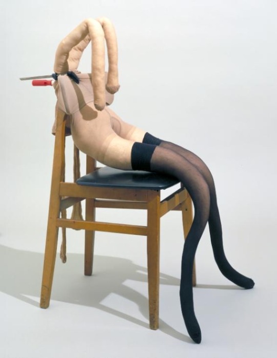
Photo from -> https://www.tate.org.uk/art/artworks/lucas-pauline-bunny-t07437
https://www.tate.org.uk/art/artworks/lucas-pauline-bunny-t07437
0 notes
Text
Art history 8/12/20
Banksy - commenting on society
English graffiti artist Banksy has become one of the world's most recognized artists while remaining relatively anonymous. Staying true to Street Art, he's built a celebrated body of work, both permanent and impermanent that utilizes satire, subversion, dark humor, and irony to create resonant social, political, and humanist messages. His style is a signature stencil aesthetic that has elevated him from man with a spray can to a highly creative artist known worldwide.
His artistry lies in his ability to use humour, mordacious and satirical perspectives and motives in his art in order to trick viewers into contemplating the underlying seriousness of his messages. Most of Banksy’s work confronts serious issues and problems surrounding capitalism, advertising, politics and humanity as a whole. It is this very sense of innocent fanciful and mischievousness contrasting with daring and morbid truths that make Banksy such a controversial and interesting artist.
Banksy remaining anonymous almost removes the status of artist and forces all the focus upon his art primarily which is the overall goal for him as his messages are so important while his work beautiful and iconic. However in doing this more questions are raised about the identity of Banksy.
Another important point is graffiti is illegal and Banksy's work continues to raise questions in the social sphere about the lines between public art and vandalism. I personally think and believe graffiti is art and not vandalism but that is my personal opinion.
However, If his work on the side of a building becomes a collectible, protected piece while another less known street artist is jailed for performing a similar action, what does this signify about the hypocrisy afforded to fame and equality in our society? Why can one be jailed and one be credited for pursuing the same dreams and actions?
I personally really love Banksy’s work, I think it’s beautiful to look at and the underlying messages are very important and powerful, to the point we’re they need to be addressed and spoken about more and Banksy is doing just that. Creating a conversation.
A personal favourite piece of mine by Banksy is Rage, the Flower Thrower 2005. This piece features a man wearing traditional riot gear, a bandana obscuring his face, his cap on back to front and dressed all in black. His stance is one of a person violently throwing something, he’s taking aim and is ready to throw his weapon. However, instead of a weapon, he holds a bunch of coloured flowers. By substituting a weapon with a bunch of coloured flowers (which contrasts to the rest of artwork which is only painted in black) Banksy is advocating peace instead of war, and he chose to put this message of peace in an area known for its high conflict. The work also carries the message that peace comes with active hard work. The bouquet of flowers in this work, in addition to symbolizing peace and life, may also be understood as commemorating or symbolising that peace requires hard work, much as growing flowers does. It is a brilliant example of Banksy's use of art to showcase messages of social importance, I really love this peace.
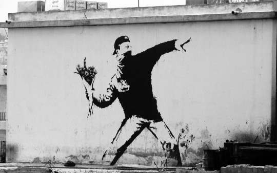
https://pin.it/1mle7ZW <- photo from.
https://www.guyhepner.com/banksy-art-as-a-political-weapon/
https://www.streetartbio.com/artists/banksy/
https://www.smithsonianmag.com/arts-culture/the-story-behind-banksy-4310304/
0 notes
Text
Art history 01/12/20
Chris Ofili - no women no cry
This painting is of Doreen Lawrence crying because she lost her child. Her son Stephen Lawrence was murdered in an unprovoked racist attack in London, 1993. In the painting she is portrayed as strong and dignified, although she is sad her son died she is fighting for a greater cause, for black peoples lives to be improved, there futures to be promised and for equality.
When the murder charges against the suspects were dropped Doreen resolved to hold the men who killed her son to account. She became a powerful campaigner, forcing a public inquiry into the way police dealt with Stephen’s murder and Its findings made the Metropolitan Police institute make changes to all murder investigations. Doreen also launched the Stephen Lawrence Charitable Trust in 1998 to promote equal opportunities for young people and they also run a programme to financially support architecture students, as Stephen dreamed of being an architect. In 2000 Doreen won an amendment to the Race Relations Act, meaning authorities must reveal what measures they are taking to treat all people fairly and also, thanks to her campaigning, the Criminal Justice Act 2003 scrapped double jeopardy – the legal principle preventing someone being tried twice for the same crime and In 2008 she opened the Stephen Lawrence Centre in Lewisham which offers free courses in IT, creative arts and multimedia.
This painting was created using Oil paint, acrylic paint, graphite, polyester resin, printed paper, glitter, map pins and elephant dung on canvas. All these materials and objects add depth and layer to his paintings. I really love how he combines different materials and pushes the traditional expectation of what a painting consists of to a more modern and creative concept, it’s almost like a colleague. There are lots of details in the painting that are small and require close examination for example in her tears are colleagues of her sons face and the blue eyeshadow is associated to Virgin Mary, it symbolises impurity and represents royalty.
Doreen Lawrence is a strong and remarkable women who fought for her son and for all black people. I really admire her and I think it’s amazing what she has done for her community and her son. I also love the painting itself, I think it’s beautiful and showcases her strength while acknowledging her pain for her loss for her son, it showcases a mother fighting for her child.
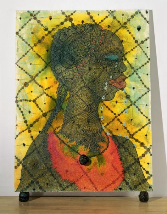
Photo from Tate.org.uk
https://www.tate.org.uk/art/artworks/ofili-no-woman-no-cry-t07502
https://artsandculture.google.com/asset/no-woman-no-cry-chris-ofili/bwEqkX2cKDce7Q?hl=en&avm=4
0 notes
Text
Art history 24/11/20
Sam Taylor Wood - still life, decaying fruit, video art.
Pieter Claesz - still life, A skull and writing quill, 1628
This contemporary video art created In 2001 by Sam Taylor called still life showcases a bowl of fruit decomposing through a time lapse. This work symbolises the passing of time and what that means to us, as well as showing us the beauty in something that is decaying and disappearing. It’s fascinating watching a perfect, healthy bowl of fruit turn into nothingness that is no longer edible or delightful to look at as It’s not often that we see the effects of time on perishables.
The idea of documenting a natural process that we will go through when we die is oddly fascinating but also morbid. Most of us fear death and the loss of time, however with technology we have the ability to capture and replay moments and freeze time which is a distinctively modern perk to technology. Included in this work is a plastic pen positioned next to the bowl which I perceive as being a constant, representing those things that will never decompose, that aren’t natural and by placing it next to something that is perishable, it’s contradicting. The fruit to me symbolises that there is beauty in change and in the fact that time is constantly moving forward. It’s something to embrace and capture as it’s a natural process whereas the pen is a reminder of what we don’t have, unlimited time. By documenting this process through a time lapse, something that will last forever and can be rewatched is interesting as the point of the work is to showcase the beauty of time and natural order and represent our feelings toward that subject. A still life is traditionally an oil painting, so this being documented as a video may also represent how society/people have evolved and changed as well as technology is popular, heavily relied upon and it’s our main source of communication.
This historical painting by Pieter Claesz painted in 1628 using oil paints on wood consists of a gap toothed skull, writing quill, books and more. Each object has explicit symbolism and exquisite detail.
In this still life, the objects serve as stark symbols of life’s shortness, arranging the unsettling objects on a stone ledge ultimately connects the pictures space to our own, making the message all the more compelling.
The use of a limited colour palette mainly consisting of different tones of greys and browns and the shadows really make the painting all the more seamless and 3 dimensional. The fact he added a reflection in the wine glass among all the other detailing really impressed me as these fine details make the painting more realistic.
The symbolism of the objects may be interpreted differently depending on the viewer. I think the books and quill may symbolise peoples accomplishments such as writing and education and the wisp of smoke in the lamp and the reflections in the glass show fleeting existence, a moment that has passed.
There are clues in this painting to peoples fragility like the skull which is merely an intrusion into the world of the living, symbolising death. Candles also traditionally symbolise life, however in this case it’s burnt out which I interpreted as meaning death as there was no life left.
However during my research for this painting I read that this painting represents Pieter Claesz negative approval for the advances of scientific knowledge which I personally didn’t think of to begin with but upon further research it makes sense. This painting actually condemns the advances as a waste of time. According to the Metropolitan Museum of Art, the skull on top of the books, the empty and overturned wine glass, and the barren candle holder “suggest that worldly efforts are ultimately in vain.” Normally when something is glorified and reflected as positive and successful the colours are bright, vibrant and inviting whereas the lighting and colours build a dull and negative scene, rather then a positive one in my opinion. I think nothing in this painting is meant or made to look positive or glorifying but I still think this is a beautiful piece of art, disregarding my personal interpretations and it’s actual meanings.
Comparing these two different pieces of art I think that they are both engaging due to there symbolisms and different interpretations but also the subjects involved are quit intriguing and interesting to view such as the mouldy fruit and exquisite detailing in the painting.
I think that they also both have elements of negativity and confront problems/opinions head on that are actually quite controversial and personal to people such as fear of death and loss of time or not being able to control time. They are different in physical ways of documentation, Sam Taylor’s work being a time lapse which is a modern way of documenting something that is a video and Pieter Claesz work being a traditional oil painting from the 1600’s but unlike the time lapse, a painting does not move. Although the painting is still there is a lot of movement within the picture with the reflections bringing it to life. In the time lapse the fruit doesn’t move, the mould just evolves and the fruit decays and eventually disappears but the positioning remains the same so both art works are similar due to the fact that nothing moves. I really appreciate the time and dedication that went into both pieces and it’s interesting comparing two still life artworks that are so different. Traditionally still life means to document something that is dead or doesn’t move, Sam Taylor documents something decomposing which is the fruit ‘ dying ‘ and the mould growing, so is it traditionally a still life? Whereas Pieter Claesz is a still life, nothing moves and it’s all dead, they are just objects. So these two in comparison is such an intriguing set of works to inspect, I personally love them both for different reasons and I support both methods of documentation.
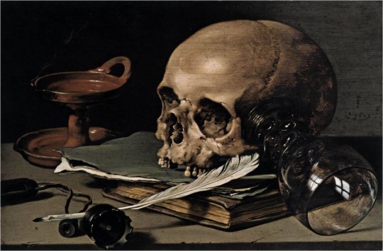
Photo from arthur.io - still life by Pieter Claesz
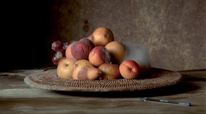
Photo from Tate.org.uk - still life by Sam Taylor Wood
http://groupdecompositionproject.blogspot.com/2015/01/sam-taylor-wood-still-life-little-death.html?m=1
https://www.tate.org.uk/tate-etc/issue-9-spring-2007/matter-time
https://www.metmuseum.org/art/collection/search/435904
https://arthur.io/art/pieter-claesz/still-life-with-a-skull-and-a-writing-quill?crtr=1
0 notes
Text
Art history 17/11/20
Andy Goldsworthy - snowballs in summer
This art work ‘ snowballs in summer ‘ is an example of Land Art linking to climate change due to its ever changing form and the unbalance in nature. It’s transient meaning it won’t last forever, we only have photographic evidence of the work as it has been made to be destroyed/changed by nature and it’s environment which to me represents the significance of individual moments and memories but also recording them. The snowballs consist of snow, elderberries, barley, wool, crow feathers, beech branches, chalk, river pebbles and barbed wire. All of which were embedded in the snowballs and were reminders of the rural landscape from which they originated and this would become more apparent as the snow melted leaving behind the debris.
As we know snow is compact and malleable. We build snowballs, igloos, snow men and more! so it can be morphed and sculpted at our will. However it requires consistent cold temperatures in order to remain in its fluffy, malleable form, apply heat ie. rising temperatures and it will melt and turn back to water.
The snowballs were situated throughout London, UK on a warm summers day. The 13 snowballs had been made in Scotland during their 2 previous winters and kept in cold storage in readiness. I think the location of the snowballs was important because in there short lives Goldsworthy wanted them to be seen and London is very busy so of course they would be seen by many there. In particular placing a snowball in a park in summer or anywhere in summer is very out of place and unexpected due to the temperature and time of year. They were very out of place which inevitably drew more attention to them.
Snow is an interesting material for him to have used but I think because of its changing form it acted perfectly for what Goldsworthy wanted. The debris inside the snowballs were slowly revealed as they were always physically changing due to the summer heat until they had melted, leaving behind all the objects that had been implanted inside them. I think the message here was that not everything is permanent, nature is unbalanced and will correct itself, everything returns back to its original/natural form.
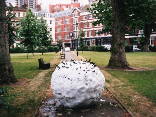
Photo from imageobjecttext.com
https://imageobjecttext.com/tag/snowballs-in-summer/
https://www.artfixdaily.com/artwire/release/848-decordova-exhibition-andy-goldsworthy-snow-on-view-this-summer
http://www.cameronandhollis.uk/midsummer-snowballs/
0 notes
Text
Art history 10/11/20
Cornelia Parker - Cold dark matter: An exploded view 1991
Cold Dark Matter: An Exploded View is the restored contents of a garden shed exploded by the British Army at the request of Parker. The surviving pieces have been used by Parker to create an installation suspended from the ceiling as if held mid-explosion. Lit by a single lightbulb the fragments cast dramatic shadows on the gallery’s walls acting as an extension of the piece itself, engulfing the room.
Parker using a shed of all things may seem odd or some what random but the purpose of a shed is actually important to the meaning of the work. A shed is where you store things you cannot throw away, the objects stored inside are not valuable enough to store inside but they still hold some form of sentimental value. They get dusty, grow rusty and are used rarely but are still valued or maybe just forgotten? The mundanity and also outdated quality of the shed made it the perfect victim for this piece of work. By blowing it up, she is taking away the safe place, the place of secrets and personal history but also in a way redefining its purpose and creating a new space that can be more valued and appreciated in a new form and perspective.
The objects that make up the installation are not only fragments of the shed but also objects that Parker collected over the course of 3 months that were stored in the shed during the explosion. The objects range from tools to children’s toys and some have personal significance and others were gathered from friends or car boot sales. All of which that were found after the explosion are suspended along with the fragments of the shed. Each object was individually suspended using transparent wire. By doing this Parker created a ‘ frozen moment ‘ which removes the pathos that the objects would have had, had they been displayed on the ground. By putting everything in the air it almost gives each piece life again; Is it still exploding? Or possibly rebuilding itself? Frozen in the moment.
What makes this work really interesting to me is that viewers can walk round and look through the work, discovering it element by element. Making the space between the objects an important part of the work and boundaries between the work and the viewer are blurred. The physical aspect of the work is just as important as the atmospheric perspective and interaction. Rather then re-invoking horror or destruction the suspended objects can now be contemplated, viewed in a new perspective and given life again.
I really like this concept, when we think of war we think of loss, death and destruction and these objects and the shed were violently blown up, the objects are charred, broken or destroyed, almost lifeless but by giving them a new purpose and rebuilding them, it has created a beautiful masterpiece and it re-invokes life and creates a mesmerising piece of art that has a new purpose and is re-energised.
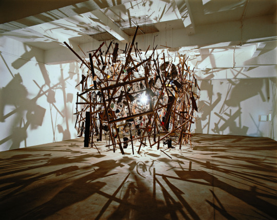
Photo from chisenhalegallery.com
https://www.tate.org.uk/art/artworks/parker-cold-dark-matter-an-exploded-view-t06949/story-cold-dark-matter
https://chisenhale.org.uk/exhibition/cornelia-parker/
0 notes
Text
Art history 20/10/20
Tracey Emin - everyone I have ever slept with
This artwork consists of a tent that Emin appliquéd names of everyone she had ever shared a bed with into. The tent was presented with the door open and with a mattress inside, making it seem inviting at first glance. However when looking inside you realise this is a personal space, a form of art. Entering seems quite invasive in a way and it almost makes you feel guilty for having an insight into her personal life and her history.
This art work was initially criticized because many people suggested that the list of names were sexual conquests that were a form of boasting more than a work of art. However, Emin's choice of wording in her title adds a degree of nuance to the work. The list of people she has "slept with" refers more generally to people she has shared a bed with, or literally slept next to. This piece is less about sexual intimacy, as it is about general human intimacy. Furthermore, the small size of the tent and the way the viewer had to enter the tent in order to view the names suggests a sense of intimacy and places an emphasis on the emotional connection gained from sleeping side by side, rather than on sexual conquest, the need for assurance and human touch is something we all desire.
This work also expresses notions and messages of femininity. For a women, sex is a subject that women can get branded sexually and negatively on. The brand ‘ slept with ‘ doesn’t actually suggest sex unless you perceive it that way, therefore assumptions should not be made. Also, appliqué is a permanent art form that is inviting and colourful but it’s also a stereotypically feminine hand craft. However that is an outdated assumption and background but by applying those techniques and that history to this piece makes it a feminine space.
The tent appears homely and comforting, we may associate it with happy memories and holidays but it’s also a private space, it’s her space, it can be opened and closed as she pleases and everything inside is her history but this piece is open to our own interpretation and you’ve just read mine.

Photo from widewalls.com
https://www.google.co.uk/amp/s/www.theartstory.org/amp/artist/emin-tracey/artworks/
https://www.google.co.uk/amp/s/www.theartstory.org/amp/artist/emin-tracey/artworks/
0 notes
Text
Art history 13/10/20
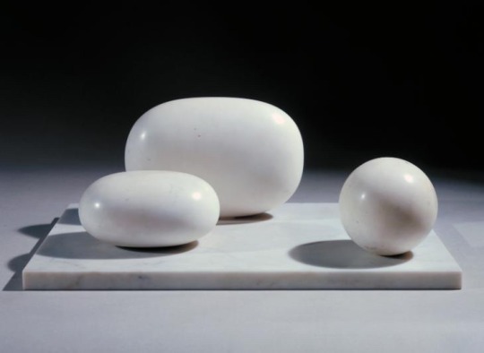
Three forms - Barbara Hepworth, 1935
The three forms consists of three rounded elements positioned on a flat rectangular base, all in polished Seravezza marble largely white, but small brown marks, grey flecks, and pale grey graining are visible on close inspection. This was one of the first sculptures that Hepworth completed after the birth of her triplets in October 1934. Therefore the choice of three forms with two being alike and one slightly different but with them all being equal due to their proportions and distance may be in connection or representation of her triplets who happen to be two girls and one boy. The choice of colour being white may also reflect the children’s purity and innocence as well as a new beginning. I personally feel this is a very peaceful and simplistic peace that does represent her family, especially because this sculpture marks a point of style change in her work. Hepworth’s earlier abstract works are based on the human form whereas the three forms are purely abstract, reduced to simple geometric shapes.
Upon my first inspection of The three forms, my thoughts were it’s minimalistic but also natural, natural in the way of colour and their imperfect forms, it made me reminisce on memories I have of being at the beach as the forms remind me of pebbles that wash up on the shore. It’s calming aesthetic and simplicity may seem minimal but these shapes were created by being hand carved, therefore they took a lot of time and patience to create, this shows her dedication, care and love for her work and craft which could also be symbolising her love, dedication and care for her children.
Hepworth had feelings associated to being absorbed in the relationships in space, size, texture and weight, as well as the tensions between forms and this is showcased in this piece through the sculptures slightly misshapen and imperfect forms. However their sizes and the spaces between them are precisely proportional and balanced with each other which may be symbolising the connection and love between her triplets. I think this piece is beautiful and harmonious, the time and dedication allocated for this project and the imperfect natural aesthetics of this piece are wonderful to inspect and appreciate.
https://www.tate.org.uk/art/artworks/hepworth-three-forms-t00696
https://artsandculture.google.com/asset/three-forms-dame-barbara-hepworth/rgH-FpUnuLM6rw?hl=en-gb
http://barbarahepworth.org.uk/sculptures/
0 notes
Text
Art history 06/10/20
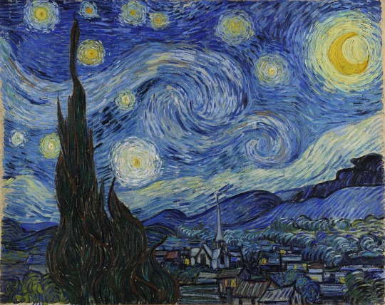
Vincent Van Gogh - The Starry Night
Painted in June 1889, this beautiful oil painting depicts the view from the east-facing window of van Gogh’s asylum room at Saint-Rémy-de-Provence, just before sunrise, with the addition of an imaginary village. This painting is one of the most recognised within western art and is considered to be one of Van Gogh’s greatest creations to date.
The ambience in the painting evokes some rather strong emotions within the viewer. The tranquility within the setting and application of the paint contour forms and means of expressions, used to convey emotion. The painting does provoke a slight feeling of foreboding with the swirls of paint reminding me of strong gusts of wind and the village is painted with dark colours but the brightly lit windows create a sense of comfort as well as the beautifully lit stars in the night sky create hope. The size of the stars make them the main focus of this painting, to me indicating that in darkness there is light and Van Gogh highlighted this by enhancing them.
Van Gogh was known for his thick application of paint on canvas, called impasto. An Italian word for “paste” or “mixture”, impasto is used to describe a painting technique where paint (usually oil) is laid on so thickly that the texture of brush strokes or palette knife are clearly visible as seen in starry night and all of Van Gogh’s other paintings.
This painting is undoubtedly beautiful and unique in the way of Van Gogh’s application and techniques that evolved throughout his year of painting.
I especially love the layering in the sky and swirls that lead into beautiful stars which represent hope to me, despite the darkness and sadness that came with this painting due to it being created while Van Gogh was staying in an asylum following a psychotic break where he cut off his own ear with a razor. However I do think that the negativity associated to this painting depends on how it’s perceived by each viewer as everyone views things differently especially within art.
https://www.vangoghgallery.com/painting/starry-night.html
https://www.moma.org/collection/works/79802
0 notes
Text

This is my second joiner I created for my photography workshop in college.
I used my photos from stockhill to make this and I prefer this joiner to the other because I think this one is more seamless and aligned better.
1 note
·
View note
Text

This a joiner I created using photos I captured in Stockhill woods for my photography workshop in college. 2/12/20
0 notes
Text
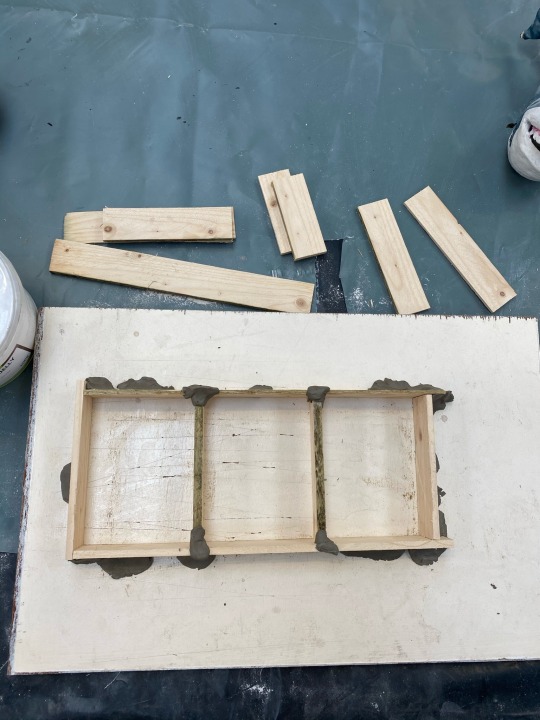
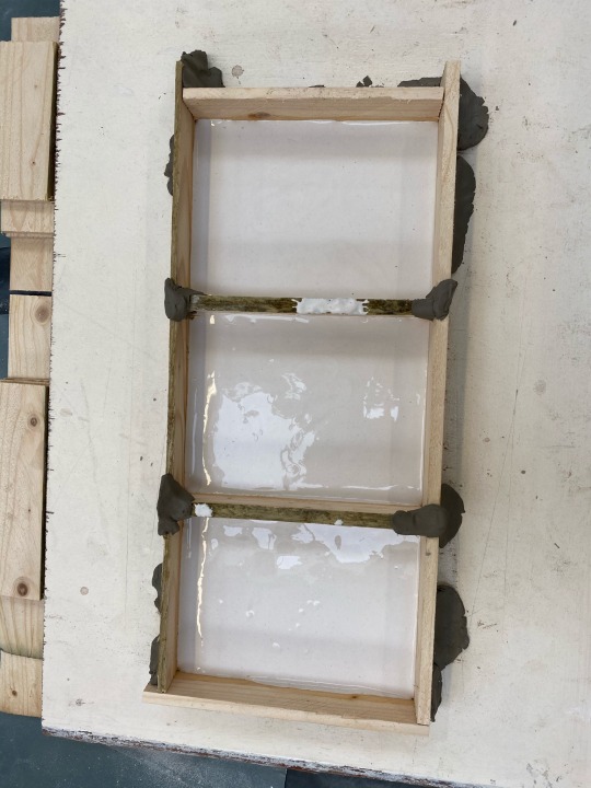
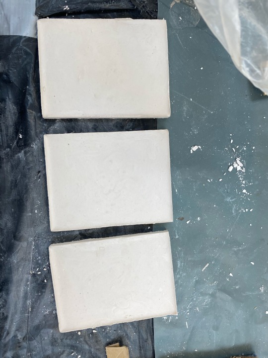
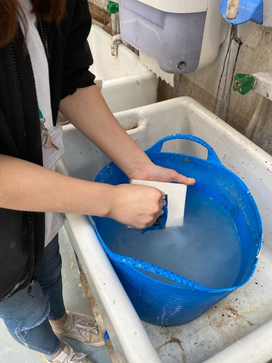

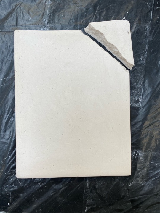
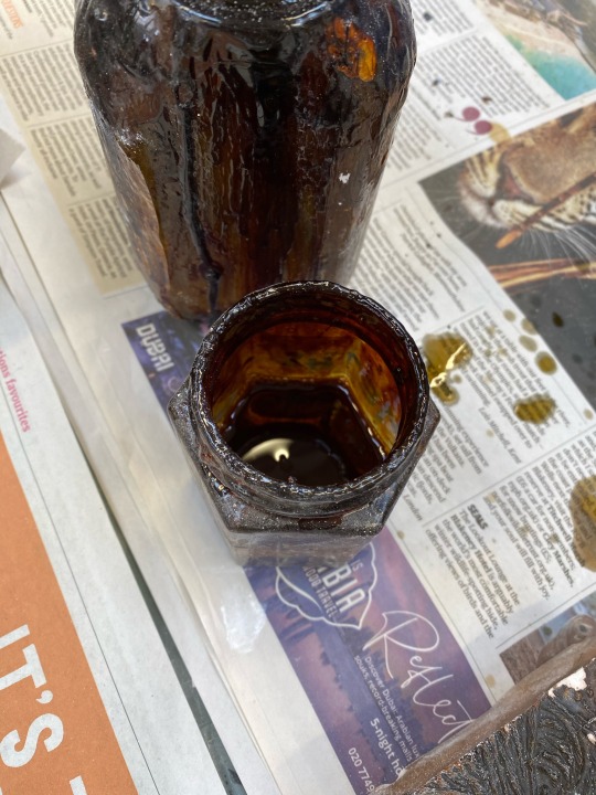
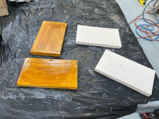
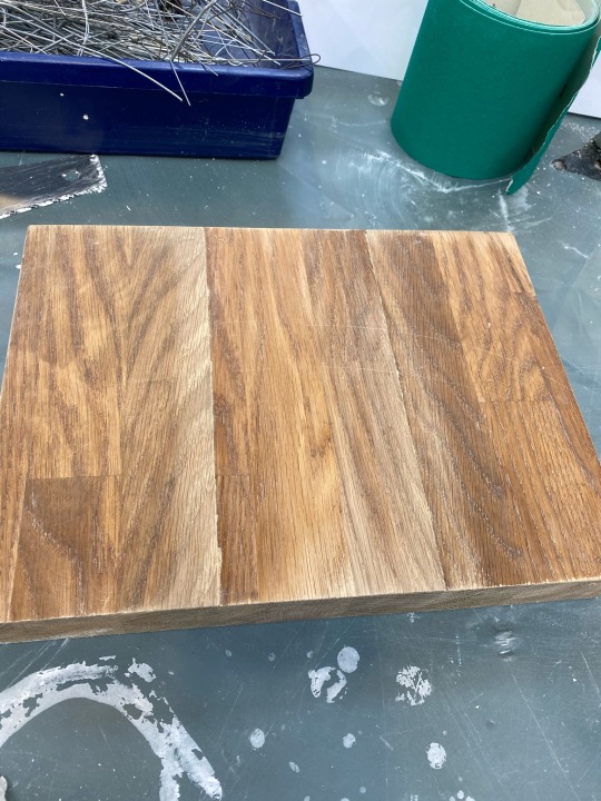
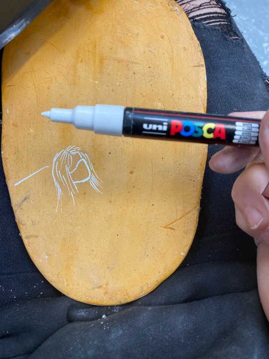
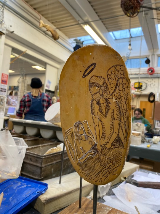
I made 7 tiles altogether and coated half in shellac so I could experiment with finishes on plaster and artistic mediums such as pencil, paints! + more ...
0 notes
Text
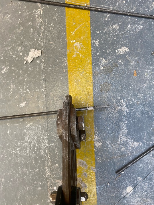
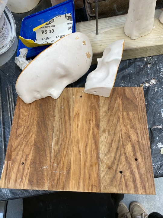
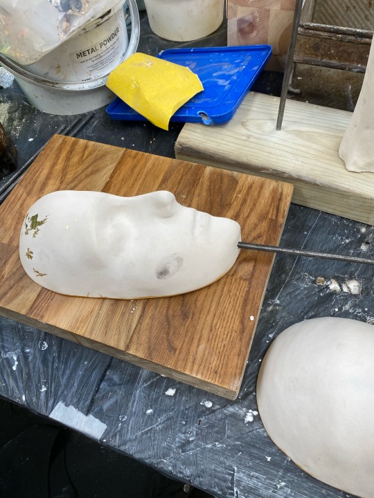
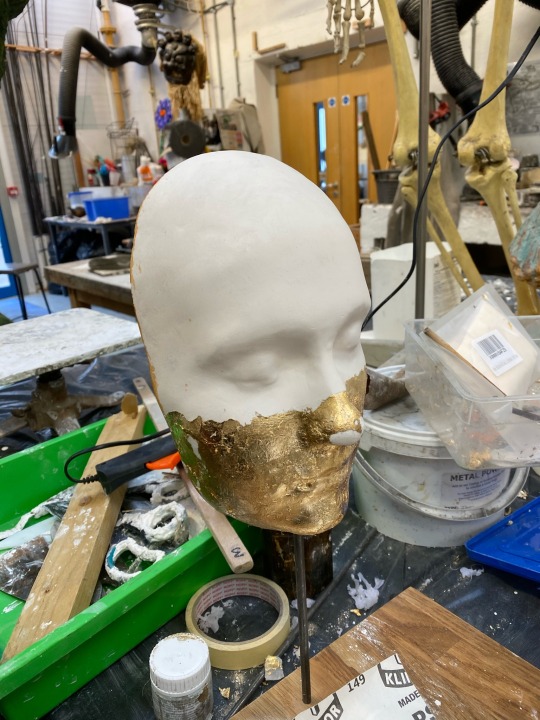
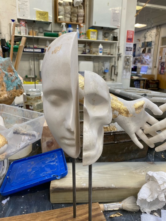
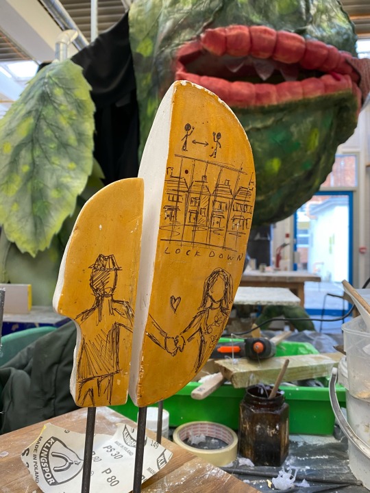
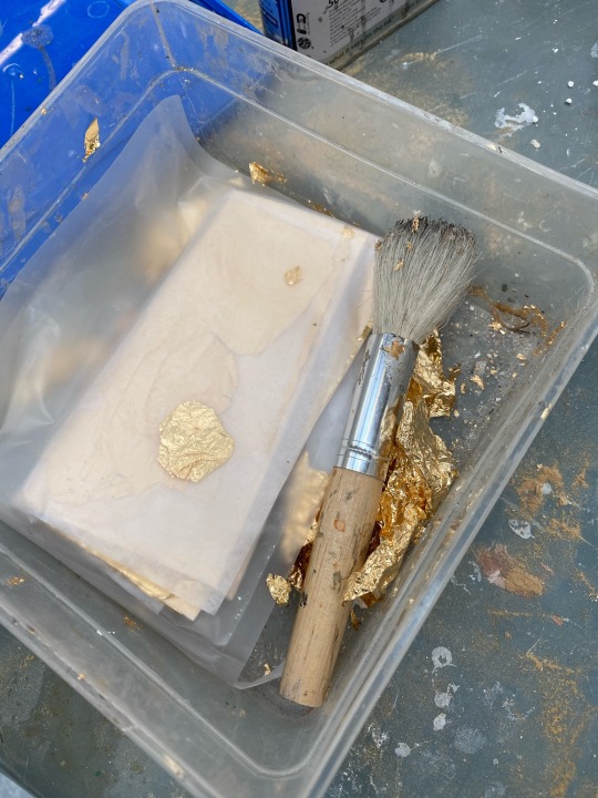
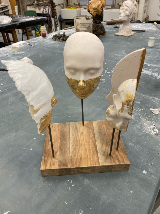
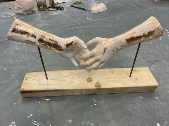
To attach the heads I drilled into the base with a 6mm screw, same size as the rods and used strong super glue to ensure nothing would be loose or wobbly. I added gold leaf and shellac to the backs of the heads and drew on some illustrations for finishing touches.
0 notes