Statistics
We looked inside some of the posts by jakecgraphicdesign and here's what we found interesting.
Average Info
Notes Per Post
0
Likes Per Post
0
Reblog Per Post
0
Reply Per Post
0
Time Between Posts
1 day
Number of Posts By Type
Text
14
Photo
3
Last Seen Tumblr Blogs


Fun Fact
Tumblr Inc. is using 66 technologies for its website.
Text
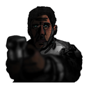
Final Evaluation
Here i have provided an image version of my ‘Under the influence’ project final evaluation. This acts as a back up should the original printed become compromised.


0 notes
Text
“Primordial” - Why this name?
For the title of my project i have chosen the word ‘Primordial’. The dictionary definition of primordial is:
existing at or from the beginning of time; primeval.
(of a cell, part, or tissue) in the earliest stage of development.
The word primordial instantly makes me invision some kind of being, some kind of perplexing entity which goes beyond human perception and imagination. I feel as if this word fits perfectly for my project as it describes something ancient and simplistic, such as an ancient single celled being - this links in perfectly with my themes of taking the human form and degrading it, simplifying it down and deforming it until it is no longer recognisable, and looks more like a microscopic creature then it does a human.

The word has a certain slimy and slithering tone to it, enticing visions of immense, incomprehensible creatures - images which perfectly link to the themes and visuals of my project overall. Even if you do not know the definition of the word i feel as if it still communicates these ideas. All of these features make it the perfect title for my project.
0 notes
Text
Survey results
In order to improve the effectiveness of my final piece and my project overall, and in order to better suit and understand what the audience wants, i created a short 5 question survey which i asked a range of different people in person, including strangers on the street and a few people i know personally. As well as this, i also created a digital version of the survey, using the site SmartSurvey.com, i posted this site on a few popular Horror forums online and garnered around 50 results.
To make the results easier to understand i have compiled them together using word, the online survey website automatically transferred the results into a word document which was very useful. Here are the results i collected:


Here is also an animated GIF showing each page individually:

Through the survey i got a lot of results and even when complied like this the information can be hard to understand and actually apply. However, to help me make sense of the data i have used an online tool to develop some graphs which better illustrate the results of the survey. Through these visual graphs it is easier to process the information and therefor apply it to my work. I will be commenting on the results of each question individually.
.

The first question was “Would you consider yourself easily scared?”, and here is the results complied into two pie charts, the first showcasing the results of the physical questionnaire and the second for the online results. As you can see the results of both are quite similar, with the vast majority answering No in both result sets. The physical results has the least amount of people answering that they aren't easily scared with a 64.29 percentage, while the online results boast a higher percentage of 82.89% saying no. It is possible that the online results may have a much higher percentage of no answers as they are shielded through anonymity with the internet and therefor have more freedom to falsify answers - sometimes being easily scared can be seen as an almost weak and undesirable trait, especially males, so it is important to take the fact that these answers may not be 100% valid into account. Alternatively, another reason for the higher percentage of No answers may be because the people who answered have built up more of a resistance to horror and are no longer scared easily because they consume so much horror media, afterall, i did only post these surveys on horror orientated forums, in order to seek out the audience i knew would be most likely to enjoy my comic. Alternatively, this questions results provided me with an extra layer of detail into the following questions a i know those who are answering the questions like the next “ Do you enjoy being scared” who are easily scared and who aren't, allowing me to make the comparison and get a result such as’80% of people who answered they aren’t easily scared in fact enjoy being scared.’
The next visual results come from the second question: “ Do you enjoy being scared”.

From the second questions results we can see a huge difference in percentages between the two result groups. The second question was asking if people enjoy being scared and in the physical groups chart we can gleam that the majority of the people answered yes, with a percentage of 57.14%, just about coming on top of the 42.86% percentage of people who answered no. From this physical results graph we can see that a lot of people actually enjoy being scared or at least thrilled, making it easy to assume that these people enjoy horror media in some fashion. In the graph for the online results we can see that a much larger percentage of 82% people answered that they enjoy being scared, dwarfing the 18% of people who answered no. Once again this result is to be expected as i did only ask users on Horror orientated websites, so it is to be assumed that there would be such a high number, however, i am surprised with the amount of people who answered yes in the physical results and i am delighted to see how many people possibly enjoy being scared and therefor perhaps would enjoy me horror book too. This gives me a grasp of how big the audience possibly is for my product.

These graphs are instantly extremely different and more complex then the previous graphs. These graphs represent the third question, which was “What’s the scariest piece of horror media you’ve seen?”. This question is slightly different compared to the last two in that it doesn’t result in a yes or no answer but instead requires the person answering to give me some more information and tell me what horror media has really stood out to them, this also means the graphs are presented a bit differently with numbers showing the amount of times said media was answered instead of a percentage. The reason i decided to actually illustrate this particular question as a graph was because i noticed some people gave the same answers, and i thought it would be interesting to see which meda is the most popular.
The most popular media for the physical study results was horror imager, which includes real photographs such as world war two images, this clearly shows that a lot of people find realistic events and possibilities scary, they go over the realm of fiction and into real, tangible possibilities which is truly frightening. Next to this with 2 mentions was the Sinister film, which has proven to quite popular in the online results too, meaning the film could be a good point of reference and influence i can use to improve my project. Aside from these people have also answered a lot of horror films, which is to be expected as they are the most popular and accessible horror mediums. A fear of spiders and insects is also a common fear, which has influenced me to include more insect like creature designs within my body horror and monster imagery.

The online results are very different - because i asked a lot more people i garnered a lot more results and therefor have been given a lot more sources for research and inspiration in order to improve my project. The most popular and therefor most scary piece of media that people answered was Martyrs, a french film which i previously hadn’t heard of. Similarly to the answers of the physical survey, the vast majority of media people answered were films, with Martyr and insidious being the most popular films followed by the exorcist film and Steven Kings Pet sematary book, showing a different medium is also popular. I received a lot of different results showing me that there is such a wide range of frightening media, even some of my personal favorites such as Junji Itos Gyo manga was cited. There was also a short animated horror comic, called The bongcheon-dong ghost, which shows the breadth of media people enjoy.

These are the visual graphs representing the final question “What type of horror media do you like the most?”. With this question i wanted to see for definite what type of horror media the people i was asking enjoy the most, and my suspicions were correct. As you can see, the most prominent answer in both of the result groups was Films, mostly because they are the most accessible and normalized type of horror media, and also because they are quick, fun and easy to consume. In close with films on the physical results graph is books , which yet again isn’t entirely surprising as they are also quite an accessible type of horror media. Then we have horror imagery and horror comics coming in behind, however, Films are the most triumphant overall.
Within the online results, Horror films dominate the graphy even more with a huge 43 people answering. Horror films clearly are the most enjoyed type of horror media ever and the reasons are obvious. Just like in the physical results graph, horror books comes second, once again making it clear that horror books are also a popular choice. Lastly we have horror paintings, comics and folk law with very low scores of 1′s and 2′s. This information tells me that the vast majority of people prefer horror films the most, however, this isn’t to say that there isn’t a large audience and love for horror focused comics and 2D imagery.
0 notes
Text
6 inch by 6 inch Exhibition frames
For my personal section of the exhibition a previous presentation idea was to present my final book but also 6 - 6 inch by 6 inch frames showing imagery from my book above the physical object. The idea was that these frames would be placed on the wall above the book to give the viewer a larger and better look at some of the individual frames within the book.
To create the imagery i took some of the more interesting and intense frames from the book in order to almost represent my book and give the viewer a brief taste into the themes and atmosphere of the story. One of the main aspects of the books narrative is the fact that it takes place over 9 hours within one night, with the events becoming more and more horrific as the night goes on. To illustrate this idea i had the idea that each individual frame could represent an hour within the book, with the first representing 12 o clock where the story begins, and then showing the next 8 hours until the final at 7 o'clock.

These frames act as a narrative in themselves by showing each key step or rather section of the story - the imagery giving the viewer a brief idea about what happens during that section of the overall narrative.
However, i ended up deciding against using these six frames within my presentations, and in their place i decided to present 3 more dynamic and impressive pop up sheets which i feel greater represent my final product and
0 notes
Text
Exhibition Designing
The final part of our project was to exhibit our final work. The form of our final piece dictate which way we presented them, for example, flat imagery such as a4 print outs would be presented attached to the wall. As my main final piece is a book i was given a shelf and some wall space i could use to display my work. For the wall space i decided to exhibit the three flat prototypes which i had created before hand. However, i felt as if these flat pop ups weren’t as dynamic and impactful to represent my work - they didn’t really pop up and almost jump out of the page at you.

Here’s how the three flat pop up prototypes originally looked, and below is the developed versions where i added more interesting and dynamic pop up elements, effectively overhauling the designs.


The three pop ups were positioned close together on the wall, so the paper elements of each of them crossed over, making them blend or almost melt together into one piece. The last step was to add the final book onto the shelf, completing my exhibition.


0 notes
Text
Horror Survey

To gather important information and data for my project i created a short questionnaire featuring 5 simple questions. The purpose of this questionnaire was to collect information on what type of media people find scary, if people enjoy being scared and similar questions in order to improve the impactfulness and scariness of my media. As i said, The questionnaire was made up of 5 simpler questions, which i will explain the purpose behind individually:
1) What is your name, age and gender?
This was the first question of the survey and perhaps the simplest. The intention of the question was to collect some basic information about the person answering, so that i have so slight context being the other questions, for example, through this information i could determine if a large amount of people who consider themselves easily scared are males, aged 20 perhaps - the first question simply gives me more data and information in relation to the next 4 questions too. This question also helps me determine what kind of audience my project may have and to see what type of people would potentially enjoy my project, so i can better aim my project towards that potential and most likely audience.
2) Would you consider yourself easily scared?
Once again, this question exists so i can understand how much of an audience there is for my project, and generally what percentage of normal people would consider themselves easily scared in general. The question also helps me to understand if the imagery within my book would be scarey or at least creepy enough to unsettle a large majority of the audience.
3) Do you enjoy being scared?
This question is a continuation from the last and adds a bit more information. Once again this question helps me determine what kind of audience are interested in horror media, and if there is a large amount of people who enjoy consuming such media and actively being scared by it. Therefor, this question once again helps me understand if what kind of audience would enjoy my book and if this audience is sizeable ( it is important to note that i do not have the capabilities or time to create a very large, global survey and therefor i am basing my ideas and data on a small pool of results which i personally collected).
4) What is the scariest piece of media you’ve seen?
The purpose of this question is to collect some research and inspiration points from other people. For example, if a large amount of people site The Conjuring as the scariest piece of media they have seen, i can then go and see what makes that piece of media so scary and apply those features to my own work to the best of my ability. Basically i can take what people find scary and use that to make my own work scarier. Through this question i can also understand what type of media people find the scariest and see what people consider the most and least frightening. While i assume the majority will say Horror films as they are the most accessible, it will be interesting to see what other mediums people find scary.
5) What type of horror media do you enjoy the most?
This question links to the previous, as it is designed so i can understand what different types of horror media enjoy, whether that is films, books, comics, sculptures etc. It will be interesting to understand this so that i can determine what types of horror media are the most popular and sought after for entertainment - which type of media has the largest audience. Once again this question should help me understand if people actively enjoy or seek out Horror comics, or if they have ever even read one. If they haven’t, then hopefully i can change that by suggesting my comic to those who have told me they already enjoy horror media, based off the third question.
0 notes
Text
Advertising posters
During the creation process of my book i created some now unused page designs for the back of the covers. These pages were simply meant to cover the black whit space on the back of the front cover, however, these pages are no longer needed. However, i didn’t want these designs to go to waste so instead of simply tossing them aside i decided to develop them into poster designs. Inspired by the movie posters of Saul Bass, a designer i studied early on within the project, i envisioned these posters to act as advertisements, advertising the comic book i created.
Here is the design of the original interior page, which i now developed into a 3D poster:

To couple with this poster, i also developed the cover imagery from the book in a promotional piece. I also developed the final frame of the comic into a poster design too, using Photoshop techniques such as Liquify, warp and altering the opacity to give the characters face a ghostly, eerie aesthetic, signaling the events of the narrative.


0 notes
Text
Use of colour - My 4 Shades

Colour, as shown, is a prominent part within my visual comic book. For my visuals i have chosen to use a colour scheme of only 4 colours: A plain black, a plain white, a dull grey and finally a piercing red. I have a few reasons for doing so. Firstly, i have been inspired by the way my influences have used colour, such as the more bright and atmospheric shades Robert Kirkman uses or the creepy, monotone and more traditional schemes of Junji Ito and Shigeru Mizuki.

I have explained this idea further through out my book, however, i have combined influence from all my research sources and the way they use colour - the atmospheres and effects their colour schemes create on the viewer and used this information to create my own colour scheme shown below:

The majority of the colour scheme consists of very dull and boring colours. Inspired by Junji Itos and Shigeru Mizuki’s use of colour, i wanted to keep the more unimportant visuals such as the backgrounds and the environment more dull, so to not distract the viewer away from the more important aspects of the frames. As well as this, the use of strong blacks helps to create a dark, eerie and Gothic atmosphere which couples really well with the themes of my book. This deeply links to colour theory and the links to the frightening and macabre which the colour black has. Also, using a predominantly black and white colour scheme links back to traditional comic books, which in turn have the pre-conceived consensus that they are made for kids, which once again helps to create an element of surprise and shock when the horrible imagery and events appears.

To combat these very dull colour i have also used a bright and piercing red which stands out and instantly grabs the viewers attention, which is one of the reasons i have used it; Having such a vibrant and vivid colour really pops out against the deeper shades, which forces the viewer to instantly look at the colour. This is a brilliant way to get the viewer to look at the more important imagery and elements first, as they are instantly drawn to them. Another reason i used this red is once again because of its connotations; Red is synonymous with danger, violence, rage and most importantly, blood, and by using this colour i can inadvertently suggest these themes to the viewer, and set the tone/atmosphere of the narrative through colour alone.

The red colour is brilliant for creating vividly violent and disgusting scenes. The colour is almost overpowering and hypnotizing in its deep vibrancy. For this aspect of the colour scheme i have mostly been influenced by the work of Robert Kirkman, namely his outcast series and the way he uses colour to create atmospheres and mods within his illustrations.

0 notes
Text
Messy Aesthetics - Creating deliberately rough frames

A visual feature of my overall design is to have elements of roughness and messiness, for example, within my frames i have deliberately kept small aspects of them rough and imperfect, such as the exterior boarder of the frame. Alternatively, the actual pop up mechanisms and visuals are kept slightly impactful and rustic. I have been carrying this visual technique through out my work for a couple of reasons: Firstly, the slight element of crudness retains the more handcrafted and personal visual element to the aesthetics, counteracting against the cleaner and more professional digital frames. Linking to the techniques used by Saul Bass, having this kind of aesthetic enhances the viewers perspective of the work as they can actually see that you, as the creator, have personally put the work in - they can see the roughness of natural drawings or the crudeness of hand made pop ups, which in turn removes the stigma of digital work. It seems to me that Digital work is often seen with less value by those who aren’t creative, as they are under the false perception that digital work is easier and quicker to create and therefor involves less effort; which is sometimes true but at the same time can be completely false.
As well as this, using an intentionally rough design also adds an element of charm to the imagery. For some reason, when an image has a more hand drawn style with textures and rough lines, it seems more appealing and pleasant in a strange way. I think this links back to the more personal and hand crafted feeling the illustration gives off - it is charming to see the faults of a hand drawn image as opposed to a perfect and clinical digital image.

As well as these effects, using a more rough stylistic approach also helps to enforce and enhance the more gritty and macabre imagery and themes of my book. The messiness of the strokes couples really well with the messiness of body horror imagery and creates a sense of urgency and intensity through dramatic, violent strokes.
This effect gives the imagery a more traditional horror style look, akin to traditional horror comics such as Tales From The Crypt, who share a similar, vintage look:

0 notes
Text
Main Prototype 1 Evaluation

Once i had completed all of the frames and constructed each page digitally i could now begin the actual process of printing them out and assembling the pages physically. This activity was as simple as saving each page from the Photoshop document into a jpeg image file, which i then compiled into an Adobe Acrobat binder, in the form of an A5 booklet.

Doing this basically turned the A4 individual pages into A5 Pages, allowing two to fit on one side of the page. Each A4 page was also double sided allowing the book to be read and put together properly. As the title implies, i wanted to create a main prototype booklet before i printed the actual design in order to make sure every aspect worked as planned and that nothing needed to be changed/improved upon.
The next step was to actually print all of the pages in full colour from this binder document. When printed i made sure to examine each panel on each page in order to scout out an error or problems within the illustrations which i may not have seen during the digital stage or which may have been caused during printing. Luckily, i didn’t find any errors, however, i did fail to account for one crucial factor: When assembling the binder in adobe Acrobat i failed to take the actual pop up pages into account - there needs to be equal pages in the binder to get an equal amount of pages on each physical page, meaning that, in order to allow room for the pop up pages i would need to take them into account within the acrobat document and add place holders, which i could then fill in after its printed. This is a prime example of why the prototype was useful as without it i would not have realized my fault within the design.

Despite the faults in the physical design, i still decided to staple the pages together in order to create the actual booklet, in order to see how the booklet looked and performed in this stage. Once again i didn’t find any problems and the book performed as i expected, which is all i can ask for. I found the book easy to read, lightweight and a relatively quick and enjoyable piece of entertainment, which i believe will be amplified and improved when the pop up elements are added in, giving the book the elements of surprise and uniqueness
Each of my pages were printed onto normal A4 paper, which, while making them relatively easy to damage, also made them lightweight and easy to replicate, because of the cheapness and commonness of the material. However, for the cover i wanted to use a more robust and solid material, which would hold the book together and add a slight layer of protection to the more fragile paper pages. As well as this, i wanted the cover to stand out and be unique from the plain white pages. In keeping to the bold reds of the pop up pages, i decided to use a vibrant and eye catching red card for the books colour. The red card which i used also had a slightly rough and bumpy texture to it, which i feel adds a great level of depth and interesting texture to the piece which correlates to the grittiness of the narratives events and overall design.

Originally, i designed the front and back cover with the main colour being white, and the more important features such as the titles would be in the bold red, contrasting against the plain background and making it pop out from the page. However, by using the red card, the printed turned all of the white space transparent, making the whole page red, which was my intention. This overall coat of red drowns the cover in a visceral blood like appearance, visually linking to the themes of violence and horror as well as the imagery within the book. The striking red makes the cover a lot more eye catching overall as now the entire cover is the eye catching shade, as well as contrasting against the plain, white interior. The imagery of the red on the white also acts as hint to the events of the story, with the red cover being a metaphor for the horror and horrific events of the story, around the plain white, representing the characters normal life. The way the red, representing the horror, wraps around the white, being the normal, represents how this characters normal life has been absorbed and completely consumed by the horrific events of the narrative. The cover foreshadows the horror to come.

The bold, red cover is a design choice i really like and one i will be using for the final booklet, so once again, creating a prototype and experimenting has proven useful in improving the quality of visuals but also the meaning of my final piece.
My next steps are to finally create my physical booklet - my final piece.
0 notes
Text
Creating Frames Process
As a huge portion of my final piece is in the style of a graphic novel, meaning the narrative is communicated through a series of images which follow a character and their movements, reactions, actions etc in a linear fashion. reader views the frames from left to right and views one panel at a time.

An example page taken from Robert Kirkmans Outcast comic series.
For the individual frames and overall pages of my book i followed a rather simplistic process which contained of multiple easy steps; i used both digital and traditional processes and tried to demonstrate my skills in each of these methods.
My comic pages had to communicate the narrative i created and follow the character - they need to show his emotions and reactions to the events of the story. As well as this, the frames need to show the surroundings and environment the story takes place as well as the horrific monster who acts as the protagonist. Another key element of my final piece is the pop up pages, the inclusion of pop ups meant i had to include space for these pieces when creating and designing the comic style frames.
1) Story boarding/Thumbnail Sketches:

The first logical step of creating any type of narrative product, be it a film, book or graphic novel is to create a rough draft of the outcome; as i created a comic book i created a series of small, roughly 2.5cm by 2.5cm thumbnail sketches. I sketched out the idea i had for the visuals of each frame roughly and quickly - details and cleanliness of the drawings wasn’t a big issue, as long as the more important features such as the characters and a basic idea of the background/surroundings were there. I purposefully kept the drawings minimal so i could quickly create them, giving me more time to spend on the actual finished frames.
I roughly story boarded the whole narrative, leaving me with around 28 - 30 small and quick sketches for all of my frames, giving me a visual idea of how the story would play out and how the narrative would actually look in a visual form. I also left spaces for the pop up’s - creating this storyboard helped me visualize how the pop up scenes were going to fit in, and if they would smoothly flow into the narrative.

Story boarding can be considered an art form in its own right: i’ve mentioned my interest in story boarding before on my spring board and through out my project. I find it interesting to see how the creator of the media carefully planned out each shot and action, especially in films as it shows you the Director knew exactly what to do for every tiny piece of the film. Its fascinating to see the process and how the end product came to be. Alternatively, sometimes storyboards show content which was cut or changed in the final product, providing us with an idea of what the media could have been, had the content not been altered. To illustrate my point, here’s a story board from the original Star Wars, which shows an almost creepy and strange ‘Wookie’ design (The Character hadn’t been given the name Chewbacca at this point) as well as a strangely futuristic suited Han Solo, sitting in the cockpit of what i assume is the millennium falcon.

2) Drawing Frame Designs:
The second step of this process was to begin drawing the actual designs of each individual frame. I used the original thumbnail sketches as my guides to basically redraw each frame, except this time i redrew them much larger and included more detail. I spent more time on the drawings, adding detail to the character and their face, as well as the backgrounds. As well as this, i also added environmental features such as shadows an shading to each frame, However, i later found out that this element was rather pointless as the digital image trace effect didn’t pick up the finer details of shading, so i stoped implementing them by hand.
Following the plans and ideas i created before hand, which were based of my research and influences, i used a quite simple and minimal style. I chose to keep the characters and backgrounds rather bare, plain and simplistic, in an attempt to almost create the idea that the book was intended for children in the viewer, in order to make the horror that much more impact full when it appears. As well as this, a big visual aspect of my frames is block colours - i only used a colour scheme of 4 shades, so the lack of detail made it easier for these blocks to be implemented, and they looked better visually.

I drew out each frame in pencil carefully, however, i kept to the visceral, messy and gestural strokes within the designs to add style and create a more intense and dramatic sense through the visuals.
3) Digital Developments:
Once i had drawn out each of the frames by hand the next step of the process was to scan them into the computer using a scanner, allowing me to edit them digitally. Firstly i opened the frames into photoshop, where i slightly cleaned them up and removed any errors in the drawings, however, i made sure to keep the gestural visuals in the designs. I used the basic Eraser and Paint Brush tools to alter the small mistakes. It was fine, during this process, to leave in the background and paper elements, as these would be digitally removed in the next step.

Once i had cleaned up the images a bit i then copied them into the software Adobe Illustrator. In Illustrator i utilized the Image Trace option, which is basically a technique which digitally traces around the images lines. The method creates a bold, black outline of the image and removes any blocks of colour or tone, which in turn removes the paper background, leaving me with clean, digitally traced versions of my original illustrations.

By using this technique i can quickly and easily give each of my frames a crisp, clean and professional aesthetic. Through this simple method i can make my frames look so much better, and i can also alter the messiness of the frames by adjusting the Image trace threshold, a method i talked about in a different post.
I used this method on all of my frames, giving me a quite professional aesthetic while still keeping to the original style of my illustrations. This step was fairly simple and done quite quickly, except from some slight experimentation with the Image Trace Threshold level and other properties.
For the second digital development i took the now digitally traced image back into Photoshop. In photoshop i could now begin colouring in each section of the drawing using the simple Paint Bucket tool. I used a basic 4-colour - colour scheme (i have explained this further in a separate post) to colour in each section of the drawing. The minimal colour scheme meant i needed to be selective and careful with the colours i used, however i followed a few continuous rules, for example, the walls would always be grey or white, while the most impactful and important features of the drawing would be the bright red shade, in order to bring attention to it. Once again this process was very easy and simple, however, it gave me visually interesting and aesthetically pleasing designs.

4) Arrangement:
The final step of the frames creation process was to arrange each individual frame onto the pages. During thumbnail sketching i knew what order the frames had to be in, in order to present a linear narrative, however, i still had to come up with the arrangement of the frames of the page, this included how many frames would be on one page, how big or small the individual frames would be and how they would be placed together. Before starting i had some basic rules which i could follow:
Firstly, i had the idea that the more important and impactful frames would be large on the pages, therefor being more prominent and gaining more attention due to their importance. As well as this, i didn’t want to keep the pages too crowded or too bare, so in turn i came up with the idea that the more impactful sequences such as the action areas would have a higher amount of frames which would be closer together in arrangement, which means the user would read a higher amount of frames in a quicker time, making the reading experience seem more rushed and more impactful, correlating with the events of the narrative.

Alternatively, for the more slow and mundane parts of the story there would be less frames, making the experience seem slower and less erratic, which once again correlates to the events.

These techniques are examples of how i have considered the audience in my designs, as well as how i have used a Gestalt Theory style technique to purposely manufacture the way in which the user reads the book, which in turn links back to my theme of creating an interesting user experience.
Here is an image of some of the printed pages in my first main prototype book:

0 notes
Text
Front and back cover designs
An integral part of any book - my pop up book included is of course the front and back cover. The covers of the book are integral not only for presenting the important informations, such as the books title, author, subtitle etc, but they also give the reader the first glimpse into the atmosphere and tone of the story within. Through the use of colour and aesthetics the writer can present the ideas, concepts and mode of the overall story instantly and quickly to the reader, without them having to read a word. There are hundreds of examples of famous book covers, but here are some of my favorites which have inspired me:
Goosebumps:
Admittedly, i still have a fair collection of goosebumps books, they’re a fond part of my childhood and they hold so much charm, this is partly why i like the covers so much.

The covers for R.L. Stine’s goosebumps novels all have their own individual tone and mood which is presented through the bright and alluring colour schemes. The use of colour plays off peoples natural assumptions and connections they make between themes and ideas and the colours, for example, the colour green is instantly linked to nature and health. The Goosebumps series are all light horror books made for kids, and while the covers do poses creepy and unsettling imagery, such as the emotionless living dummy, it is clear through the charming style that these books aren’t intended to be horrifyingly scary, but instead are a kind of light horror with elements of humor. Through the cover alone you can tell these books are made for children and that they’re charmingly cheesy, which i adore.
American Psycho:

Another great book cover which i am constantly influenced by is Marshall Arisman’s design for the 1991 American Psycho book cover. This book cover is instantly striking, presenting a morbid and strange representation of what seems to be a human man, but with hollow, sunken eyes and a blotched, bloody face. This is supported by a deep blood orange background which pops against the characters dark suite and bold yellow tie. Instantly from this cover we are presented with themes of the macabre and morbid, through the characters seemingly gorey appearance and the chilling block reds, which suggest danger and violence. Not only this, but the characters deranged and demented face contrasts against their sharp and crips suite, creating a juxtaposition and suggesting elements of mystery, trickery and an uneasy combination of two things which shouldn’t mix. As well as this, the cover features gestural lines and strokes, which provides a more intimate and hand drawn aesthetic, which can sometimes be rare in book covers currently.
My Designs:
Front:

Back:

For my designs i have chosen a relatively simplistic approach, with a limited colour scheme of black, white and red, along with hand drawn text and a textural background. The inspiration/the idea of the covers actually came by accident while using the program Adobe Illustrator. For the frames of my book i have been using a process which includes scanning the original illustration into the computer and then using the Image Trace function of Adobe Illustrator to digitally trace around the line work of these images.

When using the image trace function you can alter the threshold of the line work, which basically effects how much of the original image the trace picks up, for example, in this image i have turned down the threshold very low, meaning that very little of the image is shown:

Alternatively, if you turn up the threshold value very high the tracing picks up more of the more subtle and less clear aspects of the scanned in image, so any small stains or differences in colour will appear, as shown in this variation:

It is this messy and textural effect which gave me the influence and imagery for the backgrounds of my covers. Using a textural background image suggests a few things, firstly, textures can be used to present some kind of atmosphere or mood, for example, a soft and clean texture like that of a flowers petal will communicate a more calm and relaxed atmosphere, however, a more messy and splattered texture like the one i used in the background suggests a much more energetic, violent and explosive mood through the uneven and carefree shapes and tones. As well as this, Textures aren’t really telling imagery, meaning they don’t really give any visual indications of the events of the story, they are mysterious in that they can’t be read and the don’t really provide any informations about the narrative or the events of the media, so in this effect i have kept the events secret and mysterious by not giving anything away.
By accidentally turning up the threshold of one of my frames i got the idea to use a textural background.

In keeping with the simplistic theme and approach, for the text i used some very simple hand written imagery. I chose to write the main text by hand because, similarly to the use of obvious strokes in the American Psycho cover, using hand drawn aesthetics adds a hand made and more personal elements which the viewer can relate to. It shows that more effort and more love has been put into the art as creating things by hand is harder and more time consuming then using simple digital methods. Hand drawn titles also add to the more gritty and creepy aesthetic as they aren’t clinical and clean like computer text, but are imperfect and rough.
However, to contrast against this messy and violent aesthetic of the text and the textural background i have used some more clean and digital text which is hidden behind the texture. The digital text is meant to be clear and clinical, it is the subtitle and is meant to clearly communicate this to the viewer. The clean text is hidden behind the gritty texture, communicating that there are some interesting themes and messages underneath the body horror imagery which isn’t immediately shown. Hidden ideas questioning what the human form and what the perception of the human form is, what happens when the human form is distorted, how easy it is to do so etc. Through using layers and digital text which contrasts against.
In terms of colour i have stuck to the original monotone and dull colour scheme, which is combated by the violent, striking red which instantly draws the viewers attention towards it. By using the bold colour for the title i have forced the viewer to instantly read the title and therefor instantly understand what the media is about. Once again, the use of the deep reds presents themes of violence, danger and gore, acting as almost a warning to the reader.
0 notes
Text
Prototype pop up models
Experimentation and prototyping is an important aspect of creating art pieces, especially 3 Dimensional pieces. The act is so important as it tells us what ideas and concepts work and which don’t, it allows us to test the effectiveness of ideas before we use them on the actual end product to ultimately improve the effectiveness of the product. Prototyping Is also a good way to learn new techniques and play around with the materials, colours, and imagery, providing you with alternatives and new ideas to your plans to help improve your end product; as well as this, creating prototype models is a good way to practice the making process. Experimentation is a natural aspect of any design process and prototyping enforces this.
Prototyping was an important step in my product for the reasons above. I created a number of test pieces and pop up designs in preparation for my final piece’s. For my prototypes I created two different types of models, one type I am calling the ‘dynamic pop up’s’ and the other ‘flat pop ups’, and I will be explaining why.
Dynamic Pop Ups:
Dynamic pop ups are more traditional pop ups in the sense that they utilize the page’s fold to work. This type includes such methods as the V fold and the parallelogram techniques. As the name implies these pop ups are generally more 3 dimensional and exciting. I have created a number of test pieces in this view which I will present and then briefly explain.

This pop up was the first created but also acted as the first pop up prototype. I created this piece during the ‘Stranger in a strange land’ workshop. For the visual aesthetics I developed a frame from Junji Ito’s manga ‘Thing that drifted ashore’ from a 2-dimensional illustration into a 3D pop up. For the pop-up element, I used a parallelogram technique where I attached the images with flaps to the main crease of the page, making them pop up when the page is opened. I used Valley folds so the pop-up pieces smoothly opened and closed with the page. This piece may have been the most important as it inspired the actual idea of using pop ups within my project, as well as this, this piece was a good introduction to pop up methods, the technique we used was easy and simple and showed me just how effective and visually interesting you can make otherwise flat illustrations through simplistic techniques.

For this second piece is continued with the idea of turning flat illustrations from artists who have influenced me into 3-dimensional pop ups. This time I adapted a frame from Robert Kirkmans Outcast comic book series, which is about demonic possession and supernatural events. This time I took the first-person approach of Kirkmans original comic book and used the same perspective which makes the viewer feel as if the character is looking or even speaking directly to them. This effect is amplified through the 3D development as it increases the realism and the immersion even more. Also, in this piece I have integrated colour, using the same scheme within the original illustration. The violent reds amplify the violence of the scene, and the rough texture created by the crayons which I used help to make the piece look more gritty and vulgar. I think that this is another example of how a flat illustration can be developed and amplified by turning them into 3D pop up models.
For my next two prototypes I began creating my own designs instead of developing existing work. I began by simply designing elements of body horror such as body parts; Eyes, teeth and even tentacles, which I then assembled together. This technique would eventually develop into the ‘Horror Prefabs’ idea. For these first prototypes I kept the pop ups minimal and small, with little pop up parts. For these two pop ups I used the V fold technique and the parallelogram technique. The first design was the simplest as I only used one small piece of card for the pop up, however, the pop up is still interesting due to the puzzling and horrific imagery. However, this design doesn’t excite the shock and repelling impact which I would like to create due to the minimalism of the design.

For my second pop up prototype I have made it much more dynamic and exciting because I have used a lot more pop up features and the v fold technique pops out in a more vicious and violent manner through the visual relation to an opening mouth. The way the paper springs out in every direction envelops the viewer and almost makes creates a kind of ambush like feeling of being surrounded suddenly. I feel as if this design creates a much more interesting and intense visual experience than the more boring previous design, which works a lot better for my project.
Continuing from the style of the last pop up, with this design I decided to amplify the aesthetics more. I wanted to make the design more interesting and dynamic by increasing the size and complexity of the model by adding more pop up and spring elements. Another unique element of the design was that I used the vertical rectangle method we developed in the ‘Stranger in a strange land’ pop up technique, which uses the base papers fold line to push the vertical card upwards. For this design I was quite messy and loose with the construction, which I feel like amplifies the roughness and almost rapid aesthetic and nature of pop ups.

Flat Pop Ups
As I stated before, I created two different prototype techniques, one being the ‘Dynamic pop ups’ which I have discussed, and the other being ‘Flat pop ups’ which I will be explaining here. Flat pop ups are designs which do not use the base piece of material to pop up – they are not as 3 Dimensional or dynamic as the other type and don’t rely on techniques such as the V fold or parallelogram methods but instead use a flat base material, with the pop-up elements being small springs or similarly basic techniques. In terms of pop up methods these flat pop ups are more basic and minimal, however, the visuals can be more detailed and intricate due to the flat base material, as it makes it removes the limitations of having to stay to the strict shapes of the pop up. This means that I could make the designs a lot more detailed and therefor engaging and interesting to view, despite being much more minimal.

I created 3 of these flat pop up designs all with similar aesthetics, such as the minimal pop up elements but complex and visually interesting designs.
Overall, these prototype models have helped me to understand the limitations and possibilities of paper pop ups and have given me good practice while creating them. I could see what works well and what features need to be improved upon. The pop ups have allowed me to see what my design ideas and plans will look like when realized, as well as allowing me to determine the effectiveness of the pop-up aesthetics.
0 notes
Photo


Primary Research - photographs taken during the Shoreditch Street Art and Graffiti tour. (Converted into GIF form to include a lot of photos in a condensed space. I took over 100 Photos during the trip.
0 notes
Photo

Primary Research - photographs of miniature, realistic skulls used for inspiration and observational drawing.
0 notes
Photo


Primary Research - photographs taken at the Colchester Natural History Museum.
0 notes
Text
1 Minute Presentations

On week six we were around the mid point of our projects and the FMP. In this week we were given the task to create a short 1 minute presentation with accompanying imagery to present to the class. The idea behind this is that the presentations will help us in the class see where other people are in their project and what the focus/themes and ideas of their projects are. As well as this, these 1 minute presentations were designed to help us think about where we actually are at the moment and what we should be doing next.
The content of the presentation was what we had been creating recently and what stage we were at within our project. For my slide i chose to talk about the recent developments in pop up’s i had been creating. During the ‘Stranger in a strange land’ task i was inspired by the imagery of Junji Ito, so i decided to develop his flat illustration, taken from the graphic story ‘Thing that drifted ashore’. and develop into a 3 dimensional pop up. In my presentation i talked about this and how i plan to make pop up’s a more prevalent feature in my project and final piece.
it was interesting to see how other peoples projects are going and it was nice to take a moment to see what the rest of the class has created.
0 notes