
Don't wanna be here? Send us removal request.
Statistics
We looked inside some of the posts by james-narchi and here's what we found interesting.
Average Info
Notes Per Post
21
Likes Per Post
15
Reblog Per Post
6
Reply Per Post
0
Time Between Posts
11 days
Number of Posts By Type
Text
10
Last Seen Tumblr Blogs


Fun Fact
The Tumblr app for Google Glass was released on May 16, 2013.
Text
Final Post
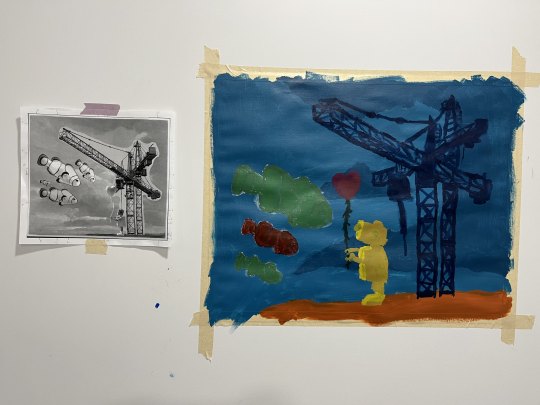
This is my final painting on the right and my collage on the left. The mood that I wanted to do was a moody whimsical, that while the colors are muted giving a slow, dull impression, the colors are also varied enough to make it unserious.

This is my word painting. I had some trouble doing the word painting having to redo my underpainting and my solvent and oil paint mixing together, but other than that I found this project interesting. It definitely doesn't look as 3d as my sketch for it but I learned about the process of oil glazing and the mistakes that could happen and I should avoid when and if I do it again in the future. I thought it was a bit of a nuisance having to apply oil briefly and then waiting for it to dry, but the whole process was still interesting. Seeing the color get strong and mix as you layer oil with it was really nice to see.


This is my updated color wheel and I found how adding the complement to mute colors and blending can add better shading to different parts of my painting as shown in the cylinder.


My abstract painting was quite simple so I didn't need to cut through my masking tape, but I did find the process somewhat nice seeing how square my square was and how nice the shapes came out looking in general. On my still life I had a bit of trouble figuring out how to use medium which is something that I still want to try out later in the future. During that project I also had a very hard time mixing my paint in order to get the color that I wanted, especially since sometimes because of how different the paint looked once it was put down the canvas. Using medium was something that was quite interesting to me and although I didn't understand it much, it's something I look forward to learning in the future.
Overall I really enjoyed the opportunity to be able to participate in this class. I had no prior experience to painting before this semester but I had a great time and discovered that it's something that I want to continue doing in the future. I had a lot of trouble during this semester but I hope the experiences, good and bad, will allow to me grow as an artist for myself.
2 notes
·
View notes
Text
Week 7


I personally found this activity to be incredibly difficult as it was more about getting colors right and as a result, majority of my time was used in mixing colors. I had a hard time getting the base color right, but then I also had to be conscious and careful of what I was adding to that base and how much of it I was adding. It was definitely useful having the color wheel with me because I got to use it as a constant reference to which colors and turn to which, as well as the temperature that they had. Adding on, I painted over the paint that I already repainted multiple times because I wasn't getting the colors properly and I could've made them closer. It was a bit tiring to do that, but it was definitely worth it as it made the painting come closer to the colors of the reference. I definitely learned a lot from this still life activity and I want to become better at mixing paint and recognizing the nuances in colors in order to bring about a more accurate depiction of what I'm referencing and what I'd have in mind.
2 notes
·
View notes
Text
Week 6

Making Chromatic Black: Making chromatic black was a bit challenging because my partner and I both found it hard figuring it out what color we needed in order to balance out the colors. In the end when we compared everybody else's black with our black we realized that ours was more green and we could have used more red. It's definitely a skill that we'll gain as we gain more experience with paint mixing but it was a very interesting learning experience trying to create black.

Saturation/Value Activity: For this activity, we had to organize the colored paper in the order we thought the color was the strongest to the weakest. I actually found this activity to be one of the easier ones because the colors we had felt easy to see how vibrant they were.
Temperature Activity(No Image ☹): For the temperature activity, I personally found it still a bit confusing grouping up the colored paper even though I knew which was which. I personally tried seeing where the warmth and cool temperature or feeling that the paper was radiating or exuding but unless it was super obvious, I couldn't put my finger on which was which.

Boundary Activity: For this activity we had to create similar boundaries for each of the colors and I found this activity easier to do because of it's similarity to the saturation exercise.
2 notes
·
View notes
Text
Week 4

Skylark by Lynette is an example of low contrast due to the artist's use of various shades of brown. The different shades work to create a softer look on the top portion of the artwork. It becomes noticeable where thing's are darker and lighter without it being too obviously different, allowing viewers to still clearly see what is what in this piece.

Unlike the previously mentioned artwork, The Persian Jacket by Grace Hartigan, is high contrast shown by the various colors used in this painting. Most of the colors presented don't mix well for the most part and as such you are able to tell what each color is supposed to represent in the scope of artwork. In this case the colors contrasting the dark background work together to create a resemblance of a figure that's the main attraction of the piece.
1 note
·
View note

Text
Week 3


This week in our painting class we learned about tonal values and practiced them through oil painting. Initially I had some difficulty with getting the shading of the lamp but I received very useful advice to start with the center of the piece and work from there in order to make it stand out. I don't think I got the feeling of the lamp quite right so next time I'll make an outline to get the proportions closer to the original. Overall, I had a really fun time working with oil as difficult as it was.
1 note
·
View note
Text
Acrylic vs Oil
As we discussed in class, there are many differences between oil and acrylic paintings. Acrylic paints generally dry fast, look vibrant, flat, and opaque, whereas oil paints can take a while to dry, look more lush, glossy, and transparent. Acrylic and oil paint can't be mixed together, however, you can paint oil over acrylic paint that has been dried, but not vice versa.
1 note
·
View note
Text
How to Stretch a Canvas
Connect two 16 inch boards and two 20 inch boards together, with the ridges on the outside. Make sure the corners make about a 90 degree angle.
Staple the corners of the boards where they intersect. Use about ~3 staples.
Put your frame on top of your fabric and make sure there's about ~3 inches of fabric away from the end of the frame on each side. If needed, use a blade cutter to remove excess fabric.
Flip the fabric over the frame and staple tightly. Start from the center and staple on both sides.
Rotate to the other side of where you just stapled. Follow step 4, but use a canvas plier to pull the fabric to ensure that the fabric will be stapled tightly.
Repeat step 4 and step 5 to the other sides not stapled.
Add 2 more staples to each side using the canvas plier.
Create a memory fold on the corners of the fabric by placing your finger in the middle and creating two "wings".
Add 4 more staples to each side using the canvas plier. There should be about ~9 staples on each side.
Fold the corners of the fabric and staple the corners to ensure they don't leak to the other side of the frame and reveal themselves. Use about 3 to 4 staples.
1 note
·
View note
Text
Hi everyone!!
My name is James and I'm currently a computer science major in my second year. I decided to take this course because during my time in high school I took a studio art class that I ended up really enjoying. I'm honestly not too big of an art person but I hope to learn a lot from this class and have a fun time. In my free time I like to read books/comics, watch shows/movies, play my kalimba, walk, and overall spend time with friends and family.
I look forward to getting to know you all and about painting throughout this semester.
1 note
·
View note
Text
first post with the fam
Caleb, James, Bloria and I (Ben) Are making the glossary of painting terms. bleeding: discoloration; color change
blocking: Making outline for color.
balance: to distribute color.
glaze: a thin layer that changes the top
Prime: preparing canvas
alkyd: Oil based paint
Wash: thinning out paint.
dry brush: a dry brush that still contains paint.
impasto: thick paint to create texture.
blistering: bubbles forming outside of a paint film. We decided to do dry brush and do it with oils.
9 notes
·
View notes