
Don't wanna be here? Send us removal request.
Statistics
We looked inside some of the posts by jbfiin and here's what we found interesting.
Average Info
Notes Per Post
1
Likes Per Post
1
Reblog Per Post
0
Reply Per Post
0
Time Between Posts
1 month
Number of Posts By Type
Text
3
Photo
12
Link
2
Last Seen Tumblr Blogs


Fun Fact
Tumblr Inc. has $15.1M in annual revenue.
Text
Creating something ‘Creepy’
9A lot that goes into creating creepy things is the Uncanny Valley which is basically something that looks almost normal but has something that is off about it, for example a humanoid person with a smile that is just a little too big or eyes that are a little too high on the face. Its difficult to create this feeling in pixel art as any alteration in appearance could just be mistaken for a design choice for art style so I do have to work around that in making things a lot more obvious so it’s hard to do that a lot with the characters
Something I can do, however, is achieve that with the environment and setting, you can apply the Uncanny Valley rules to an environment as well as just characters like having a normal house with stairs that lead to nowhere or a door that, once opened, only has bricks behind it- the key to the ‘creep factor’ is ambiguity, not knowing for sure weather this ‘thing’ is a threat or not. It’s one of the reasons I chose the Geisha as the main antagonist as the caked up makeup makes it hard to tell her expression and therefore what the intentions are Stephen King calls this terror instead, he says: ‘Terror is like coming home and having everything you own be replaced with an exact copy’
0 notes
Text
Evaluation
I’ve really enjoyed this course so far, I think my favorite aspects of it are definitely creating the sprites and tilemaps and animating them. The reason I picked this course is partly because I’ve tried game development before and really enjoyed it, but mainly because I like creating sprites and art and assets and then seeing them work in a game exactly as I had envisioned them to look. My strong point is probably art over the coding, but I enjoy both nevertheless. I feel like incorporating and using my assets in the game is what worked the best, I had a few issues with lighting but managed to fix that so that all of the colours were flat and, so far, everything’s turned out exactly as i wanted. The balance of coding-to-art is comfortable for me as we create our assets and then the next day we’re already putting them into the game. I like that we started basically from day one, we were making a game- and at the end of the half term I have something that is playable and, in my opinion, of some good quality.
Some of the home tasks were a bit exhausting, especially when a game I had to review I had no real interest in so I was just writing what I thought I had to write instead of my thoughts as I’m always afraid of just saying that I don’t like a certain game or it’s art style. Of course, however, this was due to COVID but it wasn’t one of the highlights of this term. I thought the blogging would be an issue when I was told about it, but- for the most part- it isn’t really that big of a deal; I post something when I make some headway in a character or a tileset and write about that character or the process of creating that particular asset and when we do some code, we’re allowed about 10-20 minutes to make blog posts about it anyway so it’s not like any major time was lost due to blogging. Actually, it’s cool too look back over my Tumblr to see how the ‘game’ I’ve got was created and especially how my character progressed.
In the next project, we’re going to be making a First Person Shooter, although I love 2D art and pixel art, I would love to learn how to create 3D characters. I would still go for a cartoon style as I find realism kind of boring in games. I have a few ideas of the player character and enemies and some mechanics so I’m looking forward to learning how to make them all work. For my final project where I can do whatever I want, I will definitely still create a 2D platformer/metroidvania but who knows, this next project may inspire me to create a 3D game. I’ve never tried to make a 3D game before so I’ve never used anything like Blender, so I’m looking forward to learning to make 3D characters and environments- I’ve usually only ever made 2D RPGs or platformers. I probably won’t go for the usual ‘shooter’ but I had an idea of you playing as a frog and the bullets is just you shooting your tongue out at things.
Overall, I’ve really enjoyed this course and this first half term has me excited to learn more about game development and Unreal Engine. I’m mainly excited about using Unreal as, compared to what I was using before, you can do so much more and it’s not all thick blocks of text just to make the player move left or right and it’s super easy to see what each chunk of ‘code’ does. The shading and movement capabilities of the engine give me faith that I will definitely be able to create the game I’ve been thinking of inside of Unreal and, using the blog’s I have- and will- create I’m hoping to do so without having to watch 300 tutorials during the process. In conclusion, I’m very optimistic and I’ve enjoyed this project immensely.
0 notes
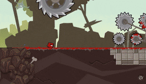
Photo

This is a design for my game’s first major boss fight against a boss called Regaleeches. This boss was inspired a little by the Destroyer from Terraria. They have one phase where they will simply move around the room in a ‘worm-like fashion’ and the player will have to avoid them; they have another phase where they will both peak their heads out of the holes in the wall (Depicted in the image) and occasionally spit venom at the player, this is also the player’s opportunity to deal damage to them; and a final phase where they will dash from one side of the room to the next either in the upper half or the lower half, forcing the player to stay on the upper or lower platforms. The design for the boss itself is one large leech or worm with one head on either end- it’s the king/queen of the first area hence the name Regal-Leeches.
1 note
·
View note
Text
Overlap Events
...and other examples of what you can do with them.
Using an overlap event you could have the player enter a room and when they do, the door locks behind them and a boss/enemies will spawn. You could have the player walk into a shop and have some kind of shop HUD appear. An example from Hollow Knight is a Hot Springs that the player stands in and it slowly replenishes the Knight’s Soul and health. An example from Celeste is when the player gets within a certain radius from an NPC, she talks to them- this is probably just a large overlap event that sits on top of the NPC and triggers when the player gets within it.
0 notes
Photo


Super Meat-Boy
SMB’s art is very iconic as it features the hard black outlines and a very ‘cartoon-y’ style. The original SMB has a much flatter look and doesn’t have the depth that the top image has (which is the new game). The run cycle for Meat Boy is a very simple 4-frame cycle and has that ‘squish’ sound effect on every step.
Of course, SMBs signature is the trail of blood/meat you leave behind when you run or cling to a wall. For a platformer like SMB, it can be very useful to tell the player where they’ve been before so that they don’t keep dying at the same points. It also just adds that bit more detail to the gameplay that some other side scrollers don’t have. The controls are tight which is good for a precision platformer, however the acceleration and deceleration are a bit too long in my opinion; it feels like you’re walking on ice sometimes and it can be hard to gauge where you’re going to land. This, paired with the fast speed at which you’re in the air, can make moving very frustrating.
I do like the fast-paced stakes at which the levels are played, for example at some points there may be a few moving razor-blades around you so you’re going to have to make quick decisions so that you don’t die. That’s something I’d like in some of my areas, instead of some basic spikes that don’t really move, maybe have some moving obstacles so that the player can’t just stand there for days deciding where to jump, it forces them to make decisions.
Another thing I appreciate about this game is how the objects that can damage the player are outlined so it’s blatantly clear to the player what they shouldn’t touch. I would like to incorporate something like that into my game, so that the player isn’t continuously running into spikes or lava etc.
0 notes
Photo

Character Re-Designs
After reviewing Celeste, I realized that I wanted my character to change. I liked it, but I feel like it needed to be either a bit more detailed or larger. I started by just trying to make it longer so I created the second version of it which I like, but I didn’t like the hood and I felt like I couldn’t make him move the way I had envisioned my character to move. So I started on the next one, after making it I felt like that was probably the one I was going to use. I liked the lighter tone and the fact that it was much larger than my original sprite. I didn’t want to just settle with this however, so I decided to create two more. For my next one, I wanted to make a more ‘droopy’ look and make it look more tattered and dark. So I made the face hole in the hood more of a U shape and had the head look flatter. This one didn’t really make me that excited so I didn’t really go much further with it. My final design is the one that I’ve decided to go with however. It’s not much different from the first one, it is a bit larger and has more detail but doesn’t venture too far from the style of my initial design. I decided for this one what it may look like if I just scrapped the hood shape entirely as I wanted a change and then the whole thing just came together. I like the more de-saturated colour and I think I could animate this pretty well too.
0 notes
Photo


Celeste
Characters From a look at this game, I really love it’s art style. The simplicity of a lot of the sprites can be made up for in the fluid animations that each one has. Usually, dark outlines don’t work that well as they can make sprites seem too simple, but they work really well on this game. The way the character’s hair blows is very smooth and even her idle animation has really believable movement for breathing. The background objects such as the fireplace has a really nice looking animation as well, I think this is helped by the ‘simplicity’ of the style so that there aren’t too many things that have to be animated in just one sprite.
Backgrounds and Tiles The backgrounds and tiles have really nice intricate details as well- the first 10 or so pixels of the tiles are coloured and detailed and shaded really nicely and they slowly fade back into less detail and a darker shade to make them seem as if they’re fading into black. This is used in a lot of platformers, especially ones that take place in scenes such as dungeons or caves like Celeste. Another way this is usually done is with the classic grass on top and then dirt to fill in the rest of the platform. The backgrounds usually feature a simple parallax background with some different tiled walls on top in certain places to create the feel of a real mountain with peaks and broken bits of stone and rock everywhere. This background style reminds me of the way Terraria does their backgrounds much the same - with a base parallax background that changes depending on the player’s location, topped with walls to provide that little bit more detail.
Effects In a few of the images, there is smoke and rain and snow used. I have a few ideas already that would need to use things like this, I imagine to incorporate these into my Unreal game, I would need to use particle effects, I do like particle effects in games like these such as the little Lumaflies in Hollow Knight and the various bugs in Terraria that all use particle effects as it makes the world feel more alive and detailed.
0 notes
Photo

In a usual game, the game begins with a title screen, where you then navigate to a load/start screen that will take you to the actual gameplay, if you win - some kind of win screen or cut scene will play and then you will be returned to the title screen - if you die, some kind of lose screen will play and then you will be able to load the game again or return to title screen or start a new game.
0 notes
Photo


Creating a Character
1. I usually start a new canvas at 32x32 for enemies (64 for bosses usually).
2. I then outline the main shape of the character in black and use blue and red for appendages to separate them from the body to avoid confusion.
3. I then lay down the base colour and then a darker version of that colour for the outline (I don’t like using black for outlines that much).
4. I then lay down a light and dark tone for the base body, usually the light comes from the top right so there’s the lighter tone up there and a darker tone in the bottom left.
5. I then separate the different body parts into layers so that I can animate them easily and then start to make the body first. To animate the body first, I put a blue overlay to decide where the next pixels will go.
6. I then repeat to create a whole body animation. After that, I animate the different body parts and then put them all together (I scrapped the arms because I realized that just legs looked better)
7. After everything is animated, I remove all shading and then polish the animation a bit with the body parts and body all together to make sure everything looks as smooth as possible before I put the basic shading back on top.
8. Finally, I add some dithering to the shades to make it look a bit more detailed and then I export as a gif.
0 notes
Link
The way Mario’s levels are designed, the player is introduced to a new mechanic, they they have to use the mechanic to get past and obstacle, and then they have to use the mechanic in a higher stakes scenario teaching them to master that mechanic. A way I can think of incorporating that into my game is having the player find a power-up (such as a dash or high jump) and making the player have to use this new ability to leave the room that they found the ability in (such as have them drop down a wall that’s too high to jump back up normally, so they’re forced to use their new high jump to exit). And then have the player face a boss who’s attack forces the player to use the high jump to avoid or have a platforming section that needs the player to use high jumps well to traverse therefore making the player ‘master’ this new ability.
0 notes
Link
From this video, I’ve learned that you can make a game feel more alive and immersive to play by changing how the player and characters interact with the world and inputs. For example, making a shooter character jolt back when they fire off a shot and vibrate the controller. And having screen shakes when large events happen. Also things like squashing and stretching the player when they jump and fall can all help make the game, characters and world feel more believable.
0 notes
Photo

Dying
Firstly, I created a boolean variable inside of the player called isDead which would simply be 0 if the player is alive and 1 if the player is dead. Then, inside of the spike object, I had a check to see if the player had collided with the spike, if they did it casts to the player, sets it’s health to 0 - killing it - and then sets the animation (flipbook) to playerDie. I then had to get the length of the death animation so that at the end the room would restart (respawn the player). When I ran the game, the player would replay the animation for 2 frames before switching rooms, so I had to create a delay of -0.2 frames before reopening the room so that the room restarted before the player’s death animation restarted.
0 notes
Photo

I made another boss for my second area - Cigaretta. She’s going to be able to lunge at the player, throw her spike and some normal attacks too!
0 notes
Photo


Win/Lose Screen Code
To make the win and lose screens, I had to create two new widgets and add the win and lose screen textures into them which wasn’t really that hard. Then, inside of the player, I added a key binding (for now Q and E sufficed) and created the win screen widget when it was pressed. I then added the widget to viewport, otherwise it couldn’t be created, and linked up return value and target so the command knew what it was adding to viewport. I then repeated this with the lose screen and got the result in the above image.
0 notes
Photo

Implementing Animations
The first thing I had to do was decide weather or not the player was in the air; if they were in the air, the player would enter the jump animation and if not they would be in the idle animation.
To implement that, I first had to start an Event Tick, this made sure that every single tick the player was in the correct animation. So to check if the player was in the air, I dragged out the Player Movement node that is given as the game is started up and then dragged off it to an Is Falling node, I then plugged that into a branch so that we could have an ‘is’ and ‘isn’t’ output. If the output was true, that meant that the player was falling and therefore was in the air, so coming out of the True node I had to grab the Player Idle node and drag out a node to change the flipbook. I then connected the True condition to the Set Flipbook node and set the Flipbook to the jump animation. Coming out of the false condition was originally just changing the animation to Idle - but it now does another check.
This next check is to see weather or not the player is walking or standing still. So inside of the default ‘Player Movement’ code, I used the logic that 0,0 meant the player was still and if it was larger or smaller than that the player was moving in some direction. So, dragging out of the movement node, I created an equals node and set it to 0,0 (this was basically asking weather or not the player’s position was equal to 0,0 - not walking - or not) I then plugged that into a branch and did the same thing as previously - if it was true, so the value was 0,0, the player’s animation would be Idle and if it was false, so the value was larger or smaller than 0,0, the player would enter the walking animation.
After all of that, I had an Animation Engine and the player acted out all of the animations when they had to.
0 notes
Photo


Textures, Sprites & Flipbooks
Here, I have created spritesheet animation of my player’s run cycle and imported it into Unreal - I then turned it into a Paper 2D image so that it wasn’t blurry and then extracted the sprites by setting a 32x32 grid on the spritesheet and creating 8 individual sprites.
After doing that, I simply selected them all and created a flipbook of them (this basically plays all of the sprites in succession to make an animation). This allowed me to create a simple 2D animation which I’ve repeated with the player’s idle animation, their jump, midair and fall animations, and the player’s death animation.
0 notes
Photo

In-Game Items Test
I’ve tried to create a little hut to test out just how detailed I want my world to be and I think it went well. I added the scenery just randomly but I want little houses in the world to look kind of like this that the player can enter. Inside will be either an NPC, some random notes and items just for world building or a shop or new area.
0 notes