
Don't wanna be here? Send us removal request.
Statistics
We looked inside some of the posts by jemimaboultonmessagesmultiverse and here's what we found interesting.
Average Info
Notes Per Post
4
Likes Per Post
3
Reblog Per Post
1
Reply Per Post
0
Time Between Posts
1 day
Number of Posts By Type
Text
17
Last Seen Tumblr Blogs


Fun Fact
The average Tumblr user visits about 67 pages every month.
Text
3D Evaluation

imposing, jagged, isolated.
infinite, gigantic, reflected.

linear, abstract, impressionistic.

void, never ending, repeating.
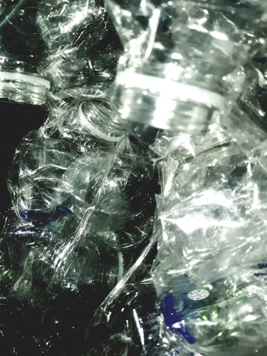
During this project I used the process of photo manipulation to create colour altered and repeating pattern photos of my tower, which are heavily inspired by the shapes seen in brutalist architecture and the repeating patterns in Cube. From these processes I have learnt ways that I can alter images to make them feel as though they are of something completely different and create repeating patterns which are mesmerising out of something as simple as a water bottle tower. I also learnt in myself that I enjoy digital art.
I came across a problem when I was trying to make my tower, as I wanted to glue the bottles together to avoid any tape being seen in the photographs. In the end I opted for tape, as the clear shape actually wasn’t very visible. This solved my problem and worked much more effectively.
I pushed my work as I looked at the original photographs of the tower I made and felt very inspired by the shapes and contrast seen in the folds of the plastic. From this I chose to manipulate some images and create kaleidoscope imagery as this is what I felt was best representative of the shapes and patterns I was seeing and experiencing in the tower.
2 notes
·
View notes


Text
My dystopian building

In this picture I used a mirror to create a photo with a lot of dimension where the background is just as important as the foreground. The sense of space being used in this way is crucial to my concepts as it looks like a whole city as opposed to one tower on it’s own. The photo is monochromatic mainly and defines the textures and layers of the crumbled plastic which is reflected in the mirror. The way the reflection is faded and is darker than the actual tower creates depth and implies a distance from the foreground as if the towers could go on forever and are finite. The clear texture of the bottle is similar to glass and reminds me a lot of the towers in London such as the shard, and also the towers in futuristic retroism. The shapes and folds remind me a lot of geometric patterns and drawings of architecture as well as kaleidoscopes.
0 notes
Text
My dystopian building
I made a tower out of water bottles to based my art on for this 3d project. I photographed it from various angles and changed many of the photos to black and white to add contrast and create the idea of a dystopian future. I took the photos from many angles to show the full tower and also show scale and create the concept that this is a big tower and not in fact a small building.


I kept the background as plain as possible and I used the flash to make the dimensions of the plastic folds and the entire stand out in comparison to the background. The form is man made and angular in a very similar way to how brutalist architecture and the example from Cube look very angular and dystopic.
0 notes
Text
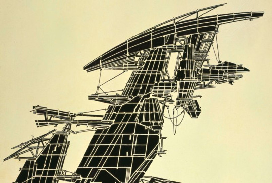
Towers
Brutalist Architecture

imposing, daunting, jagged, modern, isolated, prison-like.
Cube, 1997

industrial, robotic, futuristic, trapping, puzzling, confusing.
Playtime, 1968.

imprisoning, omnipotent, controlling, segregated, inhumane, boxed in

linear, prison bars, imperfect, systematic. intense, geometric.
2001:A Space Odyssey, 1968.

spherical, infinite, technical, astrological, bright, shapely.
Lebbeus Woods

monochrome, destructed, contrasting, insignificant, tiny,
quadrilateral, blimp, floating, balanced, anti gravity, pushing boundaries.
Retro Futurism

colourful, technology reliant, progressed, vintage, possible.
2 notes
·
View notes
Text
Evaluation
The 3 artists that impacted my ideas the most are Robert Rauschenberg, Kathe Kollwitz and Sui Park. Robert Rauschenberg influenced me to want to layer things within my work and he was the reason I layered my screen prints the way I did and he made me want to use contrast between colour and monochrome, and that became really important for the way I portrayed parallel universes in my art.

Kathe Kollwitz made me want to create more emotive art and develop my ideas to be more raw and portray the way I feel and the message I want to get across. In my intaglio printing I made very dark prints of a sullen looking man, which is very reflective of the way I felt when I was doing the printing.

And finally, Sui Park influenced me to think about pattern in my work and made me include patterns and cut out work in my books which I really enjoyed creating and added some more abstract shapes in my work which I wouldn’t have tried if I didn’t research her. She also made me think about my presence on this Earth which is something I think is important in my project as I pondered a lot on my significance.

To begin with, my ideas were themed slightly around Greek Mythology as I researched my star sign and my constellations for the project. Then, as things developed, I decided I wanted to gravitate more towards the idea of parallel universes as I had 2 books to filled and thought it would make sense and link to the theme if I did one in colour and one in black and white. To further develop this idea I looked at the show “life on mars” as this is about a man who gets hit by a car and we are unsure as to whether he is in a coma or in a parallel universe, but he is taken to the same location he works in just instead of the 2000s it is the 1970s. After researching this I researched the linked song which is David Bowie’s “life on mars”.
I have experimented with dry point, intaglio and screen printing, and I have learnt to use a sewing machine and sewed into some pages in my book, which I really enjoyed doing even though it too me a while to get used to doing.

During Thursday’s drawing lessons I learnt a technique I really enjoy, where I cut up and rearrange some faces and blind draw them, before shading into them further and making them more developed. This technique allowed me to be more loose with my drawing and less of a perfectionist, which really helped me in further lessons. I also learnt how to use a stick of graphite, which is something I hadn’t done before but it is something I carried on developing in this project and in my personal work.
The piece below is a piece of work I found very impactful to my learning as not only did I experiment with a process which I have found I love, but I created something I was extremely proud of and that is on a larger scale than I usually work on. This piece taught me a love for oil pastel and that black and grey with a hint of colour is a colour scheme which I love a lot.

I am pleased with the outcomes I have created in the Thursday drawing lesson more than anything else I have produced in this project, and unfortunately I don't not feel I developed my penguin books to the standard that I wish I did, especially the colourful book as I didn’t refine that one much.
If I could display my work anywhere in the world at any time in history I would want to display it in the Elizabethan era and I would sign it as some other famous painter at that time and title it “Elizabeth” so that they would get beheaded for portraying her in such a ghastly manner.
If I picked some music to go with this project it would have to be the album “the oogle deathmachine” by Days n Daze. This is because this album is very scratchy and shouty, but also serine at moments, so I think it sums up my work quite accurately in this project.

This is my home workspace. It is a bit of a mess but it functions for me.
Something that I can do now that I couldn’t do before this project is use a sewing machine, but now that I can do that I can incorporate it into my other projects and my life at home and maybe even make my own clothing, which is something that I have been considering for a while.
My final ideas were heavily influenced by my research, in my research I made references to patterns, so I experimented with creating patterns using the words in the books. I even drew David Bowie because I referenced him in my research. Overall I believe the links between my research and my work are obvious.
The work I am most happy with is my Thursday lesson work as I believe I was very experimental and I made art which pleased me whilst also enjoying the process, which isn’t something I achieve a lot. The screen prints I created also are something I am proud of as well as the intaglio and dry point prints, as they were all processes I hadn’t used before and therefore I was very happy when my outcomes were successful. I believe I created dynamic pieces with the printing process as they had lots of contrast and showed the objects and words I desired them to.
0 notes
Text
Intaglio and Dry Point Prints
We created dry point prints on plastic and intaglio prints on this cardboard with a shiny covering. I tried to create a similar face on my first prints, with one of them being the blind drawing of the other. I was really happy with the prints I created and they were based on the collages I created in the drawing lesson on Thursday. They were very dark horrific images which I really connected with when creating and therefore would like to carry on in my personal work. The lines I created in dry point were much finer and there was no block colour due to that being hard to achieve on plastic with a fine engraver, so the intaglio board was used for the slightly more detailed print. I also kept the outside of the intaglio print and I used that as shown later.

The first print I made I wanted none of the negative space to have black in it as I wanted to see the print very clear. This left a boarder which I didn’t like so with my next dry point prints I left the black ink around the border in a very purposeful way. This applies to my ideas as the black border makes the print look as though it is being sucked into a vortex, much like a black hole. The texture created by the fabric used to wipe the prints clean created some brush like strokes and small lines which further emphasise the entrapment of the void.


Unfortunately in the print above I cleaned the print too much and actually managed to wipe the ink off The print area, so I was much more careful after this print to not do that. My issues regarding the border were solved when I printed my intaglio print as it is in the shape of the object, making it be clean on the page used.

When printing you have to soak and blot the paper as ink will transfer better to damp paper. I also used a printing press which isn’t something I had ever used before. The first face I printed, above, had too much ink on it and therefore I learnt from this and tried to apply less next time. Unfortunately my next one had too little ink on it as I must’ve wiped too much off. I decided to do all my prints in black and white to match the dark themes of the books I had chosen and to relate to the sky at night and black holes and more daunting things about our universe.

The two prints below were very successful and they displayed all the dark parts and light parts that I wanted in the prints. These are the prints I am most happy with regarding this task. I really like the way the hatching shines through and brings many textures to the face and the way the not completely clean plate leaves some graininess on the face with further adds to the idea that this person is old, as the majority of the faces that this was based on were old men.


Finally , I printed some pages for the black and white page. This is where I used the frame of the intaglio print. By using it is this way and creating a puzzle like composition I relate to the audience the idea of parallel universes, where these images are the same they are just reversals of each other, which is what could happen in the universes when the particle configurations are changed.


0 notes


Text
Self Portrait
Luke Dixon
Luke Dixon is a portrait artist who works in a very pop art style which uses the contrast of black and white and a very interesting hatching technique which follows the contours of the face. when I look at his work I think of mapping, detail, segmented, hatched, shaded, realistic, geometric, portrait, organised, purposeful, abstract, maximal, gritty and regimental.

The lines used are like the lines seen on mapping to display how deep something is, and they are used for a similar purpose, to show depth. Everything about this style of art is very regimental, with every line spaced in a very specific way to create the correct tone and all the lines being evenly spaced out with no exceptions. This has a very purposeful outcome, and it reminds me of Emma McNally’s work due to the geometric way that everything is segmented and the common use of lines.
When I made my own self portrait in the style of Luke Dixon I started by outlining all the different tones on a photograph of myself to make it easier to differentiate the tones when I trace the shapes later using a lightbox.

I then used a lightbox to trace all of these lines on to a plain white piece of paper so I have a clean slate to add the hatching to and create the tonal values.

I then used different closeness's of hatching to create some darker areas and some lighter areas. I chose to only shade the face as I felt if I had continued to on the rest of the picture it would have become difficult to see what parts are the face and what parts are the hands and hair. I also kept some parts white and coloured in some parts black to show the darkest areas and the lightest areas on the face.

I then used a photo manipulation program to layer some parts of the process and achieve a disjointed composition which strongly resembles the way parallel universes can be similar but slightly different at the same time.

0 notes


Text
Life on Mars? by David Bowie
The song Life on Mars? By David Bowie was released in 1971, and it reached number 3 on the UK singles charts. The lyrics of the song describe a girl who is let down by reality, and therefore wonders whether there is life and other opportunities elsewhere, such as on Mars. I believe this is relevant to my project as the song is related to the TV show I have talked about previously. Also, the subject of the song is relevant as I am also pondering on the possibility of better universes because our one is terrible.
Some people see the song as something much more political, and perceive Mars to be a metaphor for Russia, and the question being asked being much more representative of “is living oppressed worth it?”. The first interpretation is probably closer to the way Bowie intended, however.
A further interpretation is that this song is about how the song is discussing the way media has become our reality. The girl has arguments with her parents, which is relevant to the media at the time as the 70′s was the era when rebellion against your baby boomer parents was a popular thing. In the chorus, Bowie describes things which would typically be seen in films, before saying “wonder if he’ll ever know he’s in the bestselling show”, implying that he is an unaware actor, possibly an actor in his own life, performing for the world, just like we all are doing, by Bowie’s interpretation.
0 notes


Text
life on mars tv show
I have chosen to research this particular show as part of my project due to the way it keeps the audience wondering whether this is an example of another universe or not throughout. In the show, the protagonist, Sam Tyler, gets hit by a car and taken back to the 1970′s. The name of the show comes from the song that was playing when he gets hit, Life on Mars by David Bowie.
Throughout the show Sam hears family members talk to him from the real world and sees this young girl from the TV how updates him on his state in the real world, as he is actually in a coma and not a different universe. He realises that he has to co operate with the police force of the 70s to possibly get back to his real life and he meets some people he knows back in his 200s life whilst also trying to argue against the corruption of the police in the 70s.
The antagonist, Gene Hunt, is a dirty cop from the 70s who uses violence and brute force and bribing to get what he wants. He also chooses to believe the information he wants to believe to close cases faster. Sam Tyler argues against this and chooses to use the more modern investigating techniques he knows to get things done more accurately. These contrasting characters work together to creating a very clever excuse for Copaganda, as on one hand the cops are shown as corrupt and bad and a terrible thing for society, but those were the cops in the 70s, and Tyler’s character is there to provide a balance and display that the cops now are much better and more politically correct.
At the end of the series Sam Tyler finally recovers from his coma, but not before he can save his 70s friends from a shoot up on a train, so he has a terrible time in the real world, and actually kills himself to get back to the friends in his head. This is a great end to the series as it is unexpected but it also shows the weight that the people he had made in his mind held in his life. It holds the message overall that what you are striving towards may not be what you truly want in the end.
0 notes
Text
Squares
Richard Long
When I look at Long’s sculptures I think of the words natural, godly, treacherous, intricate. realistic, limiting, forbidden, planet, segmented and preserved.

The portrayal of a landscape being smaller than it usually would be and being able to look over it make me feel like a godly omnipotent being as I wouldn’t usually be able to view this much of a landscape without aid from a drone or helicopter. The way that the eco system is preserved on it’s own segments reminds me of our planet which is on it own and on its own rock. The fact that this landscape is untouched by human technology makes me feel as though it is forbidden as it is completely natural and shouldn’t be ruined by us. These are opinions I share with the planets that humans are trying to inhabit, as we have ruined our planet and therefore I believe we should leave the others alone.
The large amount of detail put into make this landscape look real is very intricate and convincing, and the size of the square is limiting but in a very good way as it forces the artist to put their all into a smaller area opposed to using a larger canvas and focusing much more on the bigger picture.
My Squares

I created my own squares as the limit in space makes it less daunting to experiment and easier to create more patterns and such as it only has to fill a small area. On the whole page I tried to create a balance of space and use both big and small squares on both halves of the page. In my squares I used the space to the maximum possibility as these are either repeating patterns or shapes made to specifically fill the squares, for example how I have made a word fit in the box in the top right corner.
Some of the lines are presented in an abstract architectural way, with the triangles weaving towards the centre like a black hole drawing you in. In other areas my writing is more illustrative, like where the words follow one continuous line and are repeated in a finer line to create an illustrative abstract shape in the square which is related to the book whilst also being completely meaningless in ways. I also created a few squares using stencils layered in ways where I have written a word from the book with the stencil, each letter on top of one another, creating a pattern of jumbled shapes and completely unreadable asemic writing.
0 notes
Text
Genesis 4
Anselm Kiefer
When I look at Kiefer’s art I think of woodlands, dirt and grit, wastelands, apocalypses, dystopia, ashes, blood, layers, mixed media, violence, textures and death. The grey tones and textures of sticks and leaves remind me of the aftermath of a forest fire where we are left with nothing but destruction and death and ashes. This means the painting makes me feel very desolate and isolated. I feel a similar way to this when I look at the sky on a cloudy day as it is nothing but a desolate grey which can be rather saddening.

The axe laid in the middle of the painting makes me believe that the meaning of this is that humans are destroying the earth, as humans created axes and they are a simple example of the man made technology that is ruining the earth and destroying the forests which are so important for our livelihood and the livelihood of many species.
The dark brown mark amongst the marks which appear floral to me reminds me a lot of a dark secret hidden within beauty. It makes me feel as though this grotesque mess of beauty is being ruined by this dark growing mess to become a depressing stain. This makes me feel really overwhelmed and sad due to the happiness being taken into the sadness, in a similar way to when day becomes night. The dark smudge reminds me of a black hole and it is similar to the way a black hole can consume our universe and possibly take us to some place much darker.

My Art
In my art I created some graphite drawings which are of some crumbled up paper which twists and turns on a journey which resembles a journey through space and time. I filled the space of my boxes with dark graphite marks which are very similar to the dark universe and the way the graphite has a texture on the page which leaves some areas lighter than others looks very similar to the way that stars look like in the night sky. The tonal way in which I have shaded these with the graphite is to create deep contrast and depth between the twists to accentuate the folds and turns within the tiny meteorite I have drawn.
The abstract shape reminds me of rocks and rubble which float around in space and the hatching I have created in areas creates contrast as their is a large contrast between the neat lines of the hatching and the rough texture of the graphite shading on the page, which to me can emphasise the concepts regarding how different a parallel universe could be to our own.


We then moved on to a task which involved drawing around rocks and bones to create these abstract shapes with them. I then created a nucleus for the shape with a piece of tiny rusty metal. These lines I have created feel very atomic to me as the lines surround a nucleus very much like an atom. The lines also remind me of a plasma ball when you touch it and the lightening appears, which I in turn relate to planets due to their round shape. The lines in my art all represent a different universe with a different particle configuration, all very similar but slightly different, going on their own journeys and adventures.
I did two pages of these and on the first page I followed a triangular border to create confined universes, all similar in their beginnings and their shapes and colours, but ultimately different due to their patterns and configuration. In on of these I used an extract from my black book to create the triangular shape, writing the extract in a way which is unreadable meaning that the actual meaning is hidden only for me. I also used a pattern similar to the one I used on the Rorschach test in areas to represent the layers of the universe and how there is so many things we are yet to discover that are hidden within our planet and the universe we are a part of


With the second page I applied water to the ink so it would bleed and I then shook the page in certain directions to make the drips fall in certain ways. this way the drips connect all the objects and create a solar system on my page. The ink is affected by the water and creates blurred edges on some of the liner which, to me, communicate the message of the gas which some planets are made of, The irregular shapes of these communicate the different conditions that all planets have.


0 notes