
Don't wanna be here? Send us removal request.
Statistics
We looked inside some of the posts by jennynudijini-blog and here's what we found interesting.
Average Info
Notes Per Post
29
Likes Per Post
11
Reblog Per Post
18
Reply Per Post
0
Time Between Posts
3 days
Number of Posts By Type
Text
8
Photo
7
Link
2
Last Seen Tumblr Blogs


Fun Fact
Tumblr is available in 18 languages.
Text
Reflection_The FOOD Event
Artefacts in several core projects or 3 specialist modules that imposing from the diverse design contexts and key issues to interface with society and collaboratively working as a team work, are responding to outline the entire processes of final outcomes and the ways how to communicate through strategies to audience and research of design contexts. The power of unconsciousness ideas were harmonising with each group’s discipline, prototypes or the other found materials, individual contributions and group contributions, due to be created something that is more innovative and sensational experience within the wider context of the event. One of core projects, an interactive or an objective manipulates that cultural, environmental, social, ethical, and critical thinking to establish how the Food Waste would be co-hosting by 100+students and staff in Studio 1 Communication Design at RMIT University. As all people have different personalities, individualities, opinions and perceptions, we have reached to explore our responses to the various ideas, new information from any references and thoughts to gain the most suitable idea on the food event. I’ve realised that self-knowledge possesses disparate and affirmative opportunities on every single step despite each person are from different country or different religions and distinctiveness. Moreover, the case study intrigues me with the diverse contexts and prompts me to trace my own learning journey as I attempt critical concepts into more meaningful ideas by using our knowledge and experimentation. Some ways to be reflective or evaluative planning, problem solving and finally decision making in our discipline help me to interpret real-life events and considerable situations through relevant research, experiences and practical working.
Categorically, we made a decision to figure out what prototypes or the other found materials would be used and how they could be consisted of installation design or activated with audience. I focused on an effective planning with use of waste after the food event finish. I came up an idea, which compost the whole waste as layered composting with the compostable cups and building the cups as a castle to compare and collect the ratio of waste or data from the event. However, we realised that spending money to get them and wait for experimenting them would be also wasting. This problem clearly tells us the strengths and the weakness of our conceptual prototypes. Honestly, we were ready and expected a huge or well-visualised installation design at the end of the day to show our creativity and how much we’ve put efforts on it. Ultimately we renewed our idea to count the specifications such as statistics, which are the types of fruits, amounts of fruits and timing on preparation. It was successful and satisfied with setting items on the table to clarify how many and what kind of fruits, to design the infographic posters. Withal in this studio class, there are three different areas to create my own artefacts as a partnered work and individual works. They are symbolising my personal distinctiveness to draw design thinking towards how my five senses are predominating on the delicate capability of conscious approach. To outline the all aspects of this course and processes in 12 weeks, I can say my perspective is changed to responsive and saturated by working with others.
0 notes
Photo
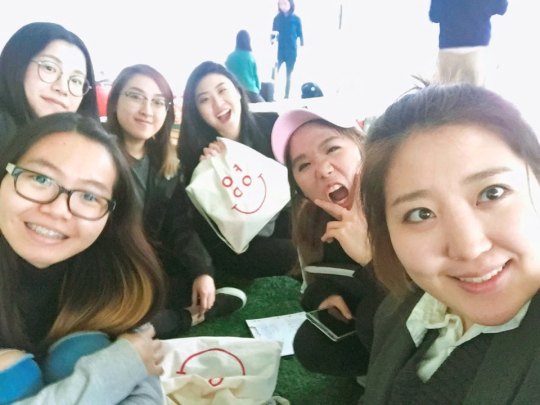
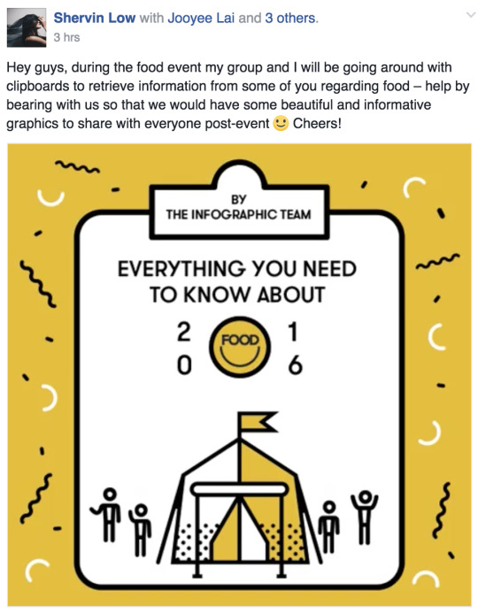
Core2639 Project 2 The FOOD Event
It is able to see diverse evidence of my group’s contributions and individual contributions to describe research, brainstorming, planning, development, experimentations, documentations, sketches, prototypes and final outcomes. We always attempted to separate the roles of capabilities in order to interplay with each other and for bringing the planning and developing our ideas out to solve our problems. The results are satisfied even we were used to encounter unexpected situations or discussions. At the first time, I was a bit of pressured to go forward that more than one person should be participated in one mini-group work. However, I realised that taking responsibilities and risks were for all of us and it was another chance to think different and more valuable opportunity to respond to specific or ethical strategies in our design and small society, Studio 1 Communication design at RMIT. I am sure that our discipline for the teamwork and finalising outcomes worked collaboratively and effectively on the collecting data to refine the posters of colours, layouts and design elements and principles. As we had a few experiences in our working process, personal interpretations, styles and uniqueness are different. Thus we tried to combine and refine in one style to get not confused and mess. A rationalised our work is to visually inform and communicate with collected data from the Food event. There were diverse prototypes to be used as an installation design and major materials, which are the ‘fruits’. I think our work was not external; it was internal work to be more insightful and go into depth of statistics such as economic, mathematical calculations, descriptive types of objects and extra sources from these. This is because we wanted to show how we’ve put more effective efforts on the event and how we respond to detail study. To outline the entire working and final work, we did not hesitate to be lazy and be collaborative. Definitely success was there but lot of sufferings or failures were there as well. The point that we have been through together was successful thing and worth result. We all feel a sense of accomplishment on this project and for 12 weeks.
2 notes
·
View notes
Text
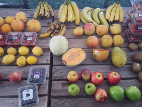
Andy suggested that there are a few ways to demonstrate our event without the found materials, which is plastic. This was a challenge to solve the problems we had. We were pretty sure that the filling the food waste in the compostable cups but we needed completely different ideas and experiments in a short time. We did not have a choice to think about any other found materials or prototypes. The important thing was that we wanted to keep the main topic of our event, ‘collecting data’. Simultaneously, we realised 100+students will buy or prepare what they need for the event and their needs will be one of the collecting data. It is very difficult and demanding a lot of specifications to document statistics of 100+students’ event results. We will collect the amount of fruits, types of fruits, price for the types of fruits and possibly the weight if we can measure them. The last step to do with these data, we are going to create infographic posters of the data and share 6 posters to submit the Project 2 and SKO
Week 12
This will be a very long post as many many changes were made on this day.
tl;dr - we’ve shifted from Activate to Document, and will no longer be dealing with food waste.
This week the class walked through the event together, from the buying of the ingredients to what to do with the waste in order to figure out what still needed to be done. Each team also started to refine their ideas, preparing them for execution on the actual day.
Some of our refinements:
- each cup would represent one person (number of cups = number of people) - by ‘waste’ we mean inedible organic stuff (e.g. peels, rinds, stems and seeds)
We tried to think of ways to:
1. stably stack the cups
While we initially wanted to stack the cups to make a tower, the method required using something (we thought of a piece of hard plastic) in-between each row, which would end up as more unnecessary waste. Although we liked that a single tower of cups would be a good physical bar graph (as the bottom ones would all be filled with waste while the top would be empty)
Thinking back to when we saw a group of students stacking empty plastic cups into a triangle (pyramid?) after some beer event at Alumni Courtyard, we figured that could be a good way to do it. The next problem would be preventing any toppling over (they almost managed to complete the triangle but it collapsed) and we thought putting it against a wall (to prevent wind) would be a good solution. We also figured that if it still wouldn’t work, we could use blue tack or some tape as a last resort.
2. make the installation interactive
As for making it interactive, since each cup would be representing one person at the food event, we thought it would be fun for everyone to stack their own cups onto the pyramid. Each person would bring their cup, fill it with waste (that we would have collected during the preparation) and place it. Once the waste runs out, we would just let the rest stack the empty cups at the top. It would then be really easy to see and count the amount of waste.
3. inform them about what we’re intending to do (keep the cups!)
We figured we could just post it on the Facebook group, but seeing as not everyone has Facebook (and not everyone might see it in time) we thought it would be a good idea to make a sticker to paste on each cup with the instructions. However we realized two things: 1) it would be expensive to produce and 2) it may make the cups not compostable. So, we thought we could just have a poster/ signboard informing people what to do at the drink station (where they would be getting the cups from).
However, after speaking to Andy, we found out that every other team was trying to stay away from using plastic, so he suggested that we think of something else. Despite the cups being compostable and the fact that the drinks team would be using the cups before we do, it just didn’t really sit well with what everyone else was doing. The drinks team would now be using the teacups Andy brought during the first Soup Kitchen.
So, we had to scrap everything we’d just discussed and think of a new way to visually and physically represent how much waste we produced.
We came up with three ways to show the food vs. waste data:
1. tarp
Since the salad was going to be made on a tarp, we could photograph the salad once it’s been made and then on another similar tarp, photograph the waste from the production. It would then just serve as a visual representation, with the tarp being the scale reference.
2. weight
Additionally, we could weigh all the fruits before they get cut up and prepared and then weigh the waste to find out the percentage of it we’re actually eating. We were thinking we cold gather everyone around at each weighing or something.
3. boxes
We would photograph all the boxes full of fruits once they get to the Alumni Courtyard from Queen Victoria Market, save the boxes/ crates, and then fill them up with waste at the end and photograph it again in a similar arrangement. This way, we would have the boxes as reference to how much of the fruit we are actually consuming, and we wouldn’t have any additional waste. However we also heard from Andy that there was a team making tote bags that they would use to transport the fruit, so this idea might not work.
But basically a lot of problems kept coming up if we wanted to use the actual physical waste, so, with Andy’s approval, we decided against it.
And we’ve finally arrived at what we’ll actually be doing during the food event: our team will be collecting as much data as we can from the event and make infographics about them. We would be collecting some basic info that we can then find patterns in.
For example, from something simple like the number of each fruit we could find out which fruit was the most popular and how many colours were in the fruit salad.
However we’re also exploring the option of getting more complex data such as which fruit travelled the furthest to get to us (not just “from QVM” but maybe the origin of the fruit etc.)
How are we going to collect this data? We haven’t figured it all out yet, but to find out how many of each fruit there are, each one of us will stalk one member of the preparation team and count how many of each fruit they’re preparing as they prepare it. We’ll then collate all our results and see what other info we can get.
5 notes
·
View notes
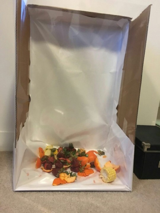
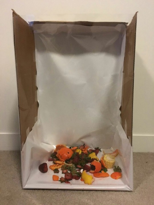
Photo
Week 12
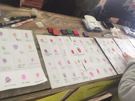
Finally, we attempted to consider how our group’s event could communicate with 100+students. Compostable cups like plastic cups had to be constructed as cattle and empty cups would be on the top. This was not matter to do it but we needed to figure out how it can communicate with people that we were going to collect the data with the food waste. It was possible to design and stick the label that comments ‘collecting food waste and compost it’. However, Andy suggested that there are a few ways to demonstrate our event without the found materials, which is plastic. This was a challenge to solve the problems we had. We were pretty sure that the filling the food waste in the compostable cups but we needed completely different ideas and experiments in a short time. We did not have a choice to think about any other found materials or prototypes. The important thing was that we wanted to keep the main topic of our event, ‘collecting data’. Simultaneously, we realised 100+students will buy or prepare what they need for the event and their needs will be one of the collecting data. It is very difficult and demanding a lot of specifications to document statistics of 100+students’ event results. We will collect the amount of fruits, types of fruits, price for the types of fruits and possibly the weight if we can measure them. The last step to do with these data, we are going to create infographic posters of the data and share 6 posters to submit the Project 2 and SKO.
0 notes
Photo
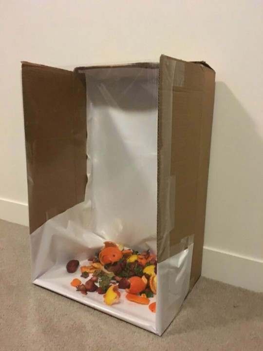
Core Project 2 Experiment
Rapid Prototypes / Other Found Materials
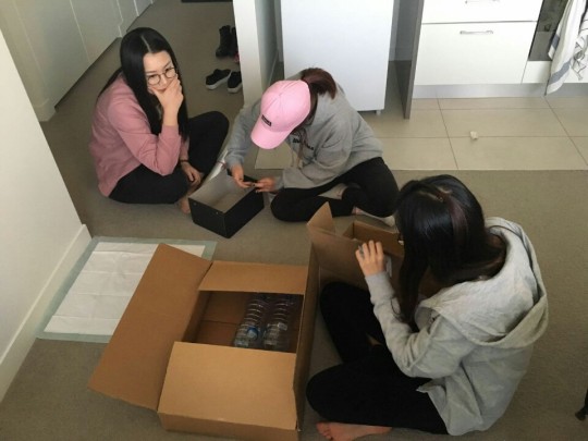
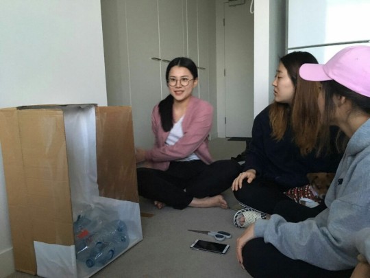
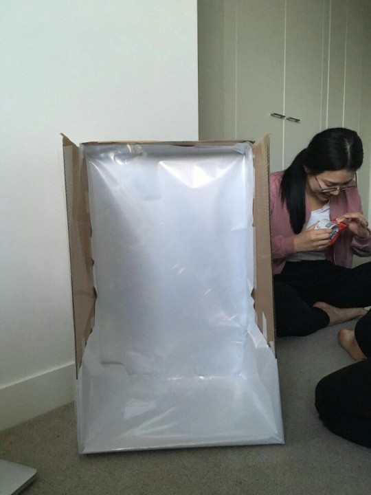
We’ve played with other found materials, which are boxes and transparent papers like flower covering papers. Those papers are for preventing the possibility of getting wet from the fruits and vegetables juice. We had to do experiment to see how the food wastes and transparency would work each other. It was not bad as we thought but the transparent paper on the front will be bendable when people pull the paper to throw out the food wastes on the box. We discussed about the thick and strong transparent paper or something else but the constraints of economical problems had come out at that moment. So that’s why we are still working and discussing about this problem.
1 note
·
View note
Photo
100 posts! Lol
3 notes
·
View notes
Text
Core Project 2 Research of Visual Data Representation
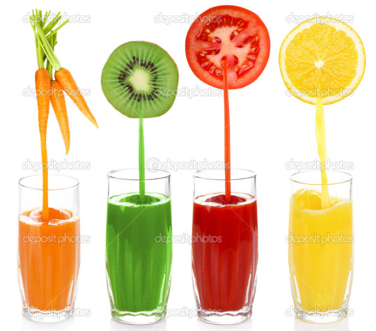
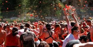
Tomato Event in Spain
Tomato event in Spain is La Tomatina tomato fight festival, Buñol, Spain. La Tomatina is a food fight festival held on the last Wednesday of August each year in the town of Buñol in the Valencia region of Spain. Tens of metric tons of over-ripe tomatoes are thrown in the streets in exactly one hour.
The reason why I want to think about this kind of events is that we can use the fruits or vegetables instead of using painting for the visual installation design. As Shervin and I already mentioned about this, this will be more active to paint or stamp on the textiles through squeezing juice from the fruits and vegetables, like using food waste. Then, we can use the food waste and leftovers to compost, as our group will activate at the end of the day.
1 note
·
View note
Text
Collecting data and subjective data on our event will open soon! haha
Week 8
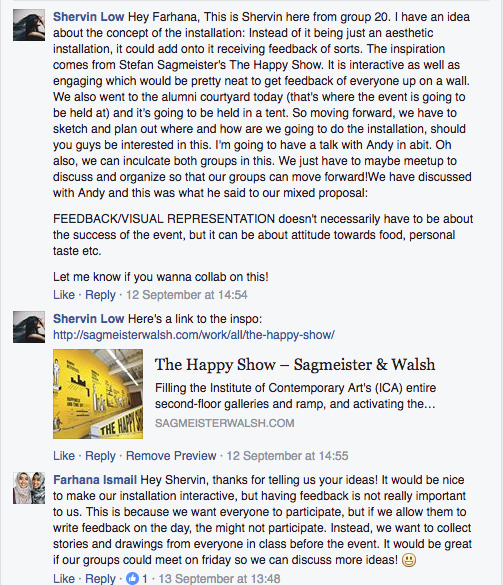
After seeing what the other teams had come up with and discussing with groups 12 and 16, we decided that what our group was planning wouldn’t be enough of a contribution to the overall Food Project.
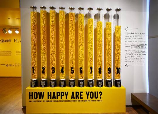
Shervin found an interactive installation by Stefan Sagmeister where, after viewing an exhibition called “The Happy Show”, they would rate their happiness by taking a gumball from one of the ten numbered (and very tall) gumball machines. In the end, the gumball machines made up a bar graph of people’s happiness.
We then went on to discuss how we could integrate this idea of visual statistics into our initial idea of food stamping. Here’s what we came up with:
have everyone rate how satisfied they were with the food project by stamping a piece of waste onto a number (very similar Sagmeister’s installation)
have everyone rate their satisfaction, but with different colours representing different levels (e.g. 1 is blue and 10 is red), but they can stamp it anywhere they like on the installation, so at the end we would be able to see the general consensus based on the most prominent colour
However, after speaking with Andy, we realised that we didn’t have to stick to print making, but rather the idea of using food waste as a tool. With that in mind, I thought of a few different ideas:
create a ‘rainbow’ out of the food waste by either sticking it directly onto a template or by filling transparent tubes with waste in the colours of the rainbow
fill one container (or transparent tube or whatever works) with the food before we eat it, and measure the level. Then, throughout the event, fill it up again with the waste, to show how much of the food isn’t being consumed. Or maybe weigh it, since generally the waste would be in smaller pieces and therefore may take up significantly less space in the tube anyway.
sort the waste into different containers based on some other factor like maybe recyclable/ compostable etc to see how much waste we’re ‘wasting
The end product would still be a visual representation of statistics, just without the pretty/ arty element of stamping, but could be equally as interesting.
Our new MSCW would probably be something more like this:
Must: be interactive, let everyone leave their mark, represent a statistic, use waste as a tool/ medium
Should: be colourful
Could: include other visuals
Will not: be an individual activity
It seems we probably won’t be working with groups 12 and 16 anymore, though I think we’ll still be meeting on Friday to discuss and maybe see where their ideas could fit in or vice versa.
5 notes
·
View notes
Text
Omg lol btw we already figured it out (as we discussed in week 10) to determine how the visual data representation with food waste and the subjective data event or objective data will be collaborative with our event. And my suggestion for the visual data representation is to stick on the plastic storage with the blue stick and our experiment stuffs of project 1 (group presentation), for using all our experimentations and ideas.
Week 8 (12/09/16)
This week was all about remixing ideas with what the other groups are doing, so we took the initiative to create a facebook group with group 12 and 16 as we thought that we could remix our printmaking ideas onto what they were doing.
Our facebook group with group 12 and 16. It was essential to us as not everyone has classes on the same day.
After having a sudden spark of inspiration, i wanted to contribute to the event in bringing our cohort together with an interactive installation, originally inspired by Stefan Sagmeister’s ‘The Happy Show’ which documents his results of his ten-year explorations and investigation regarding happiness. It was so intriguing and interactive to the visitors that it left an impact on me craving to contribute to the food event in a similar manner.
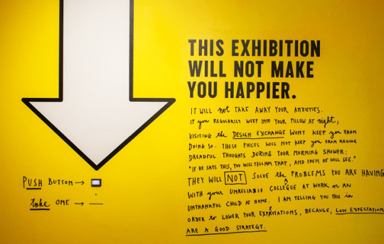
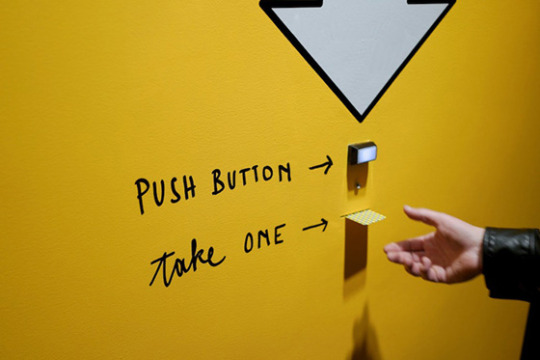
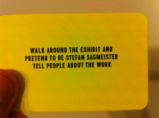
A push button that dispenses a card with instructions on how to behave during the visit. The messages are things like, “Walk through the exhibit and pretend you are the artist” and “Carry whoever you are with on your back throughout the exhibit.”
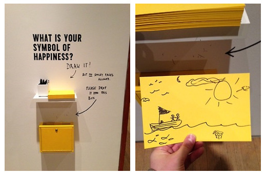
Another interactive activity to do in ‘The Happy Show’ – Drawing your symbol of happiness
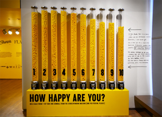
A data representation made out of yellow gumball machine to survey overall visitor’s mood levels
Displaying his favourite sweets After discussing with my group on how we could integrate this idea of visual statistics into our initial idea (which was food stamping) here was what we came up with.
- have everyone rate how satisfied they were with the food project by stamping a piece of waste onto a number (very similar Sagmeister’s installation)
- have everyone rate their satisfaction, but with different colours representing different levels (e.g. 1 is blue and 10 is red), but they can stamp it anywhere they like on the installation, so at the end we would be able to see the general consensus based on the most prominent colour
However, after speaking with Andy, we realised that we didn’t have to stick to print making, but rather the idea of using food waste as a tool.
We could separate food waste based on colour, or sorting them based on material of waste (recyclable/compostable etc) to have a visual representation on how much waste was wasted for the event. The next step for us would be to think and research on data representations as well as possible questions and materials that would be used.
We thought that it was a good idea to conduct an interactive activity of sorts and give our work meaning. Given that we chose to follow through ‘Activate’ and though we are not going through with the food stamping idea (and in turn not collaborating with group 12/16), we’re taking it further by not only creating something aesthetically pleasing but as a whole, a physical data representation that would create awareness and impact to the people present. Our new MSCW (Group 20) Printmaking/Food stamping -> Visual data representation with food waste
Must: be interactive, let everyone leave their mark, represent a statistic, use waste as a tool/medium Should: be colourful Could: include other visuals Will not: be an individual activity
3 notes
·
View notes
Text
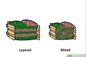
As well as our composting will be layered, not mixed, in order to look more clean and neat for installation design. Also it is really great idea to display the compostable cups like shops stack their items. If we use ZIwen’s group’ cups at the end of the day, it will be collaborative and co-hosting. I’m satisfied with your further ideas and organising our ideas.
Week 10
We told Andy about our idea of stacking several of the clear IKEA storage boxes so our installation would still be able to get the height that we wanted, but with the added benefit of it being modular and therefore more manageable than one giant container. Also it was hard to find such a tall, giant container, and making one didn’t go so well. But on the other hand, using several smaller containers would also mean wasting several smaller containers, because we really would have no use for them after the event.
He also asked us what we were going to do with the food waste after we’ve collected it and used it in our installation, and suggested we turn it into compost.
It was something that I had considered, but just thought it would be too much work and the process itself is pretty long, as it takes quite some time for the food to break down. In essence would have to maintain a pile of rubbish for weeks (during the holiday) until it would be of any use.
youtube
I still thought it was a good idea though, and figured we could also plant the seeds from the fruits we would be eating and then use the rotten corpses of their parents (the compost made from the rest of the fruit salad waste) to fertilize it and have a little fruit garden on campus.
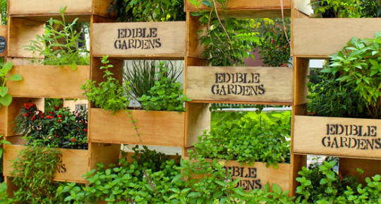
Having the ‘campus fruit garden’ was partly inspired by the Edible Garden City project in Singapore, where they’re trying to grow food at under-utilized spaces like rooftops and sidewalks. However in our project, not only would we be growing our own food, we would be growing food from our waste.
I thought the corner of the Alumni Courtyard would be a good place to keep it, as there’s currently some kind of garden there anyway, but apparently it belongs to Greening RMIT so we can’t mess with it. Elana also mentioned that it would be hard to get RMIT to allow us to put anything there anyway.
We spoke to Elana’s group, who’s planning the logistics of everything, including waste disposal. They found out that Queen Victoria Market had a ‘worm farm’ which is basically a bunch of composting bins, so they were planning on sending the organic waste there.
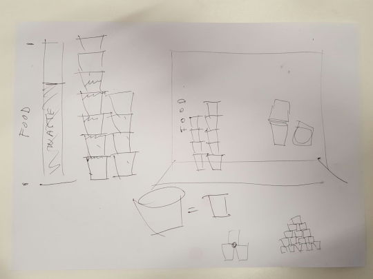
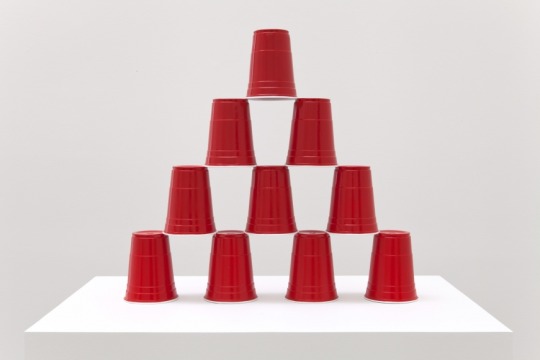
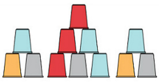
So we scratched the fruit garden idea and went back to our visual/ physical data representation idea. Jenny had the idea to fill paper cups with the waste and then stack it the way shops sometimes stack soap and shampoo bottles; with a piece of clear, hard plastic between each layer.
We thought it was a good idea, as the cups would be an easy way of measuring the amount waste (just count the number of cups) and we could use the cups to hold drinks (if any) or the fruit salad (although we found out there’s a team working on making invitations that fold into a bowl) during the event - so the waste would become a container for the waste. Paper cups made sense as it would be biodegradable and therefore we wouldn’t need to dump the contents of it out before sending it to the worm farm, but we didn’t like that we wouldn’t be able to see the actual waste inside.
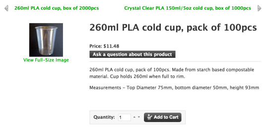
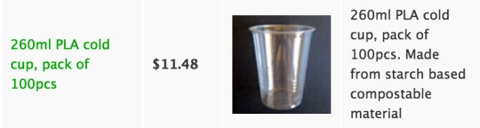
However, after a little bit of research, we found these clear, compostable cups. We found out that Ziwen’s group would be making drinks, so we spoke to them and they were fine with using these cups for the event.
The plan now is to use the cups during the event for drinks, then after all the eating and drinking we would fill them up with any waste, stack them for our installation and then send it all over to QVM for composting.
6 notes
·
View notes
Link
Core Project 2
research : Recycle
0 notes
Photo
Strategy
Part C Design Touchpoints | Information Design
1 note
·
View note
Text
Strategy
Part B Design Strategy | Design Strategy Document
Existing problems and ongoing challenges
- Such as Bazaar, Fashion, Elle magazines and the others, those are competitors that seem very identical and look the similarity to the audience. It occurs Vogue’s ‘look’ is outdated and common in market or audience’s perception
- Dealing with converting the magazines to the digital through Condé Nast makes the audience and the market confused and feel inconvenient to buy the magazine online
- There is Vogue’s distinctive direction of trend, which Vogue produces mini movies production and deliberate celebrity and fashion portfolio that specialises in
- The Vogue is playing with multiple interests and skill sets and not aware of a cycle of moving fast trend through creating even more peculiar things that audience never see anywhere else
- Contemporary and innovative implementation makes the market and the audience continue to purchase the magazine as a hardcopy
Current benefits and successes to be leveraged (used to advantage)
- The Vogue brand legacy (associated with the high end of the fashion market) by the typeface, Didot, as well as by visual recognition of the logotype font
- The current Vogue masthead (which is the physical logotype) and the design styling applied to Vogue's front covers
Unmet client / customer needs
- The unmet need and the priority of Vogue’s leadership and authority are satisfied by the brand’s unique role as a cultural barometer for a global audience
- Vogue places fashion in the context of culture and the world we live in — how we dress, live and socialize; what people eat, listen to and watch; who leads and inspires the audience and the market
- Vogue is not producing their own promotional items which causes customers
Changing client / customer behaviours and attitudes
- If the client wants to change the brand or the audience perception of the brand; for example if Vogue no longer wishes to be seen as exclusively high-end. If the audience changes the way it perceives high-end fashion and Vogue's association with high-end fashion. If the audience has become/becomes disinterested in Vogue and spends money and attention on a current competitor or new competitor
- Celebrity-audience / new audience/ models / specific photographer / images
Emerging ideas / trends
- The representative medias in the brand Vogue’s uses of techniques that are producing movies, video channels, books and digital realms prove how Vogue’s print magazine disparately separates from other magazines
- The brand Vogue always open ‘Fashions show, Runway and Designer Collections’ in many other places internationally to immerse itself in fashion, always leading audience to what will happen next
Opportunities to differentiate
- To be a ‘stand out’ or increase a reputation of the brand Vogue’s value, Vogue is required to seek how to stimulate thought-provoking on young people’ diverse interpretations, understanding and visual trends to bring refresh influence and catch an eye candy from the audience and the fashion realms
- It is essential way to manipulate in attempting to create Vogue’s own newly designed outfits, product implementation or 3D promotional items to substantiate ‘Vogue is the highlights of fashion world’
- Such a high-end brand sometimes needs to go back to the ‘original’, due to emphasise its individualities through using the concept of ‘trend are circulating’
1 note
·
View note
Photo

Strategy
Part A Research | Research Document
Design strategy is the roadmap for the visual and media components that help to build and drive these objectives (creative objectives)
Documentaries
A film, The September Issue was released in 2009 and portrayed an inside view of the production of the record-breaking September 2007 issue of US Vogue by director, R. J. Cutler. Wintour’s produced the issue with director Grace Coddington, The September Issue, was exploded over eight months and the largest ever promul- gated at that moment. With the 12th anniversary of the magazine, a documentary entitled In Vogue: The Editor’s Eye, was released in 2012 through the corporation of Home Box Office which is an American premium cable and satellite television network. Vogue's extensive archives, the film drew on behind-the-scenes that imposes the editors’ personal stories about collaborating with top photographers, diverse day-to-day responsibilities and motivations of a fashion editor at Vogue.
Video channel
Vogue published the Vogue video channel including Vogue Weddings and accessed via their website through the conjunction of Condé Nast’s multi-platform media
Voguepedia
Voguepedia was launched in 2011 through Condé Nast Digital for fashion encylopedia that maintains an archive of whole issues of Vogue’s American edition since 1892
Books
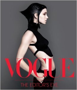
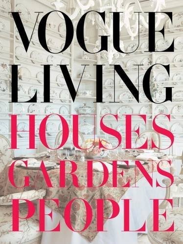
Books published by Vogue include:
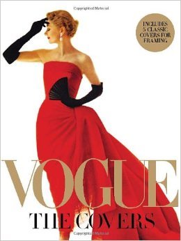
· In Vogue: An Illustrated History of the World's Most Famous Fashion Magazine · Vogue: The Covers · Vogue: The Editor's Eye · Vogue Living: Houses, Gardens, People, The World in Vogue · Vogue Weddings: Brides, Dresses, Designers, and Nostalgia in Vogue
0 notes
Photo
Strategy
Part A Research | Research Document
Business strategy can include financial, product and market objectives (business objectives), which are best expressed through brand touchpoints
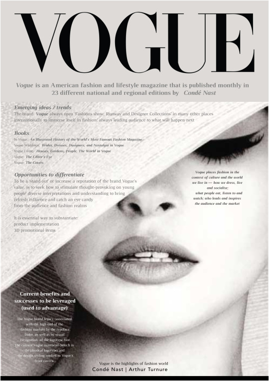
Vogue is an American fashion and lifestyle magazine that is published monthly in 23 different national and regional editions by Condé Nast
(Arthur Turnure’s years) Arthur Turnure found Vogue as a weekly newspaper in the US, sponsored by Krisoffer Wright; the first volume of united issues has published on December 17 1872 with a cover price of 10 cents (equivalent to $2.63 in 2015). Turnure’s purpose was to establish a publication that manipulates “ceremonial side of life” which interprets “attracts the sage as well as debutante, men of affairs as well as the belle” or a concern with fashion, coverage of sports, social affairs and males’ readership.
(Condé Nast’s years) Nast’s management brought huge influential abilities out to reveal his numerous magazines of publications and profit that dramatically increased a reputation in the society and the design fields. Withal, 1911, the brand, Vogue gained the brand name value through the ways of targeting an elite audience and responding to changes in the lifestyles of its target audience.
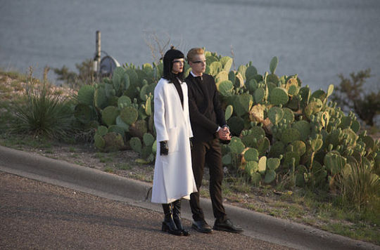
Anna Wintour became editor-in-chief of American Vogue in July 1988 and focused on new and accessible concepts of ‘fashion’ for a wider audience. Technically, Google partnered with Vogue to feature Google Glass in the September 2013 issue, Chris Dale who manages communications for the Glass tem at Google declared The Vogue issue has become a cultural touchstone ahead of New York’s Fashion Week.
Models Toni Garrn and brother Niklas Garrn wearing Google Glass during the 2013 September issue fashion photo shoot in Ransom Canyon, Texas (25 June 2013) -photo-
Wintour’s one of projects, “Fashion Night” was launched in 2009 and concerned about the Global Financial Crisis in 2007-2008, is called Great Depression. She made a decision to overcome various charitable causes and activate the retailers into the retail environment again with proceeds donating. 27 cities around the US and 15 countries worldwide were co-hosted with Vogue included online retailers in the beginning of 2011. This event occurred over the predicted profitability in the US and brought a result of potentially permanent hiatus but the event continued in 19 other places internationally. Furthermore, she acknowledged Vogue’s approach to fashion needed to establish a cosmetology school for giving people employment and she stated: “Beauty Without Borders” such as Asia and Afghan, for the effect of different cultures on fashion and women’s lives through US $25,000 from donation. Wintour’s industry clout had been used host significant fundraising events by support of the Obama Campaign through 2012 US Presidential election. The event, “Runway To Win” invited to recruit prominent designers to build features to support the campaign.
0 notes
Text
Core Project 1
Reflection of Group Presentation in the tutorial class part 4
We were ready to present our main goals to reach the Food project. This moment was the first time to stand as an individual and work as teamwork. Working process that we have been through was not only feeling a sense of accomplishment but also establishing in self-development how to solve the problems on every step, what ideas would be suitable and accessible and why all members’ roles are important. All decisions we made were co-hosted and collaborated by diverse ideas and all different perspective points of views.
First step of core project 1, ‘gathering or generating ideas’ with research, was to implicate our ideas for fitting into reachable or usable Food project. To clarify with our few ideas, we did several experimentations and document them for report and analyze or interpret what mediums, medias and methods would work and how to lead it to the next step, is called ‘thinking with hand drawing’.
As we had a last experiment with different types of papers and painting, our presentation prepared our materials to give a chance to do our activity in the class and also display our handworks on the table simultaneously. This is because we wanted to show and prove what we’ve done and how the results could come out at the end. We are sure that we tried to do best on this project.
1 note
·
View note
Link
Video Link = Experiment !!
0 notes