
Statistics
We looked inside some of the posts by jeremy5165882-blog and here's what we found interesting.
Average Info
Notes Per Post
50
Likes Per Post
22
Reblog Per Post
0
Reply Per Post
28
Time Between Posts
6 days
Number of Posts By Type
Text
7
Photo
8
Last Seen Tumblr Blogs


Fun Fact
69% of Tumblr users are millennials.
Text
Week 12 - Model making (cont.) and course reflection
Ill get the model making progression over, so I can reflect on the course we’ve travelled through over these two semesters :p
(model making continued) After transferring the measurements taken from the various tools and methods to paper and sketches, I then moved them into autocad and drew them as best as I could to what the real dimensions were on the object. I had trouble formatting the scale 1:1 in different instances (such as the page layout and lock settings) where I had no idea what happened, and transferring the data taken from the measurements onto a computer program I find very unwieldy (to wield* sorry, been thinking of swinging swords all day. would like to swing a sword into my blue foam, the trebuchet that’s worth the same as the 5min bbc bitesize quiz, project 3 and my non-existent vapd.) was difficult in the extreme. After a few naps, I managed to complete it and can now transfer them again to templates so I can start working on the foamcore model.


Course reflection:
Looking back, I realise now that I actually enjoyed far more aspects of this course than I thought I did. Working on something new each week and getting introduced to a myriad of techniques and programs was something I found very useful, as they formed a basic understanding which we could then practically apply to the tasks and assessments given (and also integrating them in our other courses).
Going from project 1 to 3 and all the tumblr posts and tasks in-between with friends, made the learning curve slightly funnier. It was painful though. But seeing everyone in a similar kind of pain made it more bearable.
I really enjoyed learning new techniques and applying them to projects, and I found that repetition is the key for the majority of the skills and programs we were taught. Project 2 was a heap of repetition, but I thoroughly enjoyed the process as rendering a 3D product from just nothing but a sketch was very rewarding.
I found autocad, the sketching techniques we were taught, engineering/technical drawings, Photoshop and the various other programs I picked up along the way such as InDesign and Illustrator, were a great help as they unlocked more ways for me to conceptualise and attempt other projects in the other 2 courses.
It would be great if this course ran for the entire year over 4 semesters, as we could go into each program and skill more deeply, and develop it to a more competent extent. But I'm glad they introduced these, and it’s up to us now to personally develop them with the foundation we were given.
I did have to arrange other course’s work over this occasionally...(when the fear of failing fundamentals became too real lul.), but I'm glad I ditched sleep to complete (to my own satisfactory [more or less] level) the projects and tasks we were given. They have benefitted me greatly, and I really appreciate the spheres of design that this course has opened in my perspective and thinking.
p.s thanks to all the tutors who took time to personally help us and guide us whenever we had a problem or question. I don't think I've ever had a question not answered, nor a tutor that was unavailable due to time restrictions. I’m really grateful that we were lucky to have them teach us this semester.
7 notes
·
View notes
Photo


Week 11 - Model Making
This week, we were asked to bring in an object for project 3 (our last project! i can finally do a dance after finishing this! .. but on second thoughts, it’ll prob b project 3 dancing on my grave instead). After scouring the house for a suitable object, I settled upon the object in the pictures above^. I'm not quite sure what it’s called, even though I've used it countless times over the past few years; but what I do know is that you put food inside... and food will still be inside (albeit in little pieces) unless you take it out.
Honestly though, I chose this object because of its appropriate size (workable model with foamcore ribs in mind) and it’s occasional aspects of challenge in its contouring.
I started by covering the object in masking tape, then proceeded to label each layer with gaps of 1 inch (2.54cm, will be even smaller once done more accurately. *accidentally used inches instead of cm.). I then drew lines to section off pieces to get a rough idea of how the foamcore parts would be slotted in. Using a digital caliper, I measured some of the areas of the object, but found it difficult when the caliper reached its maximum length or the contouring was too complex to measure. I approximated a bit when drawing a pencilled diagram of an orthogonal top view and side view, because I got stuck with the way the object was shaped. Ill have to go to uni this week and use the contour gauge and other tools in the workshop to get a more accurate measurement before I start the autocad sketch.
I found the measurement tutorial that we had in the lecture and in the workshop to be quite helpful as I've never seen or understood these type of handcrafted things very well, and tbh I'm still quite confused. It’s coming along slowly, and I guess as I familiarise myself better with the understanding of how to transition my understanding of measuring an object properly - to its drawing phase, - then autocad, - then to a foamcore model, ill begin to appreciate and apply what I’ve learned in the workings and process of this final project.
2 notes
·
View notes
Text
Week 10 - Sketching
This week, we had a guest speaker come and give us a lecture and tutorial on some of the basics of sketching and perspective drawing. Unfortunately I was unable to make it on Wednesday as I felt a bit off, but I was able to come on Thursday where he continued the second part of his lecture. I’m a bit devo I missed out on the first part, as I constantly bemoan my lack of drawing abilities and would love to learn anything to improve.
When Skeehan began to draw on the board, I did nothing for awhile except watch, as I had never before seen perspective sketching to draw cubes and shapes in this way. As he continued the lecture and explained how the lines would align to each point and how precision could be achieved through plotting certain lines at different intervals and such, it really broadened my view on how technical drawings could be perceived.
I have to admit I struggled through the entire lecture as I could barely draw straight lines without a ruler, or apply the lines to the given points to form anything that resembled the required cube or shapes we had to produce. Thankfully, one of the tutors and a few people around me gave me some really helpful drawing tips and basics, so that was nice :) I found it vastly different to the engineering drawings we had practiced in previous tutorials. Although the mathematical feel and technicality was still present, it was like seeing the orthographic views we had sketched in previous weeks, go through a prism and combine to form a three dimensional perspective which held a certain degree a realism, while hinting at the theoretical and imaginary.
My pocket also struggled when I saw the price of the copic pens, and ill invest in them once I can put food in my mouth and afford drawing utensils at the same time.
After the lecture, I did some research on perspective drawing, and was opened to a whole new world of the possibilities you can create with this type of drawing and sketching. It was really fascinating, seeing people’s work and the conceptual and technical illustrations which were drawn. I think that it would immensely help me as a designer if I could practice what we were taught and be able to build up the skill to an applicable level; as I can see the usefulness and possibilities that could stem from learning sketching such as this, in the design sphere.

5 notes
·
View notes
Text
Week 9 - Rendering presentation and photoshop process
Intro: This week we completed our Project 2 assessment by doing a presentation on the rendering we had poured blood, coffee and tears into. p.s (as this week9 post consists of more than one post and is rather lengthy, I’ll be splitting it up and structuring it like this: -intro -reflection and critical evaluation on presentation -photoshop process -research board process - 2 separate posts with all the images, documentation of rendering, and work process
Reflection and critical evaluation on presentation:
-Was I adequately prepared? I think I was prepared enough to give a simple presentation, but as I wasn’t sure what type of presentation we would be expected to give; thus i retained a few basic ideas on presenting which could be applicable to what we were doing. Looking back, I think if I had written a few notes, memorised them and practiced speaking in front of a mirror, it would have assisted me better on the day.
-Did I speak clearly and articulately? Unfortunately, while I think my attempt to speak was passable in a way, I don’t think I spoke that clearly or articulately. I’ve always had trouble speaking in front of people while doing a presentation, and I have difficulty transferring what is in my mind, into a worded explanation. (tbh a small part of the reason I transferred from my previous course was to avoid public speaking and presentations… I obviously dug a bigger grave when I chose industrial design). This is something I’ll have to practice I guess, as I realise presenting is a big part of this course, and if you’re able to convey in an articulate and aesthetic way the concept you have, it’ll be extremely useful in the future.
-Was the pace of my delivery appropriate? It was decent but not great. Instead of pacing the content out in even segments, I accidentally spoke a little too long on some and hurried on others due to nervousness. If I made a small structure such as: -introduce process/name, describe, background info, tie into next topic] for each thing I talked about, it would’ve helped pace my delivery more appropriately.
-How did I feel before / after the presentation? Before: Nervous reck. After: relief.
-Was my support material effective / helpful Yes, I found my support material to be very helpful and effective in conveying my idea and process across to the audience. My research board/support material helped to guide me as I had organised it in a step by step process of what I had done. So if I ever got lost during the presentation, I just had to refer back to the board and continue. It was also quite easy to point to each quadrant of the board when presenting, as it referred the audience with a square of visual images to the idea/process I was talking about.
What did I do well and what would I do differently next time? -I’ve pretty much summed up all the pros and cons in each question above, but something which I think I did normally was the support material and the simple but effective concept behind It. For next time, I hope to practice different small aspects of public speaking such as overcoming stage fright and learning to articulate words clearly so that I can be more equipped to present something in upcoming assessments.
Photoshop Process: This unfortunately reminded me a lot of our course in fundamentals where each project takes around 20+hrs, and if you haven’t considered once taking the easy way out before the census date or through an accidental topple over a cliff, you’re either extremely gifted or not doing it right. The product I chose to render was an Ultrasone Edition 8 EX headphone, and looking back, I reckon I should’ve chose something easier. As this was my second time ever using photoshop, the darn headphones took around 20-25hrs to render, not including the research board, printing process, indesign and illustrator programs.
I’m really bad at computers in general, so opening photoshop gave me nightmares. I started off by: -drawing and pencilling an outline of the headphones and then scanned it in and opened the file on photoshop. Next, I -constructed layers Using the basic Colourfill ayer + Light layer + Dark layer which the hairdryer tutorial introduced to us, I created a set of layers for each segmented part as well as ordering them into groups and files. Next I -created paths for the individual segments which made up the headphones. After fiddling a bit with illustrator, its apparently easier to draw paths and then import them to photoshop instead of drawing with the pen tool. Once all the paths were complete, I assigned them as -masks to each respective layer with its corresponding part. I then -coloured each layer and discovered that if you’re working with a black/silver coloured object with lots of reflections, shiny aspects/facets, it’s better to colour everything in shades of grey and then use the brush tool to whiten or darken the grey to achieve the desired look. This way you can achieve both a black and a white from a base grey colour, as well as create differences between light and dark to replicate a mirror finish. Once each segment was coloured, I painted -aesthetic replication of mirror finishes, shine etc over the segments which were shiny/reflective on the original product. Using the brush tool, and modifying the opacity, brush size (all the way from 1-2ppx – 300 – 400), hardness and colour, I painted over the parts with my mouse cursor resembling a real life brush stroke. This part took me hours as I had to research light reflection and mirror finishes as well as creating even brush strokes with a mouse and the varying degrees of light and dark around each painted stroke to create the desired surface aesthetics of the matte ceramic, chrome/aluminium and polished pvd (physical vapour deposition). I came to a realisation that no matter how the object looks or feels in real life, the only tools you can recreate it with photoshop is an aesthetic manipulation of light, colour and texture to deceive the perception that it is actually like the real object. Thus I then moved on to -textures By finding an image of the texture on google and then cutting and shaping to fit over the required segment. The grill/net pattern over the flat part of the inner earpad of the headphone was relatively easy to construct as I only had to shade it whiter in the middle and darker on the edge of the circle, but the real complexity came from recreating the pleather (synthetic leather) look on the earpads and headband. I drew tiny white and black lines across a black surface, then layered the texture on top and then used a satin layer and a few other changes to create that soft rippling effect of tense stretched pleather. I then applied -logos and text For the logo and grouped text, I copied it from the product/website and photoshopped it to fit onto the headphones, as the tutors advised us against just typing a company’s logo, and to make it more realistic and appropriate if we just transferred the original logo across. Finally, I moved to the -background Where I created a gradient fill of black to white to accentuate the products shine and black and white tonal qualities.
This concludes a brief summary on the photoshop process that I completed to construct the headphones
Research Board Process:
For the research board, I used InDesign to construct the layout and appearance. I allocated my board into 6 quadrants, with each quadrant being able to hold 4 images. From left to right, each box showed a step of my processes. 1st box –Inspiration, 2nd box – pinterest, 3rd –research, 4th –form/materials, 5th – documentation of photoshop progress, 6th – surface/materials finishing. Thus I was able to show a glimpse of each of my steps, while retaining the ordered and aesthetic construct within one board.
4 notes
·
View notes
Photo


first 8 photos are the research board last 2 photos are the start of the photoshop process (maximum 10 photos for photo posts according to tumblr, so I have to do another one down below :/)
0 notes
Photo


photoshop documentation
a tip^^ - if you click on these images and then look at them through the tumblr slideshow feature, u can see the images a lot more clearly and it looks cool as u can see the process from the sketch phase - building onto each other until it reaches the final phase :)
5 notes
·
View notes
Photo

week 8: photography
product shoot
lifetrons drumbass iii (portable mini speaker)
2 notes
·
View notes
Text
week 8: photography
This week, we were asked to play around with photography and edit the results with photoshop. As the most I've used a camera/camera function on anything is to send screenshots of essays or work, (and as I abhor cameras and photography in general for the intermittent sporadic bursts of photographic blackmail I occasionally receive) I've never been too keen on this whole idea of photography. My aunt also enjoys the camera far too much, so I think I'm also scarred from that.
So while I walked with friends trying to capture ‘good’ pictures (failed), after an hour, I appreciated the whole concept of photography and the skill and effort behind it. Don't get me wrong, i’m still quite adverse to it, but ye. Respect photography, but i’m gonna explore it as one would prod a dangerous animal who you’re entrapped with.
tbh i’m really bad with photoshop, so I explored as many functions as I could and found a myriad of interesting tools and results along the way. Unfortunately they we’re not quite applicable to my photos as I did not know the correct way to apply them. So I edited a bit here and there, but left some of them as they were pretty much.
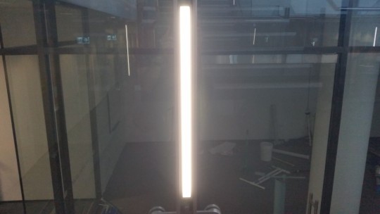
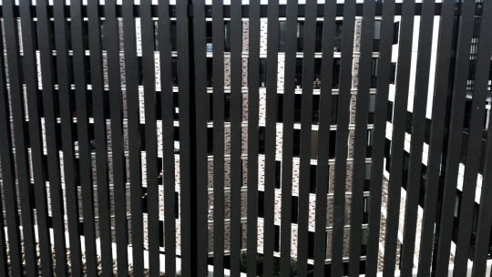
-photo 1 (light tube along stair railing [lecture building]) no photoshop used as i preffered it as how it looked. -photo 2 (trove of cans under concrete slabs [roof of a student accommodation building]) played with a few minor adjustments to saturate the cans so they would be a small blur of colour amid the ordered and grey slabs. -photo 3 (metal sphere with a dorito bag inside) I’m not quite sure how to describe how I edited this because I have no clue. It looks funny. that’s also probably why I'm clueless as when I went back to see the adjustments, I didn't understand a lot of the terminology used with photos (which I'm slowly learning). -photo 4 (sunlight through trees) I felt like I could make this appear nicer with a photoshop edit, but all the changes I made to it looked worse than the original, so I kinda left it like it was. -photo 5 (railings and units) I changed the colouration and black and white highlights so that colour in the image would not detract from the pattern the photo formed.
Although I'm not the most enthusiastic when it comes to photography, I admire the results my classmates and others have produced and the effort and skill they had in creating it. Today’s lesson has helped me understand a bit more of photoshop and the importance which photography plays in design. I’ve added the whole camera thing to my ever growing list of things I kinda despise, but would be really useful if I worked on it. rip.


soz for the scrolling. I’m not sure how to format pictures so that all 5 would fit into one or into a smaller space.
2 notes
·
View notes
Text
Week 6: creating a 2d photoshop rendering
In this week’s tutorial, we learned how to use photoshop to render an image of a hairdryer. As this is the first time I've ever used photoshop, I was really confused at every step of the instructions we were given, and the instructions and pictures were based on a much older version of photoshop, at times it was quite confusing. Watching some tutorials and googling, as well as asking for some tips helped push past these difficulties and I was able to complete the task given to some extent.
I had a lot of trouble with the lighting aspect, as it all had to be done manually and I had no previous artistic inclination as to how lighting/reflection works. After studying the pictures for some time and then using the brush tool as the instructions listed, I was pleasantly surprised to see different finishes and reflections being able to be replicated with just different shading methods. I also got stuck on the whole interface usage with the myriad of masks and layers, as it was very perplexing as to where to add which paths to which layers, and which setting affected which part etc. Luckily as each of the segments of the hairdryer was in individual groups as well as the background and file layers, if I made a mistake (of which I made multiple) it did not affect the rest and I could more or less easily recover it and fix the problem.
It was quite fun at times to work through this, but I have a nagging feeling that some of the steps could be operated differently through various functions to obtain a better/simpler result, but my knowledge of photoshop is pretty much nigh zero, so ill stick to what the instructions and tutorials said.
All throughout the process of rendering the image, I found some things didn't look that exact or clean as it should've been. So if you look slightly closer, you can see multiple lines that overlap and colours which are distorted. I wasn't sure how to fix them as I thought the instructions said to do some parts quickly and then we would be able to fix them later on, but either I missed the fixing part at the end or it wasn't there, so it turned out kinda funny.
One thing I really wished I knew how to do, was how to bend the text with the product’s name and brand, as the casing was curved. I assumed the text would be printed on but would appear curved in real life, but I couldn't find the tool to curve the edges of the text to give the impression it wasn't just written on, but actually printed to the curve of the hairdryer casing.
All in all, opening photoshop for the first time and being asked to do this hairdryer rendering was a lot scarier than I thought, but it was a good experience which will hopefully set me up well for the upcoming rendering assignment.


4 notes
·
View notes
Text
Week 5 - more drawing with CAD
This week’s exercise was a step from the previous task, as we basically completed a few multi orthogonal views like last week, except with a few added instructions and details. Working with autocad a second time felt a lot less frustrating than last week, and I was able to manage a few more of the functions and tools at a more comfortable level. I was confused at certain parts as the apparent dimensions changed multiple times, but once everyone agreed on a set number for some vital dimensions, everything made a bit more sense. I struggled more than a couple of times, where I had a setting restrict the usage of others or was inputting the wrong commands. But sitting next to people like tim, anthony and sean who were vastly more proficient in autocad, heloed a lot as I was able to ask them questions and observe them helping others. I wasn’t able to interchange between the model layout and layout 1 very well, as I had constructed a border and other details in layout 1, but it wasn't appearing on the model. Also somehow the centrelines wasn't adhering to the circles, and I didn't know how to manipulate the text to form the right size and shape within the title box. Also, as we had to print out the drawing on A2, that was an extra challenge in itself. I had problems formatting it so that the layout locked itself in an A2, and then creating the border so it would print black and white. I was able to print it out eventually, but the uni printer decided a few more things than what I preferred, so although it looks alright, the paper is oddly shaped. This week was more enjoyable than the last, as it’s rewarding to remember things learned from last time and use them, as well as the continuation to learn more from autocad and others.


2 notes
·
View notes
Photo

Week 4 studio tutorial - drawing with AutoCAD
I’ve never been one with anything computer related, so fiddling with autocad was like dropping a tortoise into water and expecting it to swim.
After opening autocad I struggled with the mere basics, as the layout and thought process required( to at least make it somewhat usable) was completely new to me. Having no other experience in other vaguely similar fields such as photoshop and adobe, I was bewildered by the bizarre amount of information and icons, to which I had no idea what they represented or how they were used.
After looking at some guides and with advice from the tutors, I managed to start drawing the basic lines needed for the top, front and right views. Marcus who was sitting to the left of me, helped tremendously as he was able to apply some of the knowledge he had used overseas with another software program, to autocad. As his mac was updating to a new version, we worked together and produced the views that were required.
I totally forgot about using layers during the whole process, so until the end when the three views were completed, the screen showed just the shapes, without depicting where we had used construction lines or dimensions. Thus I had difficulty in redoing the layers and adding them to the drawing. Once I had done so though, it was much easier to understand and to manipulate the different sections as it was segmented and clear. I did have trouble doing centre-points, and one or two lines had an occasional decimal in them, so I knew that some figures weren't precise. For next time, ill not withhold from asking someone or a tutor, as I learned that, it’s a lot more efficient to get something wrong and then learn from someone on how to correct it, than to be stubborn and try multiple times on your own without success.
I realised how infinitely complex autocad is, and was taken aback by the amount of minuscule changes that could be applied to the thousands of settings laid out on the screen. I understand now, that to not be overwhelmed, it’s better to work with the few things that we were taught (even if it meant doing it in a slightly less efficient way) to familiarise ourselves with the basics, and then from there we can slowly create a schematic pathway into the functions and tools which are offered to us.
Even though it was difficult, it threw a refreshing perspective as it was a whole new sphere, compared to drawing by hand.
7 notes
·
View notes
Photo

Week 3 - Orthogonal Projection
This week we learnt a bit about cross sections and dimensions. Receiving orders to complete a few sketches of the topic we had studied, we were then thrown into the deep end and found that even if the tutors threw life savers whenever you needed help - to aid in ur self-inflicted drowning attempt - you still kinda ended up ded anyways. (personally for me. everyone else seemed to be breezing through these darned drawings haha)
I found that the practical application of drawing isn't equivalent to the time spent reading the textbook; and that the transition to apply what I have read - onto the drawings/sketches we were asked to complete, is not a smooth one.
Thus once again, after asking the tutors Only 1 or 2 questions(jksx50), I managed to sketch a slightly dishevelled drawing. In all seriousness though, the ability of the tutors to explain a concept or assist in the correction of any of our blunders, is very concise and understandable (even if we’re not the brightest cookie). I find it genuinely amazing, because I struggle with conveying ideas or questions; but the tutors are able to translate my haphazard verbally illustrated diagram, and reformat them into the right words and order so that their advice is not only understood by the upper echelon of brighter cookies, but thankfully and readily available to us plebs.
something that was helpful when working with others (tarana i think her name was)... she pointed out that my drawing looked very confusing when my sketched lines didn't quite appear in crucial places at the right time. Instead she suggested that I make certain lines appear before others, in an ordered fashion to aid the construction of new ones. This helped me to see my drawing more clearly. btw, tarana is vry good at sketching horizontal dimensions, both on paper and irl.
The trickiest part about this influx of new drawing techniques and technical guidelines which we had to adhere to, was the understanding of where to place lines and shapes without having excess pen/pencil work on your paper. Also, when I asked the others who worked around me, concerning labels for length and written dimensions, every individual paper had slightly different labels in various areas. I’m perplexed as to which dimensions should be labelled, and as to how many we need.
I'm slowly getting the hang of drawing, but drawing cleanly and precisely is a struggle. The required head knowledge to make the drawing process faster, is quite vast, so the time it takes to draw and illustrate things can be lengthy, and the end result is often a sorrowful afterimage, of what was once a nice idea.
Fundamentally (love that course), I found that technical drawing aids greatly in understanding a portion of the required framework of creations, onto which then aesthetics can be then synthesised on, and the co-existing spheres of different aspects of design which overlap to compliment the other.
2 notes
·
View notes
Photo


Week 2 - Engineering Drawing
In the second week, we were asked to complete what appeared to be a relatively simple task of drawing some orthogonal views with a third angle projection. Boy, simple is the last word that came to mind after I finished.
Maybe it was the unfamiliarity of drawing, or I’m just not very skilled in general with these tasks, but I found this rather hard. Laying out the page in a common-sense engineering fashion and understanding how the object would be perceived if it was looked at a certain angle, was quite difficult to grasp as it had a very mathematical and logical thought process to it. After asking a tutor for help, and as they showed me the correct process and explained the logic behind it, it all began to make a bit more sense and I was able to complete the task with more or less difficulty.
We were then advised to sketch some views of a simple object that we had, so I chose an earphone case I had in my bag. As it was made out of hard plastic and had straight edges and faces, I thought it would be pretty easy to sketch out. But the more I examined the case, the more I realised it was in fact designed quite intricately and in a rather aesthetic way with a substantial amount of minor curves and faceting. Thus drawing it was a bit of a challenge, but I wasn’t able to do it justice as it looks so much different and better when you actually hold and examine the real product.
I hope to improve my thought process and adjust my logic when it comes to engineering drawing, as well as to practice my drawing skills so that I will be able to illustrate objects and drawings better as I find it is a vital skill in our course, as drawing helps you format the ideas in your head, and helps you to understand other artistic processes such as shading, light and depth.
4 notes
·
View notes
Photo


Week 1 - Getting Started
I wasn't able to be there on Wednesday when they held this class; so I had to replicate at home what was did there - from the pictures sent by a friend. I honestly found technical drawing very hard. I was at a minor predicament at how to use some of the tools given to us, and also, how to even begin drawing the pentagram and wheel.
After awhile, with more or less common-sense and the manipulation of tools (in which I suspect were the wrong ones but accomplished a similar objective anyways) the drawings turned out okay :)
I think I missed out on a lot of vital information concerning the tech drawings, as well as the atmosphere of working with other students.
I sincerely hope I wont have to miss any more, as I really enjoy learning these things.
3 notes
·
View notes
Text
brief introduction
Hey:) my name’s Jeremy, and I’m from Australia. I transferred to industrial design from a law/arts degree at wsu, due to realising the unwanted need of dying to cynicism well before my time. I’ve come to realise as the saying goes... ‘out of the frying pan and into the fire’. rest in peace. law was less hectic than ides. I chose this course because of the fascination in which the spheres of design holds. But any keenness for design which I possess, is currently neutralised by a lack of any knack of apparent aptitude for this creative conundrum.
1 note
·
View note