
Statistics
We looked inside some of the posts by jessilawrenceart and here's what we found interesting.
Average Info
Notes Per Post
3
Likes Per Post
3
Reblog Per Post
0
Reply Per Post
0
Time Between Posts
7 days
Number of Posts By Type
Text
17
Last Seen Tumblr Blogs


Fun Fact
Tumblr was named as a finalist in Lead411’s New York City Hot 125 in Aug 2010.
Text
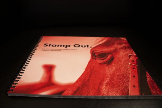
Stamp Out Rationale
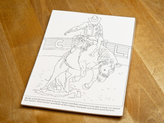
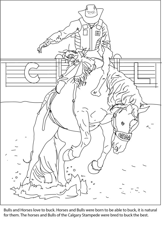
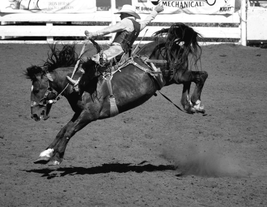
This project was very near and dear to my heart. My grandma was a barrel racer for many years, so rodeo has been a big part of my life. My 90-year-old grandma and I spend every stampede watching it on tv together. So when people boycott the Calgary Stampede or spread miss information, It does not sit well with me. The Calgary Stampede unites the globe and showcases the bond between horse and rider. So I wanted to take this project as a way to inform the public on the welfare of the animals and showcase how amazing the stampede can be. I designed an easy to follow informational booklet, which includes information disproving common myths on the stampede. I also designed coloring pages to promote the younger generation to get involved and learn as well. It is important to get younger people involved because they are the future and can stop the spread of uniformed hate directed toward rodeo. Many of the photographs were taken in by me at our local rodeo.


0 notes
Text
Applied Viscomm 2- Stamp Out
April 1-6
Finalize
The final days of the project I finished up my coloring sheets for the kids and had time to get my book printed. I made a few corrections to my pages and was able to get the book printed at a local print shop, just in time before the virus shut down the shops.
These are the coloring pages.

And these are a few images of the final solution.


0 notes
Text
Applied Viscomm 2- Stamp Out
Mar 4 - 30th
Book Creation
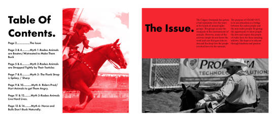
After I had all my facts lined up and ready to go, I began building my book. I wanted to incorporate the red of the Calgary Stampede logo. I wanted the book colors to be very simple, but also pack a punch so I went with black, white and red. I began sketching ideas out.

I loved the layout so then I began to build it in indesign. I edited some photos in black and white and then the others I made red. Many of the photos used are my own personal ones taken at the local rodeo here. To give a more personal touch to the book.

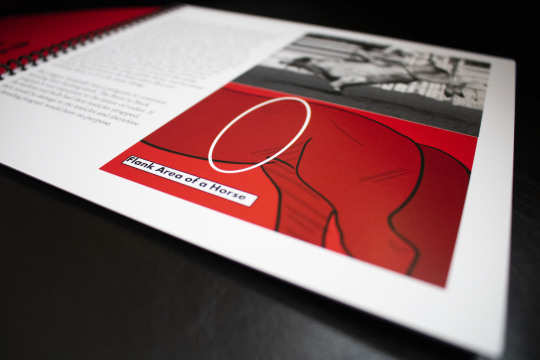
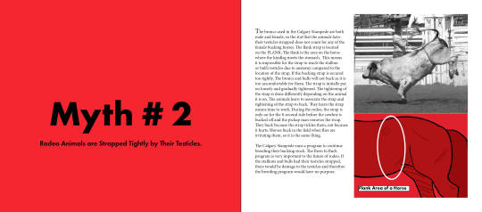
I then needed to add an illustration to one of my pages to explain the flank of a horse.

I then put my pages together.

0 notes
Text
Applied Viscomm 2- Stamp Out
Feb 17- Mar 4
Information collection.
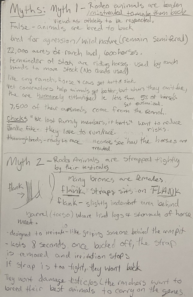
I spent a lot of my time researching. I spent the first week looking through articles of animal rights activists to narrow down some of the common myths. I chose 5 and began collecting information. The Calgary Stampede Blog had good information from credible sources such as veterinarians.
The 6 myths I chose to talk about are-
Myth 1: Rodeo animals are beaten and mistreated to make them buck and kick.
Myth 2: Rodeo animals are strapped tightly by their testicles
Myth 3: The flank strap is sharp or spiky
Myth 4: In the chute, riders prod or hurt the animals to get them angry.
Myth 5: Rodeo animals have hard lives.
Myth 6: Horses and bulls don’t buck naturally.
Below are the notes I took for the different myths.


0 notes
Text
Applied Viscomm 2- Final Project
Our final project was a self guided project. We were required to choose an issue of out choosing, and create a solution to it. I chose to do the Calgary Stampede and their treatment of animals. I have a personal connection to rodeo and it really frustrates me when people tear apart the sport without knowing anything about it. The most important thing to a cowboy or cowgirl is their horse. I wanted to create something to disprove myths and educate. I wanted to showcase that rodeo animals are treated with love, and often better than their two legged counterparts.
Bellow is the mood board I created. I chose to do a printed booklet and also do coloring pages to get the younger people involved at a younger age as well.

0 notes
Text
Applied Viscom2- Project 2
Rationale
I started off the project wanting to create reusable bags for sneakers. The bags were to be used to keep the shoes safe when you wash them if they needed to be cleaned but were also packaging. However, for this project, this would not work. So back to the drawing board.
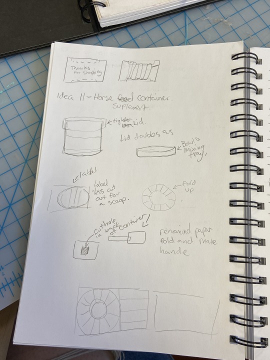
I settled on creating a reusable, multi-purpose supplement box for horses. The box would be made out of cardboard. The label doubles as a scoop when folded. The Lid of the box even doubles as a mixing container. The purpose of this was to eliminate the excess waste the big plastic containers create. All in all, I really like the idea and where I was going with it, but I would like to see a real package designer take it on.
The one thing I was not a huge fan of for this project was the amount of waste. You can mock-up on illustrator all you want but when you print it out, there is always a trial and error and lots of paper is wasted unnecessarily.
The Logo design took a lot of research. I wanted my product to be different than everyone else, So I looked at tons of horse supplements online, at the UFA and other retailers where horse supplements are sold. I chose orange for this logo because so many companies use blues, purples, and greens and I thought it would stick out a bit more than the competitor.
The scoop took a bit of finessing but the size of it is perfect for the container and you get a good amount of the supplement in it.
All in all, I am happy with how the product turned out!
0 notes
Text
Applied Viscom2- Project 2
Feb 17th - 24th
Finished Design and Build Container
Here are the final designs for my packaging for the supplements. I realized going in I would have to double layer the label so when one label is removed for a scoop, the user can still see what the bottle is. I really like the logo I went with. Many other horse supplements use photos of horses so I thought It would stand out compared to the competition.


I really struggled with making the container. I knew a circular shape would be hard to create and I think looking back, I would try to find lighter cardboard. But I needed to be heavy enough to hold up. I wanted a lid that detached so I would be able to mix multiple supplements or oats in with the supplement.

Small scale Mock-up of my packaging.
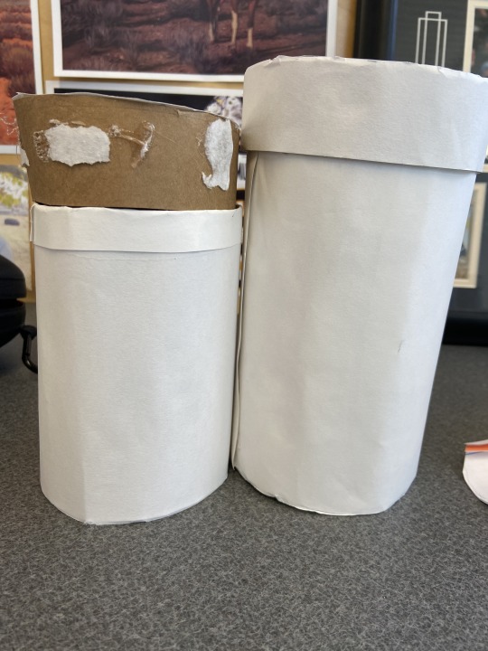
Playing with two different sizes. I went with a thinner, taller one in the end.

scoop appearance when folded.
0 notes
Text
Applied Viscom 2- Project 2
Feb 03- Feb 12
Sketches, research, and ideation
I spent all the time these few weeks really ideating and trying to ger my idea out on paper. I knew I wanted it to look like a cylinder. So Playing around with sketches and how I wanted to actually build the thing took a while. I Then focused my time on how I wanted the label to look. I liked the layout of the PGX Daily bottles so I decided to build mine on that. I also sketched up some doodles of the horse Icons for the logo. I created a list of words for horses and health and came up with the name BRONCOFORM.


0 notes
Text
Applied Viscom 2- Project 2- Recycled Packaging
This was our second project for applied. The purpose of this project was to design packaging that was made mainly out of paper or cardboard. The packaging would have a new purpose, or possibly two purposes. The final outcome was to redesign packaging to be more environmentally friendly.
My idea was to tackle the packaging for horse supplements. A majority of these supplements come in those big, thick white plastic containers that are very hard to use. So My idea was to put the supplements into a cardboard container, and have the label double as a scoop, and the lid for mixing. I would create my own brand for the feed and custom label. On the reverse of the label would be lines where the consumer would fold the scoop.

0 notes
Text
Applied Viscom 2-Project 1 Poster Design
Design rationale For this project, I focused a lot on experimentation. I did a lot of initial research on ideas but I just played on the computer to see what worked. My first initial thought was to do Star Wars. I messed around and did some sketches of a Star Wars looking world but with art and design elements included like brushes, palettes and lap tops. It’s a cool idea that I really liked and I got wrapped up in the research and I know for sure I’d like to go back and explore it. It wasn’t the direction I wanted to go. I then wanted to do an image of Darth Vader where he is half illustrated and half drawn. Again I loved the idea and read a few articles from one of the designers on the movie as but I wasn’t totally feeling it. So I landed on my Baby Yoda and Louis the 14th. I’m really pleased with the illustration on Baby Yoda. I know how popular of a meme he is and I knew he would appeal to high schoolers. However I chose to go with my Louis the 14th doodle design Instead. We all sit and doodle on things, on homework and I thought it would speak to the highschoolers inclined in art. I also thought it could draw the kids attention in with the bold colours and funny imagery. I went with the red because red is bold and eye catching then added some yellow to represent the school colours. I love how it turned out and it marries the world of the fine art and art history with the digital world in a fun way.
0 notes
Text
Applied Viscom 2- Project 1 Poster Design
Jan 20th- Jan 22
Finish Darth, Meme Poster, and Louis the 14th
The beginning of the 20th was finishing the Darth Poster. However, It dawned on me that Darth Vader is not exactly current.

So I came back to my meme idea. But how do I tie memes and StarWars together? Two words. Baby Yoda. Baby Yoda (The Child) is from the Disney + show The Mandalorian. His meme is probably the most popular meme of 2019 and the beginning of 2020. He is really popular with teens so I thought it would appeal to them.


I found a bunch of reference images of Baby Yoda and began illustrating. I then added Impact for the main text and added the college info onto the bottom.

Then had my second Idea for my second poster. I was really inspired by art history and James Victore and how he drew on top of photographs. Everyone doodles and draws on notes etc in high school. I also thought it was reminiscent of snap chat and how people draw on photographs. I also chose Louis the 14th because I love his portraits. I took a portrait of him in photoshop and posterized the image. I then took the image and flipped it into black and white then shipped it to Illustrator. Where I then image traced the photo. I then plugged in my tablet and began drawing doodling on the image. I free drew the typeface. I am really happy with this more last-minute design.


0 notes
Text
Applied Viscom 2- Project 1 Poster Design
January 15th- 20th
Design 1(Ish) Darth Vader


I began by brainstorming Ideas of Star Wars Means to people and how it relates to art. Starwars Is the pinnacle of creativity and showcases the world's creative people can come up with. Star Wars also bridges the gaps between the young and old. The new Star Wars had released in December and it is the most popular film in theaters. I knew a lot of people would watch it and be interested in it. So I wanted to showcase that every artist starts somewhere. I was inspired by this article from one of the creative directors of Star Wars. These vast, creative worlds start off as simple doodles. So I wanted to showcase this and how all our work starts somewhere.
https://99u.adobe.com/articles/52638/lessons-in-creativity-from-star-wars-the-force-awakens
My plan was to fully illustrate an image of an iconic figure such as Darth Vader and then print the page off. I would then rip it up, and sketch the other half of the image. They would be collaged together.
All I had to do now was finish the Illustration.
1 note
·
View note
Text
Applied Viscom 2- Project 1 Poster Design
January 8th and 13th
Ideation and mood board

This is the first project for our second semester. The task for this project was to create posters to get people interested in the Visual Communications program at the college. We need to have two different Ideas for our critique and from there we will narrow down our final idea.
For mine going in, I wanted to appeal a little bit more to focus more on pop culture and what teens are interested in now. So I looked at what teens today like. Star wars jumped out at first, seeing it is the most popular movie of the year. I also liked the work of James Victore and his work where he drew on top of photographs and I thought that would be interesting to high schoolers. The wood stock poster and gig poster- I liked these as well and I liked the illustration elements of the Woodstock poster but I just wasn't sold on them. I also played around with Ideas of history such as pop art, which is always attention-grabbing.
For this project, I knew I wanted to go forward with the star wars idea first. It was the topic I felt strongly towards so I knew I would start there and my second Idea would soon follow.
1 note
·
View note
Text
Project 3- Personal Brand Design Rationale
Design Rationale
Total Time: 40:07:45
Cost:$ 1.35+ 10.50= $11.85
This was by far one of the hardest projects I have had to do in a really long time. I found it really hard to initially get going. The hardest client to design for has to be yourself. I knew what I wanted but at the same time I had no clue. I spent many days reflecting, asking questions and trying to figure out who I was. The biggest thing is not getting hung up on it being perfect out of the gate. The best part about designing for yourself is the discovery and the journey. Will I be using this logo 5,10, even 15 years down the road? Most likely not, but I learned a lot about myself through this project and I am excited to explore my findings more. I had a bad experience with printing a booklet for another class so I was really hesitant to do it this time, but It turned out better than I could’ve hoped. For my branded item, my sketchbook turned out incredibly and I can not wait to use it. I think if I where to re do this project again, I would not stress as much about what I wanted and trust the process. All in all I am super pleased with the final result and I am really excited to use this brand in the future.
1 note
·
View note
Text
Project 3- Personal Brand-Finishing Touches
December 6-8
On these two days, I finished typing up my content for the style guide. I cleaned it all up and set it all up for print. I Had a friend look over my contract and he agreed that it looked busy. He has experience with creating contracts so we worked together to re-vamp my contract and I love how it looks. It is more simple, easy to read but it still has a cool cover.


After this I had began design my branded Item. I chose to do something I would use. So I chose to design a sketchbook cover. I had taken an illustration I had done a while ago that looked similar to the image on my covers. I replaced all the colors with my three colors, shifting the tones but each color was a variant of my main colors. I love how It turned out and I know I will use it.

Hours: 12:43:42
0 notes
Text
Project 3-Personal Brand - Style Guide
December 2-4
Again, I used a two column grid to build my pages. I used the same cover as I did for the contract. For this one I designed each page as I went along. I did not want all the pages to look alike so I designed each page based on the content going in. Both red pages were just text, allowing for the images on white to stand out. I am super proud of how the style guide turned out.


Hours : 8:15:55
0 notes