
I'm a UX designer in Seoul, Korea, based on Human Engineering and Industrial Design. It's always a joy to attract users. I love the relationship working with wonderful people.
Don't wanna be here? Send us removal request.
Statistics
We looked inside some of the posts by ji-hyunlee-blog and here's what we found interesting.
Average Info
Notes Per Post
1
Likes Per Post
1
Reblog Per Post
0
Reply Per Post
0
Time Between Posts
15 days
Number of Posts By Type
Text
4
Last Seen Tumblr Blogs


Fun Fact
In Q3 of 2020, 31% of US users access the Tumblr app daily.
Text
Propose UX Concepts for Next Enterprise Messenger
“Knox Messenger” had been enterprisewide common standard messenger application in Samsung Group. Recently, as the diverse usage of collaboration tools was accepted, it became inevitable to raise competitiveness of our messenger with other external ones. As a result, we had participated in the project of proposing new concepts for next enterprise messenger.
Place : Samsung SDS
Duration : August 2017 to October 2017
Tool : Sketch
My role : 4 UX designers (including me), a visual designer, and one from for Sales Planning Team had cooperated together from the early stage of the project. We researched the enterprise collaboration tools markets and analyzed the real usage environment of on-site and off-site employees. We’re also delivering ideation workshop to derive insightful prospects. Based on them, we generated the wireframe with some major key features.
At first, we could learn from the sales planner how Knox Messenger had been managed by which departments, what kind of attempts to change this service before, and what the huddles existed.
Also, we already got used to using this official messenger, so we analyzed other domestic and foreign enterprise collaboration providers first as a part of expanding our thoughts, searching relevant literatures and interviewing other workers who had used different messengers in big companies. Based on the researches, several trends and attributes were figured out.
Unify all the other communication channels with the center of messenger
In other words, it supports both realtime and non-realtime conversation by integrating with other collaboration tools. When people message others, it brings the conversation to video calls naturally. The call logs remain in the messenger to be managed later. Also, this sorts of messengers try to replace email with themselves by offering file sharing functions.
But most Korean had been scarcely willing to talk with voice or video. It’s because they get shy of contacting directly with strangers and feel pressure to communicate without evidentiary materials. They want to speak carefully organized, but real time conversation tend to go against them, demanding faster response. When it comes to the non-realtime things like sharing files, if the vast amounts of data were kept in messengers, they would cause overload. They just wanted to be assisted in prompt messages and responds and use some parts of passing conversation to prove histories later.
Support personal tasks, associating with 3rd party business systems
In these messengers, users could utilize the provided API to connect with useful systems. The viewer was embedded in the messengers to make users handle their works remaining in the platform. Furthermore, it leveraged dialogue-based AI chatbots or commands to perform tasks. Users were able to develop customized chatbot function with API provided as needed. They could just ask the chatbots to get the results or answers. The chatbots could suggest first when problematic issues happened. These tended to emphasize the communication with systems, not just within persons.
This attribute had worked well in the large companies who had various collaboration tools which were complicated to use. We could see many who improve their work efficiency using messengers as the points of entry to other systems. But these had been actively used by developers who basically had knowledge in this area.
Manage and support multi-party collaboration
Employee could divide into several chat rooms depending on topics even with same people and this made easy to control conversation history. Some providers offered Kanban board to control their schedules effectively. Interesting point here was how to make chat rooms. In most general messengers, people had to invite individuals first to make chatrooms in most existing messengers, while this kind of messengers let people think of the topics first and then invite appropriate people later. Also, all the conversation kept remaining in the chatrooms, so people who were invited after chatting could see previous messages.
These messengers seemed totally focusing on group working. They had lots of benefits to manage each small group, but as the group increased in size, excessive notifications had been unavoidable. Also, people tended to use another lighter messenger for one-on-one talks, as it was optimized in helping group collaboration consisting of few people.
In those ways, we could figure out that the recent trends of messengers were supporting cooperations by integrating various communication tools, assisting personal tasks, and helping group-focused works. This helped us to set applicable design direction later. But it seemed that they were not the best solution under enterprise environment, so we kept verifying real contexts in using messenger in Samsung to get more insights.
Knox messenger should be in the role of common standard messenger that every employees in Samsung group uses and it’s very difficult to take care all of the diverse members. So, we were supposed to create significant personas to represent characteristic user groups and were aiming to meet at least these personas. Main factors to create mapping for personas were the level of mobility, the rank(closer to workers or managers), and the number of stakeholders they’ve communicated.

Above user journeys were based on personas we created. We could see that Knox messenger had been used frequently between works, so we went over the journey in overall work process too.(The upper journey is in using messenger and the bottom one is in work process.) Those circular marks are representing pain points that could be summarized into 5 parts below.
In large organizations, members from numerous departments participated in a same project. In order for all members to reach a consensus, it was necessary to have lots of discussions and meetings accompanied constantly including reporting to managers. Then, when people were unattended to the messenger during their journey, participating in other meetings or after work, hundreds of messages piled up. Especially, the higher position people held, the more tendency to be invited to chat rooms as responsible managers. It would be inefficient when workers took lots of time to catch up relatively minor or just repetitive, inconsiderable talks.
Employees got into a project as pair or group(more than 2 people from same department). They didn’t use messenger with another, because they could tell verbally. They rather needed to use messenger actively to communicate with workers from other departments, but it’s hard to find the contact points. There’s no way to know who the proper person in charge with this project has been. It caused many inefficient situation such that it did not only delay the project unnecessarily, but also would be unable to access and share useful information.
There still had been used too many legacy systems to handle at the same time to keep the enormous log histories so far. Various systems to manage caused workers to get workload to learn how to use. Also, they became confused in remembering where to keep and find. And besides, when they’re about to discuss information from systems on messenger, the format were not kept compatible, so that they had to fix the type with additional efforts. Not to mention they’re in difficulty in making use of volatile chat log on other systems.
Security policy cut off the flow of information when workers had talk with subcontracting or customers outside the company. Even if communication with outsiders happened quite often, we could not help but use private messengers, because they couldn’t use internal messenger app. Of course, there were several ways to prepare this situation, but still had to follow red tapes to get permission from managers, which was complexing and not that immediate.
Personal tasks had been often ignored, but it took an essential part in smooth collaboration. They discussed the works through the meeting and then each performed their individual work assigned. More efficient they dealt with their works, more cooperative their team could go further. And here at this point, we could discover a few employees had used external messenger to assist their personal works in the office. In other words, they would like to use messenger to support their personal tasks, not just for instant messaging.
Actually, there were same employees search functions provided in the portal website and the messenger application(both were available in PC). But people had used the messenger more often to use that feature, because it’s easier to quick access, rather running the comparably heavier and slower portal. Here, we could see the potential of the messenger with simplicity and lightness for expansion to many uses beyond just a communicating tool.
UX Direction
We set the goal that expand messenger's coverage to support collaboration, keeping its simplicity and lightness. For that, it was considered assisting individual affairs and solving disconnected moments which obstruct smooth conversation.
We organized the workshops to involve all interested parties throughout the project to come to consensus and generate ideas in many different points of views. Consequently, we could create UX design directions as below.
Design Concepts & Key Screens
1. Simplified structure makes possible for users to quickly access to their work environment
We simplified the overall structure based on required functions in business, working as a mini portal.
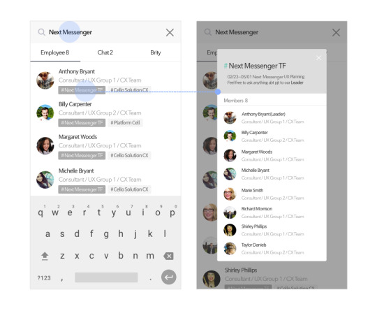
In the previous messenger, friends list tab was located left-most and selected when a user initially accessed to this app. But most did not manage the contacts list, rather, they searched employees whenever they needed. Few employees who manage also had used search box to reach persons to talk to. It turned out to be different with private messenger where checking profile picture or status message in the list.

So, we drastically eliminated tab structure, and classified big three areas - unified search, personal assistant, and chats list. In unified search, it became changed to search anything including employees, chats, and chatbot. Especially, we made it more powerful like a command box not just for searching but leading to action such as sending message right away in this area. For the personal assistant area, it was expected to work as a starting point toward the work system by being suggested contextually. Users didn’t need to find their ways through it, rather, they could be assisted as needed. And chats list were followed below.
2. Fill the break points occurred in the conversation with the messenger
2-1. Support keeping history within project team members and contacting with external departments

In most projects, members had worked in a form of pair or group. They communicated verbally on the next seats or in the repeating meeting. So, the messenger had been usually used to share files or leave the settlement, which would function as important project history later. So, we offered function for managing exchanged contents efficiently where optimized chat rooms for collaborative works, called "Ground". Once, a chat room was converted to "Ground" chat room, users could use many additional functions in a simple way and it would be useful to make consensus with histories and transfer their duties to others in long-term project.
Also, as mentioned above, conversation via messenger had not taken place that much among employees who work closely, rather, had occurred more often with workers in other external departments. So, we made chat rooms of Ground exposed to others with short description when others searched, so that strangers
to talk to work together Let them easy to discover contact point in a short time, so support external communications. The start point of works had to be smooth and quick removing unnecessary wasting time. It sounded very simple principles the messenger had to get but was not that kept well.
with employees from other I don’t know who the person in charge with this project has been. I want to ask something but it’s hard to find contact points.“
(부연설명) 페어/그룹문화 중심이 되어가는 중. 의외로 같이 일하는 그룹 내 커뮤니케이션에선 메신저 역할이 적더라. 그때그때 말로 공유하거나 옆사람에게 묻거든. 반면 긴밀한 외부 조직과의 커뮤니케이션에 더욱 많이 사용함. 하지만 외부인들의 경우 주 담당자가 누구인지 한사람이 휴가가버리면 누구에게 컨택해야할지 알기가 힘들어. 규모가 워낙 크다보니 프로젝트 진행을 위해 소통해야하는 사람만 찾다가 시간을 허비하기도 함.
부재중일때 컨택포인트를 찾거나
오히려 외부 조직과의 긴밀한 소통이 주가됨 ->
// 컨택 필요한 사람을 그때그때, 쉽고 빠르게 찾고자 하는 기능에 대한 니즈가 많음. 연락처도 안쓰고, 아는 담당자가 아닐때 키워드를 통해 유추해서 검색하여 해당사람 찾음.
Let them easy to discover contact point in a short time, so support external communications. The start point of works had to be smooth and quick removing unnecessary wasting time. It sounded very simple principles the messenger had to get but was not that kept well.
with employees from other I don’t know who the person in charge with this project has been. I want to ask something but it’s hard to find contact points."
2-2. 주고받는 정보의 호환가능성을 ���대로


Connect not only for people, but also for many systems to handle at the same time, and enable to get access easily one another through the messenger.
(garage)
In particular, contents in each services were compatible in any channels. They could keep the records in the form of A, and easily delivered A to B. It was really flexible with one another.
(부연설명) 자주 사용하지 않는 시스템도 많고 전부 다 파악하기가 힘들다. 툴에 사람을 초대하는 것 조차 힘들며 언제 어떤 툴을 써야할 지 선택하기도 어려워. 회사에서 쓰라고해서 쓰고는 있는데 상대방이 쓸 줄 몰라서 사용 방법 가르쳐주다 포기하기도 함.
2-3. 이동중/장시간 회의 참여후에도 쉽게 follow up 할 수 있도록
mobile환경에서(회의가 잦거나, 오피스 밖으로의 이동시간이 길거나..)

It’s important to support workers to catch up with the meaningful information among flooded messages. If the employees could read the chat rooms quickly, it would help them to optimize the moment. At least, it had to let them possible to distinguish approximate topics from the contexts of each chat room grasp the flow of conversation at the moment.
“Communicate with lots of stakeholders through various communication channels. It’s hard to manage history of conversations.”
(부연설명) 메일을 보내놓고 메신저로 확인해달라고 하거나 왔다갔다. 특히 외주나 외부 업체와 소통하거나 아이폰 사용자 등에 따라 다양한 방식으로 소통이 이루어짐. 전화를 하기도 하고.. 특히 conflience이슈로 대표자만 소통하다보니 비효율적으로 소통을 해야하는 ���황 발생.
메일로 다시 보내달라고 하거나.. 이슈사항은 엑셀로 관리하고 시스템에 입력하고 메신저로 또 이걸 복붙해서 공유함.. 비효율적 분산. 매우 빠르게 전달됨. 개인톡으로 대화하는 경우도 다수(업무에 따라..) 혹은 외주와의 협업 시, 사내 시스템을 쓸 수 없는 경우 빈번하게 발생. 정보 연결 필요.
// 업무에 사용하는 커뮤니케이션 툴(실시간, 비실시간, 콘텐츠 공유)이 많으며 사용에 어려움을 겪음. 협업 툴 진입점 찾기가 쉽지 않고, 협업하는 사람이 사용하지 못하면 자연스럽게 활용도도 떨어짐.
(7/7)
Discussion / Limitation
이번 프로젝트는 임직원들의 메신저 활용에 좀 더 힘주어 컨셉을 내봤던 안!
사고를 조금만 더 enterprise로 돌리면,
- 워라벨 : 업무공간과 개인공간을 구분하고자 하는 니즈, 사외 사람들과 커뮤니케이션 시 불편, 실시간 대화 알림으로 불편.. -> 이 측면에서 좀 더 고민하지 못해 아쉽다.
- 너무 강한 보안환경
기존에 삼성그룹의 전 계열사가 사용하는 사내 메신저에 대한 새로운 컨셉을 제안해보라며 TF팀이 꾸려졌다. 이번 프로젝트가 종전의 프로젝트와 달리 좀 더 의미가 있었던 점은 기획자들만 똘똘뭉쳐 아이디어를 내는 것이 아니라, 기획자, 사업담당자와 시각디자이너 모두가 함께 full day로 참여하며 조금 더 새로운 시각에서 문제를 바라보고 의견을 냈다는 점이다. 개발자는 참여하지 않았지만 사업담당자가 기존에 개발지식을 가지고 있어 좀 더 현실적인 stance에서 사내 여러 이해관계자들을 고려하여 아이디어를 낼 수 있도록 방향성을 잡아주었다. 기획자들은 사용자의 입장에서 보다 문제에 접근하려 했고, 시각 디자이너는 좀 더 심미적으로 새롭고 창의적으로 의견을 냈다.
----
0 notes
Text
McDonald’s self serve kiosk UX renewal
Improve ordering experience with self serve kiosk at McDonald’s
Project type : Individual project
Duration : January 2017(about a month)
Tools : Adobe Photoshop, PowerPoint
Summary : I and Migun Cho were supposed to study enterprise UX by improving the ordering experience with the newly introduced kiosk at McDonald’s Korea which had caused lots of complaints at the time. It was just our individual project that was nothing to do with works. We did figure out the problems it had had and tried to solve it redesigning its service.
According to the declaration by CEO of McDonald’s Korea, they introduced self serve kiosk to replace the tasks of taking orders, so that it made possible for clerks to focus on improving service quality they provide.
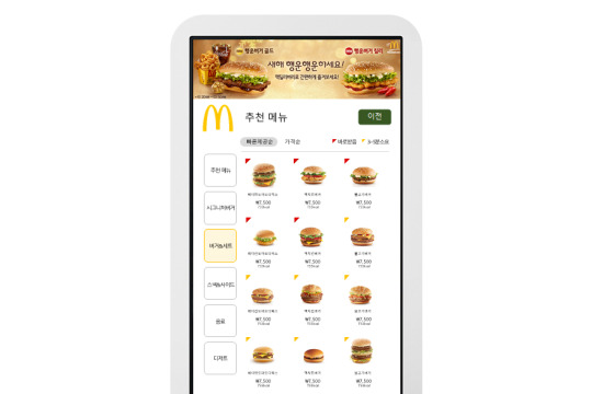
We went to easily approachable McDonald’s near the office, and observed what happened there for about 4 hours. We targeted the busiest time on weekdays, from 10:30a.m. to 2p.m. when lunch special available.We could be aware that the store reduced the number of clerks at the counter from 4 to 1, and 3 more kiosks installed, instead. The clerk served desserts like ice-cream or beverages by herself. Other clerks were making hamburgers and french fries in the kitchen, and the other clerk wrapped and served the hamburgers right next to the order taker. In front of the counter, lots of customers were looking up the screen to see when their waiting number came out on it. Here, we could discover some problematic situations.
At the counter, the clerk was adjusting the rate of taking orders, considering cooking time of hamburgers or french fries in the kitchen. When there had some delay in making, the clerk asked customers to wait for a second, and meanwhile, she served desserts which she could prepare for. On the other hand, those kiosks were consistently receiving orders without handling the events in the kitchen and customers were progressively let go to the waiting zone. Consequently, it created bottlenecks in taking orders, overloads in food processing, exhausting waits of customers, and low-quality service with psychological burdens led clerks to generate customers’ dissatisfaction.

(The scene in McDonald’s where so many people waiting for their food, and the far right picture is showing a person who cancelled order after waiting so long.)
That is, it totally failed to accomplish the intended purpose with kiosks.
Balance between customers’ tolerance of waiting and cooking time
We had to understand the whole procedure taking place in order to figure out deep routed problems. So, we engaged in interview with both customers and clerks. Key findings from customers were below.
It’s difficult to order food with using the kiosk, but it’s better than just waiting in a line at a counter.
I could wait in a line before I ordered. But it’s unwilling to wait after I ordered, because I could not predict how long I had to wait.
I was irritated when it took almost 30 minutes to receive the ice cream after giving an order.
Even if it took almost similar time between when they were using kiosks to order food and when pausing for a moment, then giving an order at a counter, they preferred the former. Although kiosks’ inconvenient user interface let them delay their orders, they favored of doing something contributory to the order. Also, they were more unwilling to wait after they ordered, than wait before the order. When they stood in a line, they were able to see the line became shorter, but when they waited after ordering, it was hard to guess how long they had to wait until their turns. The other insight was that depending on what kinds of menus they ordered, the tolerance of waiting was quite different. Dessert menu should be served earlier.
We could discover several significant points from clerks. It is followed here.
It’s too big for me to handle more orders than I received, including orders from kiosks.
During busiest lunch time, the moment when customers put their cards into the card reader slot is useful for me to prepare for quick desserts like beverages or ice creams. We cannot even spare just one second.
Best selling menus tend to be cooked in advance to use the time efficiently.
As we observed, they were complaining the discomfort from the bottleneck state while receiving orders both from the clerk and the kiosks senselessly. They needed to buy some time to handle all the orders. And we could know one of the ways to make up the time was to have customers order best selling menus.

We could summarize in the sights of McDonald’s, clerks, and customers as shown above. Receiving order fast with kiosks was causing the workload over the optimal capacity of clerks, so that it was necessary to alleviate bottlenecks in ordering process with stay at the kiosks like ordering at the counter. That is, there should be a time balance between customers using kiosks and employees. Here, we were going to use psychologically tolerable waiting time, in a customers’ position, to fill the time gap.
We could set a mission to use customers’ psychologically tolerable waiting time in order for the clerks to get more time to handle the orders efficiently. Followings are the strategies to achieve it.
Strategy 1
Reduce the waiting time after ordering, instead, let them take more time while ordering, with positive experience.
Strategy 2
Serve the food effectively, considering their tolerance of waiting.
IDEA 1 : Please, help our busy clerks!

First idea is customers can enjoy the game of helping busy clerks, while ordering hamburgers with kiosks. Then, it would attribute to alleviate bottlenecks. In more detailed, in a busy moment, the start page of kiosks would be changed like far left one in above images. Here, the kiosk is asking for help because the clerks are suffering from heavy orders. If the customer accepts the request, they would face additional steps like fourth image from the left. It has similar effect with the pause at the counter when busy moment, but it gives customers more fun and contributory feeling, that they can enjoy the waits.
IDEA 2 : What is the fastest food?
Second idea enables customers to know what the fastest food is. If the hamburgers that can be prepared in a short time is marked(red marks in above image) than customers could consider it in a moment of choice. Clerks cannot only deal with the order efficiently, but customers also can be served with just minimum waits.
IDEA 3 : Dessert Pass

When customers order desserts like ice cream or snacks, it can be prepared by the clerk at the counter rapidly. So, there should be a “dessert pass” line separated to get the desserts with this receipt directly. They can escape from the inefficient waiting situation, despite of quickly servable menu.
1 note
·
View note
Text
Accessing frequently used items based on data with long press on mobile screen
I came up with this idea while during the intra office communication channel renewal project to encourage users to communicate with others effectively.
Place : Samsung SDS
Duration : May 2018
Tools : Adobe XD, ProtoPie
My role : I had 90% stake of this idea by generating idea and discovering use cases. Seung Hyun Yoon was with 10% stake, helping me to apply for the patent.
When you see communicating moments on application services like sending messages and mails, leaving comments on SNS, inviting people to join online-meeting.., you might notice that the persons to chat are generally fixed. But it’s too annoying to enter all of their information about them every time you want to have a talk. To support this situation most services provide recent searches lists to reach the subjects easily, but those lists are variably organized depending on what the most recent search item is. In other words, once users search strangers, recent searches lists are directly containing them. Another way of supporting is to add people who they chat frequently with into bookmarks or favorites lists, but still it is too bothering.
So, I suggested the way of reaching frequent-communicated people under specific situation quickly and intuitively based on their contact data in mobile. It’s very simple. Just access the screen necessary for calling other people. Long press just the input box or related contents with people you want to call, then you can see the “frequent” searches lists that you’ve used a lot at this screen or with the contents together. Move drag to the specific person you want and detach your fingers to select. Finally, you can see the person’s information entered.
youtube
Above video is showing when you’re about to email someone with the attachment, titled “Portal Renewal PJT”, long press the title to see the list recommended based on the data about the person you’ve communicated with same title of contents before. You can get easily access the appropriate person without entering all the recipient address in the To field.

You can select several people at the same time by dragging to select the subjects you want.

Group of people can be one of the options consisted of the list.
The impacts
The present invention will contribute to time-saving and effective communication by enabling prompt access to proper people especially in working environment, so that it’ll activate fast response and feedback. Aside from this, it is flexible in wide range of applications if it is with data analysis solution and cooperating with data scientists.
0 notes
Text
Intra-office Communications Channels UI/UX
This project is for improving communication between company and employee by gathering and rearranging all of scattered contents of company.
Place : Samsung SDS
Duration : March 2018 to July 2018
Tools : Adobe XD, Adobe Photoshop, ProtoPie
My role : I and Jiho Song worked in a pair for overall UX design process. We did user research, state the problems and reason out the insights, design wireframes, and prototype to test.
There are 10 kinds of company’s internal channels in the corporate portal where different information is delivered. Although those contents were important and necessary, most employees didn’t recognize where they could find the contents. Actually, channels were spread out all around the portal in a different way of accessing depending on which departments manage it. As the employee didn’t access to each channel that much, it had become difficult to share the management’s points. And it made the managers difficult to lead this large company.
In addition to this, the management had been eager to listen to complaints that employees have had. Even if we had the bulletin boards which allow to post messages anonymously, it had not stimulated them. Rather, they used to write their thoughts and complaints on the external anonymous app. It was not only hard for managers to follow up with employees, but it could compromise corporate reputation.
Consequently, we were given the missions below.
“Increase the views of all the contents scattered around the portal, so that make impossible to talk with each other without knowing about the contents”
“Let employee chat on the internal portal website, not outside”
What the internal communications are
We summarized that the range of internal communications, so called intra-office communications here is beyond just exchanging greetings one another. It also contains sharing the business goal, building up the trust, and forming the sympathy. This contributes to establish the relationship to resolve conflicts together.
From a corporate standpoint, they aim to manage the business efficiently by cooperating with organizing members in the process and encouraging the information to circulate smoothly. For employees, strengthen the relationship not just with coworkers but also corporations to get on.
As part of supporting these behaviors, there are various channels provided internally.
How the internal communications happened
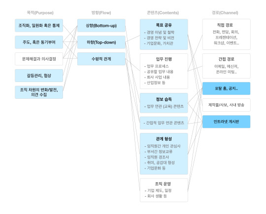
We drew a diagram like above to deeply understand all the possible internal communications. The flow of contents, kinds of content, and channels had to be associated properly with the purposes of communications. As a result, the channels, main page of portal website (called “Knox Portal) and intranet communications site (called “CommOn SDS”), where contents about the business goal, task-relevant information, and promotion of relations existed, would be determined as the most appropriate for covering the conflicts management, morale boost and development of company culture. Ultimately, it will lead to the unification of various organization.
(I intentionally omitted confidential data)
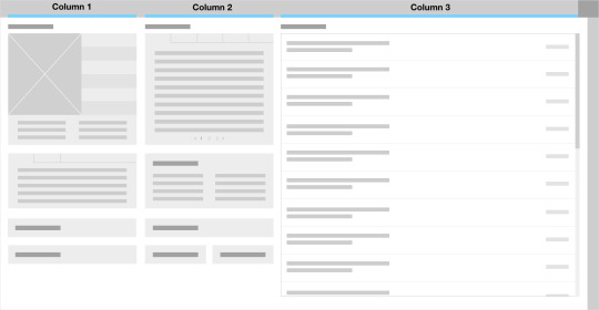
Above is the existing main page of the portal, and it is the first page that all the employees see right after logging in to the portal. Here, all contents are listed by 3 columns. Except for the 3rd column(Inbox), first 2 columns are containing information as a listed forms or shortcut link. Each content in every column is divided into several sections depending on which channel it was generated from. If it is clicked, linked channel site opens out and they can verify the contents there. Some other channels are accessed only in the quick menu in top-right of the main page. Postings are about notices, news, articles, and things related with company.
Intranet communications site is a channel for communication space between company and workers. There are about 7 menus including company news, internal reporters’ postings, CEO’s message, and events information delivered in different bulletins. Some of these company postings are partially exposed to the portal main(at the top of Column1), and it is changed everyday by the administrator. Also, free bulletin board is allocated to employees only, but it is a bit hidden away comparing to other bulletins with fewer contents and views.
The key findings
Based on what we organized, we did explore how employees had used the corporate portal and communication channel.
No matter where the content from, just interested in the content itself
They didn’t bother what channels the content originate from nor who wrote this. What they concerned was the content itself like whether the content is mandatorily reading, task-relevant, or just fun. They even didn’t know about what each channel provided. There were many people who had never explored those channels since they joined the company. Instead, they only accessed contents through the recommendation from their divisions or colleagues in the form of URL. Obviously, many people have interest in posts published by a company, but the source of writings were hard for employees to approach.
Others were accessing contents on the portal aimlessly, because it’s starting point of their work so that they just clicked when they saw interesting topics by chance. But it led to churn within minutes. They wanted to keep reading other relevant contents continuously but they were annoyed to find the proper contents posted in separate channels. Posting criterion was always adopted by managers unilaterally.
Depending on each hour of the day, read different postings in a rapid but frequent way
After clocking in, employees usually catch up with the works happened last night via emails. While checking the mails, they skim through the postings strictly necessary to check by priority. When they have some time off after lunch, they explore interesting contents they could not see in busy morning. In this way, there existed the priority to read depending on the time of the day.
Also, they don’t stay in the intranet site for a long time, they tend to be short stay, but frequently. It’s attributed by being conscious of team managers or other seniors. And a lot of duties make them burdensome to read it deeply. They quickly glance over contents and put them on back to read later, but forgot. If it is necessary to read, they try to squeeze them in visiting the sites short and frequent.
Reveal their insides out of frustration and want to be heard
Although many employees swore at the company outside, they didn’t just mean to devalue to outsiders. They wanted to expose complaints, but there didn’t exist appropriate place to deal with their concerns, remaining anonymous. Corporate culture is not that flexible, but stick to stubborn til now, so that If it is not anonymously secured, they would be afraid of getting a penalty with banning the company. That’s the reason why they used the anonymous application (called “Blind”). However, they still felt frustrated when they were aware of nothing changed after unburden themselves.
Of course, we have had our own anonymous boards inside, but most of us are developers, working in IT company, who totally understand how to extract the information of writers with a little effort didn’t trust it. As managers want employees to be delivered with their thoughts, they try to hear their voices too. Absence of communication in such a large company can lead to high turnover.
Working outside of office feel a sense of detachment from what Head office doing.
Inevitably, not every employee works in Head office. Some work down in the provinces or work outside of office. They always felt left out and discriminated with many things comparing to workers in main office. It was caused by not enabling them to engage connected the main office. While corporate managers try to communicate via website, it was impossible for them to access it in the field. They were not always sitting in front of desk to check up all information delivered. Eventually, it became difficult to catch up with the latest Head office’s news such as useful notices, seminars, lectures, intra system for communications like mentioned above.
The first design direction
(Image)
Based on what we’ve found, we determined to gather all scattered contents into the main page (Column1 & 2 / Column 3 had to remain, following the company policy) in a timeline view regardless of sources. It’s because employees were focused on the content itself that they’re interested in, rather than where this came from. It’s unnecessary to make divisions to separate each posting depending on which channels they were generated. So, we applied timeline-style to show the contents in 1depth to let them easily grasp what the postings are about.
(Image)
Also, they tend to read postings faster in office’s work environment, worrying whether something to happen abruptly. At this point, we try to support when being stopped in full reading flow, considering most of them are long-length. When they click it to see in detailed, it pops up. Then, even if they are interrupted by works while reading, they can minimize the pop-up and check it later. To assist this more, bookmark button is located in posting cards, keeping them easily.
(image)
In order to increase employees’ participations, it should guarantee anonymity from the system. It is followed that they hold great distrust toward the company managements with previous several scandals over anonymity. They cannot help but to get proven anonymity protection from the system to get quicker results. And then, we changed bulletin-style to easier to communicate with comments. This made them possible to have less formal conversation between managers and staffs, breaking the original interaction method. Also, it would be possible to comment anonymously, but using nickname, they could keep talking with each other more naturally.
Lastly, we declared to provide mobile version of this service which could extend the range of users to workers outside the office. It would contribute to keep them from having alienated, too. When it comes to the anonymous bulletin board, the availability would be higher in mobile.
The challenges
Based on what we’ve found, we prototyped roughly to examine design direction and we could find out following challenges. First, we gathered all the scattered contents into the main page in timeline view, collapsing the divisions, so that it was intended to make employees possible to explore the contents just in 1depth with scrolling. Actually, it has to bring huge change in the main page which 22,871 employees in the 20~50 age range, have used so far. But people in their 40-50 are not that familiar with this timeline-style, and prefer list view more as before.
We could also identify that people not always have enough time to explore the contents and pick what they want to see. Especially, when they are busy all day long and about to quickly verify the most important contents, this structure could be inefficient.
Last but not least, the security issue. We were supposed to provide mobile version, but some postings should be strongly controlled and banned to be exposed to others. Also, they even didn’t provide mobile version so it was impossible to link directly to them. But we had no choice but to support people who could not access with PC.
Enable two-way communication between company and workers, not one-sided
Let contents from company delivered to employees in appropriate ways.
(Image)
Informative region(Column 1 & 2) in the main page of the portal will be largely divided into two parts - one for must see contents and the other for all the scattered contents in timeline view. In that must see area, contents are organized and grouped depending on the importance, considering the compositional flow. This affects how the eye is led through the design, like where it looks first, next, and where to pause or stay. It makes possible for busy workers grasp overall important contents easily, while they are able to explore timeline contents below in 1depth by scrolling when they have time.
(Interaction video)
Especially for this timeline area, tab menu is located at the top to make easier to identify and explore the contents.
(Image)
Also, contemplating that most contents are long-length, pop-up for detailed contents is used to check and control easily while managing works. Bookmark will assist this well, too.
Employees can respond to the contents, discuss them and give their own opinion easily.
(Image)
All the contents here can be reacted with comments, likes or hates by employees in an easy and simple way. Also, they can share each contents via internal messenger or mail, so it enables them to discuss the contents with colleagues. That is, the contents from company are not static anymore, but delivered fluidly and getting easily newsworthy.
(Image)
In addition to this, employees can give their opinion through the anonymous bulletin board where it proves anonymity from the system to get trust. It will be located in the intranet communication site as one of large menus, also, appear at the main page to be approached simply. Of course, managers use corporate account to give feedback with comments. It leads to break the format and communicate actively.
Overcome the environmental constraints with mobile device
(Image)
In order to solve the security issued mentioned above, we basically use anti-screenshot and non-copyable function to protect the contents in mobile environment. Furthermore, set security levels for each content and if a content should be controlled strongly, then prohibit from being shown in mobile. But it’s just a temporary solution to be supported in other devices, so we have to keep seeking for better plan continuously.
The impact
TBD
0 notes