
Don't wanna be here? Send us removal request.
Statistics
We looked inside some of the posts by jiajingsundesignstudio-blog and here's what we found interesting.
Average Info
Notes Per Post
0
Likes Per Post
0
Reblog Per Post
0
Reply Per Post
0
Time Between Posts
6 days
Number of Posts By Type
Text
16
Last Seen Tumblr Blogs


Fun Fact
Tumblr has a low social media market share in South America.
Text
Design Studio Computing Summary -- Week 15
For this part of the journal, instead of following the guideline for Portfolio course reflection, I will summarize the outcomes in their forms.
1. Product Outcomes
At the end of the semester, I had two working websites in my collection. One is the major project, that is the first website that I have designed and built both front-end and backend from scratch. The other one is my portfolio. Generally speaking, I am satisfied with the works that have been done for the websites. The problems that I have encountered during the development are the valuable project experience which will help me in the future projects.
2. Technical Skill Outcomes
From the contact session, the project activities helped me revise the knowledge learned from Design Thinking and Human-Computer Interaction. We integrated the design ideation, user research, and user evaluation into our project process.
From the lectures and the workshops, I have learned many details of the techniques and project theories. A lot of the project works were based on the fundamental knowledge I gained from the lectures. During the workshops, I have learned and practiced the basic PHP language programming, the Ajax, and I have learned how to use APIs to grab data from other services. Apart from the knowledge gained from the course activities, I have also learned a little music knowledge as we were doing music-related projects.
3. Teamwork Outcomes
As a team leader, I think my work and support helped my team members’ work. For each deliverable, I managed to organize our work properly to meet the deadlines. From the feedback, I learned how to make better plans and make improvements to our existing work. Winning the people’s choice award is a proof of our success in the teamwork.
4. Report and Presentation Outcomes
From the report feedbacks that I have received, I learned the importance of making plans for the and revised the HCI research method. I have also learned a few tricks on how to prepare presentations, and make hand cards to remind me of the critical points for the presentation.
5. Other Outcomes
One of the important lessons I have learned from the course is that I should document the work properly especially when I am learning new things or starting a new project. It is a very helpful work routine that can allow me easily keep the experiences and knowledge fresh for the future. Besides, writing is also a good practice for me to sort out the logic between things and making plans.
0 notes
Text
Portfolio Documentation -- Week 15
Website Implementation
This week I finished the development of the portfolio website. I have made a few alternations to my original design based on the technical solution that I have found feasible for the implementation. Here are the four major features of the website: 1, homepage scrolling effect, 2, sidebars for the content pages, 3, the overview page effect, and 4, the slider bar for the detail pages.
1. homepage scrolling effect
The initial idea was to have a long home page that divided into four sections, while each website section can have an introductory page on each screen. To implement this design, I searched online for a javascript solution and I have found the ‘scrollify’ plugin for creating a magnetic effect for the scrolling pages. Therefore, I created a four section homepage based on the example he provided on the product homepage. The background of the website and the foreground images were redesigned from the original project materials. Without the transition effect, each section looks like following:
The first panel:
the second panel:

the third panel:

The fourth panel:

2. sidebars for the content pages
Since the website contents are organized in a tree structure, some of the sections have more than one content. To allow users easily navigate to different articles within the section, I decide to adopt the sidebars in common dashboards. To solve the problem of uneven length of the content and the sidebar, I used the jQuery custom content scroller to fix the sider bar on the top. Therefore, the list in the sidebar is always visible to the viewer.

3. the overview page effect
The overview page effect was inspired by the portfolio website of Mathias Sterner. I wanted to provide a thumbnail of a core image for each article. However, the image size was hard to unify. Therefore, I used a div to represent each tile of the wall and used the background image of the tile to contain the images. I have also added a hover overlay effect to the tiles so that user would see the title of the article. In the following image, the cursor is hovering above the tile with the name Part B.

4. the slider effect
As the website has many article pages, I decided to use one template to reduce the complexity of the modifying the page layout. For the articles that contain more than one images, I used a slider effect to display the images in sequence. The plugin for the effect is from ‘Slick’. I set the slider to an automatic playing mode. To make the picture content more accessible to the audiences, I added captions to the images.
Apart from above major design and implementations, I have also added a hamburger menu to the top right corner of the pages.
Fonts and Icons
The fonts used on the website are: Dosis, Libre Barcode, and Robot from the Google Fonts. The humberger icon is from the Front Awsome library.
Website Content Selection
The content of the portfolio is all selected from my previous works. Most of the images are of my individual work. To rewrite the documentation in the portfolio, I revised my project document, my project design files, and the weekly journals. I rewrote the description of the articles in Design Studio. The articles are mainly in three section, a brief description of my work for the deliverable, a process explanation, and reflection section.
Portfolio Reflection
The current website is the first online version. There are still many other works to be added. Since this is the assessment for Design Studio, the content of other sections, including Graphic Design and Web design requires further polishing. There is also a small glitch on the home page as the scroll effect cannot perform smoothly for the first load. Also, there should be a loading effect for the images, the loading rate for some large images are a bit slow and causes a significant pause in rendering. The sizes of the images were not optimized which causes the loading speed for the images are not even.
For the future development and maintenance of the website, I am planning to use PHP to help me divide the portfolio into sections. It can help me reduce the editing effort for different files and minimize the error rate for duplicated works.
0 notes
Text
Ideation for Portfolio -- Week 14
1. Documentation
Here is a collection of my work for the design and implementation of my portfolio.
Inspiration
I have been looking for inspirations for the portfolio website layout, content structure and color scheme. There are many innovative portfolio websites listed on Awwwards while most of them have creative layouts that require intense Javascript and CSS development. As the portfolio website should be a container of my previous works which mostly consist of different design style and color scheme, the safest choice for the portfolio style and layout should be the minimalism. Therefore, I have found many good examples on the ‘Awwwards,' as follows:

Pooliestudios, by Alexander Kaiser (Germany)
This website is a collection of projects, the contents are listed in the collapsed menu on the top left corner and on the following several scrolls, there are brief introductions and images for the highlighted projects. The white and minimalist design of the website set a good example of how to organize the web contents.

Aristide Benoist – Portfolio, by aristidebenoist
This is a project list for the portfolio. As the studio has a few partners, they arrange the website by each member. The horizontal layout and numbered list is a clear layout to show the navigation. The color scheme of the website is also very simple to highlight their works.

Mathias Sterner, By Yours
This is a photographer portfolio. Its contents are organized by the theme of the pictures. The entire website uses the gridded layout, and it is an excellent way to show more of the works in a compact space.
Sketch
Based on the inspirations and the personal works I wanted to showcase on the website, I have made several sketches of the ideas for website layout.
The first layout is inspired by the ‘Mathnias Sterner’

The grid shows several different study or work period of my pass. The line is organized as a route path, and each node represents a project time.

This second layout is showing project thumbnails in a gallery on the right side. The left is a combination of the navigation menu and personal contact details.

The third layout is a scroll-down page where each project takes a screen and by clicking on it will redirect to its own main page.
Content map
Here is a content map that I made for the portfolio:

From the diagram, we can see that everything start with the homepage. I wanted to have the contents organized by projects. The web will divide into four sections which are ‘Design Studio,' ‘Graphic Design,' ‘Web Design’ and ‘Others.' These are the sections that represent my major design projects. Each chapter contains the major individual works that I have done as a part of the program. Because of the design varies from project to project, it makes sense to each project separately instead of chronological arrangement.
Plan
Layout Design 28 Oct - 30 Oct
Content Design 31 Oct - 1 Nov
Graphic Design 2 Nov - 5 Nov
Website Construction 6 Nov - 10 Nov
Technical Research
After a brief research for the technical solution of building the website, I decided to use Bootstrap for the hamburger menu, navigation bar, and the sidebar.
2. Reflection
Choosing a style for the portfolio can be very hard as the contents may have used many different design styles and color schemes. As it has been mentioned in the lecture, it should work as a container as well as a piece of my design work. The hardest part is to ensure the integrity of the website design while having so many different contents and showing my personal style. The mockup proved that simple and white portfolio design works well with complicated content elements.
Apart from the website styling, it is also necessary to have the website structure tested with a few other people to make sure the content arrangement is reasonable.
0 notes
Text
Week 13 Trade show documentation and reflections.
1. Documentation
‘Welcome’/’Introduction’ Page
The introduction page for the music box game was added to the design after the paper prototype testing as feedback received that the operation of the music box was not obvious enough for users to intuitively know how to interact with the music scores. The feature has not been implemented before because our limited development resource and other major functions haven’t been finished. As it is strongly related to the usability of the product, we decided to add this feature before the last minute. The page will show up as a popup box in the music box page, and it will only appear for the first time user. The following is a screenshot of the layout:

The identification of first-time users is achieved by using cookies:

A cookie will be added to the user’s agent and be assigned with an expiration time. If the cookie is not found the introduction page will pop up. And it can be closed by a click on the background.
CSS Changes
As the web pages are developed by different people and the CSS style were not clearly defined at the beginning of the project. The CSS styles of the web pages are still not unified. Therefore, to achieve a better effect for the website, I had spent a lot of time to modify the CSS style for all HTML and PHP pages. Here are some comparison between the original pages style and the modified ones:
For the sharing popup window:
Before

After

For Menu Alignment Issue
Before:

After:

For Gallery Detail Page
Before:

After:

Pitch Preparation
As the team leader, I have also prepared a draft for the trade-show pitch which includes a 2-min script and demonstration:

Product Deploy
Apart from other preparation, I have also deployed the project to our team’s zone and made it available through the link: https://deco1800-p1f.uqcloud.net/
2. Reflection
a. The trade show
Generally speaking, the trade show went well, and our team members collaborated very well for the presentation. Given the lessons learned from previous interim presentation, we had rehearsed the pitch and demon several times before the trade show began.
b. Problems with Testing and Quality Control
It is a lesson that we learned from the trade show as we have several visitors who have played with our music box and spotted a few more bugs that we did not encounter before. The bugs including the database injection, facebook sharing link and browser incompatibility with Windows Chrome. These problems should have been solved before the trade show if we had a thorough plan for the testing and quality control for the project.
c. Evaluation of Future Work
This current product can be used as a prototype for next round of user evaluation. According to the user center design lifecycle, to improve the usability and UX of the current website, user testing should be the next step of the future project.
d. Improvements to the Process
The product as itself still has great potential to improve, such as more music can be transcribed into the music box version and automatic transcription needs further investigation. Also, as it is said in the previous section, a code functionality testing should be included at the end of the project. For the product implementation part, we should have a more precise division of work, and each member should shoulder similar responsibility. The work should be divided as design, front-end and back-end development. CSS and the design style should be finalized before everyone started developing their part of code.
When looking back to the entire process, project planning is an essential part which we did not do very well. In the future, we should carefully consider the risks and implementation procedure to make the process more effecient and effective.
0 notes
Text
Final Stage of the Major Product -- Week 12
Documentation
This week is the final stage of implementation and reporting of the Major product. For this week, my work is mainly divided into two parts, which are consolidating the code and writing my part of the report. To the final product preparation, I have added a few additional features to our product and modified the style of entire website. Here is a collection of the features that have been added in this week:
1. Share the modified music score.
To improve user’s sharing experience, I decided to further enhance the sharing functionality. To allow users to share their work to social media platforms, we could use URI parameters again to pass the record through the sharing link. The method of transforming music score into an array of digits has been introduced in last week journal. The rest work was to encode and decode the information so that the work can be recovered for the next user who enters the website with the shared link.
The following is the piece of code that percent encodes the music record for the URI.

The music box score can be recovered from the URI by the following way:

Therefore, here is an example of the real effect:

The above image is a modified version of a music box. Through the Twitter API, the sharing link received by Twitter is:
https://deco1800-p1f.uqcloud.net/musicbox.html?mb_score=35,14;86,14;117,11;186,11;211,9;244,7;276,9;315,8;359,9;411,6;454,3;502,4;495,7;542,1;571,11;606,12;639,11;674,12;706,11;740,12;776,11;808,9&mb_no=1
Through this URI, we could recover the modified music score as this:

2. Link between Music Box Collection and Music Box Game
The link between Music Box Collection and each music box game is implemented in a similar way as the sharing function of the music scores. The sequence of the music box is identified by the parameter ‘mb_no’ and the javascript function named GetURLParameter is used.

All music box images, scores, and records are labeled with a sequence number. Therefore, each music cover contains a link to its own music box.
3, Link between Gallery and Music Box Game
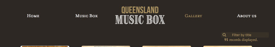
As the Gallery includes all music records, which means the music records that have music box games are also included in the gallery. For our design, we also provide users the access to music box through the gallery. It means the detail page of the music box records should be different from the others:


Therefore, we need to identify all the records that have music box game from those who do not. As we only have six music box collection, I decided to use string to identify the name of the records.
The gallery page was implemented by another teammate in PHP. Hence, the modification of the link is completed in PHP:
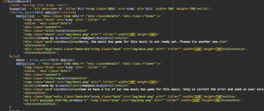
The PHP function will echo different HTML code give different search results.
4, Implement the Search function for Gallery
The search function for the Gallery is the last feature that has been added to the design. It was implemented in the same way as the example given in the workshop.
In this current version, it is still a case-sensitive function while in the future flexible search function can be added to enhance user’s search experience. The following image is a sample search result:

5. Document Writing
The rest work that I have done for studio 1 major project is to write the ‘Intended Interactivity,' ‘Data usage,' and ‘Change of Origin’ parts for the final document.
Reflection
Up until now, majority features of the website were achieved. When it gets closer to the end and product getting more improved, there are still many emerging issues that need to attend to. The website hasn’t been fully deployed to the zone yet and the CSS style of the site still needs consolidation. Also, the gallery and detail pages have outstanding bugs that require fixing. From this project, I have learned that although we were targeting technical problems separately at the beginning of the project. We still need to define a CSS style framework before any webpage implementation. Since we did not realize this at the beginning, the overall style and the quality control has become very difficult at this stage.
0 notes
Text
Journal week 11
Work Documentation
1. Send to Us function
This week I have implemented a few functions to enable the music box sharing and sending to us feature. Since the ‘your version’ staff can be edited by users, the modified results can be then sent to their social media account or to us as a suggestion for how to transcribe the music.
The two functions can be called by click on the two buttons on the top of the box.

Given the structure of the music-box game is based on a javascript incorporated with a sound manager, animation Tweenmax and event listeners. the easiest way to collect the notes info and transfer them back into a string is to scan them which is similar to the play method instead of playing the sounds.

Therefore, once one of the two buttons are clicked, a play-head will appear and quickly scan through the staff and compose a string with the note ids and positions, like this:

the string will then be inserted into the database by ajax post and PHP.

The send2us function is finished, and data have been successfully saved into the database:

The table music record has three columns: id, record, and email. the email column is saved for the future use as users can leave their email address so that they could be rewarded or appreciated for their works.
2. Responsive Music Notes
The second parts of my job are that previously the music notes are positioned at fixed places which means if a user changes the window size the notes can exceed the boundary of the music box. To ensure that all notes can appear in their boxes when resizing the window, I used the function:

Therefore, when the window is full sized, the music box looks like this

while when the size is smaller, it will look like this:

Reflections
After this week’s work, most features of the website have been implemented. The goal for next week would be to improve the website’s usability and user experience. The feedback we received from the paper prototype session for providing a guide for the first time user has not been implemented yet. Most of the technical challenges have been tackled while the user experience needed another round of testing.
For our teamwork, we are planning to divide our work by the final deliverables. I will be responsible for the final product including the CSS styling, debugging and deployment of the website. I will also help to write the document.
0 notes
Text
Progress and Reflection over the Holiday -- Week 10
This is a reflection of the work has been done over the mid-term break.
Did you achieve what you set out to do?
As a team, we were planned to modify our website appearance according to the feedbacks we have received from the previous week’s presentation so that it would look more professional and have better user experience.
As an individual, I was working on the implementation on expanding the music score from one to two music score on one page and it required a coding and editing of the existing prototype code. After a few days coding and editing, the music_box.html page changed from a single staff:

to:


Since there is no guarantee of generating an appropriate and error-free transcribed version of the music. We have decided to shift our goal simple inspiring and entertaining our audience with the music box version music into letting them help correct the errors in the transcribed version. Therefore, we have added a new function called ‘send to us’. A picture of the original music has also been added to the page so that users could refer back to the image when they are modifying their own works.

Are you on track for the final deadline?
I have finished most parts of my website implementation. Therefore, my work has been on track for the goals. the only coding left to do is to improve the responsiveness of the website. As there are many interactivities going on, there are some challenges to make the notes and animation adapt to resolution change of the website. My next tasks will be helping my team members to finish their work and plan for the next round of test.For our team, the main thing left is to incorporate the database API into the gallery and finish social media sharing functionality. Ideally, the work will be finished by next week or we will try to figure out a solution as a team.
0 notes
Text
Design Studio Reflection for Part B -- Week 9
For this week, we had another presentation to report our progress of the major project. As we planned last week, we have divided the work into four pieces so that each one of us would be able to take the main responsibility for one task. I am responsible for the investigation of auto transcription of music scores and the implementation of the game prototype for our web page.
Are you as far along as you thought?
For my personal part of work, my progress goes well as the plan. The most part of my work is to investigate existing auto transcription solution. Therefore, the work is a little challenging, as its result is not certain.
The first software I tested was Audiverse as it can output the musicXML file for an image copy of music score. After transcription, the music can be played by a software named MuseScore. Before transcription, the original score is:

After processed by the Audiverse computer vision algorithm, the music elements are recognized and marked as follow:

Even though most of the notes can be recognized for this score, but most of the old scores cannot be correctly processed.
Beside Audiverse, I have also test OpenOMR, which is another Java application that can recognize music scores. The recognition result is not ideal, and extra procedures are required, such as converting the original image to a binary image, as:

The processed result for above image is:

From the result, we can see that the Audiverse recognition rate and accuracy are better than OpenOMR’s. Also, Audiverse provides output file in the format of XML which has the potential to be used as the raw data resource for the music box.
In conclusion, although some of the music scores can be successfully transcribed, the application does not work for most of the script in the dataset. Therefore, the automatic translation of music score has been temporally suspended as there will be many other implementation works to do.
The interpretation of transcribed MusicXML might be resumed if the rest website implementation and testing work are finished.
What's left for Major Project Part C?
By far, the initial design phase of the project has been done. the most part of remaining work is website implementation using PHP, javascript, HTML, and CSS.
As the music box game is almost finished, the major part is the implementation of dataset API and social media APIs. We also need to find out a solution to consolidate the information flow and data representation in our web pages. If there is more time, we could also improve the visual effect and interactivity for the web pages.
Apart from the website implementation, the final report document also needs to be planned as well.
What responses did you get back from your request for feedback?
For our part B presentation, we asked a question about whether the current music box implementation and effect would be sufficient for visualizing the data. The feedbacks are generally positive, and we have also received suggestions on utilizing the auto-transcribed data to prompt users modification and corrections on the machine errors. It is a good direction for the project to go. As this wouldn’t require too much alternation on the existing implementation, we could use it as an option in our digital prototype testing session.
Are there areas of improvement within the team regarding communication and development of your project?
By far, our team communication was good. Still, there were some minor improvements needed for the delegation of individual responsibilities and quality control for our works. Currently, we are using GitHub to manage our team’s source code so that everyone in our team could collaborate on the project development. As each of us has undertaken some developing work, the coding style, and web page style need to be unified. From the experience of our previous work, some of our teammate (sometimes including me) tend to finish our individual work right before the assignment deadline, which makes it impossible to do peer review before submission. It is not good for the overall quality of our work. Therefore, in the future, we will define an internal deadline to make sure our team members can review the work before submission.
0 notes
Text
MVP planning practice -- Week 8
On this week’s contact session, we did a planning exercise for our project. During the practice, we worked in our group to identify the scope of the entire project, the responsibility of group members, and we have also planned for the MVP. Our MVP will include the basic static web pages of the application and a partially implemented game for the music box. To reach this agreement, we had a small discussion about what is the core of our concept and what would be efficient in next usability testing. The static pages can be regarded as a digital prototype to test how users would actually use the service under a real use context. The game prototype, which is the essential part of the website, would give users a real experience in listening and editing music boxes.

I am responsible for the implementation of the game prototype. I did some research online and found a sample code on musicbox.grit.it which provides a technical solution for the interactivity. I planned to use one day to modify and implement the code. It is impossible to finish all the coding, but basic interactions such as playing music and editing can be implemented. The connection of the database and music transcribing is not covered in the MVP.
0 notes
Text
Paper Prototype Journal -- Week 7
Our paper prototype testing
This week we have tested a paper prototype in our class. For the preparation, we printed out website mockup and made extra buttons and notes to mock website interaction. The following picture is an overview of our paper prototype.

Before the testing session, we determined to use two-way to record and gather test feedback. First of all, during a testing session, we have one of our team members to observe and take notes on an observation sheet. Apart from observation, we also invited our testing participants to complete a questionnaire at the end of each testing session. Apart from the questionnaire, we have also received many oral feedbacks from our peers. The following are a few pictures taken during tests:


There were 9 participants who tested our prototype. Therefore, we have received 9 feedbacks from our survey. Here is a link to the survey questions:
https://goo.gl/forms/oGs8AiV9EkGXoj3k2
Most of our participants found the design of our website interesting and provided us with useful suggestions, such as reorganizing the website’s structure to reduce the confusion between music boxes and the gallery, adding an introduction to the game so that audience would be able to understand the process better before they start to play, and providing more information on the original music score.

It is encouraging to see that most of our participants think that the ideal is interesting. However, We have also received many suggestions on how to improve the design:

The question we designed to test the clearness of our definition of gallery and music box explicitly proved our concern was right. To figure out a solution for this, we had some discussions. After the test session, we decided to swap the two sections in the website navigation. We will make the modification in our next prototype and to test them again with our audiences. The relevant question and its answers are shown as below:

Reflections on the design of the prototype testing
Generally speaking, the testing session went well. Our participants and our team member also spotted a few problems of the task design. In the music box game, we should have asked our participants to explore by themselves before leading them to play the game. Since we design the tasks in the sequence of the way we assume how players would ideally interact with the page, it gave hints to our testers about how to use the page while the hints do not exist in the original design. Therefore, the test result of users’ understanding of the music box game is affected by our process. Most of our testers responded that they could understand how to play the game, but the real situation might be more complex. This is a lesson we have learned from the test session.
Testing other’s paper prototype
I haven’t had too much time to test other’s prototype before the end of our contact session, so I only tested with one other group. The design of the group is very interesting. The testing procedure is well defined. There was only a minor confusion about some of the tasks. The good thing I learned from the testing experience is that they have used multiple Likert scales to gather more precise information on tester’s preference.
0 notes
Text
Reflection of Working as A Team -- Week 6 Journal
What happened last week?
We have just formed a team of four in the previous week. After a thorough discussion, we decided to continue with the concept of Queensland Music Box. For the first week of teamwork, we have submitted a concept document by the end of this week. I am very happy to notice that our team has worked very efficiently together. We split the document into four sections and each one of us took one section to write. Although every is responsible for different part, we have discussed what we should talk about in each section. We have worked out a proper project plan, as follow:

What systems of communication/collaboration we are using?
We are using the Wechat instant message service for our team communication. Therefore, during weekdays, we should respond within 2 hours, and during weekends 24 hours. We also have regular weekly team meetings which are held normally on Monday afternoons. So far, the plan works well and we have achieved all of our targets.
What needs to be improved?
Although the result for last week presentation and concept document is not out yet. Our progress over the last week has been good, even though we noticed something that we need to improve. First of all, we need to spend more time on document proofreading and grammar check. Besides, apart from each assignment formal deadlines, we should have an internal deadline for each member’s work so that we could have time to consolidate and edit our works.
0 notes
Text
Design Process -- Week 5
For this week, we have formed a team of 4 and discussed our concepts for the major project. At the end of our discussion, we decided to choose the Queensland Music Box as our primary concept idea. The original concept is from my design exploration.

During our discussion, we have made some update to the concept. Instead of only create a game for the old music scores, we are also going to present our audiences with the music cover page and information for all of the music scores.
Based on the updated concept, we design an initial navigation flow for the website and the basic user task flow for our music boxes.

The overall navigation is defined as above. The music boxes page and the gallery design have two different sets of the music cover collection while they have a similar form. During the design process, we have talked about the potential confusion might cause for the users. Therefore, we decided to test it in the paper prototype testing.

For the visual design of the website, I have created two homepage style for our team to choose from:
The first one is a vintage style homepage to fit in with the age of its contents.

The second one is a modern style which tries to bring up the theme of bringing back old music to our modern life.

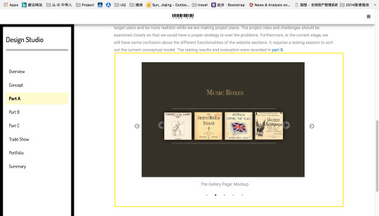
Apart from the homepage, I have also made a draft mockup for our team’s prototype.


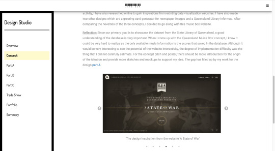
The design inspiration is from an award-winning website from the State Library of Queensland, named ‘The State of War’. The color theme was chosen because the vintage style that it represents is suitable for the topic of the webpage. Some of the detail might change because of the actual situation might change in the web application.
0 notes
Text
Design Concept Reflection -- Design Studio Week 4
1. Presentation review
I presented on the Monday workshop. As an individual presentation, the pitch was smooth and short. Before the workshop, I wrote a small script including everything I should say and wanted to present. So although there were a few points that I forgot to say because of being a little nervous, the main content was presented as I planned. I took the time when I practiced by myself; the time should not be over 3 and half minutes. During my presentation, I looked at my audience several times, and I could see their expression changed from confusing to understand. There was a little disappointment, which was I forgot a few parts of the contents I prepared beforehand, and I forgot to ask if there were any questions. However, from the tutors' feedback, I have made my points clear to the audiences.
2. Concept review
My concept is about using the images of traditional music scores to create a music box game. Compared to other ideas of my classmates, my concept was clear and suitable for presenting the music data set in SLQ. The concept is very interactive and could be both educational and inspirational for the intended users. Regarding its feasibility, my concept might encounter some technical issue when transforming the score into digitized ones.
3. Concept critiquing
There are two concepts I found very interesting. The first concept is about making a fictional game for the soldiers' portraits. Both of its interface and storyline are very good. The storyline of the game is fictitious as it let users assume a role of a postman. The vintage design of the game interface can easily bring people back to the old-time. The only pity of the concept is that the storyline seems a little simple as there were hundreds and thousands of soldiers so how to make the game more dynamic so users would want to know more of the data set. Another concept is about to make a soldier finding game. The game design is very comprehensive as it includes levels, time constraints, and incentives. It considers all the aspect of making a game interactive and attractive to users. The only concern for the concept is that the pre-processing of the soldier portrait could be very time-consuming as all soldiers have to cut out of their original picture to fit into the game scene.
0 notes
Text
How to be both practical and creative? -- Design Studio 1 Week 3
In the past two weeks, I have been looking for a practical and creative solution to showcase the State Library datasets. In order to generate a reasonable idea, I examined the 21 datasets, and a few external APIs and databases as well.
In terms of user engagement, I have looked for many interactive games such as the jigsaw, some riddle games, and doodle games. Most of the game can be used to combine with some of the information provided in the database to improve the user engagement. Apart from games, I noticed that most of the data contain various images such as portraits and landscapes. These images can be used in design applications or user customizations. The data visualization could be organized in several ways such as alphabetically, timeline based, or geolocation based. During the contact session, we have grouped some of the data by their traits.

In my research and brainstorming process, I also paid attention to information that users might find useful in their daily life. The library information data are the most useful ones as the dataset contains the location and opening hours of each Queensland library. This has also become the most popular data that used by my classmates. However, I found the connection between the data and user is still weak and there are many existing solutions which make users have no particular needs in using the new website. In order to find inspiration of website interactivity, I made some research on awwwards. Inspired by many website effects that combining audio effects and animation, I came up with the idea of creating a website that contains simple music samples for the SQL_Music Queensland dataset. Therefore, music box style sample could be a possible solution. Therefore, I searched for existing music box applications (e.g. http://musicbox.grit.it/) and web audio solutions, such as web audio API. I have found many online applications or mobile applications that are made for music box style tune composing.
0 notes
Text
Week 2 Idea Generating and Reflection
This week we still trying to generate more ideas based on the state library database. I had two brief ideas that utilize mainly the data from the given datasets. The main concept of my ideas is to connect audiences with the old data with might increase their interests in learning and browsing these data. The first idea is to create a game for the old newspaper from 1914 to 1918. Users will be asked for the date ( day and month) that they are interested in. Then they will be rendered with a photo of the newspaper of that date from a random year. They will be asked to which year the newspaper would probably belong. This idea is inspired by the birthday cards and greeting cards in gift shops.

If they get the answer correct, they can use the photo to create a gift card or be given some other small incentive. The second idea is to use the LBS technology to show user nearby old real estates. Once a user opens the application, the web service identifies the location and provide the user with a collection of nearby old real estates. A relevant location is then pinpointed on the map. Users could click on the data point to find out more about the real estate and the pictures of the current location. The idea is inspired by the google maps for nearby resturants.

Reflects on the brainstorming method
The method I used in the brainstorming session is basically browsing through existing dataset in the SL database and think of what kind of interesting way to present the data. For the brainstorming method, we have tried to generate ideas as a group for one dataset and then categorize the ideas’ purpose and formality into groups such as for fun or educational, maps or timeline.
At this initial stage of idea generating, I think there are two requirements for generating ideas. First of all, the information given in the application should be useful for users. They should either provide practical solutions for users or provide meaningful information that users might be looking for. Secondly, by using the application users could connect themselves with the data in a certain way. In the case of above two ideas, users could connect with the data by their important date or their current location.
0 notes
Text
Design Studio Entry 1
Given the introduction from our lecture, this is a practical course which we are supposed to learn and practice our skills by designing and implementing real projects. Based on what I know of this course, I expect to be practice design skills I gained from my Design Thinking class and my web implementing skills from my Web design class. I want to learn several things from this course. First of all, I want to practice my project organization skills. Since the major project requires teamwork, I know that we will be required to learn how to plan and do works properly so that we could meet all the deadlines. It includes time management and team management. Therefore, it will be a good chance to practice these skills. Secondly, I want to practice my skills in designing alternatives which including applying user experience goals and usability goals in the design process. At the moment, I still not very sure about the entire procedure of the project and the learning curve of this course. Therefore, I am worried that a poorly formed initial idea might seriously affect the final results. I hope that by the end of this semester, I could be more familiar with all the design processes and implementation processes. Also, I hope that I could properly manage my time and progress throughout the entire semester.
I hope the course could provide use more practical skills for both design and team collaboration. I am looking forward to more class discussions during the studio session.
0 notes