
Don't wanna be here? Send us removal request.
Statistics
We looked inside some of the posts by jkstatistics and here's what we found interesting.
Average Info
Notes Per Post
2
Likes Per Post
2
Reblog Per Post
0
Reply Per Post
0
Time Between Posts
17 days
Number of Posts By Type
Text
17
Last Seen Tumblr Blogs


Fun Fact
The KCSC sent more than 20K requests to delete posts related to prostitution and porn to Tumblr from January to June 2017.
Text
Covariance and Correlation
Covariance is a measure of the joint variability of two random variables. Covariance measures the linear relationship between two variables.
If the greater values of one variable mainly correspond with the greater values of the other variable, and the same holds for the lesser values, i.e., the variables tend to show similar behavior, the covariance is positive. and if the variables tend to show opposite behavior, the covariance is negative.
A correlation coefficient measures the extent to which two variables tend to change together. The coefficient describes both the strength and the direction of the relationship.
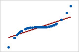
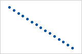
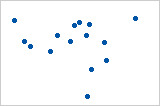
What is a monotonic relationship?
A monotonic relationship is a relationship that does one of the following: (1) as the value of one variable increases, so does the value of the other variable; or (2) as the value of one variable increases, the other variable value decreases. Examples of monotonic and non-monotonic relationships are presented in the diagram below:

Monotonicity is "less restrictive" than that of a linear relationship.
For example, the middle image above shows a relationship that is monotonic, but not linear.
if a scatterplot shows that the relationship between your two variables looks monotonic you would run a Spearman's correlation because this will then measure the strength and direction of this monotonic relationship. On the other hand if, for example, the relationship appears linear (assessed via scatterplot) you would run a Pearson's correlation because this will measure the strength and direction of any linear relationship.
Pearson product moment correlation
The Pearson correlation evaluates the linear relationship between two continuous variables. A relationship is linear when a change in one variable is associated with a proportional change in the other variable.
For example, you might use a Pearson correlation to evaluate whether increases in temperature at your production facility are associated with decreasing thickness of your chocolate coating.
Spearman rank-order correlation
Also called Spearman's rho, the Spearman correlation evaluates the monotonic relationship between two continuous or ordinal variables.
The Spearman correlation coefficient is based on the ranked values for each variable rather than the raw data.
Spearman correlation is often used to evaluate relationships involving ordinal variables. For example, you might use a Spearman correlation to evaluate whether the order in which employees complete a test exercise is related to the number of months they have been employed.
Correlation coefficients only measure linear (Pearson) or monotonic (Spearman) relationships. Other relationships are possible.

Pearson = +1, Spearman = +1
Pearson = +0.851, Spearman = +1
Pearson = -1, Spearman = -1
Pearson = -0.093, Spearman = -0.093
----------------------------------------------------------------------------------------------------
A comparison of correlation and covariance
Although both the correlation coefficient and the covariance are measures of linear association, they differ in the following ways:
Correlations coefficients are standardized. Thus, a perfect linear relationship results in a coefficient of 1.
Covariance values are not standardized. Thus, the value for a perfect linear relationship depends on the data.
The correlation coefficient is a function of the covariance. The correlation coefficient is equal to the covariance divided by the product of the standard deviations of the variables.
Therefore, a positive covariance always results in a positive correlation and a negative covariance always results in a negative correlation.
0 notes
Text
Alias Coefficient
When you run a Linear Regression model in R, sometimes you see NAs in the model output.
This happens because the variable is linearly dependent on other variables.
''alias'' refers to the variables that are linearly dependent on others (i.e. cause perfect multicollinearity).
See the example below.
library(datasets); data(swiss); require(stats); require(graphics) z <- swiss$Agriculture + swiss$Education
So in this case ‘z’ doesn’t help us in predicting Fertility since it doesn’t give us any more information that we can’t already get from ‘Agriculture’ and ‘Education’.
fit = lm(Fertility ~ . + z, data = swiss)
> alias(fit) Model : Fertility ~ Agriculture + Examination + Education + Catholic+ Infant.Mortality + z
Complete : (Intercept) Agriculture Examination Education Catholic Infant.Mortality z 0 1 0 1 0 0
When we notice that there’s an NA coefficient in our model we can choose to exclude that variable and the model will still have the same coefficients as before
0 notes
Text
Variance Inflation Factor - VIF
Variance inflation factor - VIF quantifies the severity of multicollinearity in an ordinary least squares regression analysis. It provides an index that measures how much the variance (the square of the estimate's standard deviation) of an estimated regression coefficient is increased because of collinearity.
Consider the following linear model with k independent variables:
Y = β0 + β1X1 + β2X 2 + ... + βkXk + ε.
Rj2 is the R2-value obtained by regressing the jth predictor on the remaining predictors (a regression that does not involve the response variable Y).
1 / (1 − Rj2) is the VIF.
The VIF equals 1 when the vector Xj is orthogonal to each column of the design matrix for the regression of Xj on the other covariates.
If the VIF is greater than 1 when the vector Xj is not orthogonal to all columns of the design matrix for the regression of Xj on the other covariates.
Note: VIF is invariant to the scaling of the variables (that is, we could scale each variable Xj by a constant cj without changing the VIF).
If the variance inflation factor of a predictor variable were 5.27 (√5.27 = 2.3) this means that the standard error for the coefficient of that predictor variable is 2.3 times as large as it would be if that predictor variable were uncorrelated with the other predictor variables.
A rule of thumb is that if VIF >10 then multicollinearity is high.
Note: Looking at correlations only among pairs of predictors, however, is limiting. It is possible that the pairwise correlations are small, and yet a linear dependence exists among three or even more variables, for example, if X3 = 2X1 + 5X2 + error, say. That's why many regression analysts often rely on variance inflation factors (VIF) to help detect multicollinearity.
A good example of removing multicollinearity using VIF is here
0 notes
Text
How to create YTD (Year to date) and MTD (Month to date) Sales Calculations
Create Calculated Field with the below code.
YTD Sales:
IF [Order Date] <= TODAY() AND DATEDIFF('year',[Order Date],Today())= 0 THEN [Sales] END
change the field ‘year’ to ‘month’ and you get your MTD
MTD Sales:
IF [Order Date] <= TODAY() AND DATEDIFF('month',[Order Date],Today())= 0 THEN [Sales] END
From the Measures pane, drag YTD Sales and MTD Sales to the Columns shelf.
0 notes
Text
5 Charts Every Sales Leader Should Look At
Here are some essential graphs to make the best out of your sales data.
http://www.slideshare.net/TableauSoftware/5-charts-every-sales-leader
0 notes
Text
Data visualization best Practices
Here are the two articles I found great to present the data beautifully and in the most understandable manner.
Visual Analysis Best Practices - Simple Techniques for Making Every Data Visualization Useful and Beautiful
Which chart or graph is right for you?
0 notes
Text
Tableau Dashboards Designs - 2
You want to display some measures(profit/Sales) based on some fields (Regions/Product Categories/Customer Segment) but you do not want to create separate worksheets for all these. How would you do this on a single worksheet?
for e.g.
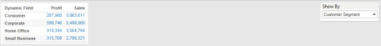

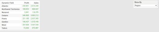
We can do this with help of Parameters and Calculated fields.
Step 1: Create parameter
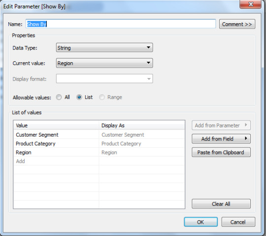
Step 2: Create Calculated field
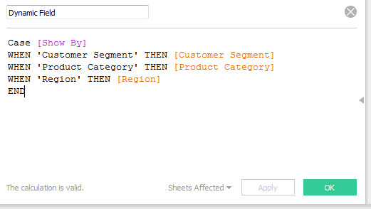
Step 3: Add the calculated field to the Rows shelf.
Below is the example
https://public.tableau.com/shared/Q2CYD9ZK3?:display_count=yes
0 notes
Text
Tableau Dashboards Designs - 1
You want to display economic factors of countries. When clicked on a country/Countries table should filter the data based on selection. How would you do this? (like below screenshot)
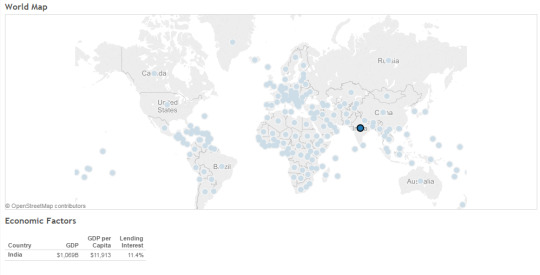
By creating an action filter we can do this.
https://public.tableau.com/views/WorldIndicators_422/Dashboard3?:embed=y&:display_count=yes&:showTabs=y
1 note
·
View note
Text
Unstandardized Vs. Standardized coefficients in regression
Suppose we are trying to predict a final exam score based on the number of hours spent studying.
If I get a B (Unstandardized coefficient) = 2, this tells me that for every of 1 hours study time, I predict an increase in the final exam score of 2. This relationship is in the original units (hours studying, and exam score). This is useful for predicting things in the real world, but it is difficult to compare different predictors. Predictors might have large B values just because they are measured on a larger scale (compare minutes to hours in the above example).
Standardised regression coefficients do a similar thing, but in a standardised way. The β( Standardized coefficient) refers to the number of standard deviation changes we would expect in the outcome variable for a 1 standard deviation change in the predictor variable.
For example, if I got β = .5 for hours of study, this would tell me that for every 1 standard deviation increase in hours of study, I can expect a .5 standard deviation increase in the exam score. Because this is standardised, β make it easier to compare different predictors to see which is more important.
1 note
·
View note
Text
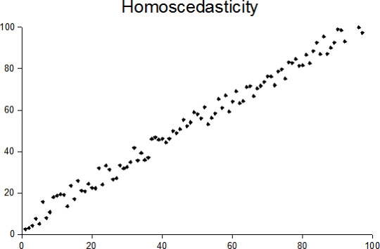
Homoscedasticity Vs. Heteroscedasticity
Homoscedasticity:
Heteroscedasticity:
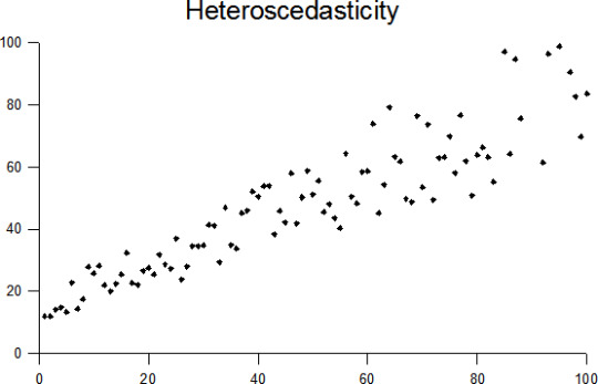
A collection of random variables is heteroscedastic if there are sub-populations that have different variability from others.
----------------------------------------------------------------------------------------------------
Example: Income vs, Expenditure on meals.
As one's income increases, the variability of food consumption will increase. A poorer person will spend a rather constant amount by always eating inexpensive food; a wealthier person may occasionally buy inexpensive food and at other times eat expensive meals. Those with higher incomes display a greater variability of food consumption.
----------------------------------------------------------------------------------------------------
Fixes for the Heteroscedasticity:
Logarithmized data.
Non-linear transformations of the X variables
Weighted least squares estimation method
Heteroscedasticity-consistent standard errors
0 notes
Text
Sensitivity Vs. Specificity
Sensitivity and specificity are statistical measures of the performance of a binary classification test.
Sensitivity / Recall / True Positive : Positives that are correctly identified as Positives
e.g. percentage of sick people who are correctly identified as having the condition.
Specificity / True Negative : Negatives that are correctly identified as Negative
e.g. percentage of not-sick(healthy) people who are correctly identified as not having the condition (i.e. healthy).
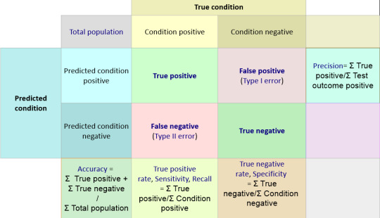
Below statement should make it more clear.
A perfect predictor would be described as 100% sensitive (e.g., all sick are identified as sick) and 100% specific (e.g., no healthy are identified as sick);
0 notes
Text
Phases of an Analytics Project
Broadly speaking these are the steps. Of course these may vary slightly depending on the type of problem, data, tools available etc.
1. Problem definition – The first step is to understand the business problem. What is the problem you are trying to solve – what is the business context? Very often however your client may also just give you a whole lot of data and ask you to do something with it. In such a case you would need to take a more exploratory look at the data. Nevertheless if the client has a specific problem that needs to be tackled, then then first step is to clearly define and understand the problem. You will then need to convert the business problem into an analytics problem. In other words you need to understand exactly what you are going to predict with the model you build. There is no point in building a fabulous model, only to realise later that what it is predicting is not exactly what the business needs.
2. Data Exploration – Once you have the problem defined, the next step is to explore the data and become more familiar with it. This is especially important when dealing with a completely new data set.
3. Data Preparation – Now that you have a good understanding of the data, you will need to prepare it for modelling. You will identify and treat missing values, detect outliers, transform variables, create binary variables if required and so on. This stage is very influenced by the modelling technique you will use at the next stage. For example, regression involves a fair amount of data preparation, but decision trees may need less prep whereas clustering requires a whole different kind of prep as compared to other techniques.
4. Modelling – Once the data is prepared, you can begin modelling. This is usually an iterative process where you run a model, evaluate the results, tweak your approach, run another model, evaluate the results, re-tweak and so on….. You go on doing this until you come up with a model you are satisfied with or what you feel is the best possible result with the given data.
5. Validation – The final model (or maybe the best 2-3 models) should then be put through the validation process. In this process, you test the model using completely new data set or test data set i.e. data that was not used to build the model. This process ensures that your model is a good model in general and not just a very good model for the specific data earlier used (Technically, this is called avoiding over fitting)
6. Implementation and tracking – The final model is chosen after the validation. Then you start implementing the model and tracking the results. You need to track results to see the performance of the model over time. In general, the accuracy of a model goes down over time. How much time will really depend on the variables – how dynamic or static they are, and the general environment – how static or dynamic that is.
0 notes
Text
Cab Booking Cancellation Prediction
The business problem here is to improve customer service a cab company in Bangalore. Area of interest is ‘booking cancellations’ by the company due to unavailability of a car.
The goal is to create a predictive model for classifying new bookings as to whether they will eventually get cancelled because of unavailability of a car.
Data fields
id - booking ID
user_id - the ID of the customer
vehicle_model_id - vehicle model type.
package_id - type of package (1=4hrs & 40kms, 2=8hrs & 80kms, 3=6hrs & 60kms, 4= 10hrs & 100kms, 5=5hrs & 50kms, 6=3hrs & 30kms, 7=12hrs & 120kms)
travel_type_id - type of travel (1=long distance, 2= point to point, 3= hourly rental).
from_area_id - unique identifier of area. Applicable only for point-to-point travel and packages
to_area_id - unique identifier of area. Applicable only for point-to-point travel
from_city_id - unique identifier of city
to_city_id - unique identifier of city (only for intercity)
from_date - time stamp of requested trip start
to_date - time stamp of trip end
online_booking - if booking was done on desktop website
mobile_site_booking - if booking was done on mobile website
booking_created - time stamp of booking
from_lat - latitude of from area
from_long - longitude of from area
to_lat - latitude of to area
to_long - longitude of to area
Car_Cancellation (available only in training data) - whether the booking was cancelled (1) or not (0) due to unavailability of a car.
Dataset can be downloaded from here.
Started with Feature Engineering. Used MS Excel for that.
vehicle_model_id
package_id
travel_type_id
from_city_id
from_month: extracted from from_date
from_weekday: extracted from from_date
from_time_category: extracted from from_date and segmented into 5 buckets (based on patterns in the data)
online_booking
mobile_site_booking
booking_month: extracted from Booking_created
booking_weekday: extracted from Booking_created
lead_time_days : This is the difference in days between from_date and booking_created
Features in bold are the ones I created from original features.
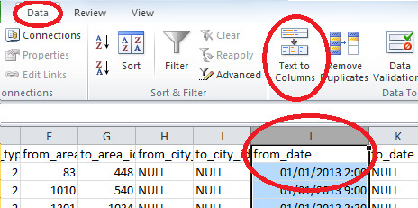
While extracting month, weekday and time from from_date I got to understand that excel was taking the format of the date columns wrongly. I corrected this as below.

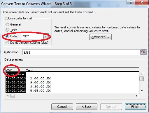
Some high level analysis of data
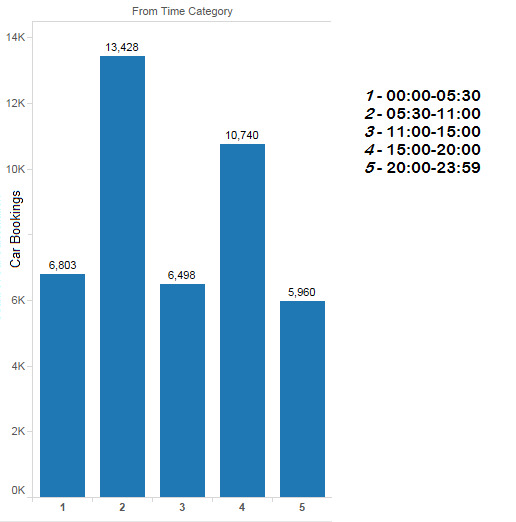
Cab bookings at different hours of the day

Looking at the pattern in the booking time hours of the day are divided in 5 parts as below.
I started with building model with Random Forest in Rattle (R GUI). Here the data is unbalanced (Large difference between the number of rows with Car_Cancellation = 0 and Car_Cancellation = 1)
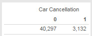
I used stratified sampling to handle this unbalanced nature of data.
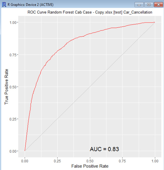
Random forest gave a balanced model with ~23% OOB error rate for both the categories and ~83% AUC using ntree = 230, mtry = 3, sampsize = c(2000, 2000)
That’s it for now guys. See you soon with the next blog. Let me go and find ways to fine tune and improve the model.
0 notes
Text
Hypermart CaseStudy
HYPERMART is a large hyper market. Hypermart started 6 months back with 1 store at Mumbai. It sells food items, general merchandise and apparels. Hypermart has a loyalty scheme that runs in all of its stores, which allows customers to collect points that can be redeemed against future purchase.
Tom Hanks CEO at Hypermart comes with rich exposure from leading European retailers. In order to grow and compete he has identified that they need to take a more structured and strategic approach; putting customer data at the core of their decisions. Madhuri heads marketing at Hypermart. She wants to use rich loyalty member data to improve her customer understanding. Insights around customer behavior will help her increase customer satisfaction and grow business.
The dataset can be downloaded from here.
Below are some of the questions we would answer from the data.
1. How do we identify loyal customers using a customer segmentation technique? (Here we will segment the customers in a manner that allows for marketing decision making)
Potential Approach: If we take a high level view of the data then the technique which seems a logical choice to segment the customer is RFM (Recency Frequency Monetary). Drawback: In the given context the focus is segmenting the customers based on loyalty, thus it makes more sense to give extra weight to the frequency part i.e. how many times does the customer comes back to buy things.
Our Approach:
The technique which has been applied to segment the customers is an extension of RFM where the customers have been segregated based on the number of transactions and different months in which the customers have made purchase.
The given file contains the data for 7 months so I have used the criteria for a frequent customer to be “customer who had made purchase in 3 or more months”. Using this criteria the first set of loyal customers are picked.
The transactions and sales of the picked customers are compared with the average transactions & sales for each month. If the transactions & sales of the particular customer are higher then it’s chosen to be a loyal and a productive customer.
Calculations can be found here.
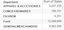
2. What are the leading categories in each departments?
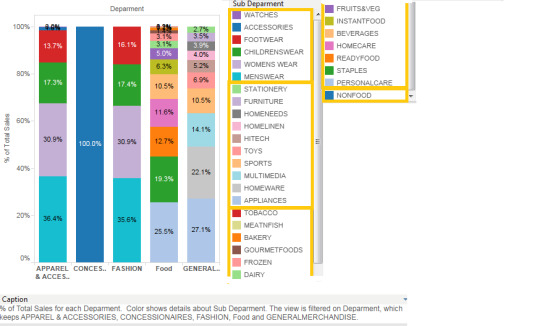
Leading categories within each department can be easily visualized with this type of stacked bar chart.
4. Where do loyal consumers spend their money?
Most of the spending by loyal customers is on FOOD and General Merchandise department.
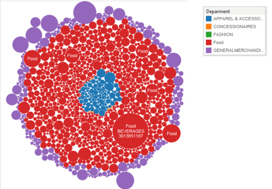
5. What is the trend of number of customers of different departments? and What is the contribution by each department?

We can see here the number of customers of FOOD department is low but Sales of FOOD department is highest. While On the other hand CONCESSIONAIRES department has highest number of customers but very little contribution to the sales.
This type of analysis can be useful to determine promotional strategy and cross selling strategies.
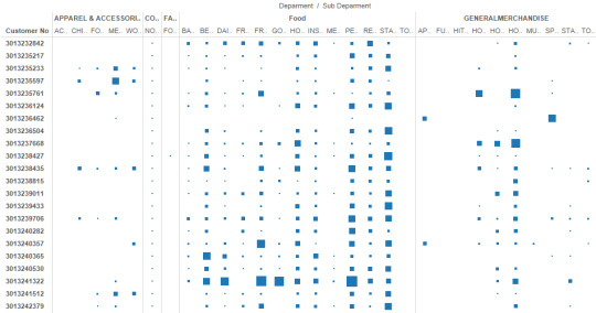
6. What is the trend of revenue of sub-departments?

Here is the trend of some of the categories which has common behaviour of spike in July, which could be because of promotions or discounts. We do not have sufficient information to draw the conclusion here.
7. What are the Best performing SKUs(items) and what is their trend?
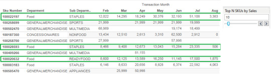
Here are the Top 10 SKUs by sales. SKUs which are highlighted in green are showing consistent growth. Accordingly we can make decisions and forecast about these items.
Similarly we can analyze worst performing SKUs and their trend. We can accordingly do the root cause analysis and find out how sales of those SKUs can be improved. Otherwise we can make decision whether to continue selling those SKUs or discontinue their selling. Note:Microsoft excel and Tableau are used to create the visualizations and performing calculations.
0 notes
Text
What Machine learning algorithm should I use?
The Microsoft Azure Machine Learning Algorithm Cheat Sheet helps you choose the right machine learning algorithm for your predictive analytics solutions.
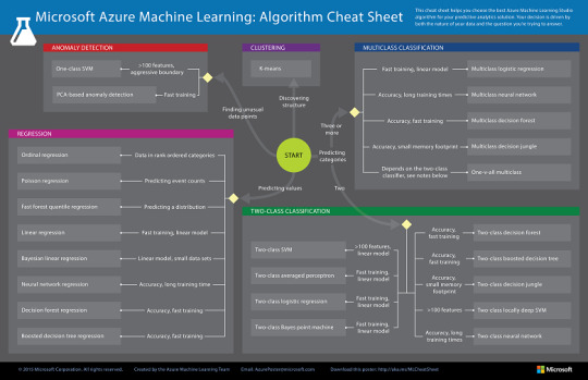
This cheat sheet has a very specific audience in mind: a beginning data scientist with undergraduate-level machine learning, trying to choose an algorithm to start with. That means that it makes some generalizations and oversimplifications, but it will point you in a safe direction.
for more details read here
0 notes
Text
Market Basket Analysis for Cross Selling (using XLMiner)
Market Basket Analysis is a widely used technique among the Marketers to identify the best possible combinations of the products or services which are frequently bought by the customers.
In simple words, Market Basket Analysis looks at the purchase coincidence with the items purchased among the transactions. i.e., what is purchased with what? For example, in a foot-wear store, socks are often purchased with a pair of shoes.
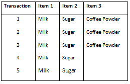
A small dataset to understand the terminologies
Terminologies
Apriori Algorithm: This is the algorithm used in the analysis. For more details read here
Association Rules: This is the outcome of the analysis.
Rule 1: If Milk is purchased, Then Sugar is also purchased.
Rule 2: If Sugar is purchased, Then Milk is also purchased.
Rule 3: If Milk and Sugar is Purchased, Then Coffee powder is also purchased in 60% of the transactions.
Antecedent & Consequent: Generally association rules are written in “IF-THEN” format. We can also use the term “antecedent” for IF and “Consequent” for THEN.
Frequent item set – Item set occurring in high frequency. For example in our Coffee dataset, Milk and sugar combinations occurred in 100% of the transactions.
Support – The support for the rule indicates its impact in terms of overall size. If only a small number of transactions are affected, the rule may be little use. For example, the support of “Milk & Sugar” is 5/5 transactions or 100% of the total transactions. While the support of “Coffee powder” is 3/5 transactions or 60% of the total transactions.
Confidence – It determines the operational usefulness of a rule. Transactions with confidence with more than 50% will be selected. For example, the confidence of milk, sugar and coffee powder given milk, coffee can be written as
Number of transactions that include Milk & Sugar (Antecedent) and Coffee Powder (Consequent) is 3
Number of transactions that contains only Milk & Sugar (Antecedent)) is 5.
P(Milk & Sugar AND Coffee Powder)/P (Milk & Sugar) = 3/5 = 60%
Hence we can say that the association rule has a confidence of 60%. Higher the confidence , stronger the rule is.
Lift ratio – The lift ratio indicates how efficient in the rule is in finding consequences, compared to random selection of transaction. As a general rule, Lift ratio of greater than one suggests some usefulness in the rule. for more details read here
Let us run through this with the help of a large open dataset. Let us use Groceries dataset.
A Marketer is interested in knowing what product is purchased with what product or if certain products are purchased together as a group of items which they can use to strategize on the cross selling activities.
Association Analysis with XLMINER
As a first step we need to understand what is purchased with what with the help of Association analysis.
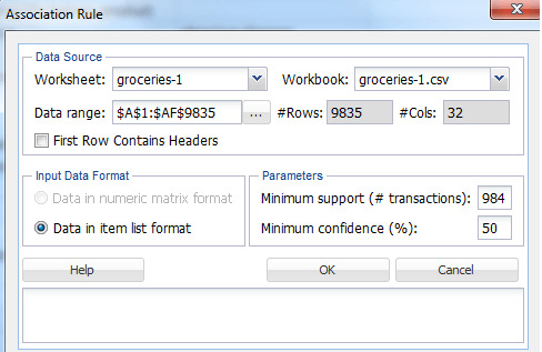
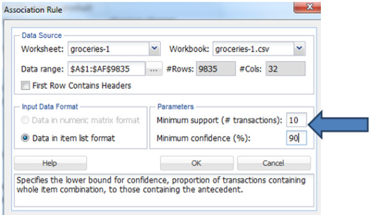
Once you run the Association analysis you can see the below pop up by clicking on “Association Rules”
================================
Terminologies
Minimum Support (#transactions) – The minimum support of the rule is defined as the minimum number of transactions that include the relevant parts in order to qualify to be part of frequent item set. The default minimum support would be 10% of the total number of transactions taken for analysis.
Minimum Confidence – The minimum confidence of the rule is defined as the minimum number of transaction that has consequent will also have antecedent. The default minimum confidence would be 50%.
From the summary of the data we know that the number of unique items are 169 and number of transactions are 9835. As the number of unique items is huge, there would be huge variations between the co-occurrence of the frequent items. Hence we will consider the minimum support to be 0.1% of the total number of records. In order to have a better confidence and less error prone on the rules generated we will give the minimum confidence to be 90%.
Note: This is not a thumb rule. We are taking in order to get a better result. A Marketer may analyze with different combination of support and confidence and see what works best for his business.
for example:
And here the Output is
A new tab with in the excel sheet will be created named “AssoRules_Output” as shown below.
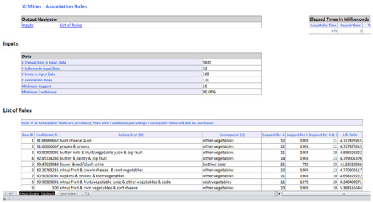
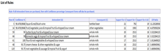
A Marketer would consider rules with high Lift ratio, high Confidence and good support.
For example,
IF flour, root vegetables & whipped/sour cream are purchased THEN whole milk is also purchased. This rule has 100% confidence. The confidence of 100% tells us that this rule appears to be a very promising rule for the business.
0 notes
Text
Bias Vs. Variance Dilemma
High Bias
Pays little attention to data
Oversimplified
High error on training set (Low Rsquare, large SSE)
High Variance
Pays too much attention to data
Does not generalize well
High error on test set than the training set
0 notes