
Statistics
We looked inside some of the posts by johnmartinphoto and here's what we found interesting.
Average Info
Notes Per Post
4
Likes Per Post
4
Reblog Per Post
0
Reply Per Post
0
Time Between Posts
2 days
Number of Posts By Type
Text
17
Last Seen Tumblr Blogs


Fun Fact
Tumblr was acquired by Yahoo for $1.1B in 2013.
Text
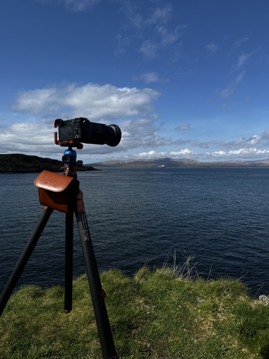
Risk Assessment for shoots during the project
Risks Identified;
proximity to water (Likliyhood) Low (Risk Control Adeqtue) Yes
Flying the Drone (Likliyhood) Low (Risk Control Adeqtue) Yes
Driving the Car (Likliyhood) Low (Risk Control Adeqtue) Yes
Other people (Likliyhood) Low (Risk Control Adeqtue) Yes
working from a boat (Likliyhood) Low (Risk Control Adeqtue) Yes
damaging eqiemtimeant (Likliyhood) Low (Risk Control Adeqtue) Yes
Falling over (Likliyhood) Low (Risk Control Adeqtue) Yes
During my time shooting this project I will take my upmost care to prevent any unnecessary danger to myself or anyone else
2 notes
·
View notes
Text
Development Post
What Three Words


with this project, I have included the what three words location for each image in the book this allows the reader to view where each location is. this can be scanned by a phone which takes you there on google maps. I did this in the first edition and really liked having it there. It keeps continuity with the project and it makes sense to include it as my purpose with the project is to celebrate Scotlands beauty
0 notes
Text
Development Work Photographer Research
Shona Perkins
I discovered Shona Perkins is an ICM photographer while working on this project. Her work primarily focuses on seascapes and ICM work which is very fitting for my type of project. This edition of the project has mainly focused on the sea in many images. i really enjoy looking at many of Shona's images as they are very calm and often shoot at sunset but the sea combined with the ICM it makes for a very abstract piece of work. after some research one thing that influences Shona's work is abstract minalmisilm and contemporary art which ties right in with my project about Capturing Scotlands Beaty. Shona also runs a company called my Beautiful Scotland and the ICM Experience. this gives others the opportunity to learn how to make this work and get the experience of working with an industry professional something I would be interested in as well. One image of Shon's I particularly like is one taken out on the outer Hebrides on the isle of Harris. this image reminds me of a similar image I made for this project. i particularly like the tones in the image combined with the more subdued evening light.


2 notes
·
View notes
Text
Development Post
Changes to the project plan
As my Project has progressed plans have changed and developed one major one being my trip to Oban, Iona and Staffa this week long trip allowed to Borden my locations and diversity the range of images and techies used in my project. On this trip I got a chance to visit finals, cave, white Beach on the Isle of Iona and McCaig's tower this trip was a great opportunity for me to experance photographing multiple locations in a short space of time and ho to mange it. One downside of shooting quite intensively over a week. Is having a large backlog od development work to catch up on. This has taken me quite some time to get up to speed with (About a month) largely due to the fact its not my favourite thing to do although having said that it was more than worth it for the images this trip resulted in.
some BTS images from the trip


0 notes
Text
Places | Let Me Take You On A Journey | VOL 2 (Personal Project) SH8Staffa
Contact Sheets (With Mark ups)

Green = Chosen
Yellow = Shortlisted
Images From Shoot
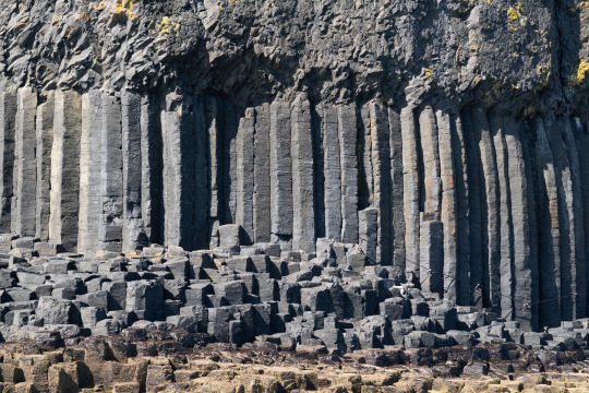
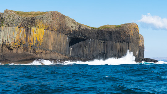

During my time at Staffa I spent my time photographing many different things from the boat unfornaty I didn't get the opportunity to land on Staffa although this did mean I get the opportunity to go around the whole island on the boat seeing all the different rock formations seen on Staffa. Many of these images aren't really suitable for the intention of my project although I did get some just for the project aswell,
Final image
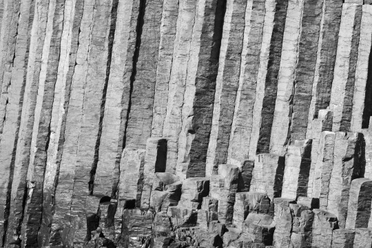
Shoot Evaluation
Overall I thoroughly enjoyed this trip to to Staffa to shot some awesome images with the cool rock formations found on this island. I particlery like this one of the cube like rocks found on the coast of the island. Its something that's quite to this island and makes people stop and think about the shapes of the rocks
0 notes
Text
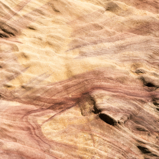
Places | Let Me Take You On A Journey | VOL 2 (Personal Project) SH7 Capile Caves
Contact Sheets (With Mark ups)

Green = Chosen
Yellow = Shortlisted
Images From Shoot
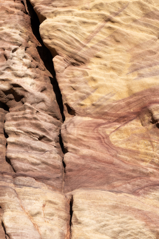
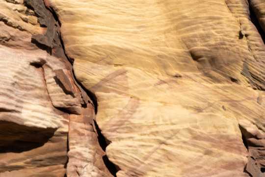
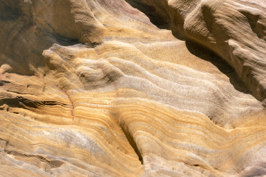
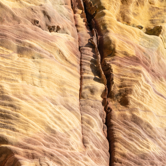
In Chosing my final image I wanted something that represented simplicity thet would also work well as a square crop so I done a lot of experimenting while on location here at Capile Cave. I reread using the ICM movements although In mu option this location isn't really suited to it. I went to do this shoot at the hours leading up to and during golden hour in the evening.
Final image
Shoot Evaluation
Overall this was probably my most relaxing shoot I have done while completing this project. taking a step back and look at the closer details of what makes up the landscapes we photograph can be very refreshing and enjoyable and personally I like the image above for its simplicity and quinue texture and colour patterns found. I also like how I was able to make it a square crop which I struggled to do with some of my other shortlisted images. if I was to redo this shoot I might have left slightly earlier as at this location there is a hill behind where I was shooting meaning once the sun dipped below that the light was gone although this didn't really cause much of an issue as I had around 2 and a half hours on location after walking there.
0 notes
Text
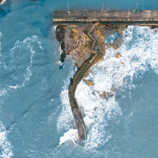
Places | Let Me Take You On A Journey | VOL 2 (Personal Project) SH6 St Moans
Contact Sheets (With Mark ups)

Green = Chosen
Yellow = Shortlisted
Images From Shoot
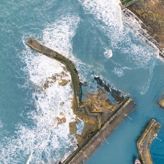
While I think this image is pleasing to look at and offers a new perspective on this location I decided to favour the image with straight lines as the shapes in the other image (Below) keep the viewers eye on the main focal point of the image compared to this one where ur eye is lead out the image to the right top handside
Final image
Shoot Evaluation
Overall I throughly enjoyed shooting this set of images. during my time shooting these I could hear the waves crashing which I find very peaceful and calming. As this location is noramally photographed from the top of the pier I thought Id give the location a new perspective with using the drone only for this shoot I think this has worked very well in this instance as it has allowed to experiment with shapes in my images in this intense a triangle. The colour of the water seen here isn't actually real it was more of a grey colour although it goes without saying this wasn't ascetically pleasing nor was it making the pier stand out. to combat this I used a mask in Lightroom to change the colour of the water making it a more astrally pleasing blue colour.
Here is a idea of what I done

0 notes
Text
Development Post; Slight Name Change to Project & Preview Of current Back & Front cover
Previously I planned on naming the final booklet Places | Let Me Take You On A Journey VOL 2 although after more consideration I have decided to Rename it to Places | Celebrating Scotlands Beauty personally I think this better represents my intentions with the project of comparing and appreciate the Scottish landscape through a fresh perspective with the use of creative camera controls.
Preview of Current Front Cover

Back Cover

0 notes
Text
Places | Let Me Take You On A Journey | VOL 2 (Personal Project) SH7 Iona Shoot
Contact Sheets (With Mark ups)
Green = Chosen
Yellow = Shortlisted
Images From Shoot

With his shoot i thoroughly enjoyed shooting these images the place was calm I was there alone and in peace. Looking into the smaller details in the landscape has been one of my favourite parts for the shooting process for this project. having said that not all of them are equal one of the main reasons for my selection process was how the image would crop as i have made a commitment to keep all images square in this project as it almost makes people stop to look as most images are either vertical or horizontal this is neither its equal. i think this crop is an important part of my project so some good images had to be sacrificed in favour of the crop. the image on the bottom right is the one I'm talking about in particler.
Final image
Shoot Evaluation
this image has a great sense of minimalism something I have always seeked in my work (Mosty) as more is often less the fewer elements in a photo the easier it is to create and view. during my time shooting this, I was using my observation skills on a closer level to depict these small scenes from the more extensive landscape. overall I think this image fits perfectly into my project and makes a good ending point as it's the last image in the book. if I do produce another image its also a good starting point in the next edition if I decide to pursue that idea.
0 notes
Text
Development work photographer research
During my time doing this project I have continued to research photographs and other artists making similar work. One of the photographs I have found particularly inspiring is Kim Grant a landscape photographer based in moray Scotland. Kim’s work and motivation behind the work shares a lot of the values I have with my project and work in a border general. Kim’s connection to the environment we photograph is something we have in common and that has given me motivation and thinking for the purposes of my project. With Kim’s work her ethos is about connecting with nature and the environment around us this has great connections with my purpose with my work although I sometimes struggle to realise this particularly when sat at a desk although when I’m shooting these reasons come to mind so easily Likely something to go with the experience of being in a location and creating a pice of work instead of being slouched at a desk where the connection to the environment isn’t there and isn’t visible. Many of my favourite images of Kim’s follow a similarly style to my images within this project. Many of Kim’s recent videos explore techniques I have been using to create a my images for this project such as ICM and double exposure. Overall I think following Kim’s work for a prolonged period of time during the creation of this project has greatly helped me understand the purpose of producing this type of work and my main goal of showing and comparing the natural and ur an environments of Scotland. This creates a journey through Scotlands environment in an impressionist and artistic form not usually found in many other photographers. Another reason I believe I am particularly drawn to Kim’s work is the area of Scotland she photographs this is an area I am familiar with and have a lot of memories here while I have not been to take any photos there in some time.
0 notes
Text
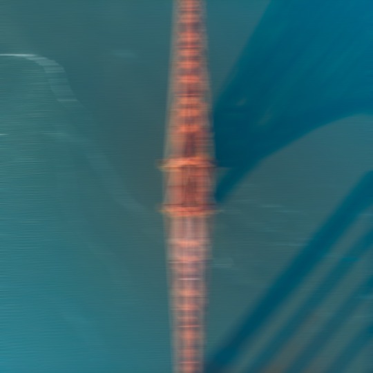
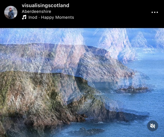
Front cover
For the front cover of this book I have decided to use an image and while this image wasn’t shoot for the project it’s still worth mentioning as it forms part of the continuation of the project. I think this image worked well for the front cover. It has a strange sense of mystery this is particularly due to the angle it was taken being above the forth bridge. The image was taking using a drone and I applied the ICM effect in photoshop using the ICM effect in photoshop gives the viewer an insight to what’s inside the book.
Back cover
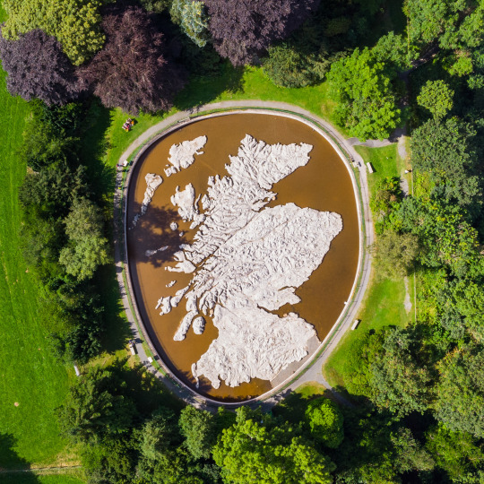
Not exact image
For the back cover I have chosen to use an image of a map of Scotland I did take this myself although it was actually taken before the project so cannot be marked. I have decided to make some changes to the image to make it fit in firstly I have made the water blue this creates a great sense of relation to the Scottish flag which comes back to my motives of the project to capture Scotland in a unusual way through the use of ICM.
0 notes
Text

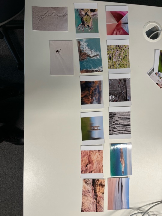
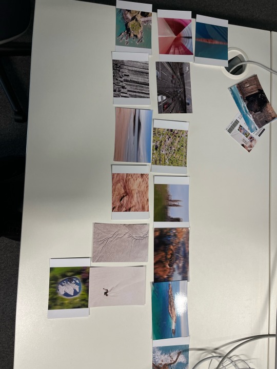
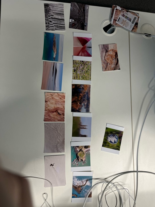
For selecting the images I want to include in this book I ordered some free prints online so I could have physical photos to move around and order in addition to this I also printed 3:2 and 1:1 versions of each this help me with the selection and decided weather or not I wanted to make the images square. Doing this allowed me to see the sequence of the photos and what worked best I have chosen to go with the one in the top right corner as I feel it best represents a good flow in terms of simplicity/complexity and colour it almost goes back to the begging of time.
0 notes
Text
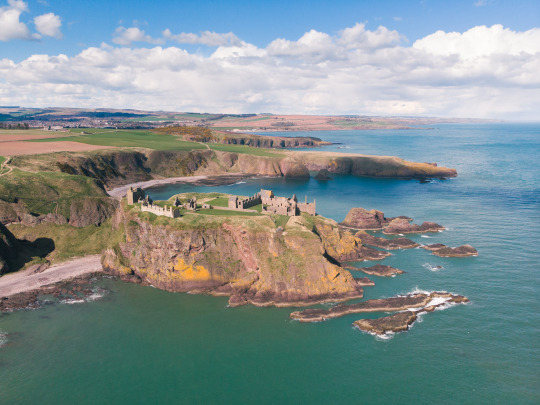
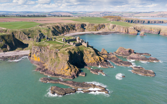
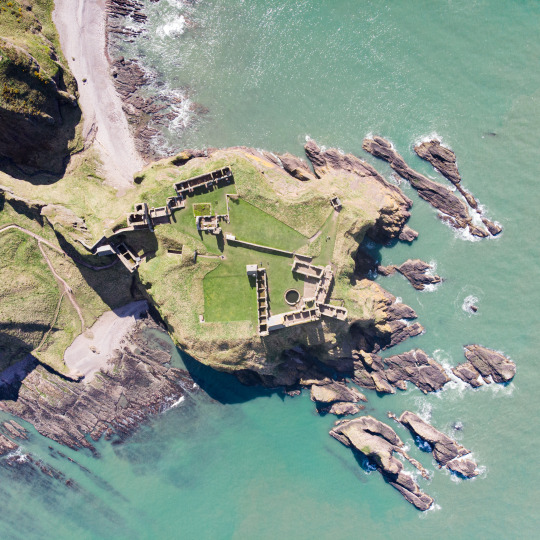
Places | Let Me Take You On A Journey | VOL 2 (Personal Project) SH6 Dunottor Castle
Contact Sheets (With Markups)
Green = Chosen
Yellow = Shortlisted
Images From Shoot
Final image
Shoot Evaluation
Overall i very much enjoyed shooting these images. Using the drone allowed me to gain a unique perspective on the castle that isn't possible from ground level. i really like the mixture of greens and blues in this image it makes it very pleasing to the eye along with it being at the coast. the shape of the castle is also very interesting to look at from this angle combined with it being on a rock surrounded by the sea. i didn't feel the need to add anything extra to this image as i think it works by itself.
0 notes
Text
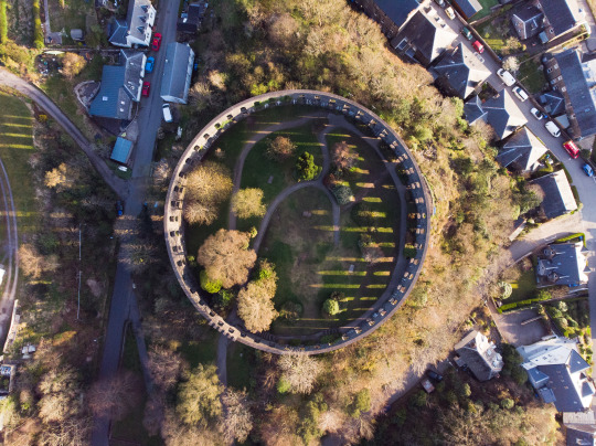
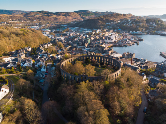
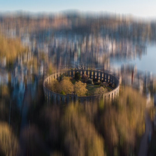
Places | Let Me Take You On A Journey | VOL 2 (Personal Project) SH6 McMcags Tower Oban
Contact Sheets (With Markups)
Green = Chosen
Yellow = Shortlisted
Images From Shoot


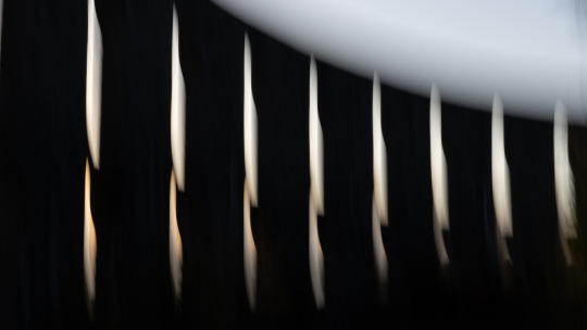
When at this location i decided to do a lot of experimenting with the camera in addition to using the drone. when inside the tower itself I decided to use the camera for some interesting movement shots with the light coming through personally I find these images pleasing although I'm not convinced they do the location justice in the same way the drone shots do as these ones don't capture the actual shape of the building quite as well. with the image on the top left while a nice angle I have used this angle multiple times previously in this project it also has quite a few distracting parts around the edges with houses etc.
Final image
Shoot Evaluation
Overall i think this shoot went very well. I was able to go there at golden hour so I managed to get this location with the best light and avoid the midday sun. using the drone on this shoot was very beneficial as it allowed me to show the shape of McCaig Tower as it's a circle and which would be difficult to show from a normal angle. I did try using the camera at this location although the results it yielded didn't do the location justice and more or less made it look like a structure with gaps in it. Being able to get this angle was very advantageous at this location. In addition to this, I added the Adamski effect onto it as it creates a point of sharpness in the image and emphasis the building's unique shape. As for cropping as its a very important part of this project I quite like the tower being centred so a square crop was perfect for this. the combination of the image being a square and the subject being a circle is a nice contrast of shapes also!
0 notes
Text
Places | Let Me Take You On A Journey | VOL 2 (Personal Project) 5 Goavan Sands
Contact Sheets (With Markups)
Green = Chosen
Yellow = Shortlisted
Images From Shoot

In choosing these images, I wanted one resembling a painting. I don't really like the pictures on the left and right as they are too blue for my liking and have no contrast, making them look very flat. the image in the middle is the same as the image below and while as a stand-alone image I actually prefer this 16x9 crop all my final images had to be 1x1 to fit into my booklet
Final image(s)

Shoot Evaluation
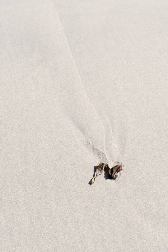
Overall I think this unplanned shoot actually turned out alright it was a great time to experiment with different shutter speeds and camera movements. This location wasn't great for the smaller detail shots as the sand had already loads of footprints. so I decided to focus on the ICM shots here. i had experimented with having a slightly longer shutter speed and a faster movement which resulted in a rather intersection image it sort of looked like more of a pattern and texture than an impressionist image I was hoping for with this shoot so I decided to switch things around and be more gentle with the movements to capture the above image. At first, I wasn't sure about this image as I thought there was too much blue sky although after a couple weeks, I started to experiment with different crops on the image and found the 1x1 crop to suit it very well it removes my annoyance about there being to much sky and gives more context to the surroundings with this being an image at the seaside it makes it very relaxing to look at combined with the impressionist effect it looks like something from a painting sherpas
0 notes
Text
Places | Let Me Take You On A Journey | VOL 2 (Personal Project) SH4 Iona Shoot
Contact Sheets (With Markups)
Green = Chosen
Yellow = Shortlisted
Images From Shoot
With this shoot, i did quite a bit of experimenting with different angles and heights to show different shapes and patterns. This has worked well for me. It allows me to show the area from a different perspective and a unique vantage point. With one of the images I tried doing a checkered pattern of the image in photoshop although I'm not overly pleased with it so I think ill stick with it in a more traditional fashion.
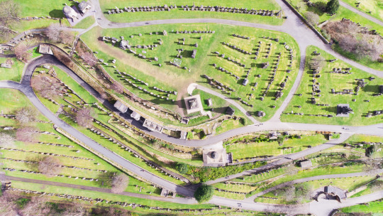
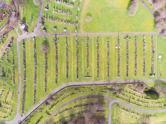
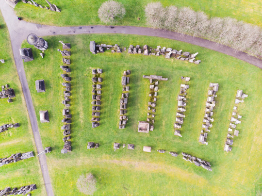
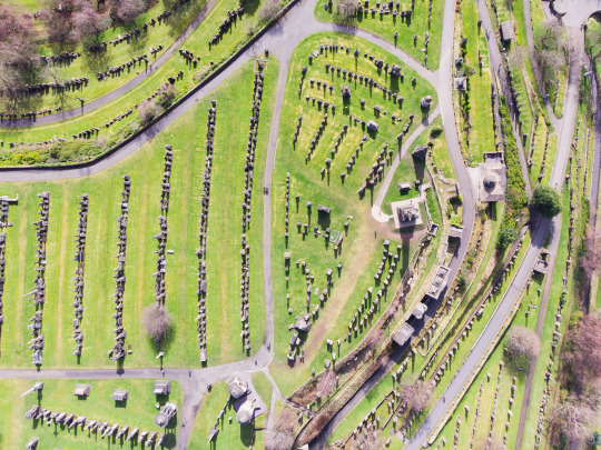
in choosing an image from this shoot I wanted something with a lot of paths and shapes so I decided to go with the top image. i like how the path winds around the image and it has a variety of different interesting points around it. another image I strongly considered was the image on the bottom left there I really like this one for its simplicity although I wasn't able to scusesfulluy give it a square crop meaning it, unfortunately, wasn't a contender for the final selection. the image in the middle isn't really what I was looking for with this shoot the paths don't really lead your eye anywhere just around the image plus it feels a bit static and is also unbalanced on the top right
Final images
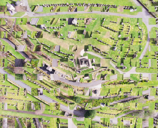
Shoot Evaluation
Overall I think this shoot was a success I was able to get strong sunlight which give me shadows which in turn gave the gravestones a sense of realism it almost made them look 3d while they appeared very flat. My favourite part of these images is the shapes present I particularly like the two above. I like the way the path leads your eye around the photos. it gives the image a great range of never-ending shapes visible in the image. the green colour is also very striking and the mixture of man-made objects and natural things in the image makes it a good image for transitioning the book from urban to rural locations. Although given the concept of my project I didn't think this image stood well enough by itself so I decided to put my own twist on it and use these boxes seen on the above image to help tie it into my project. i really like the effect this has on the image it gives the image a very contemporary look and also made the image crop to a square far easier as I didn't need to worry about cutting the path off etc etc
0 notes
Text
Places | Let Me Take You On A Journey | VOL 2 (Personal Project) SH2Glasgow Motorway Shoot
Contact Sheets (With Selections)
Green = Chosen
Yellow = Shortlisted
Images From Shoot
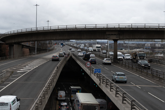
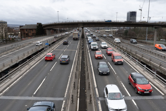
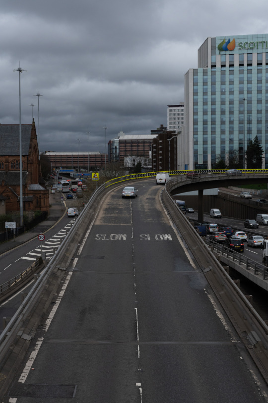
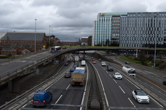
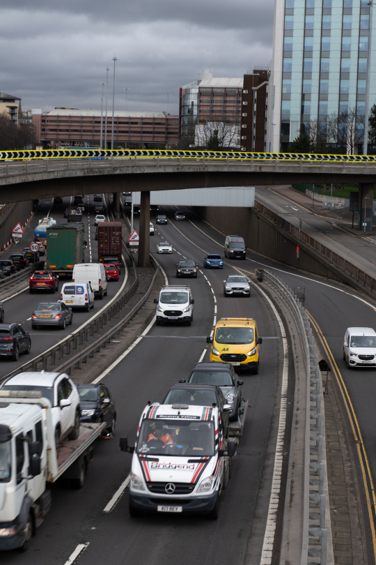
Final Image From Shoot
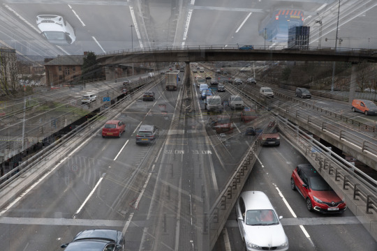
Shoot Evaluation
While this shoot wasn't the most enjoyable to shoot as it was above a loud and smelly motorway it yielded some awesome results that fit right in with this project. With this shoot, I shot loads of images of different parts of the motorway and then made them into multiple exposures. this has created an image that looks like it has roads in all directions even upside down. To do this I just opened them as layers in Photoshop and played around with the transparicity and layer blending options until I got this result I may go back at some point and look at different edits I go do on this. Images like this can often feel overcrowded and busy so to try and mitigate this by having the main image have all the roads going in the same direction if works or not I'm not to sure either way I think this image looks apart and ties in with the project and looks super captivating
0 notes