
Statistics
We looked inside some of the posts by jonprocillustration-blog and here's what we found interesting.
Average Info
Notes Per Post
2
Likes Per Post
2
Reblog Per Post
0
Reply Per Post
0
Time Between Posts
7 hours
Number of Posts By Type
Text
17
Last Seen Tumblr Blogs


Fun Fact
In 2020, 44% of users from Denmark used Tumblr daily.
Text
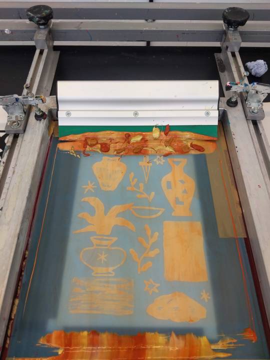
Lasercut Workshop
The laser cut workshop was really interesting. I had previously used the laser cut facilities in my second year of my undergrad illustration. I had loads of fun cutting out mushroom shapes and by the end of the project knew the facilities quite well. However the workshop was all online, allowing us to create a laser cut from home.

There was a lot of prep before we could start printing, fist having to download the app adobe catch, which took a while. However after that the entire process was really smooth and very easy to follow, which was a relief for someone who isn't very tech savvy. We were tasked to draw an image that was relatively simple. Using the app to take a photo of the drawing and then editing it into adobe illustrate. This part of the workshop was a little difficult as I'm not the best illustrator. We had to colour the paths red to cut right through, green to score and blue to create a crosshatch shade. I was used to this process so it didn't take me long. After that we sent the files off and let the technicians edit any mistakes we made and prep all the files onto the same sheet of wood. Watching the laser cut the wood was incredibly satisfying. After a while the laser was finished and we had a laser cut shape that was etched and shaded.

The technicians talked about the range of materials that colour be laser cut, there seems to be no limit to the amount laser cut has to offer. Etching into materials, cutting blocks and shapes both offer interesting opportunities for etching and block printing. I would like to explore the printing possibilities of laser cut. I think cutting an image out of wood, colouring it separately, then putting it on a press and printing a multi coloured print in one press would be fun and almost like letterpress but with shapes

0 notes
Text
Linocut Workshop
The lino block consists of a thin layer of linoleum (a canvas backing coated with a preparation of solidified linseed oil) usually mounted on wood. The soft linoleum can be cut away more easily than a wood-block and in any direction (as it has no grain) to produce a raised surface that can be inked and printed. Its slightly textured surface accepts ink evenly.

I wasn't massively excited for the lino workshop mainly because over the various lockdowns, it's one of the only printing techniques that was available to me. I had spent the past few months practicing at linocut however was interested in improving my ability. I think that the most important thing that I learnt during this workshop was how to align the lino blocks on the press allowing for multicoloured prints to be accurate. This was something that I had struggled with. Ben taught us how to use scraps of grey board and paper to align the lino which was useful as it meant that we didn't have to buy specific tools. After the demonstration we were tasked to create a lino cut. I wanted to create a multi coloured print however due to work I was unable to finish the other layer. I am still pleased with my print and am really looking forward to using the studio in the next module.

One thing I was surprised about was how much I enjoyed the linocut workshop. At the beginning I was a little over the print method, however after the workshop I fell back in love with it. I eventually bought my own press, which i'm very excited to use over the summer.

0 notes
Text
‘Eating trifle in the company of flowers’ A Talk with Wuon-Gean Ho
I thoroughly enjoyed Wuon-Gean Ho’s talk about her experience as an artist in lockdown and how she overcame the problems that arose with it. Her presentation about her work was really engaging and I enjoyed listening to her talk when discussing the themes and context behind each piece. Not only did she talk about the context of her work, she broke down her images and explained how they were made. I found this very interesting as she showed us the layers that made up her image and how they affected one another to create the final image.
Wuon-Gean Ho’s work is primarily lino based, often using two to three layers per print. This talk couldn't have come at a better time as I had completed several lino prints and wanted to find a way of improving my designs. Ho’s work has inspired me to add more colour to my own designs and blend the layer to add texture and depth. During the zoom call Ho explained what her typical work process was when creating one of her prints. She begins with a simple sketch, often drawn from life, which she will then trace onto her lino and begins carving. She doesn't focus too much on the layout of her work, as they are often from a warped perspective initially drawn from her primary research. The first plate that she carves sets the scene and composition of the print. This is often the plate with the most colour. Her second plate will then highlight the focal points of the print, bringing emotion and depth to the image.
Ho uses a range of mark making techniques within her work, creating light and dark textures that completely change the style of the work. Ho not only uses mark making to create atmosphere but also creates half tones that she uses throughout her work. These half tones are used in a variety of different ways to create glass like reflections or glowing effects. I've never seen halftones in lino prints before and was fascinated about how she makes them. Inspired by the wiping of ink off a plate, a technique used in etching, Ho explained that three layers of ink are rolled across the lino, taking a cloth to wipe away the ink to create halftones. An extra layer to create full and half tones on the same lino, allowing one colour to be printed at the same time. This is a technique that I'd like to add to my work, and am looking forward to developing in the future.
The talk moved from techniques to her most recent project about lockdown. Wuon-Gean Ho’s lockdown print series really delves into the emotions and struggles she faced living alone during lockdown. There is something very raw about her work that holds a unique charm. Her visual language feeds into the emotions she wishes to portray to create a very real and honest look into lockdown life. I found myself feeling oddly humbled as she showed us her prints and discussed their inspiration. I would love to be able to create something personal to me in a future project. I've often kept separate from my work, choosing to focus on something I'm interested in, rather than focusing on a personal experience. I think it could be interesting to try something a little outside my comfort zone and focus on a personal project that will hopefully be relatable to others and may offer me some personal insight. Ho noticed that she puts females as the professionals in all her prints, whether it's a vet or the lady giving the ultrasound. This wider context to her work was only discovered when Ho gathered all her prints together. I think it would be really interesting to see what subconscious contexts my work might hold, if any!


0 notes
Text
Fabric Printing Workshop
Fabric printing was one of the workshops I was most looking forward to. I had previously thought about taking my designs to a new medium and always thought about how I could translate my designs onto both ceramics and fabric. I have wanted to learn this area of print for a while now, specifically to create t-shirts and tote bags. Annoyingly I haven't got the photos I took of this workshop due to getting a new phone.
We were first introduced to the studio, learning where everything is and how to coat a screen. The process of preparing the screen is the same as the screenprinting I'm used to, the only difference being that the screen has wider holes in the mesh to allow more ink to pass through.

We were given a selection of fabrics to print on which was nice as we got to see how different fabrics and textures affected the print. With thicker more wooly fabrics, we were advised to pull the ink across the screen an extra time to allow the fabric to soak the ink in and get a full coverage.
We were taught to pin all the fabric down that we wanted to print on first. I'm not going to lie, I did have some trouble with this part, but after a while I got the hang of it. I didn't have the pins at the right angle when pinning down as they have to be almost horizontal with the table.


When it came to printing there were several differences between printing on fabric and printing on paper. The first being that there was no frame to place the screen on, which meant that we had to place the screen down by hand. Lining up the screen was a little difficult as it was hard to see exactly where the stencil was laying on the fabric. I imagine with a multi colour print this could become challenging. However, only doing a single colour print, we just had to make sure the image was on the fabric. Secondly we had to pull the print with one hand as the other hand was used to secure the screen. This again took a little getting use to. The squeegee had a rounded rubber end rather than the angular corners when printing on paper making pulling the print a lot smoother. This did mean that we had to keep the squeegee vertical when pulling. The ink was pushed through the screen twice.
After we printed on the fabric we were then allowed to print on tshirts. My t-shirt was used as the example so I didn't get to pin it out myself but watched where to pin it out. It was kinda obvious when I thought about it, but I'm glad that we were shown first. The process was very much the same, I used one of my designs this time as I wanted to give the shirt as a gift. A piece of cardboard was placed inside the top to prevent bleeding through to the other side. After that I lined my screen up and pulled the ink through twice.
I was really happy with how the prints came out, and over all, the process was really enjoyable. I would love to come back and print some of my designs on t-shirts and tote bags.

0 notes
Text
Wood Engraving Workshop
Wood engraving wasn't what I had expected when first walking into the workshop. I had initially thought it was where a soldering iron was used to burn marks into the wood. I was pleasantly surprised when I found out it was a similar process to woodcut. Wood engraving is a method similar to woodcut however the image is incised into the woodblock, rather than the background being cut away.
At the beginning of the workshop we were shown examples of wood engravings which were incredible. The amount of detail that could be made in such a small image was mind blowing. We were then shown the tools that we would be using. It was interesting to see the difference between the wood engraving tools, how they are used and what marks they can make. They also differ from the lino tools I use too, for one they were much sharper.
Due to the sharpness of the tools and the size of the block, the method of cutting was slightly different. We were given off-cuts of lemon wood, a soft wood with a weak grain. We placed the off-cut onto a pile of boxes holding the block below the surface. This allows the block to be swivelled around to help control the direction of the line. Having the block raised also doubled up as a safeguard in case your hand slips with the tool.

Before designing my image I wanted to practice engraving to inform me on how my image will look. I definitely struggled with carving at the beginning. Rather than engraving I was more gauging the wood out which wasn't very effective and probably blunted the blades that Ben took so long to sharpen (sorry Ben!) I had been applying pressure for so long that my fingertip went numb, and it is still numb! After adjusting the angle by bringing the tool almost flat to the block there was less resistance from the wood making it much easier to carve. I found cutting circles out slightly difficult, mainly due to rotating the tower of plastic boxes but got the hang of it in the end although I could get them all the same size. There was an adjustment period where I had to get used to not having my hand rest on a surface when cutting.

We began designing our images, like the rest of the workshops I incorporated a greek vase into the image. I wanted to do this so I could easily compare how the process and techniques would dictate how my image will be formed. Before we started carving we were advised to darken the wood so that it's easier to see where we had engraved once started. Initially I wanted to make my image with block shapes by removing large areas of the wood, however I soon realised that this was going to be very time consuming and is a woodcut method rather than a wood engraving one. I decided to adapt my image conforming to wood engraving techniques by cutting little dots into the background changing the tone from solid black to a mottled effect. I think this was successful on the whole however if I had more experience I think that I could have created more of a contrast between the background and the vase.

When it came to printing the block the process was the same as any relief print, by rolling ink over the block and laying paper over the top. I found printing a little more difficult, I'm still not sure why but the ink didn't seem to be as dark as a woodcut or lino. I think I may have applied less ink to the block than I usually would. I used a variety of types of paper, preferring the thicker paper due to the embossing outline.

When woodcutting I found that I was more careful and considered the marks I was making opposed to when using lino. I think I had a similar approach to this style of mark making as I did when etching. The pressure of knowing that all the marks would show up, made me a lot more careful. I did really enjoy the process after getting used to how to position my hands and the tools. Although it wouldn't be my first choice of printmaking, mainly due to the size of the image being relatively small, I would like to go back and create a few stamps that I could use for my packaging or as a logo on my other prints.

0 notes
Text
Screen Printing Workshop
I had spent the last couple of months of my undergrad in the screen print studio, just before the first COVID-19 Lockdown, so it was great being back. I definitely felt like I've grown as an artist over the past year. Coming back I feel more prepared, focused and full of new ideas. I'm really excited to get back into studio life.

Screen print is a type of stencil printing, where a screen made of silk/synthetic is stretched across a frame. A stencil is then made using a light sensitive resist and exposed like a photograph, this is the technique that we used in the introduction however a stencil can be made by using lacquer or by laying adhesive paper over the screen. After the image has been stencilled ink or paint is then pushed through the non-blocked areas using a squeegee onto paper below the screen, creating the desired image.
‘The most commonly used and versatile method in practice today uses photo emulsion and computer-generated artwork. This method enables the printing of fine line drawings, small and detailed type, and photographic imagery.’
Williamson, C. (2013). Low-tech Print : Contemporary Hand-made Printing. Laurence King Publishing.
Photo-screenprint can produce some incredibly detailed images which we were able to explore during our introduction. I already knew my way around the studio, however it was nice to be refreshed on the process after being away for so long. I learnt some new little tricks to help with alignment after washing the screen to use another colour. I also took this opportunity to really play around with the process, following Emma’s advice, and not worrying about the outcome. I think that this really helped me explore the detail that textures that can be produced. In the past I focused a lot on block colours and lines to create my images, however moving forward I'd like to include a textured and tonal element to my work. This would help blend colours and add a new element to my image making. After exposing the print, I decided to use black ink for the first couple of prints as I wanted to see how the textures would translate onto paper. Most of the textures came out really well, however where I experimented with ink (the black rectangle) didn't seem to work as well. I think I may have used too much ink so when being exposed the light wasn't able to shine through giving the desired effect.
Being in a particularly experimental mood I wanted to try something I hadn't done before which was to create a marbling effect with the inks. To do this I added half emulsion and half paint to a pot and gently folded them together without mixing them. I did this with four colours. I then flooded the screen with emulsion and dripped, sprayed and splattered the four half mixed mediums onto the screen. I then pulled the squeegee over the screen to create a marbled effect. The results were great although the image is hard to make out. I tried the again this time using the previously mixed ink, this created a kind of mottled effect, and each time after that the colours began to blend, even when adding new pain directly to the screen. After some trial and error I think I know how to get the best results. By layering a base colour down to define the outline of the shapes should be the first thing to do. Once that's done then use the marbling technique using just emulsion to flood the screen adding the ink mix onto the screen like I did the first time. I realised that I'd have to wash the screen between every print to get the best result as once the paint mixes, the marbling effect is lost.


The next part of the introduction was a demonstration on how to screen print onto ceramics. The beginning of this process entails screen printing onto a gum transfer plate. The pigment used is finely ground glass. The mixture is very thick and must be printed quickly or it'll dry. Once all colours are printed and have dried, apply tepid water to the desired ceramic surface and gently lay the gum plate over. Add more water to the plate and eventually you will be able to remove the film leaving just the image. Once film has been removed smooth the image to the ceramic surface using a paper towel. Once the image has dried, the ceramic object is then fired in the kiln. Resulting in the image being permanently printed to the surface as well as being water resistant. Introducing ceramics into my artistic practice is a step I have been wanting to take for a while now. I'm lucky that this MA will give me the opportunity to do that! I would love to print my designs onto a ceramic object, ultimately I'd like to be able to throw my own vases and then screen print over the top of them. During the demonstration I learned that printing onto flat surfaces was much easier however if the surface was smooth the image would lay across a curved shape. I realise that I have a long way to go before I will be able to print on a self thrown pot. I'm hoping to book a ceramic workshop after the Easter break as I will then be able to practice, as well as looking online for a cheap throwing wheel to practice on at home!
I think one of the reasons I'm drawn to screen printing is that the possibilities really are endless. I plan to be in the studio a lot over the course of this MA and am really looking forward to developing my visual language as I learn new techniques and grow as a printmaker.
0 notes
Text
Etching workshop
I hadn't explored etching during my undergrad and so was very excited to be introduced to the process and have a go myself.
There are two types of etching that we would try during this workshop: the first Hard Ground Etching, where a copper plate is prepared with an acid-resistant ground. Lines are scratched into the ground, exposing the metal. The plate is then immersed in acid which reacts to the exposed metal causing it to produce incised lines. The longer the plate is exposed produces deeper incised lines. We left our copper plates immersed in acid for one hour before removing them. The resistant ground is removed and ink applied to the sunken lines, but wiped from the surface. The amount of ink that is wiped depends on the overall darkness of the tone. By wiping in focused areas creates contrast in the tone and can lead to some interesting aesthetics. The plate is then placed against soaked paper and passed through a printing press. The pressure from the press allows the ink to transfer from the recessed lines and into the paper.


The second etching technique we tried was Dry Point. Similar to the Hard Ground Etching, lines are cut into a slightly more resistant plate of perspect. Once the image has been carved ink is applied to the plate and like the first process is wiped away using circular motions with a cotton cloth. The plate is pushed through the press where the ink is transferred to the soaked paper. Due to being soaked the paper expands allowing it to absorb the texture of the plate as it passes through the press.


The final results of both types of etching didn't seem too different to me, maybe because I'm new to this I don't know what to look for? Maybe if I play around with the strengths and limitations of each process more I'd be able to identify and appreciate the difference. However the contrast when scoring the plates was dramatic. The perspect was more resistant and thicker, sharper tools were needed. I think that I struggled more with this process due to the perspect being transparent making it difficult to see where the incisions were. I often found that I had missed where I wanted the lines to connect. However due to the lines being deeper more ink collected in the grooves, creating a thicker more blurred lines. The copper plate was much easier to engrave allowing you to produce much thinner lines however the down side was that every line counts and a mistake would almost certainly show up on the final print.


Coming back to etching I would definitely like to explore drypoint more, as I'm more heavy handed, I found the mark making process a little more easy. The process is a lot cheaper and faster than Hard Ground Etching, so I feel I will naturally be more carefree when it comes to experimenting with the process. I'd like to experiment with embossing an image after it's been printed. I think that this could give some really interesting aesthetics as well as developing my generally flat images providing them with more dimension. Although the drama of preparing the copper plate will be missed, I'd like to experiment with the simpler of the two techniques for now.
0 notes
Text
Artistic research: Talk with Emma Greggory
To begin this lecture, we were tasked with writing our artistic research when approaching a projecting My creative research includes:
Reading around topic
Look at how other artists approached a similar topic.
Rough sketches
Colour tests
Drafts
Final image
After listing what I thought my artistic research entailed, we were then asked to make a list of where we pull inspiration from, ranging from interests to places to rituals we do to get into the creative mood. I never really thought about how, when or where I felt most creative. Reflecting on this has made me realise that there is a constant flow of artistic research, and it's only now that I realise why artists are constantly sketching, photographing, collecting and making note of their surroundings and its effect on them.

After creating a mind map of where I pull inspiration from I've realised that artistic research is nearly infinite and that in the past, when creating work, I have limited myself so much. I'm now aware of how to use my interests in relation to the world to draw inspiration and guide my visual language. I'm going to keep a note of this mind map to reflect back on throughout the stages of a project. I think that this is going to really improve the quality of my developmental work moving forward.
After the talk with Emma I wanted to learn more about artistic research and found these two definitions of artistic and academic research:
Academic research - discovery of truths and laws of nature; propositions taken to be true when they correspond to the reality they seek to explain.
Artistic research - creation of meaning and generation of understanding, statements seek to alter extant perceptions about the world.
These definitions have personally helped me understand (or maybe clarify) the aim of my work and the reasons why I'm interested in mythology, pseudoscience and people's relationship with nature, through spiritual or religious means. Both artistic and academic research methods are apparent when looking into myths and when talking about magic. The idea of having part of a ‘truth’ and filling in the gaps with generated understandings of the reality they exist in is the reason I'm drawn to these topics. The narratives and ways people connect to the natural world fascinates me and I intend to go forward with what I have learnt from these statements as guidelines when conducting my own research, as well as throughout the developmental stages of future projects.
0 notes
Text
Lithography Workshop
We are finally in the studio!! The first physical workshop we did was an introduction to Lithography. I thoroughly enjoyed this workshop and can safely say it's been my favourite so far! Lithography is a printing process that uses a flat stone or metal plate on which the image areas are created using a greasy substance so that the ink will adhere to them, while the non-image areas are made ink-repellent. During the workshop I could see some similarities between screen printing and lithography, however, while screen printing uses a block to create stencils, the lithographic process is built around the fact that grease and water won't mix.

We were introduced to both stone and offset lithography techniques and while both have their individual characteristics and marks, I felt that using the stone plate was a longer, more complicated technique. We began by making marks using various forms of greasy mediums such as tusche, crayon, pencils, lacquer. We had to be careful not to rest our hands on the stone as the grease from our fingers would show up when applying ink. Once our images were completed we were shown how to rub gum arabic into our waxy images. This was repeated a few times focusing on the darker parts of the image. The stone was then washed with water ready to be inked. We had to stop the session there as we had overrun due to talking a little longer during the offset tutorial. However we were told that Ink was then rolled over the stone a number of times, any excess was to be washed off with a sponge, which mirrored what we did with the inked aluminium plate during the offset portion of the workshop. Now that the image had collected ink the plate was then ready to be printed. If I was to try using a stone plate I would definitely need a technician on hand as there were lots of types of chemicals that I know I'd confuse.


The offset tutorial was my favourite part of the workshop. I enjoyed the stages of the process which reminded me of screen printing. Unlike using a stone plate, the process of offset lithography transfers an image twice, first from the plate to a roller then the roller to the paper. Due to the image being transferred twice it means that the final image appears the same way round as on the plate. The process of drawing onto the aluminium plate was a lot more relaxing. We first had to draw on mark resist and if we were to get fingerprints on the image we are able to get rid of them, to an extent, when exposing the image onto the plate.


I'm really excited to re-visit the lithography studio and see how I can incorporate this process into my work and equally how my work can be influenced by the technique. In the workshop I used an image that I'm used to drawing, however I experimented with the texture of the greek vase by using and mixing multiple mark making techniques. I really enjoyed the experimental nature I had when being introduced to a new style of print and wish to keep that mindset as I further explore this form of printmaking. I plan to be more experimental with my image making in my next visit, as I'd like to try and incorporate more layers and add a gradient by dabbing an inked sponge.


0 notes
Text
Idea Generation with Emma Gregory.
In preparation for the Easter holiday zine homework, Emma Greggory held a zoom lecture which focused on idea generation. The aim was to learn some new tools and methods to help generate ideas. We began by discussing ways in which we generate ideas, more often than not it was through things we’ve read, watched or seen. After some reflection I found that a lot of my ideas were inspired by what other artists have done, making my work more of a homage to theirs. I tended to rely on this method of idea generation, and as a result not allowing time to think for myself. Having some idea generating tools will be extremely useful for future projects as well as life in general.
The idea of a morphological matrix was discussed as it is a great way to generate ideas by visually setting out a number of variants and allowing the user to combine and play around with them. Another method would be to change the context of the idea by using juxtapositions and parallels. Thinking about different contextual view points in regards to a new project is an easy way to generate ideas. How does the project relate to time, gender, nature, setting, history, philosophy, politics, religion, culture? By looking at a new project from lots of different angles is called Convergent thinking, by applying this to any stage of a project will help explore the possibilities of the project. Both of these methods have been covered during past lectures, which I find useful as it helps me understand how to apply ideas and techniques to a range of situations throughout the course of a project.
We looked at the Fluxus manifesto created by George Maciunas in 1961. We were tasked to pull out verbs and adjectives from the manifesto that stood out to us, placing them together to create new ideas that stemmed from the original source. These were easy and simple ideas that still count as artistic creation even if they aren't backed up with context or history. Much like the manifesto itself, which stated that a person doesn't need to be professionally trained or have specialist materials to create art. I promoted the idea that anyone can be an artist and that creating work out of cheap day to day material is just as valid as ‘High art’. Maciunas believed that art is the experience of life and we all have the ability to tap into it. This really resonated with me as I often find myself doubting whether I'm an artist or whether my work is ‘up to scratch’. Reading the manifesto and participating in the small tasks Emma set us, I realised that I don't have to justify my work to be art. Anything I make can be considered as art. I can refine my work and improve upon it, but it doesn't make the work any more or less valid as art.
Emma then gave us a number of other idea generating methods as seen below:
Challenge assumptions - Push the boundaries of limitation. E.g when given a size don't create to that format and allow the other to crop the image as they see fit.
List Attributes - Quality and characteristics
Biomimicry - A thing that exists in nature. Apply tasks, ideas, and projects to nature.
Personal Analogy - Apply a task to something that relates to your life, e.g emotion, hair, experience, memory.
Wishing - Apply desire, wishes can be an insight into a person.
Chance - use an element of chance, e.g roll a dice, blindfold.
The last idea generating method Emma gave us was Osborne’s checklist.
S - Substitute
C - Combine
A - Adapt
M - Modify
P - Put to another use
E - Eliminate
R - Rearrange
Each letter should give you at least four quick ideas, except for Combine which would spark many more ideas.
‘combinatory play seems to be the essential feature in productive thought’
- Einstein
We then applied some of Osborne’s checklist to Einstein's quote. We translated it into two languages, ripped them up and placed them back together. This was just an off the bat experiment but it showed that by ‘playing’ around with some basic ideas could lead to some great art. On closer reflection to this I think that the overall message of the lecture was to trust our instincts and to not overthink our decision making. Have confidence in the idea that mistakes will be made but to trust that they are all learning experiences and will perpetuate creativity. I'm going to keep this in mind when approaching a project as a reminder to be more free with decisions and ideas. To keep reminding myself to loosen up and explore more possibilities as this is where artist development is found.
0 notes
Text
Linocut of Artists and Designers

Lino is attractive to those with limited resources. Lockdown means that processes that require tools and chemicals like screen print and etching are not easily available. Block Zero requires printing for various postcard projects so I decided to read this book as I thought that lino was going to be the best option when printing at home. This book was really helpful when starting lino print, it has all the information needed as well as tips and tricks that are explained in a simple way. Not only does the book teach you how to print but also how to look after your tools, how to dry and store prints and ways of setting up a printing space, even in your home.
After creating a number of one coloured prints, I didn't know where to go from there. The book has lessons and tasks that start at the very basics and lead you to creating multi coloured prints in easy to follow step by step instructions. I decided to take the lessons over the past week. The first lesson involved dividing a sheet of lino into squares and doing a series of mark making techniques in each square. This allowed me to practice using the cutting tools. I found making the line change thickness with a ‘V’ shaped cutter the most challenging, and cutting circles the easiest.


The next lesson was to cut an image out of a sheet of lino. The task was to just carve lines out and leave the rest of the print black. I wanted to print an image that fit with my current Ancient Greek theme. The swirls of the column were a little tricky but I'm happy with the overall look.


I then was tasked to carve an image out of a sheet of lino, I tried to add detail and work on my cutting control. It went okay but the vase is a little wobbly.

Carving technique that moves from light to dark.


The last task was to create a tri colour lino print. I definitely went for a more challenging image for practice but I'm quite happy with the results. I didn't have access to the studio and only had black ink so tried creating different tones. I did this by layering ink and printing it a few times till there, after a while the ink would appear lighter. I did this for the three layers creating three different tones. Although the tones worked I must have miscalculated the layout as I found it difficult to align the prints. To get around this I cut the lino to the very edge of the image removing the excess lino and giving myself a side to align the image. Once we get access to the print studio I'm looking forward to reprinting this in colour.


This book has helped me learn the basics and given me the tools to create more intricate designs and push this practice further. It was a fun day following the tasks throughout the book. It reminded me of being back in the studio, which was a welcome feeling in regards to lockdown. I am seriously considering buying the book as it has easy step instructions, and the information for storage and set up is invaluable .
Nick Morley (2016) Linocut for Artists and Designers. Ramsbury, Marlborough, Wiltshire: Crowood. Available at: http://search.ebscohost.com.ezproxy.uwe.ac.uk/login.aspx?direct=true&db=nlebk&AN=1690234&site=ehost-live (Accessed: 10 March 2021).
0 notes
Text
Screen Printing (using the arm!)
I wanted to print my Zodiac images to put on my website and also to have a refresher session in the studio. When talking to Arthur about what I wanted to achieve in the session I explained that I'd normally cut paper to size before printing then print each print individually. Arthur suggested doing a more commercial approach, printing all the images onto a large piece of paper and then cutting them to size after. I decided to take his advice as it was a faster way of printing and would be good to try a new method.

I wanted to make 10 of each print, before I would have pulled 120 individual prints, with this approach I'd only have to pull 10 prints. There is a little more prep for this as the stencils need to be lined up accurately so when cutting them out it's an easier process. Lining up the stencil was a little fiddly as there were so many to form a grid, I had made sure they were near perfect, slicing the smallest strips off to get it right.
After exposing them I had to block out the lines that had been missed between the stencil. Arthur showed me a technique using a bit of card to quickly spread the blocker across the screen. This was so much faster than using a paint brush.
When it came to printing Arthur explained how to use the arm, which was something that I've never used before. I found it quite hard to get used to the amount of pressure to use and making sure that the pull was at an equal speed and didn't stop half way, creating a line on the image. I definitely preferred to screen print by hand however it was good to learn how to use the arm as it will help if/when I print a large image.
I found out the hard way that you have to lay the stencils in line perfectly to print using this method. It was after I had printed all the images that I realised that two rows were slightly off meaning that I wouldn't be able to take the sheets to the print bureau to get them cut. I had to cut all the images out myself which I think took longer than if I were to print 120 prints on pre cut A5 sheets. I think that if I wanted my designs to have more than one colour this method would have been more useful, however due to only printing the colour I think that this method took longer than if I had printed them individually on pre-cut paper.


0 notes
Text
Make X: Composition
The second episode of Make X is focused on composition. A collection of UWE faculty members presented what composition meant to them and how they interpreted it through their work. All the presentations were interesting, however it was Rachel Marelie Davis’s work and how she used composition that most inspired me.
Davis talked about how she often creates objects using different kinds of materials ranging from cast aluminium to wax. She went on to say that it wasn't until she began laying out all of her objects that she realised that this was the product of her work. The composition of how the objects would be arranged creates an interesting visual. I think that this relates to my way of working as I often have lots of elements that I place together. Due to COVID-19 I’ve been using a digital drawing pad, the drawings I've made using that haven't been amazing but I would combine them all to create an image. I focused on creating an A5 image of Greek stories that inspired the twelve Zodiac signs. Some were more successful than others however I would like to create prints that I can constantly rearrange to create new images.

Davis then went on to talk about other compositions that influence her work as well as more playful approaches to composition. Photography is a key element to her process, often taking pictures of objects, scenes, colours that she is aesthetically attracted too. As she spoke about this I realised that I did the same thing, taking pictures of interesting layouts and compositions that naturally formed in day to day life, however I never looked back or used them for anything. I now know that I have a large collection of images that will act as a helpful tool to use and can help me in future projects. Not only does Davis take photos of naturally occurring compositions but also gathers objects together, arranges them and photographs them. This can be anything from orange peel to a collection of similarly coloured leaves. I think that this is really interesting and a fun thing to do when out for a walk. Another activity that she talked about when out in nature was recording how shadows from surrounding greenery sat on a page and traced them. These mini projects closely link with the lecture ‘Touching is believing’ about recording information in many different ways and I think collecting objects from a journey and arranging them into a composition might make an interesting project.

In response to the MAKE X talk I went away and carved some quick stamps out of lino to experiment with composition. I tried various layouts, layering images over each other to create new shapes. Printing at home proved quite difficult, I think because when pressing on the paper with a spoon the lino would shift under the paper. I tried taping them down however it didn't make much of a difference. Although they aren't the most groundbreaking images, I learnt a lot about lino printing during this process. It was fun to explore the process and get results through trial and error. Through this I am able to use some new techniques that I look forward to taking into new projects.
0 notes
Text
Paper and Ink Workshop : Printmaking Techniques Using a Variety of Methods and Materials

One of the last chapters of this book really stood out to me, highlighting key points about the future of small press printing as well as how and why there has been a resurgence in this practice. The opening paragraph sums up the main reasons why print has become popular with John Foster stating that ‘Several factors keep small-press printing alive today, but the one that ensures it has a vibrant future is the simple economic one: it costs less to try something new.’ While I agree that the cheapness of print takes away the financial pressure of failure, allowing more creative freedom with little consequence, I do think that the main reason for its popularity is the ease of getting results as well as the range of results from just a simple print.
Foster then gives a brief history of the “renaissance’s” small press printing has had over the past fifty years. It was really helpful to have a quick explanation of how this practice developed and evolved over time and how it was used in response to politics. Screen printing managed to elevate itself into galleries and artist portfolios for much of the 1960s due to being adopted by many of the leading figures in the Pop Art movement most notably Andy Warhol. This elevation allowed screen print to become more than a process, but created an aesthetic for itself that would be recognised throughout the art world. Screen Printing had not only broken into the galleries and the ‘high art’ community but had also become a tool in the creating protest art during the late 1960s in response to social turmoil and dissatisfaction. The youth at the time realised that screen printing was a valuable process when creating art ‘Whether pushing for civil rights in the American South or trying to cover all of Paris in paper’ (Foster, 2013). Both the Pop Art movement and various social movements in the 60s have shown the vast range of image making that print has to offer, as well as the potential the process has.

After talking about the history of screen print, Foster moves on to talk about what practicing artists are doing now to push the boundaries of screen print. Focusing on artistic duo Seripop, Foster explains that some artists are moving away from the idea of hanging a framed print on a gallery wall but are undertaking huge installation projects creating three dimensional pieces grounded in screen print. I had never thought of using screenprint to create an installation, and learning about how other artists have used print to create incredible pieces of work has really inspired me to push the boundaries of my own work. I’m very eager to see how I can adapt printmaking into my work and how my visual language will change because of it.
The final chapter ends with an explanation of how designers adapted their craft throughout the many resurgents of print. The biggest being the introduction of the internet which had ‘alerted a hungry public’ to the availability and affordable prices of art prints. This exposure and interest had surprised almost everyone in the small-press print industry especially when a global marketplace opened, as a result, allowing room for small businesses to thrive and grow. Small-press printmaking therefore changed from freelance work and hobbies to viable and successful side business or full time jobs. Learning about the different ways printmakers were ‘able to carve a niche and form sustainable businesses’, as well as navigating this increased interest in prints was really interesting. I don’t know much about the industry, in terms of business as well as not being sure where my artistic career could go. I feel I have a better understanding of a number of paths my career could take, after reading some of the examples in this chapter. Some designers used the exposure they got through printmaking to secure jobs in other areas of the creative industry such as editorial or marketing. Others licensed their images to larger commercial businesses like greeting card companies, clothes stores or stationary shops. An option I hadn’t realised was possible, is to seek out grants to create larger works of art and to create large amounts of images in order to keep a flow of work and income. Another option I read, which sounds fun but I can imagine would take a lot of work, is to open up a storefront. The idea of doing this is very exciting for obvious reasons but it would require a lot of research and training into how to run a shop, taxes, business rents and so forth… But it’s still nice to fantasise about it at this early stage in my career! I thoroughly enjoyed learning about the print community, and how small-press printing formed into the cottage business industry it is today. After reading this chapter; knowing how other designers have created and improved the business has definitely filled me with a bit more confidence in relation to the future of my career. Currently I produce a few prints which I put on sale on my website to various degrees of success, so researching into ways I can include outside platforms to increase my reputation and success is definitely a step I’m going to be taking in the near future.
. John Foster (2013) Paper and Ink Workshop : Printmaking Techniques Using a Variety of Methods and Materials. Beverly, Massachusetts: Rockport Publishers. Available at: http://search.ebscohost.com.ezproxy.uwe.ac.uk/login.aspx?direct=true&db=nlebk&AN=677361&site=ehost-live (Accessed: 13 February 2021)
Image: https://images-eu.ssl-images-amazon.com/images/I/91kbuSbN7vS._SY250.png
1 note
·
View note
Text
Low-tech Print : Contemporary Hand-made Printing

“Instantly accessible, yet infinitely complex, printmaking is an art form that opens its arms to anyone, yet defies limits with the breadth of its capabilities.” – Williamson, C
Being relatively new to the world of print, I wanted to learn more about the industry, contemporary print-making and where the future of print is heading, before having access to the studios. This book was perfect for teaching me the basics as it explores the evolution of traditional handmade print-making techniques and the culture and communities that they exist in today. I was fascinated by the backgrounds and histories of traditional printmaking techniques and how they were developed in order to produce work at a faster rate as was the case for English artist Samual Simon. Simon developed the first silkscreen print in 1900 to allow him to print signs faster, which was later developed further by San Francisco John Pilsworth who experimented with using layered stencils to create multi colored images in 1914.

Not only was it interesting to learn about the history of printmaking disciplines but also the stigmas and culture that comes with the industry. I had heard of serigraph prints before and seen them in museums however I didn’t realise that they are actually the same as screen prints just with a different name. The name serigraphs was coined by Carl Zigrosser wanting to distinguish the ‘creative art’ of silkscreen printing from the commercial and reproductive uses of the process. Even now the name serigraphs are still widely used by artists and museums. Even though this is technically incorrect by most accounts, ‘seri’ being the Greek word for silk and modern screen prints use nylon or polyester rather than silk, by naming a work as a serigraph evokes a sense of ‘high art’.
After examining the backgrounds and development of the print process the focus of the book moves on to influential artists that brought the technique into the mainstream. Most notable being Andy Warhol who falls into the ‘creative art’ side of the technique and who pushed the boundaries of what was possible with screen print within the pop art movement. This movement managed to take what was widely considered as a commercial process and place it into major galleries across the globe and as a result sophisticated the technique. Influences like Warhol have led to new developments in printing methods and has led to a huge resurgence in the popularity of printmaking in recent years.
I found this book helpful not just for its historical information but also due to its documentation of print based work, showcasing a range of image making that can be created through the process of print. It primarily focuses on screen print, letterpress and relief printing, with examples of the diversity that each print discipline can offer. After reading this book I am now more excited to get into the studio and begin exploring printmaking.
Williamson, C. (2013). Low-tech Print : Contemporary Hand-made Printing. Laurence King Publishing.
Image: https://www.peopleofprint.com/wp-content/uploads/2013/12/FeatureStudioMail1007.png
0 notes
Text
A talk with Catherine Cartwright.

One of the first guest speakers, Catherine Cartwright, sat down with us (on zoom) and talked about her experience as a MultiDisciplinary artist. This really stood out for me, partially because I’ve become very set in my own ways over the past couple of lockdowns. I think hearing another artist talk about their practice made me realise that I had to be more open with my work. I think that openness will take many forms ranging from how I approach a project to how much of myself I put into the work. Keeping an open mind to new processes and ideas is one of the main things I took from this talk. I need to learn to step out of what I know and to gain the confidence and learn to trust myself in order to be experimental again.

Catherine Cartwright’s Reclaim #1 and, monotype, stitch, kozo paper
Cartwright went into detail about some of her projects, which was insightful to see how she approached a project and the ideas that she generated. I realised that a lot of her projects were profile based, often working closely to her subject. She uses an element of participation in all her projects to the extent that the person who is being profiled has control of the final aesthetic of the piece. In one of her projects she sewed multiple portraits of survivors from sexual assault, recording them from different angles, and when all the images were gathered, Cartwright allowed the subject to flip over images they didn’t want to be used. Having the person turn over their own portraits meant that Cartwright had no idea how her final outcome would look. If the subject didn’t want a certain portrait on show they had the power to turn the image around to the blank side without giving a reason. Although the outcome could vary between subjects the process was the same, a process that enabled the subject to have the security and ownership over the piece, allowing them to feel in control of the work and more importantly themselves. The process and its relationship with the context of Cartwright’s projects always outweighs the outcome itself, to the point where she is able to pass on creative control completely. I think this is what was the biggest inspiration for me as it really highlighted the importance and potential that context and process has to offer. I often find myself at the final outcome very quickly and, more often than not, before I’ve been able to really explore and play with my ideas and other processes. The kind of artistic freedom that Cartwright talked about is something that I want to explore throughout this course. To worry less about the final aesthetic of my work and allow my process to naturally form an aesthetic using context to guide.

Catherine Cartwright’s Brave New World
Cartwright also explained about how she showcased her outcomes, talking about going to the place her work is based on or a location that means something to her project, and using this setting to take her photos. A simple idea that makes the outcome more interesting and adds another layer of context and meaning to the work. She then explained that once a project is finished to consider where you want your work to go. For her multi portrait profile project the final outcomes are displayed in therapy rooms and similar places of healing. Not only does this add more depth to the work but it also creates a smaller more targeted audience, allowing a more intimate relationship between the viewers and the work. How to present and place a finished project is something that doesn’t often occur to me. I’d usually photograph my image against a white or neutral wall and call it day. However after listening to Cartwright I realise that there are ways to enhance a project after its completion. To consider where my work will be shown is a foreign thought to me due to most of my work being made for Uni. The prospect of starting a project that is process driven and guided by context is very exciting to me especially with the knowledge that my work could be hung in a place that emphasises the context of the piece.
Image Links:
Cartwright, C., 2020. Reclaim. [image] Available at: https://catherinecartwright.co.uk/wp-content/uploads/2018/06/CCartwright_Reclaim1-738×1024.jpg
Cartwright, C., 2020. Reclaim. [image] Available at: https://catherinecartwright.co.uk/wp-content/uploads/2018/06/reclaim_2_4_detail_sm.jpg
Cartwright, C., 2020. Brave New World. [image] Available at: https://catherinecartwright.co.uk/wp-content/uploads/2019/09/DSC_3140.jpg
Cartwright, C., 2020. Brave New World. [image] Available at: https://catherinecartwright.co.uk/wp-content/uploads/2019/09/DSC_3028.jpg
Cartwright, C., 2020. Brave New World. [image] Available at: https://catherinecartwright.co.uk/wp-content/uploads/2019/09/DSC_3238.jpg
Check Out Catherine Cartwright’s Website.
Catherine Cartwright – artist, printmaker
0 notes
Text
HI IM JON

Having fallen in love with printmaking at the end of my Illustration degree I never got the chance to truly explore this process fully. I’m so excited at the potential this course has to offer as well as the journey my visual language will take.
My work predominantly involves exploring how different cultures explain nature in the absence of science, exploring human desires and their connection to the natural world. I find it interesting that before scientific enlightenment what is now known as science was unexplainable and considered magic or unknown. The collective understanding of nature, from ancient cultures gives the stories their truth. Regardless of how they perceive their truth, or how the stories differ, it is their understanding of nature that constructed their culture and led them in their time. It is these ideas which I wish to portray in my prints, translating the natural ‘science’ of the past into the present.
Although I don’t feel I have found my style, I often work with one or two block colours. I’m looking forward to developing my visual language further by using mark making that will transfer into my prints, creating tones and textures. Layering images with overlapping colours will help create depth to my images and is something that I would like to explore further immediately. I have always been concerned about the final outcome of my work which I think has overshadowed the process of making, and the ability to truly play with the print process. I’m looking forward to the opportunity and time to experiment more freely, using a more relaxed and playful approach during the developmental stages of my work, enabling me to try to explore new techniques and materials as well as grow as an artist.


1 note
·
View note