
Don't wanna be here? Send us removal request.
Statistics
We looked inside some of the posts by jontymullisu6editorial-blog and here's what we found interesting.
Average Info
Notes Per Post
0
Likes Per Post
0
Reblog Per Post
0
Reply Per Post
0
Time Between Posts
2 hours
Number of Posts By Type
Text
16
Photo
1
Last Seen Tumblr Blogs


Fun Fact
In 2020, 44% of users from Denmark used Tumblr daily.
Text
Evaluation
In my editorial project I feel like most of my outcomes worked quite well and wasn’t very disappointed with the way they came out. I feel like the techniques that I used for this project worked really well to make the pages really stand out, also, I like how I used artists work that I researched to help with my design. Furthermore, I feel like I’ve done enough research to back up all my outcomes from my work because, as I said before, I used my artists quite a lot throughout this project. Another thing I liked about my project is my photographs, I feel like my photographs have come out quite well as they link in well with my topic and I made sure that I took the photos that stood out to me the most. Also, I tried to make sure I got a good composition for my photographs as I wanted them to look good on the page and not look like they’re out of place or sticking out.
However, if I had more time I would change around a few things for this project. If I had more time I would experiment with a variety of techniques and try some more complex techniques to try and make my pages more aesthetically pleasing. Adding to this, I would’ve made a few more different outcomes to see how my designs varied and to see if I liked certain aspects of each of them to help inspire and create my final outcome.
0 notes
Text
0 notes
Text
Fourth double page experiment


I decided to develop the previous experimentation by using the clipping mask tool again and adding a coin texture over the top of the “£” to help link it to the typography. As well as this, I added in a picture to create a good aesthetic for the page and a nice focal point.
0 notes
Text
Third page double experimentation


This is a couple of experimentations that I did with my fourth page, I like how the second outcome with the “£” has come out as it works well with the typography and adds a focal point to the page.
0 notes
Text
Third double page development

This is a development that I made based off of my experimentation, I decided to try and make the dissolve effect look a lot better and mixed up some of the colours on the £5 note so it looks a lot better than just one solid colour. I feel like this looks very aesthetically pleasing and fits well on the page
0 notes
Text
Third doble page experimentation


This is some experimentation that I did for my third page, I personally think that outcome has worked the best out of the the 3 pages as this design isn’t easy to make so trying to get it right is quite complex. I experimentwd with the clipping mask again as well to see how the outcome and I like how it looks on the page its quite eye catching even with the £5 as the main focal point of the page.
0 notes
Text
Second double page development

I added in a pie chart to this page as well based off of some stats that I found out about Brexit. I feel like by adding this pie chart in it adds another aspect that the reader can look at which subsequently makes the page more eye catching.
0 notes
Text
second double page development


This is a development I made of my double page, I decided to chose the design that I liked the best and used that as my template for this development. I decided to change around the colour of the ellipses on the right hand side so it linked into with my text. I feel like both these outcomes came out really well, however, I don’t feel like the gradient one worked very well so I’m going to be choosing the solid colours as I feel like it works better on the page
0 notes
Text
Second double page experimentation


This is some experimentation that I done in photoshop for my second double page. I experimented with using the clipping mask tool to overlay the British flag over some of my text to see how it would look on the page. I personally like my first outcome the best out of these designs as I feel like its quite subtle but a nice little touch to the typography that gives it a small but appealing focal point. I would like to further develop these designs as I feel like this double page doesn’t have a main focal point as its very basic at the moment.
0 notes
Text
First double page experimentation


These are some experimentations that I done for my front page using my research of design styles and layouts to help inspire me with some of my designs. I feel like these outcomes have come out well for my first page but I would like to develop them further to make the page look more like a finalised outcome.
0 notes
Text
Back cover development

This is the developed version of my back cover design. I added a few different aspects to this design to make it look more realistic, for example, the price and issue number of the editorial. By adding in this minimal aspects I feel like I have improved the design of this back cover and will probably use this design in my final piece.
0 notes
Text
Back cover experimentation


These are a few experimentations that I made in photoshop of a back cover that I could use for my editorial. As the back cover isn't normally looked at a lot I decided to go for a simplistic design that matches the front cover. The design that stuck out the most to me is the second one as I feel like it is a simplistic yet powerful design as it links well with the front cover and doesn’t overcrowd the image I’m using for the background.
0 notes
Text
Front cover development

I tried to change up the page and try out a new design to this title. I changed ‘THE’ to white and added a gradient box around the title so it stood out a bit more. Even though I like the design I don’t feel like this works well on my page as it sticks out to much and ruins the composition of the title. So I’m going to stick to the previous design I had and use this as a trial.
0 notes
Text
Front cover development

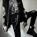
This is a development of my previous front cover designs. I decided to keep the layout but edit it a bit to make it look better on the page. I increased the size of the text as I want this to have some dominance on the page and don’t want the photo to be the main focal point of the page. I want the photo to be the second thing that peoples attention gets drawn to so I changed the photo to black and white so it didn’t draw a lot of attention to it. Having done this, I quite like the way that this has come out as it matches the text well and also links to Fabien Baron’s work.
0 notes
Text
Front cover trials


These are some front cover trials that I made in photoshop using the research that I found to influence my designs. I like how both these outcomes have come out however, I would like to develop these front covers as I feel like I could make them look a lot better than what they are now.
0 notes
Text
Front cover research


I looked at a few different varying style of front covers to see how other editorial designers compose their covers to draw attention in of the reader. The front cover is a key element in an editorial as its the first thing that the reader will see so it needs to have that aspect to catch their eye. Some magazines, don’t need a captivating image because the title of the magazine is so well known that people instantly read it (like the Vogue magazine). However, other magazines need to battle to get their readers attention so they design quite eye catching magazine covers.
0 notes

