Don't wanna be here? Send us removal request.
Text
This was my other slightly different animation, the waterfall is more subtle but I think its too hard to notice now.
0 notes
Text

This is my completed poster put on the wall,
This is my Rationale,
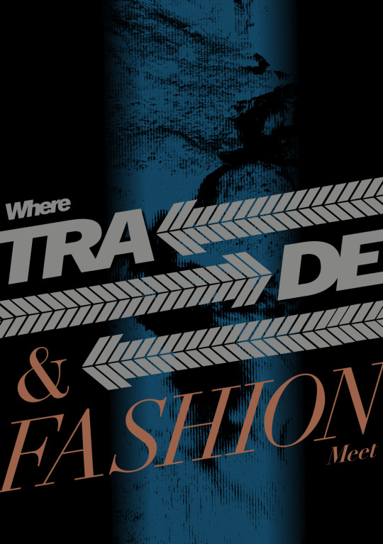
I was captivated by Commercial Bay’s sleek, contemporary industrial architecture and fresh, open vibe. This inspired me to research the building’s history, which I reflected in my poster design. I wanted to reflect the distinct two sides of the commercial bay, Trade and fashion; these are both seen on my poster, with Trade being set in a Trade Gothic font, which is very structured and straightforward as it reflects business and fashion’s font being Didot, a commonly used font in the high-end fashion world. These show distinct differences but are slid in together as a puzzle incorporated with my physically replicated tiles that make an arrow to express the movement of Trade further, as well as the back-and-forth trading layered over a bitmap of the stream, symbolising how the modern structure of the commercial bay is physically built on the historically known Waihorotiu river. My poster effectively conveys the balance between Commercial Bay’s historical Trade and industrial modernity, as well as its clear expression of high fashion, meeting together with the use of clearly mentioned techniques.
My animation depicts a river flowing like a waterfall, reflecting the fluid movement and constant flow of water. This is also reflected by the siding of my arrows, really reflecting back and forth Trade, and nestled amongst that, fashion is seen.
0 notes
Text
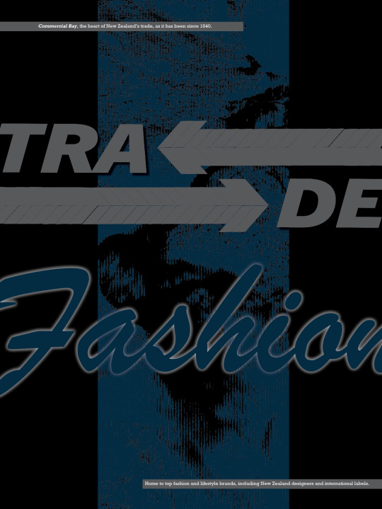
I completed two different animations for my poster; this was my first attempt. The effect I planned to use was called loop flow. However, I found that this is a purchased effect, so I resorted to using and manipulating the particle system's effect to create the illusion of falling water over the waterfall bitmap.
0 notes
Text

I decided on my final poster and I edited it to perfection and I think it accurately ascetically represents commercial bay with the combination of class and business without needing to say the place.
0 notes
Text

This is my close-to-final test print. I am glad I did this as I think I need a richer black, and I have found my grey is printing slightly magenta. These are the colours I'll adjust.
0 notes
Text


Week 11 SDL
I've been playing with making my poster look and feel more dynamic, as this was a main point in feedback, while keeping the elements that I want to be incorporated. these are my layouts and practices that I liked and think are looking quite finished.


0 notes
Text
I have been preparing my project document and entering all my Contextual Annotations as well as playing with layout and type. I'm planning on keeping it simple while still having elements that are parts from my poster, such as Font and colour.
0 notes
Text


SDL
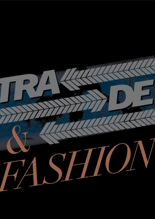
This week, I focused on editing and perfecting the posters that interest me the most, experimenting with kerning, layouts, and colours to see what enhancements I could make. I think they successfully enhanced my middle poster the most but as a whole, it definitely makes my posters look more polished and clean.
Above is a before and after.
0 notes
Text
Week 9
This is my animation made with After Effects with my most recent poster. I made the text say Trade and Fashion Collide, as inferred by the type in the poster, bringing the poster and motion to life.
0 notes
Text


Week 9 SDL
I decided to take inspiration from a piece that I found by Graphic designer Katie Rosso. I liked how the texture was seen from behind that text, and I thought I could incorporate it well with my poster, so this was my attempt to replicate it with my place and my elements.
1 note
·
View note
Text
Week 9 SDL
I completed my project document and tailored the type for my poster. I'm pleased with how it turned out; the idea and concept about parent pages and paragraphing were clearly understood.
0 notes
Text


Week 9 SDL
After getting feedback, I decided to split up my ideas, as there was a bit too much going on in my poster and I should focus on doing a couple well before putting them together so these are my further poster attempts with more isolated ideas.
0 notes
Text
Week 9 class
Trade / Fashion poster animation
Completed a animation for my poster created this week with the intended motion of the arrows and text, as well as fades with the type and underglow.
0 notes
Text

Week 8 SDL
Poster improvement
I've been working on making my poster more type-centric while keeping all of my elements. I found a deeper blue which I think works better with the grey and added the fashion aspect to commercial bay as it's also known for traded as well as its fashion and lifestyle shops I think it is an improvement from my previous design.
0 notes
Text


Week 8 SDL
On my way to Basketball in auckland the use of type that I found on a poster for auckland art gallery caught my eye because I am trying to find new ways to experiment with my type, and the simplistic use is a style I want to emulate, and these were my attempts.
In the end I didn't really like how it turned out.
0 notes
Text
SDL week 8
this animated poster by bowyer design is actually a Rebranding logo identity and channel identification design for the TV network channel ONSTYLE.
this animation stood out to me because of its simplicity and type-focused poster, which is what our poster is meant to be, and it shows some expression of the company changing the icons for O, which I thought was very simple but effective.
0 notes
Text
Week 8 SDL
Motion graphics
This animation is done by both Kwon Jun-ho and Kim Joo-ae for The Yeongdeungpo Yeouido Spring Flower Festival
This poster has used a technique that I have used in my animated poster attempts, such as the sliding motion for the type. This is very effectively used, as the intention for this poster is to be soft and really represent coming back together, as it follows the theme Spring Again,' which means that we hope to meet people we haven't seen due to the COVID-19 pandemic. the image of spring flowers is intended to blur to represent faint memories. they also tried to express the sentiment of this festival by using fonts with ample space. the cherry blossom tree petals gracefully fall across the type, really opening up the image on the side, making it become like a window as the petals blow over. the motion really adds some depth and communicates the intention of the poster very well.
0 notes