
Don't wanna be here? Send us removal request.
Statistics
We looked inside some of the posts by jordanplantgraphics-blog and here's what we found interesting.
Average Info
Notes Per Post
0
Likes Per Post
0
Reblog Per Post
0
Reply Per Post
0
Time Between Posts
4 days
Number of Posts By Type
Photo
17
Last Seen Tumblr Blogs


Fun Fact
Premium Tumblr themes are available from anywhere between $9 to $49.
Photo
Motion Practitioner
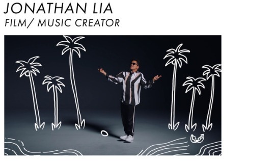
Jonathan Lia - After looking into using Premier Pro doing my animation and film making I looked into the practitioner Jonathan Lia. He creates a wide range of music videos and one in particular to me is Bruno Mars ‘That’s What I Like’. This is because I like illustrations and this video is simply made by illustrations moving in time with him dancing. I’ve never seen a video like this before and it is very unique. This video has made me want to look into film making more and using illustrations to create motion pieces. I feel like this could be a big thing in the future and if I am able to look into this and push my skills further I will stand out to other film makes. This area of the work does interest me and in the future I will look into this.
0 notes
Photo
Logo Practitioner
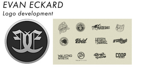
Evan Eckard - Evan Eckard is a illustrator and his logo development is a key area of his success. He creates a wide range of logos and these are for companies, clothing lines and even personal use. His work is vector based and it all is extremely smooth. His work inspires me because it is smooth and he can change his style for each project however you can still tell the work belongs to him. From looking at the work created it shows me that you can have a consistent style, however use that in a wide range if tasks and not have to stay the same consistent.
0 notes
Photo
Website Layouts
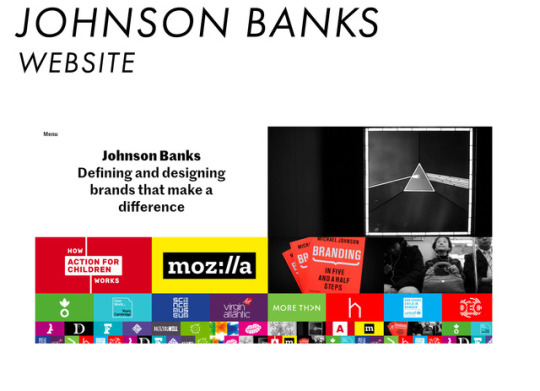
Johnson Banks - The website layout for this is well designed. When scrolling through the website on the home page the images move left in a rotation and come up from the bottom of the page. This is a unique way to scroll through the work and then made me realise that the work doesn’t have to be as simple and follow everyone else. The company took a risk with the website and this payed off. This being because the website is visually pleasing and very smooth. This shows me that in the future if i create a webpage it doesn’t have to be a ‘simple’ layout, I could take a risk and create something unique.
0 notes
Photo
Layout Practitioner -
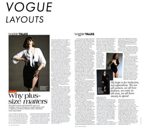
Vogue- After the InDesign workshop and looking into layouts I feel like the Vogue Layout is one of the best. It’s a very big magazine company.The layout is smooth and makes you look at certain areas at a time. You look at the images first and then you see the titles and quotes next. The way you look at the page and the text is all positioning right, it helps because the images are art a different size and then this makes the image stand out more. This is a good company to follow as it is very successful and by studying their layouts and being inspired by this, it will lead to my work looking more professional and then standing out when moving forward for jobs.
0 notes
Photo
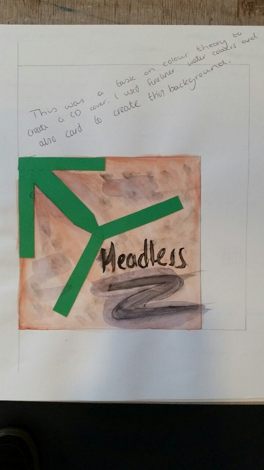
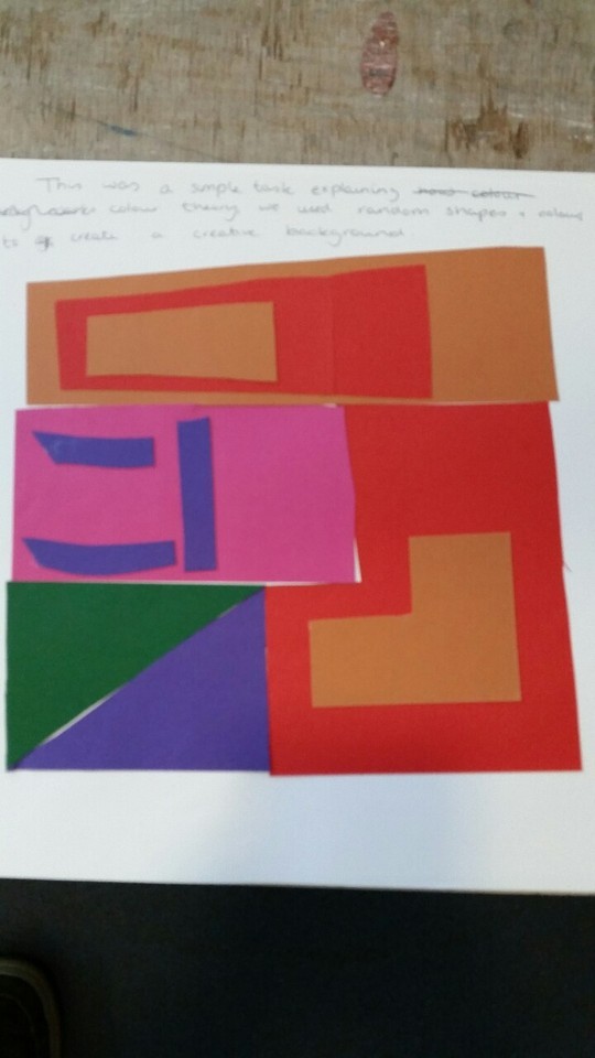
Colour Theory workshop
in this session I began to look into and understand colour theory better. I created a potential CD layout just using watercolours and card and limiting myself to 3 colours when making this. This made me think more around the idea of colours and just to flow with it. The next image shows card cut out and stuck together. This was a way to look into colours more and then find different colour combinations. It helped me to understand colour more and know that combinations can be made in any way shape or form when i’m creating work in the future.
0 notes
Photo
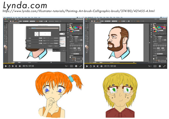
Lynda.com- Wacom Session
When creating the group zine, I created a small comic strip to give out in the presentations. This is because I had to make animated figures I used 'Lynda.com' to have a session on Wacom tablets. This showed me how to set up the brush strokes so I was able to create the work to look smoother and get to know my tablet better. This is the best way for me to create the animated figures as you are able to move more freely. This is something I would like to work on in the future as using the Wacom Tablets can improve my digital work which will help future employers to look at my work as it will stand out due to my illustrations being smoother and more fluent.
0 notes
Photo
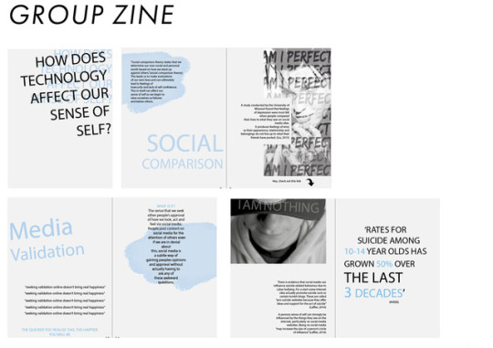
Group Zine-
The group zine we created was based on ‘How Does Technology Affect our Sense of Self.’ We broke this down into three areas and each member of the group looked into a different part of the zine. This was the best way to get the work done and enough research on each area. This full task helped me as it taught me new skills in team work and how to work together to meet a deadline. We set short term targets which we aimed towards and then made new ones after that. We also split up roles and everyone had certain parts to look more into; for example one working on lay out and another member working on gathering the information. This full module on a whole has made me feel more confident and I am now more willing to work in groups, which will benefit me when i’m looking for jobs in the future.
0 notes
Photo
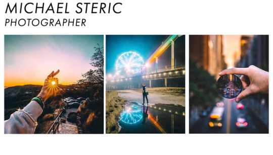
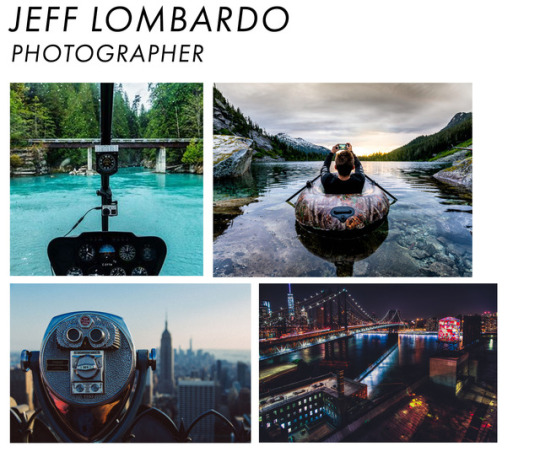
Practitioners-
Michael Steric- Micheal Steric is a Photographer who is based in Los Angeles. He uses his skills to change and manipulate the photos which he takes. He captures the light very well in the images. He makes the eye focus on a certain part of the picture due to the positioning of them, however, he doesn’t remove the background so the work seems very smooth and easy to look at. When he does blur the background he uses a small lens or certain area to show the actual image through which adds to the affect.
Jeff Lombardo- Jeff Lombard is a Photographer who travels the world to collect his images. His photographs work really well and capture the views in a good way. His pictures look like they are in proportion and its very good to look at. His images always have a certain focus point and then the rest of the images works around that.
0 notes
Photo
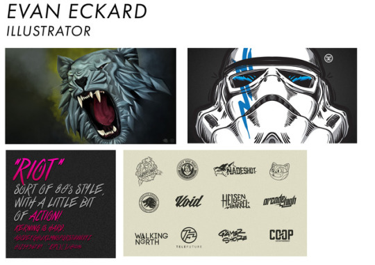
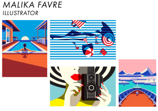
Practitioners -
Evan Eckard - Evan Eckard uses hand drawn ideas and vectors them on Adobe Illustrator and also uses a program called Clip Studio. This allows you to draw symmetrical images and after using the program as well, it can be argued one of the best to draw the work in. This being because the pen tool is very responsive and connects to the grid easier and creates smooth vectors as seen in his work. He created logos, branding for companies (clothing designs) and creates images for games and work for gamers. As seen his work is very smooth and all has a similar style to this work.
Malika Favre- Malika Favre’s work is very simple but extremely effective. This being because she works in vectors and builds layers of vectors for the detail. All her work has a similar feel and the colours in the work always match. She uses simple colours and then brighter ones to add affect in the work, which can be seen in the bottom image with red lips and red nails to make the work stand out more. Her work shows that you can create really positive and good work with simple vectors and by using block colours when in this work.
Both practitioners work are very different but both show how effective illustration can be if done correctly.
0 notes
Photo
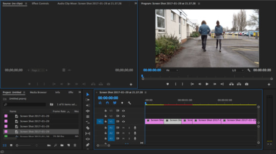
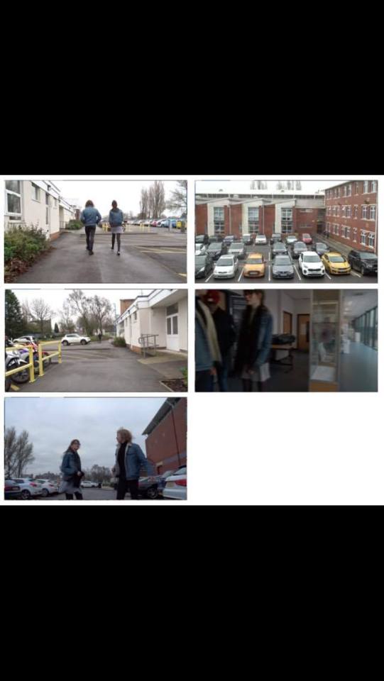
Film Making-
We were split up into groups to create a small movie. The idea behind this was to enter a building. We created this by shooting the scenes and editing them together with Premier Pro as seen on the top picture. For this we had to select the right clips in order and trim them down to fit together. This was because we had similar clips but at different angles to add affect. By doing this task my skills on Premier Pro have been increased and this will allow me to create more moving pieces in the future and branch out into areas like animation when working on the skills more and more.
When filming this we decided to use different camera angles, we used close ups to add affect when seeing people’s expressions. We then used side angles to see people running past. This was to add suspense when running away from a certain character. We then used an Aries view to get the whole scene in. This allowed the viewer to see the full scene unfold in front of them. These different angles made me more confident with filming as I was able to feel more confident with different camera angles. This will benefit me in the future as I will be able to use my skills for shooting films myself and not having to get people to film for me
0 notes
Photo
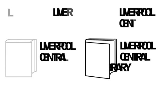
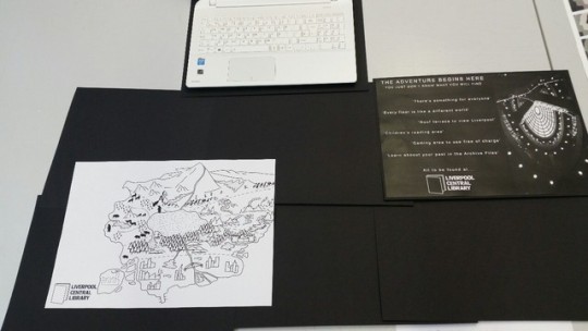
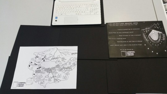
Motion and Interactivity - Pathways Project 1.
https://www.youtube.com/watch?v=L20vJ2BQ9A0&feature=youtu.be
Once in the pathways document I focused on the Motion and Interactivity piece I was creating. I created the movement on the research I found when spending time in Liverpool Central Library. What I found was most interesting was the movement in the Library was very minimum and limited, however once people opened the books up they have taken, they seemed lost in their own world. Then once the book was opened the people were moving free, when they wanted another book they were quick to go and get it. This inspired how my piece moved. I made the text slowly appear and stay close together so you couldn’t see what text was there, and once the book opened the full text opened as well and then the text is readable.
The way I created the work was by using Photoshop. I created different layers in Photoshop and started with the lowest opacity on it. From this, I then started to create more and more layers adding the text over that. Which slowly started to build up on the images as seen. I also added a small bit of instrumental music to it as well, which helped in my opinion bring the viewer in.
This task showed me a simple way to create a Motion piece and it added a simple affect to it. The task also helped increase my confidence in using Premier Pro. I understand the programme more now and feel like in future projects I can take on bigger challenges. This will allow me to add a whole new area to my work, this being more visual and hopefully that will allow me to stand out.
0 notes
Photo
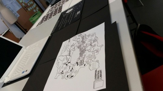
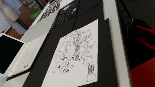
For project 1 of the Pathways module,
These images show the presentation of the work for the 1st project in the pathways module. This was a way for my peers to critic my work. They could see the Motion piece on my laptop. This was given positive feedback as it was a very simple method and they all understood what I was aiming for. This was for a small motion to appear with letters close together so you can't read the word, then once the book opens the word becomes clear due to the book making people free.
The communication piece was made to tell the audience what the library has to offer. I got good feedback about the idea of this and the image. However I got good feedback on the text as I got told to watch the layout and positioning on the text. Which I totally agree with and this will help me when moving forward into future projects as I know to look into my text positioning. This can be done by using Lynda.com to further my ability on this.
Finally I got feedback on my illustration piece. The group really liked this and the idea behind it. This was a map I created with each floor being different. This is because when visiting the library each floor of the library felt like a different world. The class said it was a very good idea and produced well in the time we had. However I picked a task too big for the time frame which limited the outcome I had created.
0 notes
Photo
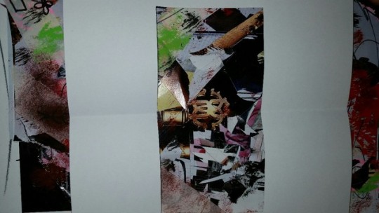
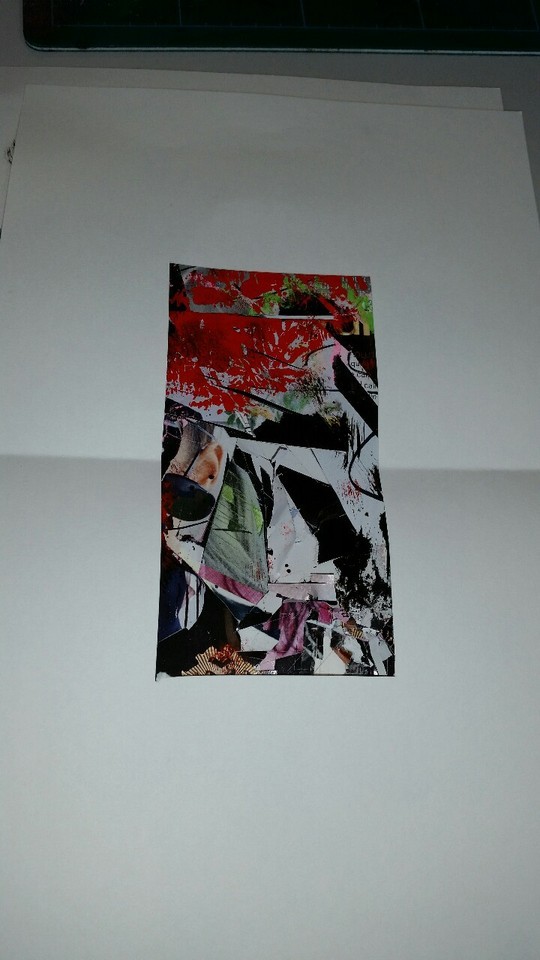
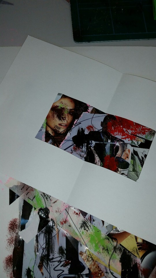
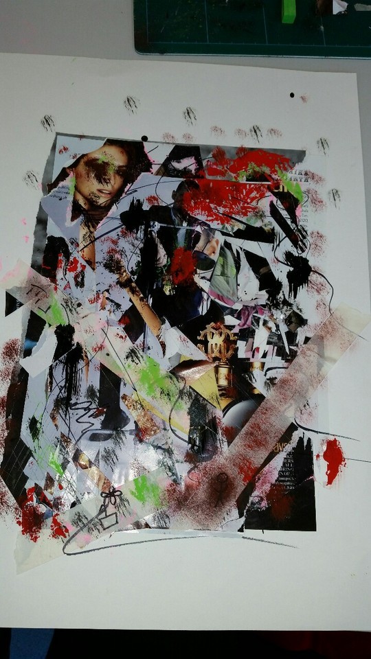
Mark Making
In this workshop, Images 1-4 shows a new area of which I have never done before. I had to stick pages of magazines down and then from this cut parts away. I wen’t into this task not liking it. But once I began and seen how the pages looked it led to me enjoying this and actually creating some different work. Once this was done I added colour into it via using pastels. I really appreciated the work and found a new technique i will use in the future. I used a pathfinder and managed to find some good and detailed areas as you can see in the images. I will use the technique in the future for backgrounds for documents as it created a very textured background and it was unique once created.
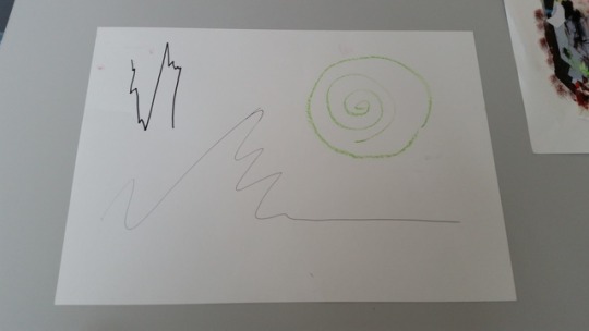
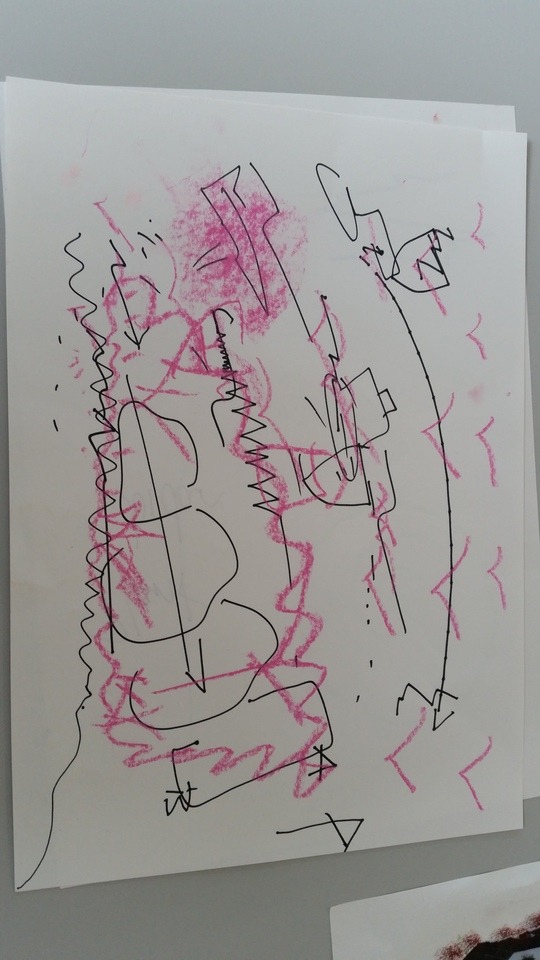
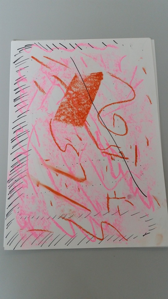
Next I was looking into mark making with the senses. Image 5 shows when I tasted food and had to draw out how the taste was. one was smooth, one was sour and one was sharp and this is shows by the small senses. Then I had to shut my eyes and listen to music and create shapes and move with the music and that is how the images 6 and 7 were created. This was a very interesting way to create work and I feel like if i was ever running a session or asking people for ideas I could use this. This is because you can’t see what you are creating and you have to feel it. In the future this could be a good way to work.
0 notes
Photo

Camera Workshop-
These pictures were taken after our camera workshop. We began by getting told the camera settings and basic knowledge we need to know when using cameras. These will help to make the pictures taken more professional. Knowing all of these small hints in the future will allow me to take my own photographs in the future.
Aperture - Determines the amount of light that gets in the camera lens, This is measured in F Stops.
Wide Aperture - Wide range which blurs the background
Low Aperture - Wide depth of field, it will take in more and not blur the background.
F Stops - low depth is F2 Greatest is F16
Shutter Speed - Determines the speed amount of time the shutter is measured. Fast is 1/100 slow is 1/30. The human hand cant hold a camera below 1/60 without a tripod or else the image wont be clear.
When saving for Photoshop take pictures as a ROAR image which will allow you to edit work easier on Photoshop.
ISO - this is how sensitive the sensor is,
Low ISO is 100,200 or 400 this will be a less sensitive but a smoother image.
High ISO is 3200, 2000 means a more sensitive image but a grained image
Other ISO, 800 at night, 200 on a bright day and 100 in a studio.
White Balance - this is how your colour reads white and how it balances it, which will then change depending on light.
0 notes
Photo
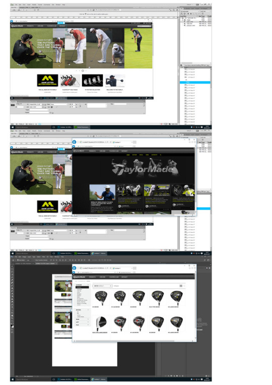
Web Page Task -
Here I was looking into creating web pages. I began by finding a website online just to learn the basics. I used 'Taylor made golf' website. I began by getting three screen shots from the website and adding them to a web page document on Photoshop. Then I used the slice tool to slice around all the areas which would then be navigating me to different areas of the website.From this I would then go to each different page of the website and do the same. Once this was completed I had to save these in a certain way.
File - Export - Save for Web - Preset PNG 8 - Save
Once this was done I then went into Dream Weaver. This allowed me to create this into a website. I had to open all 3 pages and then link the pages together. I would link them so the home page would link to all the correct pages. The clubs button linked to the clubs page and sent me to the correct page. This was completed by dragging the pages together and then this linked them. Dream Weaver was a simple website to use and this has made me feel more confident to use this to create websites. This would then be beneficial for me in the future as I would be able to create my own websites and branch out in career options.
0 notes
Photo
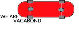
Here I was given a task on Illustrator to create a logo for a company within 1 hour. I got given a skateboard company called Vagabond. From what information I got given to read through I picked up on the them saying ‘We Are Vagabond.' This to me made a small snappy slogan which could suit going onto a logo. I was thinking of ways to create a logo for a skateboard company and I thought creating the base of the board would be a good way to go.
If I had longer to create the logo I would have added a small pattern on the bottom of the board or even putting the name of the company at the bottom. This could help the company when moving forward as well because they would be showing off their company at the bottom of their boards so this would be seen when people were using their boards.
0 notes
Photo
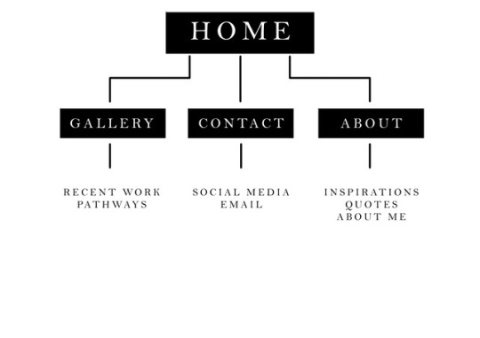
Here I have created a sitemap for a potential website we can create for our use. It is a basic site map which I will use to plan out what I will be putting on each page of the website. This breaks down the website which will allow me to plan out potential lay outs from this. The fourbwords in the boxes 'Home, Gallery, Contact, About' will be the main pages and places at the top for the drop down bar. Then below the bottom three boxes are how I will break these pages up. Creating this sitemap has benefited me as I am able to design easier now knowing what I will be basing each page on.
0 notes