
Don't wanna be here? Send us removal request.
Statistics
We looked inside some of the posts by jordantanevisualessay and here's what we found interesting.
Average Info
Notes Per Post
0
Likes Per Post
0
Reblog Per Post
0
Reply Per Post
0
Time Between Posts
4 hours
Number of Posts By Type
Text
17
Last Seen Tumblr Blogs


Fun Fact
Tumblr Inc. is funded by 13 investors.
Text
Reflection
Hierarchy was fundamental and was used frequently in my Portfolio. The visual hierarchy was apparent in all the designs in each page as the work was the main focal point with the type supporting it. It was designed this way so that people would connect with the image and design first and then be drawn to the text.
Throught the development of my portfolio and completed a lot of experimentation with the hierarchy of the type so that there is a distinction between the titles and the body text.
Clear and conventional typography was used throughout the portfolio as I wanted to avoided the typography clashing with the actual design work. The type I used needed to be simple and easy to read. I avoided decorative elements as this can distract the viewer from what is important. I kept my layouts minimalistic and decluttered so that my projects would be the key features
Usual is a sans serif typeface which is modern but can be neutral. It is easy to read because it is slightly condensed. It is simple so that the viewer will not be distracted. Usual has 5 weights and works well across a wide range of body sizes from headings to body text. I alot of my projects involved me showcasing my typographic skills so did not want the font I used to present my portfolio to compete with this.
I have aligned all the text in each of the layouts in a grid format so as the viewer scrolls down my portfolio there is a strong sense of cohesion. Another cohesive element was that for each page, the block of text was on the opposite side of the page from the previous one. I also aligned the text to either the top or bottom of each page. I was not afraid to use white space as I fell there is no need to always fill up the page. This gives the viewer time to take in what has been presented as well as the opportunity to draw the viewer in to the text.
My biggest influence through reserach was the chapter of No Plastic Sleeves by Volk and Currier where I learnt a lot about what to include and what not to include in portfolios. The most important lesson from their book was that you should showcase only your very best work and to omit anything that is repetitive. Having too many projects in your portfolio can be very offputting. I originally had a lot more so it was an essential learning for me as it then gave me a fresh perspective to go back and cut the pages I did not really need. After careful deliberation, I selected 5 projects that showcased key skills that I have.
Point of difference and variety was very important to me for structuring my portfolio as I wanted each project to stand alone and showcase each of the design skills I have. I also wanted to honour each individual project as each of them were important to me and all I had a personal connection with. This gave the projects the edge against others as well as the opportunity to showcase my skills.
Overall my work Kaupapa is essential and the core essence of my process and design style. I will always find some way to connect with my projects which is what adds the depth to my work. This is the element I want to portray and any potential employer will be able to see this. They are seeing a piece of me as well as the skills I have and would consider me as a potential asset to their company.
0 notes
Text
Final Portfolio

Front Cover - Simple and professional so it does not compete with my other projects. The aim is that they showcase my design skills and not the cover page. The main part of this section was the Māori word for Portfolio which was why I located this on the top left side and made use of hierarchy so that it was the first part read and the page.

Introduction - I wanted to tell my story in the shortest and simplest of ways so as to not overpower. This gives some insight into who I am, what I can do and also shows a more vulnerable side to me. Having a self image/ phortrait of myself against the black background gave more contrast against the first page as well as more tension as it adds an element of intrigue and this coupled with the personal statement will leave the viewer wanting to learn more about me.


Navigator books - I made a slight change in the logo to alight the N to the right of the page which visually made it more cohesive and align it with the text.
Colour palette was important here as the first of the pages I have set against a neutral background to add contrast. I did not want to do the same for the second page and wanted a contrast to the neutral tone of the open pages so contrasted this with the orange that is picked up from the colour palette of my project itself so adds to the cohesion of the pages.


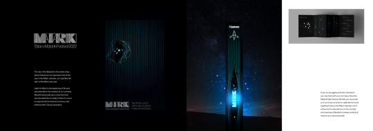
Matariki Festival
For the colour palette here I did not include a background as my work already was presented on a dark background as the festival was to be set at night so the Matariki star cluster can be seen. If I had displayed this on a light background, it would have not added to the page layout. I wanted to create more tension in the work and not have any distractions which is why for the second page I made it full size to capture the scenery of the design as well as the essence.
I have position the images using rule of thirds so people will naturally be led to the text.

I changed the layout of this first page as I wanted to visually portray the message that I have overcome the problems associated with string which resulted in my product. The page is not overcluttered and there is plenty of white space so the viewer can take in the concept and then want to read about it.

For the colour palette here, I have used a very neutral backdrop. There may not have been a big difference in the contrast as the colour palate of my string packaging is not overly bright, if I had used a bright colour as a background, it would have competed with the colours of the packaging. If I had used a dark background, this would have distracted from the product. A crucial part of this project was showcasing the process and the intentions as this project was based on rebranding string. This is why it was necessary to include those sketches at the beginning to show the initial concept and heart of the idea and then carry it forward to the next page with the actual mockups of the packaging.


You don’t look Autistic
For colour palette I have contrasted the dark posters on a light grey background. For the second page, even though the black background does not contrast with the dark posters, it does contrast well with the first point which was how I wanted to display it. The main part of this campaign Awareness was that there is not one ‘look to Autism’ which is why is was esstenial to showcase the poster set of different ‘normal’ looking people. The lenticular printing that I personally made was the most successful feature of my project as it was interactive with the viewer and they could see visually that there is no one look to autism. Reading is one things, but seeing is another. This is the reason I decided to showcase this part of my campaign as it was thinking outside the box and this is an important quality to showcase to any future employer.
I ahve left enough white space on the page layouts so as to not overwhelm the viewer but also draw them in to read the text.


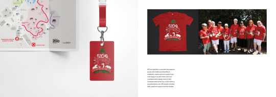
NZCare Xmas...
For the colour palette for the first page, I have kept a white background which contrasts well with the red. For the second page, I have reversed the colours to contrast with the first page but also because the map is a neutral colour, I wanted to contrast this with the bright red.
The main part of this project was the illustration and the shirt design that all the clients and family wore. It was a main feature of the entire day as it was described by many as seeing a sea of red going around the zoo. Another major design work that I did for the Xmas Zoo event was creating the map of the Auckland Zoo which showcased time out zones and any other major areas that the clients and their families needed to know. For the shirt design I wanted to showcase the design but also a photograph of the shirt being used and for the section of the map I carried forward the red for the background so that it ties in with the first page and showcased the map as a stand alone piece.
Fr the page layouts, I have left enough white space so the viewer will be drawn to the text. I changed the position of the map to the right to apply the rule of thirs concept which purpose is to draw the viewer to the text and to not overwhelm.

What I find looking at other people’s CV’s is that they can fall into the trap of thinking that because we are in the design industry, that your CV should reflect this and it should be in line with the rest of your portfolio and be very creative. This is not the case though. It needs to be professional and to give all the information an employer wants and needs on one page.
I applied Hierarchy to draw the viewers eyes to each of the main sections of my CV with the experience in the centre as this is the most important.

Back Cover - Again simplistic and showcases something that is important to me which is my Māori heritage. but as well as creating a personal farewell and appreciation towards to viewer. The main part of this section is the the statement Tēnā raw atu koe. which means thank you very much. The words themselves was the only message I wanted to portray which is why i sectioned it on the far top left side and made use of hierarchy by increasing the size so the viewers eyes were drawn there.
0 notes
Text


For the publication for Navigator Books, I wanted to change the mockup and layout of the books to showcase more pages as previously this page only showed the cover and one page.

My Matariki festical project spotlights my skills with typography but it was a project that was personally important to me as I feel Māori culture has been diminished over the years and we need to bring this back to life (especially with the many urban Māori who have no idea of who they are and where they came from. I feel I had other typographic projects that showcased my skills such as the Typographica project but I had more of a personal connection with this project and was the best of my choices.

I wanted to spotlight the signage from my Matariki Festival as I felt this was very powerful and is how festival goers would navigate their way around at the festival. This was a key feature of the project so instead of showing all the things I had considered in the project, I decided to spotlight this one. I had previously just featured on of these wayfinder images but felt it was more powerful with 3 and it cements the idea of the use and purpose of them.

The main part of the this string project was rebranding string and identifying the target market which in this case was arts and crafters. I tackled the issues of there being no brand awareness for string as well as the fact that string packaging is not user friendly and will quite often end up in a tangled mess in the bottom of a draw somewhere. Then when you do find it and manage to untangle it, you need to go and find scissors. This is why I included the concepts of the packaging idea. The result was a product that has powerful branding, packaging that is user friendly and is also tactile and it fits in smoothly in the palm of your hand. The end product would become a staple in any arts and crafters arsenal of tools and one where they will want to collect all the range.


For the project “You don’t look Autistic” The main part of this campaign Awareness was that there is not one ‘look to Autism’ which is why is was essential to showcase the poster set of different ‘normal’ looking people. The lenticular printing that I personally made was the most successful feature of my project as it was interactive with the viewer and they could see visually that there is no one look to autism. Reading is one thing, but seeing is another. This is the reason I decided to showcase this part of my campaign as it was thinking outside the box and this is an important quality to showcase to any future employer.

The main part of this project was the illustration and the shirt design that all the clients and family wore. It was a main feature of the entire day as it was described by many as seeing a sea of red going around the zoo. The zoo was open to the public on this day also so it was a fantastic way that families could connect with each other without necessarily knowing each other. This is why I made this the main spotlight of the page and also including a real photo of the design in use.

Another major design work that I did for the Xmas Zoo event was creating the map of the Auckland Zoo which showcased time out zones and any other major areas that the clients and their families needed to know. This work also showcases working with infographics as there were maps available for the zoo but they are complicated and can be confusing to some of the people we support. There was a lot of information and data which I needed to portray in a simpler format that could be understood by all which is difficult when you are dealing with people with intellectual disabilities.
0 notes
Text
Portfolio Development


I originally thought to have a facing page format ie book format, but decided that in the technology based world that we live in now, most would view online so changed my format so that people can scroll through it.
0 notes
Text
Portfolio development


Some of the work I was considering to include in my portfolio but realised there were just too many projects which can be overwhelming, What I learnt during my research phase was that if you had too many projects on show, the viewer did not engage very well. You need to select your very best projects that showcase your skills. An example here is the above photographic images. I was very proud of all of these, but my photographic skills also are showcased in my Autism awareness campaign so the others are not needed.
The idea is to make your portfolio memorable so it has to be the best of the best and those projects that are most relevant. My portfolio therefore change dependent on who I am sending it to.
0 notes
Text
Portfolio Development

When considering which projects to include in portfolio, I decided to exclude the above as this was a project of mine from highschool and even though I was very proud of it as it showcased my sculpture amd architectural skills. It was even displayed on the cover of my senior Year Book and displayed in a glass cabinet in the reception of our school. However, it is outdated and I have better projects that showcase my skills as a designer.

There is greater room of opportunity to showcase the process or the development of this project as it relied heavily on re-branding string which shows a lot of the skills I have learnt whilst training at AUT.

Research told me that it is important to only select the best of your work and to eliminate any projects that duplicate your skills and the above is a good example. I thought it would be better to just select one of the above images and showcase that.
0 notes
Text
Grid and Layout Research


Grid layouts From Thinking with type Notes and key points + Typography That Works: Typographic Composition and Fonts - Ellen Lupton
https://www.skillshare.com/classes/Typography-That-Works-Typographic-Composition-and-Fonts/1694217981
What is important in grid techniques is that the reader is led around the page and to not to have too much content.


When working with typographic and web and digital media grids, it is important to align the text and the images which gives the page structure and makes it more organised. There is no need to fill up each grid section as it is good to also include white space so the viewer can take in a particular image or piece of text.
Grids can also make it quicker to layout pages as the grid with highlight where you can place text or images quicker. The balancing of the page will also be easier and can provide symmetry.
When you are dealing with multi-page layouts (such as this portfolio), using grids can add cohesiveness between all the pages and will help prevent clutter.
Canva. “15 reasons why a grid based approach will improve your designs” Retrieved from https://www.canva.com/learn/grid-design/
Sivewright, Dacey. “Principles of Design You Need to Master”. Retrieved from https://www.skillshare.com/blog/principles-of-design-you-need-to-master/
The Good page. “Consider the Grid”. Retrieved from https://thegoodpage.net/2014/12/01/design-grids/
0 notes
Text
Cover + Typography


I decided to research some preferred fonts for portfolios as I was originally thinking that I needed a typeface that would make my portfolio stand out.
Preferred fonts
Open Sans - popular with web type and can be used for title as well as body text
Roboto Slab - popular because of its geometric form and curves and is again good for titles and body text
Montserrat - Used for larger headers and navigation text
Playfair Display - Classic serif font. BGreat for title and headers
League Spartan - Sxans serif font that is modern and geometric. Good for bold headers and titles and has the elegance for body text
Totillium Web - Solid bold and black style
LTC Bodoni 175 - Serif font that is great for headers and body text
Calluna - Serif typeface which is ideal for headers
Futura PT - Popular web font that is modern which is ideal for large and bold titles as well as body text
Freight Display Pro - Great for large headings and pairs well with serif and sans serif font
When selecting a font, you need to consider branding and match the typeface to the image you are trying to portray. At the same time however, it needs to be clear and readable. Fancy and decorative fonts should be avoided and it should have multiple weights.
Originally I thought I wanted something very flamboyant and large but when I experimented, it was too overpowering so I decided I needed a minimalistic approach to my portfolio and I did not want the senses overloaded. At the same time, I wanted a typeface that was maybe a bit different to conventional portfolio typefaces and after a lot of experimentation, I decided on Usual which is a sans serif typeface.
Usual is modern but can be neutral. It is easy to read because it is slightly condensed. It is simple so that the viewer will not be distracted. Usual has 5 weights and works well across a wide range of body sizes from headings to body text.
I was particularly interested in Usual because it has the macrons available that I need for the Māori element to my portfolio. It was important to me to include my Maori heritage into my portfolio so needed a typeface which was compatible with this.
Content of Cover & Back Page
I struggled a while with the content to include on my cover page and tried different options with using my name or even just ‘Portfolio’. Nothing sat straight with me. Showcasing my Maori heritage was important to me which is why I decided to use kohinga toi whaiaro which is the Māori translation for Art/ Design portfolio. This led naturally to my back cover as well to give the Māori translation to ‘Thank you very much’. It is simple and yet it reflects me.
My initial thought was to inject a bit of humour to the front cover with an inclusion of a funny definition of Art/Design portfolio which is corssed out and then a more serious definition is given. This did not match my portfolio at all and seemed very unprofessional. I decided instead to include a meaning that again reflected something about myself.
My photography has always complimented my design work and establishing a kaupapa (set of values, plans and ideas) with your with my photography subjects has always been an important convention to me as it adds depth and meaning to my images. The same goes for any of my design projects as they usually involve me having a personal connection with them. An example here is the Autism Campaign that I feature in my portfolio. I have autism and so I had personal investment when developing this campaign. The same goes for the Matariki Festival project as I feel it is really important to showcase this important time of the year for Māori as a way of rebuilding some of our lost culture.
I have a personal connection with each one of my projects which is how I re-defined the meaning of Art/Design Portfolio to ‘Having a kaupapa within each body of work is vital with creating a Kohinga toi whaiaro.’
Babich, Nick. “7 Things To Remember When Selecting Fonts For Your Design”. Retrieved from https://uxplanet.org/7-things-to-remember-when-selecting-fonts-for-your-design-ec1e592266c5
Bestfolios. “10 Great Fonts for Portfolio Design”. Retrieved from https://bestfolios.medium.com/10-great-fonts-for-portfolio-design-2debfe2f1bb9
0 notes
Text
Research
Colour Palette & Layout
It is stated that it is better to display work on a white or light grey, or dark grey or black background and to avoid bright colours as this tends to distract the viewer. Bright colours should be kept for other areas such as headings instead. Portfolios also present better when using a neutral colour palette and chose colours that contrast well your work. If the worked is bright, then a muted backdrop would contrast well and likewise for the reverse.
It is important for a portfolio to have clean and simple layout that is easy to follow. The pieces should be well thought out and not crammed together. It is a temptation to put as much work as you can on a page to showcase your abilities, but it is much more advantageous to select the very best single pieces and showcase these as it looks a lot more professional.
Setting the work out in a grid format is a good way and it is important to present images at the correct size and not too large as this can overpower. Give the space needed for the viewer to take in the image and admire it. A viewer will remain longer on a page that is not too big or too small and a page that is not overcrowded.
I guess the most important lesson from colour and layout is that you need to present things in a way so the viewer can pause and take everything in. Pick the best piece you have and only use a colour palette that will enhance your piece and not compete with it.
Turner, Amber. “The guide to crafting an amazing online portfolio”. Retrieved from https://thenextweb.com/news/guide-crafting-visual-elements-online-portfolio
0 notes
Text
Introduction to myself
Ko Ngāpuhi te iwi’
Ko Ngāti Rahiri Ngāti Kawa te hapū’
Ko Jordan Tane Taku ingoa’
My name Is Jordan Tane and I’m a Graphic Designer, Illustrator and Photographer living in Auckland. I identify with two things, being Māori and being Autistic. Story telling is imbedded into my blood from my Tūpuna from the stories and knowledge that has been passed on for generations.
When I was little I couldn’t always communicate verbally which is why communication design resonates with me, having to rely on communicating visually has granted me so much depth into my process and methods, and truly creating work with meaning and not just ‘pretty works of art’.
Throughout my career, I have always tried to ensure that the passion and enthusiasm for my work has shone through. As well as always giving back to my community and helping others on their own creative journey.
Edited Version
Ko Ngāpuhi te iwi’
Ko Ngāti Rahiri Ngāti Kawa te hapū’
Ko Jordan Tane Taku ingoa’
My name Is Jordan Tane and I’m
a Graphic Designer, Illustrator and Photographer living in Auckland.
I identify with two things which is being Māori and being Autistic. Story telling is imbedded into my blood from my Tūpuna from the stories and knowledge that has been passed on for generations.
When I was little, I could not always communicate verbally, which is why communication design resonates with me. Having to rely on communicating visually has granted me so much depth into my process and methods. It has enabled me to truly create work with meaning and not just produce ‘pretty works of art’.
Throughout my career, I have always tried to ensure that the passion and enthusiasm for my work has shone through, as well as always giving back to my community and helping others on their own creative journeys.
--------------------------------------------------------------------------
I feel I have applied the key features I learnt about writing a personal statement. I have kept my information to a minimum and have kept the reader wanting more. An example her is the disclosure that I am autistic as well as the fact that I was not always verbal. This piece of information divulged that because of being non-verbal, I needed to rely on visual communication which is one of my strengths.
I also did not go into great detail about giving back to the community and healping others in their own creative journeys which would give them the prompt to wnat to aks me about these in an interview.
I am sure after reading this, that the employer would want to know more about me but at the same time give them the idea that I have a lot to offer and not afraid to be vulnerable.
0 notes
Text
Research
Introductions
The first impression someone has of you is based on how you introduce yourself. There are certain key elements to this introduction with the first being that it should be short and to the point. Do not tell your whole life story, but tell them enough so they will want to know more.
Another element is to show a bit of your personality and do not be afraid to show a bit of emotion. It is good to consider writing something about your personal life as this will make you appear interesting to a reader. It still needs to show you are professional and trustworthy but will make you seem more approachable.
Do not be too fomal when writing your intorduction but not too casual either. You need to aim to write like how you would speak about yourself to someone.
It is a good idea to include a photograph of yourself but it needs to represent your personality so needs to be chosen wisely. Adding the photo puts the face to the name so needs to stand out. You can consider taking a photograph in a studio of at you desk or just a head shot.
Hutto, Cara. “8 Effective & Memorable Ways to Introduce Yourself Professionally (with Examples)”. Retrieved from https://www.inhersight.com/blog/amp/networking/introducing-yourself
Format. “ 7 Steps for Writing Your Portfolio's Biography 'About Me' Page”. Retrieved from https://www.format.com/magazine/resources/photography/online-portfolio-about-page-step-by-step-guide
0 notes
Text
CV Development


With my original CV (and after researching more on CV’s), I can see clearly now that even though this was on the right track, it was too wordy, a bit cluttered and had information on there was was not relevant.
An example here was the Avon Job work experience. It had nothing to do with the field I am in now and while that was fine when I had very little job experience, I do now and it is all relevant to the design industry.
Besides the Contact details, the experience section is the most important element for a potential employer which is why it is prominantly in the centre. The bullet points make it easier to read and not too overwhelming.
When reviewing my bullet points, I noticed I had kept in about transcribing HR interviews which is not relevant at all for the design industry so will remove this. I only want information in my CV which would be of interest to an employer in the design industry.
I decided to make a few changes from my first development which was to add the ‘Skills’ section as I think it is important for an employer to see this. I moved the references over to the bottom left as the references usually appear on the bottom of a CV so this is where an employer would expect to see them. I also saught permission to use a second persons details who agreed to be a referee for me.
Another change I made was to highlight the contact details by making this section white on black. I am not entirely sure I like this however as it does not match my design system and it is too distracting so intend to change this again. It is also one of the things I learnt from researching CV’s is to keep it simple and that black text should be used.
0 notes
Text
CV Research

There is a lot of experience here but the text is too condensed and not easy to read.
I do not like the skills section as having a rating system like this just exposes the weaknesses which is what the employer would notice also I am sure. The other feature of the skills section is using Jargon which is one of the things research shows to avoid.
The last thing I noticed is that there are no reference or education sections which are important elements to a CV. Perhaps what this person could have done was to shorten the experience section to just include the main features which would have left the space required for References and Education. By not having them, it would appear they have something to hide about their education and that maybe no one is willing to be a referee.
Sebastian R K Designs Portfolio 2017

I would guess this CV has been made with an illustration job in mind. In this way, it is very creative. The purpose of a CV however is for the content. If an employer wants to see their illustrative skills, they can look in the portfolio. A CV should be more professional and my research showed it should avoid illustrations or photographs.
It was a creative way to have a timeline showing the work experience, however, there is no description of what roles were performed at each place.
It depends on which organisation this person is applying for of course and I am sure it would stand out but an employer may not take him seriously and again there are no references.
Borja, Jesus. “Resume CV”. Retrieved from https://www.behance.net/gallery/118199691/Resum-CV-Semi-branding-2021/modules/675803809

Research shows that there are 2 types of CV’s. One for skills and one for Experience. As this person has had experience, I feel they should have had this feature more prominantly and also included discriptions of the roles instead of attempting to even out the layout by having 4 equal sections.
Once again the technical skills section spotlights there are weaknesses.Other features that research shows should be avoided in CV’s are the inclusion of the photograph and a sun illustration and the purple type as it is best to just use black.
Ananda, Yasmin. “Graphic Design Portfolio”. Retrieved from
https://www.behance.net/gallery/124208341/Graphic-Design-Portfolio-2019-2021/modules/705848657

This person has made a personal statement and talks about her career but there is no experience listed which could be a fatal flaw.
Contact details good on left as stand out but they do not include a phone number. It would rely on the employer going on her website which they may not want to.
It is good that there are no decorative elements as it makes it appear more professional but the white on black makes it difficult to read and should be avoided when writing CV’s.
There is not a lot of hierarchy used so the structure is lacking because of this.
I noticed that under references, she has stated to contact her if they want one (but again there are no actual contact details apart from the website.

This is probably my favourite of the above CVs as the hierarchy and formatting is good and it is not cluttered which makes it easier to read.
I fell however that the experience section is too small and needs to be more of a feature which lists the roles.
Instead of having the photograph (which should be avoided in CV’s) and personal statement, this should have maybe on a separate page so the CV appears more professional. The white on black should also be avoided in CV’s but she could have maybe used this for the seperate page with the personal statement
Nagari, Surbhi. “Portfolio”. Retrieved from https://www.behance.net/gallery/120947605/portfolio-2021/modules/688218585

It was interesting to see there are 2 types of CV’s and what I can see from the above examples is that some of these CV’s have been skills focused rather than work focused. I realise that some new designers may not necessarily have the experience which is why they would need to write a skill-focused CV, but to be considered in such a competitive market, it is better to have a Work-focused CV so you can be taken seriously.

Looking at the above points, I can see that most of the above CV’s have included features that should be avoided. These include having white text on a black background, the text being to long, jargon, including a photograph and images and not having enough white space.
I will keep this in mind when developing my CV. The CV should be the formal part of the portfolio. If an employer wants to see how creative you are, then they can look at the rest of your portfolio. It needs to be simple, easy to follow and well spaced and layed out.

What I find looking at other people’s CV’s is that they can fall into the trap of thinking that because we are in the design industry, that your CV should reflect this and it should be in line with the rest of your portfolio and be very creative. This is not the case though. It needs to be professional and to give all the information an employer wants and needs on one page.
Careers Govt. “Cover letters”. Retrieved from https://www.careers.govt.nz/job-hunting/cvs-and-cover-letters/how-to-write-a-cv/
0 notes
Text
Old CV


My previous CV that I had written detailing obviously my work experience, edication etc. I feel this is a good CV to give to a potential employer but not really to promote myself as a designer.
It needs to be tailored more towards the design field so for example, instead of ‘Achievements’ it should be the awards I have won. I will also cut out any of the positions I have held if they do not necessarily relate to design which in this case was my job with Avon.
I will also removed the ‘about me’ section as this will be in my personal statement which is seperate to my CV.
Overall, I find there is a bit too muich information for the viewer to take in here. There is not a huge amount I need to change, I will just reformat and make sure everything is targeted towards design and remove any unnecessary detail.
0 notes
Text
Portfolio 2021 Surbhi Nagari


Probably my favourite portfolio so far as it looks professional and the work is nicely spaced. It is not too overwhelming due to not having too much text.
There is a very good variety of different layouts and I like the dark backgrounds although this is very common throughout so she takes a risk that it may appear she has one style.
The feature I am drawn most to is the way she has captioned and sorted her work into the different design mediums (illustration, digital, logofolio and print). This leads however to the major flaw in her portfolio which is that there is way too much work and projects included. Having 4-5 pages for each project is just too many and this is the part that is overwhelming.
When there is too much work like this, the pages are easily forgotten and nothing stands out. It would have been a lot more effective if she had just picked 4-6 projects and showed her best work.
Nagari, Surbhi. “Portfolio”. Retrieved from https://www.behance.net/gallery/120947605/portfolio-2021/modules/688218585
0 notes
Text
Kate Margolis Portfolio


I really liked the appearance of this portfolio as it was sleek and professional looking. I see the personal statement was part of the CV which I do necessarily agree with. Because there is no photographic image of the Kate with her statement attached, the viewer might find it difficult to connect with the work.
What I found with this portfolio was that there were way too many pages and projects. Some of the layouts were well layed out such as the Netflix imaging page but the phone and computer mock-ups were just too repetative and forgettable. The viewer would soon lose interest and just scroll through them. The 3 angles of the phone and computer images are difficult to read as well.
I like the way the backgrounds are changed for each page as this is visually appealing and not too repetitive which is a shame as this was wasted by repeating the same page layouts.
Overall, I felt frustrated looking at this portfolio as it had a huge potential and I really like the look of it, it was just the overwhelming content and some of the repetitive page layouts that let it down.
0 notes
Text
Anbokejo graphic design portfolio pdf


In contrast to the previous photograph of the designer, this illustration of Anbokejo shows that he has character and perosnality and you remember it straight away. It almost makes you want to meet him as he seems to have a sense of humour. By having the graphic illustration, it gives a face to the work (so buy in from the viewer).
Unfortunately that was one of the only good things I could find in his protfolio. The page layouts were perhaps too conventional and very unimaginative from a design process perspective.
There is no process, development or explanation of the images and they are are just random images at times with no direction.
The page with the obvious ‘learn to dive’ campaign probably does not need an explanation, but I was unsure what the magazine layout page was about.
I found overall, it was a disappoinment as it showed such flare with the initial graphic illustration of himself but then fell flat. It would give me as an employer that this person is not going to go out of his way as a creative and just do the bare minimum to get by.
0 notes