
Don't wanna be here? Send us removal request.
Statistics
We looked inside some of the posts by josh5209434 and here's what we found interesting.
Average Info
Notes Per Post
33
Likes Per Post
15
Reblog Per Post
0
Reply Per Post
18
Time Between Posts
2 months
Number of Posts By Type
Text
17
Last Seen Tumblr Blogs


Fun Fact
69% of Tumblr users are millennials.
Text
Week Ten - Model Finishing
Introduction
This is the final part of a project that has been in the works for several weeks. My fingers are crossed that the 3D print turned out well and that I am able to produce a nice sketch model. This is the first time that I will be making a sketch model to such a high standard, usually painting and priming is reserved for a more final prototype.

The 3D print
I think that with 3D printing there is always a risk that there can be errors in the print and with these prints sometimes taking 5 plus hours to complete, errors can easily be missed until it is too late. This 3D print that I made on my DLP 3d printer is no exception. I think it is because my resin is a little old, but there were a few curing issues, with this one being the best, with a slight issue on the cap, which I should be able to fix.

Ignoring the small issue, the quality of this DLP resin print always amazes me. No rough edges and little finishing is something that always drew me to DLP resin 3D printers, rather than FDM. there are very thin layer lines that do not need filling.

Fixing the issue
Now whilst I would have loved to use new resin and get a print that was perfect, I didn’t have time to get a new shipment of resin in. A quick fix that I was very lucky to be able to do was to make a replacement cap that would slip over the poorly formed cap. I made this on my lathe from a piece of abs and it only increased the size of the cap by 1mm. I acknowledge that this is not the best solution, but with time running out, I believe that with enough layers of paint, the fix should be hidden.

Filling a small gap
As the resin cured under uv light, a small gap opened in the side of the bottle, as a result of the resin shrinking at an uneven rate. This was an issue hat I had to fix by filling in the gap with some putty. The putty was filled in with a wide scalpel and sanded away with p320 sand paper once the putty dried after 6 hours.

First primer layer
Now I will admit I get impatient when painting and it was clear that i might have rushed the primer layer a little bit the first time round. The paint was running and uneven. I had to wipe away the paint with solvent and reapply using much lighter layers which did turn out to be much more even.

The Final Presentation
As best as I tried I got a few pieces of dust in the paint, I guess trying to paint in the same workshop that stores two lathes and other dust making machines is not the greatest idea. However with a little touch up in photo shop I think I was able to get a decent looking photo. My biggest mistake when taking the photo was using the flash on my camera. the coat on the cap was a little thin and the light must have shone though it making the paint layer look much thinner than it looks in person. I still think it also reflects my skill with a spray can too. More patience would have paid off. However as far as a sketch model goes, it is still the highest quality sketch model i have made, and as a design iteration, and using it to see form and scale, it certainly is fir for purpose.
2 notes
·
View notes
Text
Week Nine - 3DS Max
Introduction
This week is going to be interesting because of the 3ds max component. My experience with is is very limited and the time I used it was 6 or so years ago trying to set up a render which was quickly abandoned in favor of keyshot, so this is going to be a learning experience. I have used blender a little bit which I think is a similar program but for all intents and purposes, this will be new to me.
Also note, I am very fortunate to have access to my own 3D printer, so whilst i will be doing the CURA part, I will instead expert the file to my own 3D printer and print the file from there.


Screen shot from my old attempt at using 3ds max from 2014
Introduction to 3ds
The most helpful part for me here was just allowing me to learn my way though the program without too much guidance. I think that just allowing me to go through the program and see what does what is a great way to understand how 3ds works, and there is certainly a lot to learn.
What I learned about 3ds
The biggest thing to get my head around was how this is a program where i can edit the polygons of files, unlike CAD there is no parametric framework to use, which opens the door for allowing me to do a lot of free form work which solidworks really constricts me from doing easily.

The tool which I spent a lot of time practicing with would be the modifiers tab. The edit poly tool was brand new to me and is a tool that I could have used a lot in the past. Being able to edit the mesh without the constraint of planes is really freeing. One thing that I will need to work around is how well I am able to select groups of polygons and how to make objects which will respond to modifying mesh. One issue I encountered when modifying the bottle was the polygons were too large and editing them would move a huge area. This was helped by increasing the number of polygons in the stl file, but this really slowed down the speed at which 3ds max would run.

other tools which I fould useful too include the bend tool which could be very useful in making mock ups of a product that is being used or is being bent, the melt tool which could also be useful for some things that might need to melt for renders and the twist tool.
One thing I will need to do now is relearn how to use this software as a render tool because I might look to this in the future as an alternative to photo view 360 as the modifier tools mare much more powerful and flexible. I am not so sure about using this as a tool for creating models, though I know it can be done, I feel much more comfortable using parametric tools to do it.

Modifying the bottle
The change that I made to the bottle was to add an indentation of the side of the bottle for the user to hold onto and use it as a guide to squeeze the bottle. I used the direct mesh edit too to do this, which took a lot of perseverance to get right, which makes me think there is a better way to do it, but after making the size of the polygons smaller, I was able to achieve the affect that I wanted.

Cura
The bottle was then put into cura and sliced and sent to my 3D printer. This was done with little issue as I have used this software quite a few times.
2 notes
·
View notes
Text
Week Eight - 3D modelling
My reintroduction
I think it is clear from my previous blog posts that I have a keen liking for CAD. I been fortunate enough to have been able to use various CAD packages since 2012, mostly either Solidworks or CATIA v5. I have touched on Audesk packages before but in very little capacity (relatively speaking compared to solidworks), so I think this is going to be a good learning experience for me, and who knows, maybe I will love what Autodesk is doing now.

Photography
The most important thing in my opinion here was to get photos of the models using a long focal length and hopefully not have too much of a shadow. My thinking behind this was that the long focal length would compress the photo depth and make the edges crisper, whether this worked or not is a little hard to tell since a long focal length zoomed in too much. However after a lot of moving around with my lighting i found a set up that seemed to work for me. i width I could have made the shadow smaller, but in my small apartment, i think this was the best I could get from the lighting I had.

After doing all the photography it occurred to me that maybe a green screen could work and it would be easier to crop out the background.
Fusion 360
Having been a little familiar with fusion I knew that my best bet for making a good model would be to use the solid tools rather than the surfacing tools from the get go. My reasoning for this is so that I am making my bottle as a parametric model which I prefer because I can always easily go back and edit the model If I need to.

Inserting the image canvas
The first thing I did was insert the image into the canvas. The biggest challenge here would be getting the scale correct. This is something I have encountered in the past and for this I wanted to make my job a little easier. So for this project, when I made the bottle top on the late, I made sure to make it precisely 28mm and as a result I had a reference that i knew the size of accurately. This meant that all I had to do was make the cap scale to 28mm and the rest should be scaled correctly, with a little bit of lax given due to parallax which can be accounted for.

The canvases were then set to 30 percent opacity and then the bottle body was then made from it be tracking the outline using the spline tool.

This is the final bottle that was produced and to my surprise the dimensions of the final bottle match the dimensions that I intended back when I sketched the template for the foam. One tip that I have is that to help account for my inaccuracy when I was making the foam model, the two sides were not exactly symmetrical, which was not the intended result. To make the both sides symmetrical, and speed up the design process, I simply made the bottle with half the width and only one side of the features and then I simply mirrored the model.
0 notes
Text
Week Seven - Foam Model Making
Introduction
So I think it is no secret that my love for CAD (solidworks anyway) has skewed my experience in industrial design to being a more CAD and CNC based experience than a model making experience. I don’t usually work with foam in my studio projects and i think one reason is that I like cad, the second is that I never was able t hammer the accuracy of what I wanted to get in foam and I could never get the surface finish to be just right, I always had a chip out somewhere. So this is an area I am glad to improve in.

Template
So this is my template that I made from the previous task. i chose my first design because I think it offered the most number of different features. it had a chamfer on the right, a fillet on the left and overall complex curves compared to the rest, so hopefully this will give me a more challenging build.

Transfer to Card
The transfer to card was a process I ave done before. Rather than transfer the original, or sketch a copy I photocopied the original and used a spray contact on the paper and then cut the shape out using a scalpel. The shape is closest to the original and I have copies in case I mess up.

Cutting out the blank
Now here is something I didn't have a while ago, access to my proper workshop. With COVID restrictions easing I feel safe to use my workshop at my grandparents house and with it my new band saw. In the past I always had to use a coping saw to cut out the shapes, but not anymore. I simply traced the outline of the template onto the foam and fired up the saw. i was a little too fast with my feed rate at first as the foam was staring to chip but taking it slow produced a more accurate and clean cut than any coping saw could make.

Not bad results if I say so myself. I gave myself some margin for error and I will have to take it down to final size, around 3mm.

The top where the cap will be is then taken down to a square and then removed to be made a cylinder.

Filing the foam
With so much time saved with the band saw I thought I would use that time to try and get a better chamfer and fillets, so instead of using a rasp, I went and bought a new set of files from bunings, a fine and rough cut file. Immediately it was clear that the surface finish was much better, and a lot of material was still being removed with the coarse file, but no chip out were happening with the foam unless I really pushed it on a corner. The fine cut file also made the surface finish really smooth, almost ready for a fine sandpaper.

The calipers was used to outline where I had to file the chamfer to.

Accuracy is Key
Before final sanding the accuracy is checked with the inverse template and I was surprised how accurate the band saw was able to cut the model. Only minor touch ups would be needed. This method Is a great improvement on how I used to check dimensional accuracy, which would be laying the cut out on the foam and checking to make sure the foam lined up with the edges of the template.

Making the Cylinder
So another tool that I am very fortunate to have access to now which I didn't have access to a while ago is a lathe which will very easily make a cylinder from a square stock. the lathe was initially using a carbide tool which tended to rip the foam but after changing to sharp steel tool it turned down the foam and left it with a presentable surface finish.

Final polish
The final Polish was done with 180 grit, followed by p320 and finally p600. It produced what I think is the best surface finish that I have gotten from any foam model. There weren't any chip outs or dents and I was very happy with how it turned out. it was still not perfect though and a place I still need to improve it how perfectly mirrored the two sides are.

1 note
·
View note
Text
Week Six Activity
My Apartment Design Space

Though it doesn't look like much space, there isn't too much to go around in my apartment. Though many things have been made here in the past and many things will be made here in the future. The thing that has really helped me in the past though is good organisation, and having all the needed tools for basic operations on hand. So things like blades, glue, tape and markers of all sizes are here and properly organised into neat little drawers. This method has allowed me to do much with not much. I even had some spare drawers so some more special tools such as copic markers and some small 3D printing equipment and sand paper can be kept on hand. This is much easier than going to the big workshop.
What I Thought Of the Video
I think the video made some great points that I would like to greatly expand on.
Being someone who is much more comfortable behind a desk doing CAD work, rather than making a model from foam, I think that there are good points in the video that both back up and refute my line of thinking. CAD for me will always be king because how easy it is to make quick edits in parametric CAD but it will always lack a sense of scale and user interaction and I think it is these moments where models really come into their own.
Market Reactions are something, that blue the line slightly because with good renders, are sketch models really needed in this instance.
Same there for cost and time, nowadays with hoe easy it is just to make changes in CAD, I think the number of sketch models are are really needed will be less.
And I hate to keep rambling on about CAD but especially models with moving parts, there is a good argument that unless it is really necessary, is a computer simulation showing the moving parts better.
I also think with 3D printing being mentioned, because it is an automated process, rather than being hands on, the move away from hand models to 3D and CNC machined models is going to be something that will dominate design, especially because it can be done in the background, whilst the designer is doing their work and does not require a workshop as 3D printers are usually desktop sized.
2 notes
·
View notes
Text
Week Five Activity
Welcome Back Photoshop
I think so far I have been either confident with all the activities and the methods used to do them. With this activity, I know it for sure is a weak point. I am more of an illustrator and dare I say GIMP (yes I know but open source is awesome) user, Photoshop has always been something I have eluded from having a big break through with. I don’t use Photoshop usually, I mostly jump from sketch to copic to CAD so it will really pay off to revisit it because I know I will relearn something.

What I Did Well
Well I can at least say I made something that exceeds what i thought I could do. Let me start with the pros because there are a few. I am mostly happy with the background. I found doing a whole mask to do a background was a little cumbersome for such a minor detail so I actually experimented and found that by lowing the opacity of the brush and doing multiple layers, the color would get stronger and darker. This quick work around proved effective too on the bottle. it was not perfect by any means but a quick way to add a dark highlight, rather than use a mask is something I will add to my arsenal. Also adding the lines that go past where they intersect other lines was a pretty good suggestion I got from class. I had to experiment a little bit to get a length I liked, but it really adds another depth to the image.
What I need to improve and How
I think it is also obvious that this is still my biggest area that I need to improve in. I think I was okay in examining the light and adding highlights and dark spots to the correct areas, but adding small details to add nuance and texture is still something that I just wasn't able to do effectively. When I did it they just looked like they are a mistake or afterthought. The way that I think I will try and improve is either look at how similar the tools in illustrator and Photoshop are and if they are similar I might redo it there, because I have had more experience in illustrator than Photoshop. If not I might try and work in both programs because as they are, the images just look flat and 2D, rather than realistic renders.
1 note
·
View note
Text
Week Four Activity
A Bit Of Background
Unlike most of the stuff we have done so far, I couldn’t exactly remember whether or not I was good or bad at perspective drawing last time I did communications. it certainly is not something I do often, so going into this I was optimistic and hoping to discover a new love for it and maybe continue using it in the future. We will have to see.

My First attempt
My First attempt at the perspective drawing showed me a few issues associated with my method. Usually my norm is just to go in and do all the drawing in pencil and then go over in marker afterwards. But I found that doing it all in pencil first, I got lost with all the pencil lines and used the wrong horizontal lines. To correct this I simply firmed in the horizontal lines at the beginning and then continued with pencil.

I was happy with my attempt here. The biggest challenge here was deciding which lines to firm in and which to leave as pencil construction lines, as to not overwhelm the reader. I think I found a happy middle ground.

Exercise Two This exercise was more straight forward than the first with a little less clutter. It does a really cool job to show how moving the cube further away from the viewer changes the way it looks.

Exercise Three
For this exercise I was to practice perspective circles, and this was something I knew I was not good at. My old technique was to spiderweb my lines. I would start from corner to corner, but that didn't seem to produce great circles. I changed my technique to make a circular motion with my hand and then quickly draw a circle, and surprisingly this seemed to work. I still need practice but this seems to be a better way to do it, and from further practice, works better than my old technique when there is not cube to guide me.
Note: Major axis is in red and minor axis is in blue.
0 notes
Text
Week Three Exercise Part Two
Introduction
This is a continuation of the previous weeks exercise, regarding auxiliary views. This part is seemingly a little more complicated because it features a secondary view, which I don’t think I have done in the precious communications one course, so this should be a little interesting. Furthermore the chamfered face which is on an angle and cuts 3 faces will be an interesting face to draw.

3D CAD
Anyone that knows me will know that I am most comfortable visualizing objects in CAD than in my head so I quickly jumped on Solidworks and sketched up a model based off the dimensions given to me. This allowed me to get a good understanding of the views I would need to draw, especially some of the nuances associated with the the primary auxiliary.

Quick sketch just to get an understanding of the views I would need to draw

Drawing
Like always the T square is the most helpful tool I have to use. It was perfect for drawing the auxiliary lines to help line up and place the views. Originally I had opted for the 45 degree angle, but I very quickly ran out of space, so I switched to the 30 degree angle.

The rest of the drawing came together slowly because it was a lot of trial and error regarding the angles of the lines that were not perfectly 30 or 90 degrees, but I think I found what I thought to be a correct drawing.

Going back and forwards between the CAD and drawing was the most helpful was to understand what I was drawing. Furthermore without the CAD I might have forgotten to add all the hidden details.

Final Drawing
For this week and possibly until we finish the course, I have opted to change the way that I scan the drawing and add it to the page. I swapped from using my phone camera to a DSLR to get a more crisp photo and then use Lightroom to make it black and white and then Photoshop to remove any blemishes or creases in the paper. That is the way that is most comfortable for me to do. The result seems to be a much cleaner and more easy to understand drawing.
The drawing itself is something I am happy with. I was not sure about if a title block was required, and with regards to spacing, a AS1100 title block may have an impact on the legibility of the drawing.
What I still need to improve is visualizing the secondary auxiliary in my head so that I can go straight from a quick sketch to making an engineering drawing.

Box For Next Week
0 notes
Text
Week Three Activity
This week we were focusing on refining all the skills with drawing and using the as1100 standards. Over the past week I have spent a little time practicing large font writing to help improve the writing in my title block and get my writing back to where it used to be, and I hope you can see the results here. This week we came back to auxiliary views and section views. Section views are something I use quite often in my studio projects, but for a moment I completely forgot that auxiliary views were a thing, and I must admit, it is not something I have needed to use yet, but are a good thing to have skill in doing, something which was not easy last time.

My easiest method that I remember working last time was to draw the model in 3D on paper and then try and visualize it in your head, like CAD ,if CAD worked in your head and you didn't have to spend hours trying to learn it.

My first attempt was going smoothly. A rough sketch on the A3 revealed that a 1:1 scale drawing would be too great for A3, so I scaled the drawing down to 1:2 scale to make everything fit on the page with adequate spacing. I remembered to start with the title block and the drawing sketch was coming along neatly. I tried to make an auxiliary view that was the most straight forward and visually pleasing, by placing it below the front view, which to the untrained viewer would make the most sense, but I looked over the brief once more and released that the auxiliary view must be taken from the section view, which meant that my drawing was wrong. A simple mistake, and one that I can learn from.

The next attempt was an improvement as I was able to change the spacing of the views which made everything fit much more comfortably vertically. I was also able to catch and correct myself on some small errors had made previously involving making dashed lines continuous lines.

The sketch was them filled on with an a fine liner. I think one improvement I can make is to change my marker thicknesses. My thick lines are 0.5mm and thin are 0.25mm and are in my opinion too close. They are technically correct, as stated in our lecture, but visually not clear enough, so I will need to change the thick lines to a 0.7mm to avoid confusion.
My title block writing is improved from the week before too, The lines are much straighter and don’t tend to wobble as much. I still think there is improvement here that can be done.
Technically I hope that the auxiliary view is correct. I was not sure about how correct it is, but visually in my head, it seems to come out correct. Maybe modelling it up in CAD could work, but I do not currently have a key for soildworks, maybe it is something I will have to try and do in the future.
2 notes
·
View notes
Text
Week Two Activity
This week we are back on familiar ground with technical drawing by hand and as I probably expected, having not done this for so long I was a little rusty when it came down to the crunch. The object I chose to model up is an ink bottle, like what I did 2 years ago, but I chose some with some more complex angles to give myself a bit of a challenge.

This is the ink bottle in question and the first thing I had to come to grips with was what details were necessary and unnecessary for a technical drawing. There are many decorative details on this ink bottle for decoration and are subtle and would make a drawing of them cluttered and hard to follow, so I took the decision to omit them, fingers crossed I made the right choice.

After making some rough measurements, I made up the cardboard template,just to make sure that the measurements were right, and to gauge at what views I would be taking down and drawing.

Next I made a drawing of the dimensions of the bottle, I tried several times to measure the angles of all the lines that were not horizontal or vertical, but I soon gave up and found it much easier to take the measurements of the horizontal and vertical components of the angle and draw them using construction lines, rather than use a compass with a known angle.

I flipped the views I would be taking because I thought it would provide more detail in a clearer way. This week I got my pencils correct and my construction lines were much lighter than last week, and easier to correct.

The outlines were done in thick 0.5mm marker line first and whilst I thought I got everything right I made one small error, doing an inside line thick maker, showing that the most important thing you need when doing this is full concentration.

The final lines were then put in with a finer 0.3mm marker, and all hidden details were put in. I think I was correct to omit all the decorative details because the final product is much cleaner than it would be and easy and straight forward to understand.

One thing that I made a mistake with was forgetting to put in my boarder at the beginning, probably because I rushed into this. The boarder and title block were added and the final dimensions. One thing I am making an effort to change now is the 3rd angle projection symbol. I never used to add it but I am going to try and always add it when I think it is needed. I was happy with the final work but I was not happy at all with the text in the title block. I had an injury with my right hand a while back (but after year 1) and my writing was not the same. I need to slow down and try better to get neater writing for the title block because it spoils the rest of the work.
I Think that concentration is the next step I need to work on because a few small mistakes were made because I was not thinking about what I was doing, such as almost making hidden lines, continuous lines because I was simply not thinking. However It has to be said I am very happy with how the final drawing came out, and is a good improvement from previous work I have done.
2 notes
·
View notes
Text
Week One Activity
Having done tech communications in my first year I was presented with a strangely familiar set of activities this week. The triangles in the circle and the triangle cut outs are something I thought I’s never see again. Now even though I was able to do this 2 years ago, I am not going to lie when I say my attempt at doing the drawings were less than stellar. I had inconsistent lines, construction lines that were too thick and were done using a pencil and the radius corners in the second activity were easily my weak point. Over the past 2 years the amount of time I have spent drawing has not been too great, as I have opted for CAD, so I think it is a great time for me to be able to nail down and improve my drawing skills.

Above: all of my drawing equipment that I needed to complete the exercise.

Almost forgot to tape down my paper, looks like not much has changed in the last 2 years.

I can definitely say that my biggest weakness out of everything used to be that my construction lines were too thick and too dark. My biggest focus here was to always keep the lead sharp by rotating it frequently to keep it on an edge and using minimal pressure.

I think I can say taking my time really paid off. Unlike last time I made sure to use the raised edge when outlining using the marker which meant I didn't smudge the work and most importantly I made sure to remember which lines on the triangle over lapped which, something that I forgot to do last time.

My second weakest point that I have, and still can improve on is adding radius to the corner by hand using a circle guide. Even taking my time felt that I just couldn’t find the correct placement of the guide. I made it a little easier for myself by flipping the guide over to give me a better view of the corners.

I think my method that I chose this time helped, but there is still room for improvement that I can work on.

Finally the triangles was a nice twist on the exercise that we did in 2018. It was a nice challenge as I had to make 4 of them instead of 2.

From the result I was pretty happy with them. A few rough edges here and there but most of them seemed to fit, with only one of them in my opinion being slightly off (far left one).
Reflection
I am pretty thankful for the opportunity that I have to be able to do something similar again. I think it is true that drawing skills never leave, but they can certainly fade. Knowing what I did poorly last time gave me a good frame work on what to improve this time around. I am glad that I did not make any of the same mistakes this time around and I was able to improve in areas, such as construction lines and maker lines thicknesses. However there is room for improvement, such as my skill in making radius corners by hand, which I still struggle at greatly.
6 notes
·
View notes
Text
Welcome to my blog for sketch modelling
Hey everyone, thanks for checking out my Tumblr blog. My name is Josh, I am a local student but I am originally from Phnom Penh, Cambodia. This is my third year at university studying design. I missed out on doing this course last year, so it is great to be back to be able to do this course this time round.
1 note
·
View note
Text
Week 13 - Overall Course Reflection
What went well
One thing that went well was me memorizing the AS1100 standards. Having done Engineering studies in years 11 and 12, I had a basic understanding of drafting and the AS1100 standards, such as line thicknesses, engineering typefaces, zoning and bolt standards. This basic knowledge helped me remember a lot of the standards off the top of my head, and project 1 really cemented this knowledge.
Another thing that went well was the AutoCAD component of the course. I think it is somewhat common knowledge that I didn't really like AutoCAD as a software, but with that said, I found it fun to be learning a new CAD software (yes, there is a slight difference) because one of the things I like to do is learn CAD and 3D modelling software. I think that I grasped the basic features of AutoCAD very quickly, and was able to pick up several shortcuts which greatly reduced the time it took to complete my drawings. Even though I don't think i’ll be using Autocad in the future i’ll definitely remember the basics of it, just incase I need to use it.
Another thing that I liked was project 3 because it allowed me to pick up some cool skills that will help me create quick 3D models using foam core ribs, and this is definitely a method I'll be using in the years to come. This process makes very accurate models, more accurate than hand sculpting from foam (something i'm not that good at) and much less complicated than CNC machining models from foam. This project also gave me experience at how to cut curved foam core ribs, and how sharp blades need to be and how quickly they blunt. For this reason I have ordered a box of 100 scalps from China for me next foam core model project, reducing the cost, as I went through $15 in xacto blades for this assignment alone.
What did I dislike
One thing that I disliked was the hand drawn technical drawing exercises. I didn't struggle with them, and I understand that they were the basis for learning the AS1100 standards, but I don't think that I will be using this hand drawn technique again. Unlike hand drawn sketches, the technical drawings look almost identical to computer generated drawings, but take much longer to do, and are much less flexible to changes.
Another thing that I disliked about this course was the use of AutoCAD. Having used CATIA and Solidworks it felt like a big downgrade in CAD, and it felt like a huge handicap to use 2D CAD (even though it was much faster than hand drafting). Its like like it is a bad CAD programme because it is very capable, but it was a very different design process than what I have used in the past, constructing the e-drawing instead of constructing a 3D model and then making an e-drawing from the model.
Another thing I didn't like, or felt was not appropriate was project 2. I understand the value of using photoshop to create basic 3D sketches, but I think the idea of using photoshop to create final product renders, like those I made for project 2 went way over the top, and took much longer than necessary. I think project 2 should assess quick preliminary renderings, which are more suited to photoshop, and if we were to look at doing final renderings, we should look at using a proper rendering engine (such as Blender, Maya, Keyshot or Solidworks) in conjunction with photoshop.
1 note
·
View note
Text
Week 12 - Photography
This week was photography, an area that I am interested in, and have had some prior experience with. However most of my photography is macro photography of leaves, insects and products, with most if my lenses being prime lenses with macro ability, or low focal length prime lenses. The camera and lens that I used for the task was the Canon 80D with an EFS 18-135mm lens which gave me capability to change the focal length if I needed to. A big advantage of using a DLSR is the ability to get high colour depth using RAW photo format, something that a camera phone is not capable of. This will be an issue when dealing with low light environments where many details are lost in the low light due to the compression of JPEG, and less information to work with in the beginning due to the small sensor size.
NOTE: All photos on the top are unedited and the bottom photos have been edited.

This was the first photo that I took of a built environment. The location is the Tyree Building and I took the photo with a low focal length (18mm) to exaggerate the perspective of the lines, and make the building look taller than it did. This is on the brink of giving it the same distortion as a fish eye lense, but the focal length is too large. I chose the framing also because of the nice sharp lines, and the contrast between the low and high lighting in the building. For this image I accidentally shot it in JPEG instead of RAW and there was very little extra that I could squeeze from this image, but I tried to reduce the shadowing, and increase the saturation of the orange to make it pop. I also increased the lighting to make the reflections, especially the reflection in the right hand side railing pop. There is also nice contrast between the cold metallic silver that dominates the left hand side of the frame, and the copper/ceramic orange.

For this photo I wanted to catch the iconic main parade of UNSW. I shot this at a high focal length (135mm) to cut out the people walking in front of me because they were not the focus of the image, and also compress the image making the distance of the foreground and background look closer. This makes all of he buildings on the parade are the main focus of the image. I shot this image with an aperture of f/8 to make more of the frame in focus. The stairway came out with a pastel tone so I increased the saturation, and increased the red hue of this photo so add more depth to the photo, and increased the green hue of the leaves to highlight them. I also darkened shadows to add more contrast between the light and dark areas and highlight the sharpness of the shadows angle.

For this photo I wanted to catch the colours of the garden bed. I chose this photo out of about 10 that I took because it best shows the depth of the garden bed, showing that there are lots of plants, but they are out of focus and clearly not the main focus of the image. The first thing I did was increase the colour hue of the green to make the green pop, and did the same thing for the reds, but to a lesser extent to make the left side flower pop. I then increased the saturation, and then darkened the darks in the levels tab to make the contours of the plant more noticeable. This had the consequence of also making the leaf structure pop, which was very aesthetically pleasing.

For this image I wanted to have it dominated by straight sharp lines, and this building was perfect for it. It is eye catching and converys the modern architecture of the university. When I edited this I dropped the temperature of the photo which increased the blues of the photo. This also increased the contrast between the subject, and the sky, making the building pop. I also increased the saturation of the photo which make the reflections with the glass pop.

This image is a blend of the natural and built environment, with a focus on the natural colours of autumn. Here I changed the colour balance and increased the red hue and saturation to make each leaf pop. However this made all of the leaves b;end into one big blob of red, so I dropped the colours in levels, pushing the blacks up to make the contours pop, and make each leaf more distinguishable. If I were to do this photo again I would have used a tripod because this photo looks slightly out of focus and blurry.

The final photo was a photo of someone, and I divided the photo up, balancing the photo, half focusing on the subject, and half with the out of focus background. For this photo, the raw image came out very well and all I had to do was decrease the shadows and increase the blue hue and saturation of the glasses and jacket to make them pop. The green hue of the background was also increased to make the background more dynamic and give them life.
Reflection: This week was a very fun week, because it gave me some more experience with photography that wasn't macro photography, this meant that I had very different limitations that I was used to, such as lighting that I couldnt directly control, or environments that I could easily modify which made me think outside the box to create my photographs.The lighting conditions were fair and gave a good result for the photos which didn’t challenge me too much, however there were some buildings which were draped in shadow and this was annoying as there were several shots which I needed to abandon due to the lighting. I do wish that I was given more time to do scouting because time was very limiting. I also learned the importance of checking all of my settings before I start. Forgetting that I left the camera in JPEG led to the first photo being severely limited in terms of colour correction, with noise and colours being blown out being an issue when I started to change the shadow or lighting, and this was a mistake out of carelessness and my eagerness to start taking photos. To make sure this doesn't happen again i’ll make sure to do a quick sweep of all of my settings before taking photos.
This also gave me experience with Adobe Camera Raw, a very quick and effective tool for basic correction. The use of using a DSLR and Raw CR2 photos allowed me to use this programme to its full advantage. Its workflow is much more concise and quicker than Lightroom, with it having many of the same features. This is something that I have overlooked because the only reason I ever used Camera Raw was to import 16 bit images into photoshop. Now knowing the basics of Camera Raw I will be sure to use it now when Lightroom is not warranted, and time is a large factor.
5 notes
·
View notes
Text
Week 11- Perspective Drawing
In this weeks lecture we did technical perspective drawing, and I can admit that this was probably my weakest area so far. For the most part in high school I stuck to basic isometric or one point perspective for my quick sketches before I would jump into solidworks, and the last time I did 2 point perspective drawing, was freehand without any grids. Rob’s autocad drawing thankfully was a big help as it introduced me to all the technical terms (picture plane, horizon line, vanishing point) that I would need to have in mind when constructing my drawing. I took a photo of this and regularly referred back to it, allowing me to remember all the parts of technical perspective drawing.

In class I used this knowledge to construct a 2 point perspective cube with 5 segments which I thought would be a good number to break the measurements down with and construct the final chair. In retrospect I would have used slightly more lines to slice it up as I could have gotten each square to measure up to be approx 10 cm each, instead of it being closer to 13 which was harder to draw the chair with.

I then outlines the cube in thick marker to allow me to use it as a reference grid, and taped it behind another piece of blank paper using the removable tape. This allowed me to very quickly create a grid for the final chair in about 1/4 of the time it took to do the cube from scratch.

I then had to convert the chair measurements from imperial to metric. I then divided the measurements up by 5 and then tried to fit it into the grid on my cube.

One thing that I forgot to account for and only noticed it halfway through was that I didn't allow for the cube grid to be slightly taller, and as a result the chair looks squished in the final drawing as I tried to fit it in the predrawn grid.
With all the lines in place I added a bold outline and some basic shading because it was very hard to distinguish what lines were a part of the chair, and what were construction lines, so in future I will try to use a very hard lead for the construction, and much softer for the chair itself.

Another thing I will do in the future is use a t-square, a tool which I have not used recently. For this 2 point perspective, the vertical lines remained vertical, and perpendicular to the horizon. My ruler was slightly off on an angle when I was constructing them, and it is noticeable on the drawing. This could have been fixed with a t-square, something I will do from now on.
3 notes
·
View notes
Text
Week 10 - Measurement & Model Making
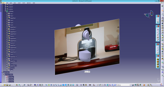
So this weeks task was to be able to accurately measure geometrically complex objects for project 3. The object I chose to measure for this project was the Delonghi EN 95s Espresso machine. The machine is small enough for this project, has complex curves and should be able to be crafted from foam core for part 2 and 3 of the project. For this project I wanted to have a very accurate measurement, reduce the time spent measuring and avoid the task of importing analogue points into Autocad and using splines to connect the dots (something is have to do if I used the profile gauges).
For the first part of the project I took a more complex path and decided to take photos of the product, import them into a 3D CAD software and then make a 3D model from the sketches, however I believed that this method would be rewarding, quicker and more accurate. The first thing I did was to make a piece of paper with two crosses 50mm apart, verified by a pair of digital calipers. I did this because then I imported the photo into CAD, I would have a known reference to properly scale the image to.

I then set up a simple backdrop and lighting set up so I could easily photograph the coffee machine. Note: ±0.2mm was a margin of error I deemed to be acceptable and much smaller than what i’d expect with other methods.

I then set up my Canon 80D on a secure tripod and enabled the live view and enabled the 5x3 grid style. This would allow me to have a grid line in the centre of the frame. I then centred the camera with the middle of the product. I was able to use some of the injection mold parting lines on the plastic to help me centre the camera, minimising parallax error. I used the zoom 10x function to further minimise the error. I then took photos from the front, back, side and top of the coffee machine.

Issue: I found that when I presses the button, it would slightly move the camera to the right, which would increase the margin of error. I found that I could fix this my simply setting a 3 second timer, which would allow the camera to return back to its origin by the time the photo was taken.

Once I took the photo I then had to lad the photo into 3D CAD to trace the photos. The CAD that I chose to use was CATIA V5-6R2017. It is a software that can adequately create complex shapes in, a programme I have used before, and have a passion to learn and use, and in my experience, runs much more smoothly on Citrix than Solidworks. The first thing I had to do was import the photos into CATIA using the “Sketch Tracer” workbench and then correctly apply the scale to the photos. I selected the two reference points and scaled them so the distance was 50mm. This is a much easier process than Solidworks’ scale method. I found that PNG photos loaded much faster than JPEG and ran slightly smoother.


I did this for the front, top and side view of the product, making sure to properly align the photos.

I then added a “new product” origin and then switched to ‘part design’. I lowered the photo opacity to %70 and created the front face of the coffee machine using the front view to reference the circle sizes and outside profile, and the side profile to determine the lengths of the surfaces. As a side note I didn't feel the need to recreate small details, such as the grills in the coffee platform, and several of the holes for the bolts.

Issue: I then used the top, side and rear photo to create the rear of the coffee machine. One issue that I had was creating the profile for the water jug as the fillets would not conform to the shape of the jug.

To fix this issue I switched to the surfacing tools and sketched the profile of the water jug and used the surface loft to create the outside of the water jug. I then added a thickness to the surface to make it workable geometry.
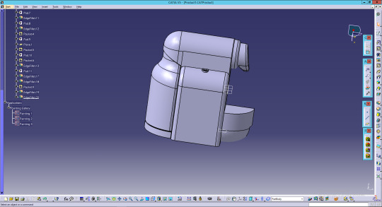
I then used the “multi-section surface tool” to create the handle of the coffee machine, and this is where I ran into my first issue. I got several error messages about the closing points of the sketches not aligning up. This was not something that I had encountered before. The way that I fixed this was to select the sketch and then change the default closing point to the bottom right for each sketch, and this quickly solved any errors that I was getting.


I then mirrored the component (due to me only producing half the object as it was symmetrical and a good way to reduce the time to create the 3D model). I was very happy with the quality of the recreated object.

All in all the process from start to finish (photographing and sketching) only took me 4 hours, much quicker than times I have heard from other people, and much quicker than it would have taken if I were to use analogue recording techniques such as profile gauges. I do think this is helped by my experience in CAD however. The big benefit of doing it this was is that now that I have my 3D model, I can use CAM software (such as a slicer) to produce the slices for construction, and I can quickly create the e-drawing with all of the contours on it.
AutoCAD
The project required us to use Autocad, so once I had created the 3D model in CATIA I used the cross section tool and offset planes to see the cross sections of the model. The cross sections would then become the basis for the ribs. I offset each section by 10mm and took a screen shot and imported them into autocad.

In autocad I would then trace around the cross sections and this outline would become the basis for the contours.


Now i'll be the first to admit that this was not a perfect method, but it did work well. There were some details and dimensions that could not be traced, either due to their size, shadow, or the angle that the photo was taken. Some examples include the thickness of the top lever and the thicknesses of the back water jug. To measure these components I used a digital caliper. These are very accurate and a very quick method to measure components. Calipers were accurate, but I believe would have taken far longer to measure and produce in CAD than my method.
If I was to do this again I think that i might run the photos through photoshop before importing them into CATIA. I would try to clean up the photos, removing any noise, correcting the white balance, and changing the levels to make the profiles less ambiguous, reducing the margin of error. If needed, I might even make a black and white version of the photo if the shape is very complex.
UPDATE 20/5/2018 - There were several things that I did after posting this to tumblr for the final model to be successful. First of all the back water jug had to be combined into the coffee machine, so it would be one part, this was done to make it easier to create the profile for the e-drawing. I also removed the buttons because they were an unnecessary detail that I felt did not need to be shown in the foam core model.
3 notes
·
View notes
Text
Week 9 - Presentation
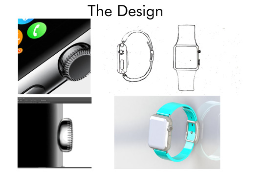
This week was the presentation for the second project (Apple Watch rendered in Photoshop) and in the days leading up to it, I was nervous to say the least about presenting to so many people. However the presentation went much better than I expected, and I think there were a few key things I did to ensure that it went smoothly.
Firstly I made sure to limit how much support material I used, making sure it was all relevant to the project, and allowing me to thoroughly aid me. For most of my A3 support pages I used only 4-6 different images which allowed the audience to easily see the content, and allow me to use to use them in the given time frame. I also made sure to order them, with the top left picture being talked about first, and bottom right being used last. This gave the aid a sense of flow and also helped me remember the content (or at the least act as a segue to the next topic) as many of the photos would lead into or relate to the next photo. I also broke up each A3 aid into separate ‘topics’ relating to the different stages of research I did; one relating to the product (understanding the branding of apple), the object (understanding the materials and lighting) and designing (how I designed several elements). I allocated one minute of explanation per per A3 aid/topic, with hopes it would allow me to explain all I needed to explain without going over, however I did slightly go overtime on the second piece which made me slightly rush the final page.
In terms of body language I made sure to look at the audience, and refrain from looking at the aid too much, or the marker. Due to presentations not being a strong point for me, I had to make a conscious effort to look at the audience because at time I felt that I was instinctively looking that the aids too much of the time. However I do think that I might have taken the phrase “project your voice” too much and I believe that I spoke too loudly to the audience at the beginning, and had to really tone the volume down for the rest of the presentation, a level that I was pretty happy with.
In my opinion, one of the biggest reasons I did well in this presentation, compared to other presentations I have done in the past is because I knew the content extensively, i.e. knowing the process of creating a texture for stainless steel, and because of this confidence I was easily able to talk about the apple watch without much issue.
If I was to do this presentation again I think I might add labels to each individual photo. I also think that the layout, whilst it did ‘flow’, the sizing of certain photos could reconsidered to make it look cleaner and more professional. I also think doing a few more practices out aloud would have allowed me to better manage my time, better squeezing in the content to the allocated one minute.

Presentation Posters


2 notes
·
View notes