
Don't wanna be here? Send us removal request.
Statistics
We looked inside some of the posts by joshna-a-levels-media-studies and here's what we found interesting.
Average Info
Notes Per Post
1
Likes Per Post
1
Reblog Per Post
0
Reply Per Post
0
Time Between Posts
9 days
Number of Posts By Type
Text
17
Last Seen Tumblr Blogs


Fun Fact
US Tumblr user growth rate is estimated to slow down to 4.1%.
Text
Creative Critical Reflection
Creating a music video for Sucks to Be Human by The F16s was an ambitious yet deeply personal project that allowed me to explore themes of human connection, nostalgia, and identity through a whimsical and visually engaging narrative. The project was shaped by a strong conceptual vision, inspired by films like Barfi, Annie Hall, and Une Femme Est Une Femme, while also integrating indie and retro aesthetics. Throughout the production, I had to consider how my work represents social issues, builds a cohesive brand, engages with audiences, and challenges or conforms to media conventions.
From the beginning, I knew I wanted the alien protagonist to symbolize the experience of being an outsider. He could represent anyone—someone struggling to fit in, someone moving to a new place, or even just someone who feels disconnected from the world. Seeing human life through his perspective makes ordinary moments—eating ice cream, riding a bus—feel more significant, almost magical.
The female lead is the opposite of him—bright, energetic, and open-minded. Instead of treating him with suspicion, she welcomes him immediately. I wanted this to challenge how people often react to things they don’t understand—whether that’s a new culture, a different way of thinking, or just someone who doesn’t fit in. The way she embraces the unfamiliar makes a quiet statement about acceptance and human connection.
The red scarf she gives him is one of my favorite details because it represents more than just an accessory—it’s her giving him a piece of her world. By the end, he’s more human than before, and she’s changed too. The looped ending reinforces that change—he’s gone, but his presence lingers, just like how people leave an impact on us even after they’re gone. I love stories that explore the idea that even temporary connections can be meaningful, and that’s what I wanted to capture here.
I put a lot of thought into making sure the music video, digipak, and social media page all felt like part of the same world. The biggest thing that tied everything together was the red motif—it shows up in the scarf, the digipak design, and the overall color palette. Red symbolizes connection, fate, and emotion, which are at the heart of the story.
I also leaned into a DIY, nostalgic aesthetic to match the indie, raw feeling of the song. The scrapbook-style digipak was a big part of this—since we didn’t have access to fancy design software, I embraced a handmade, imperfect look instead, which I think made it feel even more personal.
For costuming, I wanted the characters to visually reflect their personalities. The alien’s outfit is deliberately strange—a black trench coat in Mumbai’s heat, a weirdly tied tie, and alien ears. Meanwhile, the girl’s outfit is bright and full of personality, with the red polka-dot top tying her to the film’s central themes.
Even the camera work and color grading played into the branding. The warm, dreamy look was inspired by Barfi and Amélie, creating a nostalgic feel. I also used digicam footage to add moments that felt more personal and real, almost like memories being recorded. All of these details worked together to make sure that everything—from the film to the promotional materials—felt cohesive and emotionally connected.
I wanted this project to feel immersive and relatable, even though it’s about an alien. The best way to do that was through perspective—seeing human life through his eyes. That meant relying on body language, facial expressions, and small gestures rather than dialogue.
Humor was also a big part of how the audience connects to the story. I love how the alien's awkwardness makes him endearing—whether it’s sniffing a handshake or trying to eat a burger sideways, those moments add lightness to balance the deeper themes.
Beyond the film itself, social media played a huge role in engaging with the audience. I set up an Instagram page (@sucks2behuman) where I posted behind-the-scenes clips, teaser images, and reels to build excitement. My teammates helped create promotional reels, making sure the page felt fun and interactive.
But I think what really connects with people is the theme of fleeting connections. The ending, where the alien is gone but his presence lingers, hits differently for everyone. Some people might see it as a metaphor for friendships, others for love, or even just for growing up. I love that it’s open-ended because it lets each viewer find their own meaning in it.
Research played a fundamental role in shaping both the artistic and technical aspects of this project. I studied cinematic influences from both Bollywood and international films, particularly focusing on Barfi (Anurag Basu), Annie Hall (Woody Allen), and Une Femme Est Une Femme (Jean-Luc Godard). These films helped inform the narrative style, character dynamics, and visual aesthetics of my music video.
My music video adheres to certain indie and retro music video conventions, such as:
Soft, warm color grading (inspired by Barfi and Amelie) to evoke nostalgia.
Unconventional framing and movement (influenced by the French New Wave’s playful cinematography).
A character-driven, emotionally resonant narrative, rather than relying on performance shots.
At the same time, I deliberately challenged some mainstream music video conventions:
No performance shots: Most music videos feature lip-syncing, but I wanted this to be entirely narrative-driven.
Minimal dialogue: Instead of telling the audience what’s happening, I relied on visual storytelling and symbolism.
DIY aesthetic: Since we didn’t have access to professional cameras, we used an old Canon SX40, which actually ended up giving the project a raw, nostalgic quality.
Budget constraints were a challenge, but they also made me think more creatively. For example, instead of renting professional lighting, we shot in locations where we could use natural light effectively. Instead of hiring actors, I acted in the film myself, and it made the project feel even more personal.
Looking back, this project was a struggle in every sense of the word. But it was that struggle that made it one of the most rewarding experiences I’ve had. I had to take on multiple roles—writing, directing, acting, editing, and branding—and while it was overwhelming at times, it taught me so much about the power of collaboration and adaptability.
The project successfully represents themes of human connection and transience, builds a cohesive visual identity, engages its target audience through both content and social media, and thoughtfully balances convention and experimentation.
But besides all that, most of all, I wanted this film to feel real—that feeling of meeting someone, forming a connection, and then letting go. Even though we were just four students and one poor guy I got to act for us running around Mumbai with a second-hand camera, we made something that feels honest.
If there’s one thing I learned, it’s that great stories don’t come from big budgets or perfect execution—they come from heart, creativity, and the people you share them with.
0 notes
Text
FINAL LINKS
MV:
youtube
SOCIAL MEDIA:
1 note
·
View note
Text
Final Posts
After getting the initial posts up, I felt it was important to enhance the profile further. So, I decided to create a few Instagram highlights to organize content and give followers easy access to different aspects of the project. I updated the profile picture to something more eye-catching, ultimately settling on the center of the album cover—this helped keep the visual identity strong and recognizable.
Next, I focused on keeping the momentum going with new posts. I shared the tracklist, which was a crucial element for building excitement and anticipation around the release. Along with that, I posted some behind-the-scenes shots—these gave a peek into the process and helped connect the audience more deeply to the project.
Finally, I wrapped it all up with a final post showcasing the digipak. This was the grand reveal, where everything came together, and it served as a great conclusion to our social media strategy, showing off all the hard work that went into the visual elements and design.

0 notes
Text
Social Media
I created an Instagram account with the handle @sucks2behuman.I decided to focus on the lead title of the song for the initial posts. To do this, I created a visually cohesive grid that displayed the song's title, creating an eye-catching and organized feed. I wanted to draw attention right away to the essence of the project, and the grid layout helped convey that in a neat, structured way.
Next, I wanted to highlight the team behind the project. So, I posted about the crew—introducing everyone who had worked on it. This gave a personal touch and acknowledged all the hard work that went into the project.
After filling in the grid with a few of these posts, I wanted to make sure the feed had some visual variety. I added a few more grid fillers to ensure the aesthetic was visually appealing and balanced. The goal was to keep things visually engaging while still telling the story behind the project.
My teammates also played a crucial role in contributing to the social media effort. Paarth and Aarush created some promotional reels, each adding their own flair to the page and building excitement.
Overall, the strategy was simple: create a cohesive, aesthetically pleasing feed that introduced the project, the team, and kept the audience engaged with new, fresh content.

0 notes
Text
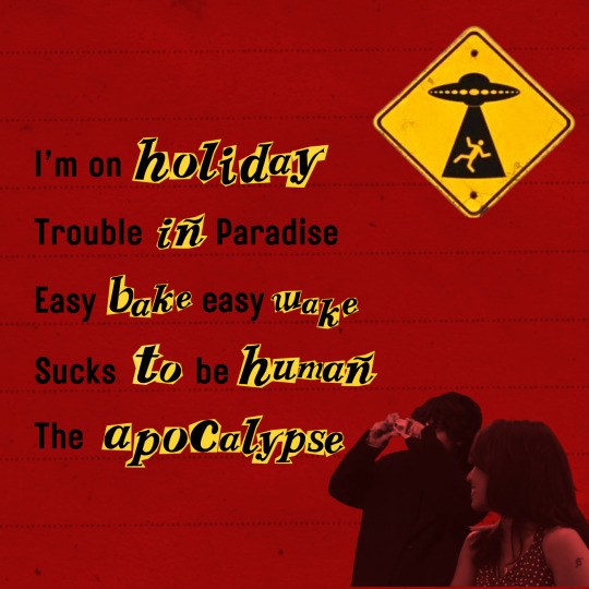
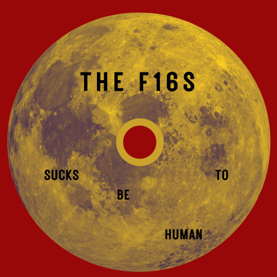
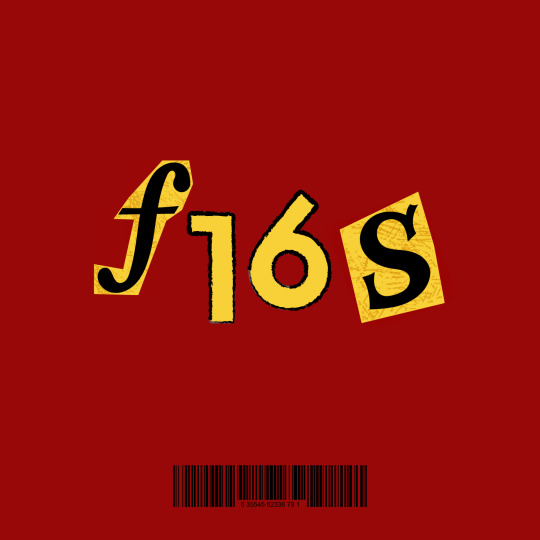
FINAL DIGIPACK
With the first draft done, I took a step back to evaluate the details that needed fine-tuning. Small but significant adjustments would make the design feel more refined and intentional, so I focused on balancing elements and improving clarity.
One of the first fixes was adjusting the explicit content sign and barcode. The barcode on the front felt overcrowded, so I shifted it to the back, allowing the cover to breathe while keeping the necessary details intact. Next, I reworked the text placement, adjusting the alignment and spacing to create a cleaner flow. It was only then that I realized I had forgotten to include the tracklist, which was essential. To accommodate it, I switched out the second slide, ensuring the tracklist was both visible and engaging.
For the CD itself, I wanted to tie in the cosmic theme of my characters. Instead of a standard design, I used an image of the moon as the CD base, reinforcing the interstellar aspect of the story. To keep it sleek, I opted for a minimalist font on the disc, making sure it wasn’t too cluttered. Meanwhile, the tracklist followed a sporadic scrapbook-style font, adding visual interest and staying true to the cut-and-paste aesthetic. I also overlayed some ruled paper for the backdrop to break the monotony of the red.
I also used two separate screenshots to create cutouts of myself and the other actor, integrating them seamlessly into the design. To further push the whimsical, offbeat tone of the MV, I included a “Danger: Alien” sign, giving the final design a playful yet fitting detail.
This entire process was a creative stretch for me, pushing me to rethink how to make the most of limited resources while keeping the design fresh and engaging. After all the adjustments, I was finally satisfied with the result. Here’s the final product:

0 notes
Text
Restarting
After struggling with my initial digipak designs, I decided to start over completely and take a more creative approach with the resources I had.
I went through every clip and photo we had, carefully selecting stills from the music video that could be repurposed as cutouts. The more I explored, the more I realized that a scrapbook-style aesthetic was the perfect fit—not just for its DIY charm, but because it happens to be my signature design style. There’s something about the layered, imperfect, and hand-assembled look of a scrapbook that makes it feel raw and personal, which matched the essence of our project beautifully.
With this in mind, I started piecing together different elements, cutting out visuals, and playing with textures to create something that felt dynamic and cohesive. It was chaotic but exciting, and the process allowed me to lean into my instincts rather than follow rigid design rules.
Here are some of the rough drafts and scraps from my initial attempt. In the next entry, I’ll break down how I refined this mess into something more polished and intentional.


0 notes
Text
First idea
Creating the digipak came with its challenges, but the biggest turned out to be our lack of photos from the shoot. With limited imagery, I had to take a design-heavy approach, making color and typography the focal points.
To keep the visual tone warm and inviting, I chose yellow for the exterior. Inside, red served as a direct callback to the motif running through the music video, reinforcing its themes. I also ensured key details like the barcode, parental advisory sticker, and tracklist were included to maintain authenticity.
Since we filmed in Bandra, known for its bold street art, I decided on a graffiti-inspired font to reflect that energy. This choice tied the project’s aesthetic to its setting, making the design feel more immersive.
I made the first draft but I was pretty unhappy with it.


0 notes
Text
Further process
With my initial concept in place, I set out to refine and structure the design into something more polished. The scrapbook-style approach gave the digipak a raw and personal touch, but it still needed cohesion—something that would make it feel like a deliberate extension of the music video rather than just a collection of elements.
The first major decision was to fully integrate the red motif from the MV. Red had been a symbolic thread throughout the project, representing connection, fate, and emotion, so it made sense to carry it into the digipak as a dominant color. To balance its intensity, I introduced yellow to maintain the warmth of the overall theme and added black as a grounding third tone, ensuring the design remained visually structured rather than overwhelming.
Another big step was redesigning the cover. I made all the backgrounds red, reinforcing the motif while giving the design a bold, cohesive feel. This change instantly tied everything together, making the elements look more intentional and less scattered.
After refining the composition, adjusting the colors, and making sure every element had its place, I completed the first real draft. While it still had room to evolve, this version felt like a solid foundation—something that finally captured the essence of the MV while standing strong as its own visual piece.


0 notes
Text
Digipack
I had to start designing the digipak now, so I studied what digipaks typically include.
The biggest challenge was the lack of access to professional design software. I didn’t have the budget for InDesign or Photoshop, which are the industry standards for this kind of work. At first, I considered making a handmade digipak, thinking it would add a unique, personal touch. But after some thought, I realized it would be a waste of both resources and time—especially given the precision required for printing and folding.
That left me with one option: using something free and familiar. I ultimately decided to go with Canva—a user-friendly tool I had experience with. Of course, it came with limitations. Unlike Photoshop, it lacked advanced customization options, and I knew I’d have to push my creativity to the max to work around those constraints.
I was determined to make this work. If anything, the challenge made the process even more exciting—I had to be resourceful, think outside the box, and make every design choice count.
0 notes
Text
Extra Work and our Target Audience
After putting together the final cut, the editor and colourist worked to fine tune the colour grading of the MV to reduce the saturation and bring out simpler colours to make it easier on the viewers eyes.
This MV should ideally appeal to a youthful audience enamoured by the simplicity of the past and the absurdity and creativity of the concept. It's light hearted with deeper themes, with loads of interesting visual shots.
We showed it to a few of our friends and got feedback:
5/7 people aged 16-22 said they enjoyed the concept
6/7 aged 16-22 said they would click on this MV if it came on their YouTube home page.
0 notes
Text
Editing and final cut
Once we were done with color grading and had chosen our final takes, we finally started putting together the final cut. This part took forever, mostly because we had added extra scenes that weren’t originally in the script. While these additions felt right for the narrative, they also meant we had to be extra meticulous in ensuring everything flowed seamlessly with the song.
We really wanted the cuts to sync up perfectly with the rhythm and mood of the track, and that meant constantly adjusting the timing, pacing, and transitions. Every cut had to feel intentional, and we worked through it with a fine-tooth comb, trying to make the scenes feel as organic as possible while keeping everything in line with the music.
It was a slow, tedious process, but it was also where everything really started to come together—where the visuals and the song clicked, creating the emotional beats we wanted to highlight.


0 notes
Text


Here's a reference of our how work looked before versus after colour grading.
0 notes
Text
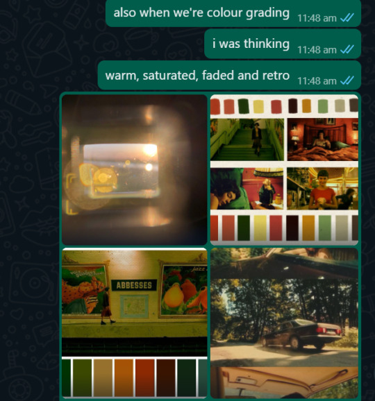
Colour Grading
I had a pretty clear image in mind of what I wanted the project to look like. As I mentioned in my previous entries, I was really inspired by three movies— Barfi, Annie Hall and Une Femme Est Une Femme. For the colour grading of the film, I leaned most towards Barfi. Barfi was saturated, captivating, warm and inviting. It felt like it was dripping with nostalgia and whimsy. I was also inspired, as most aficionados of this aesthetic are, by Amelie (dir. Jean-Pierre Jeunet) in all its green and yellow glory. I really wanted to encapsulate this feeling into our project as well, these are the notes I had for colour grading.

0 notes
Text
My experience writing, directing and acting
I often act for the media projects I write, co-write and direct; Not out of passion but necessity. But I think I’ve found that after this project, my final project in school, I grew a bit fond of it. It isn’t something I’d necessarily call myself good at, but it’s been fun. I got pretty good at not laughing mid-take, and learning to take myself seriously. It still feels a bit awkward and embarrassing at times, but if i kept that mentality, we’d never get anything done.
Writing is like breathing to me. As long as I can sit, stand or lay down for a moment with something to write in front of me, I can write for pages and pages on end. Often throughout the day I found myself editing the script just in my mind. The concept for this script was one that I was really proud of, and I was pretty bummed that because of technical difficulties and and a shortage of funding, there were some things we couldn’t quite incorporate or couldn’t do well enough. I’m still proud of what this project stands for, and that my teammates and I could create this thought-baby of all the things we love about cinema, music and our culture.
This was my first time asserting this much control over the direction of the project. It was difficult, taxing and frustrating…but also immensely gratifying. Checking each shot after it was done, managing my co-actor and teammates and working together with them was beautiful. I truly valued all their insights and our collective effort. Directing this would not have been possible without my teammates. Despite some minor squabbles and grievances, it was still fun and ultimately all part of the process.
Team projects are often hard for me as I’m someone who can be a bit meticulous and driven, as I often feel controlling and alone. But with each project I find myself becoming more flexible, as well as embracing this carefulness as a strength rather than a weakness.
0 notes
Text
Going through footage and selecting takes
We ended up having anywhere from 2 to 9 takes for each scene, which made going through the footage to find the perfect shot a huge challenge, even though we had already discarded so many takes right after filming. It was a painstaking process, watching the same clips repeatedly, but we eventually managed to choose the takes that felt the most aligned with the vision we had. After hours of sifting through footage, we finally created the master file with our final takes.
With that done, we moved on to the timelining process, where we had to figure out the sequence of the clips. This was another tough decision because we had to be selective, figuring out what was essential and what had to be left out. It was heartbreaking, especially since there were a lot of shots that were really good, but just didn’t fit with the flow of the story.
To make matters worse, we lost two clips in the process of transferring the files. At first, it felt like a major setback, but we quickly brainstormed and found a way to work around it, which saved us some time and stress.
With all that, we finally finished the rough cut of the project. It was an exhausting but incredibly rewarding milestone, and we were one step closer to finishing our vision.
0 notes
Text
DAY 3 SHOOT: P2
As we sat down in the café, we took the chance to sort through the footage and transfer the clips. While we were doing this, I called the owners of Santa Marias to confirm if we could still come by for the diner scene. Just as we were about to ask for the bill, Aarush suddenly had a realization: we didn’t need to travel all the way to Bandra for the diner shot because we were already in a diner!
We’d lucked out by being seated in a secluded corner, which meant we wouldn’t disturb anyone. So, in no time, we quickly set up and shot the two diner scenes we needed. And just like that, our filming was over!
After that, we moved to another café to sort through the last few clips and transfer all the files to a drive. With our celebratory coffee in hand, we officially wrapped up the shoot. It felt like a huge weight had been lifted, and we were all just grateful and excited to see everything come together.


0 notes
Text
DAY 3 SHOOT: P1
In this entry, I’ll be talking about our last day of the shoot. I woke up at 4:30 am and started my 20 km journey to CSMT station to meet up with the team. It was an exhausting start, but the excitement was high since we were wrapping up everything.
Our first location of the day was the double-decker bus, which was something none of us had ever traveled on before, so it was pretty exciting to be able to film on one. We bought a ticket to the last station and one back from the last to the first, so we could take as many shots as we could along the way. We made sure to get there early, hoping for less traffic and fewer disturbances. The shots came out great, but we had our fair share of tumbles trying to capture the perfect moment. Eventually, we were asked to stop filming and get off, which was a bit of a downer, but we still managed to get a solid amount of footage.
We then took a short walk to Marine Drive, where we filmed another dragging scene and a few extra shots. After that, we began our long walk to Fort, which was a bit of a trek but worth it for the next location.
When we reached Fort, I spotted a big red wall, and immediately, I knew it was too beautiful to pass up. We ended up filming our tribute to Godard, which wasn’t part of the original script, but I was determined to get it in somehow. Of course, acting weird in public for a scene was awkward, but the presence of the camera made it easier to push through the discomfort.
By now, we had also completed some more stalking shots, as well as a shot of her buying him a scarf. We then made our way to Kala Ghoda Café, where we took a quick break. Nearby, I grabbed a cup of matka chai from an alleyway, which turned out to be one of my favorite shots of the day—just a simple, beautiful moment in the midst of all the chaos.
With nearly everything checked off our list, we decided to take a much-needed brunch break, as we were all pretty drained by this point.
I’ll detail the final half of the shoot in the next entry.


0 notes