
joshsdesignblogmm
Josh's Materials and Media Blog
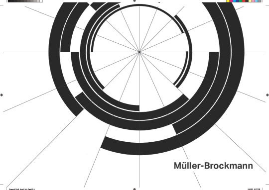
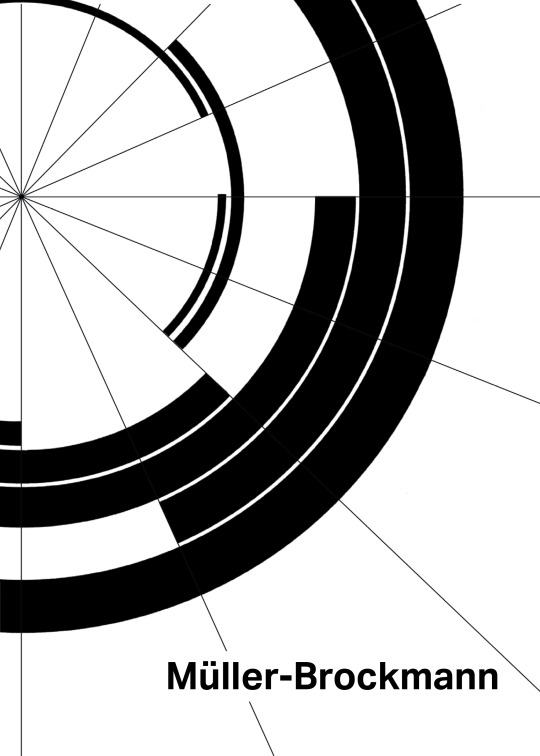
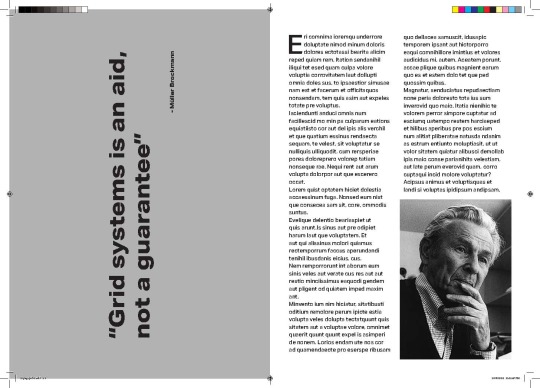
“grid systems is an aid, not a guarantee” - Muller Brockmann
27 posts
Don't wanna be here? Send us removal request.
Last Seen Blogs

himalayahearttreks
Himalaya Heart Treks & Expedition Pvt Ltd

rixdarula
Untitled

jeremyryant-blog
Searching.

paimonfriend
Genshin Screenshot Collection

centrodeayurveda
Centro de Ayurveda
Text
Reflection
In this 503 paper making my Timeline Poster and Publication, I have developed many skills. I have learnt everything about my allocated designer Müller-Brockmann from his work to his design method, his grid system, used in all of his work. I have also learnt Publication and magazine design and the process of making them.
In the first half of the semester, I learned new things while researching my allocated designer Müller-Brockmann which allowed me to learn and try an approach to a design technique that I wouldn't have known, his grid system. From learning about the grid system and how it is used, I have found a new fondness for it, in most typography designers use a form of the grid system in terms of placement and size. I will be incorporating the grid system technique in my projects and assignments in the future.
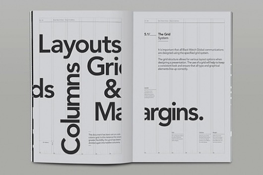
Throughout the second half of the semester, I have learned about Publication and magazine design. At the end of the first half of the semester, my goal was to learn InDesign, and now after six weeks of our lecturers teaching us the basics of InDesign, I am well versed. I have learned the process behind making publications and discovered that behind every magazine there are grids and columns to assign texts, graphics and Imagery. I will be teaching myself more InDesign skills in the semester break.
Things I would improve on is my willingness to research more extensively. I feel like on my Tumblr blog, I haven't researched enough. So next semester I will try to research more.
I really enjoyed designing my publication magazine and my timeline and I am proud of the work I’ve done. I am excited for what's to come in semester two.
1 note
·
View note
Text
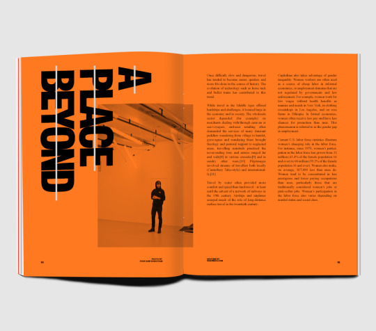
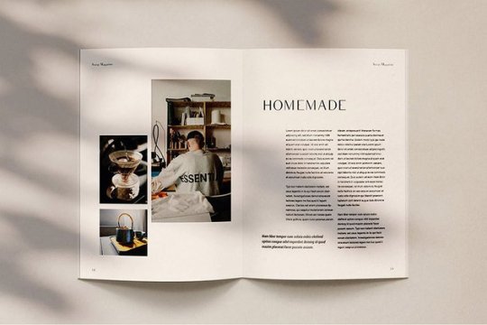
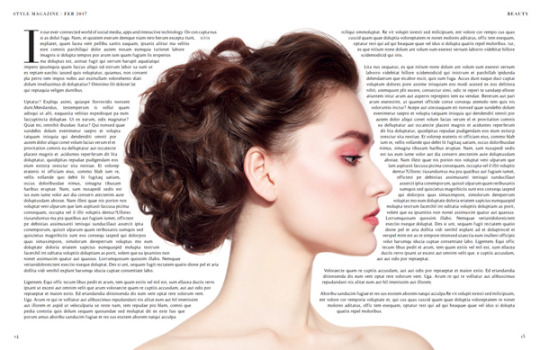
Final Publication
Imposed Spreads


1 note
·
View note
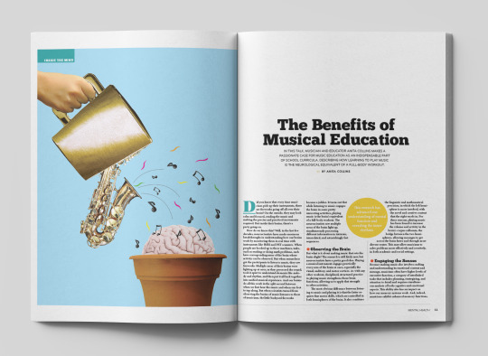
Text
Final Publication
Reader Spreads


1 note
·
View note
Link
This is a booklet of an interview with Muller Brockmann
1 note
·
View note
Text
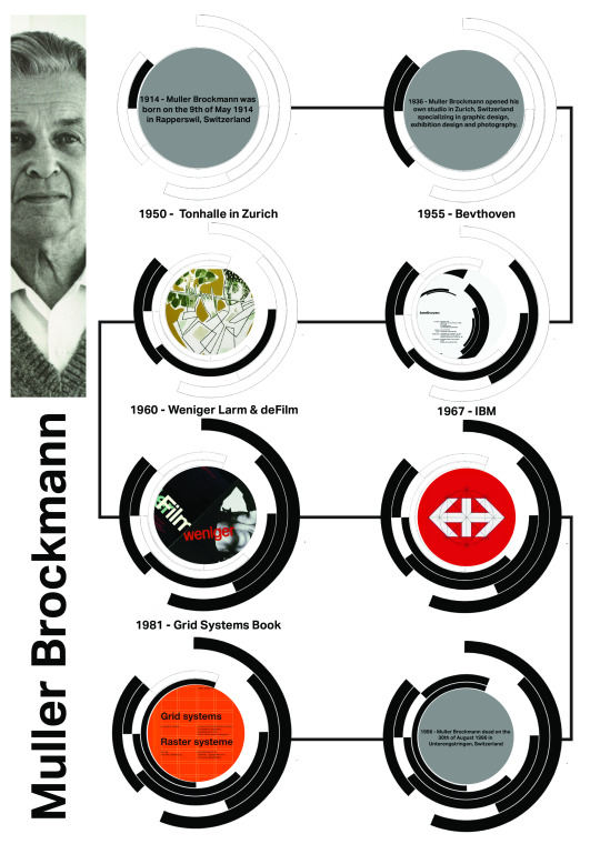
Updated Timeline Poster
I’ve added Glyphs to Muller Brockmann’s name, I’ve also added context to all the stages and also added a arrow at the beginning of the timeline.
1 note
·
View note
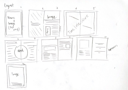
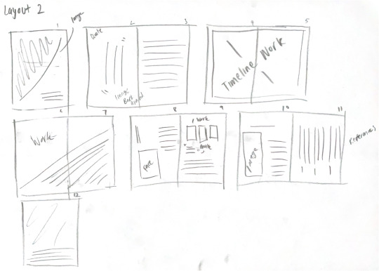
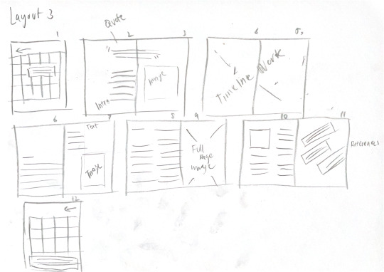
Text
Rough Final Magazine
This is layout 2 of my drawing.
*All text are placeholders, black squares are image placeholders and also doesn’t have any colour.


1 note
·
View note
Text
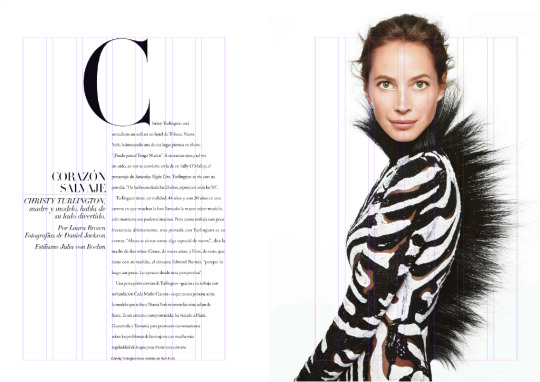
Magazines using the Swiss Style


1 note
·
View note
Text
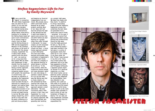
Article Used in my Publication Magazine
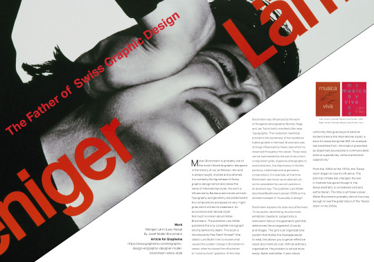
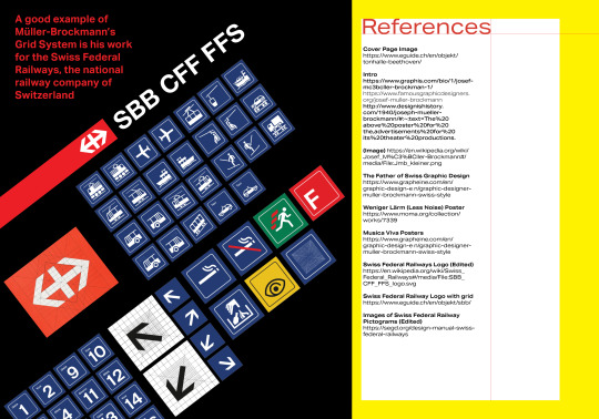
The father of Swiss graphic design
Müller-Brockmann is probably one of the most influential graphic designers in the history of our profession. His work is always taught, studied and published. It is certainly the figurehead of Swiss graphic design (which also takes the name of international style). His work is influenced by Bauhaus and constructivism. Typography and geometry are predominant. His compositions are based on very "rigid" grids which will be his trademark. An economical and rational style!
Not much is known about Müller-Brockmann. The publisher Lars Müller published the only complete monograph shortly before his death. This book is introduced by Paul Rand "himself" (the class!). Lars Müller tries to explain what caused the sudden change in Brockmann's career, when he moved from illustration to "constructivist" graphics.
At the time, Brockmann was influenced by the work of Hungarian photographer Moholy-Nagy and Jan Tschichold's manifesto Die neue Typographie. This modernist manifesto proclaims the supremacy of bar typefaces (called grotesk in German). Brockmann was strongly influenced by these rules which he observed throughout his career.
These rules can be summarized by the use of very strict composition grids, objective photographs to avoid emotions, the importance of rhythm, harmony, mathematical and geometric compositions. For example, at that time Brockmann saw music as an abstract art, so he considered his concert posters in an abstract way. The publisher Lars Müller described Beethoven's poster (1955) as the ultimate example of "musicality in design".
Brockmann explains his style very effectively: "In my poster, advertising, brochure and exhibition creations, subjectivity is removed in favour of a geometric grid that determines the arrangement of words and images. The grid is an organizational system that makes the message easier to read, this allows you to get an effective result at a minimum cost. With an arbitrary organization, the problem is solved more easily, faster and better. It also allows uniformity that goes beyond national borders (hence the international style!), a boon for advertising that IBM, for example, has benefited from. Information presented as objectively as possible is communicated without superlatives, without emotional subjectivity."
From the 1960s to the 1970s, the "Swiss style" began to lose its influence. The political climate has changed, the war in Vietnam has gone through it, the Swiss aesthetic is considered cold and authoritarian. The time is at flower-power...
Brockmann probably did not live long enough to see the great return of the "Swiss style" in the 2000s.
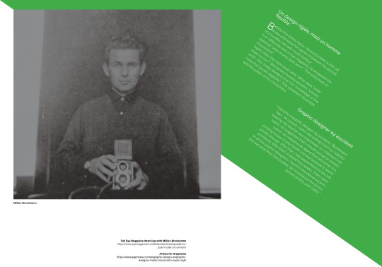
Graphic designer by accident
"I became a graphic designer by accident," Brockmann says. "At school, I didn't like writing much so I started drawing. My teacher was impressed, so I realized I had talent. He suggested that I should pursue an artistic career. So I became an apprentice retoucher in a printing house. It only lasted one day because it wasn't artistic enough. After that, I was apprenticed to two old architects. With them, it lasted four weeks. Then I went to all the graphic designers I found in the phone book to find out what they had studied. So I enrolled at the Zurich School of Arts and Crafts."
Un design rigide, mais un homme flexible
Behind this Swiss rigour, obviously hides a man, all those who knew him agree to present the portrait of a humble man with much humour.
In a 1996 interview in Eye magazine, he answered the question "what is your best work": "The white back of my posters!".
Again, when the interviewer asks "What does "order" mean to you?" Brockmann humbly answers "a pious wish", then finally declares that it is "knowledge of the rules that govern legibility". This statement illustrates well the power of his convictions.
1 note
·
View note
Link
Aktiv Grotesk (Akzidenz-Grotesk) on Adobe Fonts
This font family includes Aktiv Grotesk, Aktiv Grotesk Cd and Aktiv Grotesk Ex
This will be the typeface I will be using.
1 note
·
View note
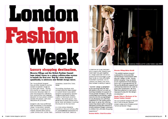
Text
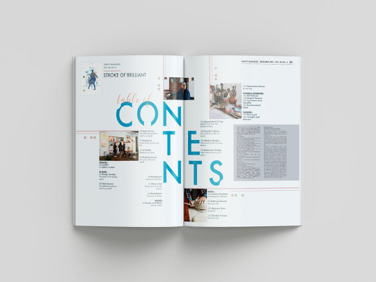
Researching Layout
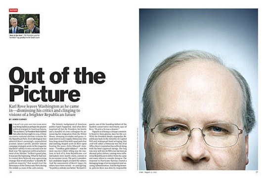
After researching magazine layouts these are some layouts I liked.
This magazine spread has a two column body text, a picture with bleed on to the second page and text rotated 90 degrees. I really like the aspect of the image bleeding on to the second page.
1 note
·
View note
Text
Typographical Roulette Design Challenge
Fonts in use: Advert Pro, Fairplax, ITC Beesknees Std and Dingbats
*I'm just missing the quote
1 note
·
View note
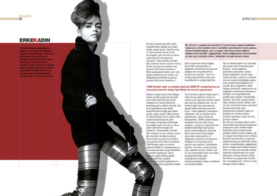
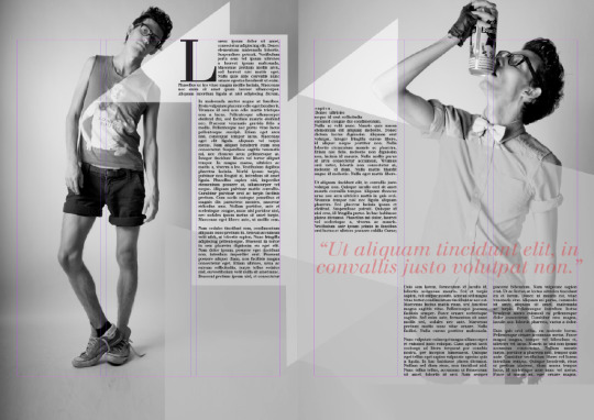
Text
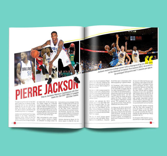
Layout Inspiration
For my spread layouts I used these magazines as inspiration

1 note
·
View note
Text
Sketches of Layouts for Bespoke Publication
My typeface is Akzidenz-Grotesk, continued from my poster design.
1 note
·
View note


Text
Reflection
Throughout the 6 weeks of research, I have learned a lot, not only from the work of my allocated designer Muller Brockmann, but I have developed my skills in Photoshop and Illustrator. This has broadened my look on design fundamentals such as colour, type, layout, shapes and posters/typography in general. What I discovered that was most significant about my designer Muller Brockmann's work was his grid system, the base layer of all his work. From learning about the grid system and how it is used, I have found a new fondness for it, in most typography, designers use a form of the grid system in terms of placement and size. I will be incorporating the grid system technique in my projects and assignments in the future.
I enjoyed learning the basics of photoshop and illustrator again, I already knew most of the things that were introduced but it was refreshing. Practising using the pen tool in illustrator with the exercises was very informative. Despise not using it in my final posters it is a very good tool when making illustrations
I had a lot of fun and learned new things while researching Muller Brockmann which allowed me to learn and try an approach to design that I wouldn't have known. I am proud of the work I have created so far and I am excited for the second half of the semester in Materials and Media. My goal for the second half of the semester is to learn InDesign.
1 note
·
View note

Text
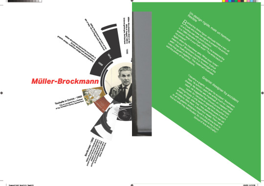
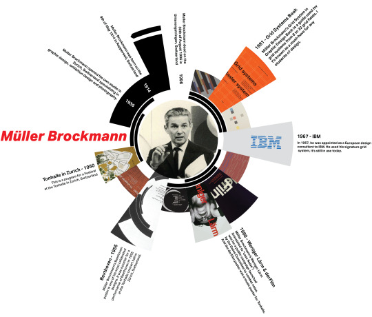
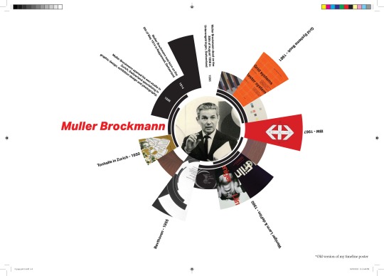
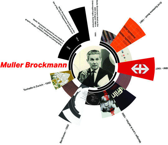
Muller Brockmann Timeline
Muller Brockmann Timeline
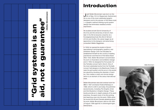
1914 - Muller Brockmann was born on the 9th of May 1914 in Rapperswil, Switzerland
1936 - Muller Brockmann opened his own studio in Zurich, Switzerland specializing in graphic design, exhibition design and photography.
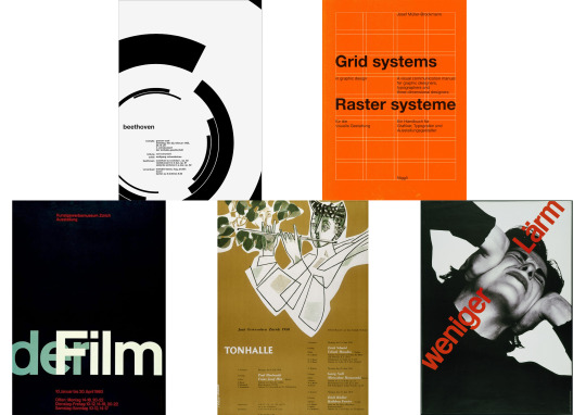
1950 - Tonhalle in Zurich - This was Muller Brockmann’s first works.
1955 - Beethoven - This was his most known / famous works.
1960 - Weniger Larm, deFilm
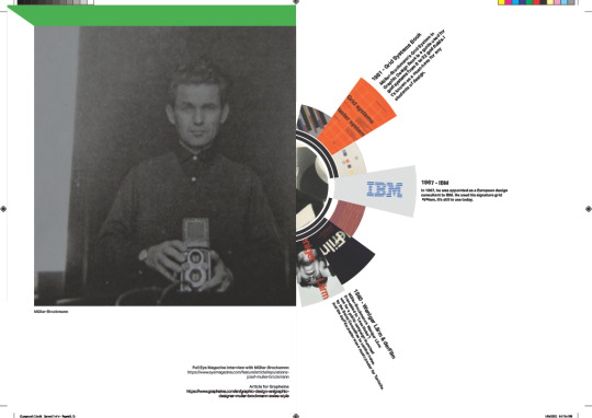
1967 - IBM - He’s work for IBM is still used today.
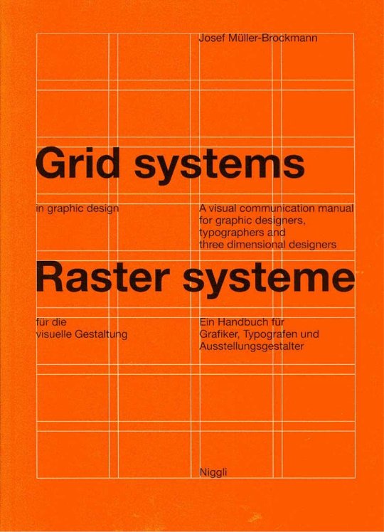
1981 - Grid Systems Book - This book is the most popular out of the few books Muller Brockmann has published.
1996 - Muller Brockmann dead on the 30th of August 1996 in Unterengstringen, Switzerland
1 note
·
View note