
Don't wanna be here? Send us removal request.
Statistics
We looked inside some of the posts by journeypackagingblog and here's what we found interesting.
Average Info
Notes Per Post
0
Likes Per Post
0
Reblog Per Post
0
Reply Per Post
0
Time Between Posts
6 days
Number of Posts By Type
Photo
6
Text
7
Last Seen Tumblr Blogs


Fun Fact
In 2020, 44% of users from Denmark used Tumblr daily.
Photo


Challenge:
We were tasked with creating a branded series of 3 products, either a redesign of an existing company or a brand we created on our own. I chose to create my own brewery, or at least the branding for one. I created labels for a porter, a stout, and an IPA. I also chose to create a carrier for the series of 3 beers with the company branding.
Approach
The main challenge I felt for this project was creating a cohesive brand identity while still prioritizing stylized illustrations and colour. I took inspiration from traditional “old style” tattoos, and created differentiations between the beers with different illustrations that played off of the name of the beer.
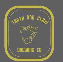
I named the brewery “Tooth and Claw”, and centered all of my beer concepts around the name. I wanted everything to be vaguely “wolf” themed, hence the names Wolfsbane Porter, Sinking Fang Stout, and Howling Moon IPA.
Outcome
I created a series of 3 branded bottles, which included a wrap-around label for the front of the bottle that contained information about the kind of beer, and a small label for the neck and cap of the bottle with the logo/wordmark for Tooth and Claw.
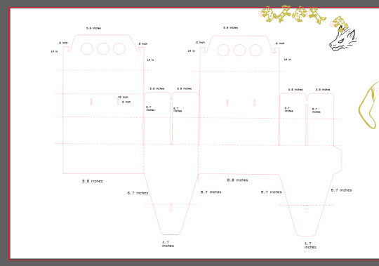
I originally wanted to make a 6 pack carrier, but since I had 3 flavours it made sense to do something less traditional and design for just the three bottles in my series, I overlayed a pattern onto the carrier with the illustrations on my labels to create some continuity with the brand.
0 notes
Photo


My project is shaping together slowly and surely, after the Hired Guns critique today I’m excited to make the (many) changes that they suggested for next week. I’m going to play with colour a bit more and up my illustrations as they suggested. It felt like a lot all at once, but I tried to make notes as best I could. It was really really helpful to have someone who knows their stuff critique me, as much as critiques from peers are helpful, having someone who specializes in craft beer especially is so helpful to my design process for this project.
0 notes

Text
Blog 10


I’m having a lot of fun with this project so far! I really wanted to do beer, so I decided to make my own brewery instead of redesigning one.
I created Tooth and Claw Brewery, it’s island based and has a rough hewn West Coast feel. I jumped into the digital stage pretty early because I had a lot of ideas I wanted to explore, and settled on three kind of beer for Tooth and Claw to sell. I’m also going to be designing a six pack bottle carrier, I tried to figure the dimensions out in illustrator first just because of how large the scale is before I mock it up on pencil and paper.
I bought some bottles that I took the sticker off of to mockup my labels on. I’m considering doing some design for the neck of the bottle as well, but I’m going to get ahead of myself since I want to allow time to create and design the carrier as well.
0 notes
Text
Blog 9

a How is the branding consistent across all of the packages?
The branding is consistent across all the packages through it’s layout and typography, as well as illustrations in a similar style.
b How does the design differentiate amongst “flavours”?
The design differentiates in colour and subject of illustration to differentiate between flavours.
c What is the brand and/or concept?
The brand is a tea company called “Morrocantea”

A. How is the branding consistent across all of the packages?
The same, simple layout and type is used for all of the packages.
b How does the design differentiate amongst “flavours”?
The design differentiates the “flavours” mainly with colour and type.
c What is the brand and/or concept?
The brand is Royal Nut Co. a company that specializes in nut butters.
0 notes
Photo


Things finally came together today! Took a couple hours of frustrated folding but everything worked out at the last minute. I spent an afternoon last week experimenting with mocking things up and printing on Kraft paper with the classroom printers since both Arc and Staples balked at the idea of printing on the brown paper I wanted. So Kevin and I cut up a Thrifty’s bag and made do!
My cardboard wrap around idea didn’t end up working, so I ended up sticking a little label on some twine and wrapping it around the packaging, I think it worked out well although I’ll make my labels a little smaller for the very final package.
It's exciting to see my original concept in it’s final fruition, being able to picture it on a shelf made the entire process worth it.
0 notes
Photo

Finally figured out how to fold my side gusseted flat bottom bag with Nancy’s help! Now I can start designing full force, with lost of test printing I’m feeling confident about being ready to photograph next week. It may not look like much, but the bag caused me so much grief, now that I’ve got the trickiness of folding out of the way I’m going to finish the design, focusing on making sure I’ve got contrast figured out while trying to make Serious Coffee branding actually look well designed!
0 notes
Text


This week was a struggle for me! I wanted to create a side gusseted stand up bag that rolled up and clipped at the top, with a cardboard sleeve. It sounded simple in theory and even when I was creating my initial sketchy dieline, but I had so much trouble getting the bottom to fold together properly. I ended up making three second sketch mockups, a lot of trial and error was involved this week. I wanted to do something more structurally sound and complex than a regular paper bag but it was more difficult that I’d bargained for.
0 notes
Photo


Today I really pushed myself to explore outside of my original idea, which was just to recreate the “pouch” design of my package with biodegradable materials and better design. I’m leaning on doing a paper bag with a cardboard sleeve to indicate flavour to resolve the issue of the sticker on the original packaging. I did a lot of research on compostable materials, but I need to shift my focus on the actual packaging design as a pose to materials.
0 notes
Text
Blog 4


This activity really challenged me, but I had a lot of fun along the way. It really made me realize how intricate and complex this whole packaging thing really is. I made a lot of little mistakes that ended up on my final version, but I think I really learnt from all the mess-ups and this activity really set me up to do well in my next project. There was a lot of trial and error involved, and a lot of re-doing my type until I was somewhat happy. I think my main takeaway is that test printing is definitely going to be even more of a priority in my next project.
0 notes
Text
Week 3 Blog


Today in class I fine-tuned my digital package replication, and played around more with adding images and type. I printed it on regular paper and made a very rough mockup to see how my folds worked, and they were mostly successful! Seeing it in physical form helped me realize what changes needed to be made, test printing is so important.
I have a bunch of little changes to make before my final printout next week, like extra fold lines and proper bleed but for the most part I think I’m on the right track. This work period was really productive and I’ve really enjoyed the activity so far.
0 notes
Text
Week 2 Blog
Today in class we started Activity Part 2 which entails recreating our partners packaging digitally, and creating a real sized 3D mockup. I took scans of my partners package and used her measurements to create keylines in illustrator, and will start adding type and image.
I had some trouble with discrepancies between the actual packaging and my partners measurements, so I ended up tracing and eyeballing some of the curves and adjusting everything to the measurements afterwards. I’m excited to start laying out the visual elements, my package is very text heavy so I’m not looking forward to writing out all the ingredients and languages but it will be a fun challenge overall!

0 notes
Text
Week 1 Blog
Sept 9th we were introduced to the wonderful world of packaging, and given our first task of mocking up an already made package.
During this class, I rediscovered how cutting precise lines is not something that comes naturally to me, I can tell I am going to spend many hours on the projects to come, and come out of this semester with a multitude of cuts. It will all be worth it, I’m excited to explore the more physical aspects of design and get my hands dirty (and bleeding).
Enjoy this photo of my box that didn’t seem to stay together due to a couple of tiny mistakes that really added up, I learnt an important lesson in this exercise, every cut matters!

0 notes