
Statistics
We looked inside some of the posts by jstengl1-blog and here's what we found interesting.
Average Info
Notes Per Post
6
Likes Per Post
6
Reblog Per Post
0
Reply Per Post
0
Time Between Posts
18 days
Number of Posts By Type
Text
6
Last Seen Tumblr Blogs


Fun Fact
Tumblr’s website traffic is steadily declining.
Text
Web Design Final - Julia Stengle and Dan Rahill
Project 3: Longform Journalism Experience
For this project, Dan and I re-designed the experience of Jack McCallum’s Sports Illustrated article, “Remembering Action Park, America’s Most Dangerous, Daring Water Park.” The assignment required us to make a single, responsive webpage using HTML and CSS. We were tasked to incorporate 4 images, 2 pull quotes, 1 audio clip, and 1 video clip into our re-design.
Part 1: Research
Ideation for this project began with discovering long-form journalism articles with compelling interaction and designs. We admired the altering left/right alignment of Propublica article linked here: https://www.propublica.org/article/false-rape-accusations-an-unbelievable-story.
The images of Pitchfork’s Janelle Monae’s article, too, provided a nice example of color inclusion which we wanted to incorporate into our article. ( https://pitchfork.com/features/cover-story/reader/janelle-monae/)
We liked the animation fade in and fade outs also present in this article: https://www.mercedes-benz.com/en/
Lastly, this NBC news article inspired our header image with the full-width video content: (https://www.nbcnews.com/health/health-care/there-s-shortage-volunteer-ems-workers-ambulances-rural-america-n1068556)
Part of this process included examining each available article for Project 3 on Sakai. We were assigned Action Park and were drawn to the park’s screwball nature and felt we could create a fun experience, given this non-fiction narrative. Sports Illustrated’s original article merely broke up text sections with pictures and had limited interaction. The site, too, did not really change between desktop, Ipad, and mobile.
Part 2: Inspiration
Once we read our article, we split the content up into seven sections: 1)
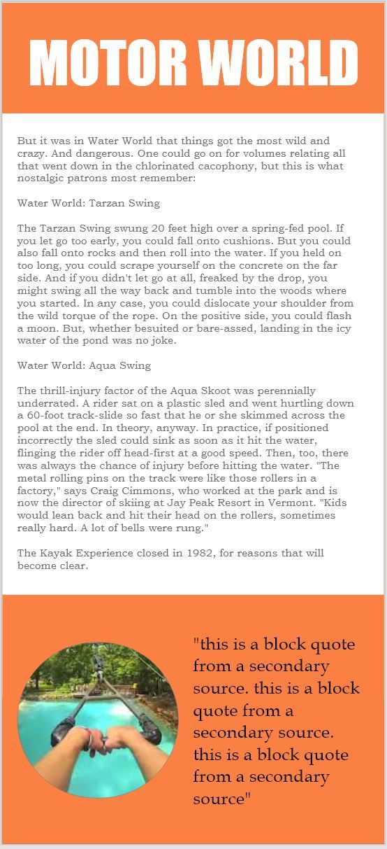
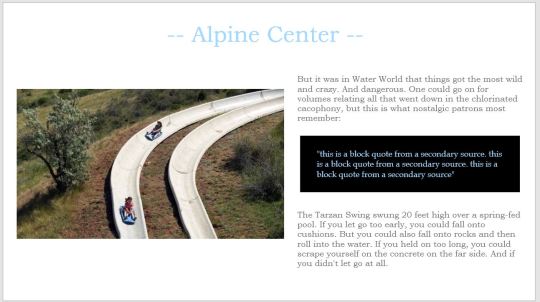
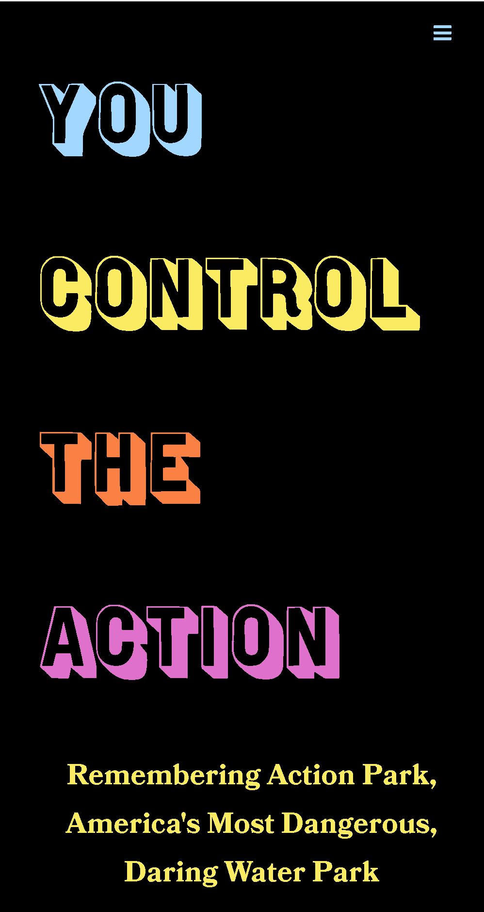
Remembering Action Park, America's Most Dangerous, Daring Water Park“You control the action” - video of a guy swinging, 2) Action Point Interview with Johnny Knoxville2. Have trailer and stats on the side (reviews, box office, budget) 3) Alpine Center (Alpine Slide) 4) Motor World (bumper cars, speed boats, etc). 5) Water World (Cannonball Loop, Tarzan Swing, Aqua Scoot) 6) Tragedies and 7) Legacy of Gene Mulvihill.
We looked to Action Park maps, commercials, merchandise, stickers, and accounts of fearful, true stories to better understand the world of Action Park. Our pull quotes came from the Mental Floss article and the rest of our inspiration is linked here:
https://www.mentalfloss.com/article/536412/action-park-water-park-oral-history
Action point logo
Bloody Action Park
Action Park Logo
Funny t-shirt
https://www.youtube.com/watch?v=VKWJpFEJw9M
https://www.youtube.com/watch?v=4r6bOaJ4ww0
https://www.barstoolsports.com/newyork/this-13-minute-short-film-about-how-action-park-was-the-most-dangerous-amusement-park-ever-is-damn-near-must-watch-for-people-in-the-tri-state-area
https://sometimes-interesting.com/wp-content/uploads/2014/02/vernon_nj_postcard.jpg
https://sometimes-interesting.com/2014/02/07/action-park/
Part 3: Style Tiles
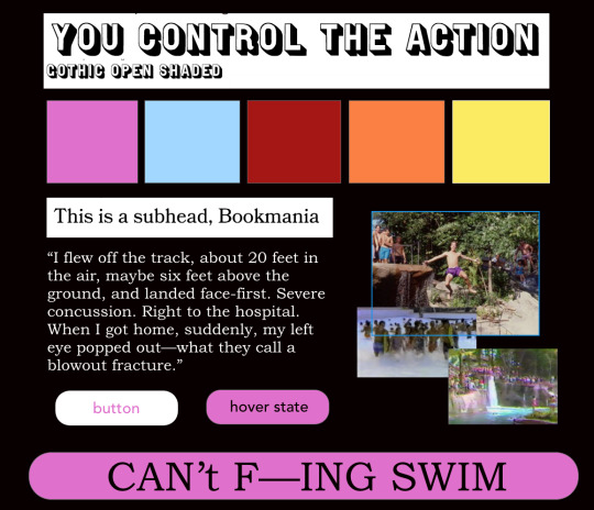
This is our original style tile. We wanted to mimic the chaos of Action Park with an 80s style of a black background with vibrant colors. We felt this mirrored the saturation of older images and spoke to the madness that the park was. After class commentary and early coding stages, we decided to stick with this theme.
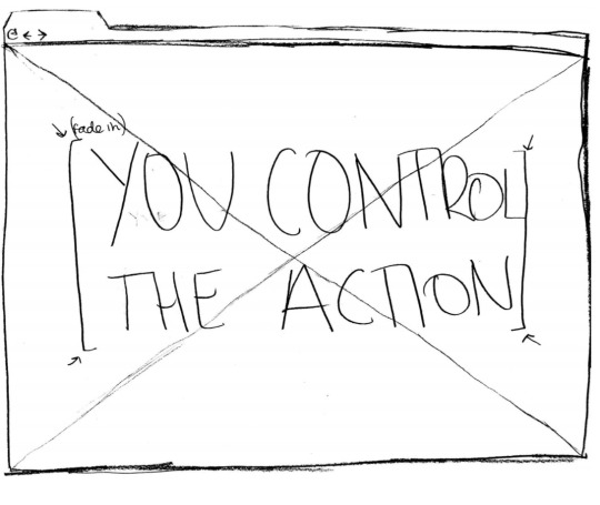
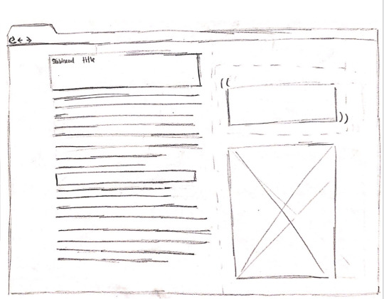
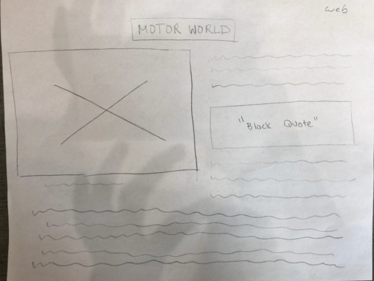
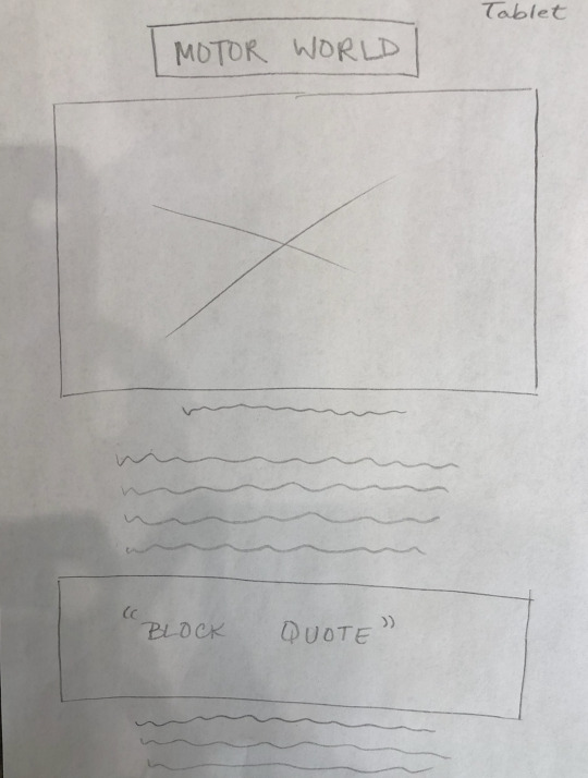
Early wireframes for this style tile are pictured below. As you can see, we attempted to incorporate fade-in animations, a video header, and split right and left sections. Notice we carried over a video header and fade in animations, but modified the left and right split.


This is our second tile, which eliminated the neon, 80s look and focused on a more blue-tone. As you can see, the font and pictures choices do not change much between the first and second style tiles. Although we did not select this style tile, we still incorporated different blue hues within the Parks and rides sections.
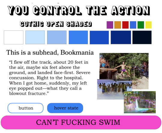
Early wireframes for our second style tile are picture below. The differences between the first and second style tiles are within the right and left alignments. There is more content separation between the text and images, which we did incorporate into our final site.
Part 4: Wireframes
Using the wireframes we had already created, we developed ones for desktop, ipad, and mobile. We focused on combining the right and left alignment patterns within one of our sections for this part. Such sketches influenced our digital mockups and wireframes.
Part 5: Digital Mockups
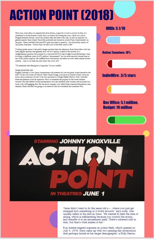
Throughout our process, we went through three rounds of creating digital mockups. The first image relates to our first style tile and focuses on a colorful theme. We utilized notions of the right/left alignment and pulling in extra content. After creating a full mockup, we decided to go with a different direction. We wanted to utilize a darker background to help the colors pop.
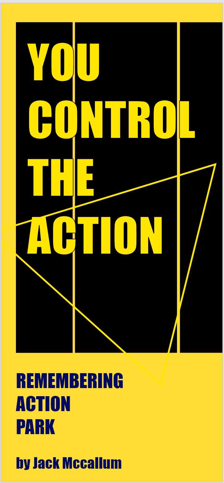
For our second round, we were messing around with different color combinations to make the site more chaotic and bright. While we didn’t end up using this color combination, we carried over the idea of a black background and bright colors. The yellow hue became a color in our final wireframes and site.

Our last wireframe, and the one we went with, is more in alignment with our original style tile. This layout incorporated a introduction with a black background which allowed the various colors to pop. The colors were then utilized throughout the site and related to each section. We utilized the right/left alignment after the introduction which was also one of our original ideas. Below is an example of mobile and desktop.
Part 6: Deliverables
This process led to our final deliverables. Below, you will find images of our final deliverables for mobile and desktop! We enjoyed working together and this project was definitely a challenge! Head to our site to see the final product!


1 note
·
View note
Text
Project 2 Interactive Site: Process Part III
Hello! If you are new to my blog, please refer to earlier posts to better understand my project process.
Next, I gravitated towards the first style tile that echoed notions of homework and notebook paper. My digital wireframe included a welcome page that then went on to explain each step of the process in detail. The main interaction was a quiz to test the user’s understanding. As each question was answered correctly, Aunt Sally was “excused” to the right. The first digital wireframe was an extremely basic front page and the more-developed wireframe is picture, too.


I then translated this wireframe to code and attempted to mimic the notebook paper sentiment. After receiving criticism during the user testing, I transformed my site to a multipage site to ease navigation and understanding. I, however, did not like how my site had developed and felt a lack of interaction with just having the quiz in my wireframe. I struggled with the html and css format and worked to strengthen the aesthetic of my site. A sample page from my wireframe is pictured below.


I did not like how my site was developing and did not like the format I had selected. On each page, I felt there was too much repetition and not enough varying interaction to hold visitor attention and engage in learning the order of operations. To solve this issue, I condensed each page to showcase as a module on the home page and increased the interaction with the inclusion of practice flashcards. This new format allowed me to blend the first and third style tile as I added more color and used the basic format of aligned content inspired from my notebook paper idea. After testing with classmates, the final site drives user interactivity better and entices them to learn the order of operations! I really enjoyed this project as it truly pushed me to develop a stronger understanding of css, html, jquery, and javascript! A screen image from my final site is below.


I hope you enjoyed reading about my process and project!
1 note
·
View note
Text
Project 2: Interactive Site Process Part II
Hello! If you are just visiting my blog, please refer to my latest post to understand this component.
After careful consideration, I selected working with PEMDAS for my interactive site. I liked the idea of designing for an audience of younger students and felt that PEMDAS is a comedic, memorable process from early education. Next, I developed a low-fidelity prototype of the PEMDAS site for user testing. I learned button identification and site navigation needed to stand out as my first prototype relied on parallax scrolling, an interaction I did not end up utilizing. Please view the video below.
youtube
Next, I developed style tiles to guide inspiration for my site. Each style tile has a very different vibe to it, but all pull from my memories of math games and math associated classroom exercises. The first style tile mimics notebook paper used for homework or practice problems while the second style tile mimics a chalkboard utilized within the classroom. The last style tile is inspired by math games from a various popular site when I was younger. Each were extremely colorful and echoed designs of word art. I knew that mismatching fonts and extremely bright colors are not well-thought design, but I was aiming for the nostalgic math sites.


0 notes
Text
Project 2: Interactive Site Process
For this Project, I designed an interactive site teaching visitors about the order of operations through the mnemonic device, Please Excuse My Dear Aunt Sally. I aimed this site at younger, elementary school students and worked to reflect that choice with my font and color choices.
BRAINSTORMING
Before selecting PEMDAS/The Order of Operations, I contemplated making a site about making pizza, conspiracy theories, fashion, makeup, science, art, recess, and music! In-Class brainstorming helped me refine my ideas and reflect on the exact steps of the processes I wanted to teach through my site. During my own brainstorming, I though of more school related concepts while class exercises pushed me to think outside the classroom space. Please refer to the images below for a more in depth understanding of my brainstorming process.


For six of my favorite ideas, I drew quick wireframe sketches to expedite my brainstorming.


WIREFRAMING
The next step was to select 6 ideas to wireframe. I drew about 5 wireframe sketches for each idea. The ideas were narrowed down to PEMDAS, making pizza, putting on makeup, how to play at recess, and how to play iSPY. The wireframe examples are pictured below. Each idea ventured into relatively different industries and targeted different audiences beyond the younger viewers I chose to design for. During class critiques, iSPY, makeup tutorials, and PEMDAS received the most praise.


After completing the wireframes, I looked at my three top choices of makeup tutorials, iSPY, and PEMDAs and determined what interactions I wanted to use that I did not know. A diagram of such considerations is pictured below.

0 notes
Text
Project 1 Process
For this project, I designed a digital poster showcasing the font “Bangers” created by Vernon Adams. “Bangers” is used in comic books and super hero based narratives. I wanted to echo the superhero and comic book aura of the font by utilizing bright, primary colors and a grid format.
The Images below served as my initial inspiration.


As the project focuses on letterforms, my inspirations transitioned to focus on visualizing sound effects. This process helped me select an exclamation mark as I felt it captured the superhero concept best.


With ideas of comics and visualizing sound guiding my design ideology, I strived to create mockups that mirrored comic book layout and content. I primarily focused on using grids to enforce the parallels to 1960s comic designs, with a focus the exclamation mark letterform.
Similarly, I worked to extend this theme into my visual analysis sketches and ideation. I developed both more geometric and organic solutions, but decided to go with odd shapes that matched the site’s theme.


My sketches are attached below.


I struggled with coding a layout that would call to mind comic book structure, and developed mockups that were too difficult to complete with my current coding knowledge. I developed more complex structures to increase the superhero-comic theme, but decided to follow a more simple layout.
My wireframes are below.


2 notes
·
View notes