
Don't wanna be here? Send us removal request.
Statistics
We looked inside some of the posts by jumpingthebaseline and here's what we found interesting.
Average Info
Notes Per Post
0
Likes Per Post
0
Reblog Per Post
0
Reply Per Post
0
Time Between Posts
21 seconds
Number of Posts By Type
Photo
3
Text
14
Last Seen Tumblr Blogs


Fun Fact
Tumblr has a 66 index score for customer satisfaction in the US.
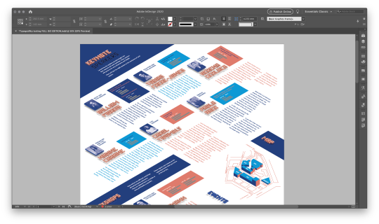
Photo


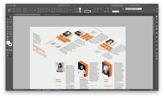
Final version of the publication
Recap & lessons I’ve learned
Don’t give up
Revisit old ideas
Explore
Throw out old work if necessary, but repurposing is better
There’s always an easier way to do stuff
What I’d do differently if I could:
Make better use of text wrap for spacing objects
Go straight into work instead of thumbnailing
Sleep more
0 notes
Photo


Figuring out the cover
Let me preface it by saying that it was a mistake to focus on the poster more than on the cover early in the development phase. It would not be satisfactory to just repeat the cover image there; but it also has to have a connection, which had been complicating everything for quite a long time. Attempted contrasting planes, hole fonts, even breaking the style and going full 2d - NOPE. Also, extending the marae onto the back cover doesn’t work at all :(
In the end, used a pattern out of the blocky title and put a coloured one in to keep the rhythm
0 notes
Text
Layout finishing up

Minor tweaking the balance

Panels breakdown: most of the content is there, not a lot broken down by the fold lines — especially not the photos!

The dark secrets of the checkerblock and green gap blocks for optic checking and straightening... they go in increments from 1 to 6, and one increment is the size of a single voxel (kept consistent through same scaling from the render to 13%)
tweaking the table
Cleaning up tables
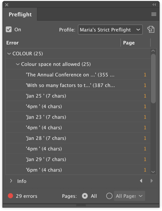
Preflight: found out that one of my colours was RGB all along! The horror!
THE LINKS CHECK (long, so hidden)


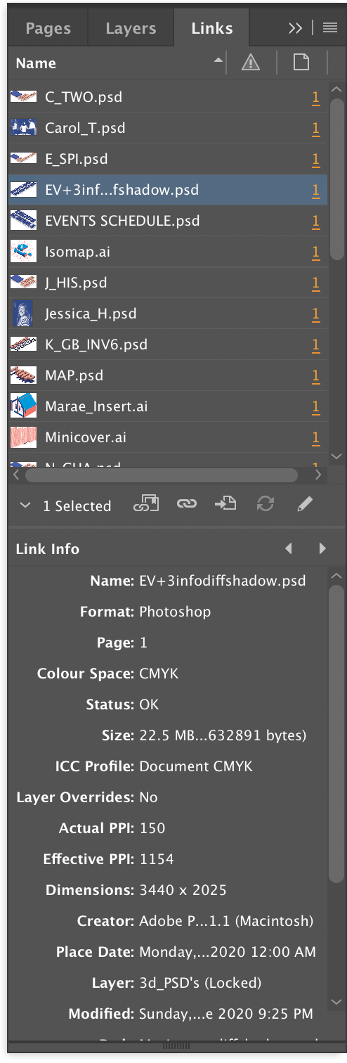
Final colours
0 notes
Text
New folds

Changed the folds layout to compensate for the thickness of paper. Now the columns are 92.5 + 2 + 93.5 + 2 + 2 + 93.5 + 2 + 92.5 — with 2 mils to accomodate for the crease (4 in the center to make room when the sides fold in), and with side columns being 1 mil less to accomodate for the thicker middle, when closed and prevent the sides from being blown out
0 notes
Text
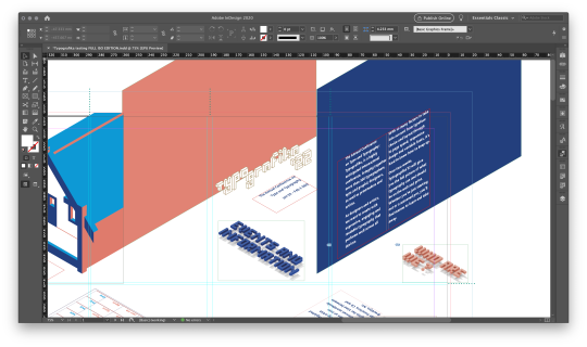
Poster side tweaking

Too parroty

Too clean

Good! Has rhythm, grabs attention,but also is evocative of the construction aspects of

Added a coloured side as George had suggested. Really brings in the depth, but needs severe balancing

Trying to balance the planes

Shortened it to 4, added missing text


More text, better balance, more scaled down
0 notes
Text
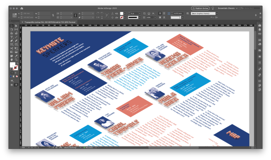
The table
COLOUR TESTING


Added building names for the keynotes


Final table in context: equal spacing, fixed chronological order and rechecked mistakes in times and dates
0 notes
Text
Inverted or not inverted

Overlay? Nice, but let’s test inverted just to be sure
Inverted is too dark and not legible


Boring-ish

Creates nice additional depth
0 notes
Text
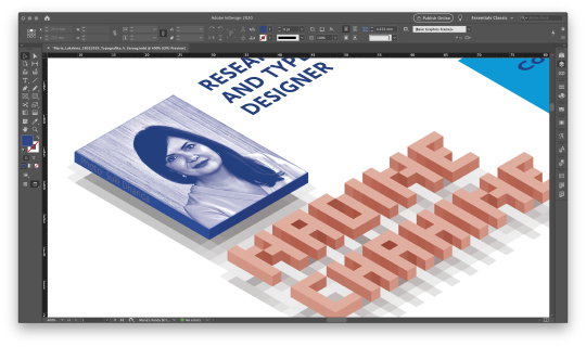
Photo change
Some speakers had their public domain/CC B.Y photos in an unsatisfactory quality, which called for a replacement under fair use.
Changed the photos for Paula Sher (https://www.monotype.com/resources/articles/type-mixtape-paula-scher, by Ian Roberts), Nadine Chahine (http://www.eyemagazine.com/feature/article/reputations-nadine-chahine, by Suki Dhanda) and Verena Gerlach (http://www.fraugerlach.de/about/, by Daniel Rodríguez)

Switched from grayscale to duotone to better accommodate the style

Slightly enlarged the background for some

Tested phototags; but they were too obstructive

Later moved the phototags to the other side; they are barely visible on 100%, but enough for the determined to find them

0 notes
Text
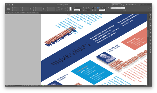
Layout OOFS
Figuring out the layout in uneven circumstances is... tricky.

Different direction of text is even trickier, it is not easily readable

Keeping the nameplates’ directions consistent, however, keeps it legible. Having the lecture table the same direction as the nameplate and the text - the other, also helps achieve another layer of separation for content: now the focus are the lecturers and their speeches, while their info is secondary.

The more of these are added, the more pronounced an interesting effect of closure gets — the first glance at the text is a bit uncomfortable, but the viewer gets accommodated to it fast, and suddenly the shearing stops being an issue, the page acquires depth, and the text is perceived as existing on a singular plane.
At this point the decision to completely forgo the panel grid for the details page is made: basically, a sacrifice of a degree of legibility for the wow-effect, integral for a typographic conference (as typography is about the oscillation between following the rules and breaking them).

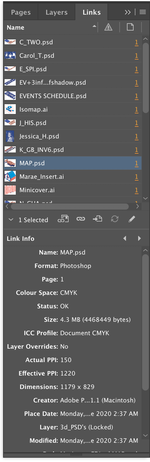
This is also the point where the recolouring of the Marae and map is happening; decided against the gradients though, as they muddy the style.
Tried more 3d-ish looking shading in line (hehehe) with the lineart– but not a huge fan, too pink

Colouring consistent with the shading on the cover wins!

One exception to the Verena’s table - it’s in the same direction as her text as it wouldn’t fit otherwise

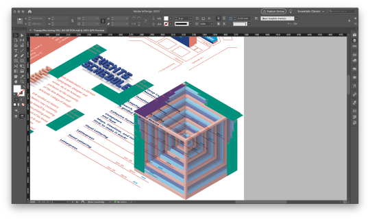
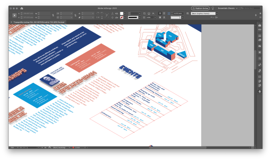
Bottom layout blocking-in

At this point there’s a severe problem: due to the limitations of the indesign guides compared to illustrator’s ones, there’s no way to have a snappable isometric grid... So here’s the painful checkerblock, scaled to size and made for checking the alignment of all elements and gaps. (later I found a way to at least partially control the gaps through the text wrap/text frame settings/paragraph offset, but the initial measurements were taken off the checkerblock... I am not proud of this crutch solution, but it was necessary).

Another element that helped with consistency was that all of the elements were originally made fit into a very rigid grid of 8 mm squares with equal gutters, so it was way easier to keep the sizes consistent across all elements


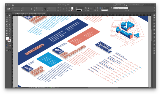
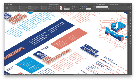
Putting the header of the map in

Putting the headers and streets ON the map


Blatant cheating with the parking symbol hehehe (before optical centering, of course)
0 notes
Text
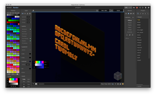
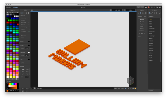
Voxel post-op
Since MagicaVoxel doesn’t have controllable zoom, the pipeline would be extended — by not using zoom at all and keeping it on default, making alterations to the text by copying it from a separate document into a dedicated render one, it was possible to keep the sizes of the nameplates identical while rendering in 4000x3000 px.
Another process moment — BG is not white enough. So... clearcutting.
Turning this...

...into this, also dulling down the colour into CMYK for softer pages. A good tradeoff as the RGB version is too salmony.

Made an action to be triggered after everything that’s not needed is magic wanded completely
0 notes
Photo


Colour development, or How to steal a colour palette
Was searching for a colour to change to, as bright orange was conflicting with the bright blue and red shading of the cover. Woke up to the Communication Daily’s newsletter, containing Map Irish Design article (https://www.commarts.com/webpicks/map-irish-design) — and it was perrrfect. Took the main working colour combo from there (BECAUSE YOU CAN’T COPYRIGHT COLOUR), scrapped the supplementary colours and and adapted everything into CMYK, changing the colour values to make them darker.
Then tested it out on the nameplates. dark Blue plus pink for the win!
https://map.100archive.com/

Yep, homing in on the look!

Looks like all nameplates going the same way is better... Could also distinguish the text on a speaker-by-speaker basis by colour-coding it with the lecture tables!
PRODUCTION TIME!


Made Tobias’s nameplate 2 lines for the sake of consistency with others and ease of layout
K, names done. Time for headings!

testing out inversion and the look ... eh, nope, too flat

Naaaah too dark

Better

Nope
No, no verticality

Not legible


Also - some kerning, while we’re at it

... nope

too flat

Close


Close!

Not bad, but needs more depth

perfection
0 notes
Text
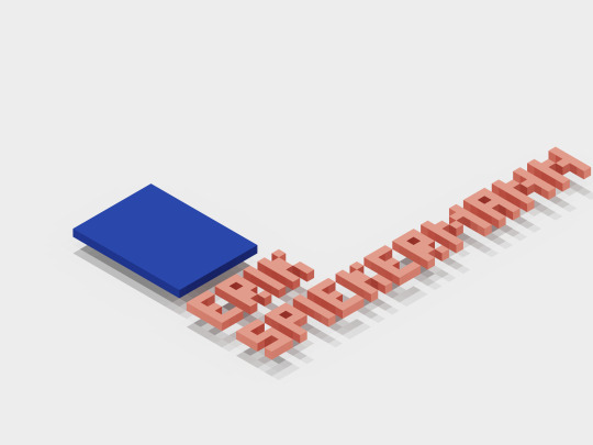
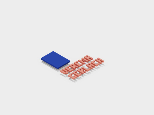
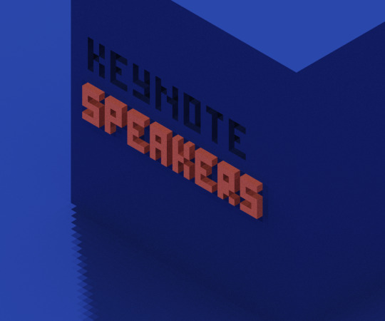
VOXELS
Another cheat: why not instead of drawing the names just make voxel renders and edited them to fit the document?

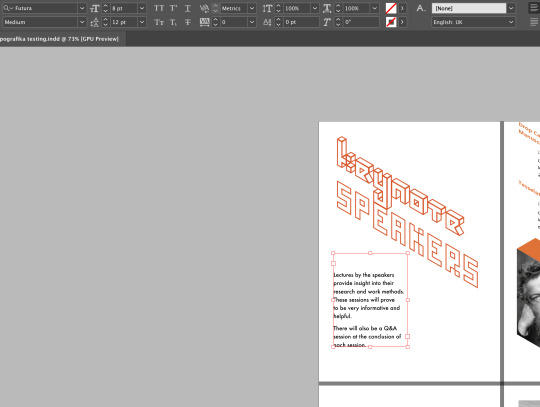
Creating the upper case font based off the SPEAKERS isometric line lettering from previous wireframe tests. Later changed N’s to be a bit bigger, but whent back on that.

Lower case font - too small

Rendered font in vertical orientation.

The bottom orientation actually looks more promising, huh. Thankfully, it’s in 3D and no need to redraw everything if you want to change stuff. PRESERVES SANITY.
Testing 3D platforms for photos: why not?

Strong and dispersed realistic shadow looks... weird

Too small and too flat for my liking, but we’re getting there

Pixelated shadow — GOOD.

Testing the single plane idea: YES, it’s the right direction! readable and clean

How about more like this? YEP. But different facing pictures are confusing. Also, hard to balance.

Ran a lifesize printtest on an A4 to check to legibility. Works! Greenlight

Also, Tobias is the only one with three lines. And another problem — exports with weird gray instead of pure white BG, and changes colours because of lighting

Trying to figure out the placements
0 notes
Text
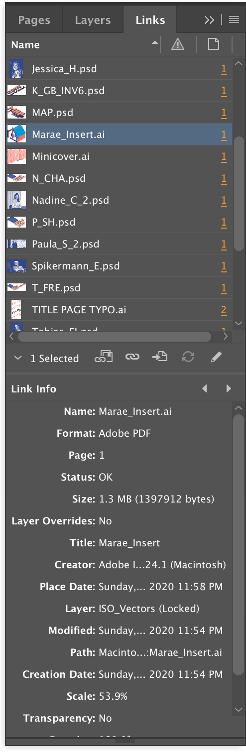
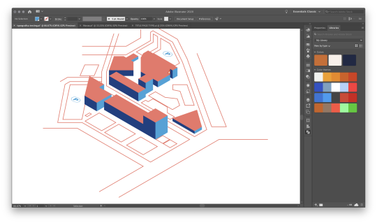
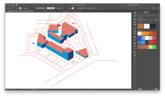
Marae
The “join us page” really needs a marae!

Sketching: long and boring, too time-consuming, and I have to redraw everything if I want to change the prespective. Something must exist out there to speed things up

Cheating isometry by creating a voxel model in Magicavoxel (free editor and renderer). The idea is to create a model in isometric perspective, snap a screenshot and trace over it in illustrator

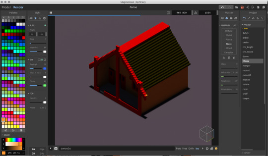
Too dark of a render :(

Fixing the model

renders just for fun

Changed the colours for easier tracing

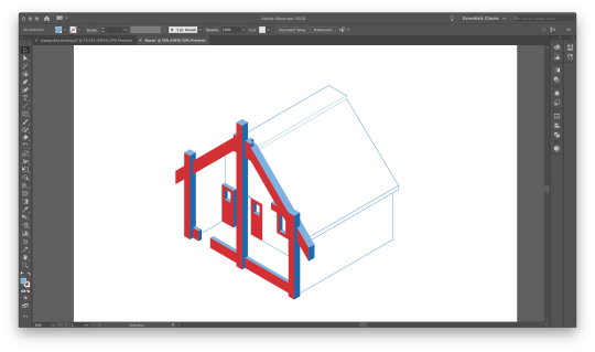
Put it into illustrator under a grid

Tracing overlayed on top of the model

Don’t like the jagged edges

Changed to slanted — fits more with map this way?
Tried recolouring it in line with the cover’s accent shading

Also tested out just simple colours


Maybe just use it as it is? Also, whoops, just realized that I’ve lost the bar on top of the doors in lineart. Whooops
0 notes
Text
Typography cons research
https://2020.typographics.com/
https://typefacts.com/en/links/typo-events
https://www.ico-d.org/connect/events/events/918.php
https://www.typecon.com/
https://www.atypi.org/
Same conflict as in the posters: form versus the function, minimalism versus decoration.
Seems like the audience of typographic conferences enjoys both strict organisation and pure breaking of the rules.
Overall, the best directions to head on would be going for the construction aspects of type and its digital nature despite the physical past
0 notes
Text
Breakthrough

This draft is the corner stone of the entire project (don’t mind the numbering problems lol). After the 1 on 1′s and some twiddling with the old paper 4-column foldout test from the first class, a revelation came: what if I stopped treating it as 16 panels (or, well, 4 and 12), but in the order of their appearance — so it’s front cover, back cover, opening spread, first foldout strip and then the full spread and the poster side. Testing on flatmates had confirmed that noone opens it strip by strip, rather goes straight to the full spread after the first.
The subsequent revelation was the following: if the biggest problems with isometric layout was the problem of balancing the conflicting 3d planes and the lack of legibility of vertical text, as one has to keep switching persectives and it’s confusing: WHAT IF IT WAS A SINGLE PLANE, BUT WITH 3D ELEMENTS ON IT?
And, well, the third revelation: figured out the priorities.
Our proud ship does not give in to the enemy, and no one is wishing for mercy.
youtube
0 notes
Text
Thumbnailing+Grid tests

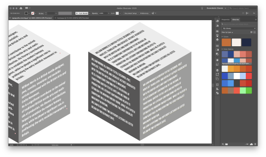
Full isometry begins with finding a font that actually works with the blasted thing, so made a cube with texty sides (1pt2) and placed it in context

Nope, too small and unreadable

Hmmm nope
Nope

NOPE

nope

nope
nope :(
Thumbnails
Trying out different arrangements of isometric text blocks: since constructing everything digigitally with the SSR method (Scale, Shear, Rotate) is long, tedious and nearly irreversible.

Has some promise, but the text boxes are so much longer

A very difficult to implement multiple planes version - problem is, gets confusing fast —what facet relates to what speaker? Nah, ain’t working
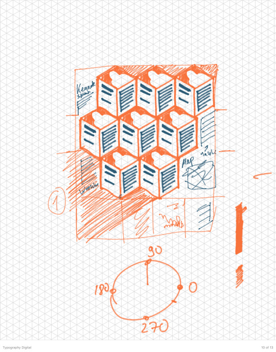
Option “Hive mind” - full blocks and a 3d-ish general outlook. Could work! text still an issue though
On another 1 on 1 George had recommended to drop the isometric idea on the back side whatsoever, because it is too hard to implement :(
0 notes
Text
Testing and 1-on-1 developments

A possible poster side main item: just repetition of a wireframe title.
Looks a bit like a burger wrap, though.
DETAILS PAGE TEST
For the body — testing out if it’s workable if only the photos and big headers are 3D.
TESTING FONTS

Not bad, but too condensed. Also, italics conradict

Mmm nope, too condensed

Going there... slooowly...
Too round for all the blockiness

Japanese font. Not bas, but something’s still off

Mono isn’t bad, aye... but too spaious, the back side won’t handle it all

Deva Ideal from the first prototype. Has some dignity
LAYOUT

Middle stage of layout testing. Just trying to rework the old grid for now for the new style

Working out placements of map and workshops blocks

Oh god.
Oh no.
No skewing photos on a vertical plane with a cutout

Better... but still no.
Office hours
At this point went up for office hours with George, who had proposed to get rid of the strict grid on the back entirely and go full isometric — which is difficult, but could work

(thumbnail by me and George from the 1 on 1)
0 notes