
Programmer, extremely gay trans girl, probably the hottest girl to ever live..
Last active 3 hours ago
Don't wanna be here? Send us removal request.
Statistics
We looked inside some of the posts by junipertheory and here's what we found interesting.
Average Info
Notes Per Post
49K
Likes Per Post
28K
Reblog Per Post
21K
Reply Per Post
54
Time Between Posts
3 days
Number of Posts By Type
Text
17
Last Seen Tumblr Blogs


Fun Fact
Tumblr was acquired by Yahoo for $1.1B in 2013.
Text
DUDE WHAT THE FUCK
found a wild new snurp garden exploit dm me for details
7 notes
·
View notes
Text
found a wild new snurp garden exploit dm me for details
#not gonna post it on main so i don't get banned#snurp.garden#snurp garden#i'm gonna win this arena run so hard lol
7 notes
·
View notes
Text
Tried the new snurp growth meta that’s been going around and honestly i don’t get it. Yeah you pretty much skip the hatchling stage but you spend just as much time forgaing org nuts so like??? What’s the point??? I’m just gonna stick to the 1.2 strat
5 notes
·
View notes
Text
Add me on Snurp Garden©️ for 25 free Snurp Nests! http://snurp.garden/
37 notes
·
View notes
Text
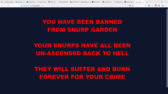
PSA: MASSIVE SNURP BREACH
TL;DR: IF YOU HAVE EVER PLAYED SNURP GARDEN, YOU NEED TO CHANGE ALL OF YOUR PASSWORDS NOW, BARE MINIMUM
ExxelionSoft, the company that owns the popular mobile petsim Snurp Garden was storing all of its client data as unecrypted plaintext, including emails, usernames, passwords and payment information (!!!), and hackers got access to it and made all of it public. You can check this pastebin to see if you were affected, but to be safe if you are a longtime snurphead, it's safe to assume they have everything and you need to take drastic steps to protect yourself. You should change all of your passwords, check your transaction history and maybe freeze your bank account, castrate yourself, and prepare to hear that your identity has already been stolen.
EDIT: I know I'm coming off as really alarmist in this post, and you might think it's not that bad, but I found some news articles about the snurp situation and it's way worse than even I said. Stay safe out there, snurpheads.
139 notes
·
View notes
Text
They added lore to the tooltips in patch 1.3? So I guess we’ve been helping Snurps achieve gnosis this entire time? Kinda casts the end of the tutorial quest in a new light
33 notes
·
View notes
Text
Hey Look At This... Comic? The Timekeepers of Eternity


Motion comics were a bit of a bust huh? Oh, there's examples here and there, especially when talking about independent weirdo hypercomics, of works that incorporated motion convincingly and compellingly, but most corporate offerings amounted to taking still images and having their panels slam across the screen, pile on top of each other arbitrarily, or fade into view one at a time accompanying voice acted lines--the worst of film, comics, and audiobooks combined. Easy enough to explain: paying people who work exclusively in print comics to do (or adapt) a "motion comic" just isn't going to result in much latitude or incentive for bold formal experimentation, nor does it play to the training of the artists handed the task.
On the other side, there's the real structure perverts, mad scientists of comics. They face the same problem as every other avant garde artist: how do you get paid? Where does your audience come from? Criticism for comics in general is underdeveloped; criticism for webcomics and hypercomics even more so. Launching what by necessity must be a more fine arts oriented career in what's still widely understood to be mass market commodities seems daunting, as does coaxing a mass audience out of its comfort zone.
It makes some sense, given all that, that one of the best showcases of the potential of motion comics would come not out of comics itself but the weird and heady film fan edit scene. Blessed with an abundance of material to work with (especially in the cases of franchises, miniseries, or films with extensive cut content or rereleased versions) fan editors have a latitude to screw around without having to produce a bunch of raw footage or drawings themselves (though, the nature of enthusiast projects does inspire people to do things like, say, redo all the special effects from Alien3).
There's certainly a mountain of frames to work with in the Langoliers miniseries from 1995. Probably an overabundance, actually. That's great for Aristotelis Maragkos, though, whose recut of the miniseries into the tight hour long experience The Timekeepers of Eternity needs a lot of raw matter.
I actually mean that literally: Timekeepers is a film produced by physically printing out photocopy versions of the miniseries' frames, manually altering them, re-photographing them, and re-cutting the audio to fit the new narrative. Its runtime is partially achieved by layering scenes onto each other, so actions happen in parallel, or characters expound on a subject while a pan of the environment fills in detail. Sometimes, astonishingly, footage of cloudy skies becomes an abstract 2001 style gradient as characters get lost in their own thoughts, or staring eyes from a close up rip eerily into a shot of a still landscape. What another compressing edit might discard, Maragkos collages back into the frame in unexpected ways.
This could be just a fun gimmick or novelty, and can occasionally come across as just a fun flourish on an otherwise kind of awkwardly acted and plotted original. But just as often Maragkos finds incredible possibilities in the strange hybrid medium. There's a shot early on of Toomey, the murderous time-obsessed business boy going through a breakdown, that blew my mind and immediately convinced me of the film's vision. Toomey, who pitched a tantrum when the plane failed to reach his board meeting in Boston, gets his nose nearly broken by another passenger. Outmatched, he retreats, resentfully, turning and walking back through the plane. As he does so, the film tears, creating a multiframe of instances of Toomey looking back, petulant tears in his eyes.

What happens when you turn a film into a comic in this way? In a static comic, splitting up this action into a series of "prolonger" panels helps clarify small movements and draw out the action, but in a film that's not really necessary. we can just watch that sequentially in time, like we do in real life. What else does this breakdown do in a comic? It can heighten a moment, suggest a psychological intensity, a kind of distending of time or hyperreality. Isn't that exactly what's happening for Toomey? He retreats, literally--we watch him do it. Yet he remains in place simultaneously, staring, seething. He might physically go, but psychologically he is still rooted in place, boiling over with anger at his rough treatment.
Shortly after this scene, we discover the textual rationale for Maragkos's bizarre aesthetic endeavor: Toomey has a bizarre tick of his own, am almost eroticized need to stim by tearing and shredding paper. As he sits and stews after another confrontation with the rest of the passengers, he tears at a magazine, and the screen tears too, layers of the frame peeling back to reveal other elements of the scene, so that his tearing becomes the ubiquitous context for the other characters talking about him and around him.

I have a lot more to say about this one so I'll cut the review short here and you can read the rest on my full blog. You can also read the rest of my Hey Look At This Comic reviews on tumblr, and support me on Patreon.
33 notes
·
View notes
Text
demon's souls being pitched originally as a competitor to oblivion is so funny. imagine being sony and you swing by the fromsoft offices to check in on the tes killer they've got in the works for you only to find you they've given the keys to the armored core 4 guy and he's got them cooking up some sort of unplayable mutant and this fucking thing is the version of the project that's actually shippable
9K notes
·
View notes
Text
I'm so very, very excited to be streaming today... the BRAND NEW EXCEPTIONAL STORY for the web mmo FALLEN LONDON, written by my GOOD FRIEND HTHRFLWRS, creator of MEATPUNKS
We're gonna play through (or as much as I can get through) and talk about it! No prior FL knowledge needed! Come watch!! bimbo.city
twitch_live
10 notes
·
View notes
Text
Hey Look At This Comic: Quincy
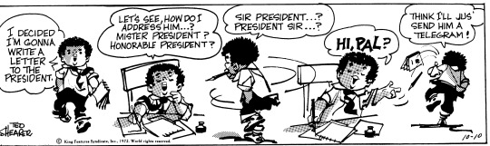


I can't remember the exact jumps it took me to get to Quincy. I know the starting point: Randy Milholland's guest appearance on Behind the Bastards for a couple episodes on Dennis the Menace. guests on that show tend to be a bit of a live studio audience, there to go "wow" and "yikes" and "[noise of discomfort]" at the right moments. not Milholland, who knows his comics history. boy, I would listen to a whole podcast of him just talking about newspaper strips! anyway, I don't think he mentions Quincy while talking about integrated casts in newspaper comics, but someone he did mention sent me off on a search and someone else mentioned Ted Shearer's Quincy, and well.
you can see, right, why this comic Got Me so fast? what a cartooning style! I'm not going to dwell on Shearer's history--you can read the Comics Journal article on him just as well as I can summarize it. I want to talk about how Shearer draws.
it's hard to do that without reference to other comic strip artists, in particular, standing as foils for Shearer's style. Ernie Bushmiller of Nancy fame is maybe the paragon of an ultra clean iconic style, where everything is almost like the platonic cartoon of what it is. (I've seen Schultz placed in this tradition as well.) not Ted Shearer's work. everything's got little flourishes and elaborations and bends and variations in outline. his comics jiggle. there are times when I'm not totally sure at a glance what his marks are meant to represent, which is a problem if you think the highest calling of comics is to relay information clearly, and a lot less of a problem if you're in love with the sheer artistry of mark making. look at that snowball fight comic, for example, and the wild mess of lines, or the way Quincy's shoes and socks are sketched, in the last panel of the letter to the president comic, with just a few confident pen blotches and a bunch of negative space. even when it's economical, it somehow feels so unsatisfied with the schematic, always searching for a way to make the objects feel a little off kilter, a little dynamic.
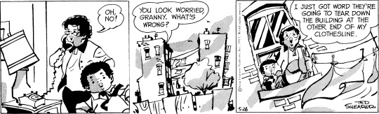
check out that first strip there, the one about where Quincy's granny frets over the neighboring building getting demolished, because it's crucial infrastructure for her clothesline. I just paged through a collection of Bloom County I have cause I was like, well Berkley Breathed has pretty dynamic panels too right? nope! Bloom County has a dynamic brushed style that feels similar to Shearer's style, but the panel compositions and the arrangement of characters and camera and environment are typically much more static. even Calvin and Hobbes, aside from the often completely crazy sunday strips, tends to have compositions that might employ a closeup or a distance shot, but tend to have relatively cohesive shots. this three panel strip starts with a panel where Quincy, instead of standing static, listening into the phone call, seems to pop in from the left, tie fluttering with movement. (also, scope the nice tilt on that lampshade, echoing the angle of Quincy's body!) panel two seems to pull out to an unmotivated ultra long shot, that not only gives us the apartment buildings but the fence partly blocking the view! Quincy's environment is so packed that there's no room for the kind of clear view of a building you might get in a Nancy strip. and then the point of that long shot is revealed in the final panel, a CRAZY dutch angle on the two leaning out the window towards the other building, as Granny reveals the other side of her washing line is going to get torn down. to accentuate this, the sheets on the line billow, again at an angle counter to the window, Granny, and Quincy.
Shearer seems never content to just have a series of characters in situations talking to each other. his viewpoint is always swinging around, his characters always turning to show new angles of themselves. the letter comic here is the most conventional strip of the lot and even this has only two relatively similar poses. all three standing poses are in wildly different positions and angles, front, then spinning to the side, then back, tilting left, tilting right.
he also has this tendency to have characters pop up almost as though they can see the camera. it's not enough that a straightman in Quincy should turn to the audience--they tend to pop towards the foreground. in that clothesline comic, Quincy doesn't look to Granny but to us, as though inviting us to join him in wondering about the phone call that has Granny so worried. in the composition of that circus comic, Shearer finds room for the characters, despite the size of the animals, at the borders of the comic, and is willing to embrace way more pronounced perspective than I'm used to seeing in daily gag strips to do it. look at that kid just sorta peeking over the bottom edge of the frame in that last panel! there's other comics of his where inexplicably another kid in Quincy's class, for example, will just pop their head up in the last panel, somehow accentuating the punchline with their non sequitur appearance. like real kids, Shearer's kids are unruly. like a real poor urban area, the very material of the landscape is unruly.
that TCJ article lays out what Shearer's motivation may have been, for such a vibrant and lived in strip:
"My first idea is to get people to like Quincy, to get them involved with the character, and then they can see for themselves the broken-down home, the torn sneakers, etc. Then perhaps readers will say, ‘Gee, maybe we can help.’ Or even the poor white can say, ‘Gee I went through this same thing myself.’"
that approach can only work because of the detail Shearer's panels overflow with. one more comparison: don't Shearer's landscapes sometimes feel a bit like George Herriman's wobbly, shape-filled landscapes in Krazy Kat? just, less weird cacti and more scrungly fire hydrants and snaggle-toothed fences. the move from panel to panel doesn't always make diegetic sense, much like the landscape moves around Krazy, but it's so lush that in total it creates a place that feels lived in, enough that it still connects with me 40 or 50 years later. that seems a testament to Shearer's strategy, and probably has some lessons for the Clarity of Communication school of comics theory.
it all adds up to a work that should be in the pantheon right alongside someone like Bill Watterson. I don't think I've ever heard anyone talk about Shearer, though. the broadest history I have--Harvey's Art of the Comic Book--doesn't cite him; nor Wolk's Reading Comics. like a lot of histories, Gardner's Projections loses track of newspaper strips sometime between the rise of Stan Lee and the rise of Comix With An X. some of that's the way the history's been canonized, but some of the way the history's been canonized is surely due to institutional racism and the pinning of the modern Art History of Comics on white men like R Crumb.
what Quincy deserves is a way of following it now... but that's not an infrastructure I can imagine anyone is interested in building. sites like comics kingdom or gocomics have snubbed rss technology for presumably the same reason social media increasingly gates all content from non-users: gotta juice the numbers and make sure direct access is the only business in town. which is sorta bizarre when it comes to a strip like this because who is signing up for a comicskingdom account, sitting down, and reading through a decade of Quincy strips? if they're already just putting the lot online for free (which, hey, I'm grateful for that, especially from a historical access perspective!!), why not set up a way to cycle through that history in a feed, shipping out the strips in the format they were meant for: something you'd see daily? but, I'm the weirdo who thinks basically the whole internet should be embracing a more broadcast syndication model. at least the comics are readable online, which means that maybe bit by bit Ted Shearer's work can get the wider cultural attention something this virtuosic deserves.
this post originally ran on Cohost on Jul 31, 2024. you can read more reviews in the Hey Look At This Comic tag and support me on Patreon.
67 notes
·
View notes
Text
streaming my favorite thing to stream: funny weird lego sets from companies that aren't lego!!!

come watch owo
twitch_live
1 note
·
View note
Text
Hey Look At This Comic: Calvin and Hobbes
I liked the idea of putting some more daily strip comics into my rss reader, and gocomics DOES post old strips in sequence every day (keeping archival materials in lively circulation 👍), and there IS a site that generates an rss feed for gocomics (they don't provide rss feeds themselves because they want you to subscribe 👎) so, I added the current Nancy run to my feed, alongside Peanuts and Calvin and Hobbes. a few days later it paid off big time with this strip:

I love this strip, but it's a bit weird, isn't it? I'm sure some people read the way you're "supposed to" move panel to panel in a typical comic: left to right across the top strip, then the middle, then the bottom. Easy. I didn't, though. My eyes darted across the page, circled around the upper left hand panels, before zipping to the big point of interest on the page: that big panel of Calvin's teacher as a great pink alien monster! the second panel in strip two, the view through the spaceship porthole of the alien landscape, got orphaned, turned into something I glanced at after the fact as I pieced the sequence back together.
which might just be how comics reading actually goes, in practice. more recent theories of comics, particularly ones coming out of the Franco-Belgian tradition, suggest we take in the page as a whole first before diving in panel by panel. that bottom left corner is also kind of a privileged position on the page, with a beautifully lumpy and toothy monster filling up almost the whole frame. no wonder my eye was drawn there "ahead of sequence"!
is that a mistake? one of my friends, when I posed the question, thought so, that the strip means to build up to that point but the page composition encourages you to read ahead. She also, intriguingly, suggested to me that even though we enter the strip seeing the whole page, we induce a kind of forgetfulness in ourselves so that we don't get spoiled. when we see the monster, do we already know it's there while experiencing it for the first time? (hypnosis, she suggested to me, is "merely a set of circumstances to help the mind do a set of things that it already does every day".)
others corroborated the weird reading orders but suggested it was deliberate. for Sarah, the whole left side of the page draws your eye down compositionally, from Spaceman Spiff's (Calvin's alter ego) gloved hands on the wheel, down to the Z shaped mesa, to the monster. this cuts out almost two thirds of the comic! but for her and a few other friends, that made sense: Calvin is daydreaming in class, and the point where his teacher pops up in front of him to demand his attention is a moment of concrete interest in a hazy sea of nonlinear sensation. another friend drew a diagram of an even weirder reading pattern:

actually, I think this makes some sense. theorist Thierry Groensteen's notion of "braiding" in comics suggests that we're constantly recomposing comics in our brains, not just panel by panel, but over the whole corpus of panels, looking for rhymes and resonances and ways the story relates to itself. it feels a little like panels 2 and 3 rhyme, to me. the frames are long and thin more than any of the others, they both have this prominent horizon line, and they both sit on top of panels 4 and 5. they relate to each other, to the point where I see how you could jump from one to the other, then back up the page and over! if I understand Groensteen right, he's not suggesting we necessarily jump around the page this way, I don't want to put words in his mouth, but I do think one of the implications of braiding and of taking in the whole page is that we might get off track and start wandering through time and space... which is exactly what Calvin is doing, after all.
I love that the actual joke of the strip hinges on these two little panels buried at the bottom of the page: the only shot not from Calvin's point of view, of him looking frazzled after Mrs Wormwood's dressing down, and then a little panel of him holding the book. that's braiding too: we understand the previous and future panels because we draw an analogy between all the perspectives we've seen elsewhere of hands (or claws) and get that Calvin is drifting into a daydream again, taking on a new role. the scenario shifts, and the color scheme changes to a complimentary one (red to green), but both daydreams are much more powerful, on the page, than the interruption by reality.
how do you read the page?
you can read more reviews in the Hey Look At This Comic tag and support me on Patreon.
253 notes
·
View notes
Text
Streaming brand new game Drop Duchy!

It's a brand new roguelike-deckbuilder-tetris-amalgamation monstrosity that just released on steam! I fuckin love games like this, and adored the demo. Expect this to be the first of many runs. Come watch! bimbo.city
twitch_live
0 notes
Text


Hey Look At This Comic: The Nib
the kind of essay comics published in The Nib (now sadly defunct) tended to lean towards illustrative panel contents. in a lot of their comics, the images show, basically, what the text describes. it's a way of producing comics that emphasizes clarity of information delivery and tends to have some level of redundancy, with relatively straightforward metaphors. one piece in the "color" issue by Erlend Sandøy bucks that trend in really extravagant fashion. the comic goes against an awful lot of conventional advice about clarity of panel layouts, often choosing sprawling nonlinear layouts or notional strips that run from top to bottom (see the two pages above). the metaphors also come thick and fast, and although most are straightforward there's enough just happening on every page that it enforces a kind of slower exploration of the details.
like, I love the way color (fittingly) and composition work in the fourth page. the smiling bike riders in the bottom catch me, they're discordant with the primary subject of the page--the failure of green parties in coalition to enact their plans and stick to their promises. what's harder to see at a quick glance is the third bike rider who's careened straight into the smog that makes up the frame. it's obscure enough in the print that I totally missed it and put my big dumb fat fingers over it when I was taking the photo! 😩 it's a fun little trick cause it takes the frame, which I think tends even when representational to recede into the background, into another area of panel content. but more than that it brings into sharper focus the overall rhetoric of the page: that green movements have achieved mainly small areas of apparent natural recovery, pushing the deeper structural issues to the margins of discourse. those issues are, however, inescapable.
(I do think the bit about the german greens totally failing to reduce coal power but succeeding in banning nuclear power is quite funny, like gosh do you think those two facts might have some causal relationship? ha ha oops)
the sprawling nonlinearity is also really well suited to a page like the overview of the countries where green parties hold power, which IS a sprawling, informationally non-hierarchical subject. how the reader navigates this page doesn't matter, and it's nice to see someone breaking from the McCloudian/Eisnerian focus on the sequence as be all end all. more than that, though, I just think it's clever and charming! What a good looking gosh darned page! composing the globe out of foliage and having pop-out informational panels be branches with their own leaves? it's great stuff, a pretty immediately graspable visual device that's both pertinent and super flexible. there's all these interesting little details--like look at the ballots flowing out of the US like leaves stuffing that ballot box, juxtaposed with the text pointing out that first past the post means all these votes go, essentially, into the void. the image doesn't make that last bit clear, and the text doesn't spell out the leaf metaphor, it's a gestalt. that's comix, baby! awoo!
the whole coverage within this comic in particular feels like a very even handed account of the green political movement's achievements and also some of its ideological failures--again, often conveyed not directly through fairly neutral text but instantiated in the art itself. it's just one of a number of comics in this issue that feel bold and experimental, and when I first wrote this review in 2023 I suggested picking up a copy of the Color Issue. in fact, it looks like you still can--I guess that must be one issue that remains in stock. but The Nib itself is no more and most of its issues, including gems of experimental documentary comicking like this, are out of print. thankfully, on the way out founder Matt Bors decided to put the entire collection onto the Internet Archive. you can read the color issue there.
this review originally ran on Cohost, Thu, Feb 23, 2023. I am porting these reviews with minor editing over to Tumblr and eventually to my own website, because websites and periodicals may die, but comics are forever.
41 notes
·
View notes
Text
she's MIDDLE AGED she's DIVORCED she hits people with GIANT HAMMERS she has a WEIRD RELATIONSHIP WITH GOD she HAS A SQUAD OF SILLY GUYS she's tormented by HORRORS BEYOND HER UNDERSTANDING and most importantly shes BUTCH. i didn't say a name but she popped into your head didn't she
39K notes
·
View notes
Text
i'd like to propose a new metric of societal development: the Encouragement of Trans Women's Power Metal Concept Albums Metric (or ETWPMCAM). where the ideal society as measured by the metric spares no expense to ensure that the maximum possible number of trans women get the opportunity to write at least one power metal concept album of at least 40 minute duration, which may or may not end up with a couple tracks that are a bit mid but which, regardless and nevertheless, must charm with their shocking earnestness. and i mean the maximum possible number of trans women. i'm talkin public housing. i'm talkin arts grants, music libraries, orchestras at full readiness. i'm talkin free public canteens open at whatever godawful hours the creative processes stalk in. i'm talkin hrt free over the counter, dedicated DON'T DIE WONDERING propaganda campaigns.
if the trans women decide that the concept needs more albums to fully explore then that's good but that's a different metric. if multiple trans women contribute to the same power metal concept album then that's also good but if any of them don't help with the story or at least name one of the princesses then they're still on the hook for their own power metal concept album. thank you. we have a long way to go.
518 notes
·
View notes